


Ferros Planes
A corporate strategy and branding to adapt the company to reality
Branding for a family-owned company that pioneers in the mechanized cutting of metal tubes
Branding strategy
Corporate branding
Challenge
We redefined Ferros Planes’ positioning, values, and value proposition
In the last quarter of 2020, we met our client Ferros Planes online and began our collaboration in a 100% digital environment due to the situation resulting from the pandemic. The great availability and readiness of all ensured that the project progressed easily and in a perfectly normal way.
The project consisted of reviewing and redefining its brand positioning, brand values and value proposition to redesign the firm’s corporate branding, adapting it to its market reality.
Ferros Planes is a family business in the metal and foundry sector, with 35 years of experience. The company is a pioneer in metal tubes cutting and machining, and more specifically in laser tube cutting.

Process
Using the NOMON method, we redefined their strategy and conceptualized their new corporate branding
After a first phase of analysis and observation within the company itself, its business field and competitors, we conducted a series of interviews with the management and positions of responsibility in the company.
Based on the conclusions, we reviewed and redefined the brand values, the brand’s verbal identity –i.e. storytelling, descriptive and tagline– and we conceptualized the firm’s new branding.
We found that Ferros Planes’ new identity needed to communicate its commitment, origins, customized solutions, as well as showcase the industrial sector, technology and quality, their team and a continuously evolving future.
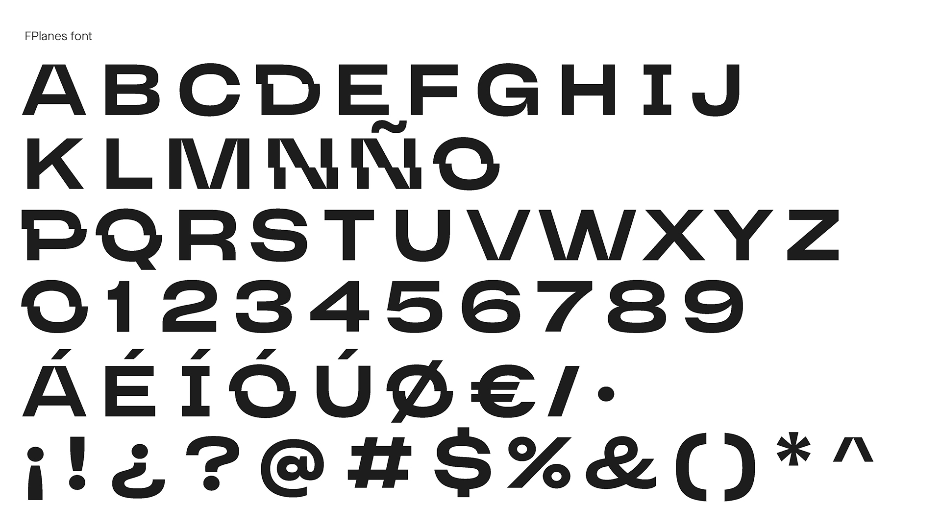
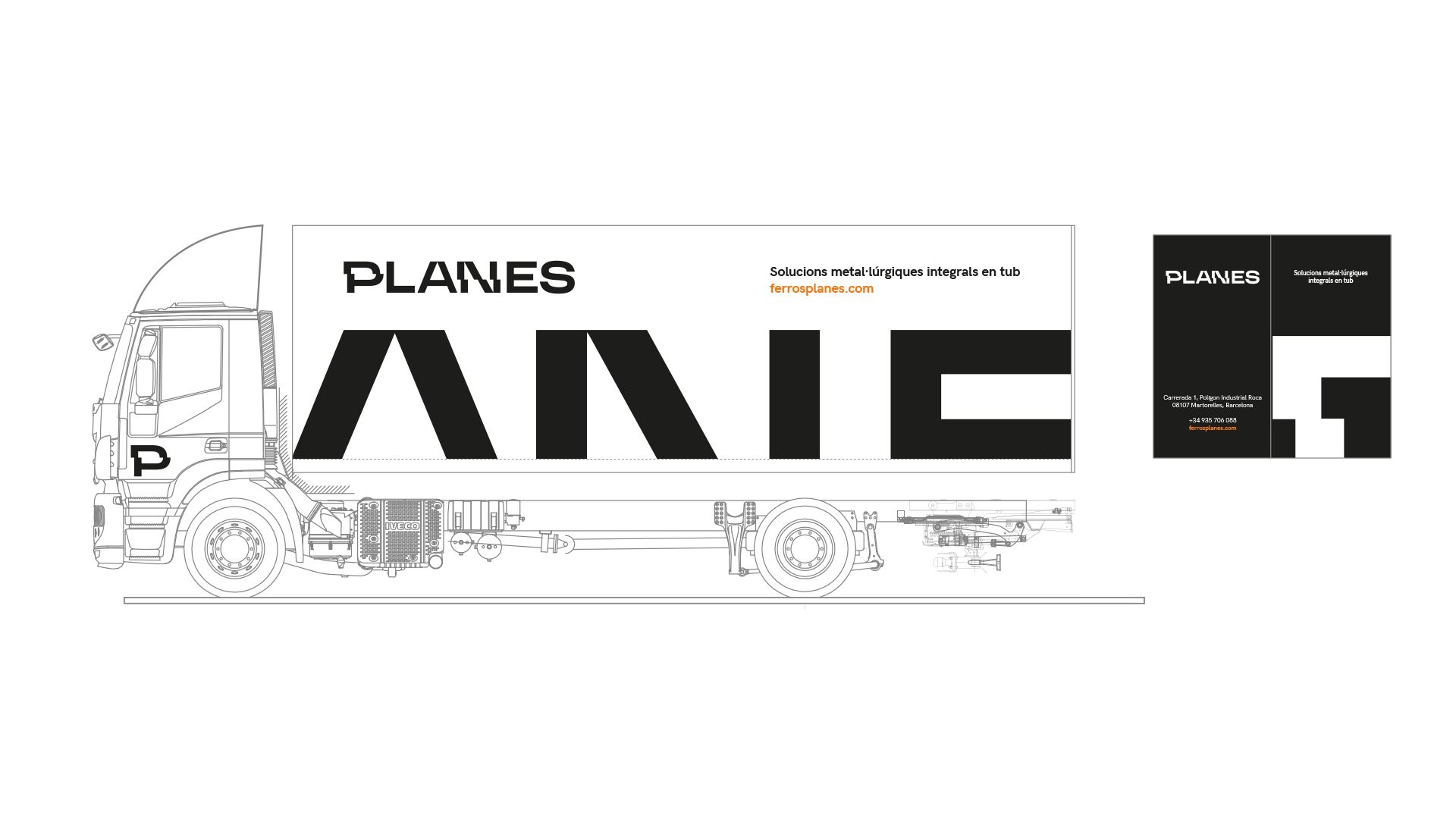
We simplified the naming, from “Ferros Planes” to just plainly “Planes”, and conceptualized its identity based on the company’s main activity, “laser tube cutting”.
In terms of the logo design, we worked on a custom corporate typeface, based on the existing HK Grotesk Medium, in which we mainly applied two horizontal “laser cuts”: one to make the letters look more extended and to achieve minimal joining points; and another with a displacement, to accentuate the division of the parts.
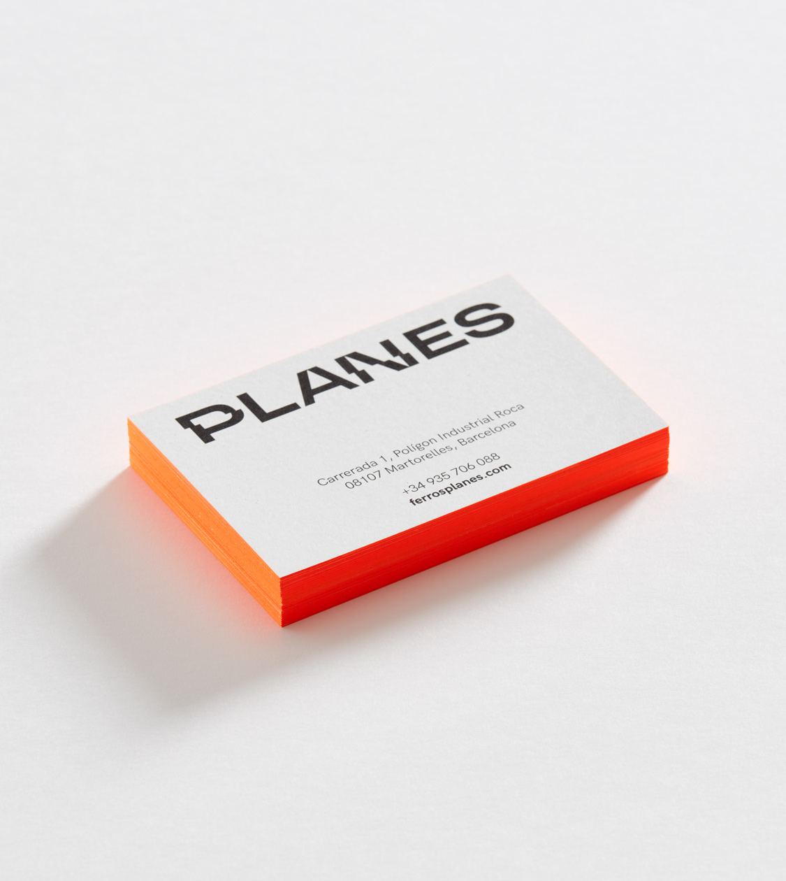
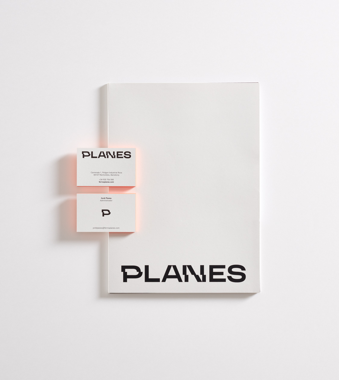
With this intervention, in addition to reflecting and reinforcing the activity of this industrial company, we abstractly expressed its versatility, an attribute that defines Planes and its main service.
This way, aiming to enhance the brand, we converted the Ferros Planes logo into a typographic family.
We completed the identity of Planes choosing a colour palette in which white, black and some brushstrokes of fluorescent orange stand out, symbolizing the colour of the light beam generated by the laser.
Result
A new identity with personality, relevance, and differentiation in their sector
Finally, we created an identity and packaging manual for Planes’ new branding –characterized by its personality, relevance and for being highly differential in the sector, but maintaining its industrial feel– which we are now gradually applying, in different phases, in the company’s corporate materials, digital communication, and corporate and product catalogue.
Tags: Branding strategy, Corporate branding
2022
More Projects