We are a branding agency assisting companies
in growth through design, fostering trustworthy
and impactful brands in a responsible manner.
We are a certified B Corp.

- Branding strategy
- Corporate branding
- Product design
- Packaging design
- Editorial design
- Communication
- Digital communication
- Retail branding
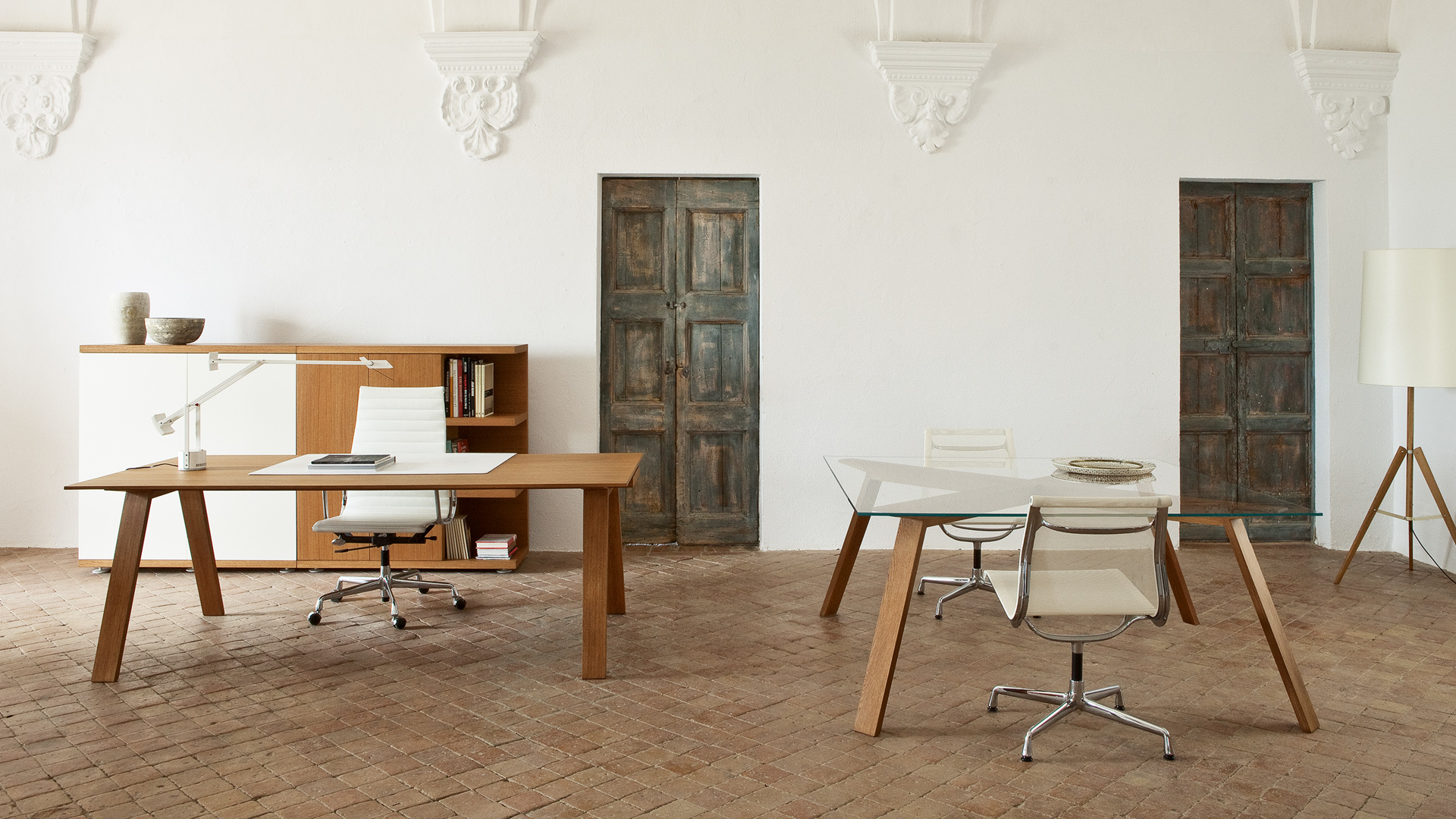
Digital environment
Industrial design
Consultoria comercial
Business consulting
Team coaching
Market place specialist
Architecture and interior design
Postproduction
Photography and 3D
Catalog automation
Production
Copys
Audiovisual
Illustration
Highlights
18
Years of
Experience
+220
Clients
+10
Year-long collaboration with
15 of our clients
+4K
Projects
6
Business model
Changes
+150
Branding
Projects
+4,6K
Packagings
and 1 patent
+500
Editorial
Projects
+130
Designed
Websites
360º Examples
360º Examples
360º Examples
360º Examples
360º Examples
360º Examples
360º Examples
360º Examples
360º Examples
360º Examples
360º Examples
360º Examples
360º Examples
360º Examples
360º Examples
360º Examples
360º Examples
360º Examples
360º Examples
360º Examples
360º Examples
360º Examples
360º Examples
360º Examples
360º Examples
360º Examples
360º Examples
360º Examples
360º Examples
360º Examples
360º Examples
360º Examples
360º Examples
360º Examples
360º Examples
360º Examples
360º Examples
360º Examples
360º Examples
360º Examples
Cosmic
Branding strategy
Corporate branding
Packaging design
Editorial design
Digital communication
Retail branding
At the end of 2023, we took on the challenge of supporting Cosmic, a leading brand in the design and production of home design objects under the Roca Group, in its brand repositioning process.
Our task went far beyond redesigning its corporate identity or communication materials. It was a comprehensive transformation that required redefining its verbal and visual identity, preserving the unique elements that make Cosmic special while adapting them to a millennial audience that values sustainability, functional design, and a balanced lifestyle.
Building on these insights, we revisited the brand’s mission, vision, and values, adopting a clearer, more authentic tone of communication tailored to the millennial generation. This gave Cosmic a distinctive narrative within the industry.
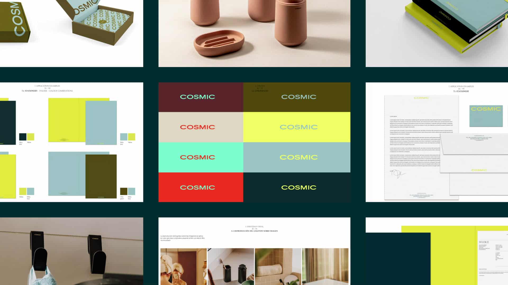
We developed a verbal identity that expresses its purpose: “A home where you can be 100% yourself.” This was complemented by a visual identity based on the concept of “Milleclectic,” which encapsulates the core traits the brand wanted to convey: millennial, eclectic, and minimalist.
This concept is being applied across all communication materials to build an authentic and relevant brand, including art direction, digital communication, packaging systems, editorial design, and retail branding.
Texia
Branding strategy
Corporate branding
Product design
Packaging design
Editorial design
Communication
Digital communication
Retail branding
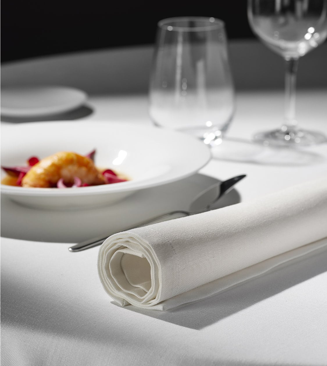
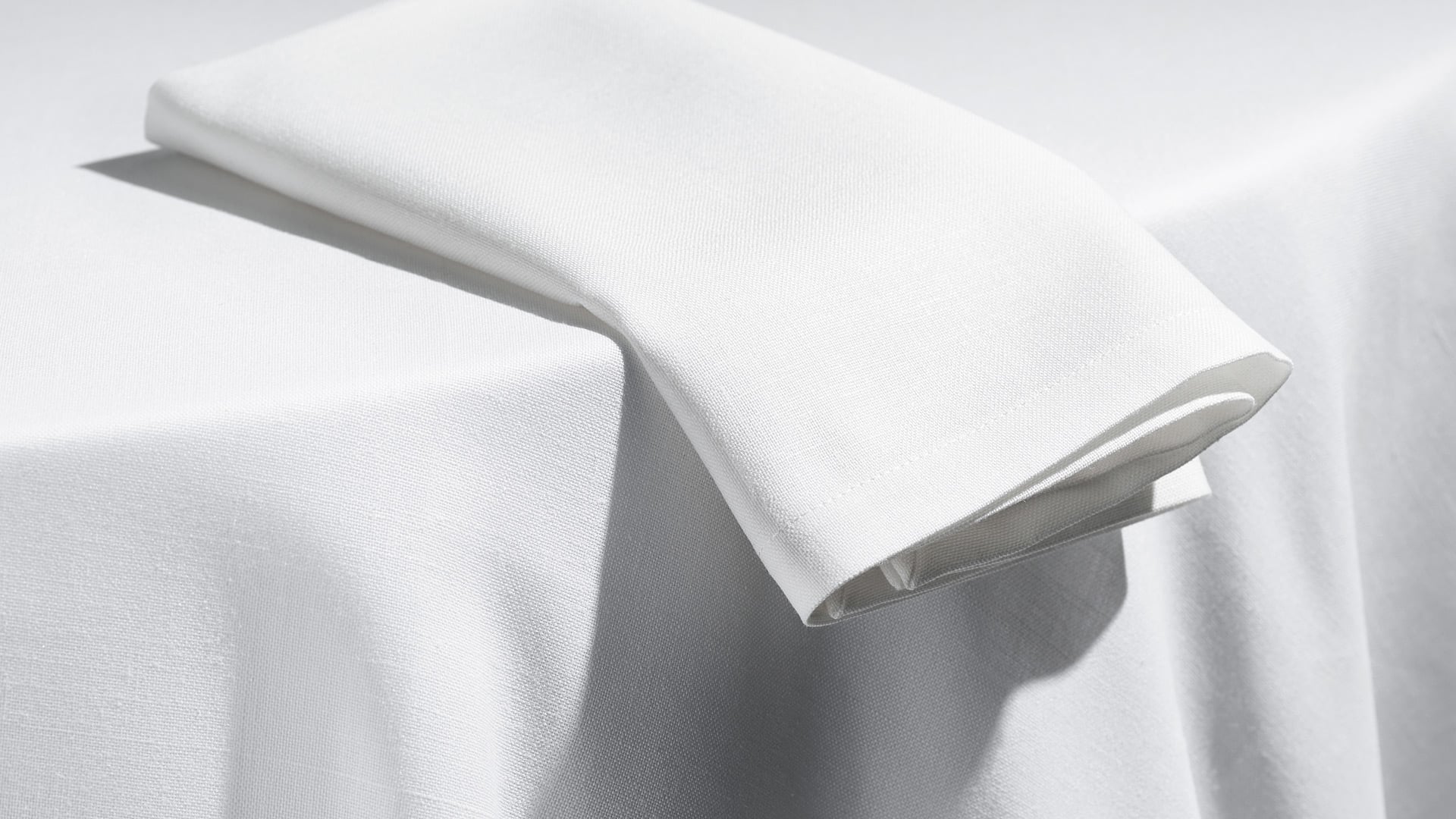
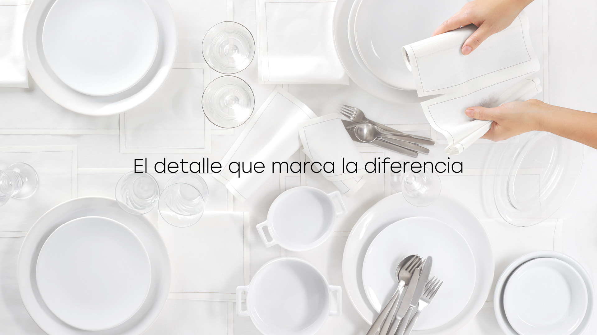
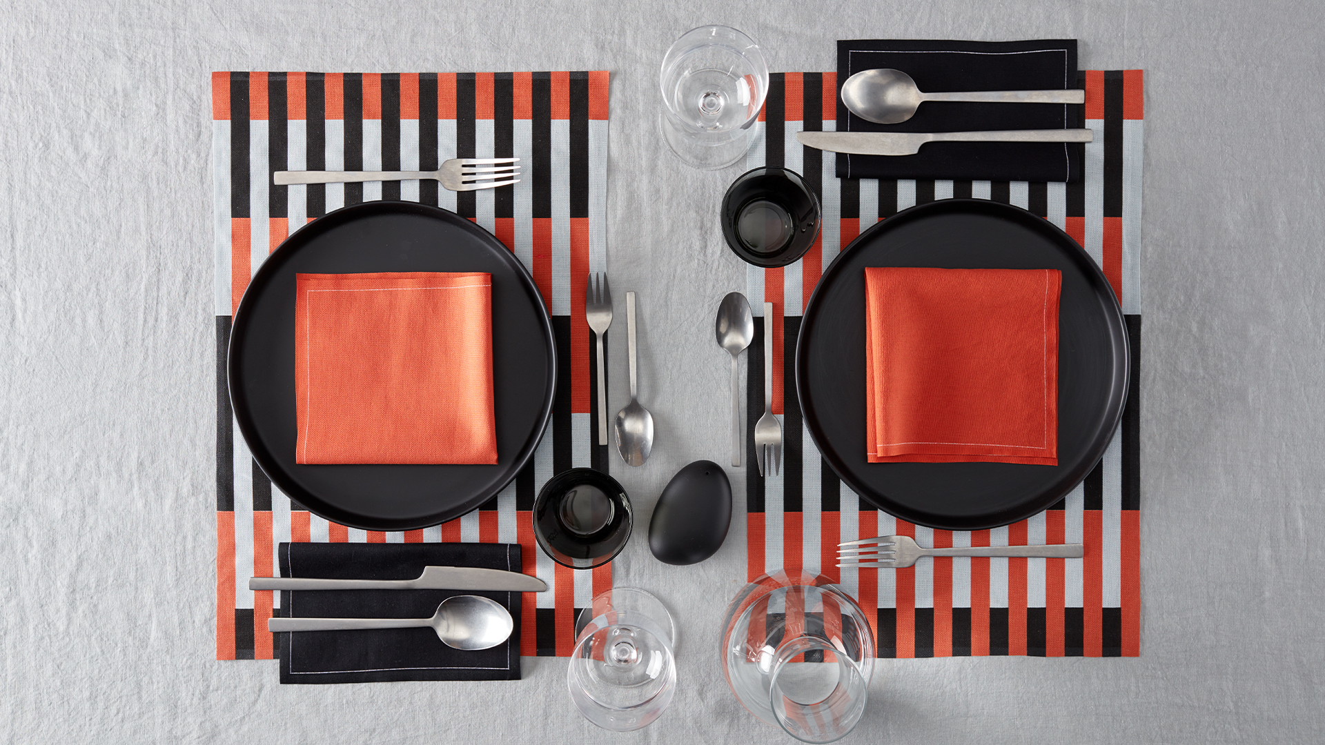
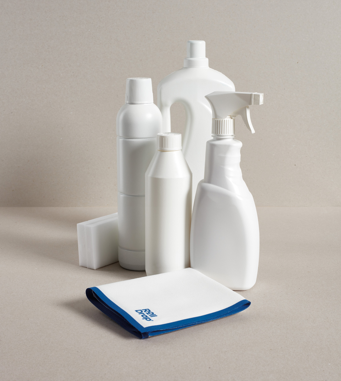
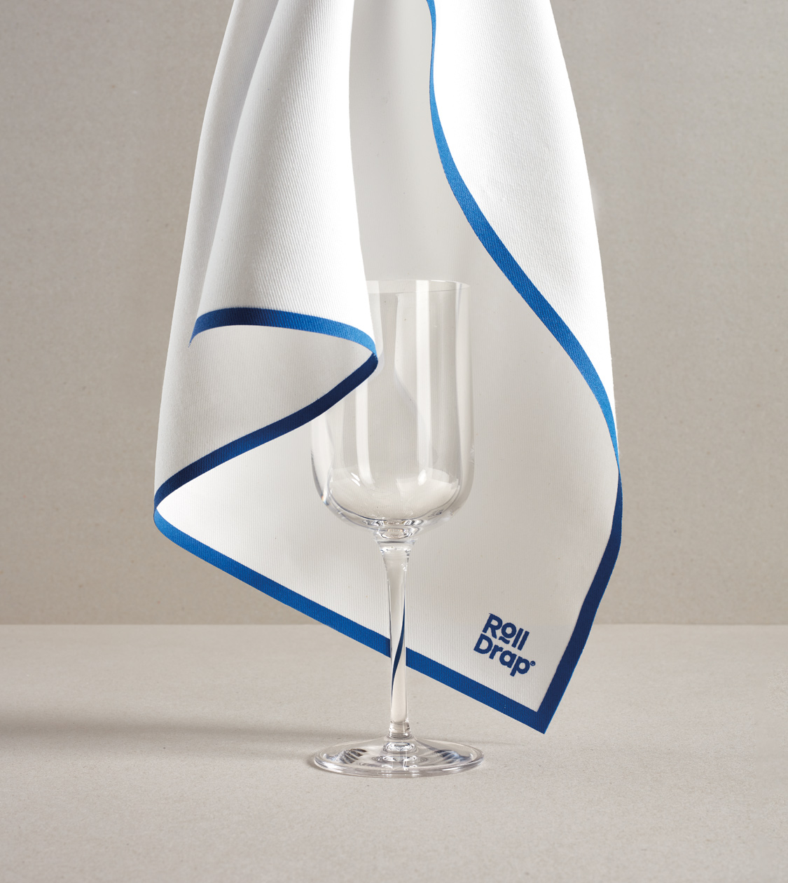
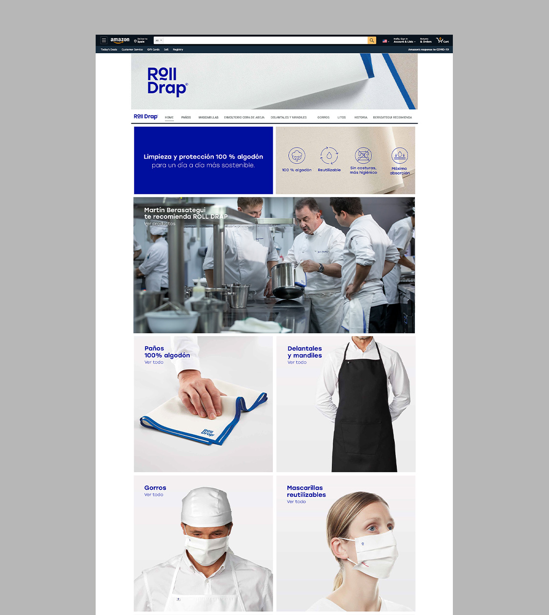
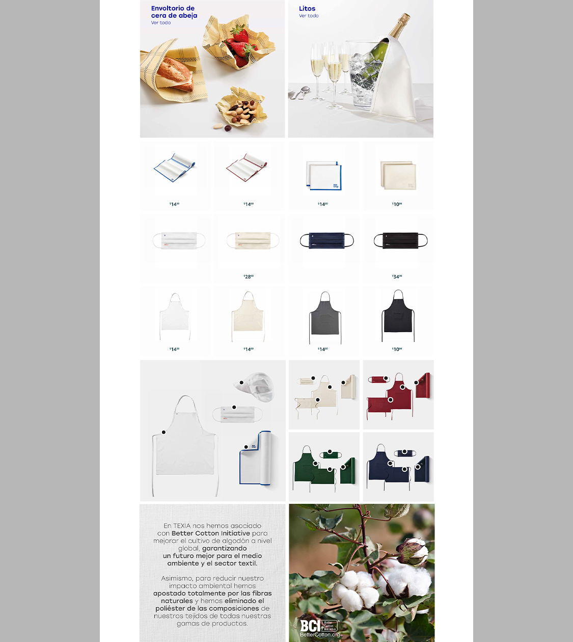
Redesign of the corporate branding for the TEXIA group brands, including My Drap, Roll Drap, and Athos Fabrics, for both retail and professional channels. We have managed to create a global communication with an impact for this 100-year old business group with a unique concept in the textile sector.
TEXIA Finishing
TEXIA Seamless
My Drap
My Drap Professional
Roll Drap Professional
Roll Drap Doméstico
Athos Fabrics


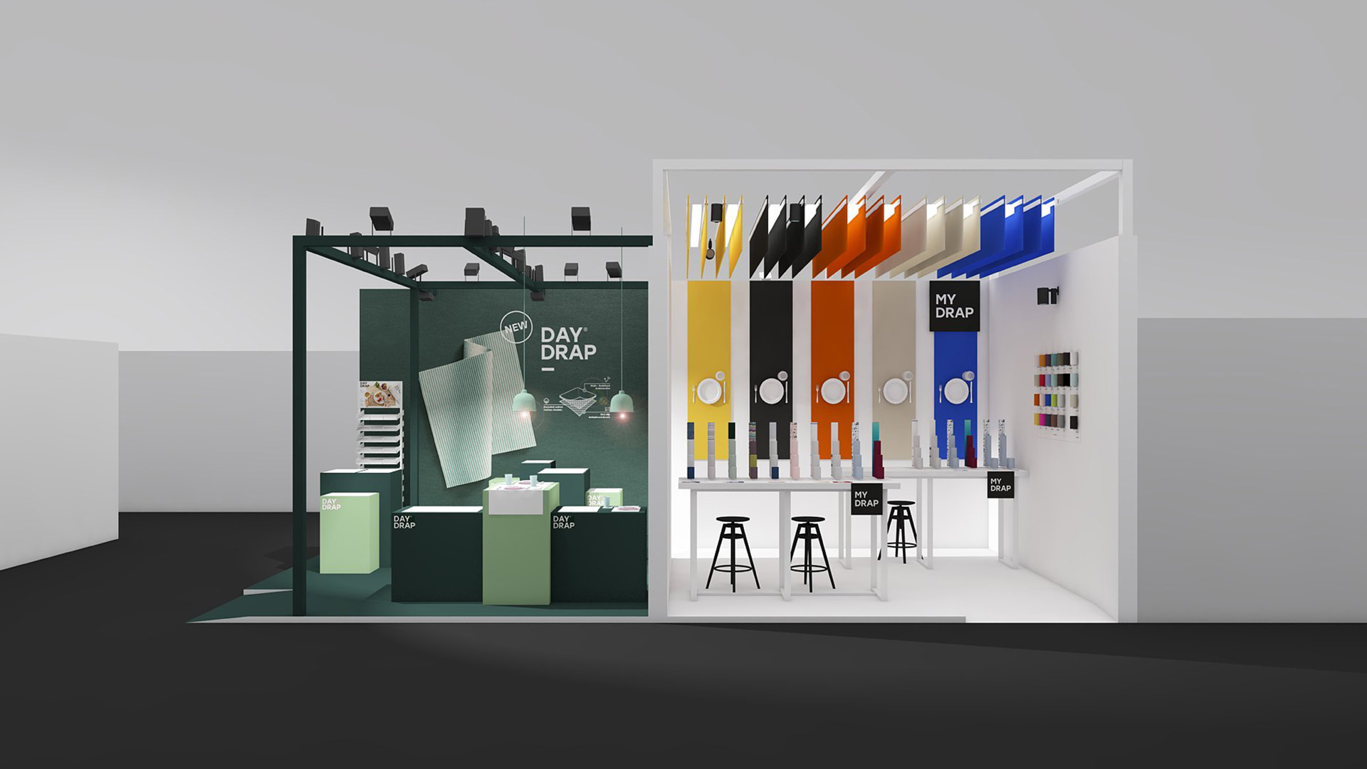

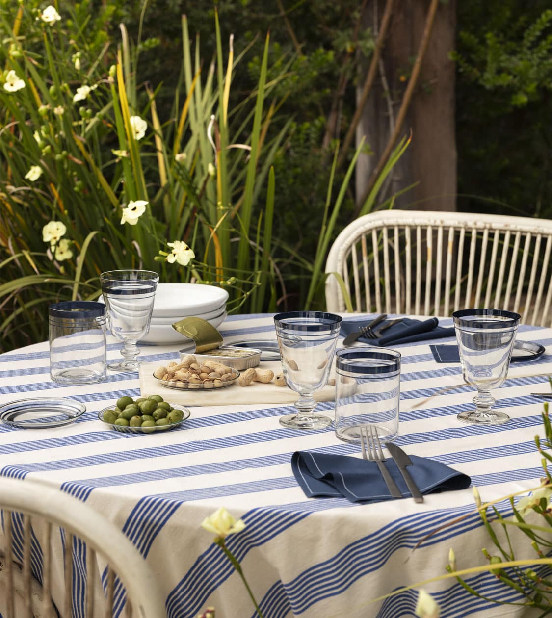
7-year collaboration with TEXIA


We have created over 200 product references for the retail channel
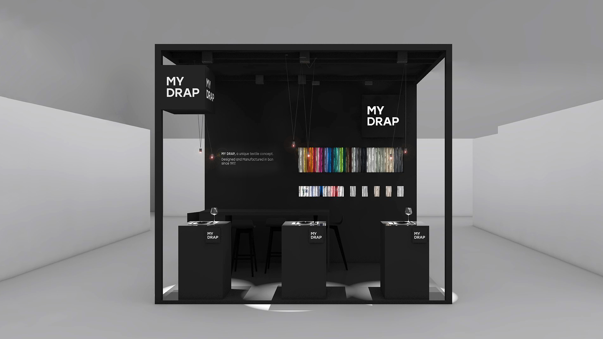

We have redesigned all of their brands
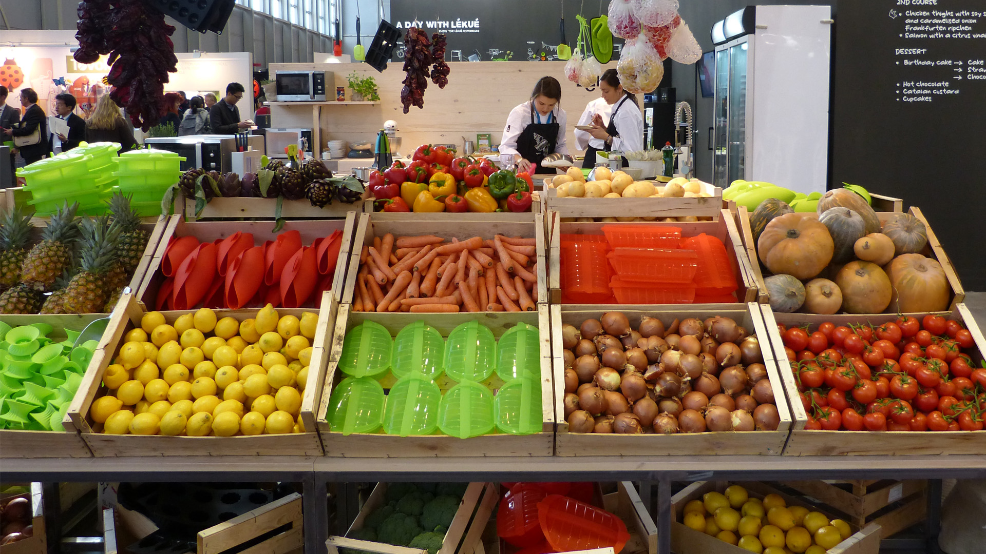
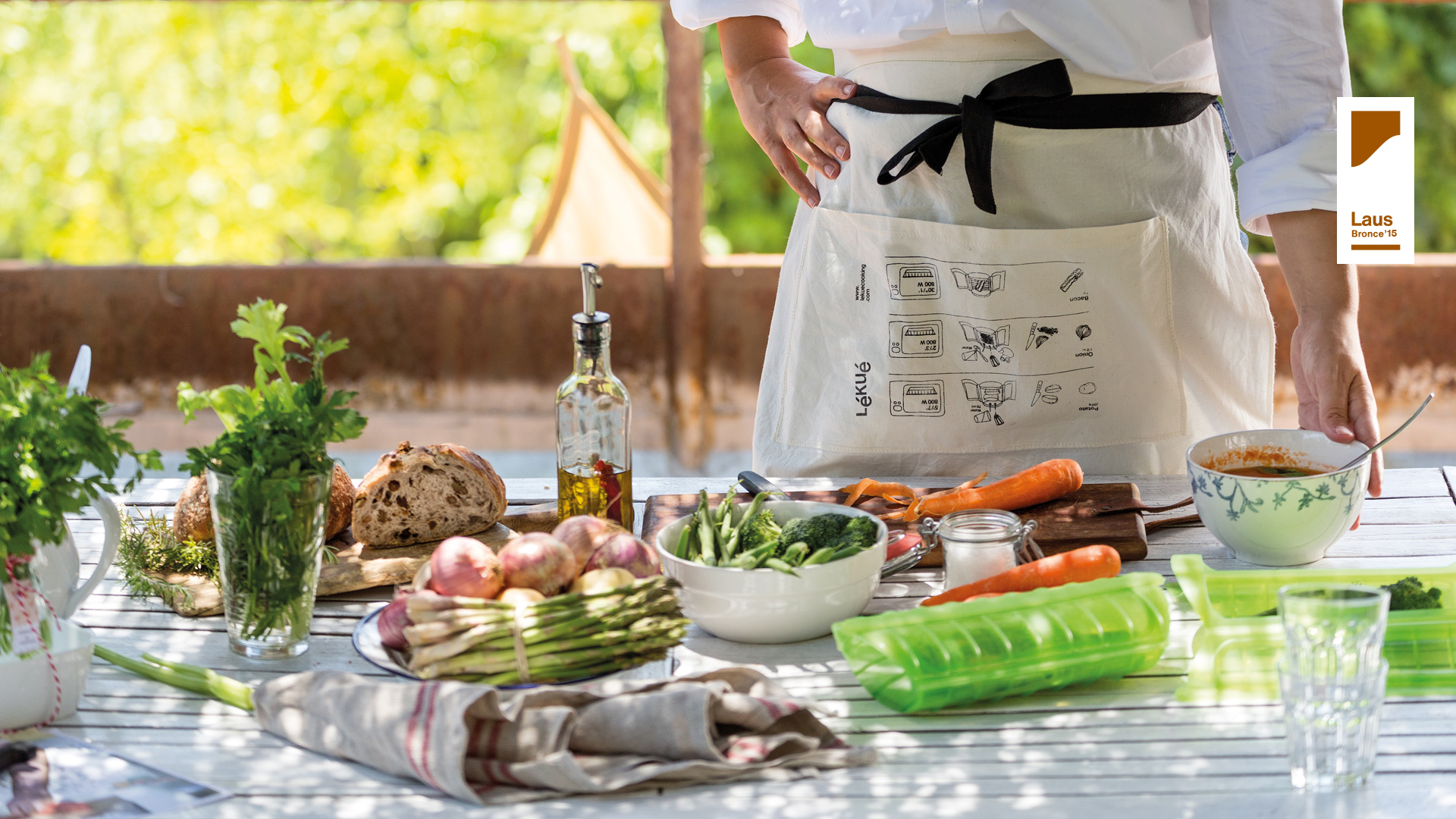
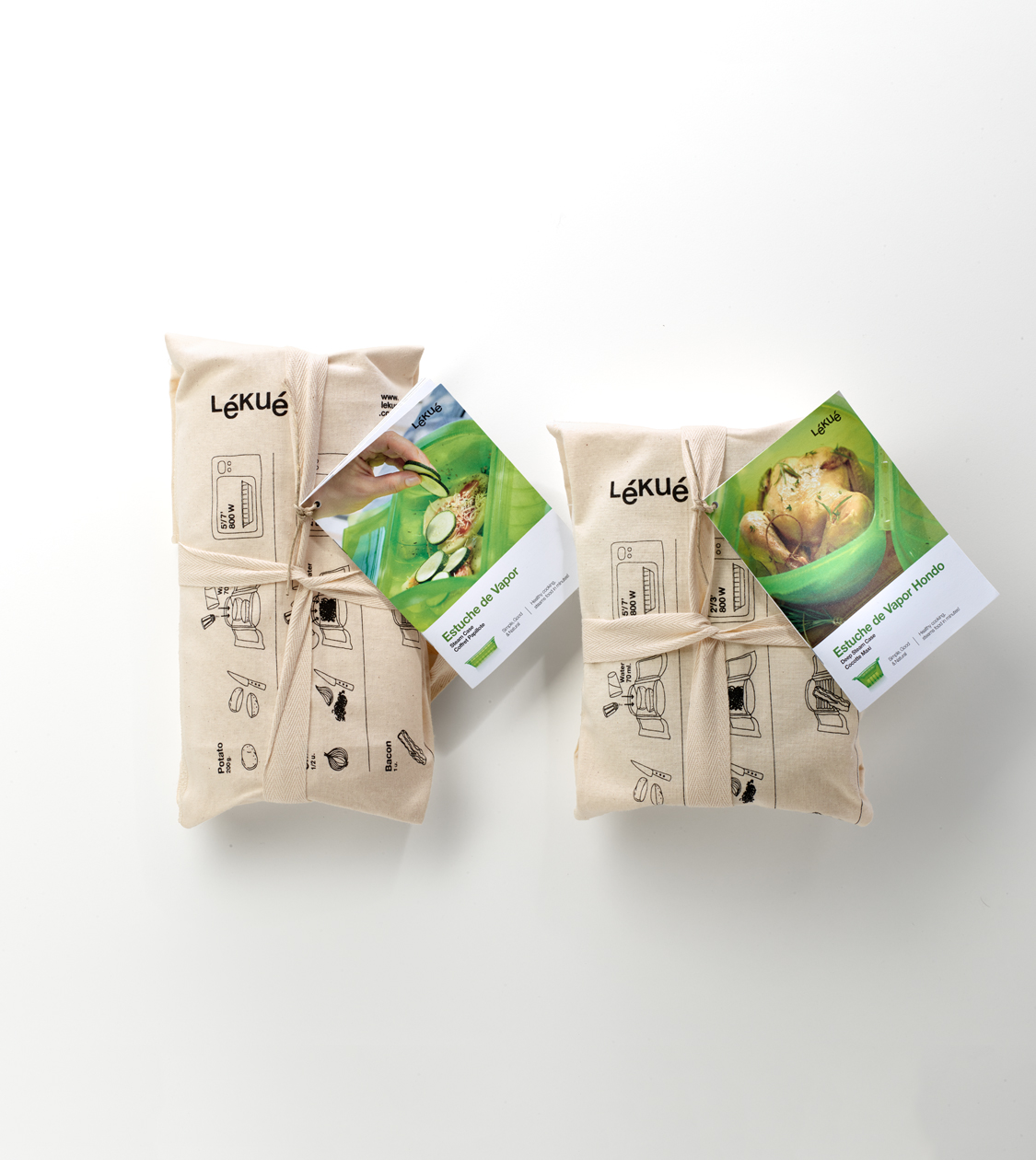
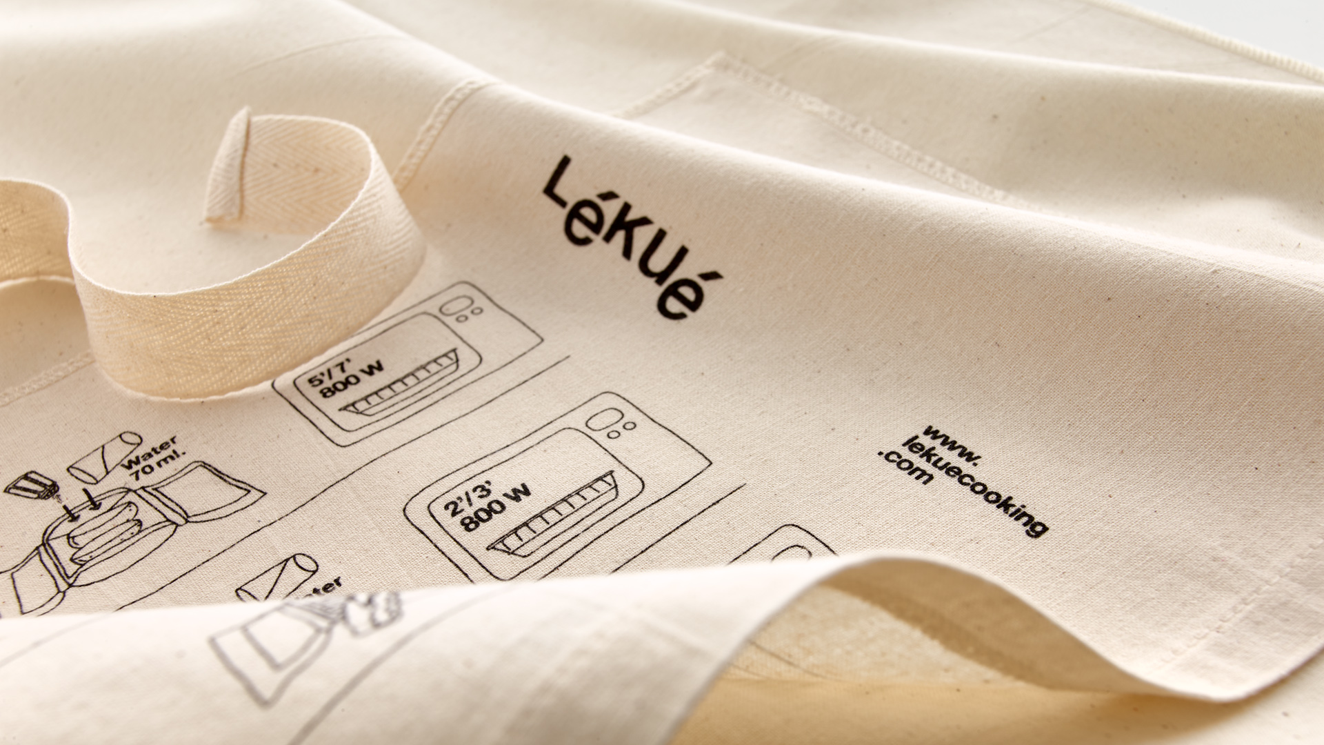
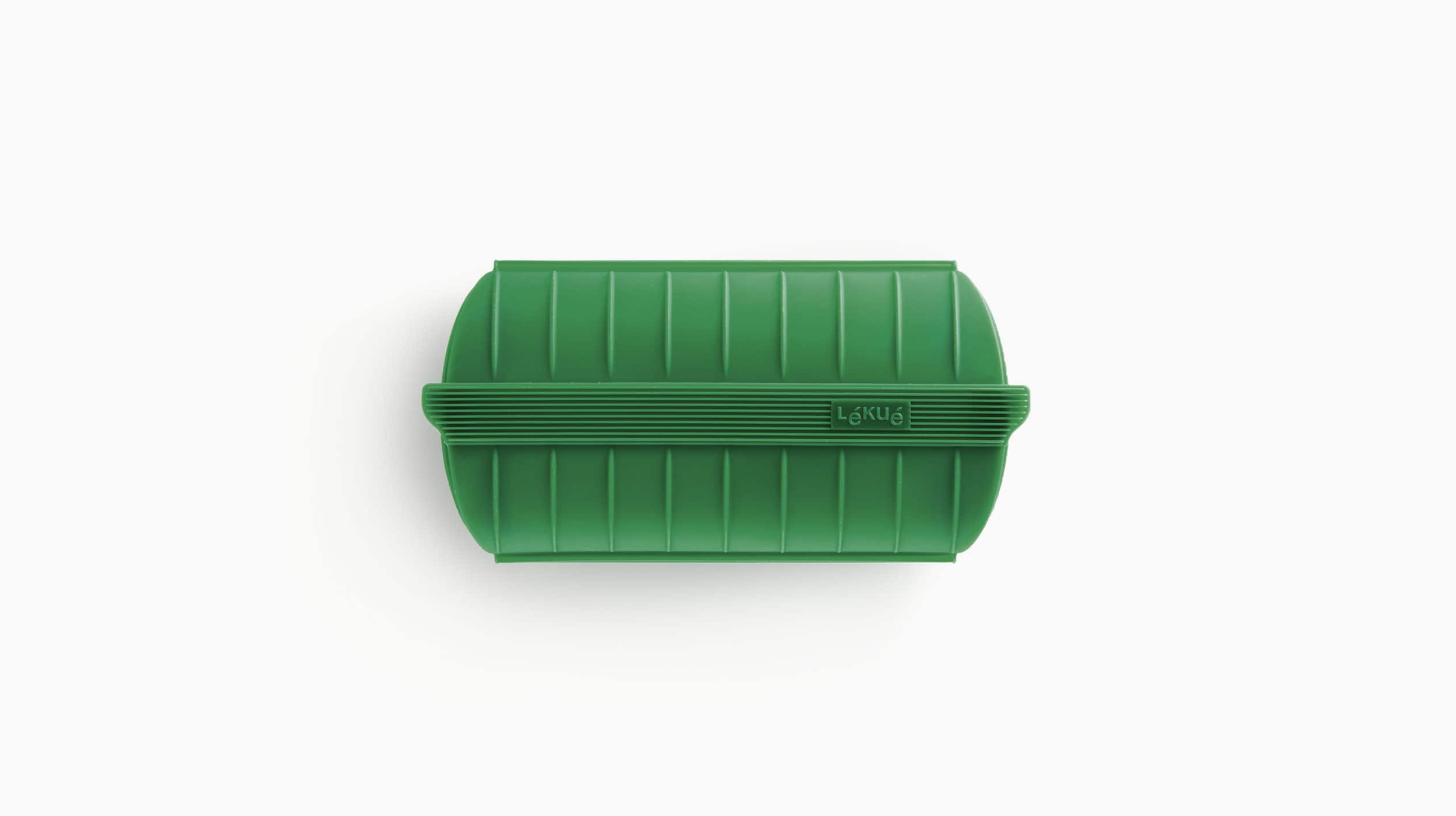
Lékué
Branding strategy
Corporate branding
Product design
Packaging design
Editorial design
Communication
Digital communication
Retail branding
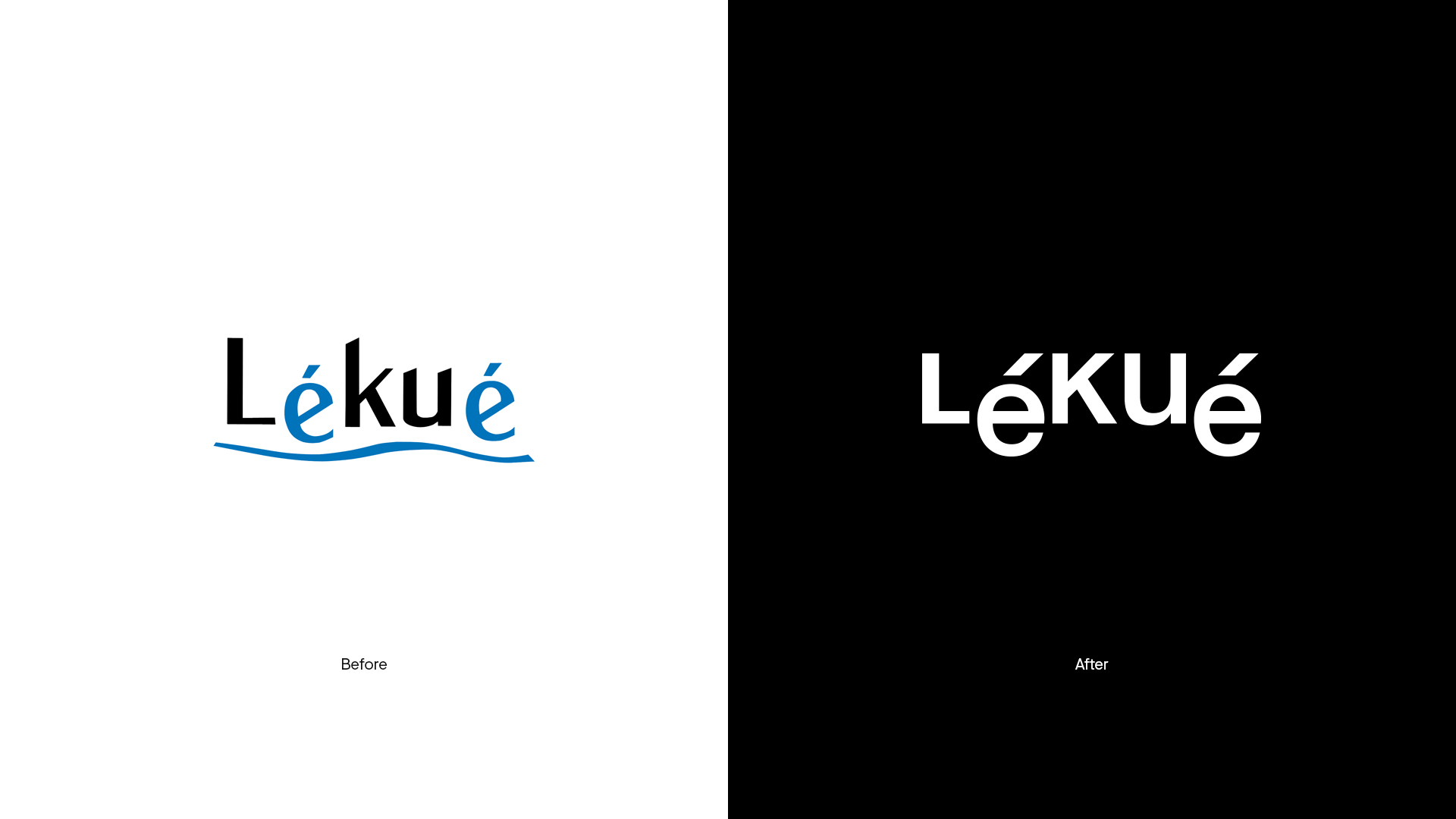
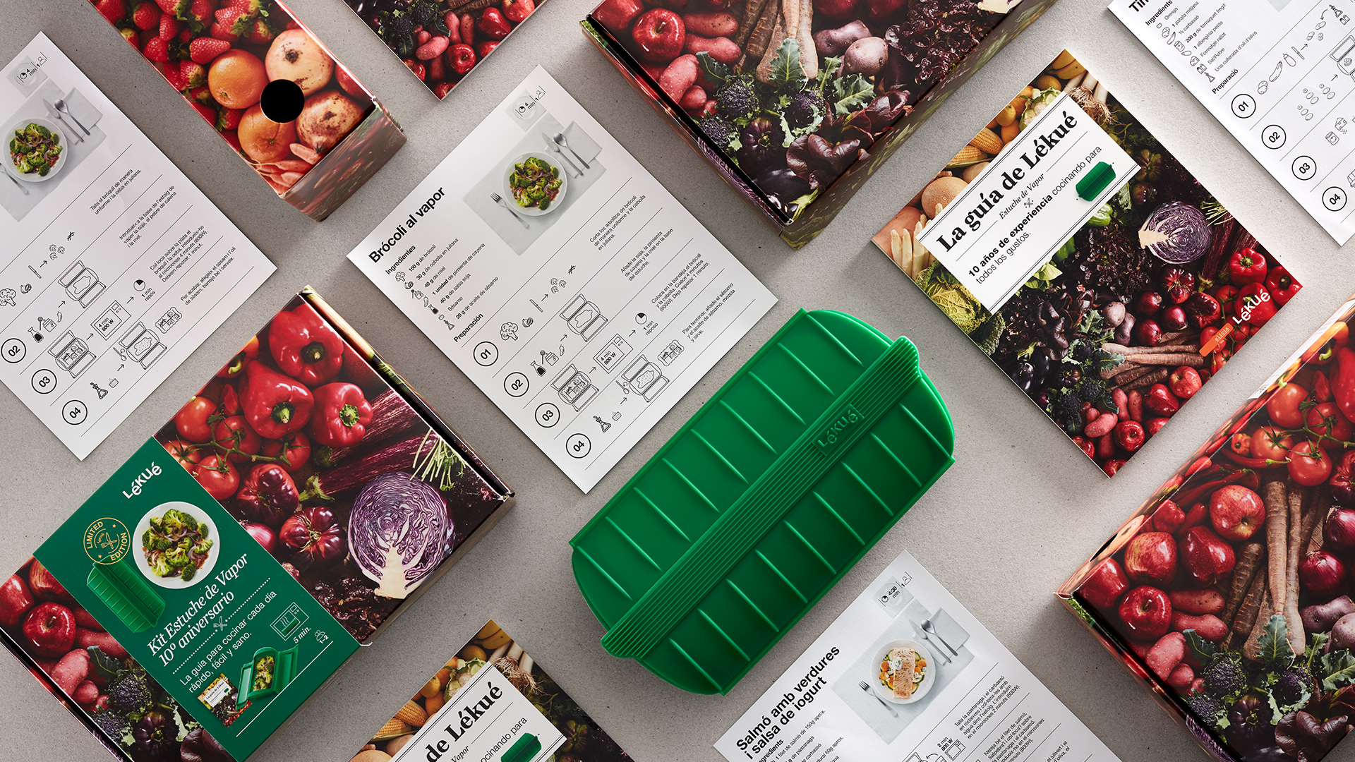
17-year collaboration with the company
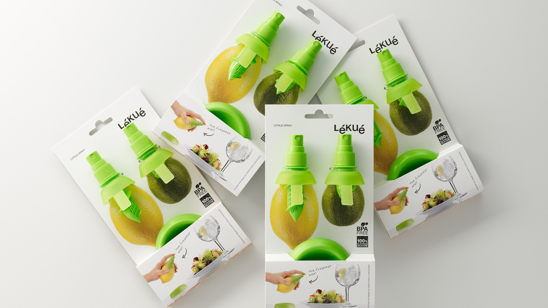
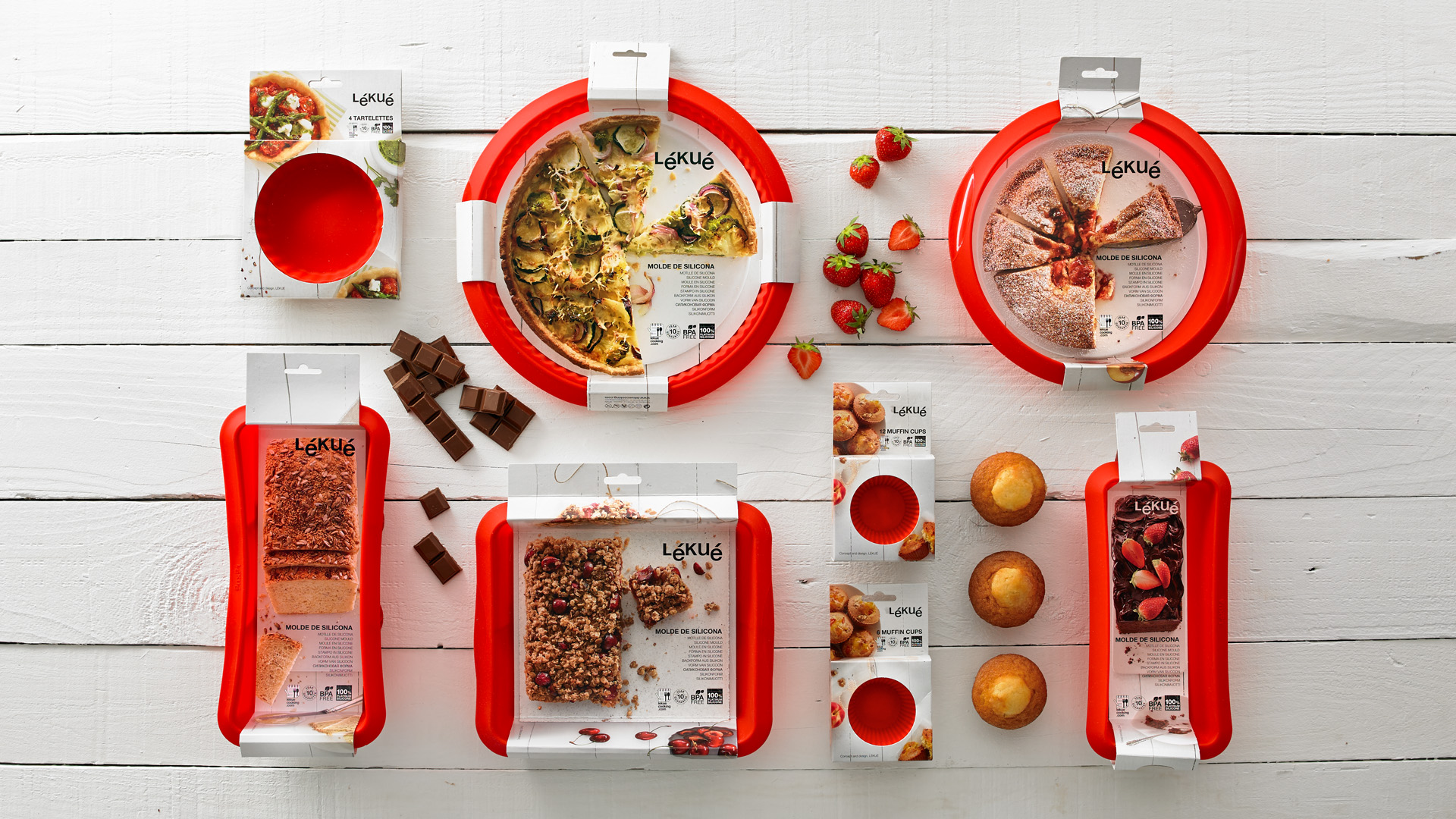
Through our over-a-decade long collaboration with Lékué – a benchmark in kitchen ustensils – we have contributed to the creation of a brand linked to design, innovation and with a prominent orientation towards the consumer. Our branding is still current and fuctioning to this day.
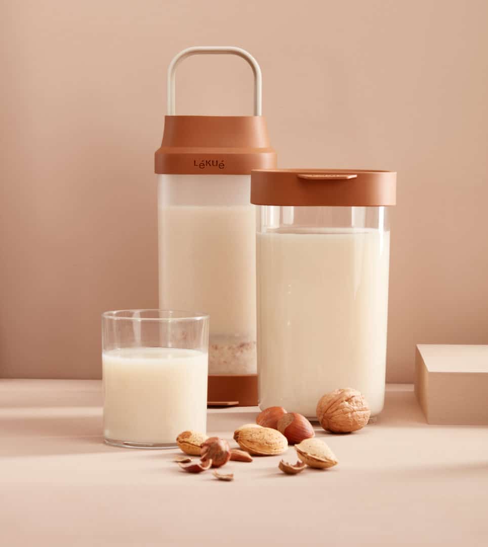


We have created over 375 packs for their various products
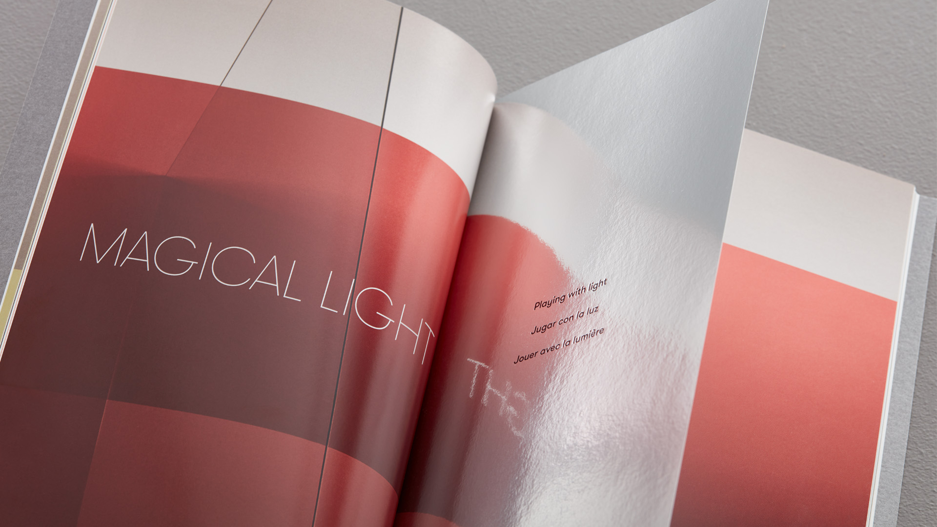
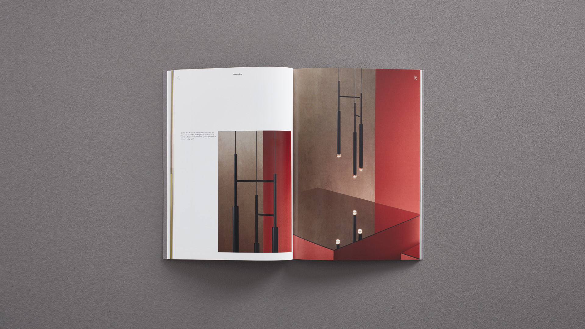
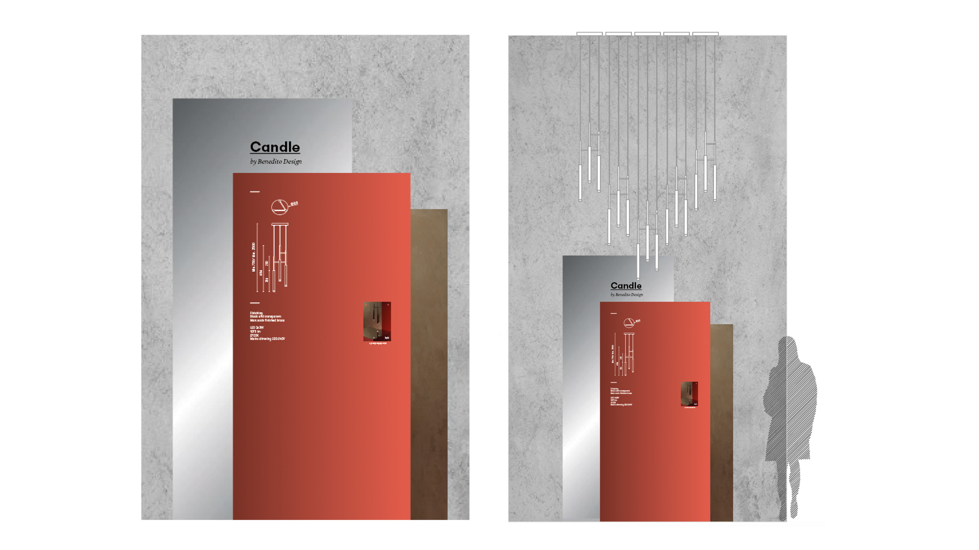
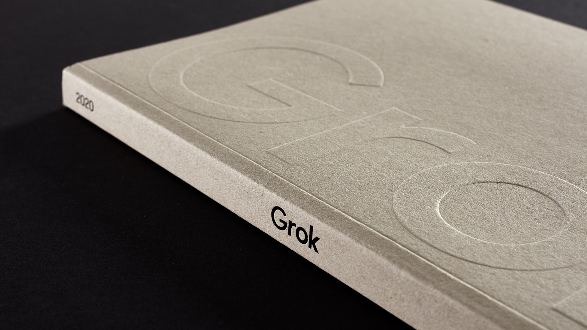
Grok
Branding strategy
Corporate branding
Packaging design
Editorial design
Communication
Digital communication

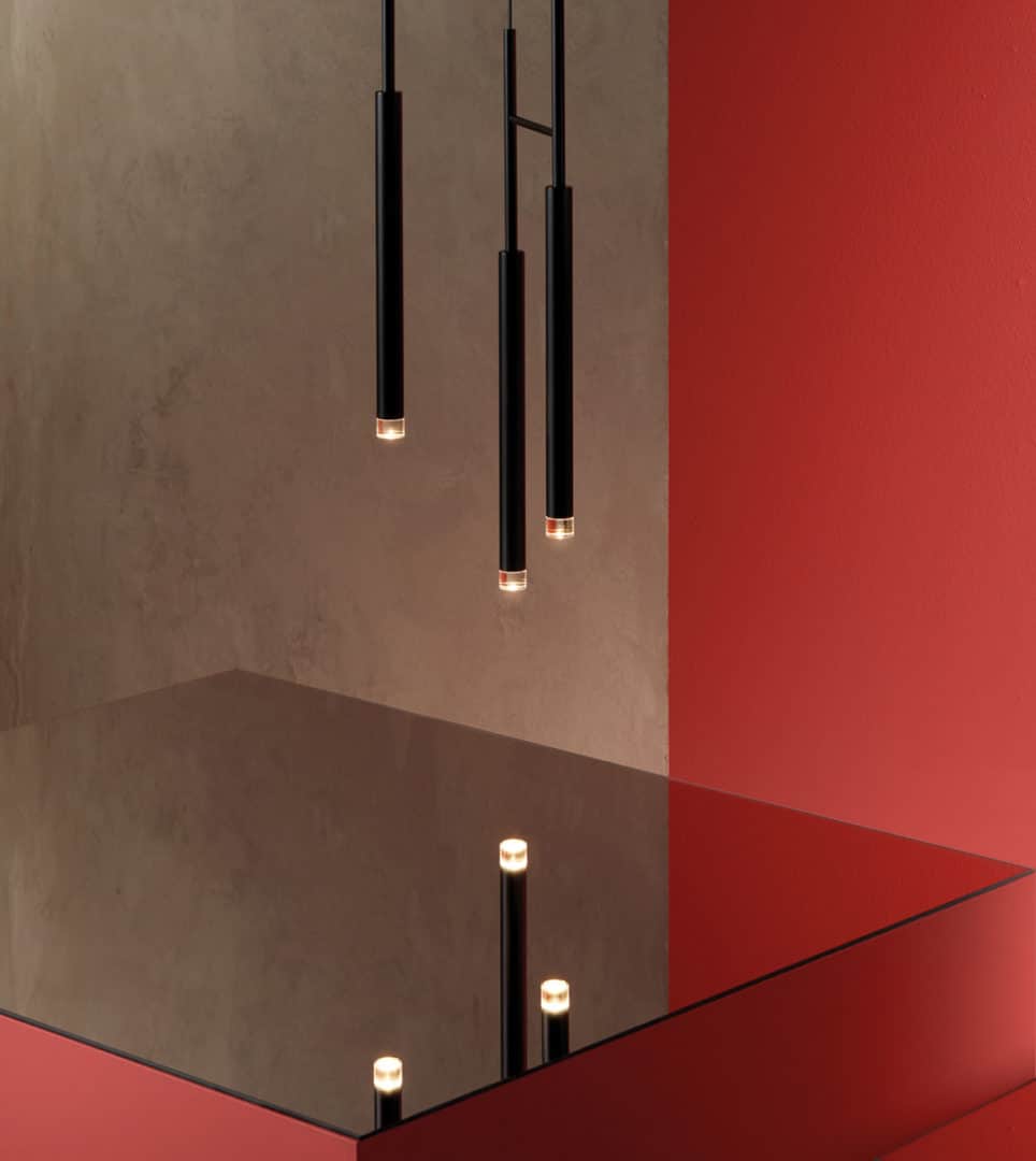
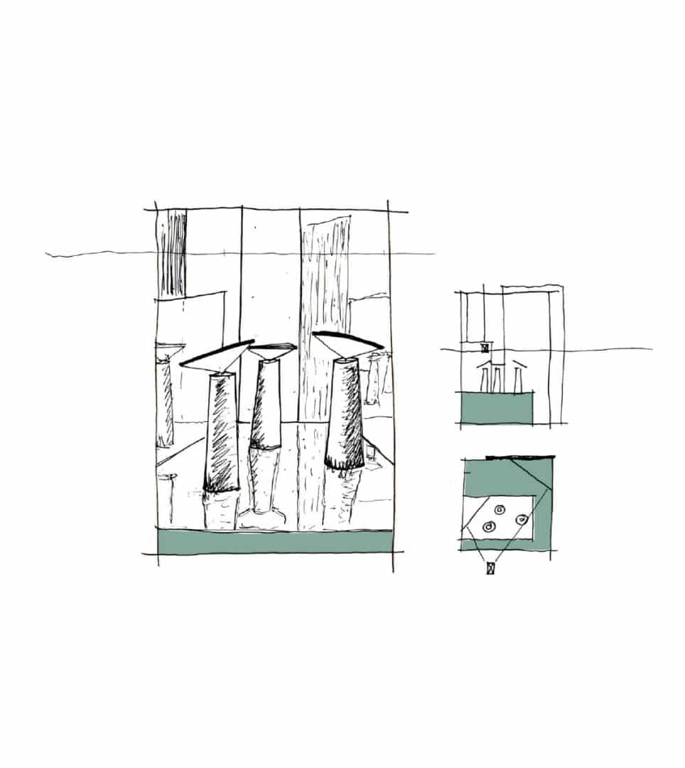
Corporate brand redesign for the trademark Grok, a manufacturer of high-end lighting for the contract and home sectors. The branding that we developed provides a visual system that enabled Grok to take a qualitative leap by positioning the brand «as the designer of contemporary lighting», effectively transmitting the value of its luminaires.


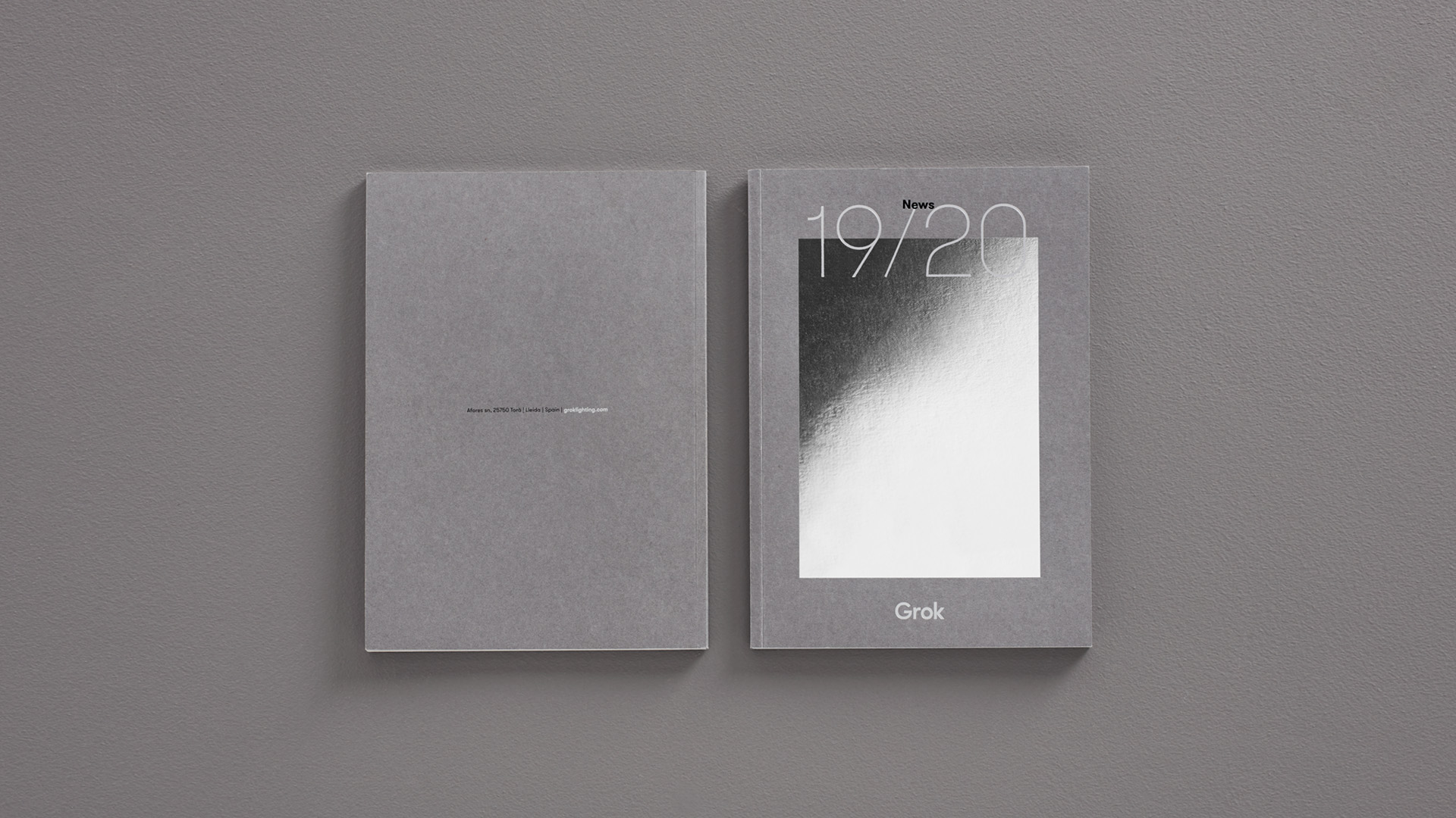
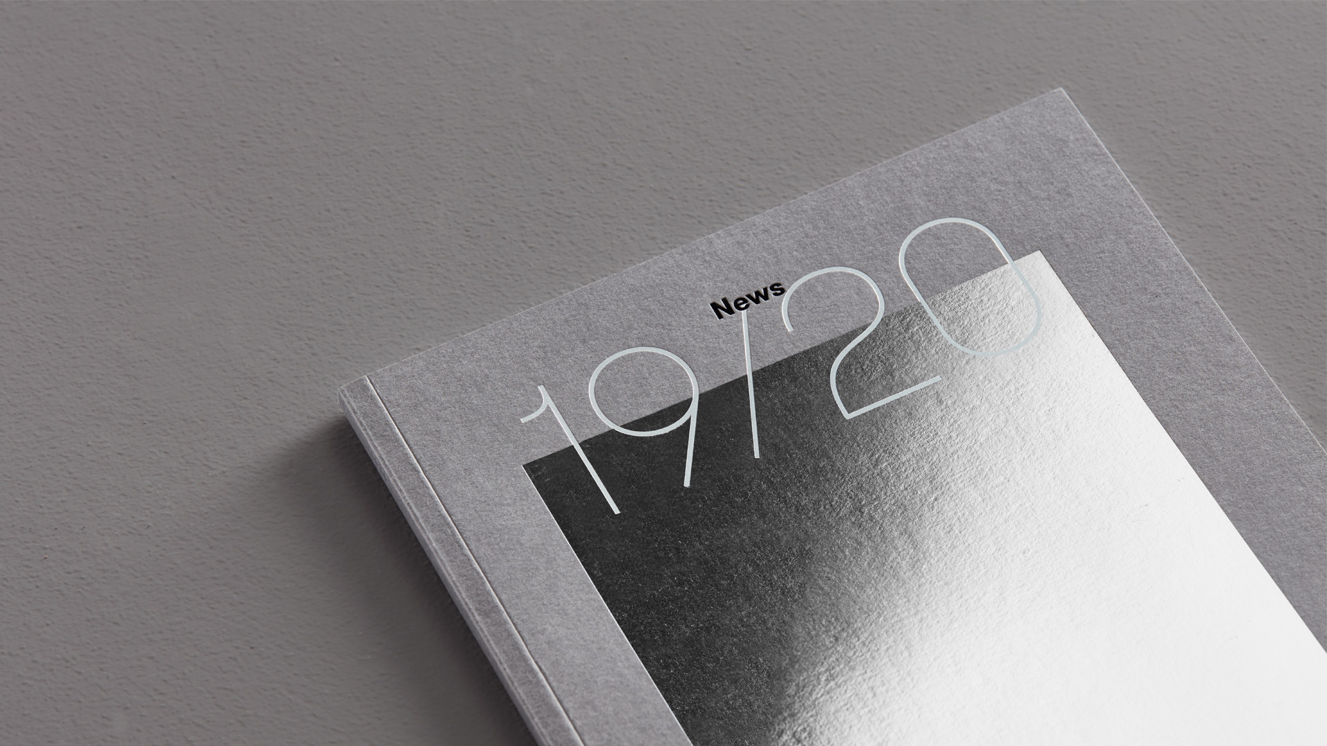
In 2019, we won the Bronze Laus for our Art Direction with the concept “Reflection in the mirror”


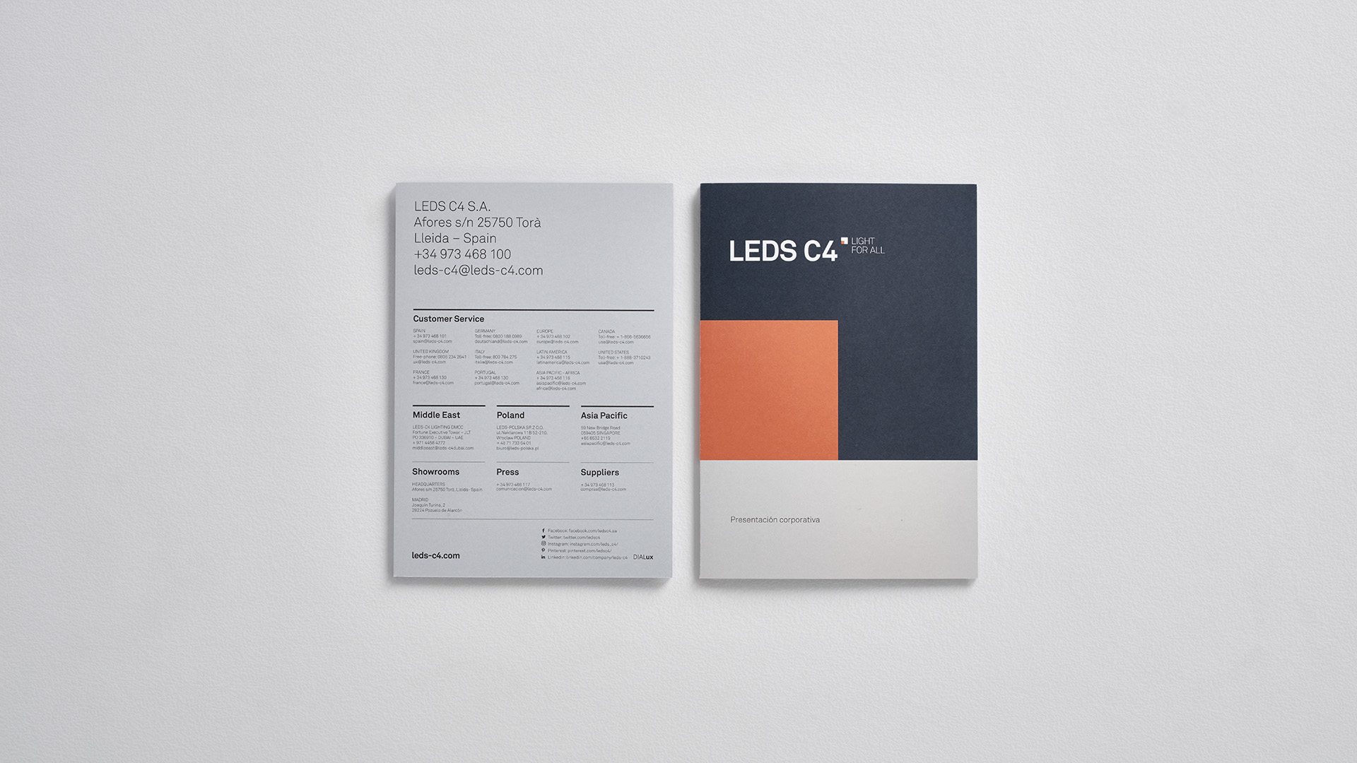
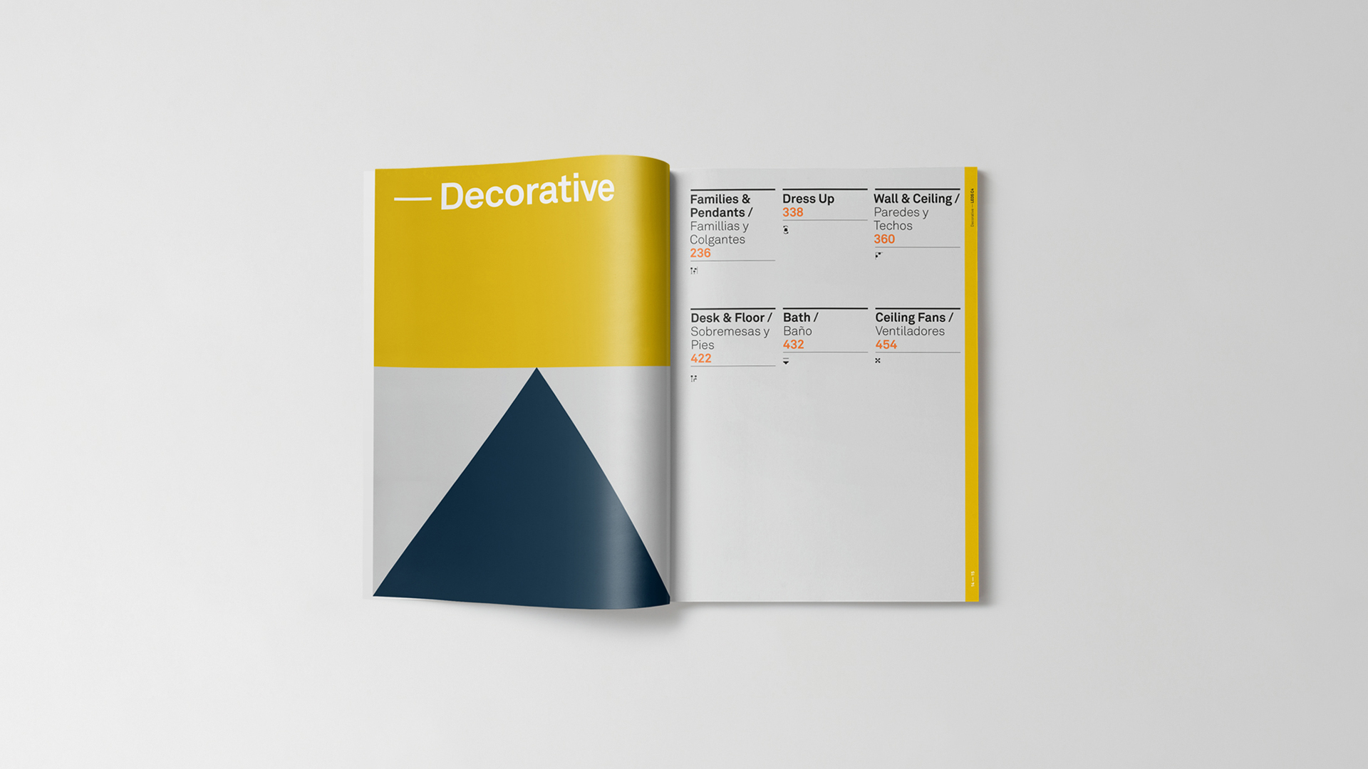
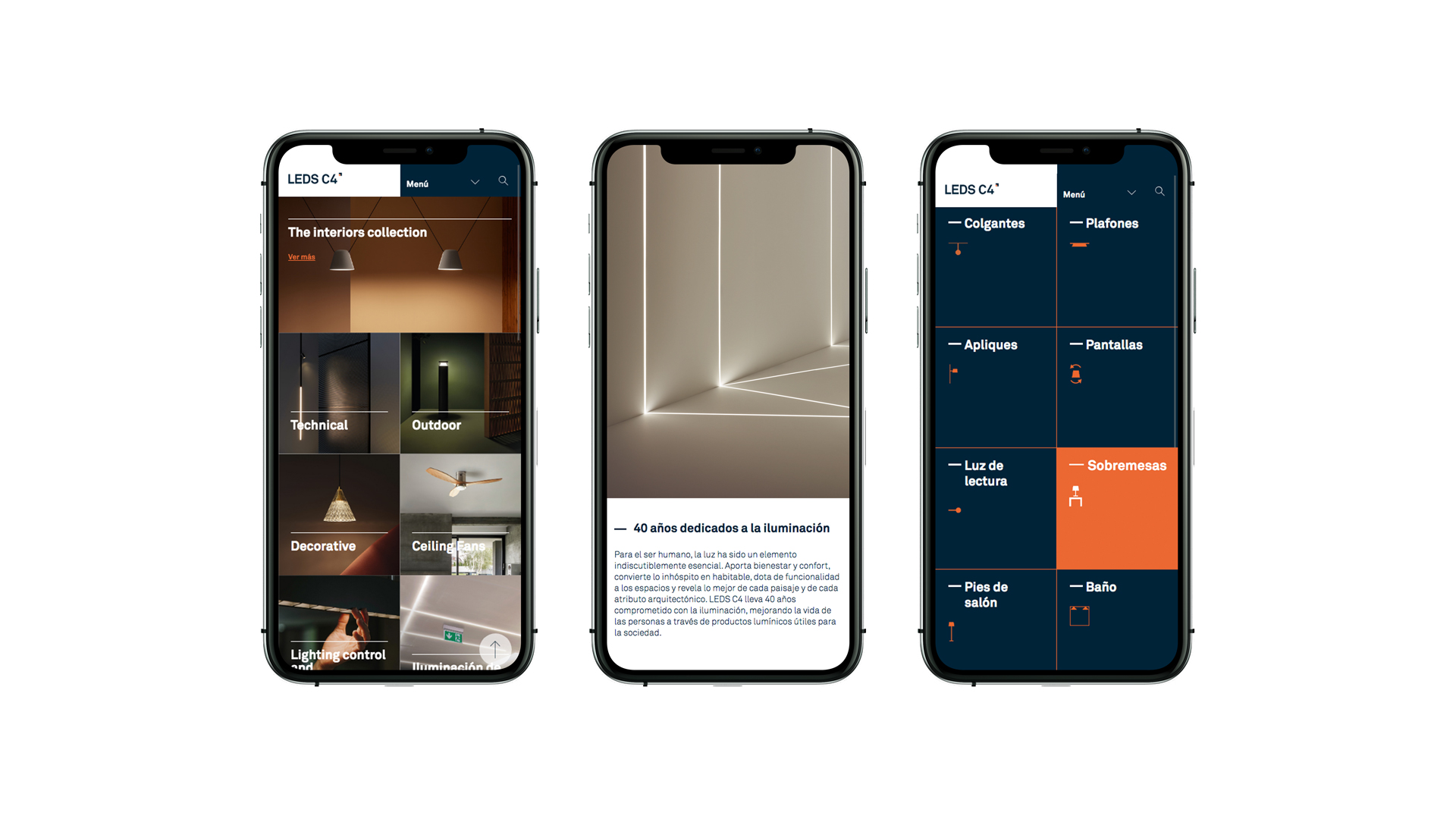
Leds C4
Branding strategy
Corporate branding
Product design
Packaging design
Editorial design
Communication
Digital communication
Retail branding
Corporate branding redesign for LEDS C4 –one of the country’s most important and influential companies in the lighting sector– to create an identity suited to convey and project their new positioning and corporate message around the world.
We created a branding which evolves from its previous identity, marked with a pragmatic character, which communicates its global outreach and allows for an unlimited adaptation to every communication material. In addition, it perfectly coexists with the rest of the group’s brands.
Apli
Branding strategy
Corporate branding
Product design
Packaging design
Editorial design
Communication
Digital communication
Retail branding


We conceptualize and design the packaging of Apli Kids educational toys to make it possible for little kids to learn while having fun while they play at home. We create compelling and creative packagings, acting as a silent salesperson, while transmitting the brand’s universe and the product itself.
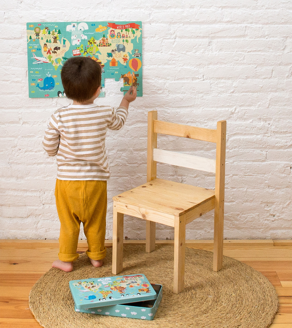

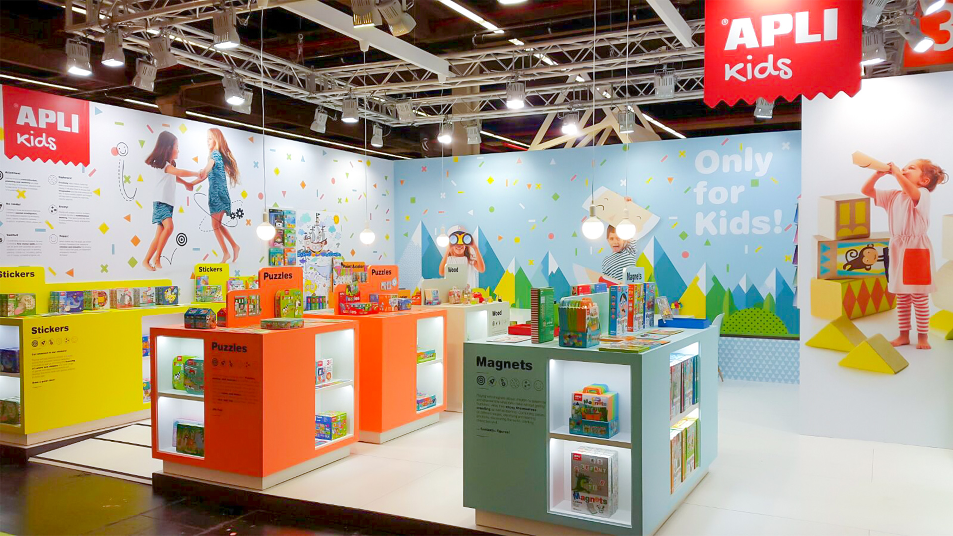
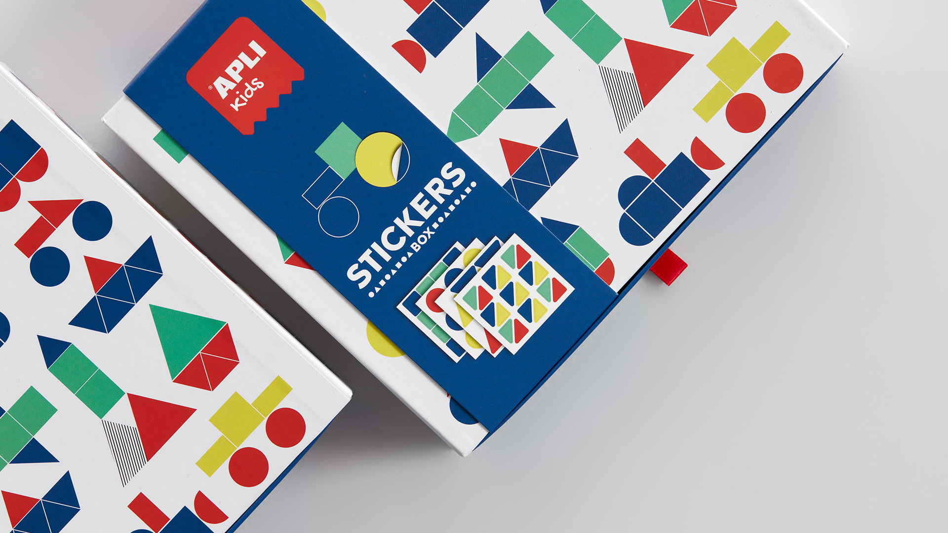
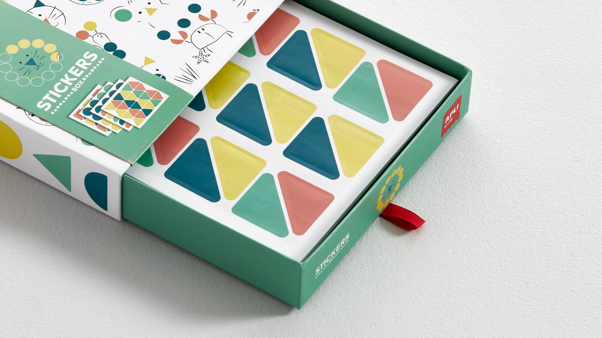
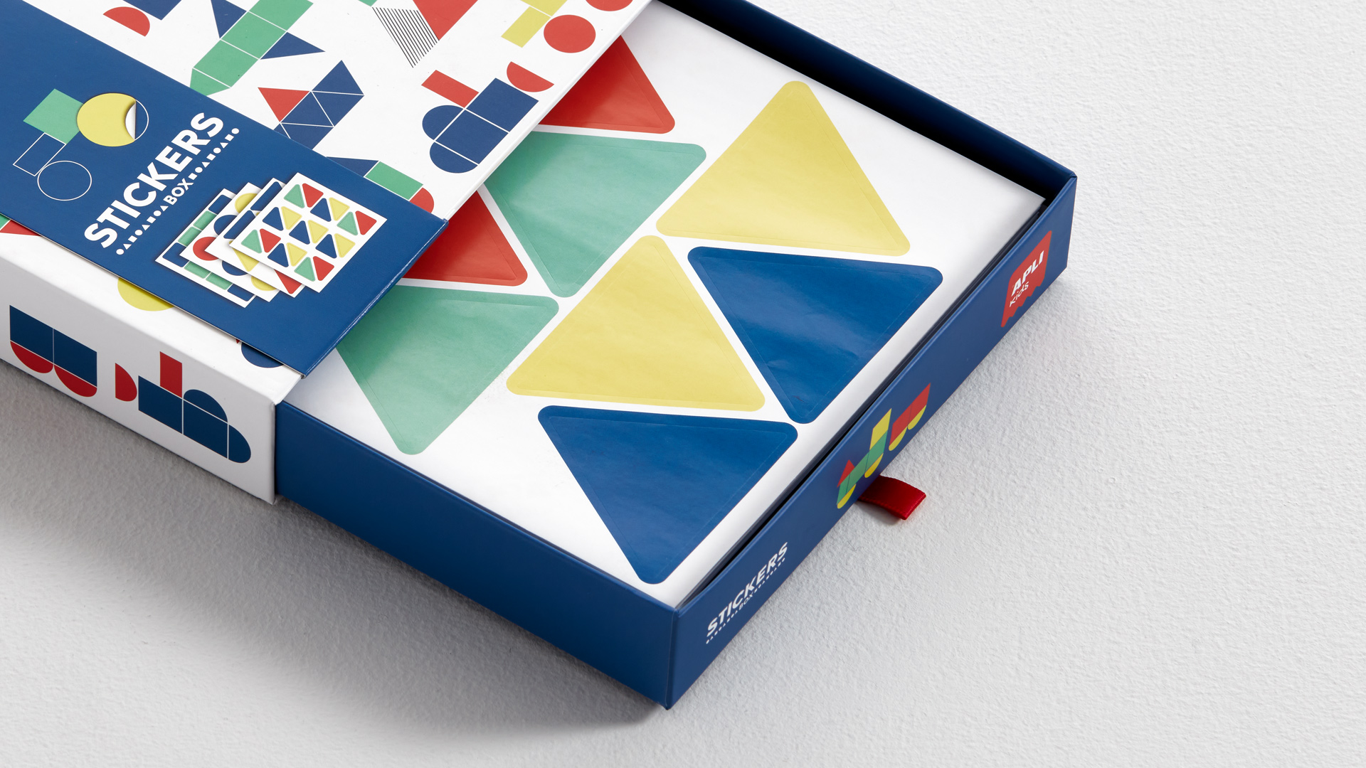
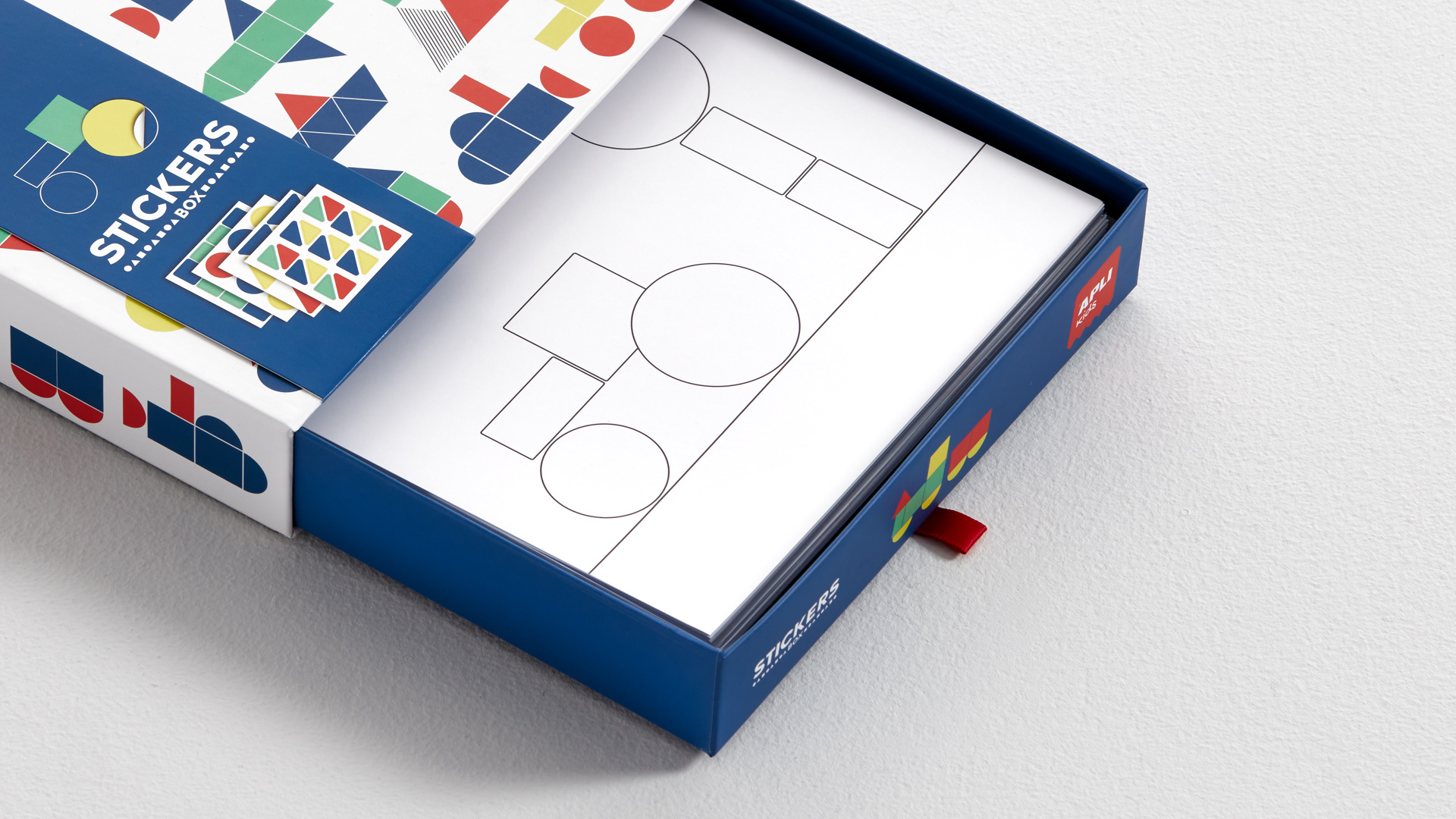
15-year collaboration with the company
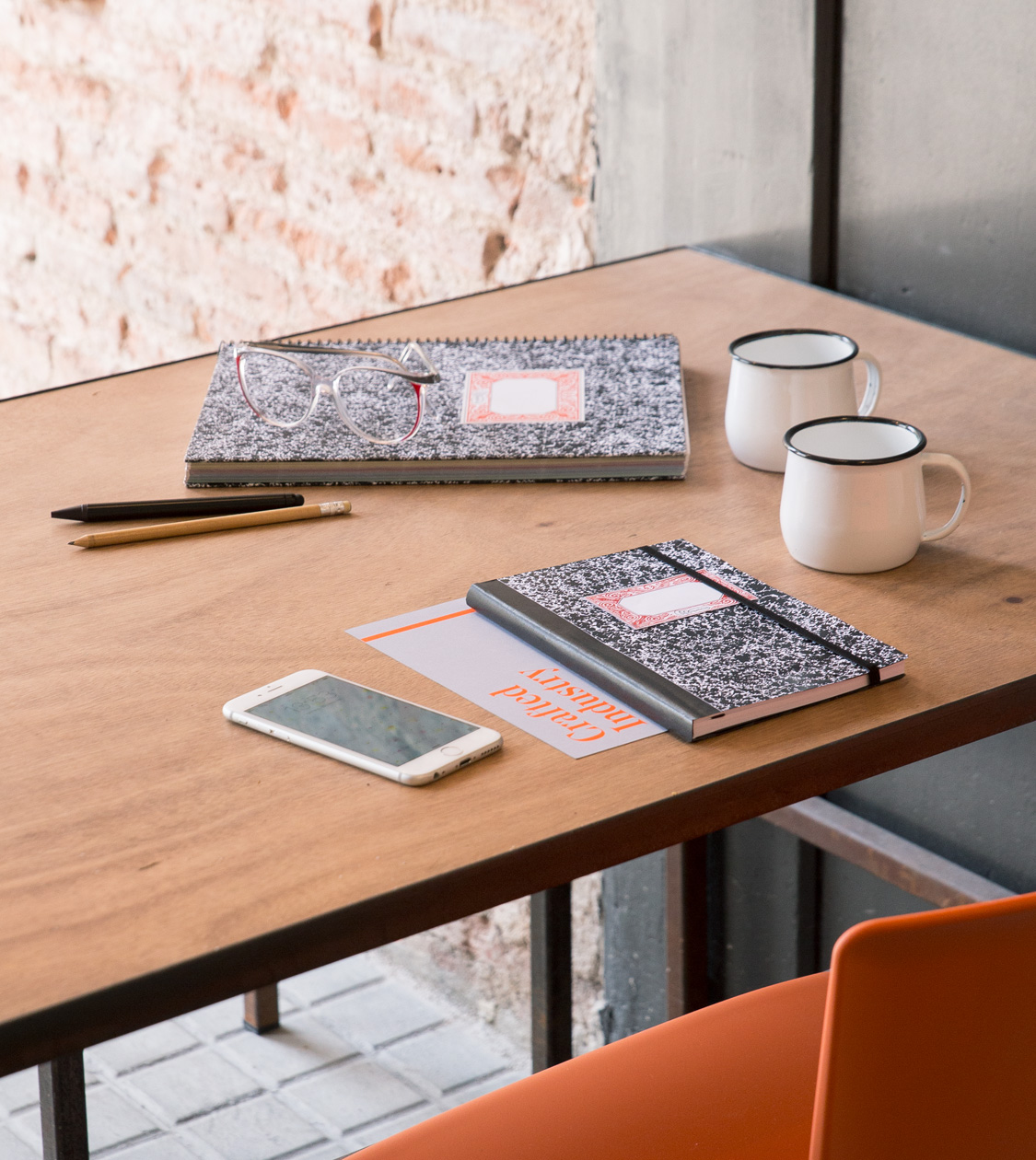
Miquelrius
Branding strategy
Corporate branding
Product design
Packaging design
Editorial design
Communication
Digital communication
Retail branding
Antes / Después


The close relationship between Nomon Design and Miquelrius for over 25 years has led to the redesign of the firm’s corporate branding, as well as the development of product ranges under its own brand and license. As a result of the rebranding, Miquelrius, which was founded in 1839 and specializes in paper accessories, was strongly and notoriously repositioned in its field.


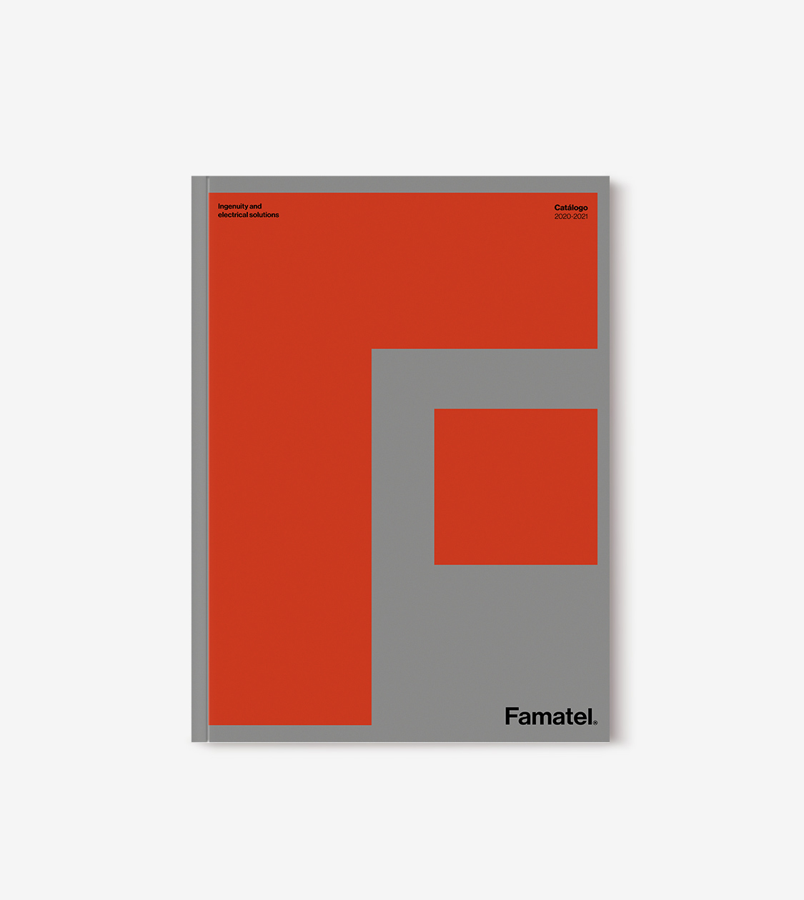
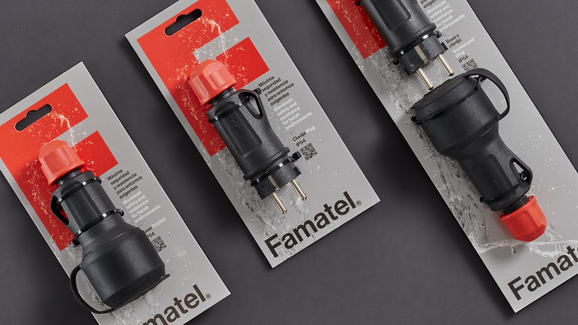
Famatel
Branding strategy
Corporate branding
Packaging design
Editorial design
Communication
Digital communication
Retail branding

Since 2015 we have collaborated with Famatel, an electrical supplies specialist with 25 years of expertise in the international electrical manufacturing field. We have conceptualized and developed the firm’s communication, and that of the business group’s trademarks.
At the beginning of 2020 we began the most important intervention carried out so far: the creation of a new strategic brand plan and an entirely new identity that would reflect the reality and the future commitment of this international firm.
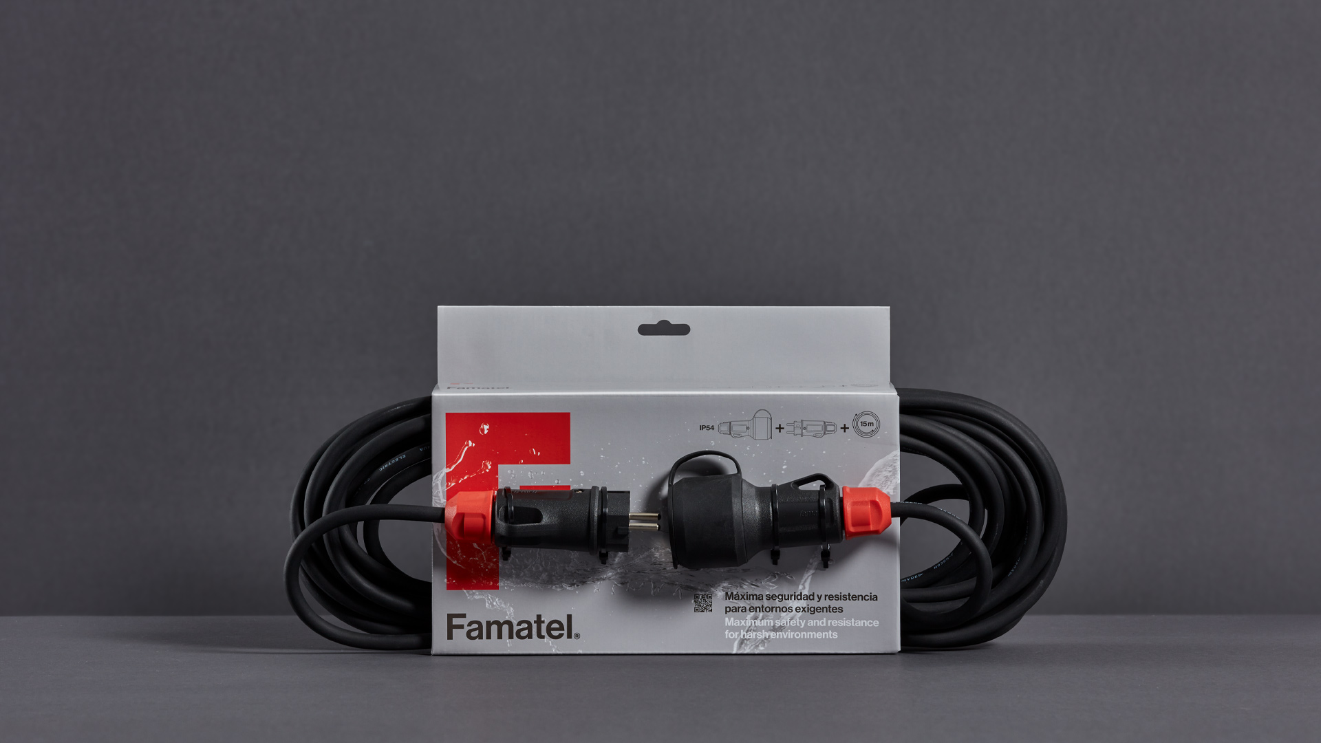
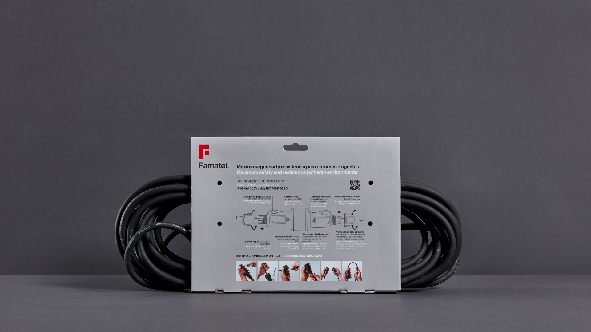
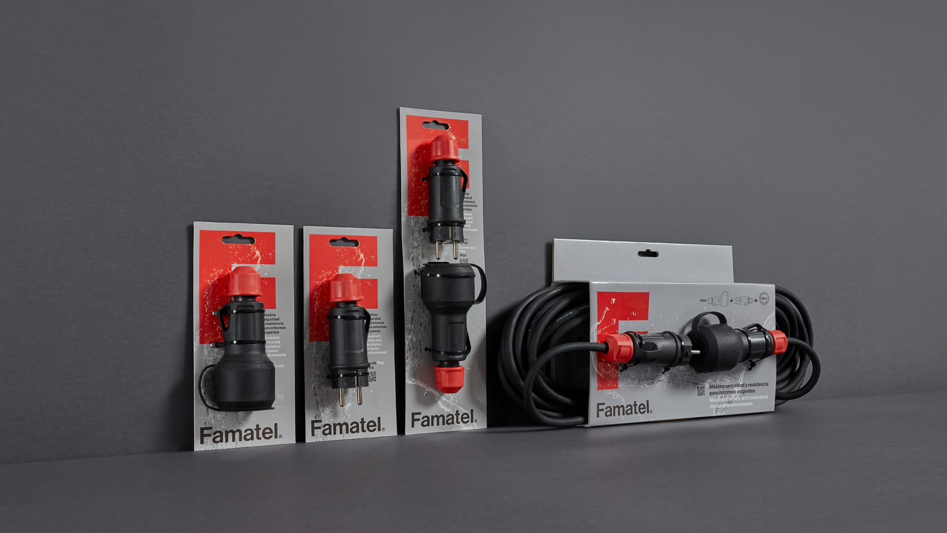

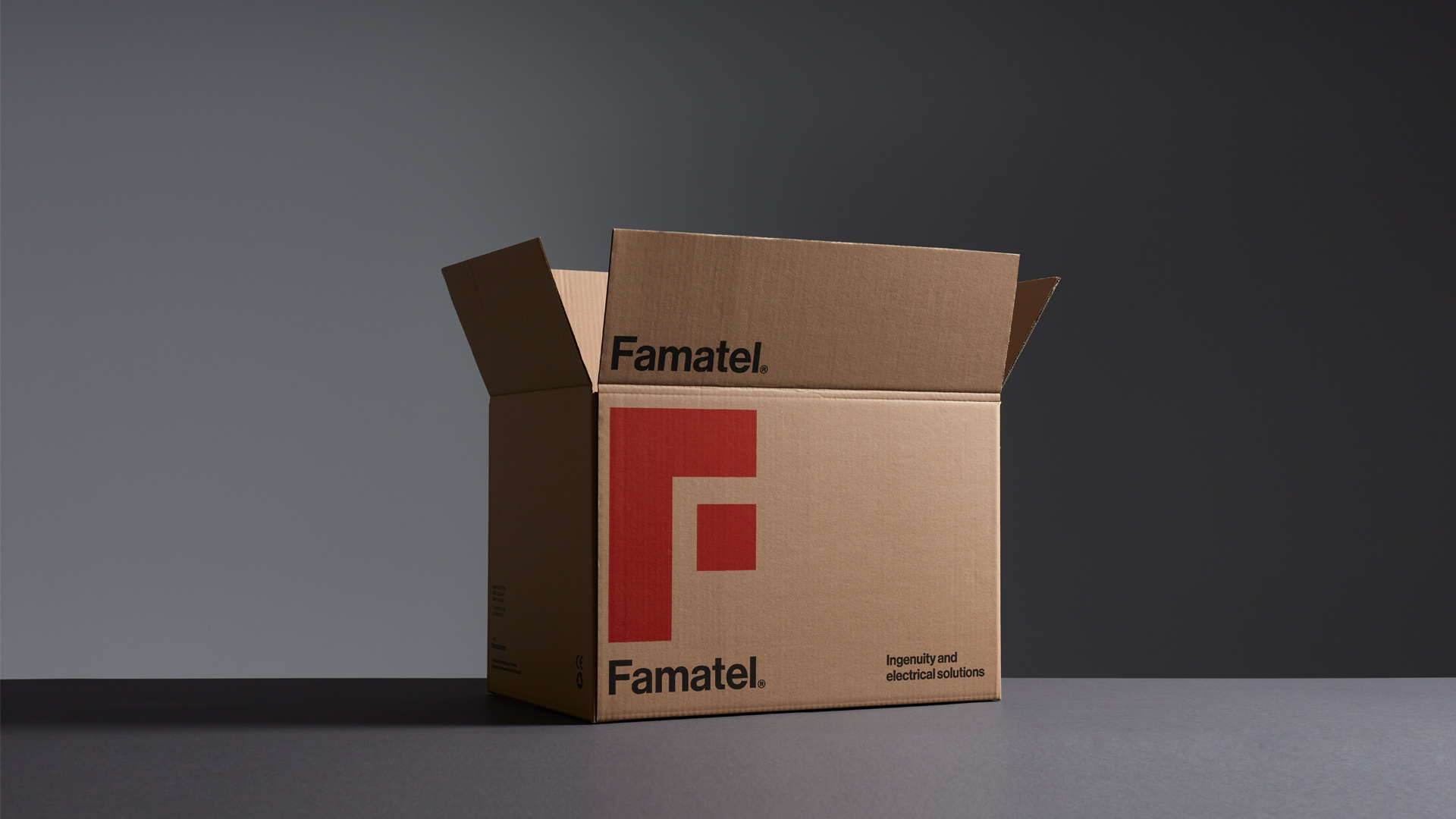


The result is a very differential corporate branding, provided with character and vitality, which represents the strength of the field and the company itself. Recognizable on the shelf, in digital communication and amongst competitors. Easily readable and adaptable to all communication formats and materials.
8-year collaboration with the company
Highlights
Highlights
Highlights
Highlights
Highlights
Highlights
Highlights
Highlights
Highlights
Highlights
Highlights
Highlights
Highlights
Highlights
Highlights
Highlights
Highlights
Highlights
Highlights
Highlights
Highlights
Highlights
Highlights
Highlights
Highlights
Highlights
Highlights
Highlights
Highlights
Highlights
Highlights
Highlights
Highlights
Highlights
Highlights
Highlights
Highlights
Highlights
Highlights
Highlights
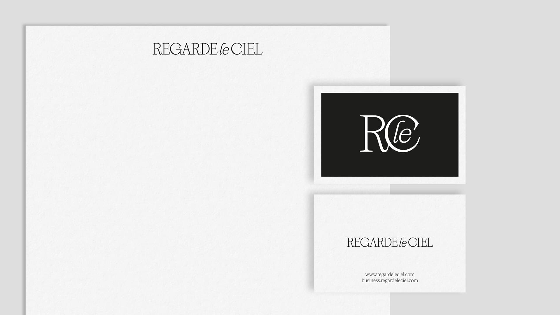
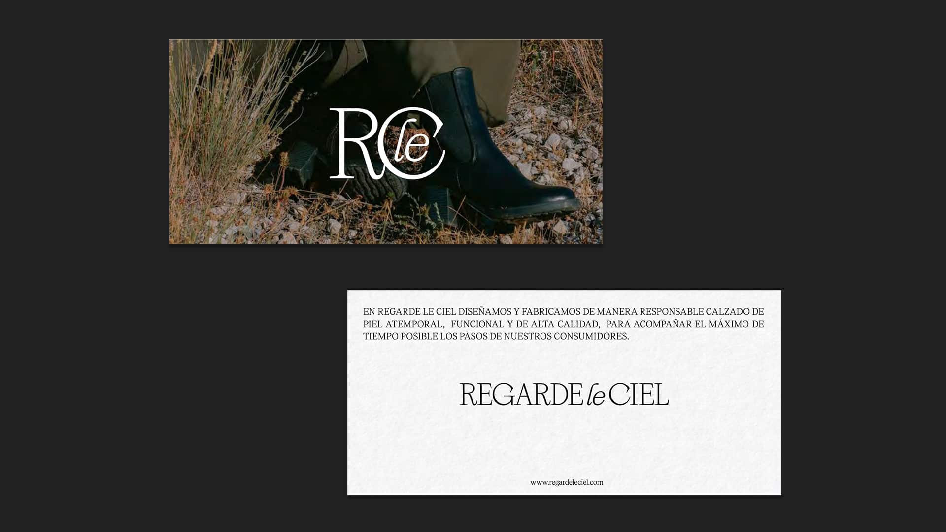
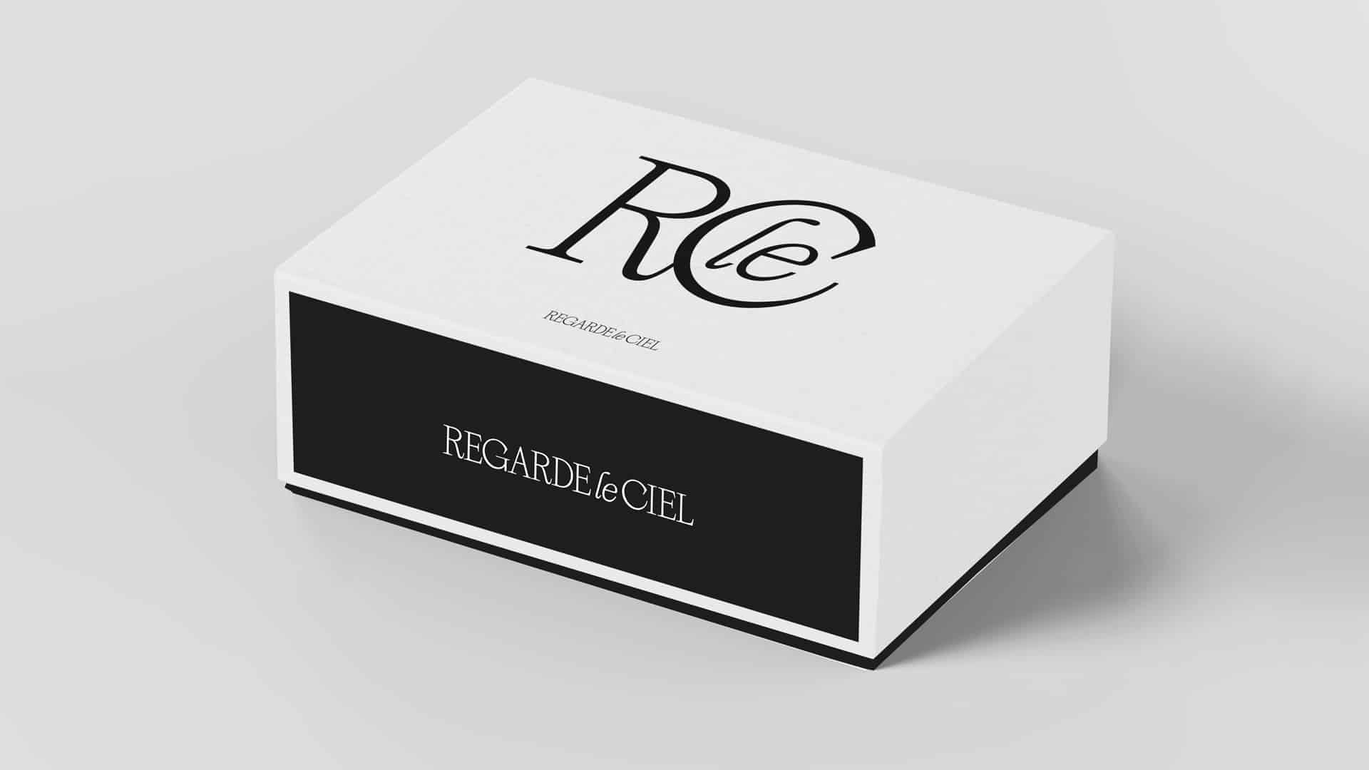
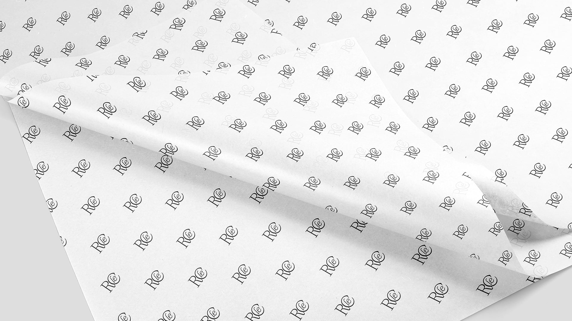
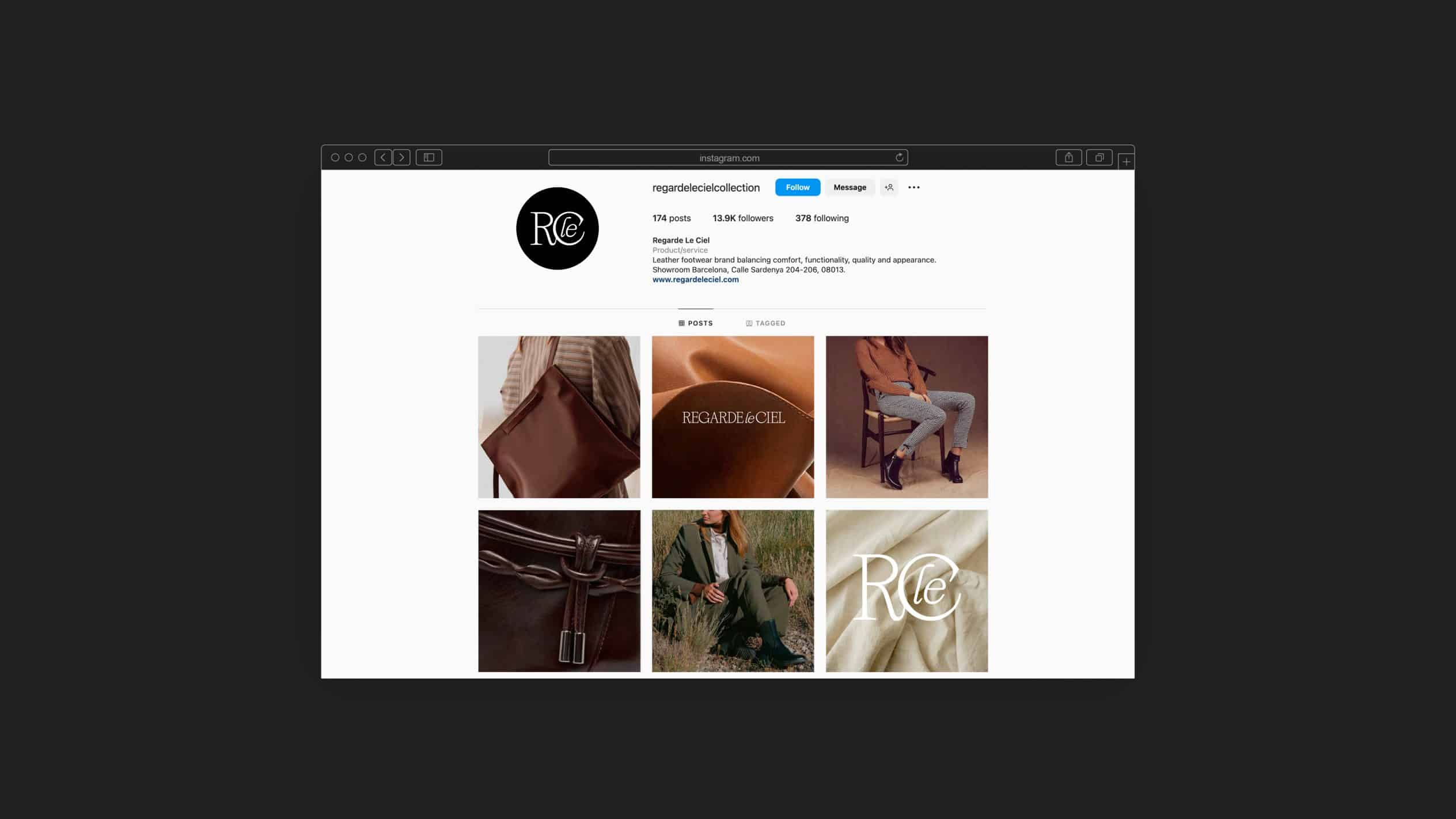
Regarde le Ciel
Branding strategy
Corporate branding
Packaging design
We’ve undertaken a corporate rebranding and packaging redesign for Regarde Le Ciel, an internationally acclaimed company known for crafting high-quality and durable leather footwear.
Drawing inspiration from their core corporate values – quality, timelessness, functionality, as well as social and environmental responsibility – we’ve crafted a contemporary corporate identity with classic design elements. This features a monochromatic black and white palette, employing a single-ink application. To complement the logo, we’ve introduced a symbol that highlights the initials and doubles as a stamp, enhancing flexibility and legibility in specific contexts.
In order to maintain graphic consistency across all communication materials, we’ve conceptualised and designed their packaging, taking into account various product types and sizes.
Zoo de Barcelona
Communication
Digital communication
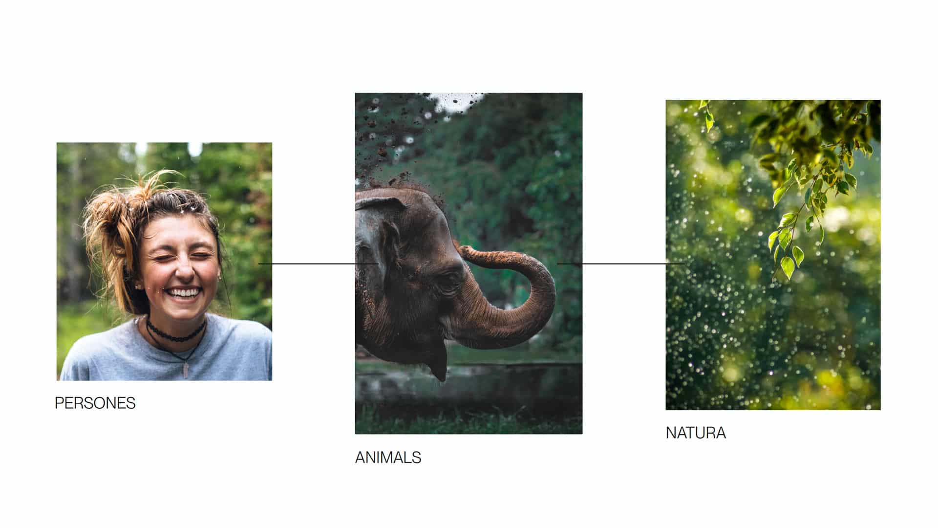
We won the competition organized by BSM (Barcelona de Serveis Municipals) from the Barcelona City Council, along with @interprofit, to define the brand repositioning strategy and new corporate identity of Zoo de Barcelona, as well as their communication strategy for 2022-23.
Drawing inspiration from the three core principles of the New Zoo Model – biodiversity conservation, scientific research, and education and awareness – we positioned the Zoo as the new Biodiversity Center of Barcelona, the city’s prime institution in safeguarding the planet’s biodiversity. Moreover, we devised a brand new architecture to effectively house and encompass its various sub-brands.
Concurrently, we delved into crafting a naming proposal (VIU) and corporate identity that truly embodied the new positioning. Nevertheless, due to internal strategic considerations, it ultimately evolved into the concept and catchphrase for the 2023 communication campaign: “VIU EL ZOO,” an inviting space to experience, with even more enriching encounters, greater knowledge, and a closer connection to nature.
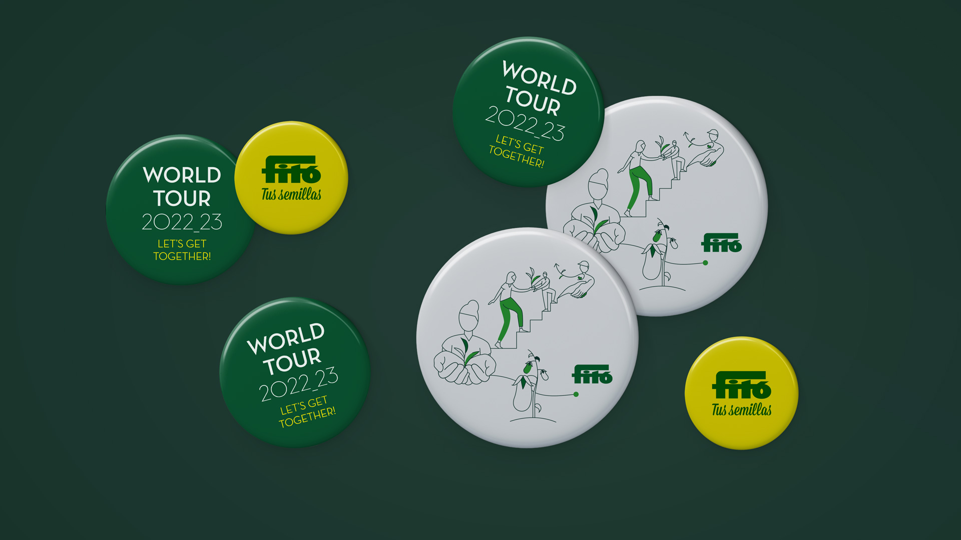
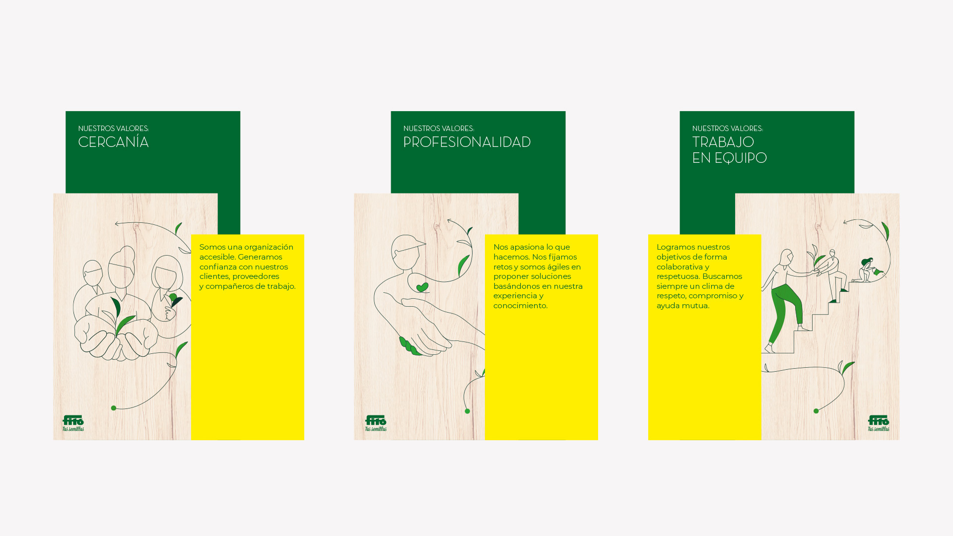
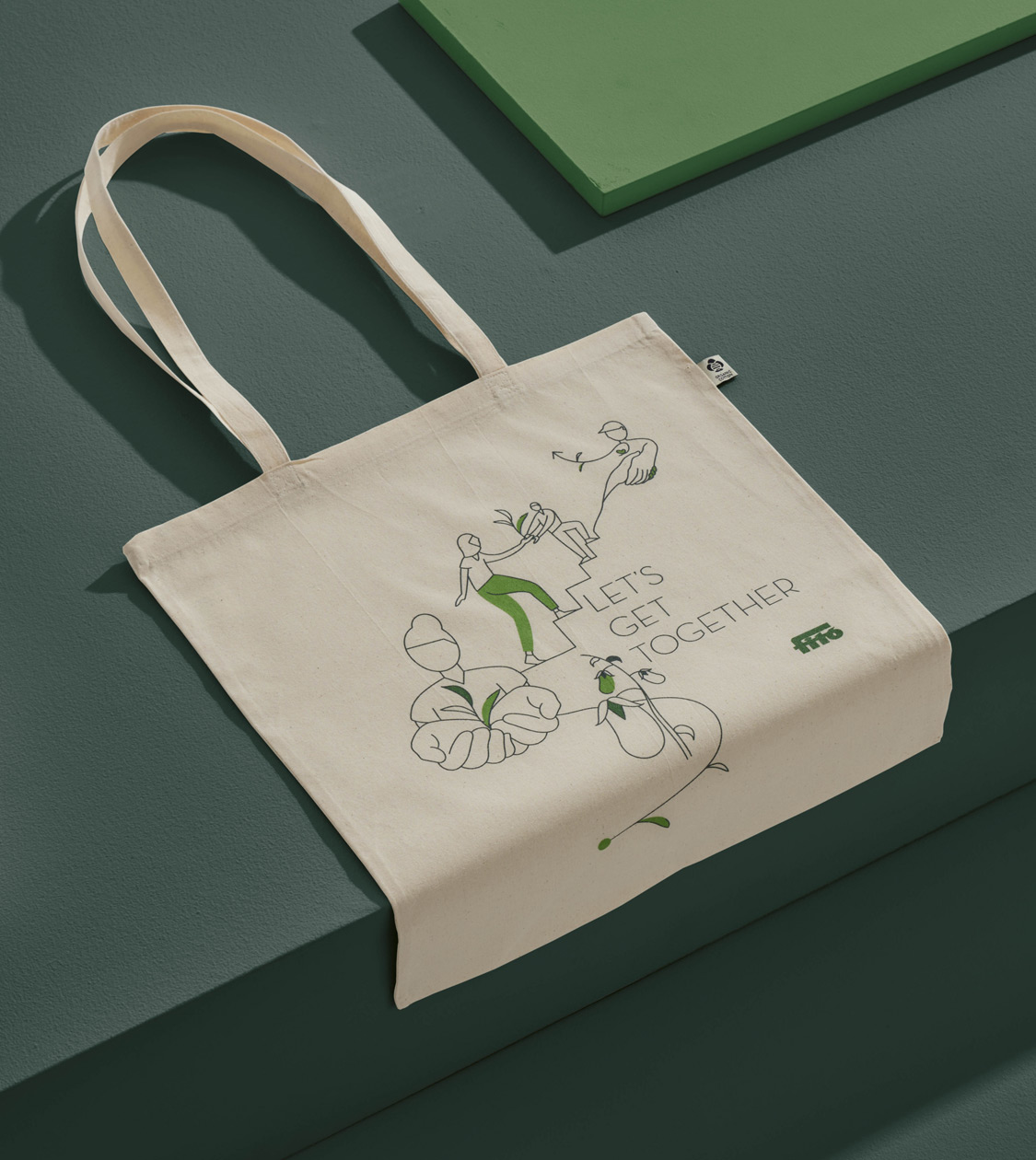
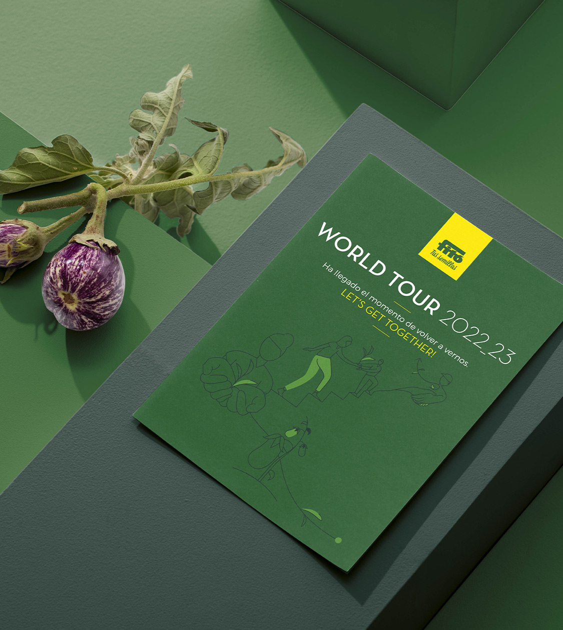
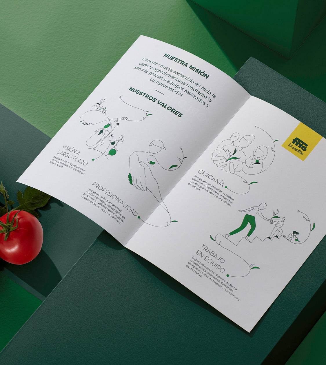
Semillas Fitó
Communication
Digital communication
Semillas Fitó is a leading Spanish multinational company specializing in the genetic improvement, production, and distribution of horticultural and field crop seeds. In 2016, we redesigned their Sembra brand, focusing on packaging for urban garden products and tools.
In 2022, as part of their 140th anniversary, the Board of Directors conducted an internal consultancy to rethink their positioning and define a new strategic approach for the future. They reached out to us again to extend and communicate this global vision coherently through a World Tour across all their international subsidiaries.
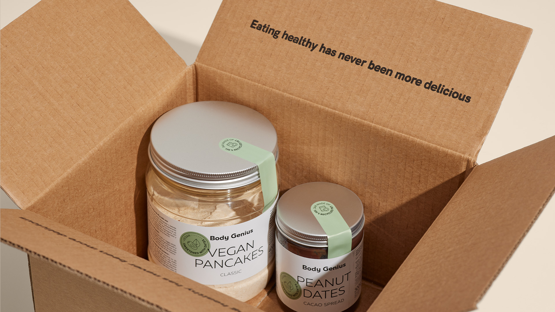
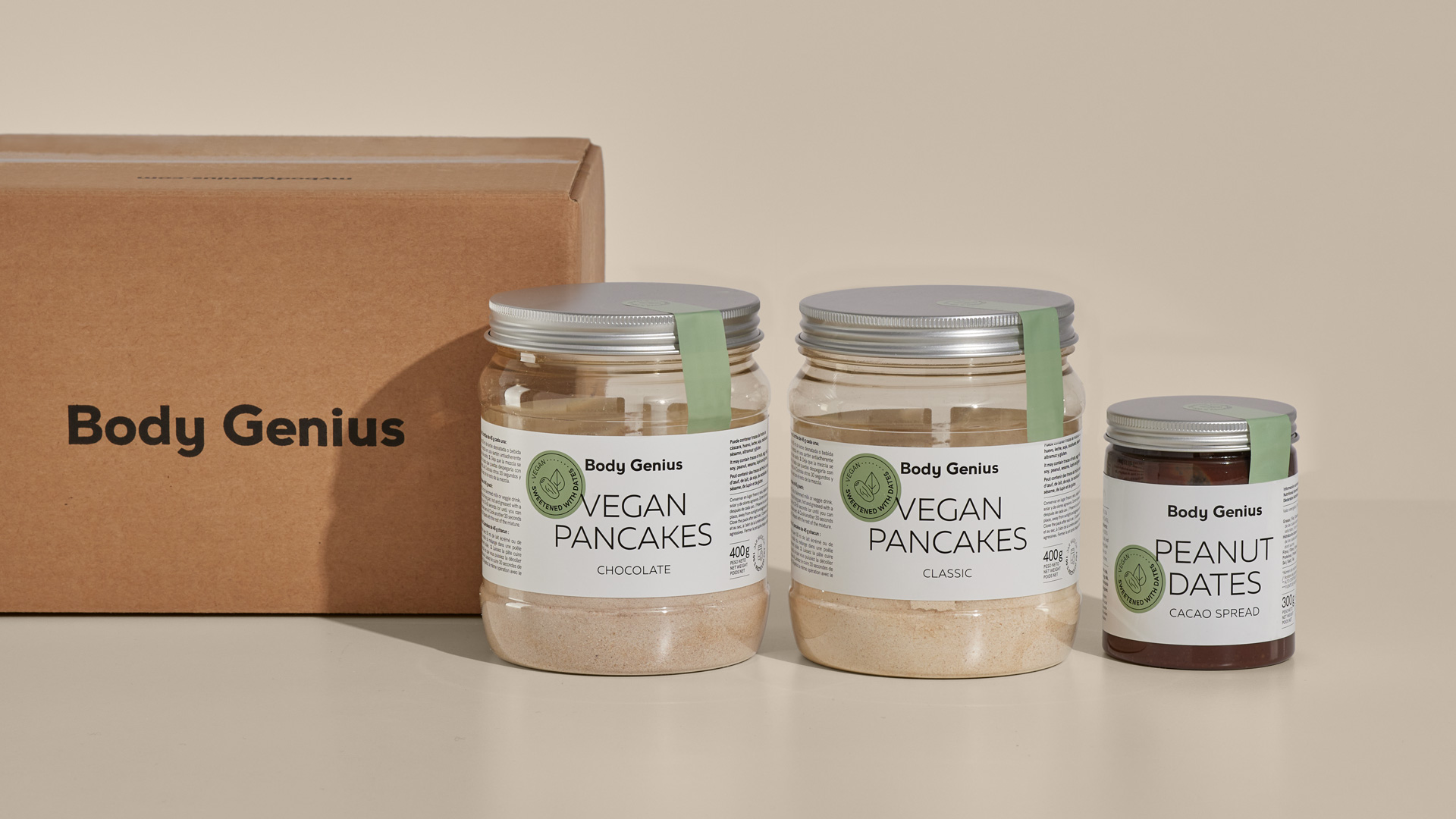
Body Genius
Packaging design
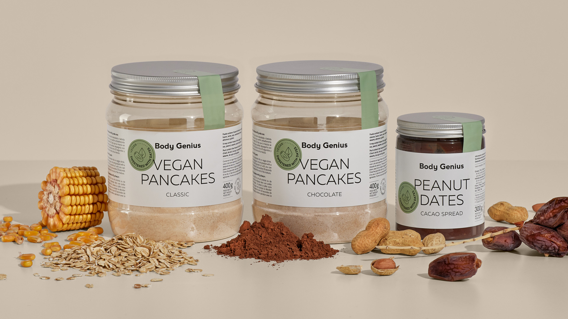
Packaging redesign for different product ranges of BODY GENIUS, a brand that has revolutionized healthy functional nutrition. Starting with the brand’s date-sweetened vegan products, the new packaging design looks clean and honest, in tune with the company’s brand values. While staying consistent with all the other ranges, it provides each of the products with a distintive personality as well.
Natwins
Packaging design
Digital communication


Since 2019, we have been collaborating with Girofibra, a company based in La Garrotxa with four decades of experience in producing healthy cookies and bars using their own recipe. We have undertaken various projects for their Natwins brand, including the redesign of their corporate branding, the conceptualisation and design of packaging for their different product ranges, as well as the development of their communication materials and website design.


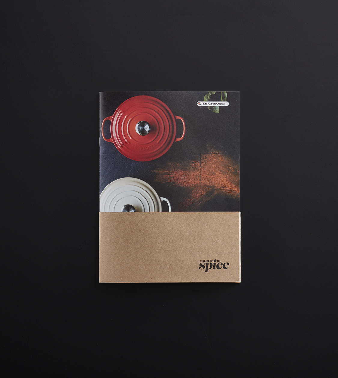
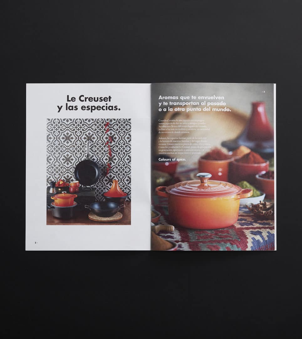
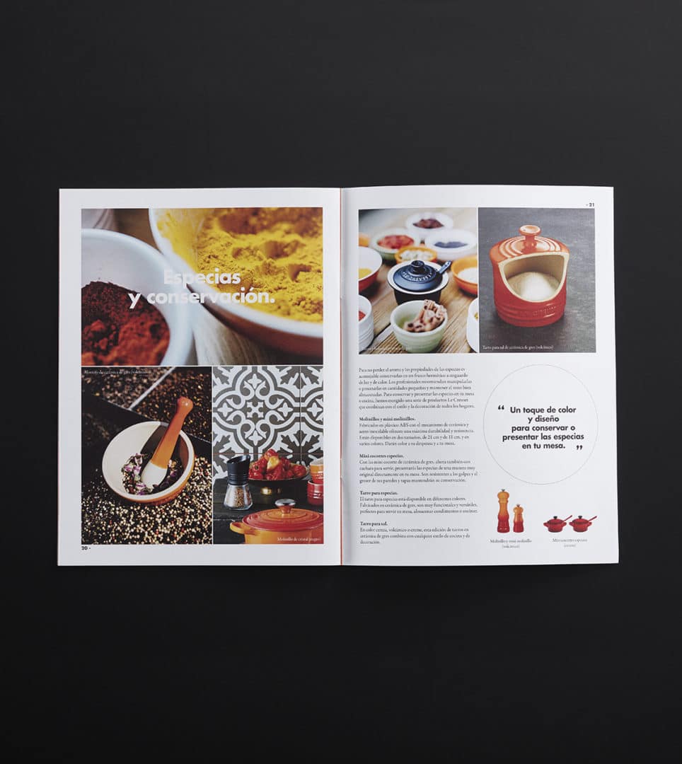
Le Creuset
Corporate branding
Packaging design
Communication
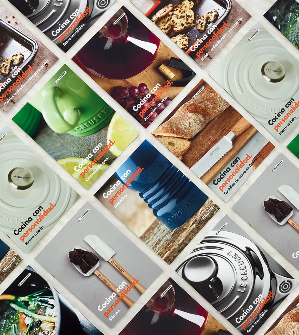
Conception and design of products, packaging, and communication materials for Le Creuset’s seasonal campaigns. Keeping in mind the campaign’s concept and population trends, we create product packages aimed at retaining or attracting consumers at the point of sale.


Rocook
Corporate branding
Packaging design
Communication
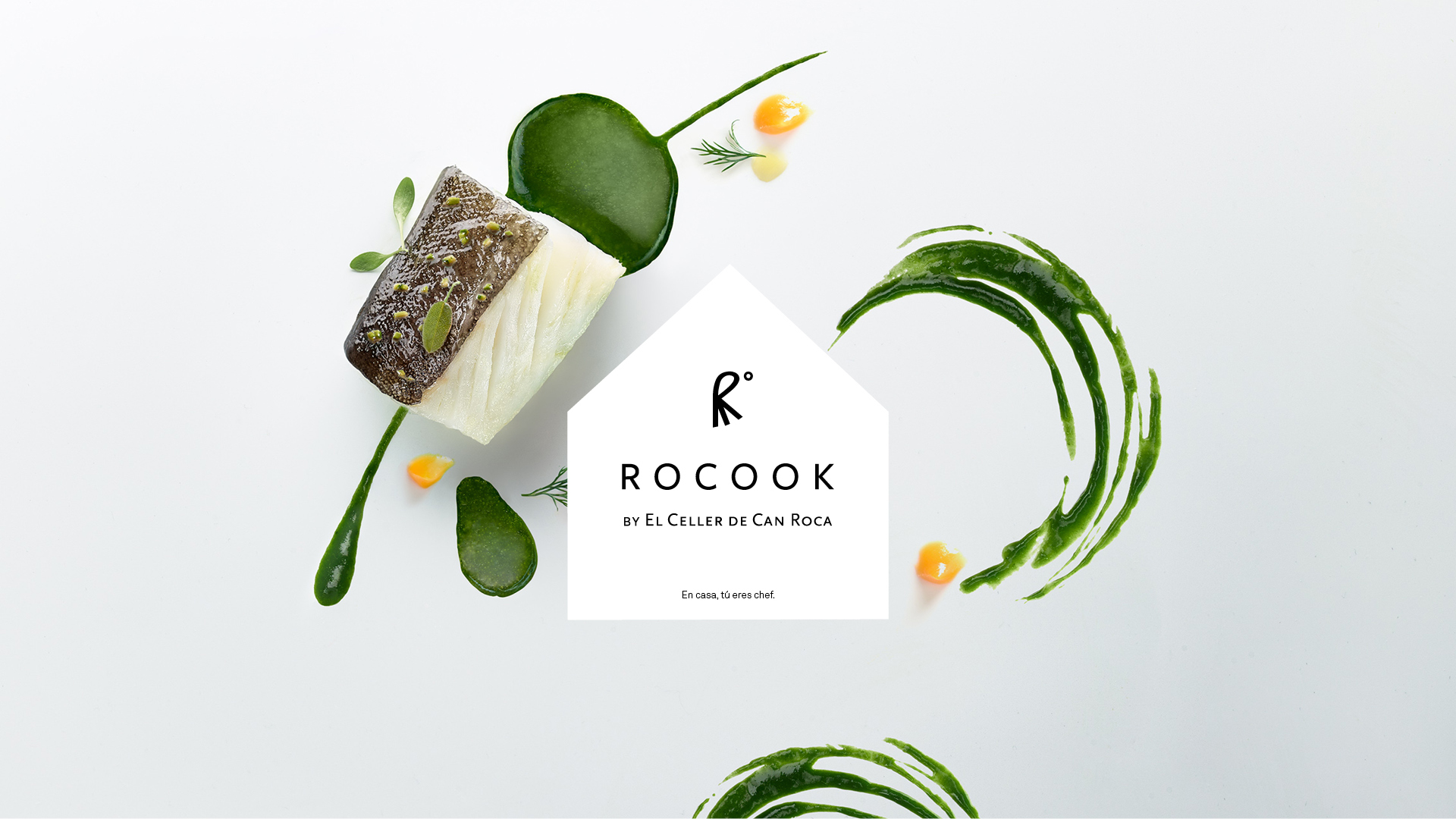

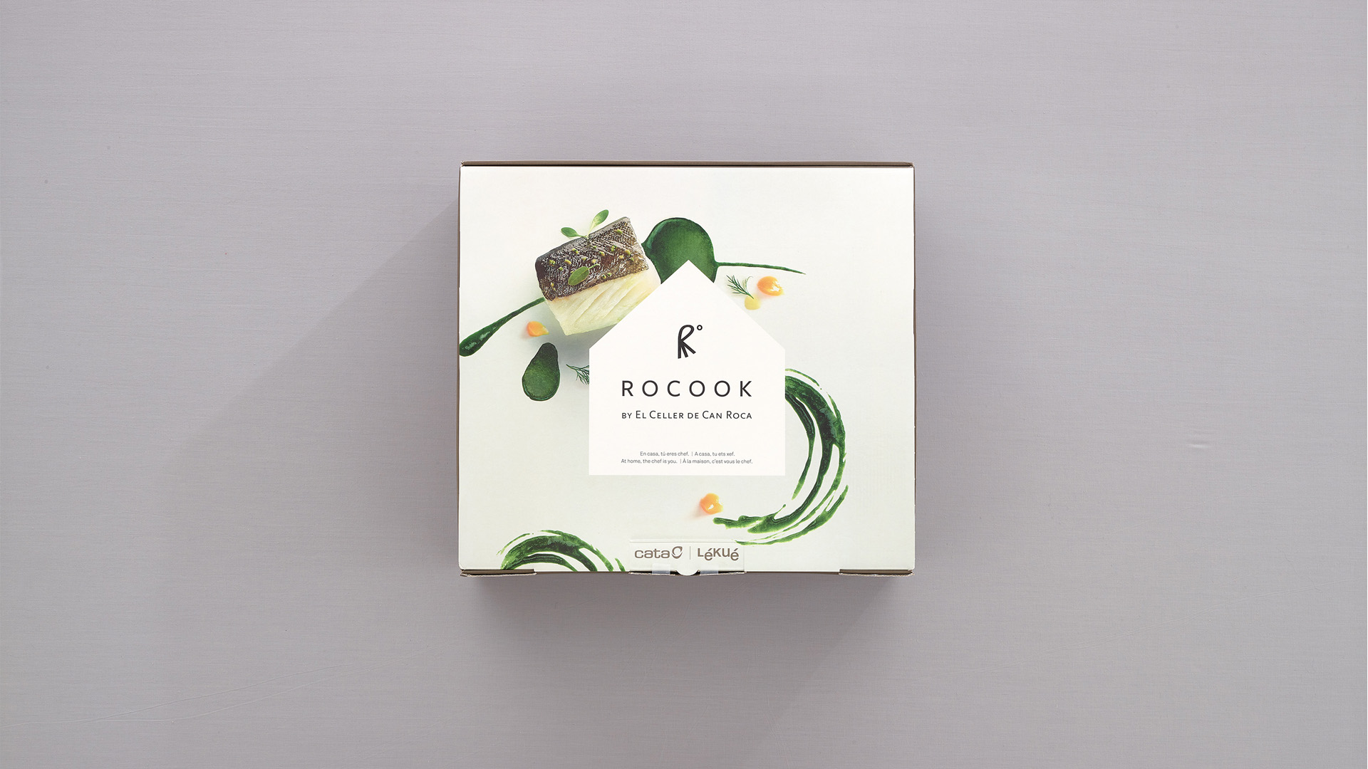
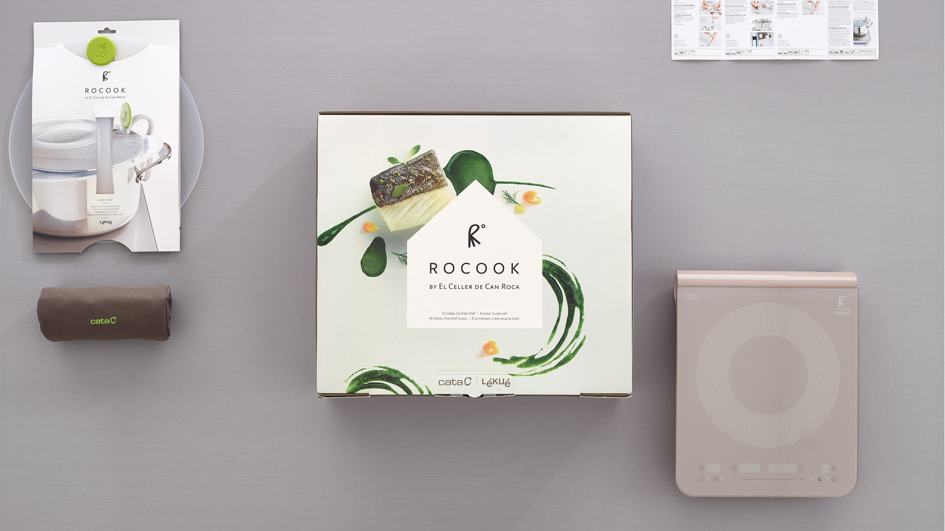
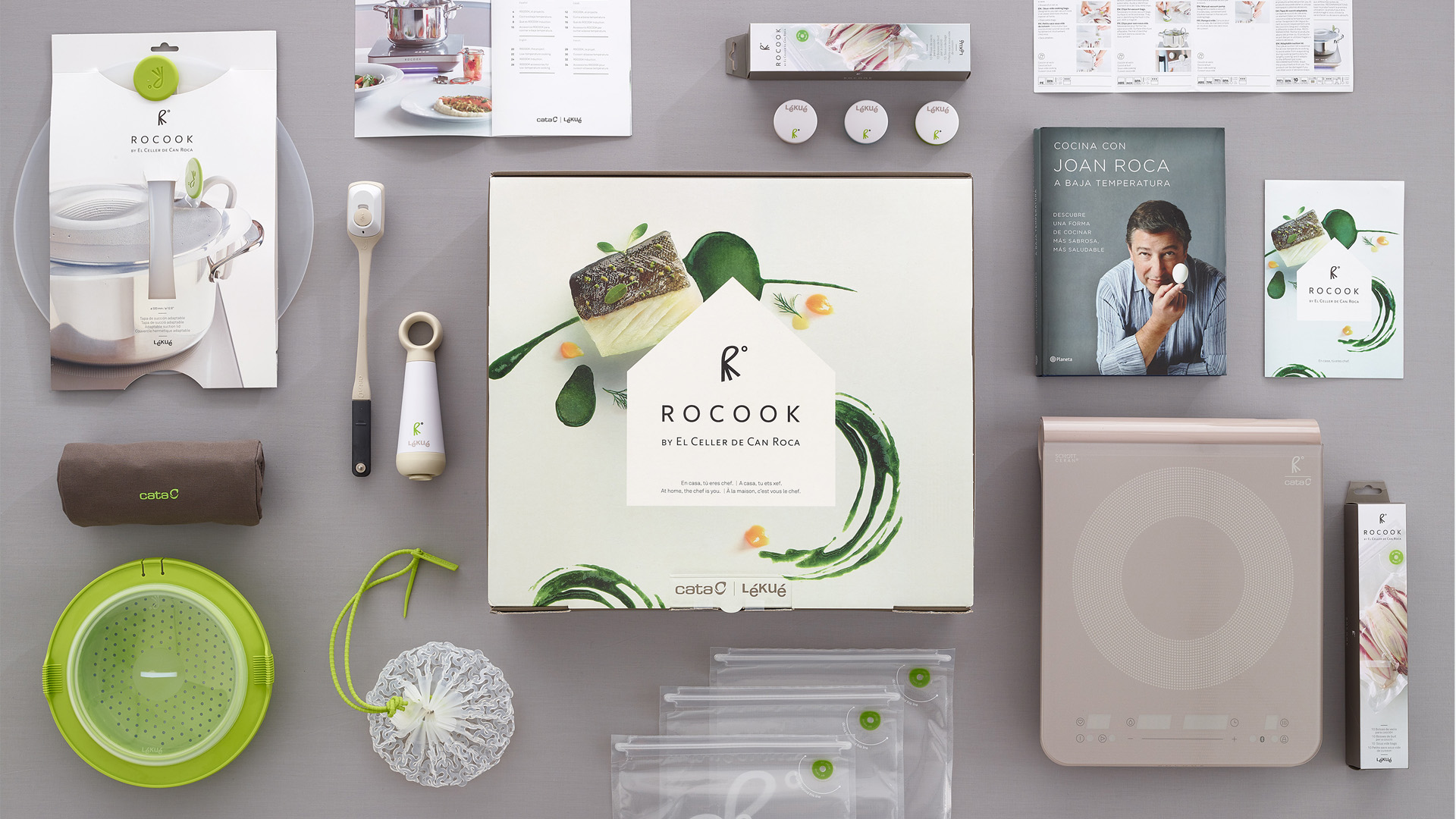
Creative concept and packaging design of the Rocook project, by El Celler de Can Roca. Rocook is a set of tools exclusively designed to discover, learn and cook at low temperatures at home.
Starting from the essence of the project, we developed the creative concept using the communication claim: “At home, the chef is you”. It materialized in the design of packaging-displays that connected with the consumer, acting as an extension of the Rocook experience. A design that was also manifest in the art direction which, in turn, gave shape to the project’s communication materials.
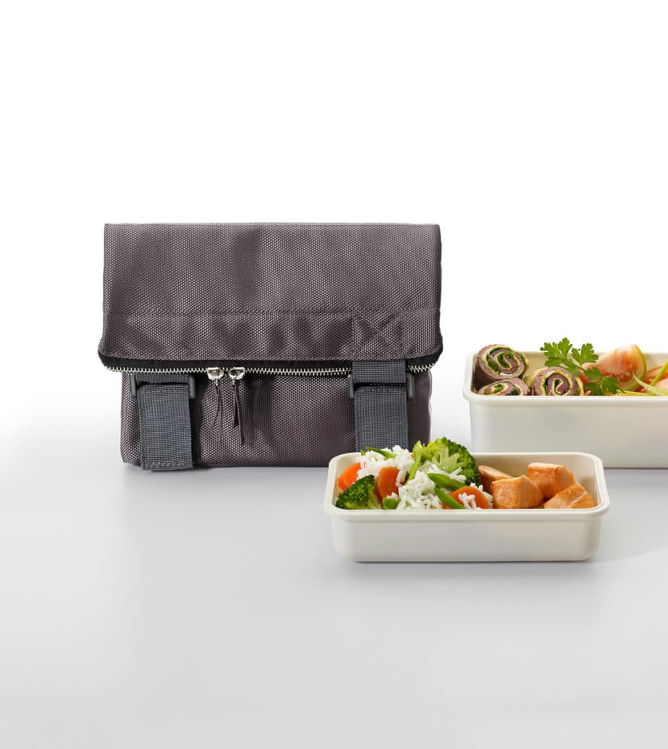
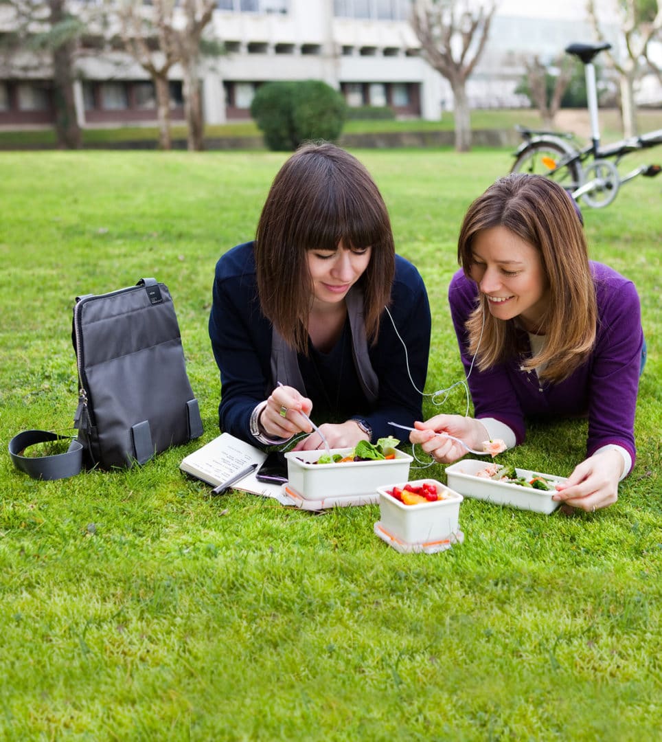
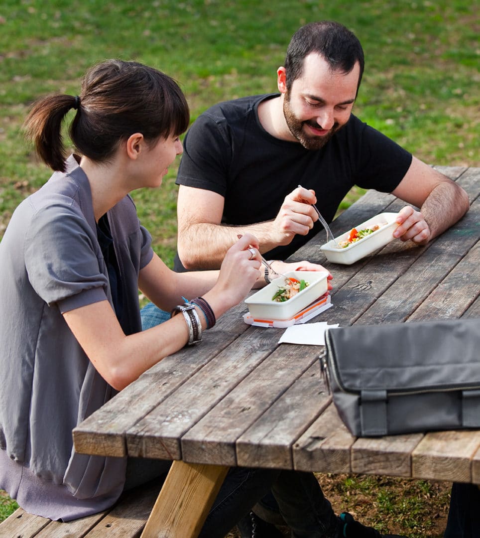
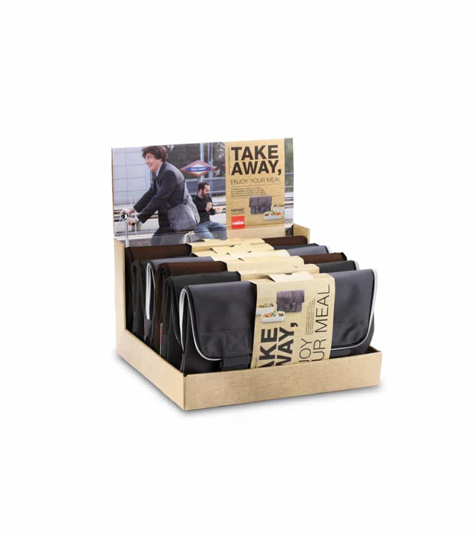
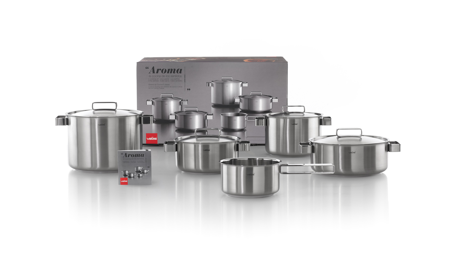
Valira
Product design
Packaging design

We have designed Valira’s packaging and marketing materials for several cookware and frying pan collections, such as the high-end Aroma collection, developed for the brand by Antoni Arola.
In addition, we conceptualised and designed its popular Take Away bag, helping the company reposition itself in the market and generate business growth with the launch of new products.

Nature by KLEIN
Corporate branding
Editorial design
Communication
Digital communication
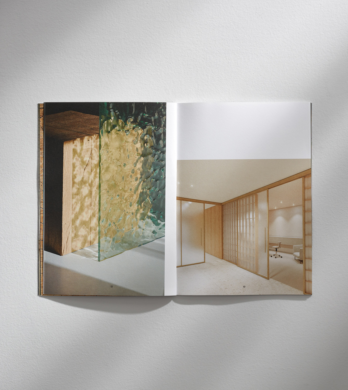
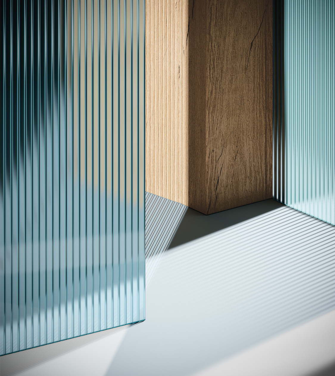
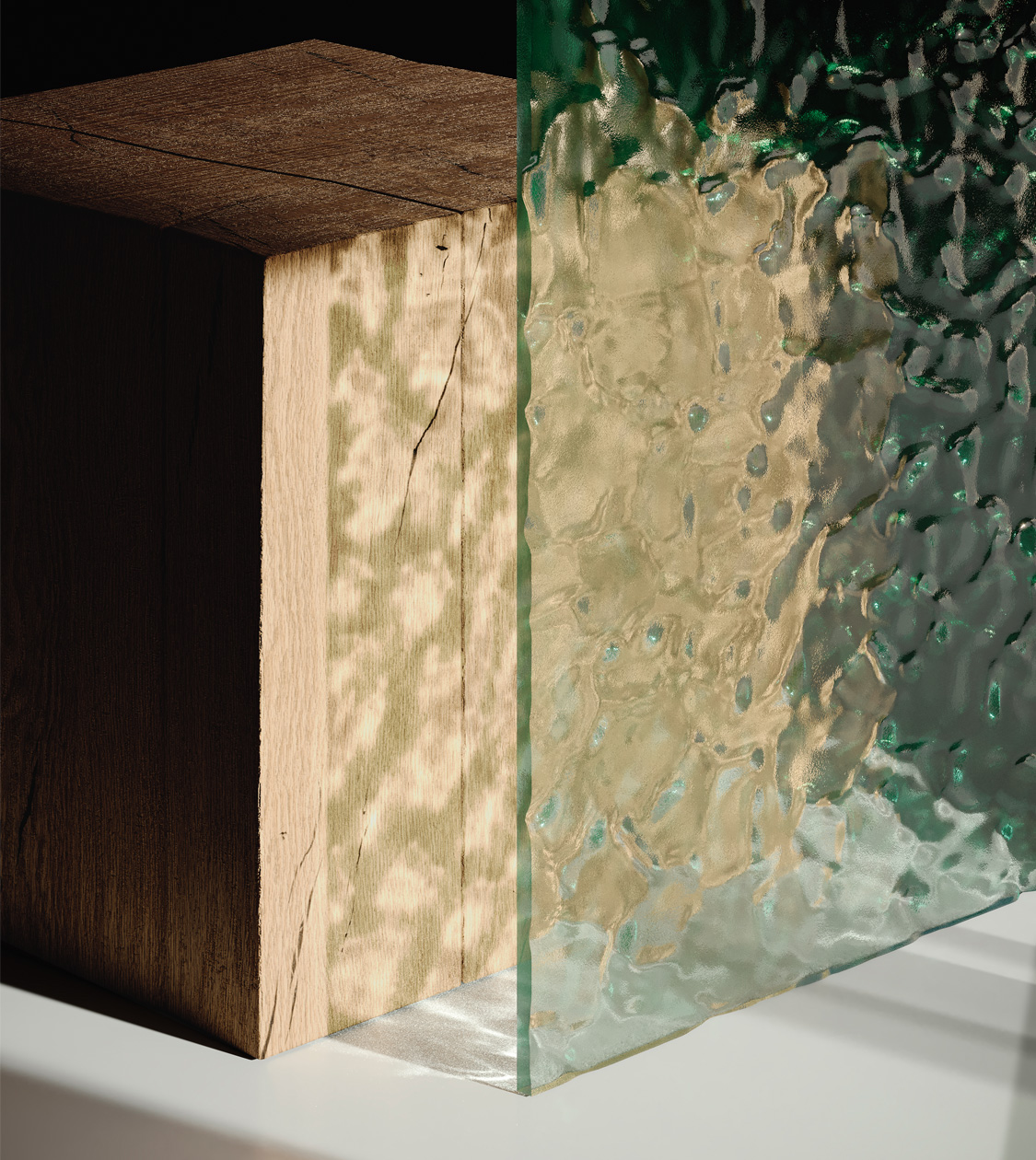

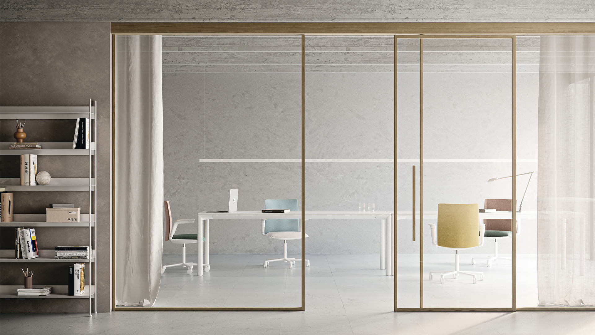
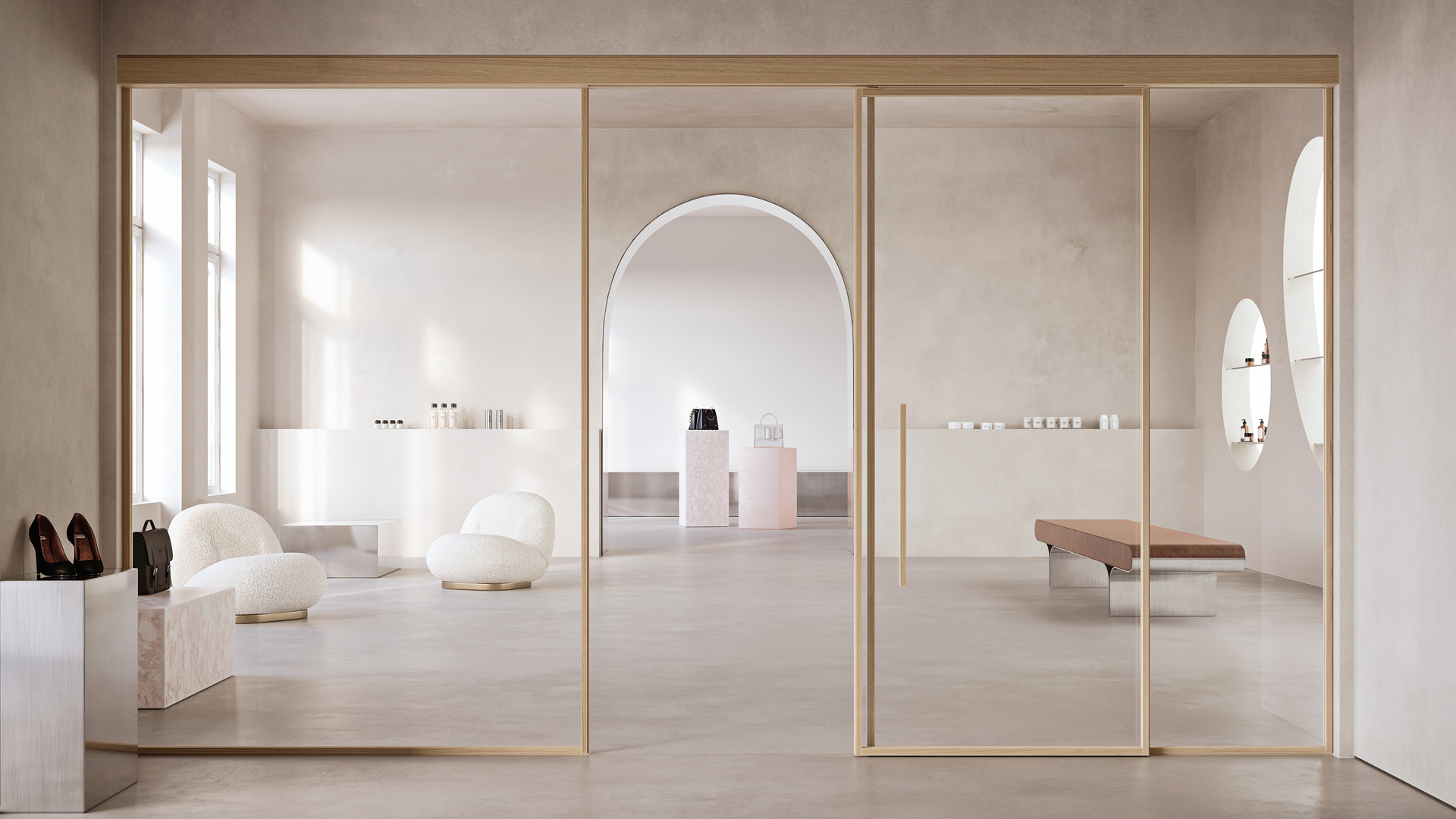
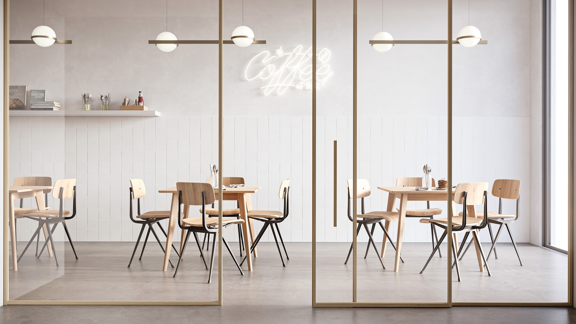
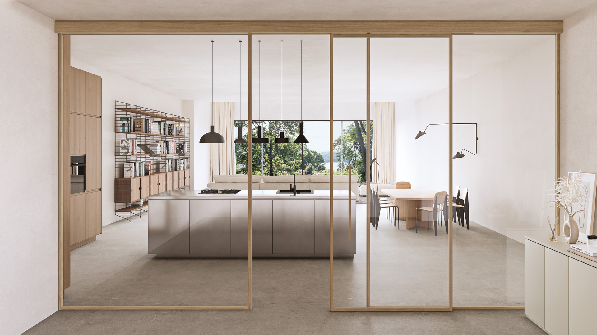
We have defined and created the communication of the new product category NATURE by KLEIN, a family business with international projection and 90 years of experience in the design and manufacture of high added value architectural interior systems for glass and wooden sliding and folding doors.
For this system of oak profiles –sustainable and based on a new atmosphere-creating concept– we conceptualized, defined and redesigned the brand’s identity and art direction. We also designed and supervised the catalog production, and conceptualized and designed the website landing page.
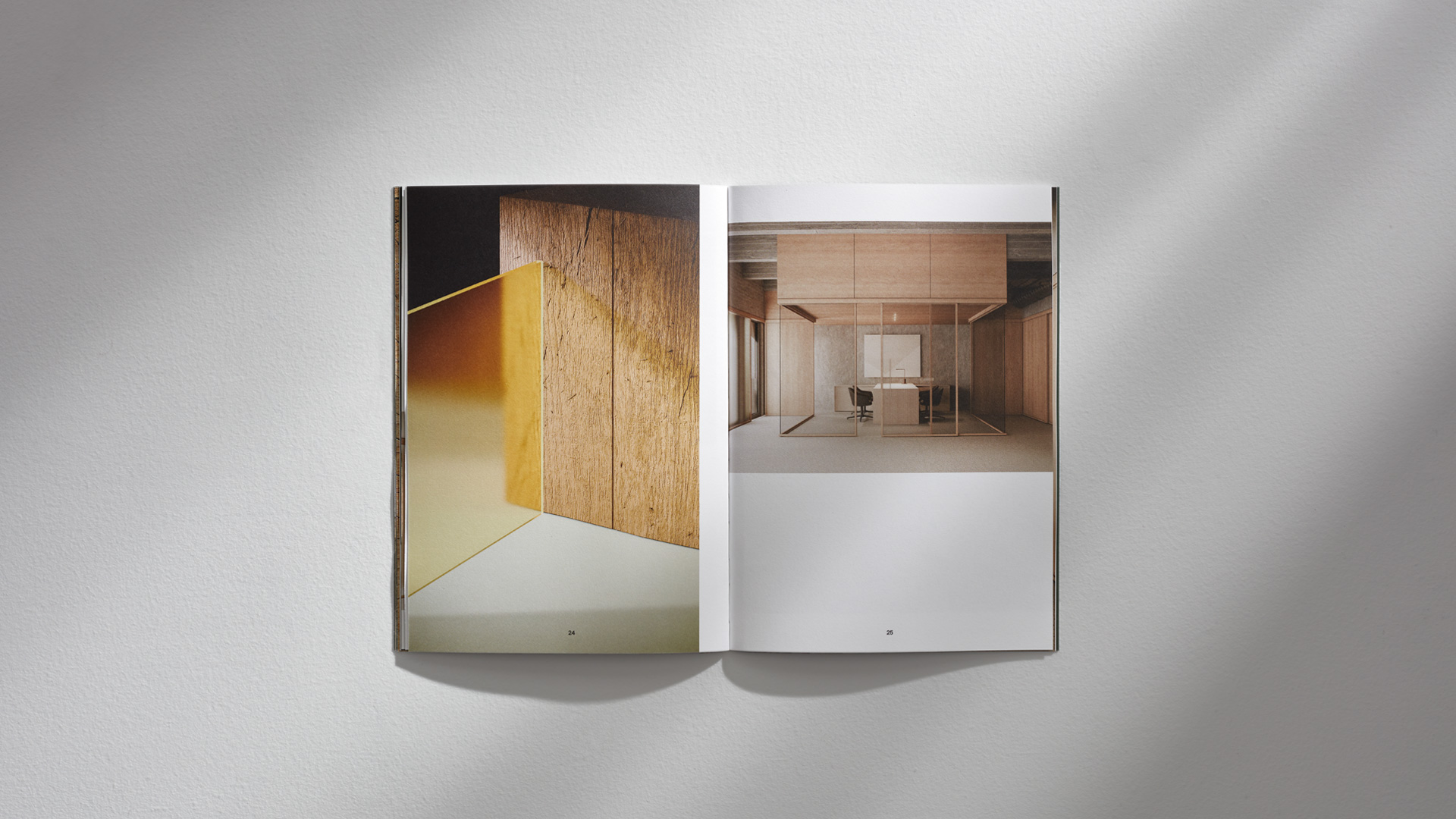
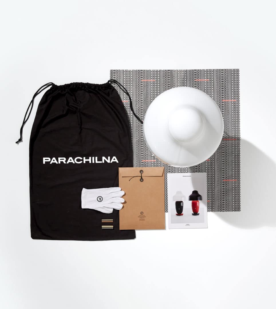
Parachilna
Corporate branding
Packaging design
Editorial design
Communication
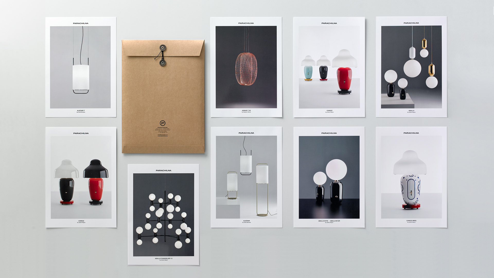
Creation of the corporate branding for Parachilna, a lighting company that stands out for the uniqueness of its designs, the honesty of its pieces, the value of the noble materials it uses, its artisan manufacturing process and, above all, for its collaboration with relevant world-renowned designers. Parachilna has received the Best New Brand 2015 award from the prestigious Wallpaper * magazine.
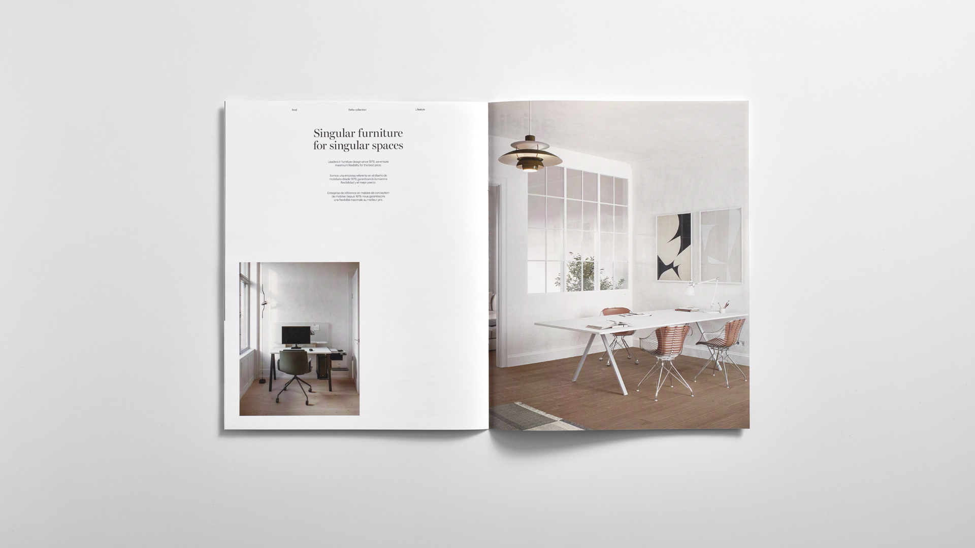
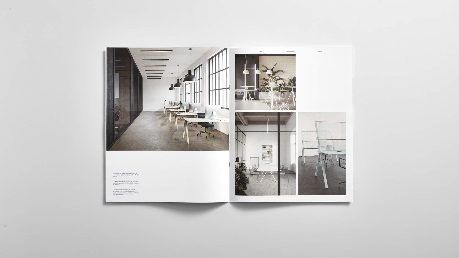
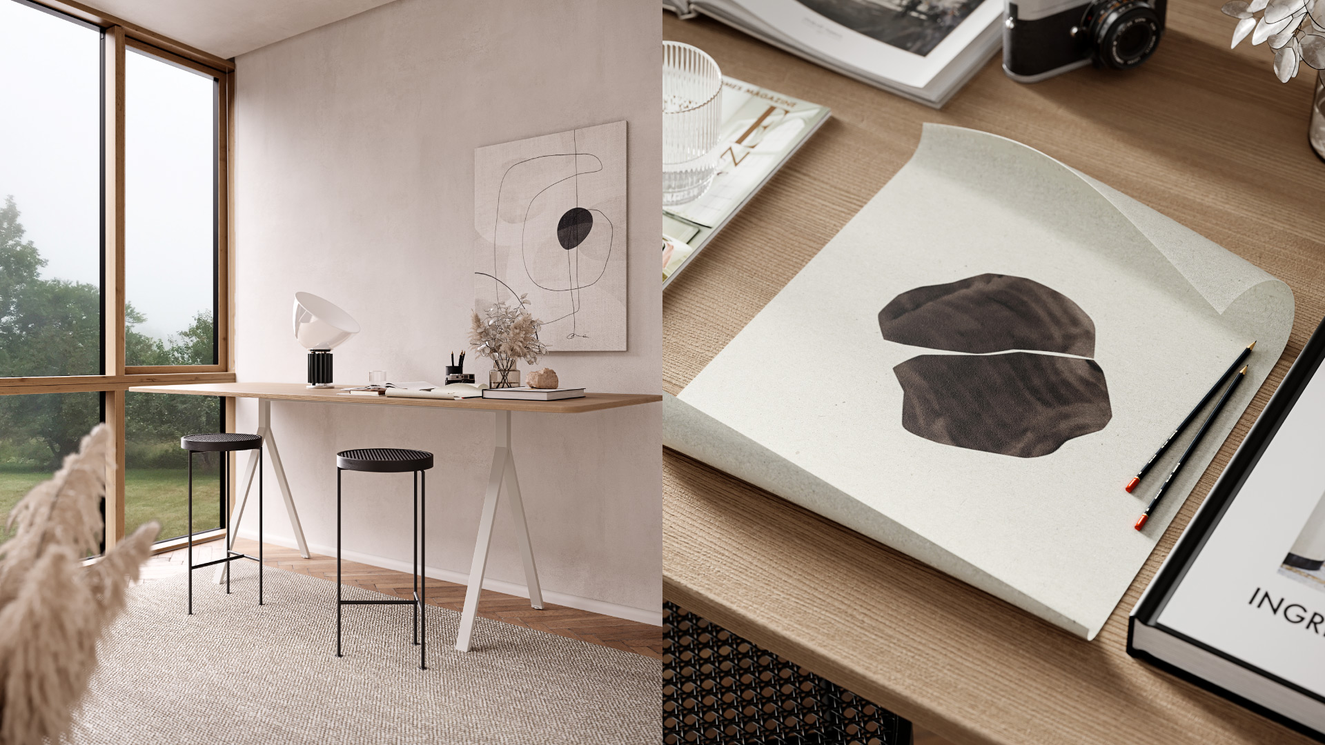
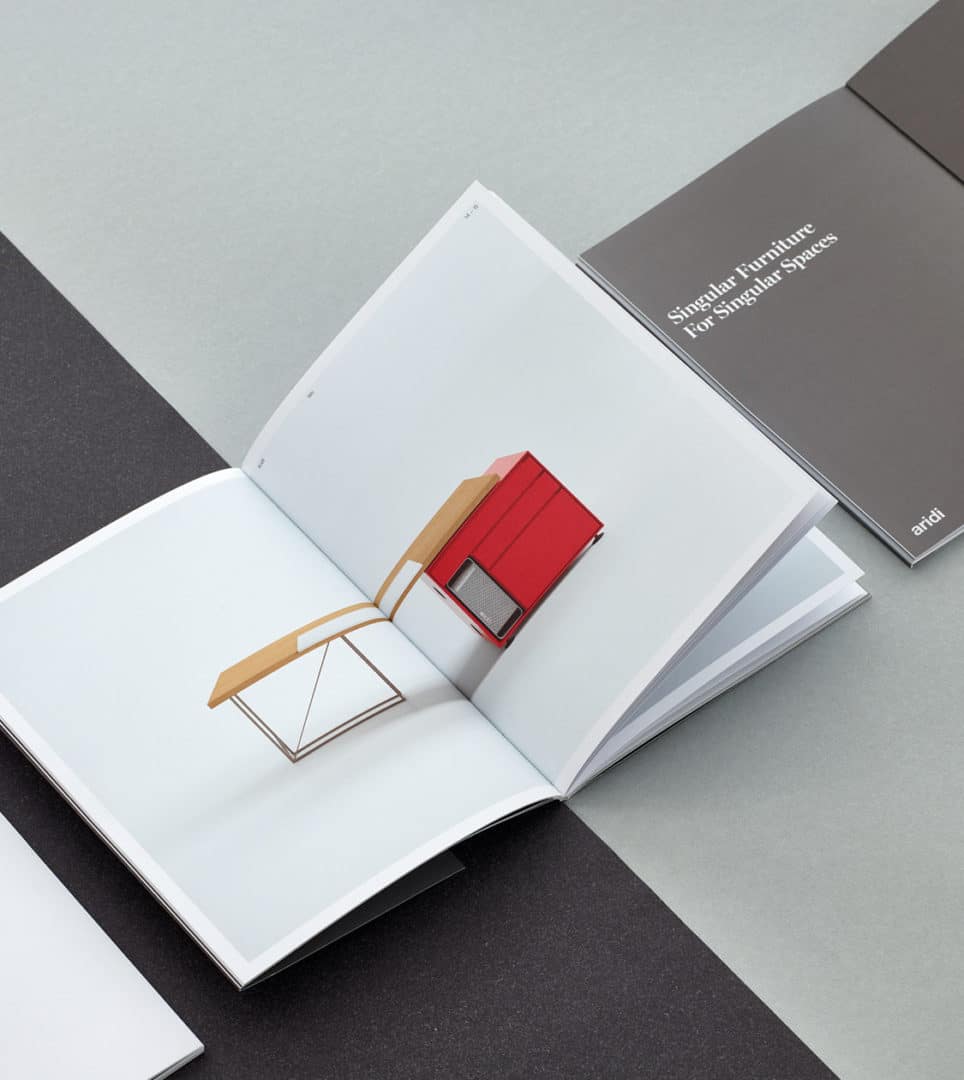
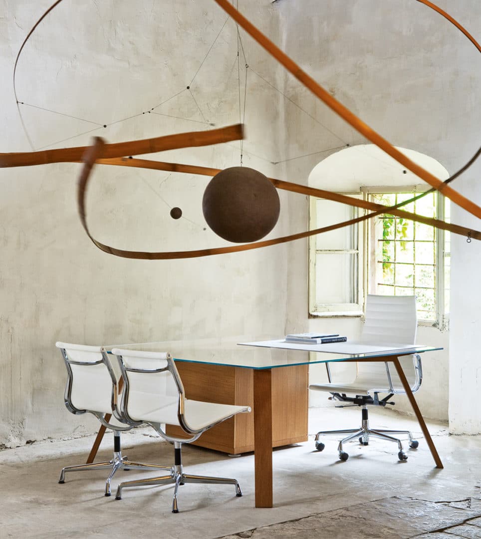
Aridi
Corporate branding
Editorial design
Communication
Digital communication
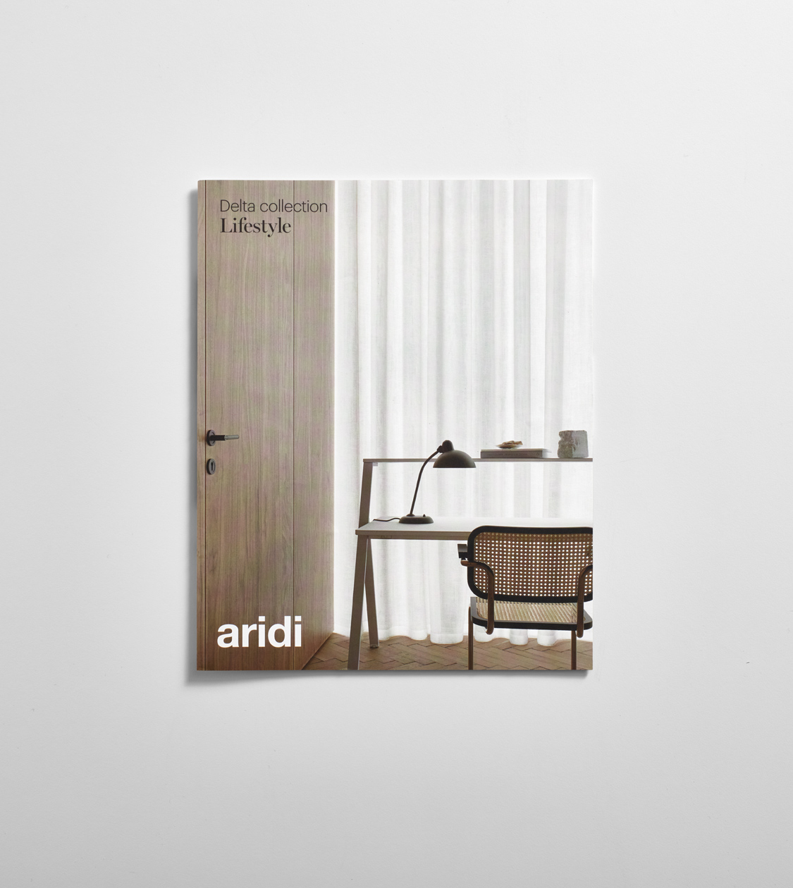
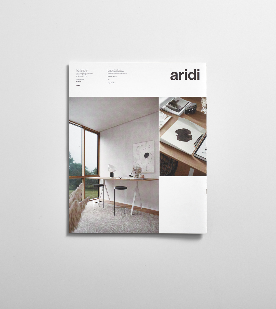
Our collaboration with Aridi goes back to 2005. Aridi is an office furniture manufacturer with a long history in the design sector. We worked on developing its corporate branding, as well as the conceptualization, art direction and design of its corporate catalogs and communication materials. The brand’s catalogs and communication pieces show the quality, elegance and versatility of Aridi’s systems and position the company as a benchmark in the field and as an aspirational brand.
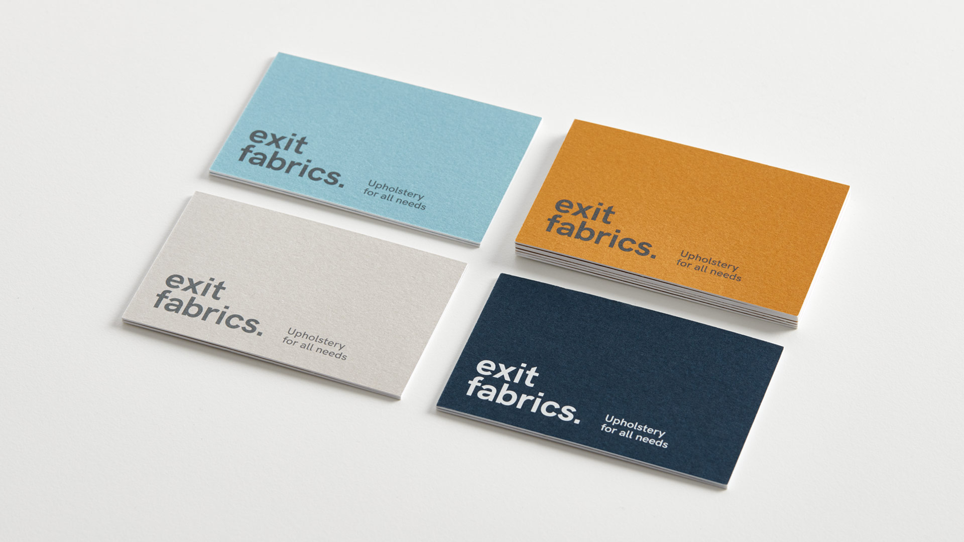
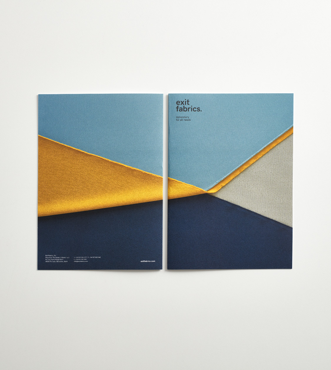
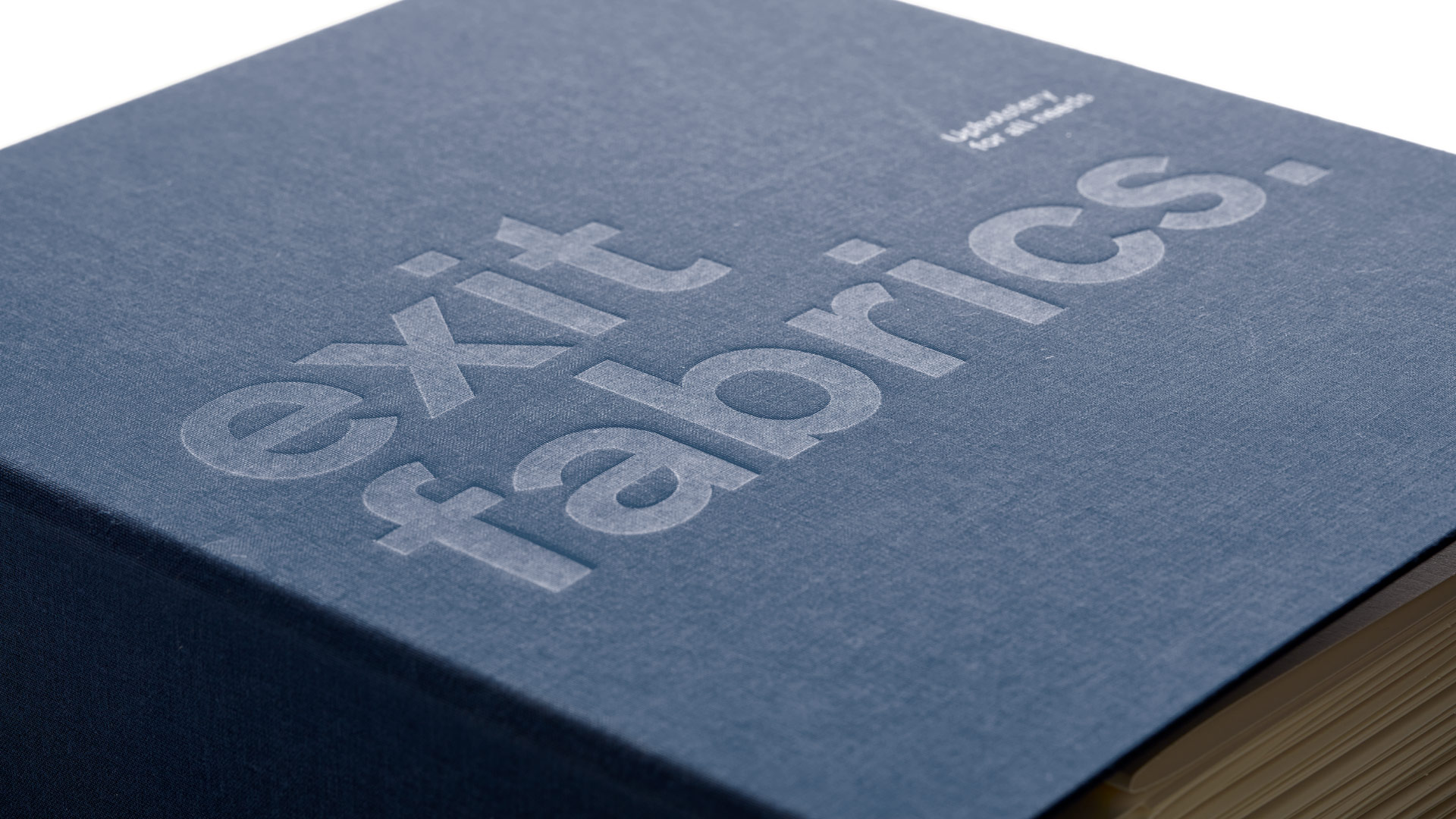
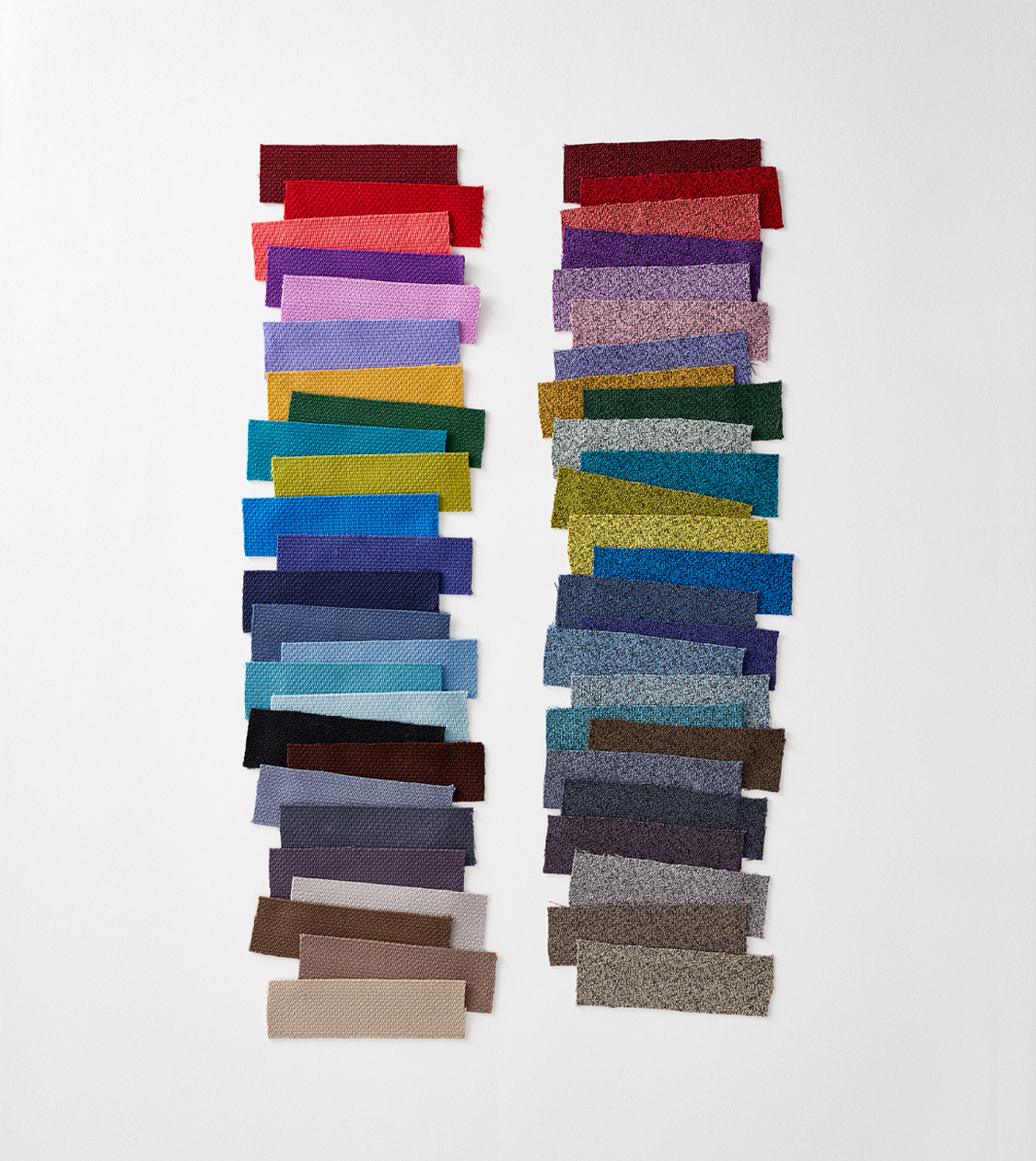
Exit Fabrics
Branding strategy
Corporate branding
Editorial design
Communication
Digital communication

Redesign of corporate branding for the firm Exit Fabrics, a manufacturer of professional technical upholstery since 1985. After the conceptualization and definition of a new branding strategy, adapted to the current reality of the company, we have reformulated the brand naming and created its storytelling, expressing a new value proposal and tagline. As a result, we created a new branding that highlights the quality of the brand’s products, as well as the textures and colours of its fabrics.


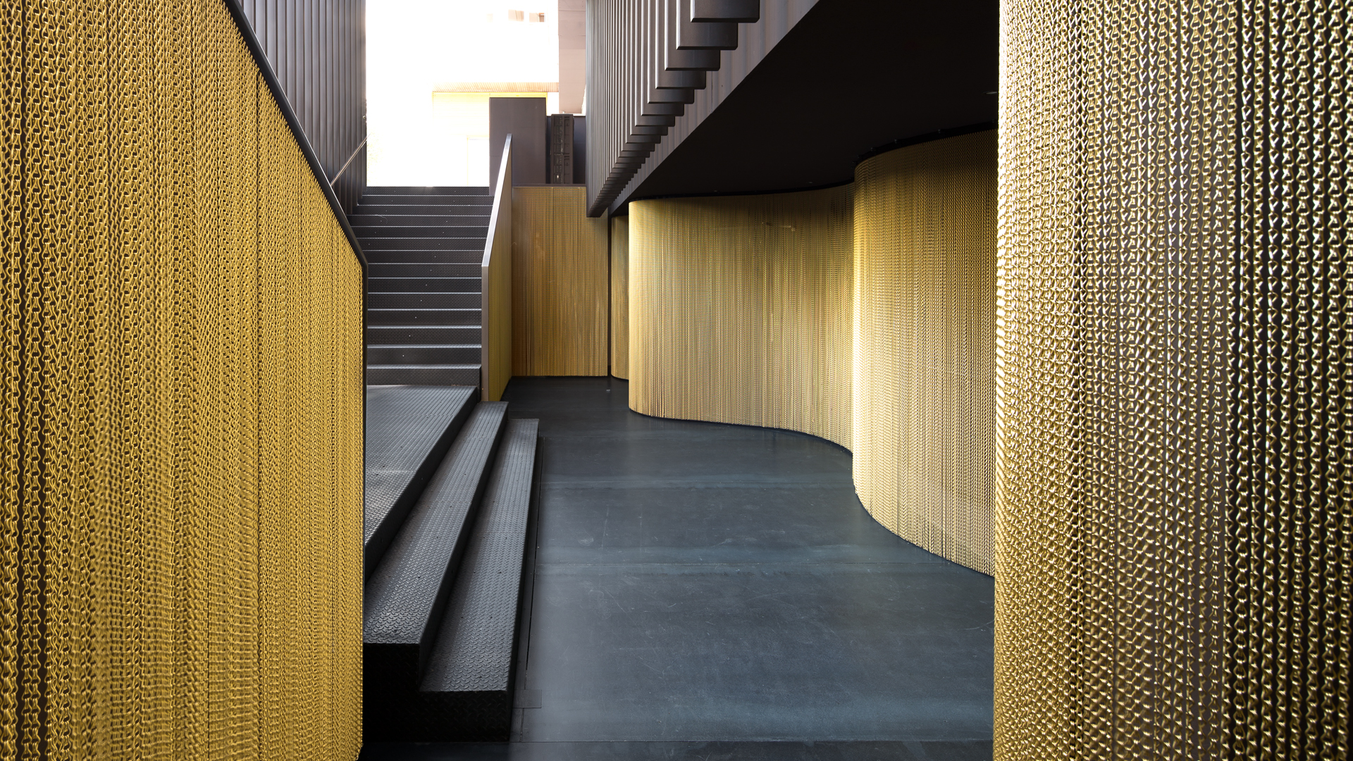
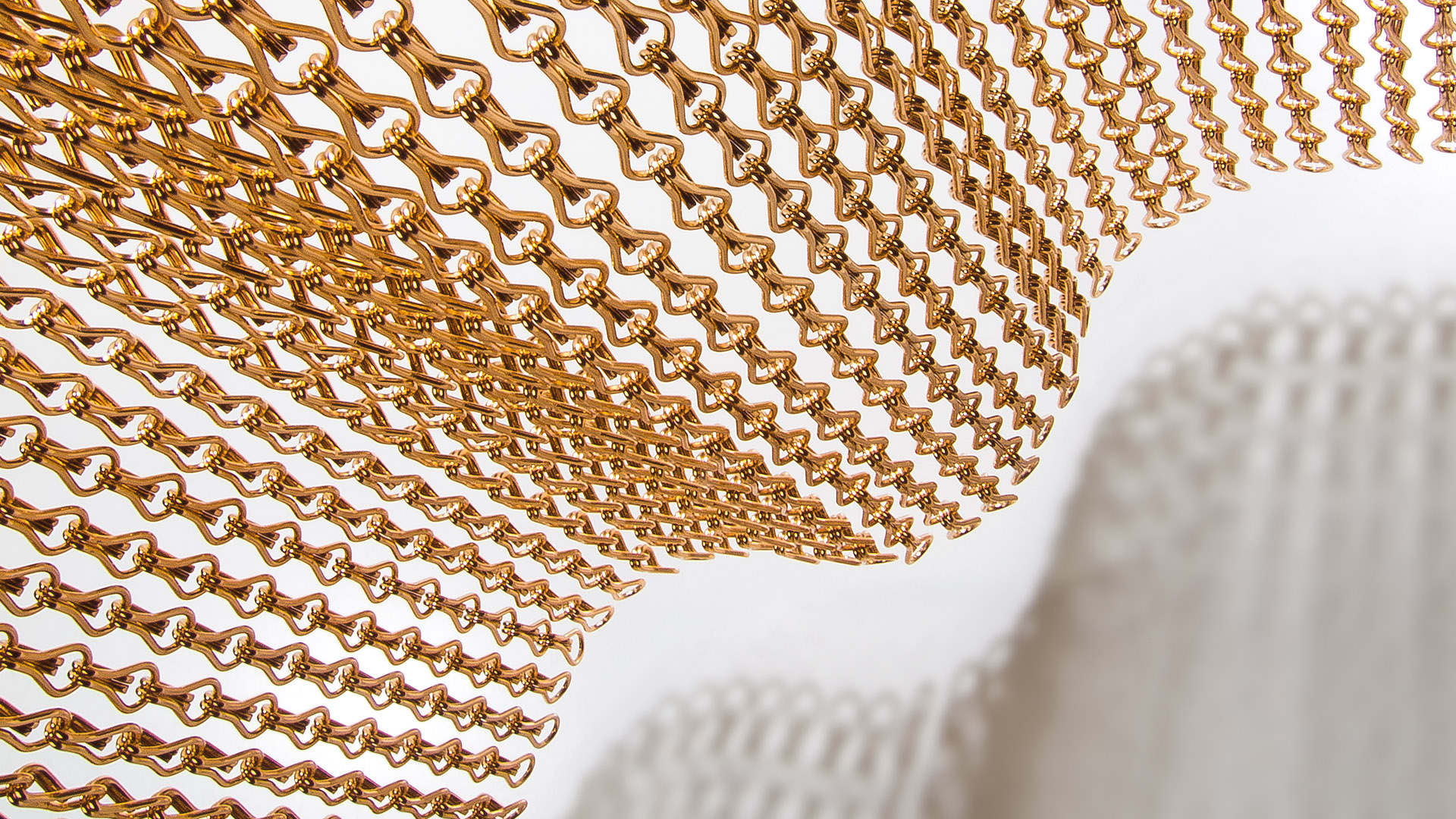
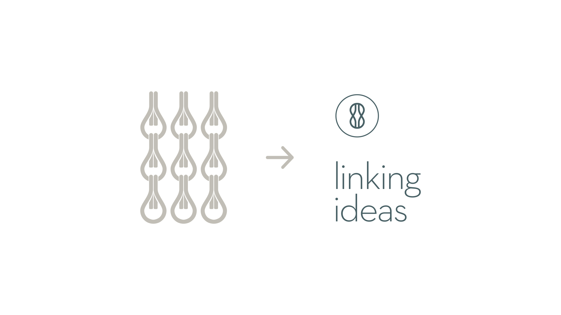
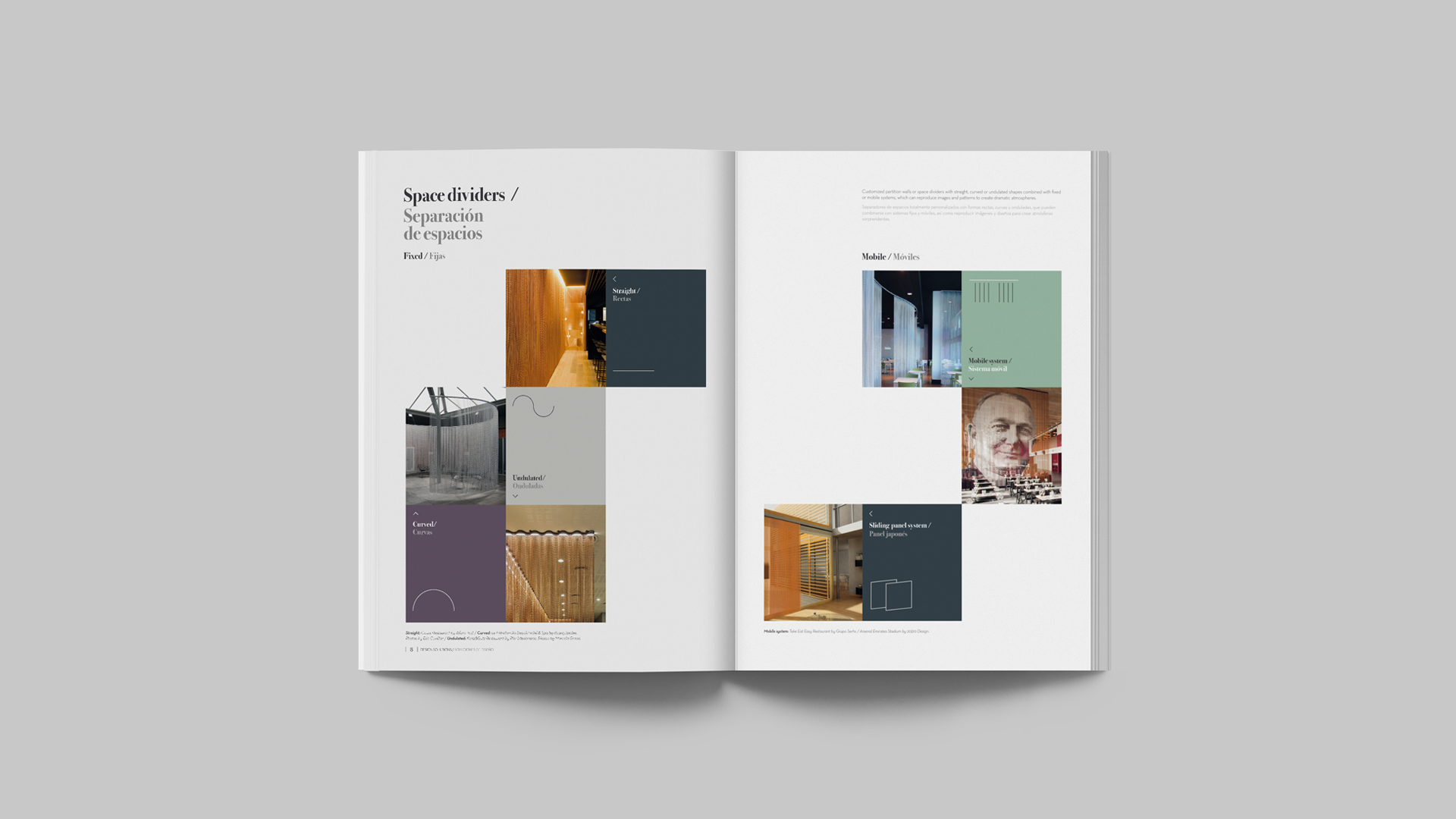
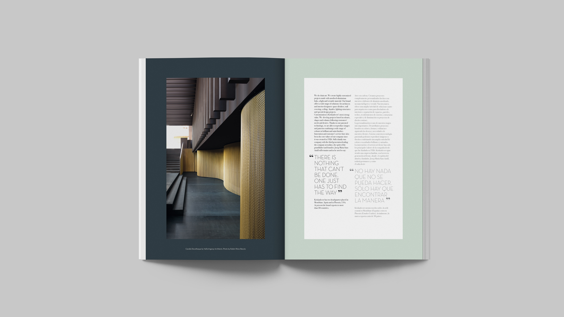
Kriskadecor
Corporate branding
Editorial design
Communication
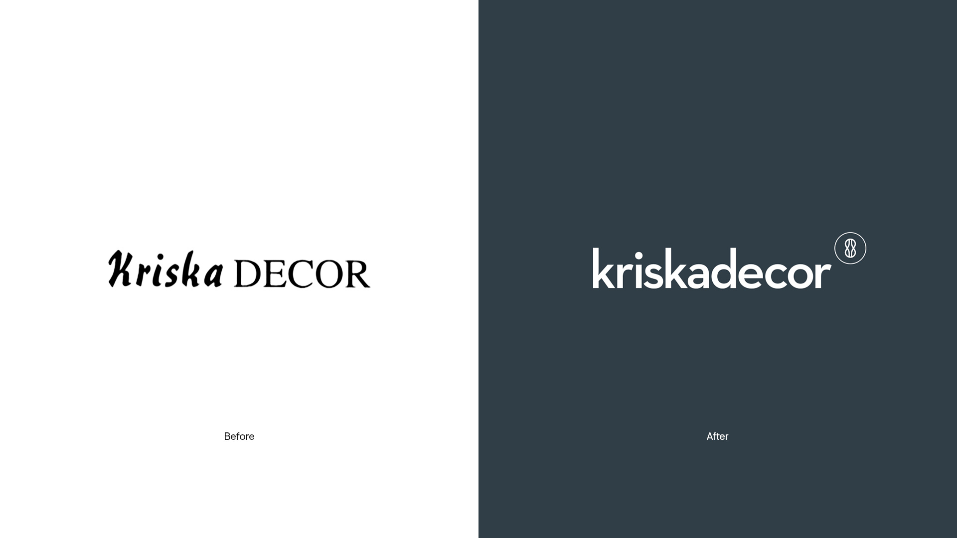
Corporate rebranding of Kriskadecor, a family business that, since 1926, has manufactured metallic structures using small anodized aluminum links. The objective was to both reposition and redesign its corporate identity in ourder to update it according to its current business situation, as well as establish it in the sector as an aspirational design brand. The new branding has helped consolidate Kriskadecor as a design brand, with a fresh powerful image and an outstanding personality.

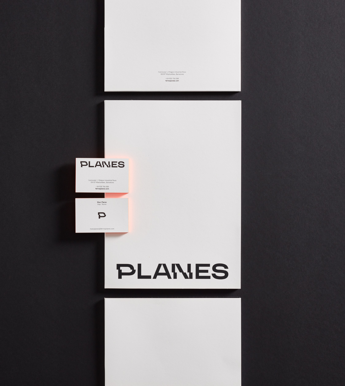
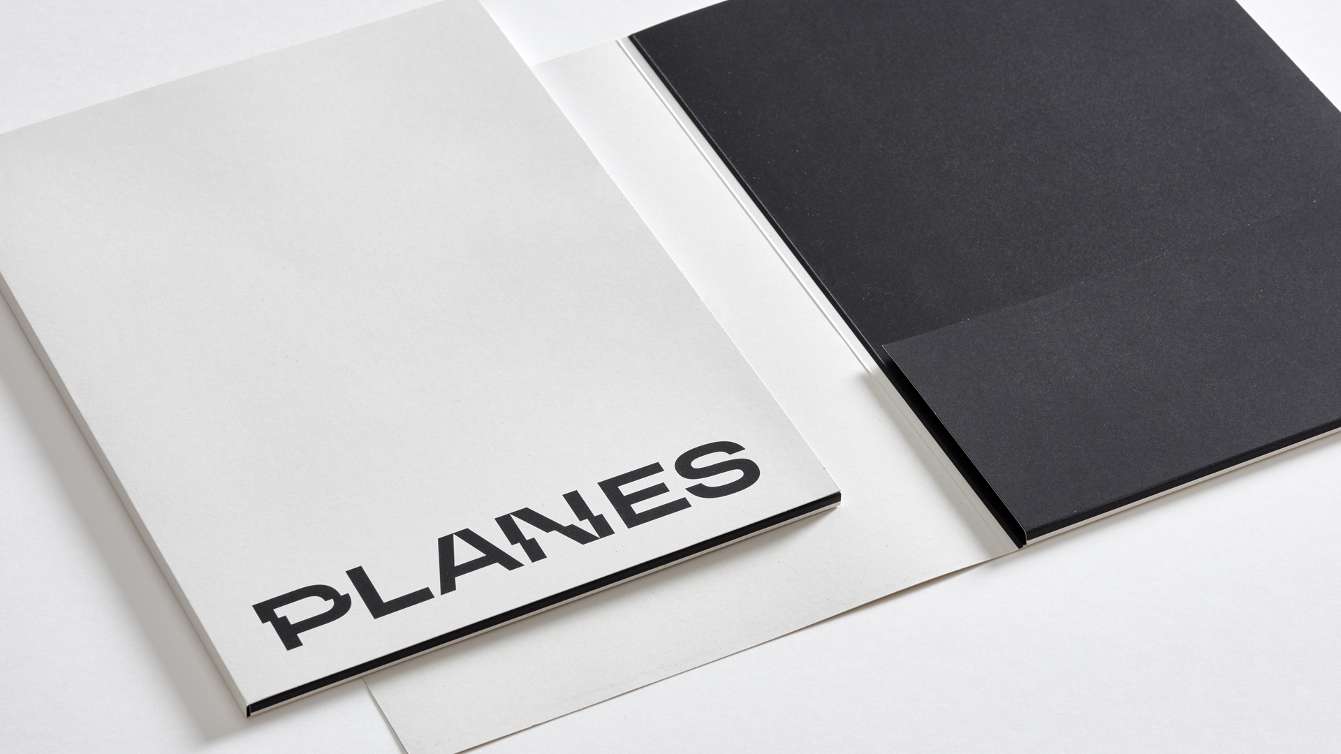
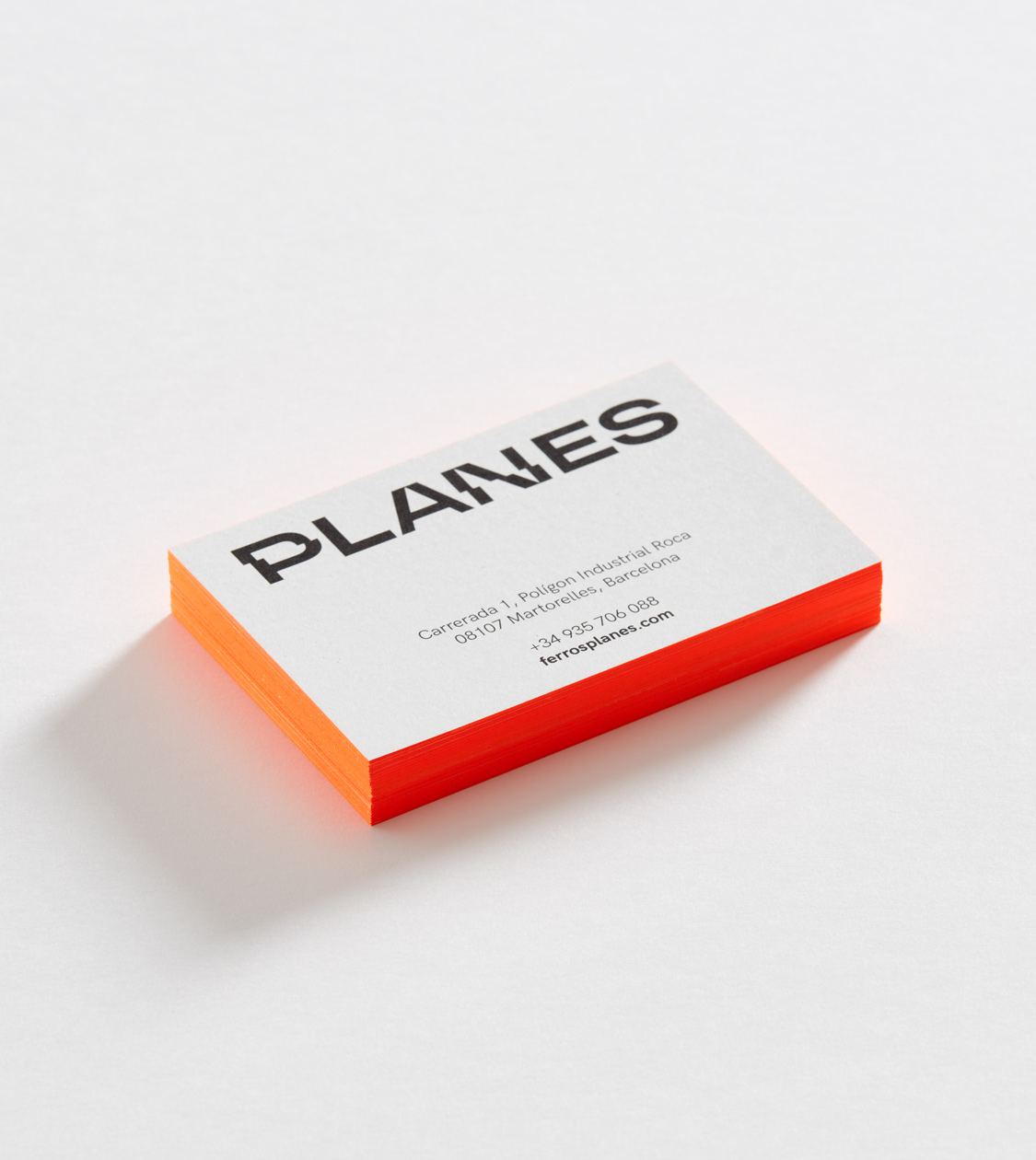
Ferros Planes
Branding strategy
Corporate branding
Communication
Digital communication
In the last quarter of 2020, we met our client Ferros Planes online and began our collaboration in a 100% digital environment due to the situation resulting from the pandemic. The great availability and readiness of all ensured that the project progressed easily and in a perfectly normal way.
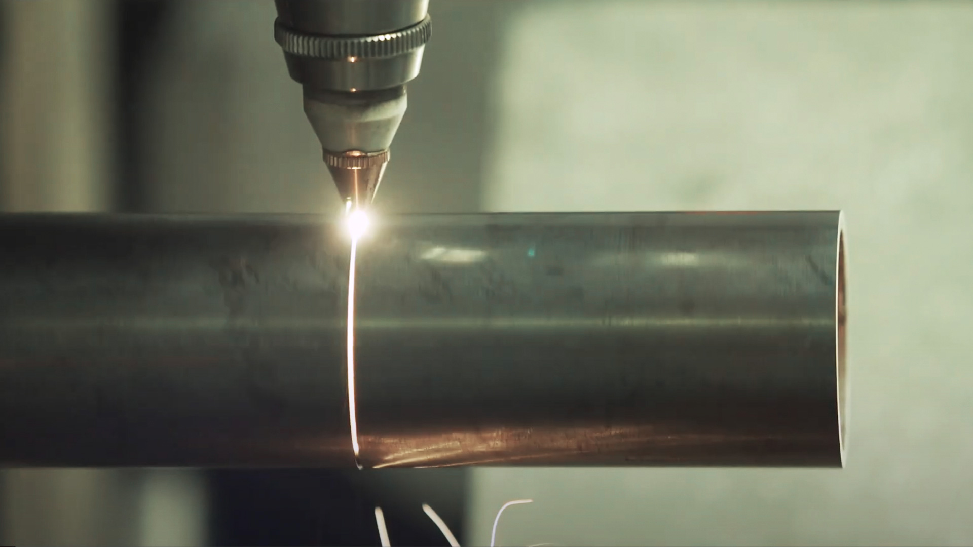
The project consisted of reviewing and redefining its brand positioning, brand values and value proposition to redesign the firm’s corporate branding, adapting it to its market reality.
Ferros Planes is a family business in the metal and foundry sector, with 35 years of experience. The company is a pioneer in metal tubes cutting and machining, and more specifically in laser tube cutting.
Casmar
Branding strategy
Corporate branding
Editorial design
Communication
Digital communication
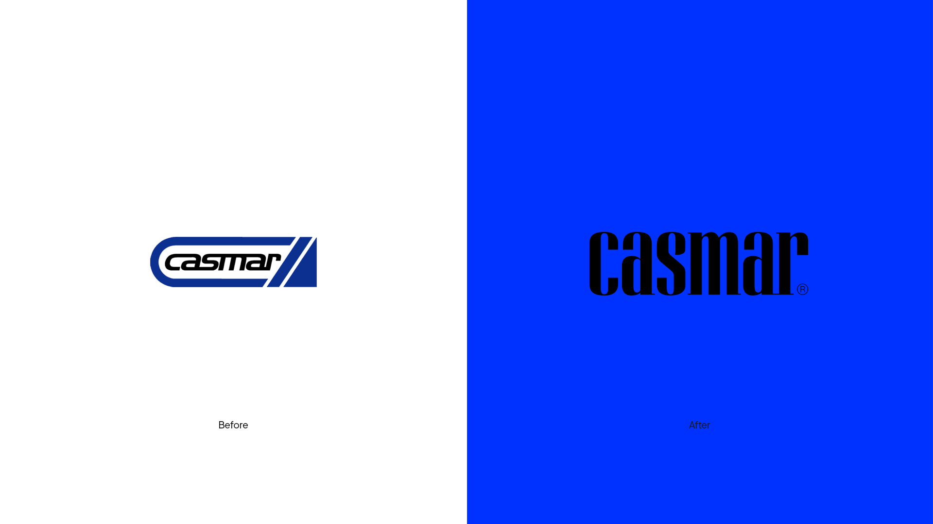
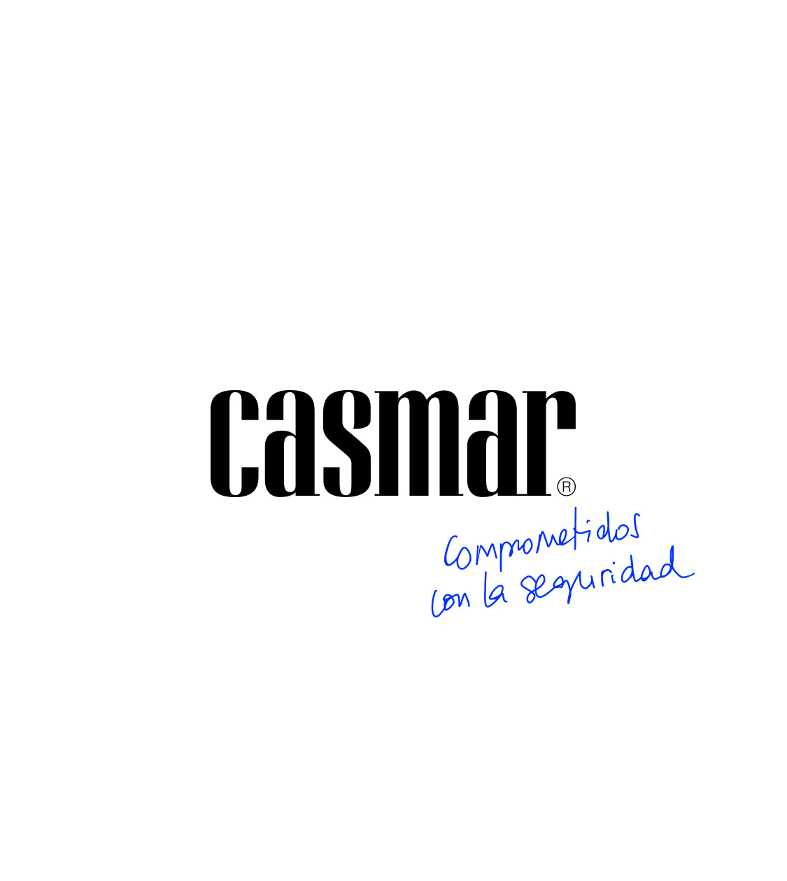
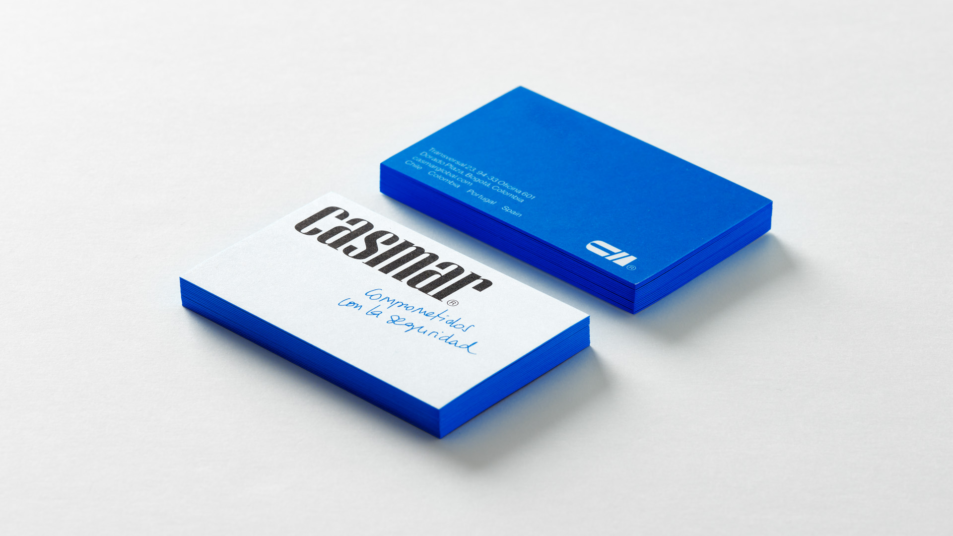
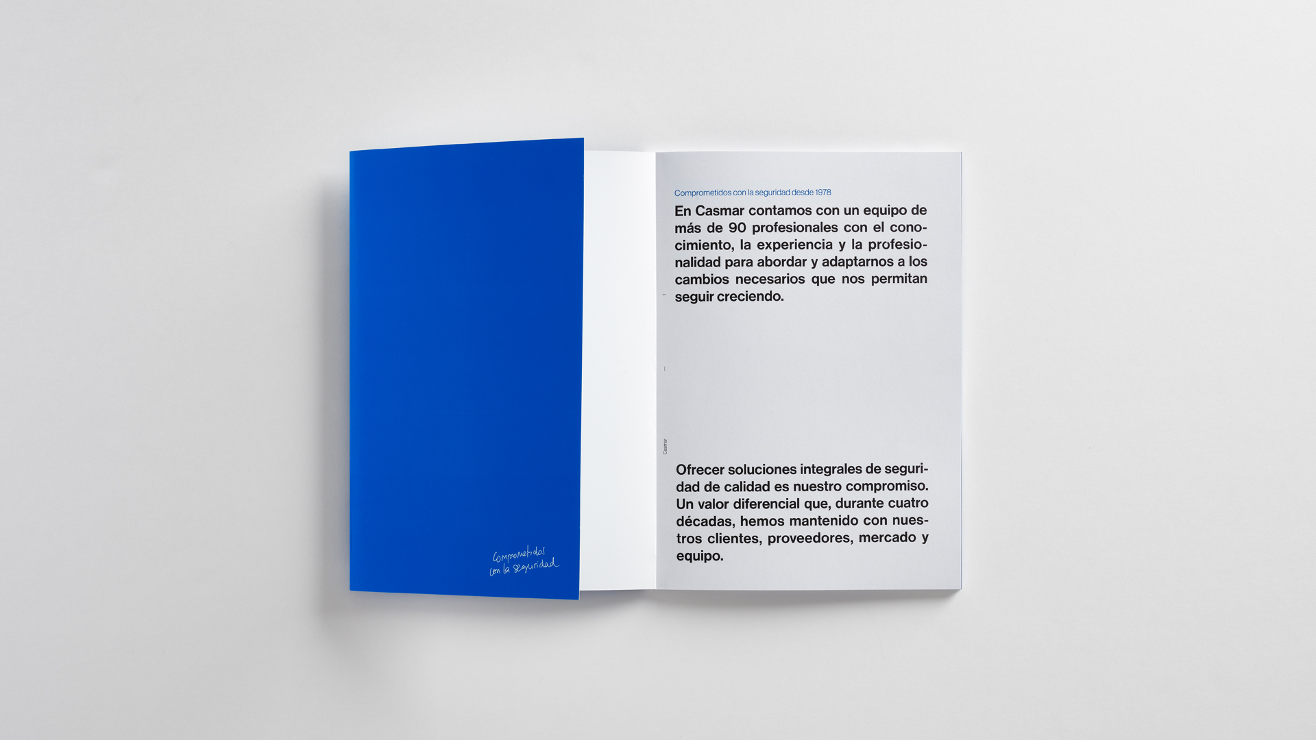
Since 2019, we’ve been collaborating with Casmar, the Spanish company with the longest and most consolidated experience in providing security solutions. We undertook their corporate rebranding to coincide with their 40th anniversary and a phase of generational change in their leadership. This required a new brand positioning that reflects their reality and commitment to the future.

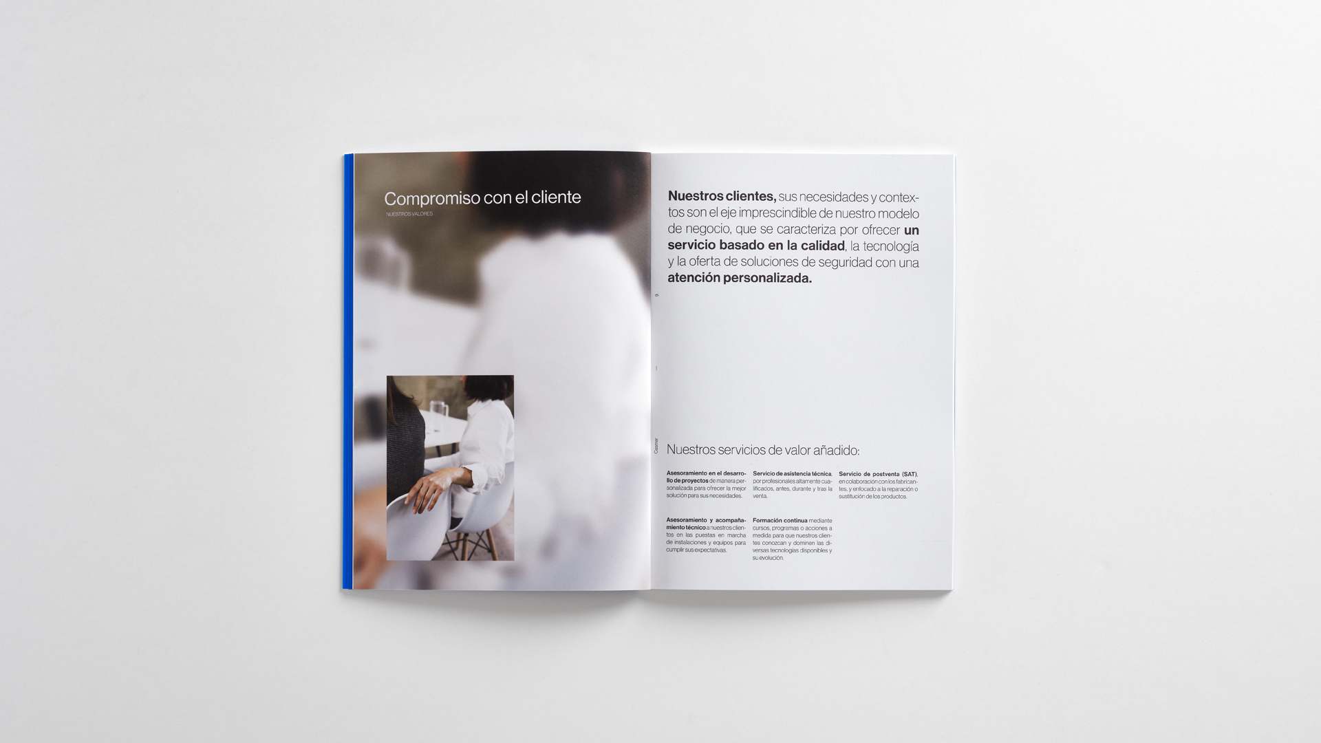
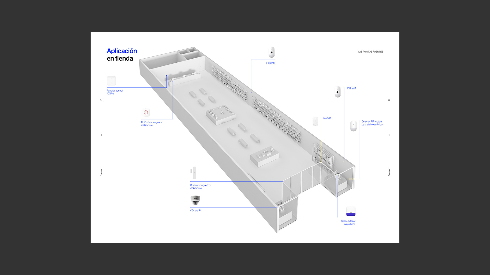
We define a brand with personality and coherence that adds distinctive value within the security sector, reflecting the company’s authentic values and attributes and enabling them to communicate their new value proposition to all their audiences.
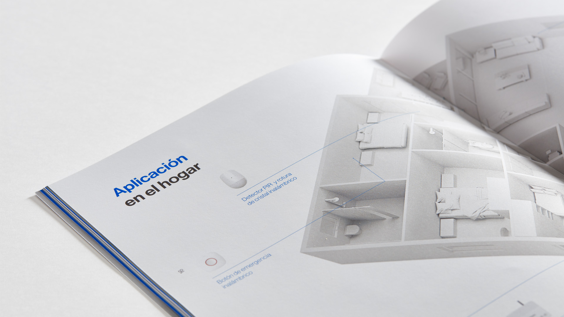
Additionally, we have developed the communication campaign for the new Hikvision professional solution AX Pro, distributed by Casmar. This wireless alarm system guarantees real-time safety for homes, offices, and/or businesses.
Toda & Nel·lo
Corporate branding
Editorial design
Communication
Digital communication
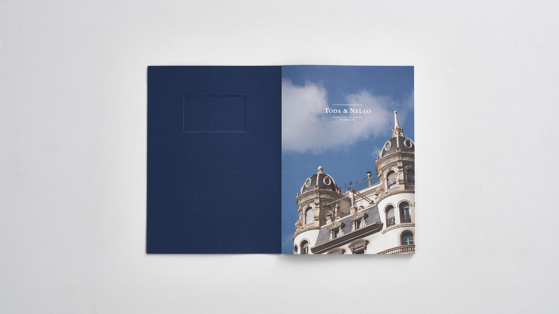
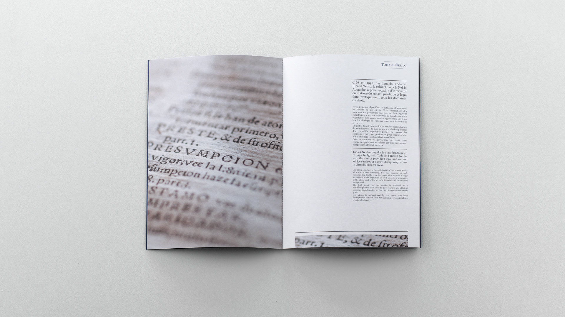
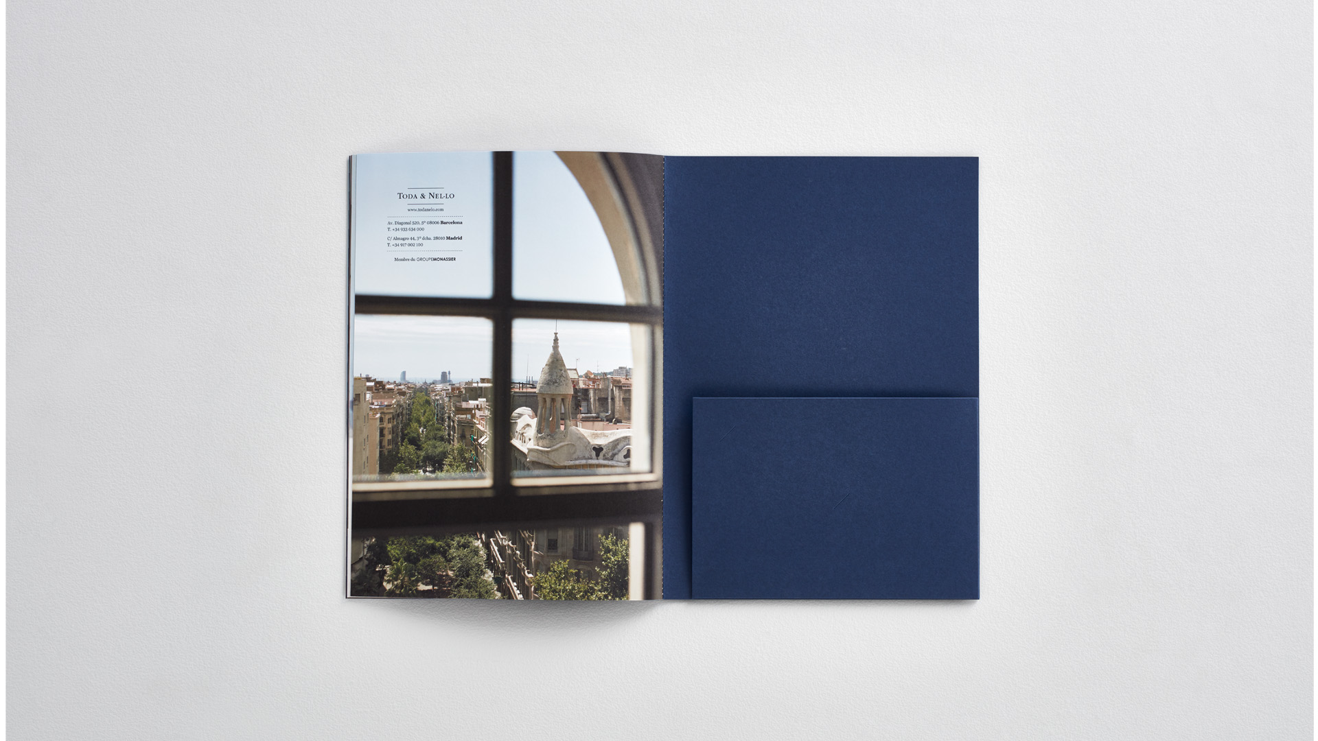
After a phase of significant growth, the renowned Barcelona law firm Toda & Nel-lo –providing legal services specialising in the combination of public and private law– needed us to oversee its corporate branding.
After analysing the business, we redesigned the firm’s brochure of services and the new website, as well as several marketing materials used daily at the firm.
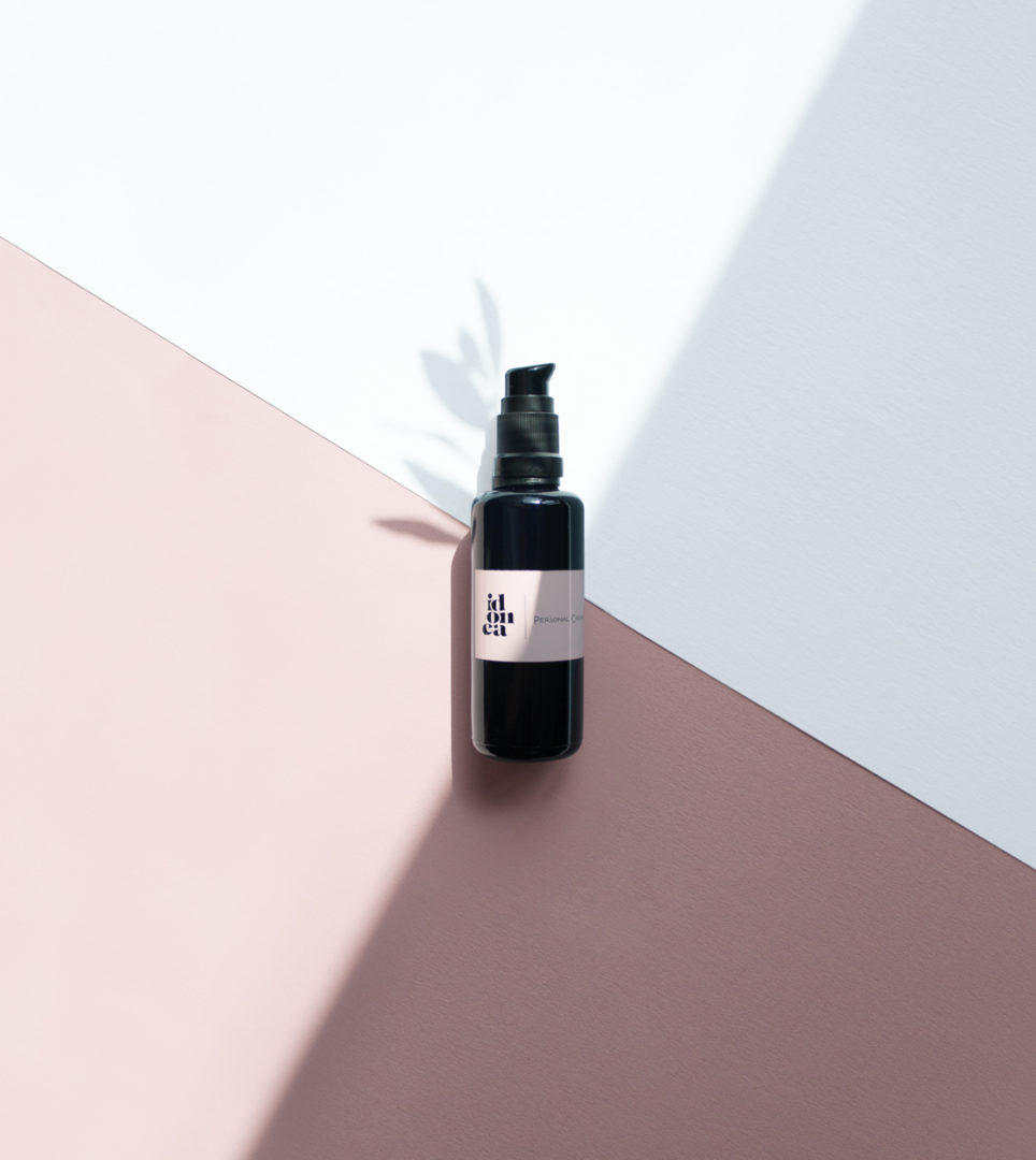
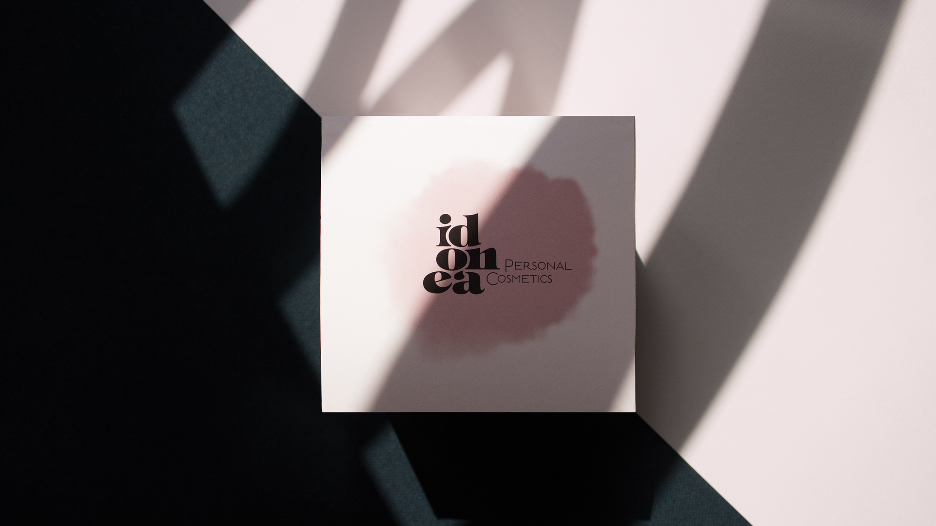
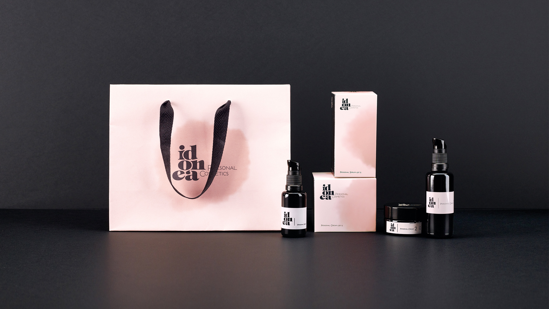
Idonea
Corporate branding
Packaging design
Communication

Creation of the corporate branding for Idonea, a dermocosmetics brand for the pharmacy channel. The branding reflects its human angle, its tangible and emotional characteristics, thus facilitating its visibility in the vastness of the pharmacy shelves. We develop the naming, conceptualize the brand and design the corporate identity, packaging and communication materials.
ICEX
Corporate branding
Editorial design
Communication
Digital communication
Retail branding
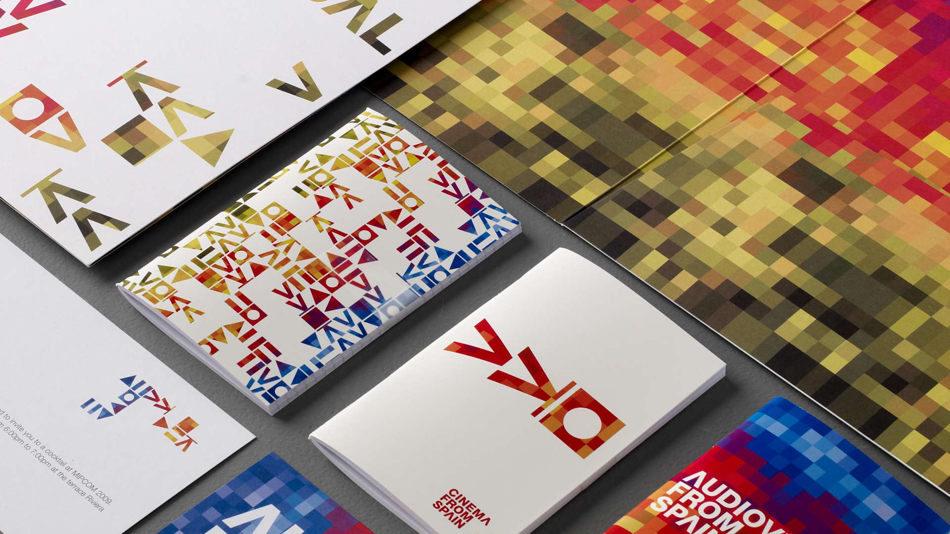
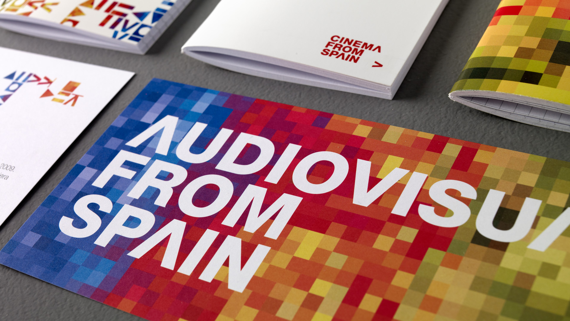
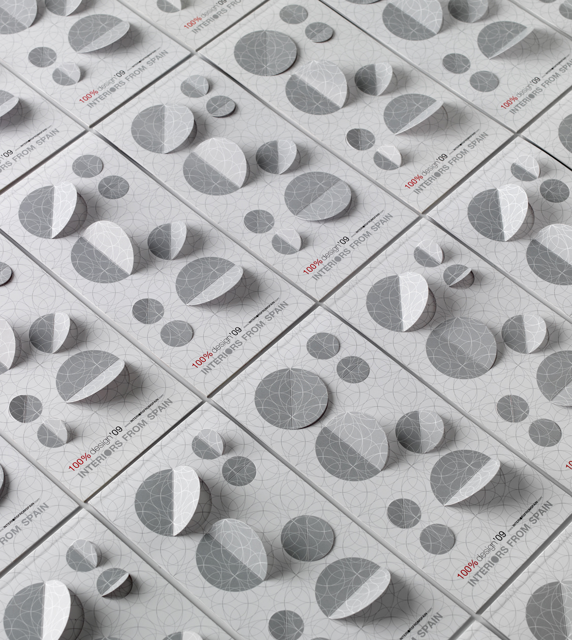
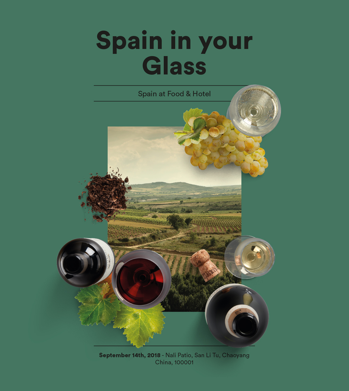
For the last 15 years we have collaborated with ICEX developing the design of several of the institution’s brands, division identities and communication materials. We took on projects such as Interiors from Spain, Fashion from Spain, Audiovisual from Spain, Animation from Spain, Games from Spain, Equipment goods, Global Forum Spain and Foods & Wines from Spain.
For Audiovisual from Spain we created the branding to support and publicize the Spanish audiovisual ecosystem at trade fairs and festivals. It resulted in an image that projected innovation and showcased our country’s creativity, freshness and vitality.
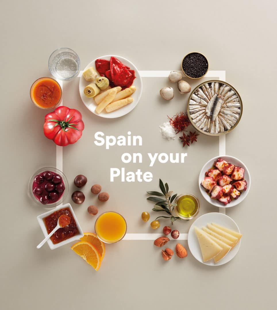
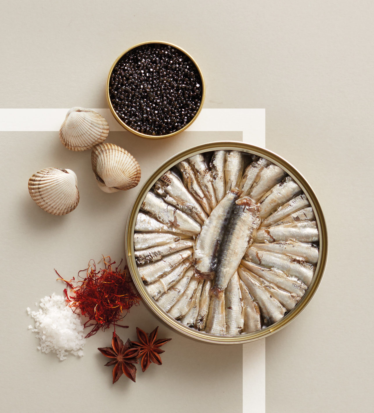
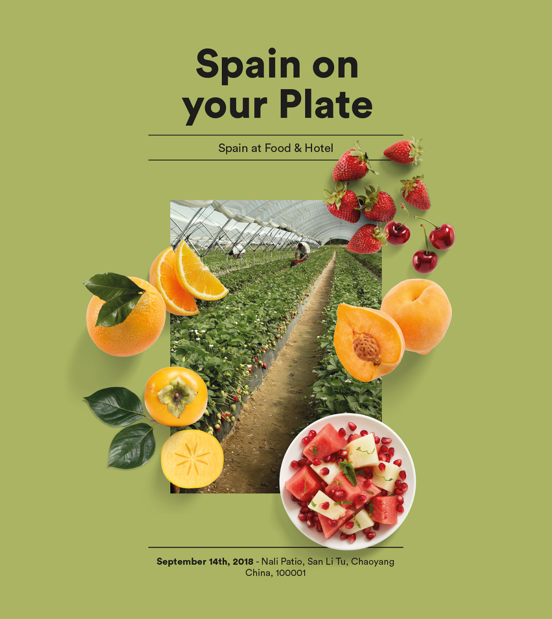
Recently, we have designed the image of the Foods & Wines from Spain brand dissemination campaign that transmits the excellence and projection of Spanish gastronomy and its produce around the world.

Sustainability
Sustainability
Sustainability
Sustainability
Sustainability
Sustainability
Sustainability
Sustainability
Sustainability
Sustainability
Sustainability
Sustainability
Sustainability
Sustainability
Sustainability
Sustainability
Sustainability
Sustainability
Sustainability
Sustainability
Sustainability
Sustainability
Sustainability
Sustainability
Sustainability
Sustainability
Sustainability
Sustainability
Sustainability
Sustainability
Sustainability
Sustainability
Sustainability
Sustainability
Sustainability
Sustainability
Sustainability
Sustainability
Sustainability
Sustainability
LC Paper
Corporate branding
Packaging design
Editorial design
Communication
Digital communication
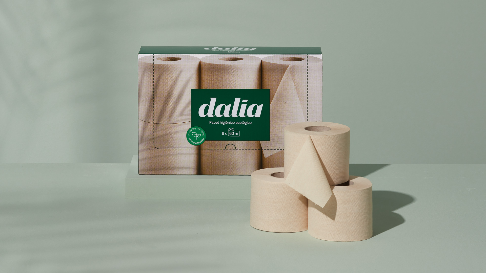
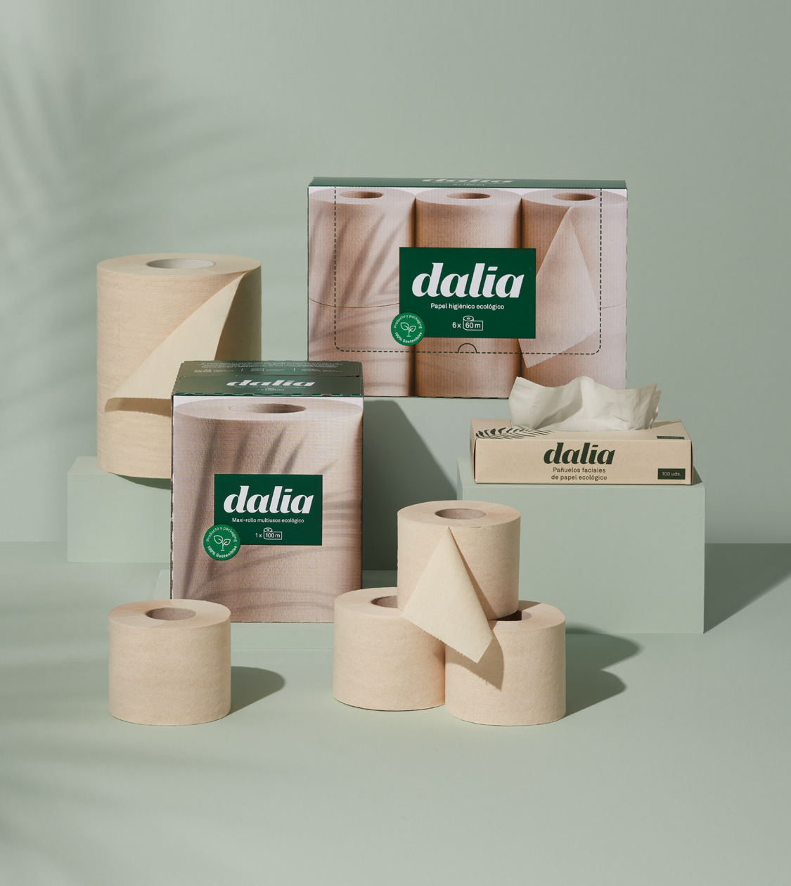
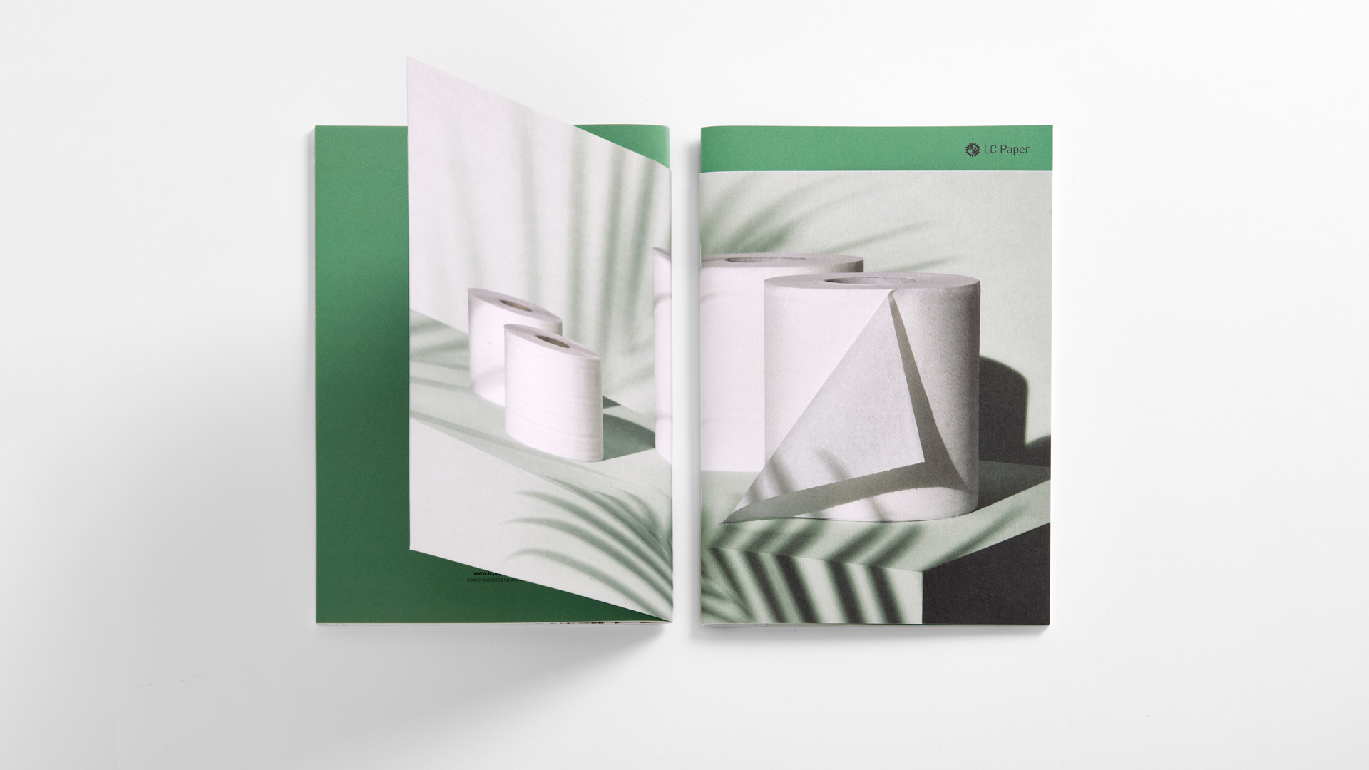
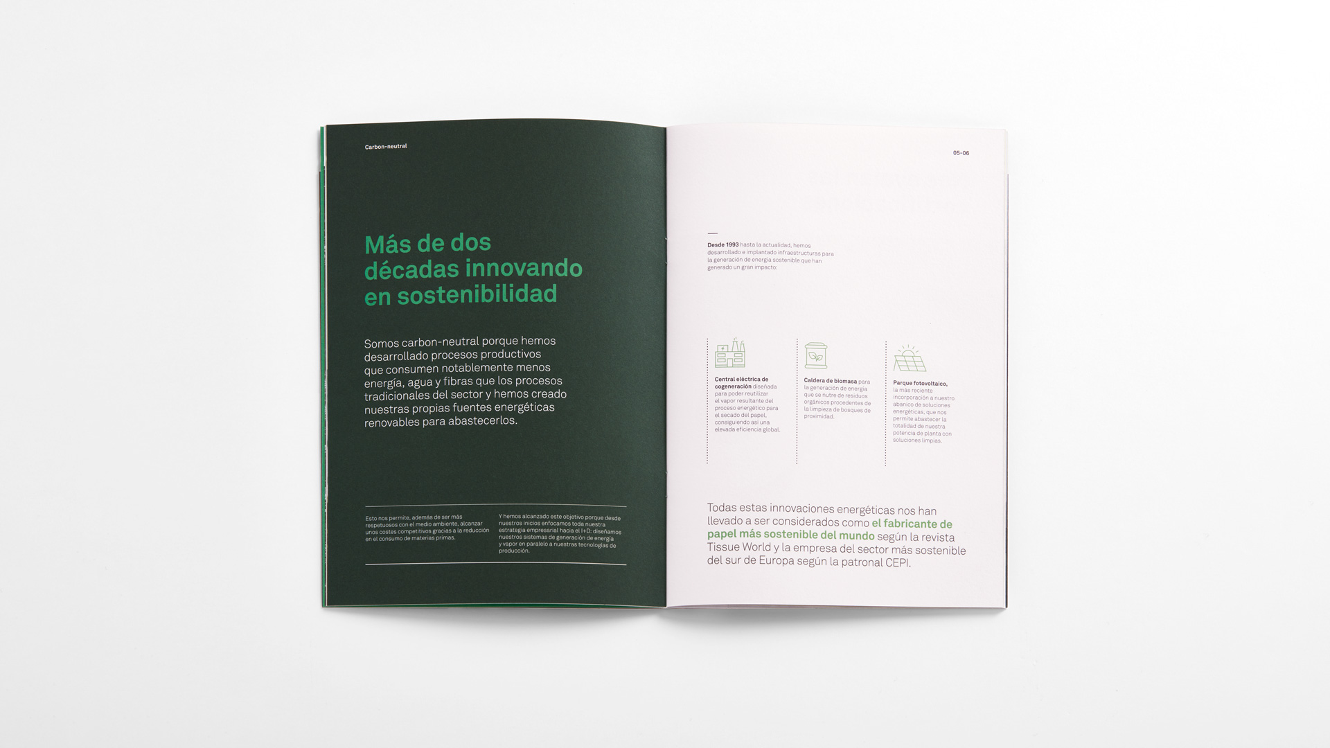

LC Paper is a company with more than 140 years of experience and a pioneer in the manufacture of paper without CO2 emissions. We have conceptualized and developed its corporate catalog that reflects the significance of this pioneering company, that completely distances itself from the traditional image of the sector, displaying an art direction that reinforces the concept of sustainability by reaching out to the final consumer.


We have also created sustainable packaging for Dalia®, its range of eco-friendly toilet paper for mass consumption. An alternative to the classic plastic pack, resistant and easy to identify in supermarkets thanks to the new concept of “transparent cardboard”, an idea that has been patented worldwide.
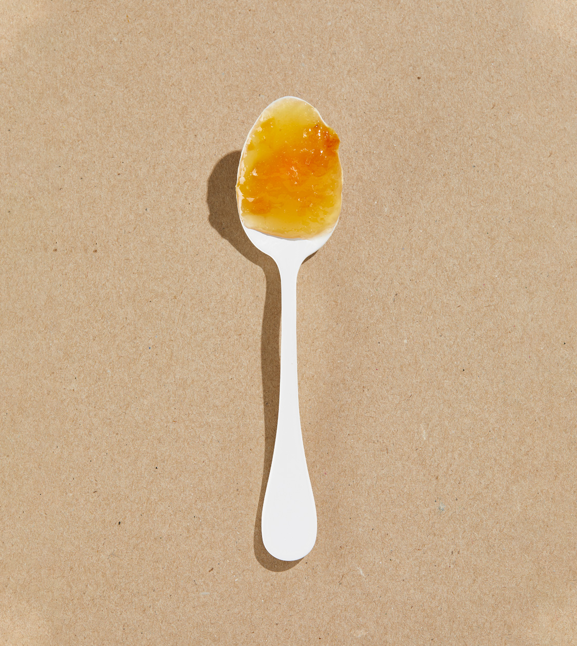
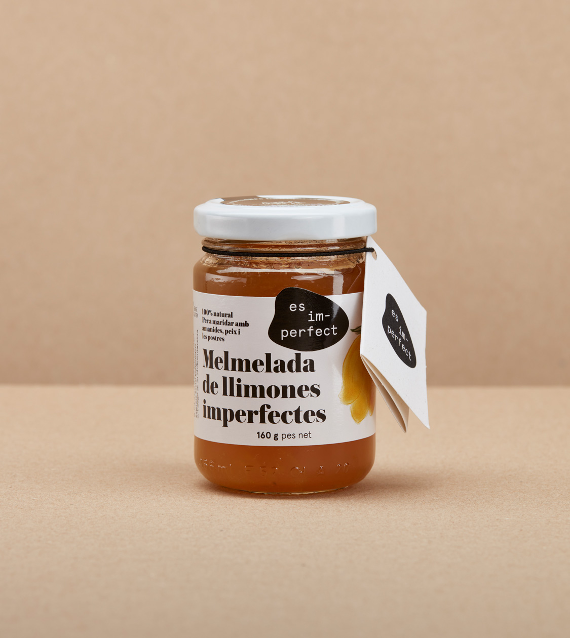
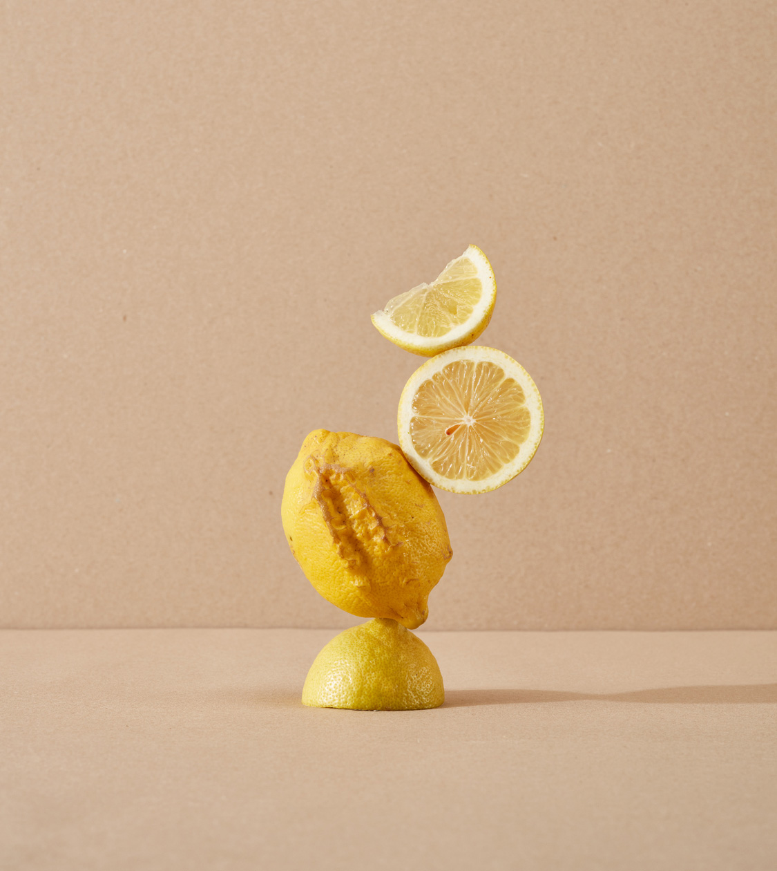
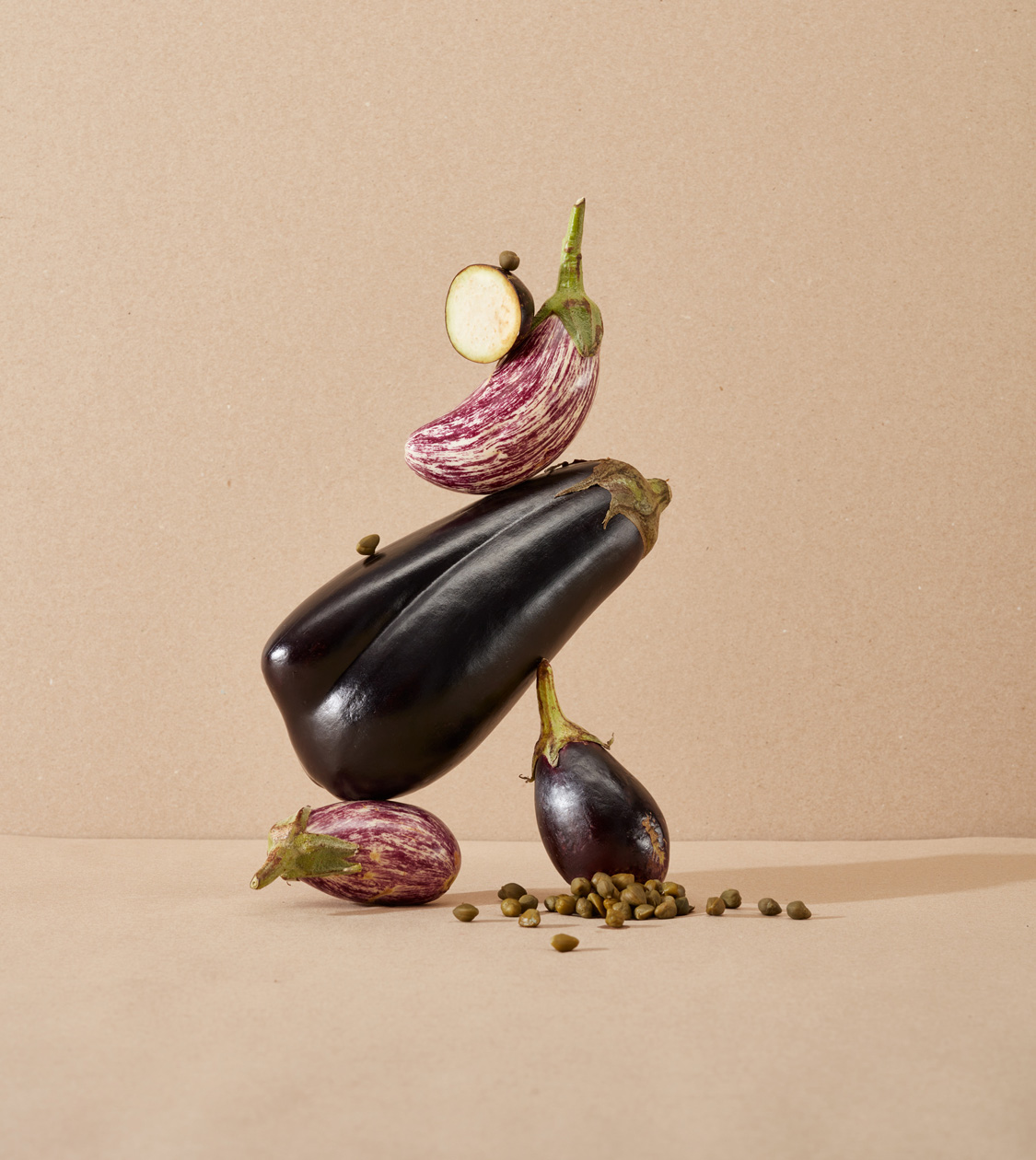
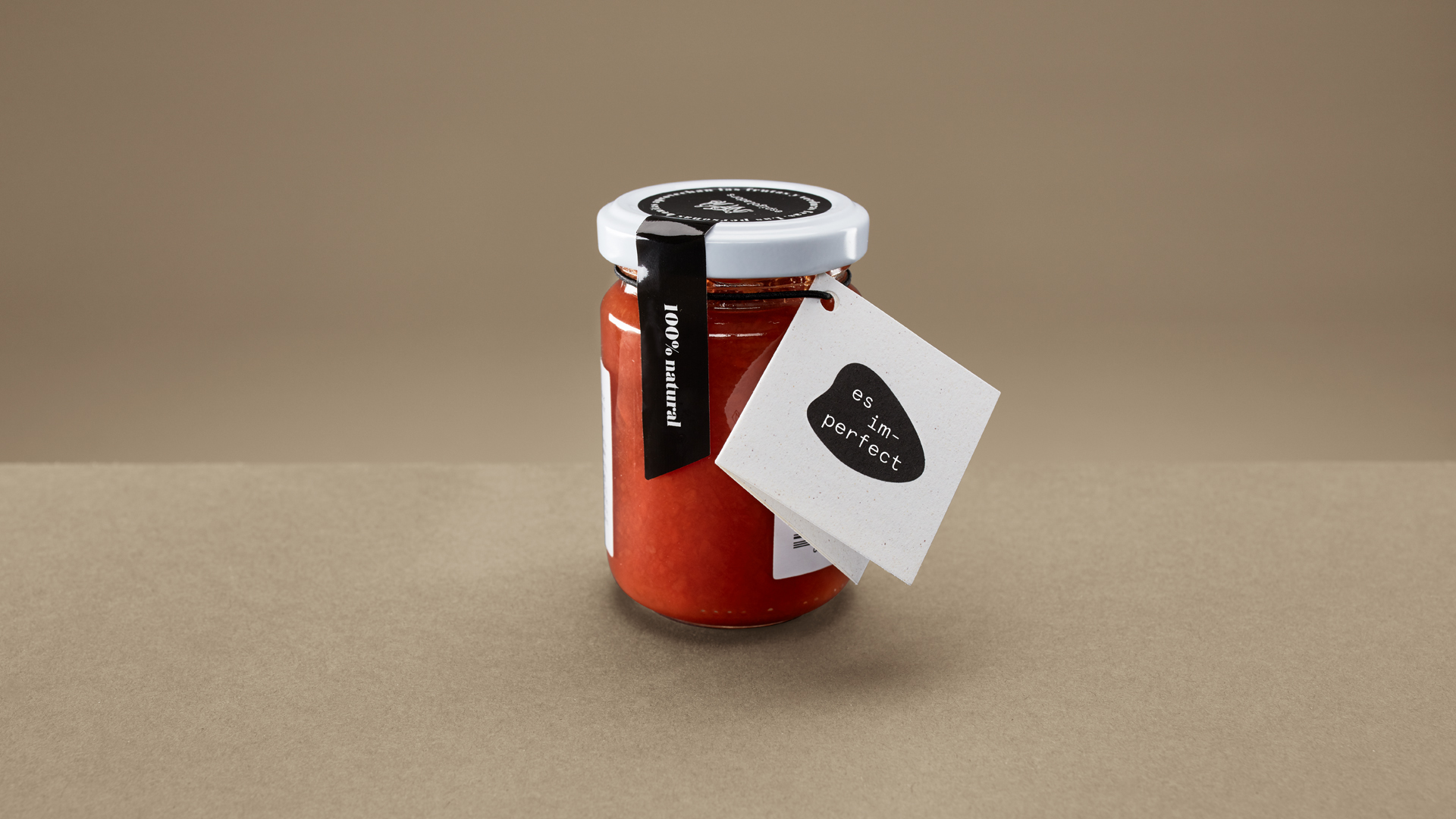
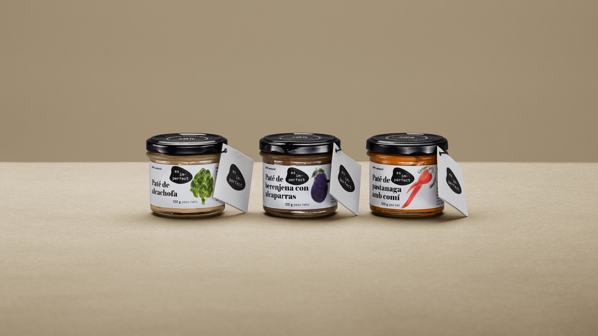
es im-perfect®
Corporate branding
Packaging design
Communication
Digital communication
Retail branding
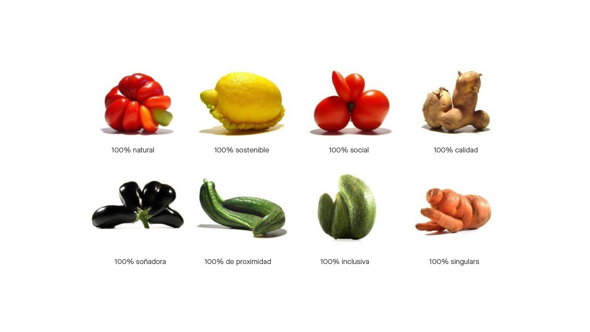

Since 2015, we have been collaborating with the social-impact driven company Espigoladors, that aims to reduce food waste. During this time, in addition to designing its displays, packaging and other communication materials, we have redesigned the organization’s branding, as well as that of its product brand es im-perfect. The new branding emphasizes the concept of the imperfection of its raw produce: ugly fruits and vegetables that cannot be marketed.
We have also conceptualized, designed and defined the art direction and storytelling of its new e-commerce, based mainly on the criticism of food waste and the overly aesthetic criteria suffered by food.

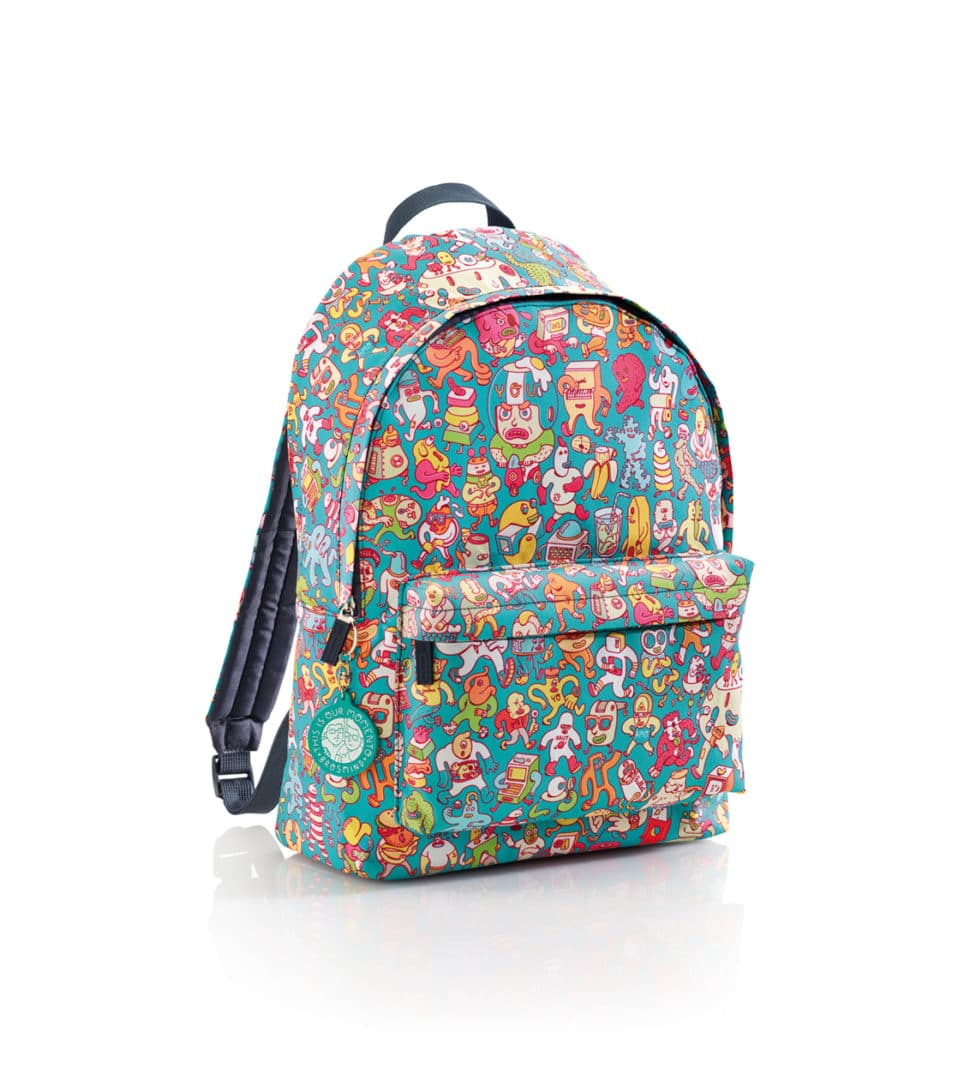
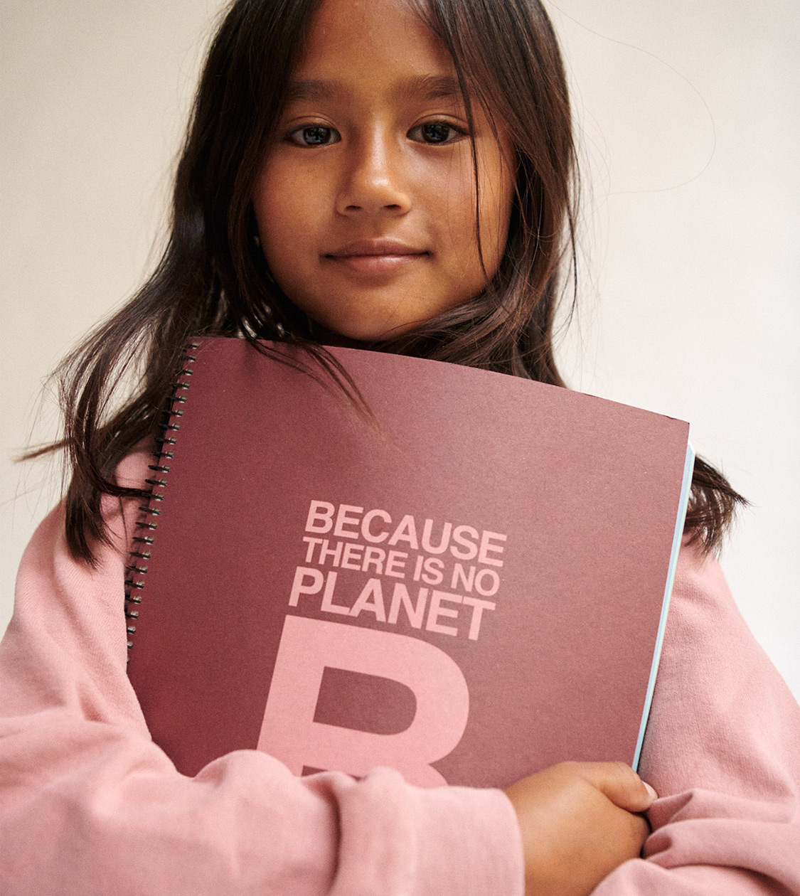
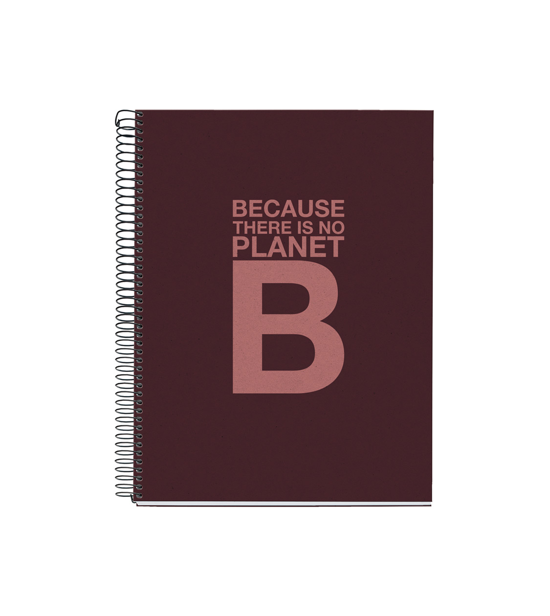
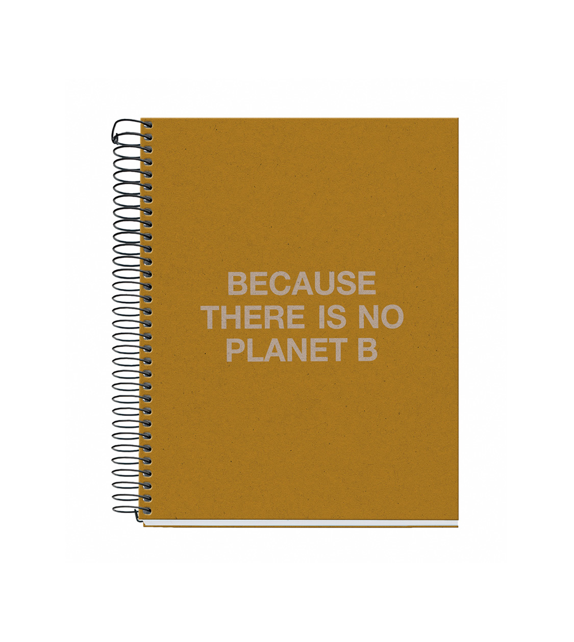
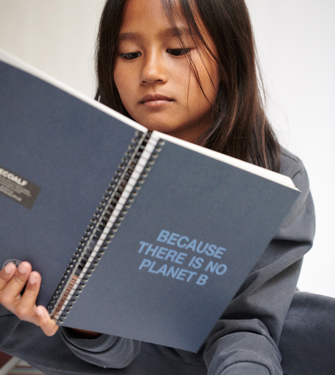
Ecoalf by MR
Branding strategy
Product design
Communication
Digital communication
«Because where others see garbage, we see raw material», Javier Goyeneche, Founder & President at ECOALF.
In collaboration with Ecoalf and Miquelrius, we have developed the “Ecoalf powered by Miquelrius” collection, made with recycled and recyclable materials, a set of products adjusted to the demands of an increasingly eco-conscious world and consumers.
The collection is made of notebooks, folders, backpacks and pencil cases promoting the message BECAUSE THERE IS NO PLANET B, which clearly conveys the importance of recycling. We also provide an explanation of how to do it correctly.


Lékué
Branding strategy
Corporate branding
Product design
Packaging design
Editorial design
Communication
Digital communication
Retail branding
After over a decade of joint collaboration with Lékué, a benchmark brand in kitchen utensils, we have contributed to the creation of a brand linked to design, innovation and with a distinct consumer orientation. The branding we developed for Lékué endowed it with such personality, it is still valid today.


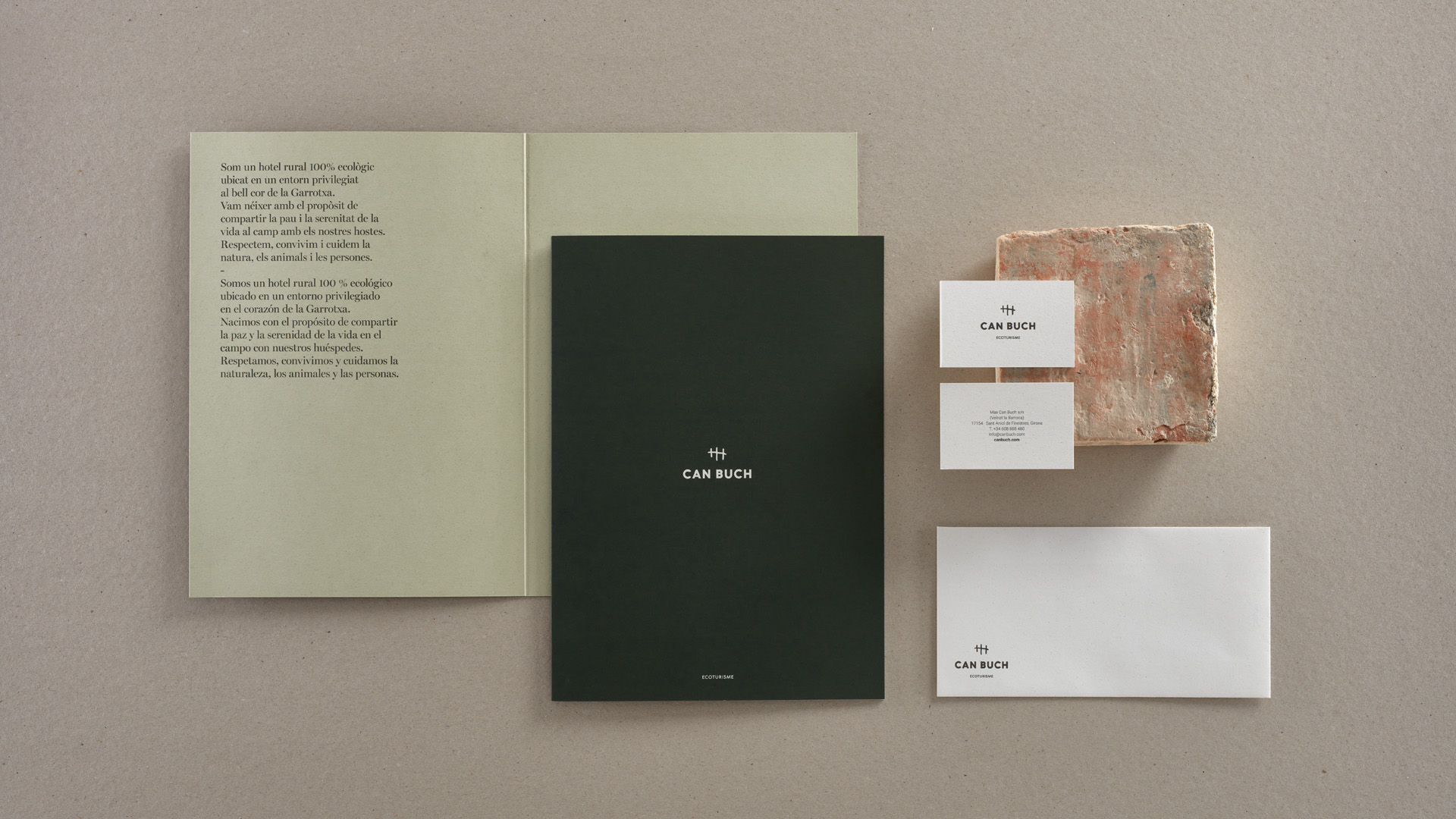
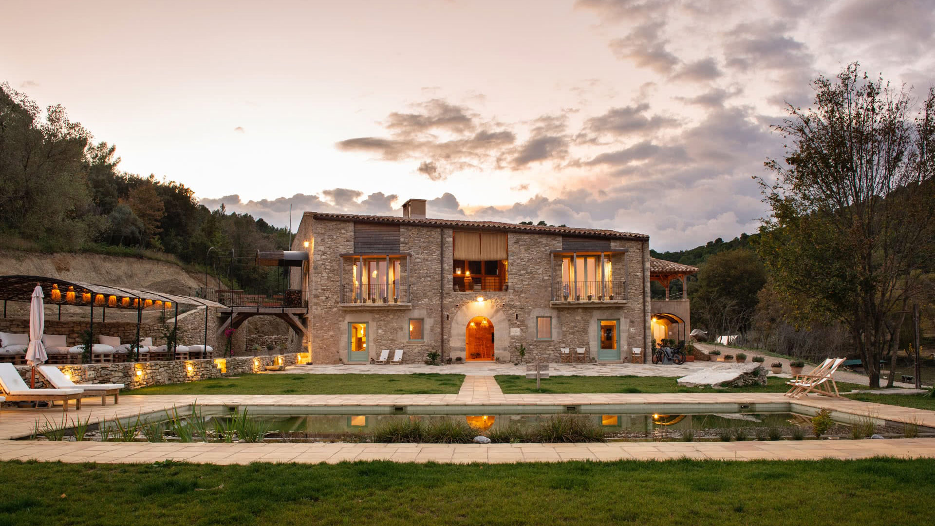
Can Buch
Branding strategy
Corporate branding
Packaging design
Communication
Digital communication
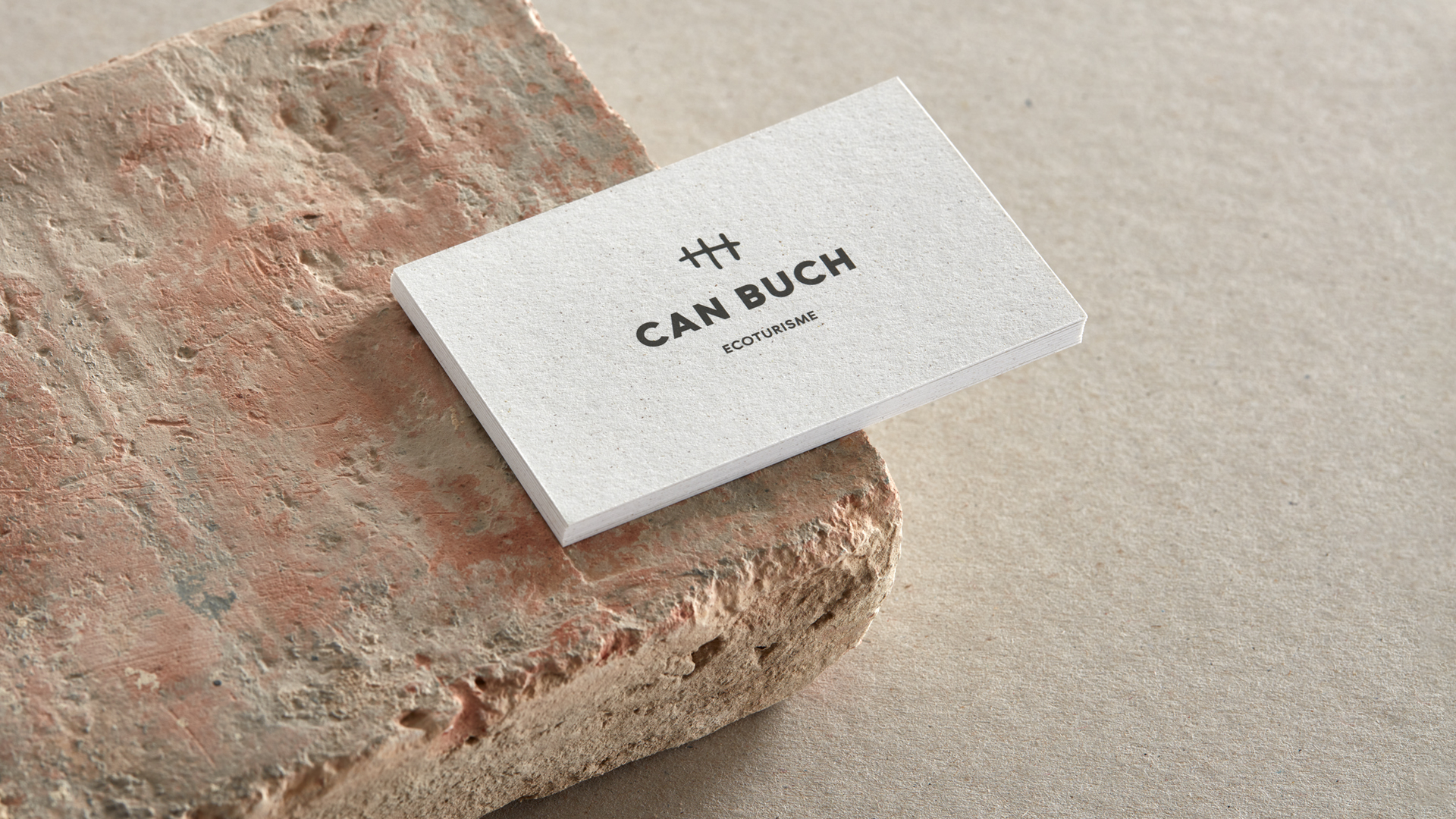
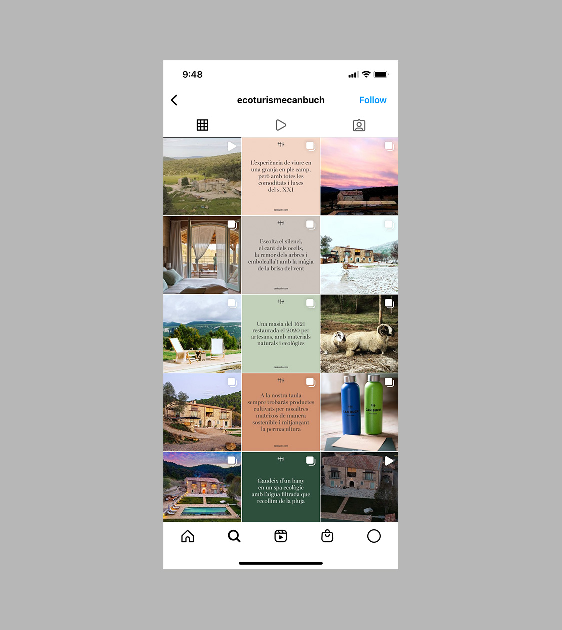
We have developed the brand concept and also designed the corporate branding of Can Buch, a new project dedicated to 100% eco-friendly ecotourism set in the heart of la Garrotxa (Girona). This project arose from the keenness to share the experience of living in the peaceful, serene countryside with appreciating tourists.
Corporate branding was subsequently applied to the hotel’s offline communication materials as well as to their main online communication channel, Can Buch’s Instagram profile.


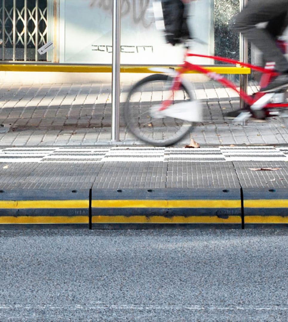
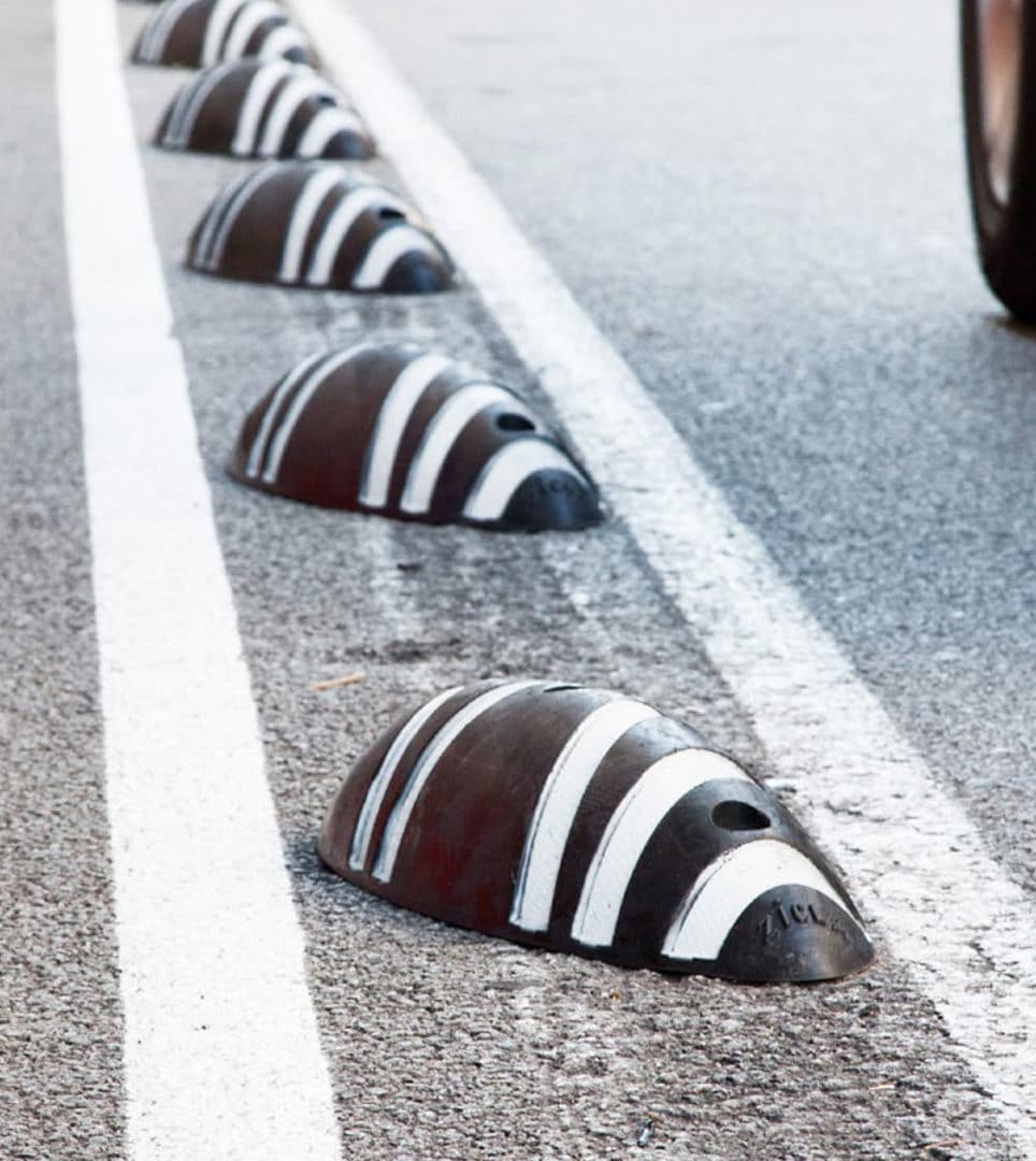
Zicla
Branding strategy
Corporate branding
Communication
Digital communication
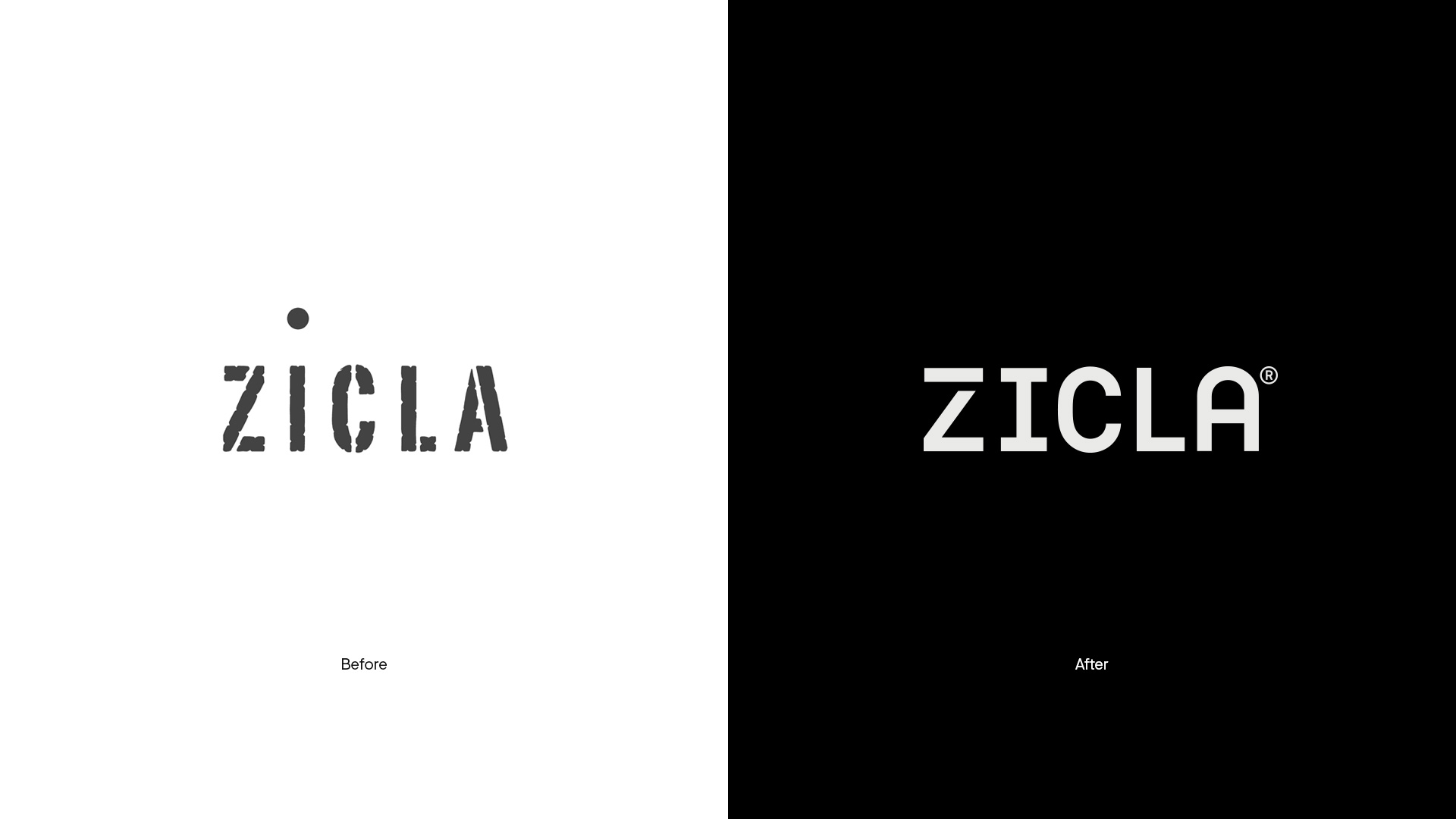
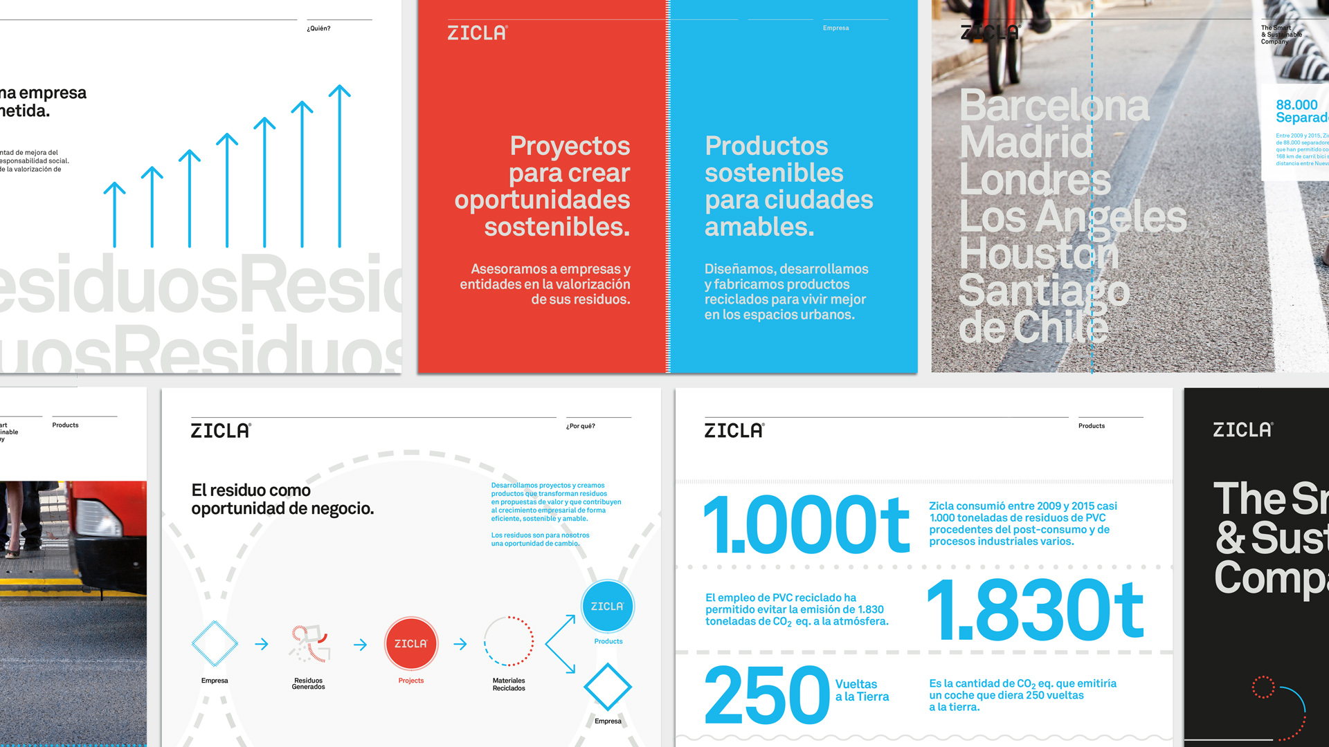
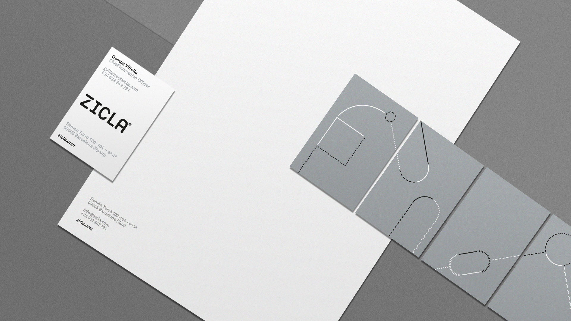
Corporate branding redesign for the sustainable company Zicla with the aim to achieve both a brand repositioning and begin its internationalization process. We developed a new branding strategy based on people, design and the culture of innovation, connected with the diversity and complexity of its audiences. In accordance with this new strategy, we furthermore defined the brand personality and its attributes, to later redesign its corporate image and create the corporate storytelling for the brand.
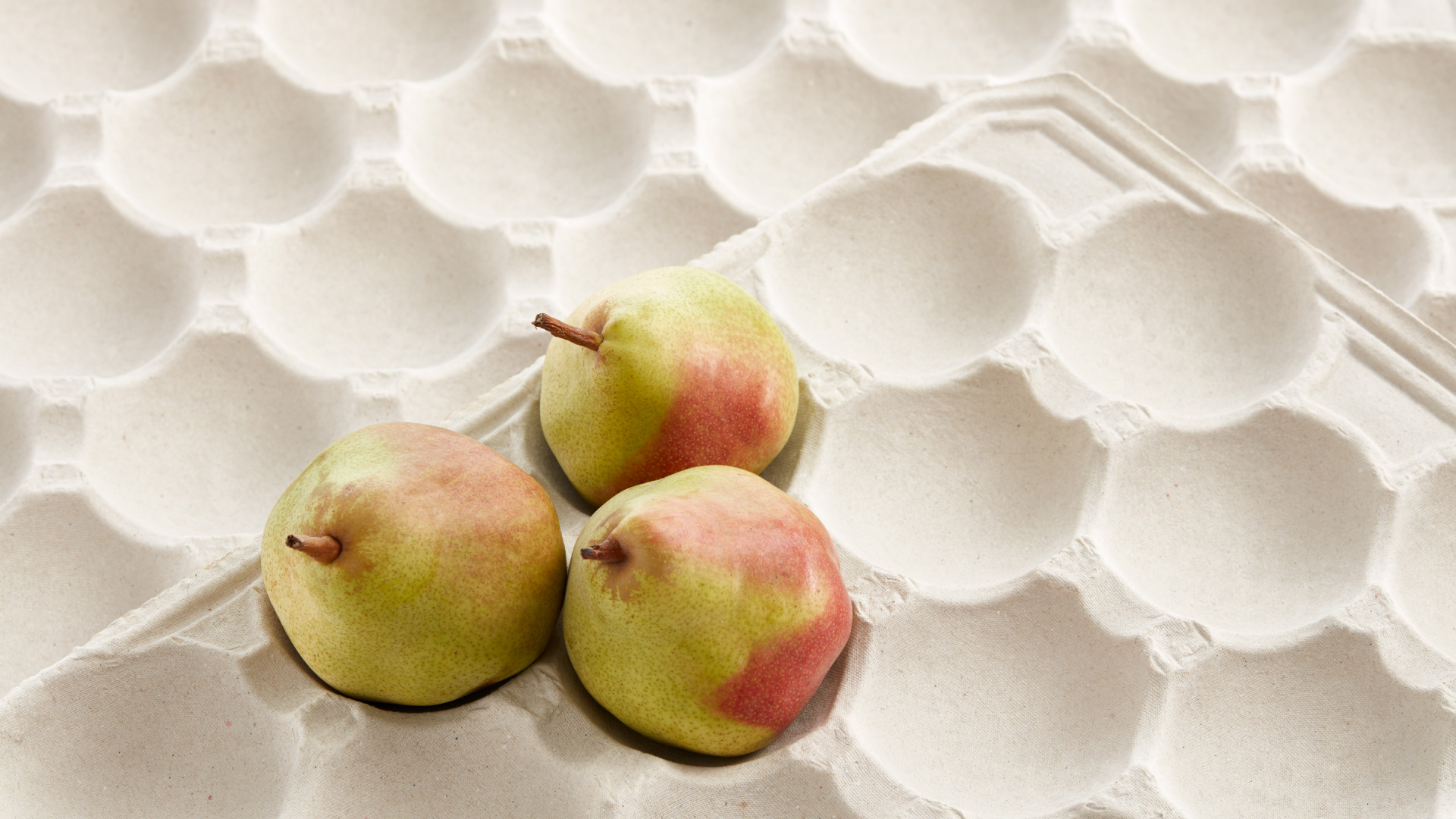
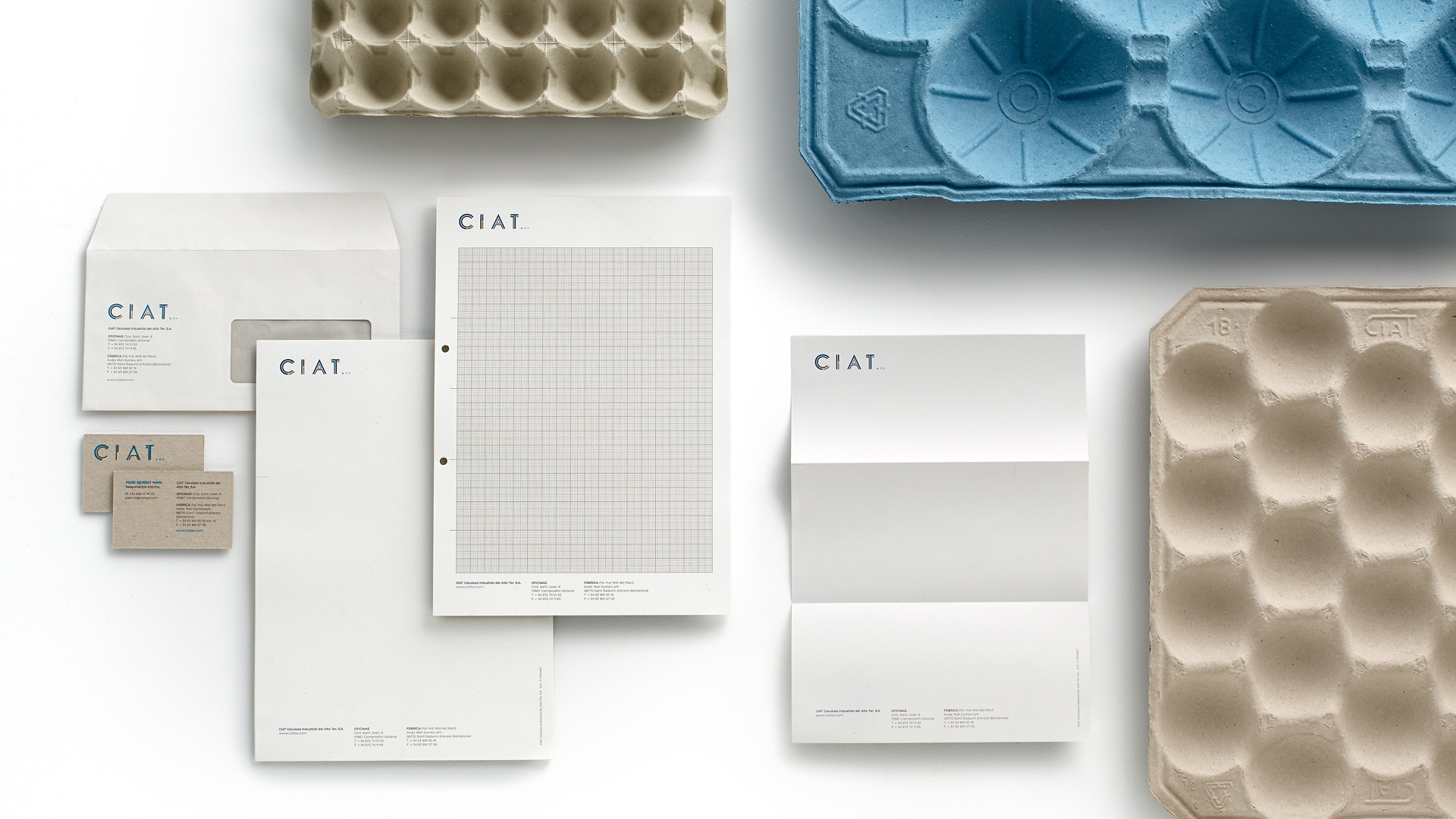
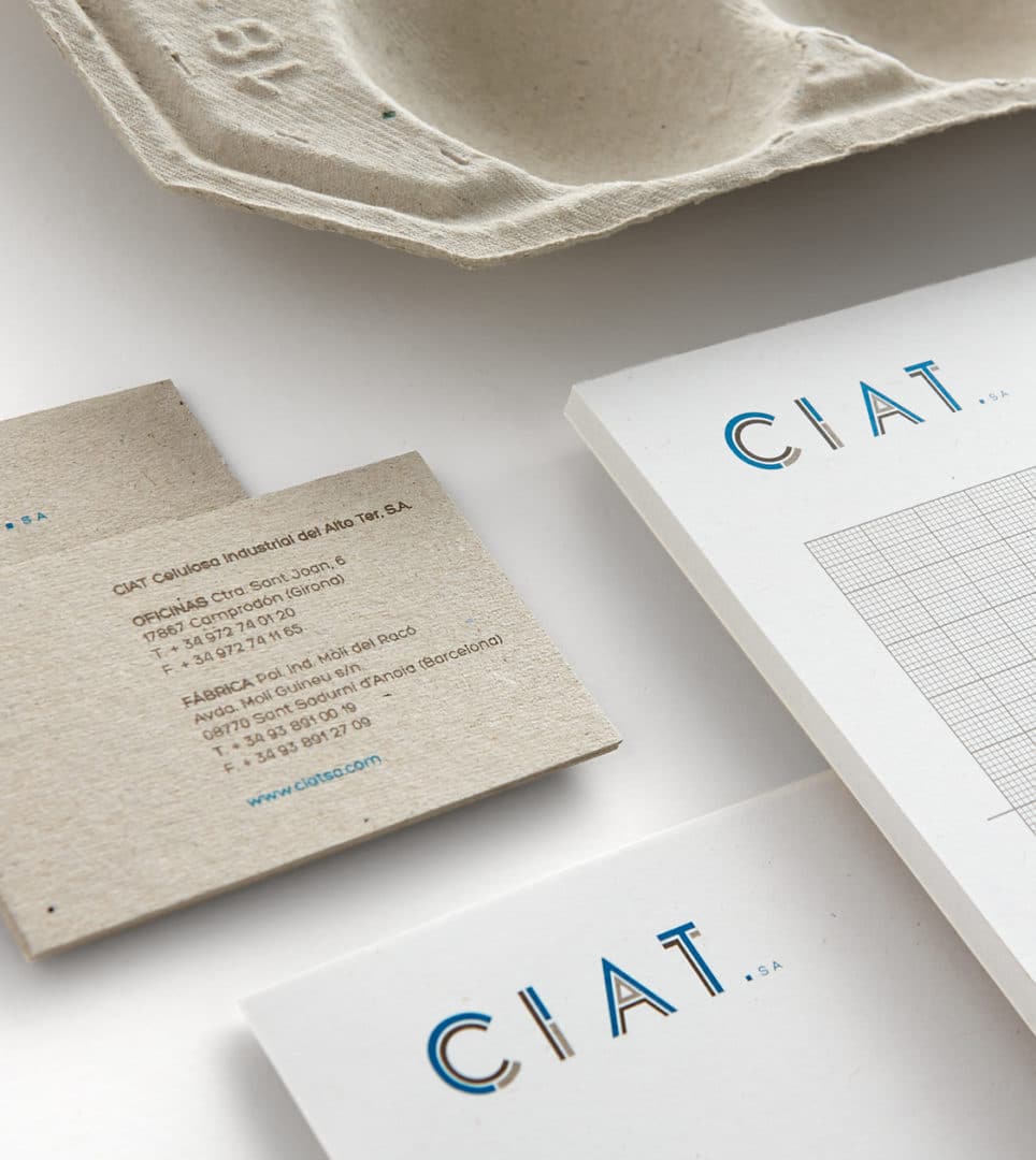
CIAT
Corporate branding
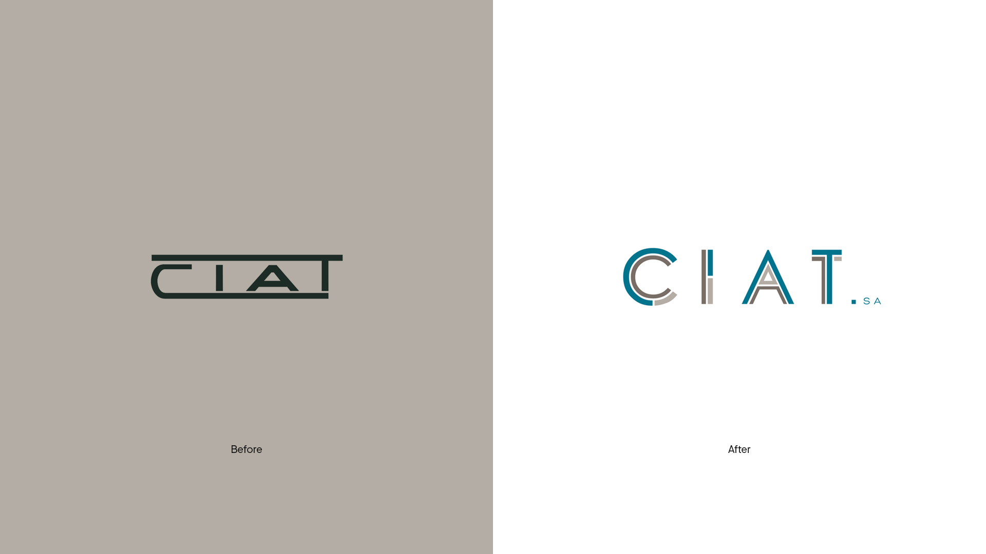
Redesign of the corporate branding of the 100 % sustainable brand Ciat, which develops, manufactures and markets molded cellulose products for the production of containers for the wine, fruit and poultry sectors. We designed a branding that highlights the versatility, flexibility and quality of the ecological material that characterizes the brand.