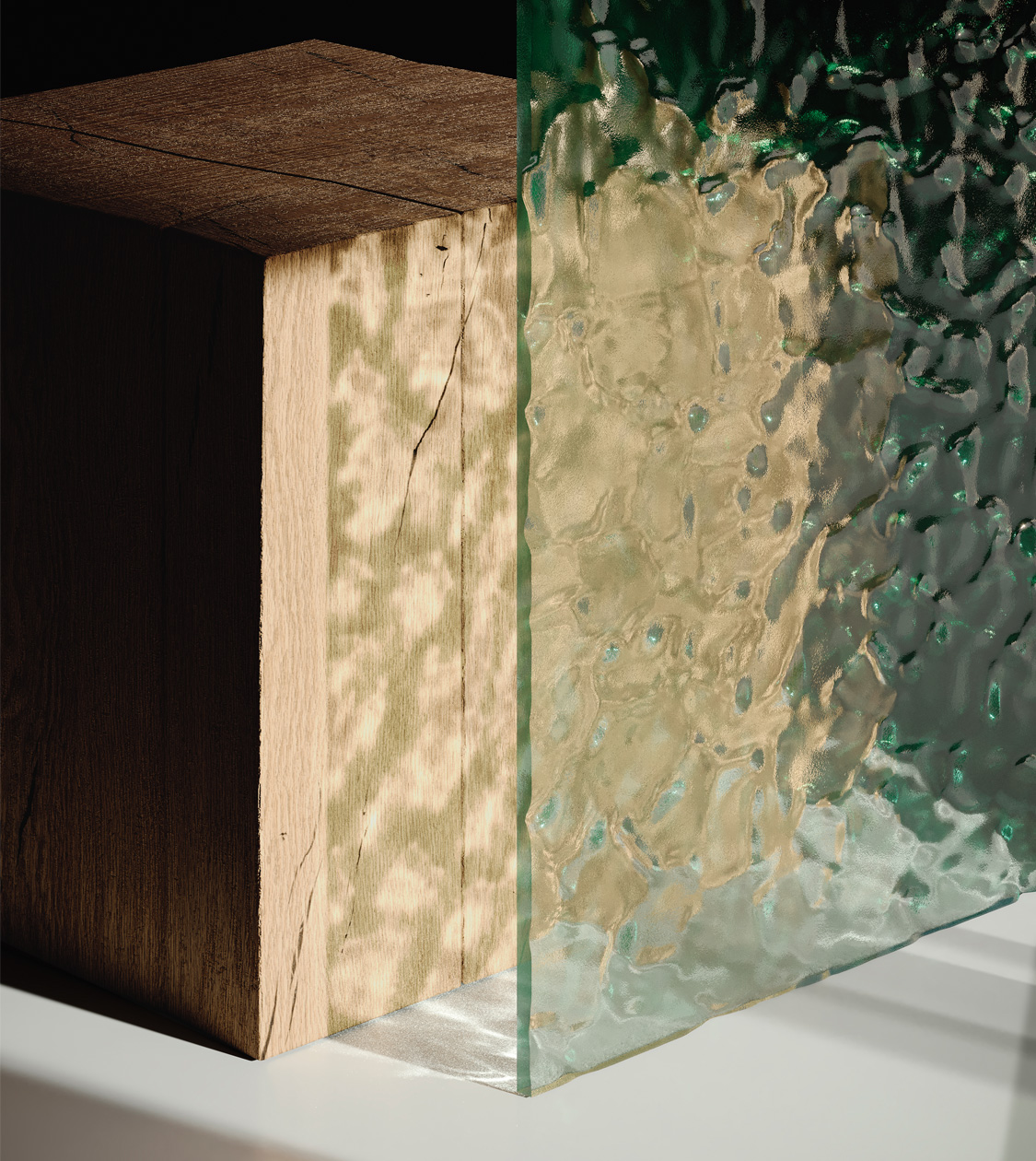
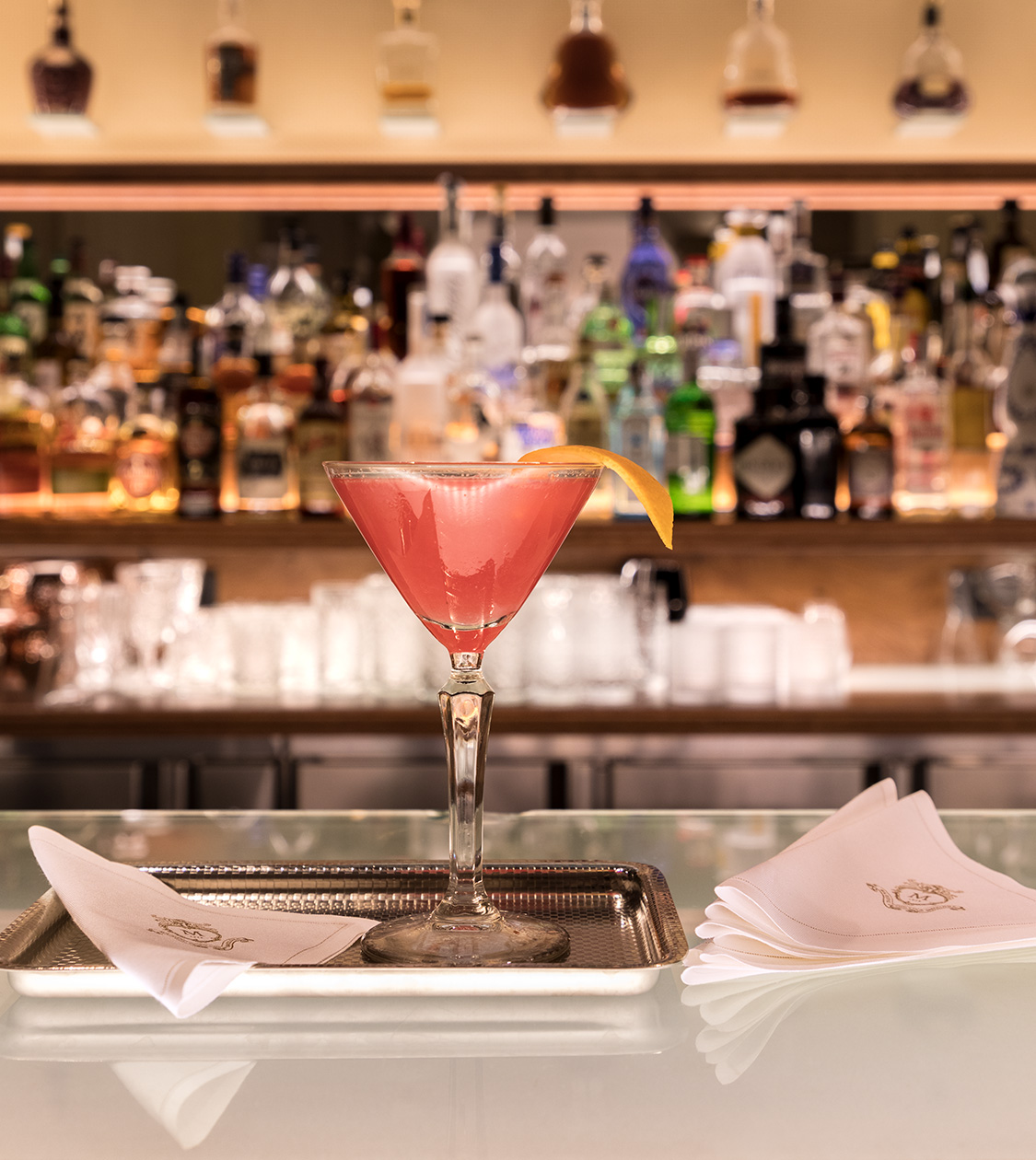
The collaboration between Kriskadecor and Nomon Design, on the process of analysing and redefining the brand and sharing values such as creativity and innovation, have been key to obtaining a new versatile identity with personality.


Services
Sector
Year
Client
CS
Project
Services
Sector
2026
/en/work/miquelrius-product-design-paper-lovers/
Miquelrius
We designed new graphic products for Miquelrius’ Paper Lovers Collection
Editorial Design
Communication
Product Design
Stationery & Accessories
We designed new graphic products for Miquelrius’ Paper Lovers Collection
Editorial Design
Communication
Product Design
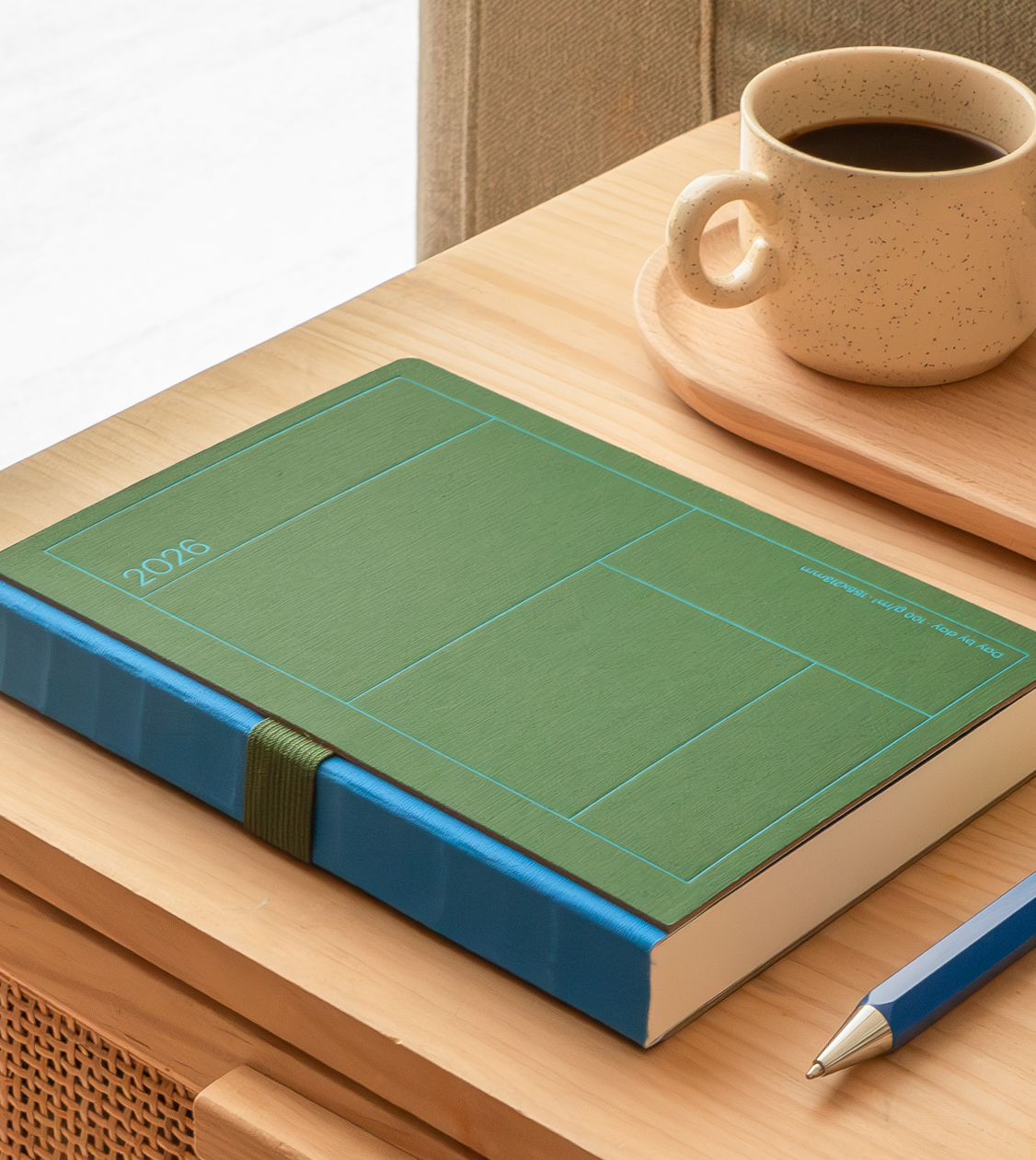
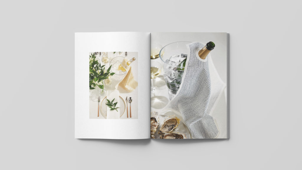
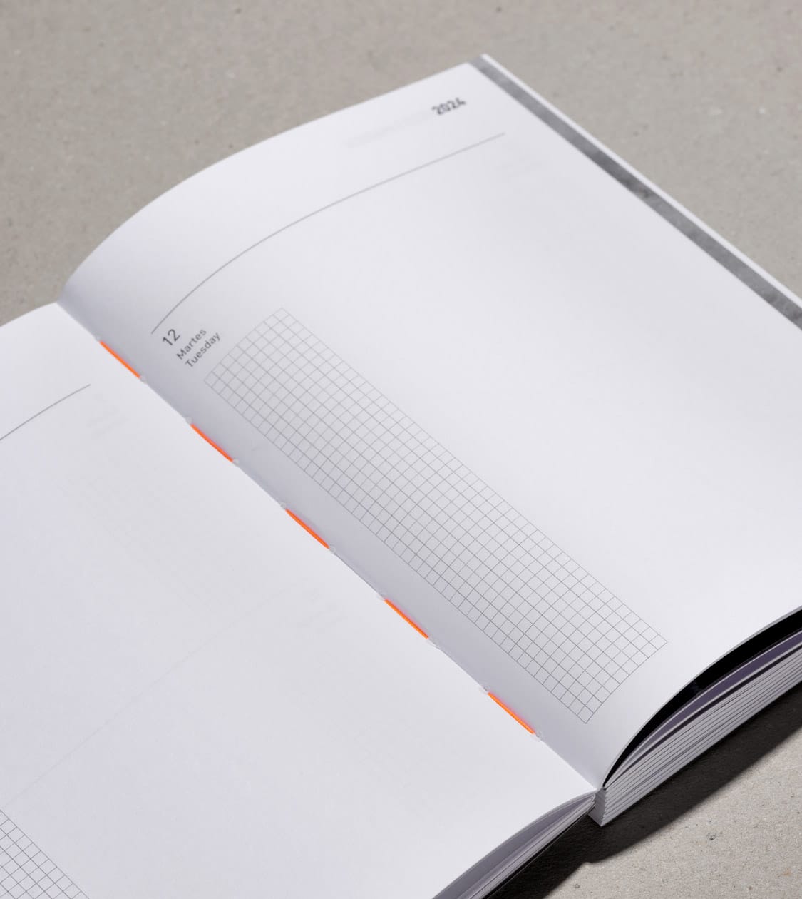
For the fourth consecutive year, we have collaborated with Miquelrius, a benchmark in the stationery sector, on the conceptualisation and design of products for its Paper Lovers collection. A line created for those who appreciate paper, design and attention to detail — where aesthetics and functionality are essential.
For the 25/26 season, the challenge was to take its evolution one step further by incorporating 54 new references into the catalogue. This expansion strengthens the collection’s identity, preserves its visual coherence and, at the same time, introduces variety and new usage solutions.
2026
/en/work/localizationlab-branding/
LocalizationLab
A new branding to project the true value of LocalizationLab
Branding Strategy
Corporate Branding
Communication
Digital Communication
Business
A new branding to project the true value of LocalizationLab
Branding Strategy
Corporate Branding
Communication
Digital Communication
With more than 25 years of experience in the language services sector, LocalizationLab had built a solid reputation based on excellence. However, in a highly competitive environment with strong international players, they needed a corporate branding that would help them stand out, build trust and position themselves as a leading linguistic partner.
The challenge was multifaceted: to update their verbal and visual identity, reorganise their service offering, and build a coherent narrative that would connect with their audiences — primarily SMEs undergoing internationalisation processes and technical departments within large corporations.
2025
/en/work/lc-paper-editorial-design-corporate-report/
LC Paper
We designed LC Paper’s corporate report — an editorial piece that goes beyond the Annual Report
Editorial Design
Communication
Sustainable companies
We designed LC Paper’s corporate report — an editorial piece that goes beyond the Annual Report
Editorial Design
Communication
In a highly technical sector, how can a corporate report become a true brand positioning tool? This was the challenge behind the project: to reflect LC Paper’s leadership in sustainability and innovation through an editorial piece that maintained clarity and technical rigour while conveying purpose, values, results and future vision.
LC Paper is a company with more than 140 years of history and over two decades committed to manufacturing the most sustainable paper products on the market. Its focus on zero emissions and the development of proprietary technology for the production of tissue, kraft and related paper products has positioned it as the first international manufacturer recognised as carbon neutral.
2025
/en/work/my-drap-product-design-christmas-2025/
MY DRAP
We designed the 2025 Christmas textile collection for My Drap
Communication
Product Design
Textile
Industry
We designed the 2025 Christmas textile collection for My Drap
Communication
Product Design
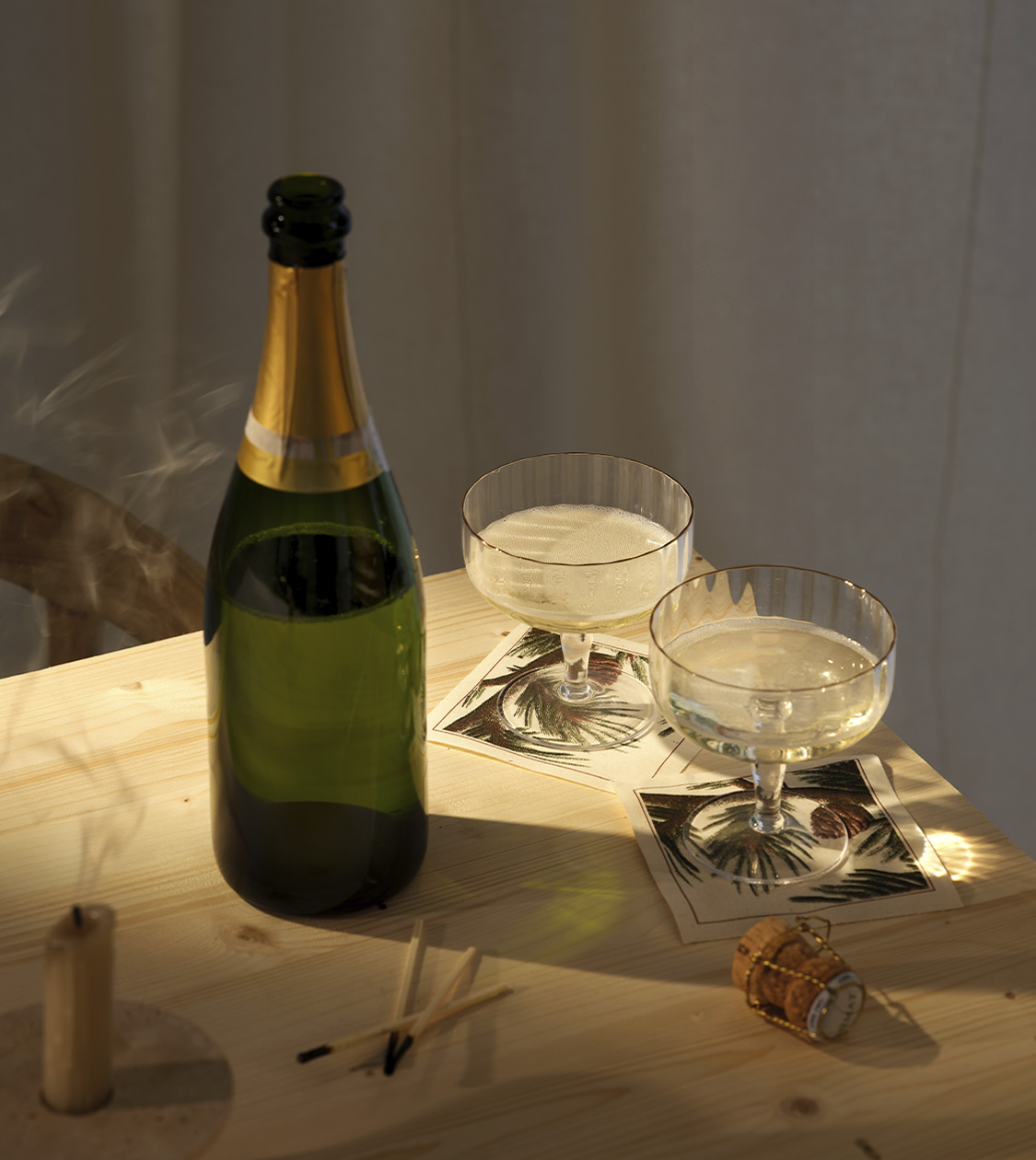
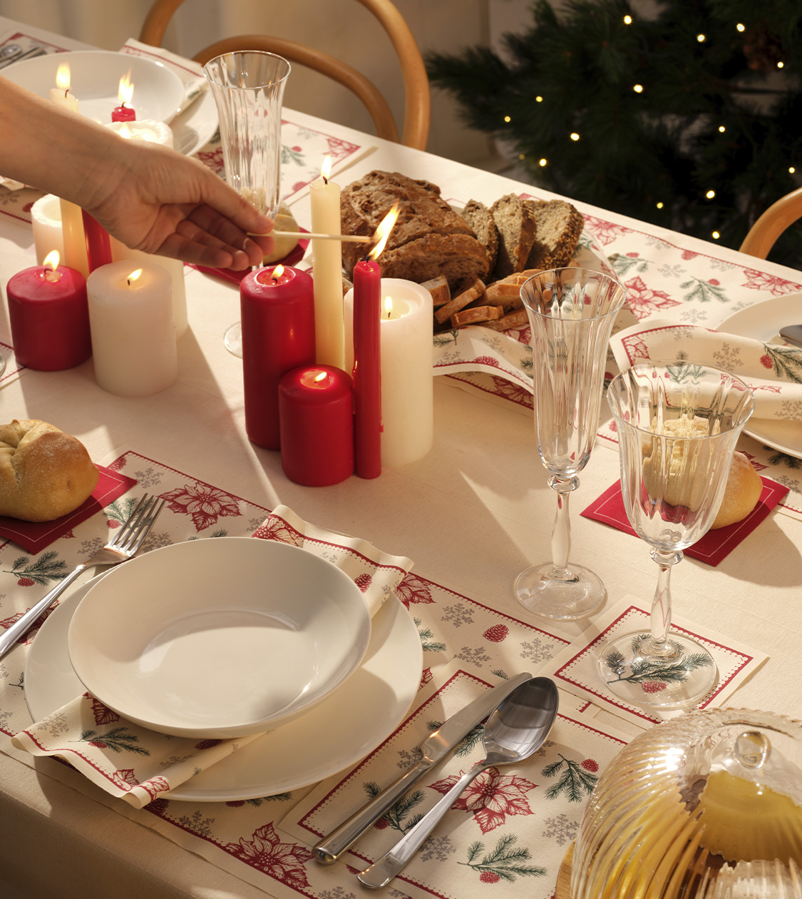
For the 2025 Christmas campaign, My Drap once again entrusted us with the design of its seasonal collection. The challenge was clear: to translate the brand’s attributes — sustainability, elegance and functionality — into a visual proposal that was diverse, emotional and commercially solid.
At NOMON DESIGN, as a branding agency specialised in strategic design, we took on the creative direction of the project and developed the graphic product design for the entire collection. The goal was not only to create attractive pieces, but to build four product lines with their own identity, coherent with one another and aligned with the brand’s positioning. Four ways of celebrating the season, all sharing the same brand essence.
2025
/en/work/casnova-branding/
Casnova
We created the branding for Casnova, a new business group committed to driving a safer future
Branding Strategy
Corporate Branding
Communication
Business
We created the branding for Casnova, a new business group committed to driving a safer future
Branding Strategy
Corporate Branding
Communication
In 2019, on the occasion of the company’s 40th anniversary, we supported Casmar through a key moment in its trajectory: the start of a generational transition in its management.
At the time, we developed a branding strategy that resulted in a renewed, professional and contemporary visual and verbal identity, respecting its legacy while looking towards the future.
That experience, and the results achieved, built a solid relationship of trust with Casmar, who once again chose us to face a new challenge: the creation of a new group brand symbolising a new phase of business maturity and innovation.
2025
/en/work/apli-group-product-design/
Miquelrius
Apli
We design new product ranges that strengthen APLI Group’s positioning in the sector
Branding Strategy
Corporate Branding
Product Design
Stationery & Accessories
We design new product ranges that strengthen APLI Group’s positioning in the sector
Branding Strategy
Corporate Branding
Product Design
For more than three decades, we have collaborated closely with Miquelrius, a benchmark brand with over 180 years of history in manufacturing stationery products. And since 2011, we have also supported APLI in its process of growth, diversification and repositioning. With more than 85 years of experience, APLI offers a wide range of functional, versatile and creative products, generation after generation.
Today, both brands form part of APLI Group, an international business group specialising in office and school supplies, present in over 80 countries, with 5 production centres, 6 subsidiaries and 7 own brands – APLI, APLI Kids, Miquelrius, Back2fun, Fabrisa, Agipa and Decadry.
2025
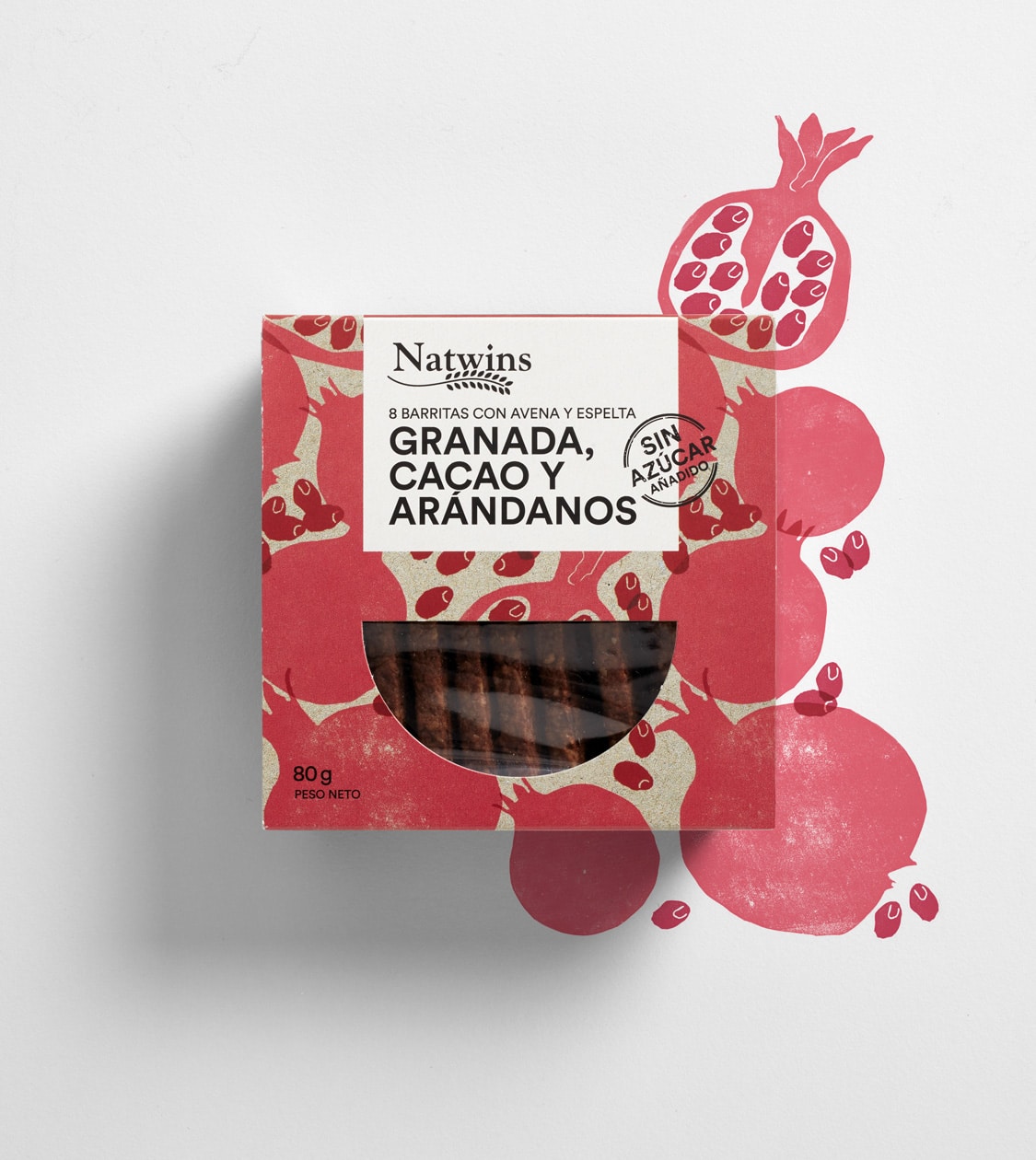
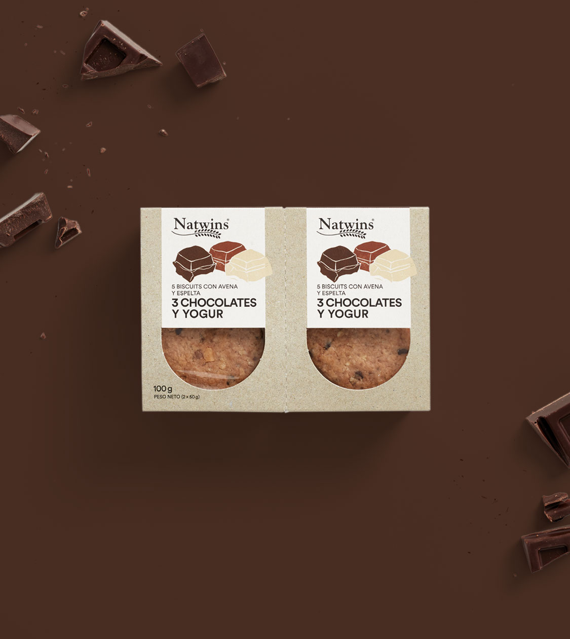
/en/work/natwins-new-packaging/
Natwins
New packaging for Natwins that makes an impact at point of sale and reflects its evolving brand
Corporate Branding
Packaging Design
Food & Drink
New packaging for Natwins that makes an impact at point of sale and reflects its evolving brand
Corporate Branding
Packaging Design

Since the beginning of our collaboration with Natwins by Girofibra in 2019 — a company based in La Garrotxa specialising in healthy biscuits and bars made from original recipes — we’ve supported the brand throughout its transformation process to gain greater visibility across all its channels.
During this time, we’ve redesigned its corporate branding to reflect its new purpose: to be bolder, more adventurous, and braver. We’ve also developed its digital communication and redesigned the packaging across its full product range.
This year, we carried out a new project: applying its renewed visual identity and narrative to the 160g format.
A larger format that not only expands the product universe but also rises to the challenge of becoming a key piece in strengthening the brand’s positioning in-store — particularly on the shelves of major supermarkets — as a reference in tasty, healthy and balanced biscuits.
2025
/en/work/bra-compac-pro-branding-packaging/
Bra
We defined the branding and packaging design for BRA’s Compac Pro collection
Corporate Branding
Packaging Design
Objects for living
We defined the branding and packaging design for BRA’s Compac Pro collection
Corporate Branding
Packaging Design
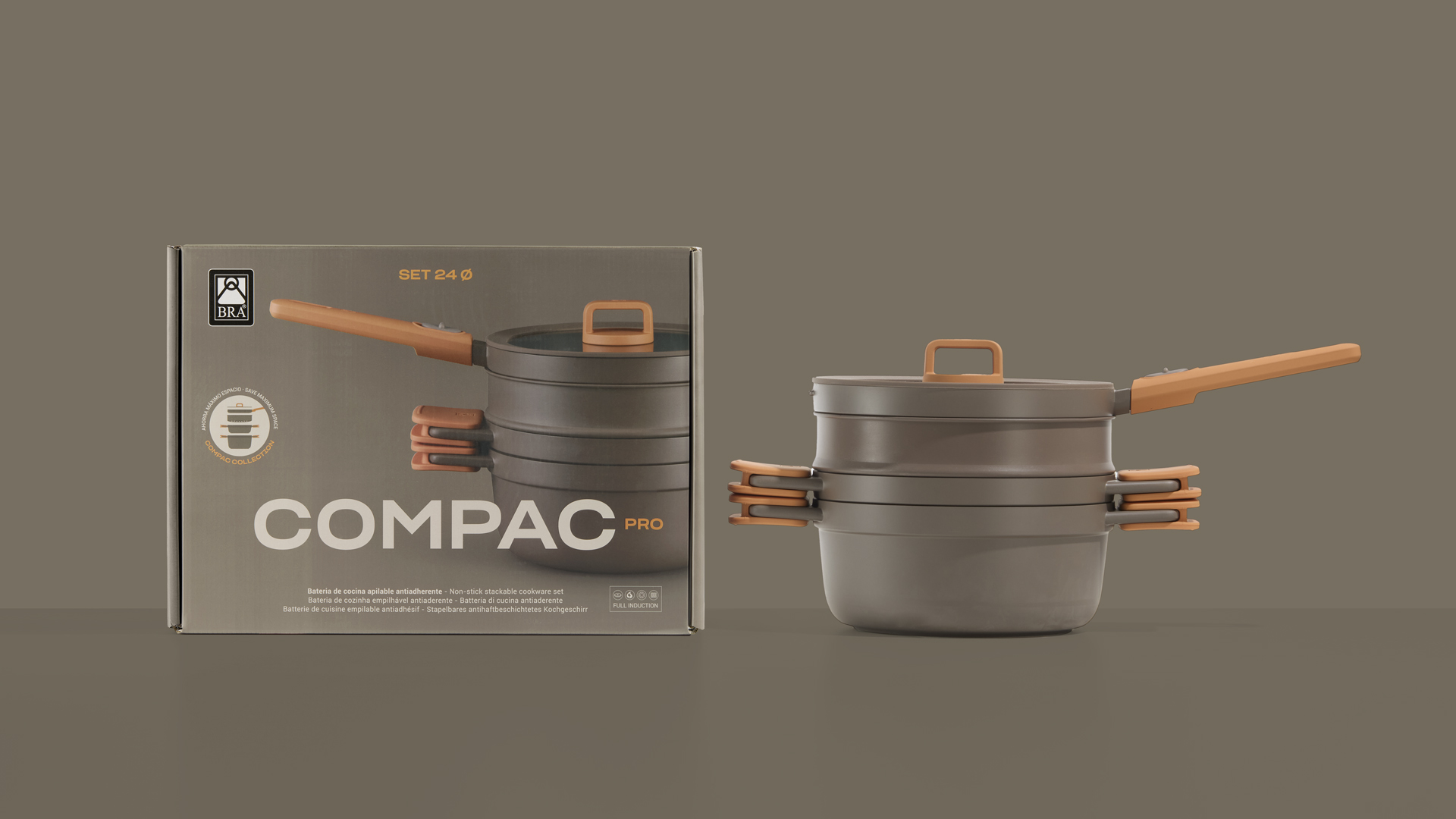
For years, we have supported BRA in the evolution and consolidation of its brand, building together a coherent universe that integrates aesthetics and functionality from a strategic perspective, reinforcing a strong positioning within the cookware sector.
With Compac Pro — the new collection created by Josep Lluscà — the challenge was to translate the product’s essential values into its branding and packaging: order, design, versatility and quality. A stackable system conceived to optimise kitchen space without compromising on performance or durability.
From naming to the development of the collection’s branding, art direction and packaging design, we conceptualised a comprehensive proposal capable of expressing clearly and directly its compact and professional character.
A project where strategy and design strengthen the identity of the new Compac Pro collection and connect with consumers seeking intelligent, long-lasting solutions for everyday use.
2025
/en/work/mescladis-digital-communication/
Mescladís
We applied Mescladís’ new Corporate Branding across its Digital Communication
Corporate Branding
Communication
Digital Communication
Food & Drink
Hospitality & Leisure
We applied Mescladís’ new Corporate Branding across its Digital Communication
Corporate Branding
Communication
Digital Communication
Once the new strategy and corporate identity of Mescladís, the Social Production Company, had been defined, the next step was to translate this new visual and conceptual universe into its digital environment.
Our challenge was to project its new identity as a social production company through digital communication that would integrate all its areas of activity under a single narrative. The goal was to create a digital experience coherent with the brand’s new positioning and with the concept that guides its purpose: “cuinant oportunitats”.
2025
/en/work/mescladis-branding/
Mescladís
CS
We repositioned the Mescladís brand: more opportunities, more inclusion, more impact
Branding Strategy
Corporate Branding
Editorial Design
Communication
Digital Communication
Sustainable companies
Hospitality & Leisure
We repositioned the Mescladís brand: more opportunities, more inclusion, more impact
Branding Strategy
Corporate Branding
Editorial Design
Communication
Digital Communication
We repositioned the Mescladís brand in line with its 2030 business plan, refining its branding strategy and identity to strengthen its presence as a benchmark in inclusion, training, and sustainability.
We designed a new circular brand architecture, restructuring its business areas to support sustainable growth. We redefined its positioning as a “social producer” and developed a new visual identity inspired by collage, symbolising diversity, inclusion, and transformation.
With this new approach, Mescladís has enhanced its brand perception, visibility, and recognition. With a unique and authentic message, the organisation can continue cooking opportunities for those who need it most, expanding its impact across more lives and communities.
2024
/en/work/drymelt-branding-strategy/
DryMelt (UIC)
Strategy and Corporate Branding for DryMelt — The Bioactive Innovation from the Bioengineering Institute of Technology at UIC
Branding Strategy
Corporate Branding
Packaging Design
Communication
Health & Beauty
Strategy and Corporate Branding for DryMelt — The Bioactive Innovation from the Bioengineering Institute of Technology at UIC
Branding Strategy
Corporate Branding
Packaging Design
Communication
In 2024, we collaborated with the Bioengineering Institute of Technology at UIC, an innovation centre dedicated to developing cutting-edge biotechnological solutions for the cosmetics and biomedical industries. Our challenge was to create the branding and communication strategy for DryMelt — a patented bioactive technology representing a scientific breakthrough in skincare.
This unique solution — solid, single-dose, water-soluble, and free from preservatives and microplastics — makes it possible to formulate natural, highly customisable products compatible with a wide range of active ingredients.
The main challenge was to position this disruptive technology within a constantly evolving market, where consumer demands revolve around preservative-free, microplastic-free, natural and sustainable products that deliver meaningful health results.
The key lay in communicating its distinctive value and competitive advantages to empower cosmetic brands to innovate and stand out with a solution that combines sustainability, high performance and a unique sensory experience.
2024
/en/work/lorena-canals-packaging-design/
Lorena Canals
We created the packaging system for Lorena Canals’ textile toy line
Packaging Design
Retail Branding
Games
Objects for living
We created the packaging system for Lorena Canals’ textile toy line
Packaging Design
Retail Branding
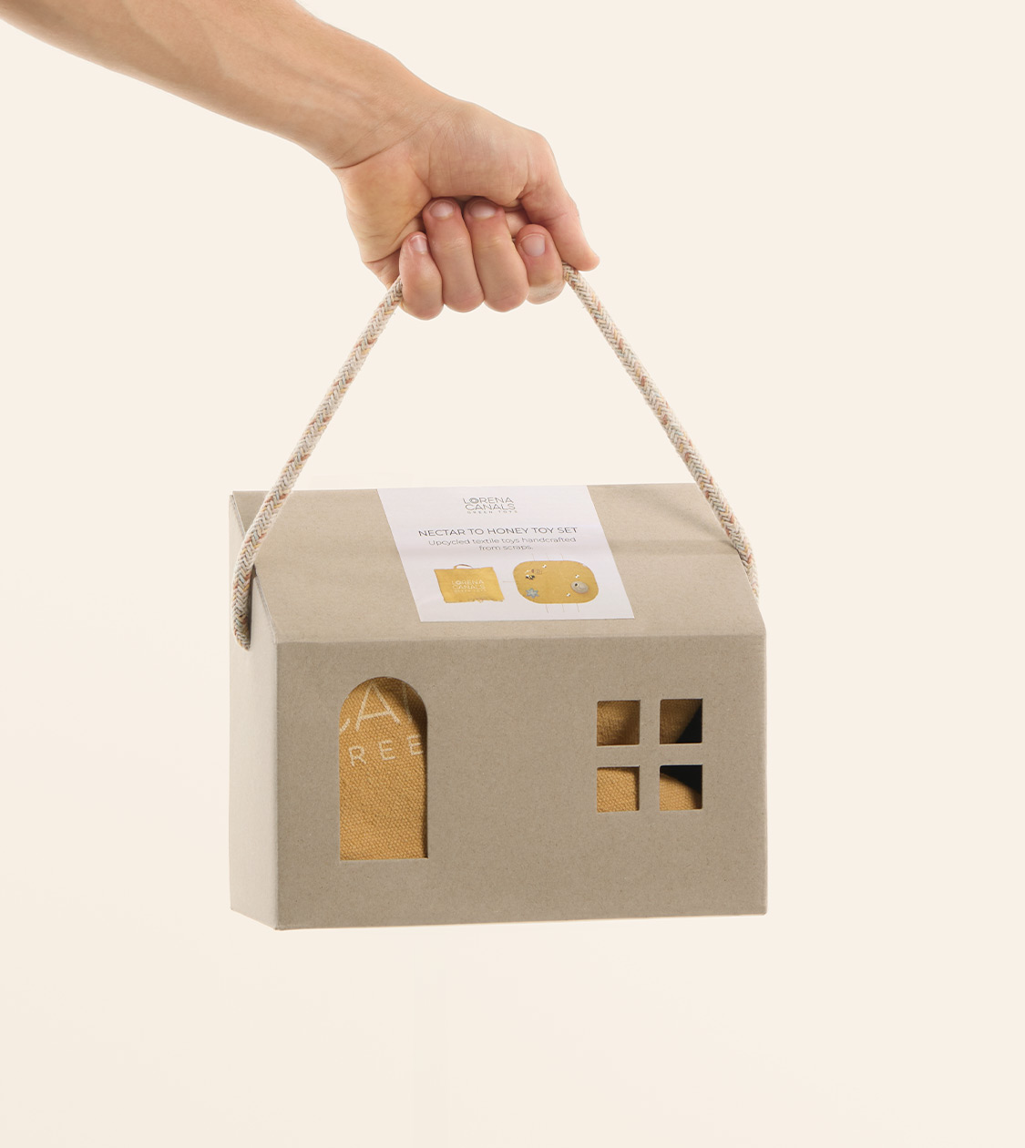

En 2024 iniciamos nuestra colaboración con Lorena Canals, una marca reconocida internacionalmente por sus alfombras y accesorios textiles lavables, elaborados a mano y con un fuerte compromiso con la sostenibilidad.
Con la ampliación de su universo hacia una línea de juguetes textiles, surgía un nuevo reto: desarrollar un sistema de packaging y exposición que unificara la comunicación visual en todos los puntos de contacto, desde tiendas físicas hasta su canal online.
El objetivo era crear un sistema que protegiera el producto, reforzara su valor y respetara la esencia de la marca: lúdica, delicada, cercana y artesanal.
2024
/en/work/cosmic-editorial-design/
Cosmic
We brought Cosmic’s new brand narrative to life in its main editorial piece
Editorial Design
Objects for living
We brought Cosmic’s new brand narrative to life in its main editorial piece
Editorial Design
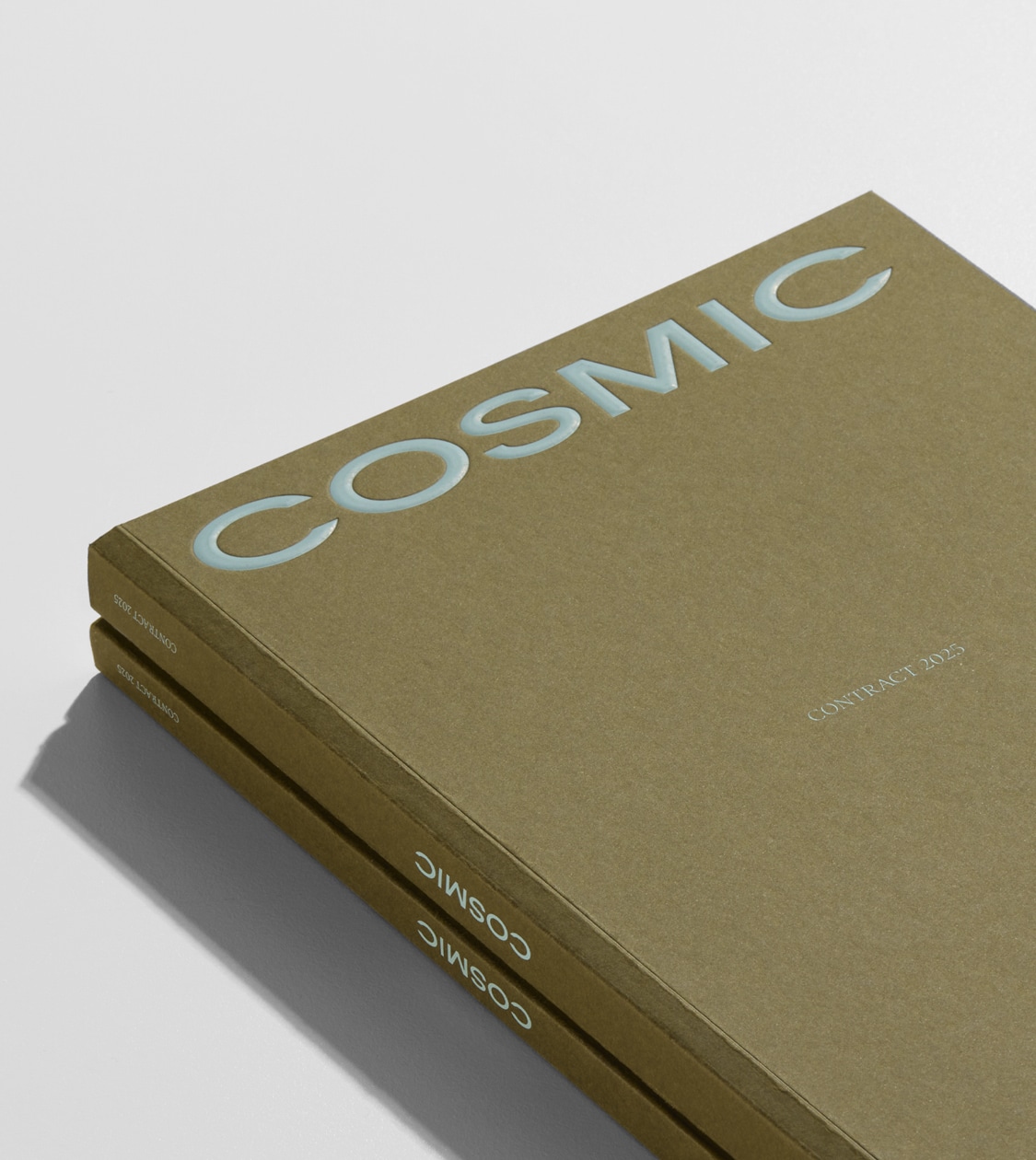
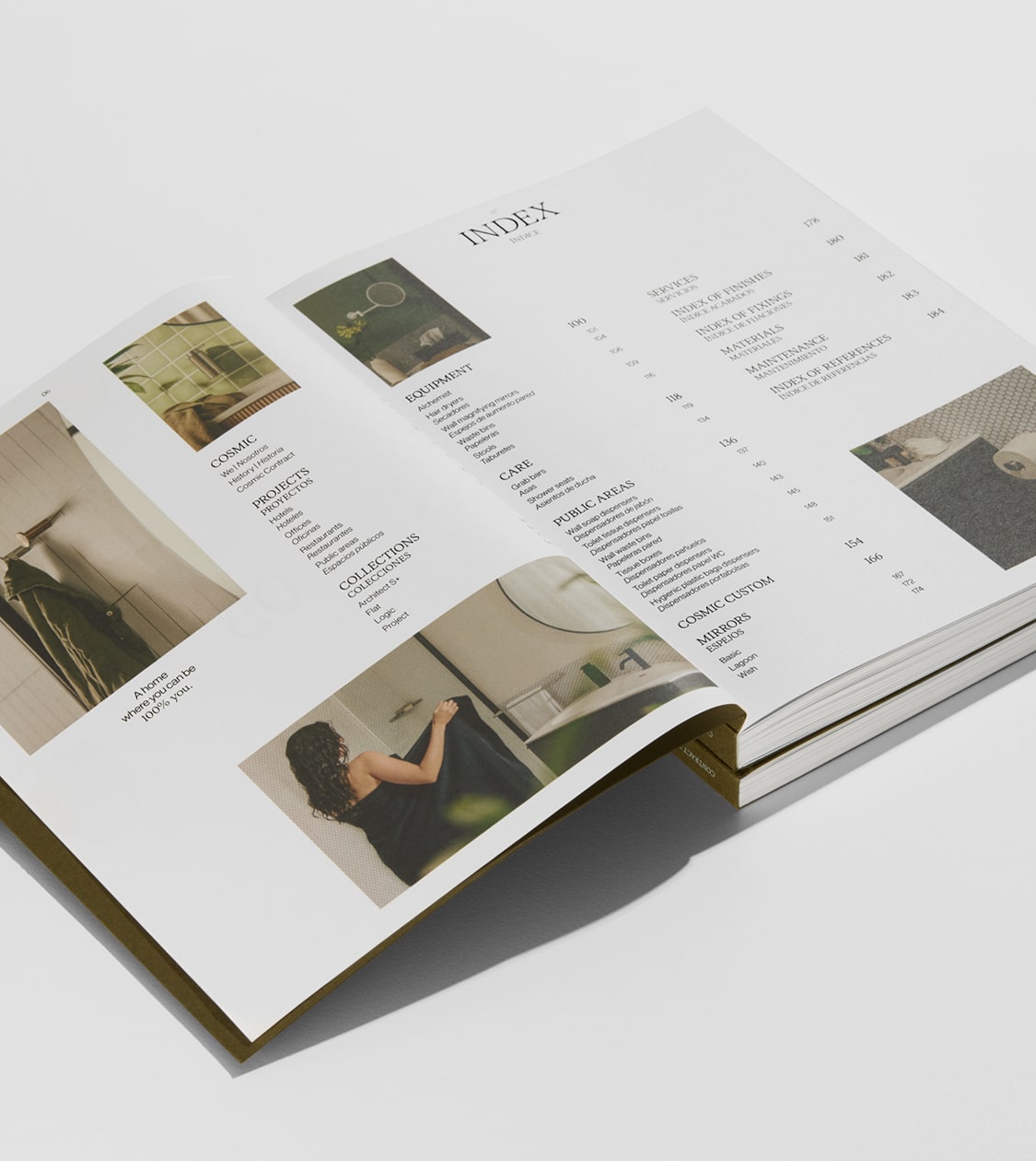
After carrying out the full rebranding of Cosmic — a leading brand in the design and manufacture of home design objects within the Roca Group — the next step was to translate its new positioning and identity into all communication materials, including its editorial content.
Cosmic’s new corporate branding had to be expressed clearly and consistently in its main editorial piece: the corporate and product catalogue. This catalogue needed not only to present and provide information about the product range, but also to connect with its target audience and convey the new brand purpose: “A home where you can be 100% you”. All of this through a more authentic, inspiring and approachable visual and editorial language.
2024
/en/work/cosmic-branding/
Cosmic
CS
A new brand repositioning for Cosmic to fully connect with its target audience
Branding Strategy
Corporate Branding
Packaging Design
Digital Communication
Industry
Objects for living
A new brand repositioning for Cosmic to fully connect with its target audience
Branding Strategy
Corporate Branding
Packaging Design
Digital Communication
At the end of 2023, NOMON DESIGN took on the challenge of supporting Cosmic, a leading brand in the design and manufacturing of home design objects under Grupo Roca, in its brand repositioning process.
Cosmic needed to evolve in order to connect more deeply with its target audience and reflect its new strategic approach.
Our challenge went far beyond redesigning their corporate identity or communication materials. It was an integral transformation that involved redefining their verbal and visual identity. We kept intact the elements that make Cosmic a unique brand, but adapted them to appeal to a millennial audience that values sustainability, functional design, and a balanced lifestyle.
2024
/en/work/texia-branding-strategy/
Texia
CS
10 years driving brand strategy and design for the TEXIA Group
Branding Strategy
Corporate Branding
Textile
10 years driving brand strategy and design for the TEXIA Group
Branding Strategy
Corporate Branding
Desde mediados de 2016 colaboramos con el grupo TEXIA, una empresa textil centenaria y familiar ubicada en Monistrol de Montserrat (Barcelona), con más de 85 trabajadores y una tecnología única que les permite comercializar los productos de sus marcas – MY DRAP, Roll Drap y Athos – en todo el mundo.
Nuestro reto ha consistido en convertir al grupo TEXIA y a sus marcas en referentes textiles globales en retail y hostelería. Para lograrlo, hemos reorientado el concepto y el diseño de sus productos hacia nuevas estrategias y un branding corporativo diferencial.
Un proyecto integral concebido para impulsar su crecimiento, diferenciándolos en el mercado con una voz propia y reconocible.
2024
/en/work/bangkok-spanish-design-week-2024-branding/
BSDW
We co-created the first edition of the Bangkok Spanish Design Week 2024, along with its branding and communication
Corporate Branding
Communication
Arts & Culture
We co-created the first edition of the Bangkok Spanish Design Week 2024, along with its branding and communication
Corporate Branding
Communication
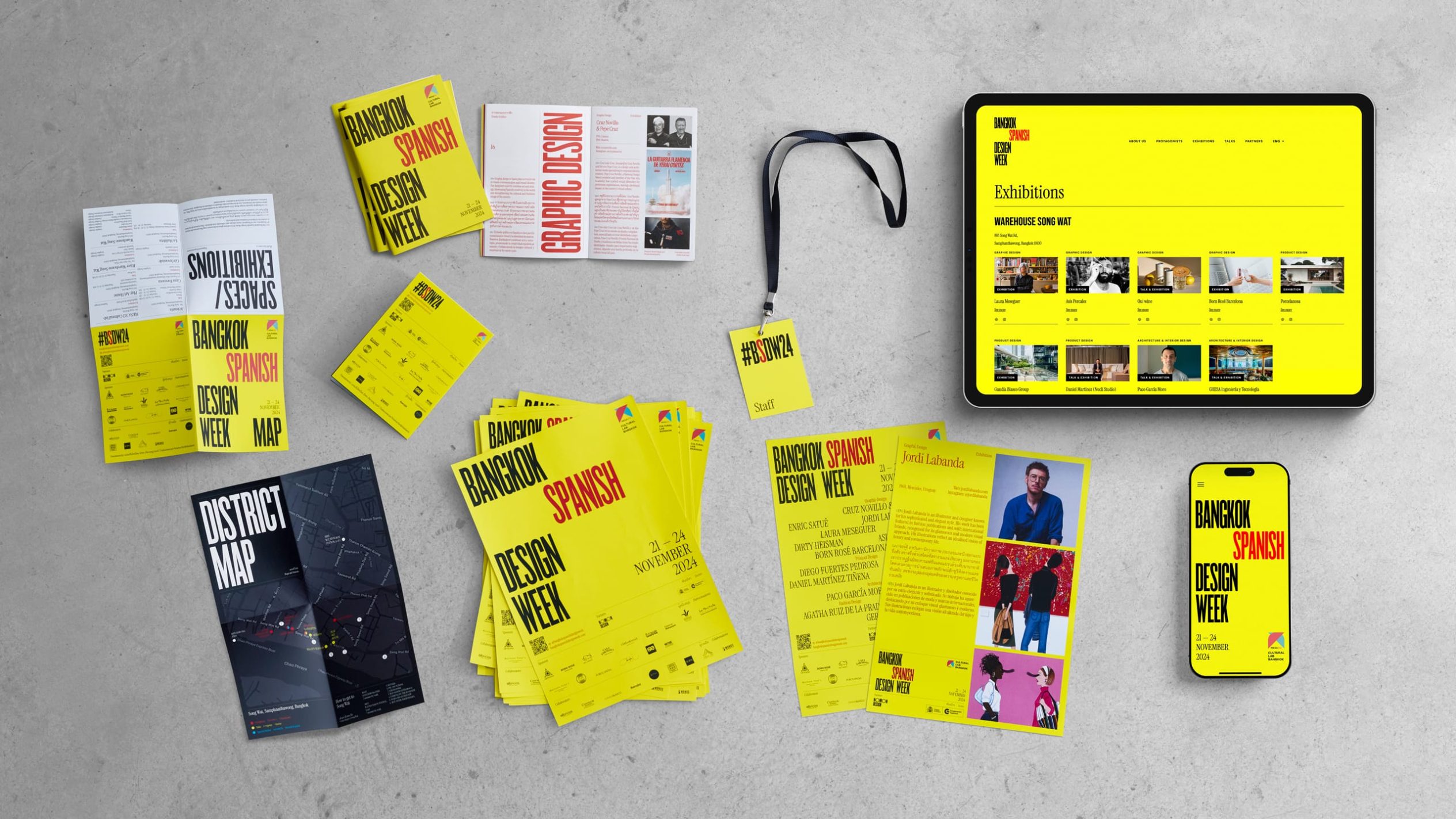
We co-created the first edition of the Bangkok Spanish Design Week 2024 (BSDW24), an event aimed at celebrating the excellence of Spanish design and fostering cultural exchange between Spain and Asia.
This first edition, held from 21 to 24 November 2024 in the emblematic Chinatown district of Bangkok, was conceptualised, created, and organised in collaboration with MESA312 Cultural Lab Bangkok and with the support of the Spanish Embassy in Thailand.
At NOMON DESIGN, we took on the challenge of co-creating the event, as well as its visual identity, narrative and communication.
2024
/en/work/dasbi-branding/
Dasbi
CS
We created the corporate branding for Dasbi, a brand that aims to be the foundation of creativity in pastry
Branding Strategy
Corporate Branding
Packaging Design
Communication
Digital Communication
Food & Drink
Industry
We created the corporate branding for Dasbi, a brand that aims to be the foundation of creativity in pastry
Branding Strategy
Corporate Branding
Packaging Design
Communication
Digital Communication
In 2024, we carried out a very special project due to our long-standing personal relationship with André and Toni, the entrepreneurs behind Dasbi, a small company based in Olot that manufactures wooden cake bases.
Born in 2020 in a small garage in Sabadell, near Barcelona, Dasbi produces robust and customisable wooden cake bases, ideal for enhancing pastry creations and reinforcing the brand identity of its clients.
Our challenge was to create a distinctive brand identity capable of emotionally connecting with its current target audience—women aged 30 to 45, creative pastry chefs who work from home or run small bakeries—while at the same time projecting the brand towards future targets and markets, such as professional pastry schools and international distributors.
2024
/en/work/mydrap-professional-texia-digital-communication/
MY DRAP
We redesigned MY DRAP Professional’s Digital Communication to showcase the potential of their textile products
Digital Communication
Industry
Textile
We redesigned MY DRAP Professional’s Digital Communication to showcase the potential of their textile products
Digital Communication
MY DRAP Professional, a leader in textile innovation for restaurants, hotels, events, airlines, trains, and cruises, needed to update its digital presence to reflect its leadership position and align with its commercial strategy.
Our challenge was to create a web design that enhanced the brand and its customized textile solutions, highlighting the quality and innovation of its products and improving the experience for professional users.
2024
/en/work/branding-athos-fabrics/
Athos Fabrics
CS
Repositioning the branding strategy of Athos Fabrics to propel its future with Texia
Branding Strategy
Corporate Branding
Editorial Design
Digital Communication
Industry
Textile
Repositioning the branding strategy of Athos Fabrics to propel its future with Texia
Branding Strategy
Corporate Branding
Editorial Design
Digital Communication
In 2023, Grupo Texia acquired Athos Fabrics, a company based in Alcoy with over 30 years of experience in the artisanal production of textile tablecloths for haute cuisine. This acquisition was part of their business growth strategy focused on creating industrial and manufacturing synergies.
Athos Fabrics not only strengthens Texia’s market position but also diversifies its offerings and allows for expansion into new segments and markets, thereby enhancing the competitiveness of both companies.
Texia once again entrusted us to lead this significant project. Our challenge was to review and develop the branding strategy, corporate branding, and current product portfolio of Athos Fabrics, aligning them with the brand values and business strategy of the Grupo Texia.
2024
/en/work/iconika-pharmacies-branding/
Farmacias Iconika
We transformed Xarxafarma into Iconika – a community of forward-thinking pharmacies committed to people’s wellbeing
Branding Strategy
Corporate Branding
Packaging Design
Communication
Health & Beauty
We transformed Xarxafarma into Iconika – a community of forward-thinking pharmacies committed to people’s wellbeing
Branding Strategy
Corporate Branding
Packaging Design
Communication
Throughout 2024, we supported the Fedefarma team in the strategic redefinition and redesign of Xarxafarma — a network of pharmacies offering their members the tools needed to enhance competitiveness and profitability.
Our challenge was to define its new positioning and to conceptualise and develop a strong brand identity aligned with its values — one that ensures consistent communication and effective connection with both professional audiences (B2B) and end consumers (B2C).
To achieve this, we worked on revising the branding strategy, defined a distinctive and memorable new name, and created a visual identity that would establish Iconika as an innovative, trustworthy brand with the ability to lead and create impact within the pharmaceutical sector.
2024
/en/work/textil-blanca-1941-branding/
Textil Blanca 1941
CS
We developed a new branding strategy for the Textil Blanca 1941 Group – honest textile solutions for rest and wellbeing
Branding Strategy
Corporate Branding
Packaging Design
Communication
Digital Communication
Textile
Industry
We developed a new branding strategy for the Textil Blanca 1941 Group – honest textile solutions for rest and wellbeing
Branding Strategy
Corporate Branding
Packaging Design
Communication
Digital Communication
In 2023, we began our collaboration with Textil Blanca 1941, a company based in Olot (Girona) with more than 80 years of experience manufacturing textile products for rest, sold in over 50 countries.
With facilities spanning more than 5,000 m² — including a manufacturing plant, logistics centre, and R&D hub — the company offers a product range based on innovation, quality, and a strong commitment to the environment and society. Its team of 150 professionals combines expertise and technology to develop high-level textile protection and comfort solutions.
At the time, the company was undergoing an internal reorganisation of its brand structure with the goal of maximising its production and commercial potential.
The rest textile sector is a complex and saturated market, where the lack of differentiation and inconsistency in brand messaging often leads to consumer confusion. Information overload and similar offerings make choosing the right product a challenge.
Our task was to conduct a thorough process of analysis and reflection to address these challenges, which led to a redefinition of the brand architecture, the development of an integrated branding strategy that ensured coherence and differentiation, and the creation of a new commercial brand.
2024
/en/work/happy-belly-barcelona-branding/
Happy Belly
We redesigned the branding of Happy Belly Barcelona, promoting a healthy lifestyle in the fashion world
Corporate Branding
Textile
We redesigned the branding of Happy Belly Barcelona, promoting a healthy lifestyle in the fashion world
Corporate Branding
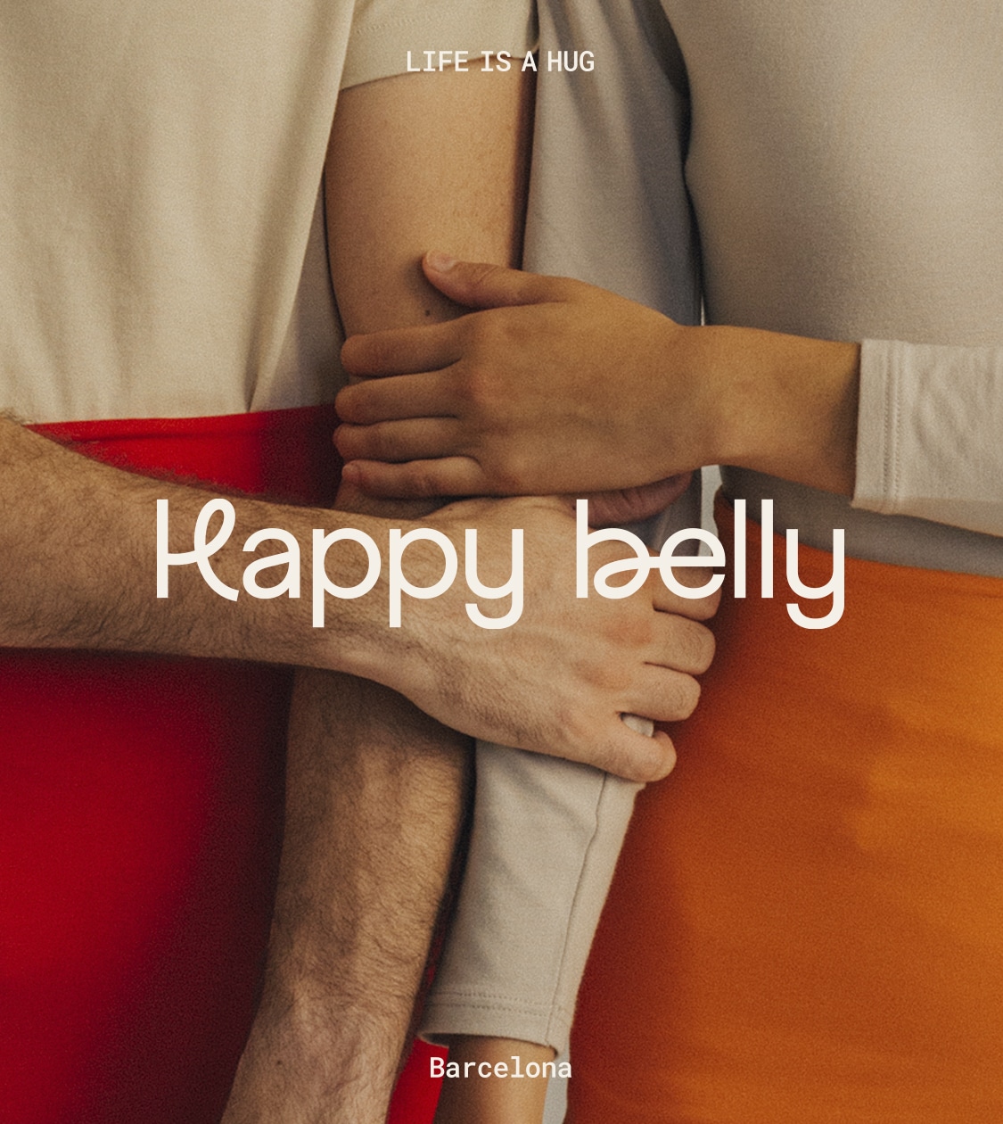
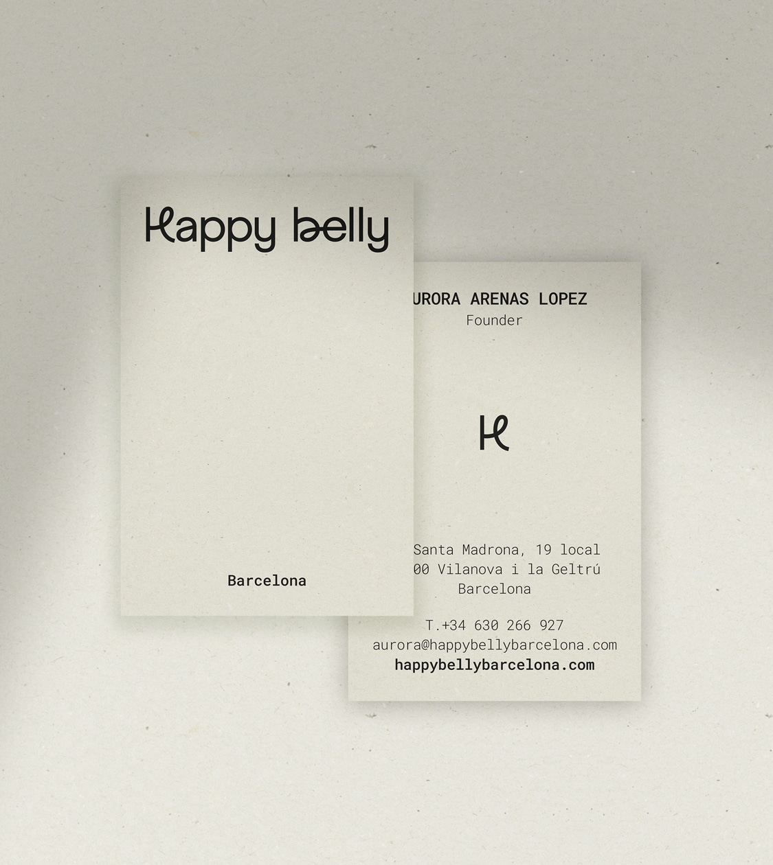
Happy Belly Barcelona is a brand that revives ancestral wellness traditions and updates them with a cosmopolitan and responsible design approach. Its flagship product is the haramaki, a garment inspired by Japanese culture that wraps the abdomen and lower back, providing comfort and health benefits.
The mission of Happy Belly Barcelona is to create garments that promote a healthy, comfortable and original lifestyle, using sustainable materials and working with local workshops. The aim: to achieve ethical production with a positive impact on people and the environment.
2024
/en/work/diedric-design-branding/
DIEDRIC DESIGN
We created the branding for DIEDRIC DESIGN, a new commercial space design company
Branding Strategy
Corporate Branding
Digital Communication
Retail Branding
Business
We created the branding for DIEDRIC DESIGN, a new commercial space design company
Branding Strategy
Corporate Branding
Digital Communication
Retail Branding

In 2023, Eduard Ribes, a professional with 20 years of experience in interior design for the food retail sector, embarked on a new chapter by founding his own company.
At NOMON DESIGN, we guided him through the entire process of defining and creating his new brand, from strategy to corporate branding, including the design of all communication materials.
For several months, we worked to ensure that the branding reflected the essence and values of his new company: experience and expertise, design, service, and commitment, and above all, teamwork.
2024
/en/work/miquelrius-product-design-slow-down-puzzles/
Miquelrius
We’ve crafted Miquelrius’ new range of adult products, Slow Down Puzzles
Packaging Design
Product Design
Games
We’ve crafted Miquelrius’ new range of adult products, Slow Down Puzzles
Packaging Design
Product Design
After conceptualizing and developing Miquelrius’ NOT BORING GAMES board game range, we’re once again collaborating with the company to create their first puzzles for adults, which we’ve defined and named: Slow Down Puzzles.
At NOMON, our aim was for these 1000-piece puzzles not only to entertain and challenge users but also to encourage them to disconnect from daily life and immerse themselves in an activity that promotes tranquility and focus, whether done individually or with family.
2024
/en/work/miquelrius-branding-notebook-collection/
Miquelrius
We’ve revamped the branding for Miquelrius’ Notebook collection
Corporate Branding
Digital Communication
Product Design
Stationery & Accessories
We’ve revamped the branding for Miquelrius’ Notebook collection
Corporate Branding
Digital Communication
Product Design
Back in 2019, we introduced the Emotions notebook collection to celebrate the 30th anniversary of Miquelrius’ first notebook. Miquelrius, a renowned brand in stationery products with over 180 years of experience, saw this collection as an opportunity to innovate.
The collection was known for its covers in vibrant, fresh tones, offering users the freedom to choose a model that resonated with their personal style or current phase of life.
When designing the collection, we took into consideration the prevailing trends and preferences of the target audience at that time. However, as time passed, this audience evolved. Consequently, NOMON proposed a redesign of the collection to better align with the current audience’s tastes and preferences.
2024
/en/work/miquelrius-product-writing/
Miquelrius
We design the new Miquelrius product collections for paper and writing enthusiasts
Product Design
Stationery & Accessories
We design the new Miquelrius product collections for paper and writing enthusiasts
Product Design
Each season, for over 20 years now, we have conceptualised and designed Miquelrius’s new product collections. We create these products with the same passion for quality, innovation, and commitment to sustainability that has defined the company for more than 180 years.
For 2024, we have designed new products and collections aimed at people who love paper, take pleasure in the act of writing or drawing by hand, and value design and material quality.
2023
/en/work/miquelrius-sustainable-agendas-ecoalf/
Miquelrius
Expanding the “Ecoalf powered by Miquelrius” collection with new sustainable products for eco-conscious consumers
Editorial Design
Product Design
Stationery & Accessories
Sustainable companies
Expanding the “Ecoalf powered by Miquelrius” collection with new sustainable products for eco-conscious consumers
Editorial Design
Product Design
Embarking on a triple collaboration with Ecoalf + Miquelrius + NOMON DESIGN, we continue to add new sustainable products to the “Ecoalf powered by Miquelrius” collection, which already features backpacks, pencil cases, and notebooks crafted from recycled and recyclable materials.
This time, we’re expanding the collection by introducing a new range of notebooks and their inaugural agenda collection.
2023
/en/work/fluxua-branding/
Fluxua
Branding to convey the values of a new online psychological clinic
Corporate Branding
Health & Beauty
Business
Branding to convey the values of a new online psychological clinic
Corporate Branding
We’ve outlined the branding strategy, conceptualised, and designed the corporate branding for FLUXUA, a novel online psychological clinic. Through personalised psychological therapies facilitated by top professionals, FLUXUA guides its patients towards improving their emotional well-being.
Our challenge was to develop a strategy and design branding that effectively communicates how an online psychological clinic can provide its patients with the same level of quality and professionalism as in-person psychotherapy, all while offering the convenience and accessibility that technology brings.
2023
/en/work/regarde-le-ciel-corporate-branding/
Regarde Le Ciel
An elegant and contemporary corporate branding to help them step even further
Branding Strategy
Corporate Branding
Packaging Design
Industry
Textile
An elegant and contemporary corporate branding to help them step even further
Branding Strategy
Corporate Branding
Packaging Design
Our challenge was to revamp the corporate branding of Regarde Le Ciel for a new phase, where they continue their commitment to accompanying their consumers’ steps for as long as possible.
Regarde Le Ciel is an international company, spanning approximately 30 countries, renowned for its responsible design and manufacturing of timeless, functional, and high-quality leather footwear using the finest raw materials.
Regarde Le Ciel products are distinguished by their craftsmanship, utilizing premium materials like soft leather. Their designs are celebrated for their classic elegance with a touch of contemporary aesthetics.
2023
/en/work/mydrap-texia-art-direction-vasos-agua-clara/
MY DRAP
We’ve crafted the art direction for MY DRAP to showcase its spring-summer collections
Communication
Industry
Textile
Hospitality & Leisure
We’ve crafted the art direction for MY DRAP to showcase its spring-summer collections
Communication
Since 2017, we’ve been at the helm of MY DRAP’s branding journey, from product design to shaping its digital presence. To ensure MY DRAP’s audience experiences the perfect colors, patterns, and textures for the season, we orchestrated a collaborative photoshoot with LOS VASOS DE AGUA CLARA (VAC), a Barcelona-based artisanal brand known for its hand-painted glassware.
2023
/en/work/zoo-barcelona-communication/
Zoo de Barcelona
CS
VIU Barcelona Biodiversity Centre, new brand repositioning strategy and communication campaign
Branding Strategy
Communication
Digital Communication
Arts & Culture
VIU Barcelona Biodiversity Centre, new brand repositioning strategy and communication campaign
Branding Strategy
Communication
Digital Communication
We won the competition to define Zoo de Barcelona’s new brand repositioning strategy
In 2019, the Barcelona City Council unanimously approved the New Zoo Model, a roadmap that paves the way for Zoo de Barcelona’s transformation into a center actively contributing to the preservation of global biodiversity. By doing so, Zoo de Barcelona joins the ranks of leading centers and zoos worldwide that are taking action against the climate crisis and the human activities that are severely impacting our planet’s biodiversity.
Built on three central pillars – biodiversity conservation, scientific research, and education and awareness – the new Zoo de Barcelona aims to become a hub for all those who want to actively participate in preserving the planet’s biodiversity.
2023
/en/work/lekue-communication-less-is-more/
Lékué
Lékué’s “Less is More” communication campaign
Communication
Objects for living
Industry
Lékué’s “Less is More” communication campaign
Communication
It’s a well-known fact that electromagnetic waves have taken over our kitchens and revolutionised our lives. But do you know the exact multitude of benefits that microwave cooking brings? Lékué does, and they want to share it with you through their latest communication campaign.
A study conducted by the Diopma Centre at the University of Barcelona concludes that, compared to other cooking methods, using Lékué microwave utensils means savings in energy, money, and time. Moreover, the food retains its essential vitamins and minerals while preserving its delicious flavour.
We understand that delving into a report can be extremely tedious, and we don’t want to put you through that. So, with this communication campaign, our aim is to present the results in a clear and understandable manner. Most importantly, we want to highlight the direct impact that this triple saving has on our daily lives.
2023
/en/work/natwins-corporate-branding/
Natwins
We redesigned Natwins’ corporate branding
Corporate Branding
Food & Drink
We redesigned Natwins’ corporate branding
Corporate Branding
Once again, we collaborated with Girofibra, a company located in La Garrotxa and specialized in the production of healthy cookies and bars with their own recipe, to redesign their corporate branding.
Since 2019, we have undertaken various projects involving packaging design, communication, and digital communication with the company. It was during this collaboration that we recognized the need to redesign their corporate branding.
This project primarily aims to achieve two objectives: to reflect the company’s goals for 2023 – to be more daring, adventurous, and courageous – through the new corporate branding, while simultaneously increasing brand visibility across all channels.
2023
/en/work/digital-communication-mr-barbecue/
Mr. Barbecuer
Creating Mr. Barbecuer’s digital communication to bring the barbecue experience to your screen
Digital Communication
Food & Drink
Creating Mr. Barbecuer’s digital communication to bring the barbecue experience to your screen
Digital Communication
In every decision we made while creating the world of Mr. Barbecuer—from the initial research and branding creation to its implementation across all communication materials—we recognised that, for barbecue enthusiasts, this style of cooking is a way of life.
To effectively reach this audience, we conceptualised and designed their website. Our goal was not only to showcase the product and introduce the new brand but also to provide valuable content for users and build a community that transcends the product itself.
2023
/en/work/mr-barbecuer-corporate-branding/
Mr. Barbecuer
Branding to elevate the barbecue experience for enthusiasts
Corporate Branding
Packaging Design
Communication
Food & Drink
Branding to elevate the barbecue experience for enthusiasts
Corporate Branding
Packaging Design
Communication
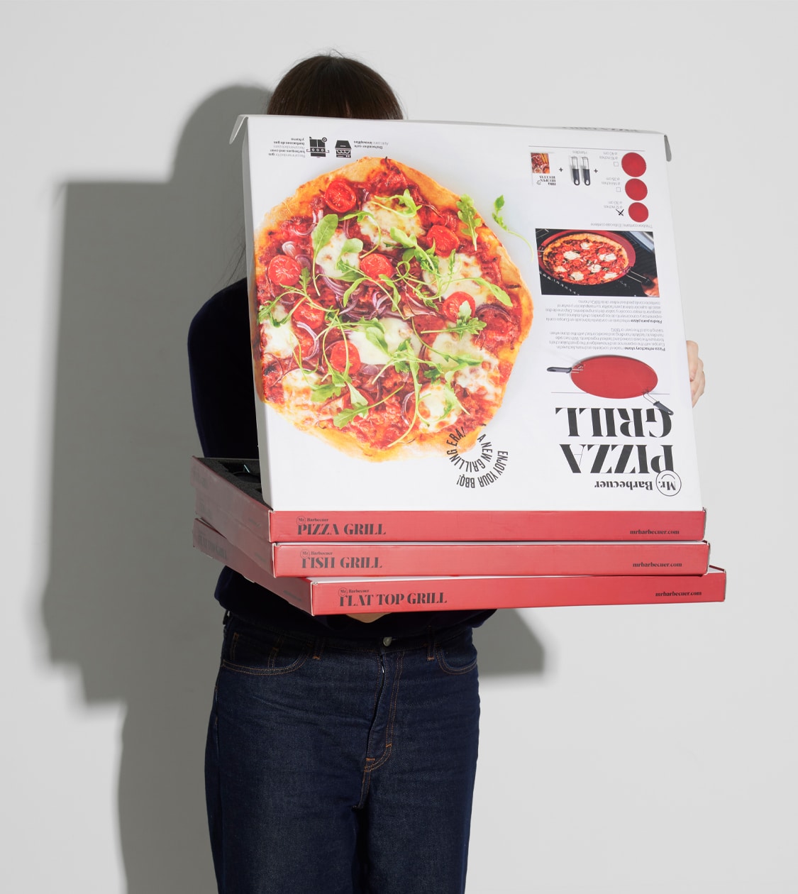
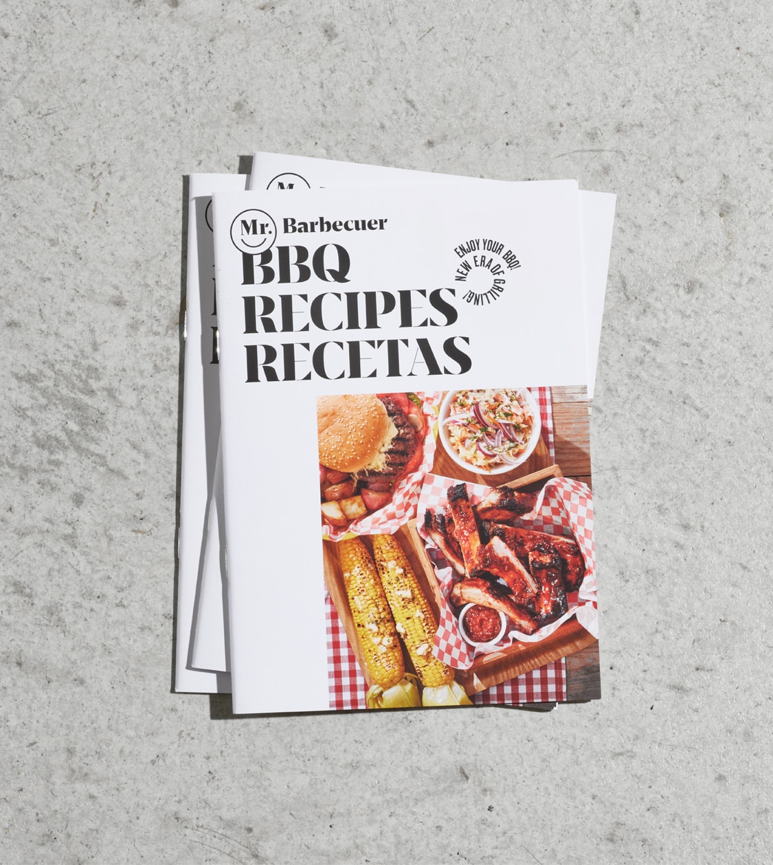
Meet Mr.Barbecuer, the latest addition to the Keraco Ceramic Technologies group, dedicated to crafting ceramic plates for grilling. With a 30-year presence in 80 countries, Keraco is a leading European ceramic manufacturer based in Spain and Italy, renowned for its culinary passion and high-quality gastronomy.
Our collaboration with Keraco spans over 5 years, during which we’ve also launched another of their successful brands: BEfresh Technology.
Our latest endeavour was to create a new brand tailored for the American and European markets, targeting arbecue enthusiasts seeking to enhance their grilling experience with the authentic taste of ceramic-cooked food.
2023
/en/work/bassols-packaging-design/
Bassols
We created Bassols’ new packaging aligned with their sustainable philosophy
Packaging Design
Objects for living
Textile
We created Bassols’ new packaging aligned with their sustainable philosophy
Packaging Design
In 2023, we collaborated with Bassols, a century-old brand and leader in bedding, bath, and table linens for homes and five-star hotels.
Our challenge was to conceptualise and redesign premium packaging that was sustainable, in line with the company’s philosophy, and communicated their brand positioning.
Additionally, it had to meet Bassols’ specific requirements: be durable, effectively protect the product, stand out from the competition at the point of sale, and be cost-effective both in terms of production and logistics.
2023
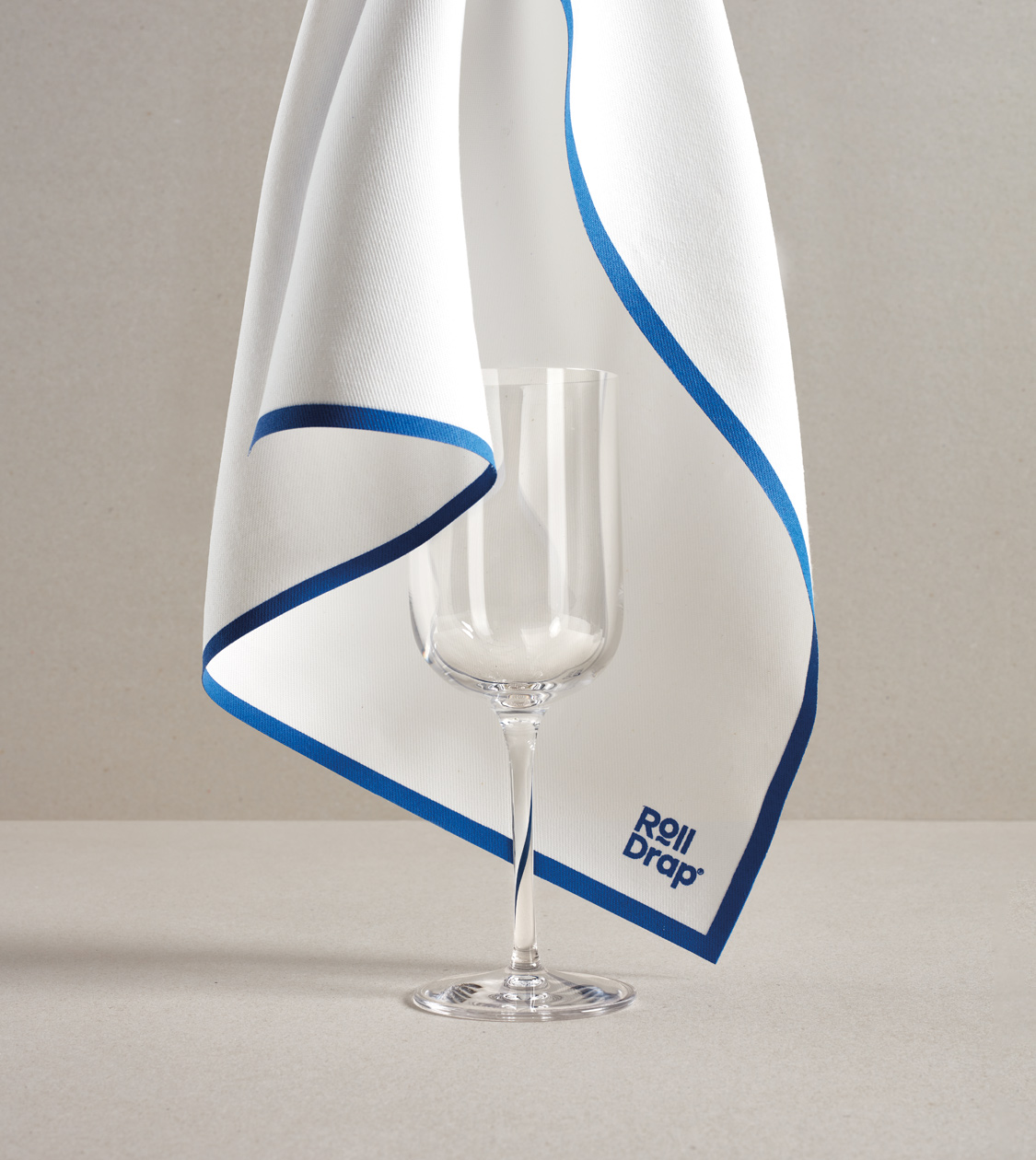
/en/work/rolldrap-texia-editorial-design-martin-berasategui/
ROLLDRAP
Reflecting the longstanding collaboration between Roll Drap and Martín Berasategui in this editorial design and digital communication
Editorial Design
Digital Communication
Hospitality & Leisure
Industry
Textile
Reflecting the longstanding collaboration between Roll Drap and Martín Berasategui in this editorial design and digital communication
Editorial Design
Digital Communication

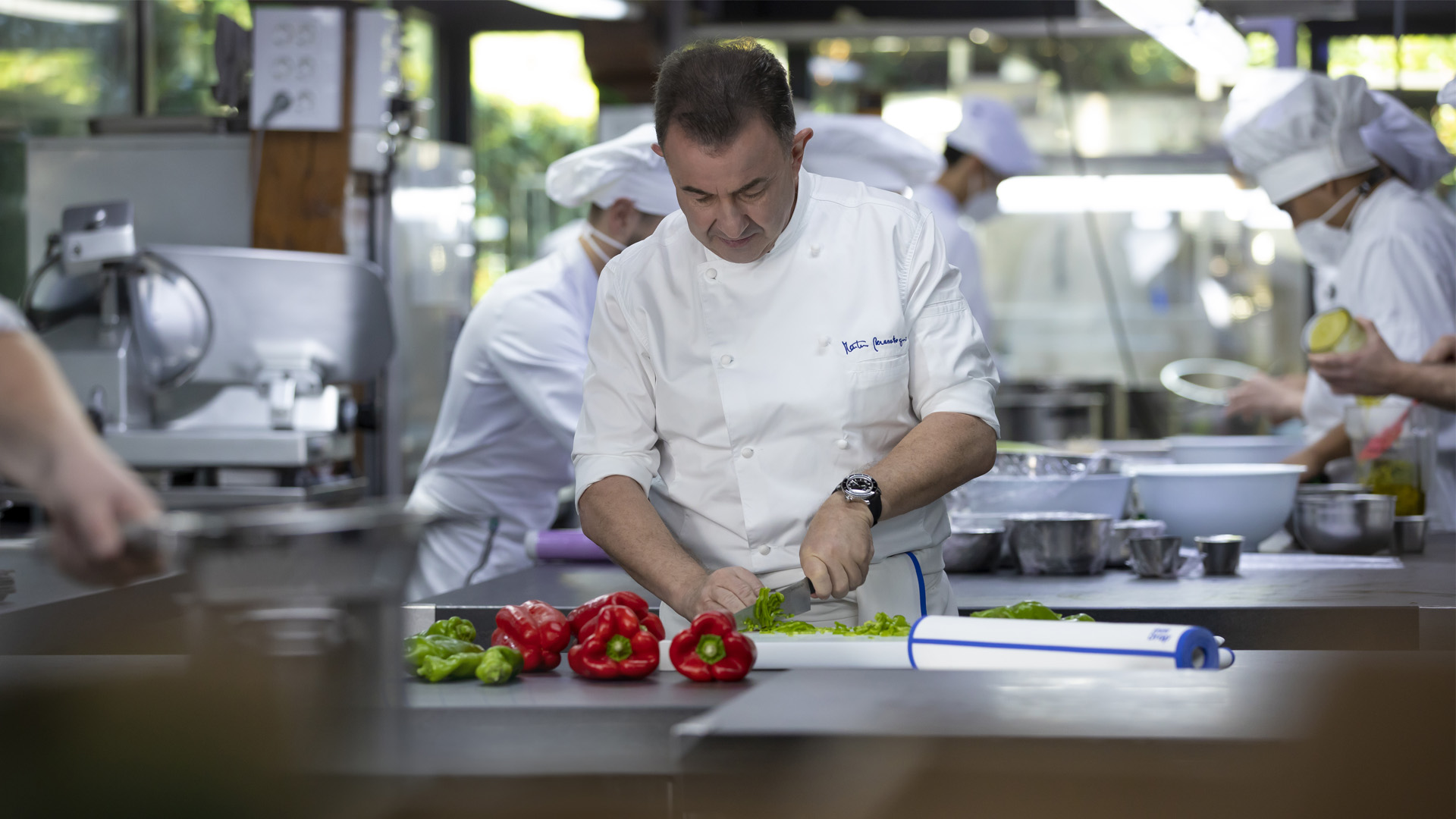
After developing and establishing the branding and art direction for Roll Drap’s communication campaign in partnership with Martín Berasategui, we seamlessly incorporated the concept into the editorial design of their corporate catalog and digital communication.
The key objective of this project was to authentically portray and highlight the ubiquitous presence of Roll Drap’s product in the renowned Spanish chef’s kitchens, where it is used and appreciated daily for its exceptional features. Our aim was to effectively engage both professional and home kitchens by showcasing the product’s practicality and numerous benefits.
2022
/en/work/famatel-branding-electric-mobility/
Famatel
We created the branding for Famatel’s new electric mobility product category
Corporate Branding
Packaging Design
Editorial Design
Communication
Industry
We created the branding for Famatel’s new electric mobility product category
Corporate Branding
Packaging Design
Editorial Design
Communication
Famatel is a specialist international manufacturer in the electrical sector with over 25 years of experience. Operating from its logistics centre in Barcelona, the company is present in over 60 countries, developing electrical solutions that add value and simplify people’s lives.
Since 2015, we’ve collaborated with the organisation on the conceptualisation and development of its communications, as well as for other brands within the group, such as Rosi, Keraco, BeFresh Home and Easy Life.
In 2022, Famatel decided to expand its product range with a new category focused on electric mobility. Our challenge: to develop branding—both verbal and visual—that would convey innovation, sustainability and efficiency for this new category, specifically for its new electric vehicle charger.
2022
/en/work/carnet-digital-communication/
CARNET Barcelona
We developed the digital communication for a sustainable mobility collaboration hub
Digital Communication
Business
Sustainable companies
We developed the digital communication for a sustainable mobility collaboration hub
Digital Communication
In 2022, we partnered with CARNET – Future Mobility Research Hub, a platform facilitating cooperation between businesses and academia focusing on sustainable and connected mobility research and development.
Established by SEAT, UPC, and Volkswagen, and based in Barcelona, its mission is to foster innovation, collaboration, and research in future mobility.
2022
/en/work/famatel-digital-communication/
Famatel
Digital Communication that enhances Famatel’s brand visibility and adds value to the electrical sector
Digital Communication
Industry
Digital Communication that enhances Famatel’s brand visibility and adds value to the electrical sector
Digital Communication
Famatel, an international company with over 25 years of experience in the electrical sector, needed to update its brand visibility in the digital environment to increase interaction with professional audiences.
To achieve this, we developed a website aligned with the new strategy and corporate branding created by NOMON DESIGN, reflecting its prominent market position and future ambitions.
2022
/en/work/famatel-packaging-design-multiple-sockets/
Famatel
Sustainable packaging for Famatel’s new range of multiple sockets
Packaging Design
Communication
Industry
Sustainable packaging for Famatel’s new range of multiple sockets
Packaging Design
Communication
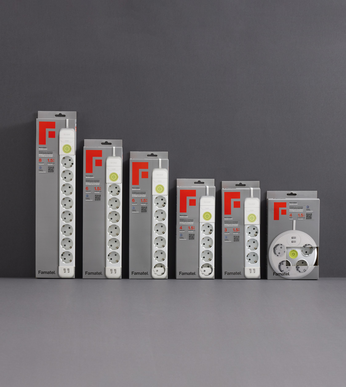

We have conceptualized and developed Famatel’s new packaging for its range of multiple sockets. Famatel is a manufacturer operating in the international electrical sector with more than 30 years of experience.
Our main challenge was to eliminate plastic from this range of products’ packaging and communicate the new features that have been added to the product, to improve its connectivity and safety.
2022
/en/work/semillas-fito-communication-world-tour/
Semillas Fitó
Rethinking Semillas Fitó’s internal communication for its 140th anniversary
Communication
Digital Communication
Industry
Rethinking Semillas Fitó’s internal communication for its 140th anniversary
Communication
Digital Communication
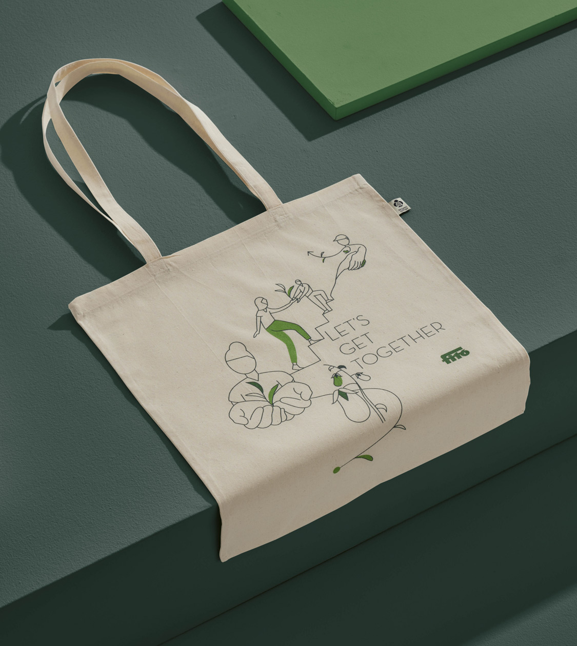
After working alongside Semillas Fitó in 2016 redesigning Sembra’s brand and packaging for its small urban gardening range of products and tools, Fitó contacted us again to set a new, more ambitious challenge.
Semillas Fitó is a Spanish multinational company, founded in 1880 in Sant Martí de Provençals, Barcelona. During its 140 years of history the company has gone from being a small seed company to becoming one of the leading multinationals in the sector of genetic breeding, production and distribution of vegetable and field crop seeds.
Coinciding with the company’s 140th anniversary, the board of directors carried out an internal consultancy to rethink its positioning and define a new strategic approach for the future.
2022
/en/work/m30-stands-branding/
M30
Introducing M30’s fresh corporate branding to showcase their new positioning
Branding Strategy
Corporate Branding
Digital Communication
Business
Introducing M30’s fresh corporate branding to showcase their new positioning
Branding Strategy
Corporate Branding
Digital Communication
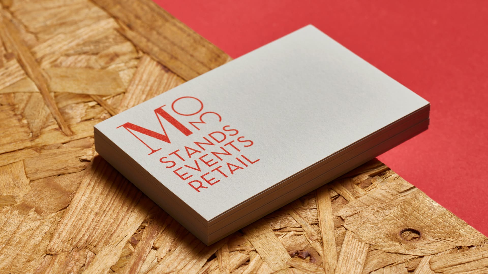
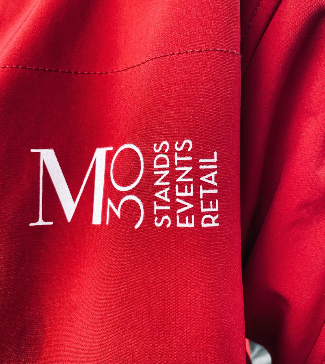
In 2020 we started collaborating with M30 –a company from Barcelona with 35 of experience in designing, building and assembling trade fair stands. We have worked with them on different projects for many of our clients for years.
Coinciding with the new challenges arising in the sector due to the COVID pandemic, and also with a change in management, M30 needed to analyse and find new business opportunities that would reposition the company within its business sector.
2022
/en/work/minds-and-heart-corporate-branding/
Minds & Heart
Creation of the corporate branding for a new Swiss marketing and communication consultancy
Corporate Branding
Communication
Digital Communication
Business
Creation of the corporate branding for a new Swiss marketing and communication consultancy
Corporate Branding
Communication
Digital Communication
During the first quarter of 2022 we have been working on Branding definition and development for Valérie Henzen’s new personal project. Valérie has 15 years of experience in the fields of marketing, branding and communication.
In order to kickstart her new professional venture as an independent consultant, Valérie Henzen needed our support to define and develop the corporate identity for “Minds & Heart”, her new marketing and communication consultancy located in Switzerland, and specializing in establishing strategies through cultural transformation and putting people at the center.
2022
/en/work/audiovisual-from-spain-communication-2022/
ICEX
We secured the global communication contract for Audiovisuals from Spain
Communication
Arts & Culture
We secured the global communication contract for Audiovisuals from Spain
Communication
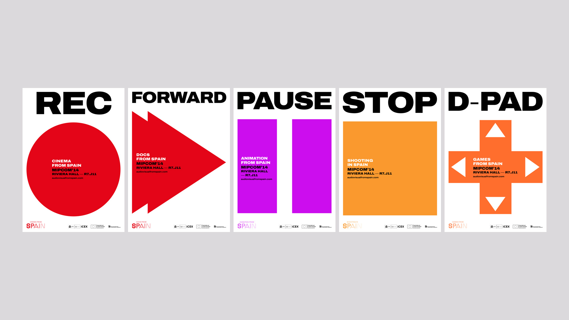
This year, we were awarded the public tender issued by ICEX to conceptualize and design the visual identity of Audiovisual from Spain, including its various sub-brands. The purpose of this project is to globally promote their annual events and activities that serve as benchmarks in the industry.
We are particularly thrilled to collaborate with them once again, having previously developed the corporate branding and communication strategies for these brands from 2009 to 2013. Now, we are ready to embark on this new phase together.
2022
/en/work/roll-drap-communication-martin-berasategui/
ROLLDRAP
A communication campaign reflecting the collaboration with chef Martín Berasategui
Communication
Digital Communication
Industry
Hospitality & Leisure
Textile
A communication campaign reflecting the collaboration with chef Martín Berasategui
Communication
Digital Communication

For over 25 years, Roll Drap’s products have been used in Martín Berasategui’s kitchens daily. This is the reason why the world-renowned chef did not hesitate to star in the newest communication campaign, recommending the brand’s 100% cotton innovative textile solutions with technical finishes.
We conceptualized and defined the art direction for this communication campaign, both for photography and audio-visuals, coinciding with the launch of the Roll Drap rebranding and its e-commerce.
2022
/en/work/packaging-design-body-genius/
Body Genius
We gave their various product ranges a packaging makeover
Packaging Design
Food & Drink
We gave their various product ranges a packaging makeover
Packaging Design

BODY GENIUS is a brand that has revolutionized healthy functional nutrition by producing genuine, innovative products with no added sugars, high in protein and using natural ingredients.
BODY GENIUS is a brand of Xocolating 1944, a company set in Manlleu, which supports and promotes local industrial production while creating and reimagining processed and semi-processed sweet products, both for professionals and end consumers.
2022
/en/work/my-drap-editorial-design-retail-2022/
MY DRAP
Art direction and editorial design for the new catalogue for the retail channel
Editorial Design
Communication
Hospitality & Leisure
Industry
Textile
Art direction and editorial design for the new catalogue for the retail channel
Editorial Design
Communication
For another year we have continued collaborating with MY DRAP in conceptualising the art direction and designing the brand’s newest retail channel catalog.
With this editorial piece the aim was to highlight the brand’s main concepts: the importance of the raw materials, its origins and the sustainable nature of the products. At the same time, of course, it was devised to showcase the quality which always characterises all of MY DRAP’s products.
2022
/en/work/lekue-packaging-design-to-go-organic/
Lékué
Design of packaging and communication for the new sustainable collection To Go Organic
Packaging Design
Communication
Industry
Objects for living
Design of packaging and communication for the new sustainable collection To Go Organic
Packaging Design
Communication


FSC-certified paper with 40% post-consumer waste (corn)
2022
/en/work/miquelrius-not-boring-games-collection/
Miquelrius
Conceptualisation and design of the “NOT BORING GAMES” collection for Miquelrius
Branding Strategy
Packaging Design
Communication
Product Design
Industry
Games
Conceptualisation and design of the “NOT BORING GAMES” collection for Miquelrius
Branding Strategy
Packaging Design
Communication
Product Design

During the COVID social distancing period, families and friends dusted off their board games. What appeared to be a temporary slow life trend will actually be staying with us for a while.
Responding to this trend, at NOMON we conceptualized and developed a new range of board games for Miquelrius: classic games for all ages and to take along with you.
2022
/en/work/aranow-corporate-branding/
Aranow
Introducing a fresh branding that captures the essence of a well-established international company
Corporate Branding
Communication
Industry
Introducing a fresh branding that captures the essence of a well-established international company
Corporate Branding
Communication
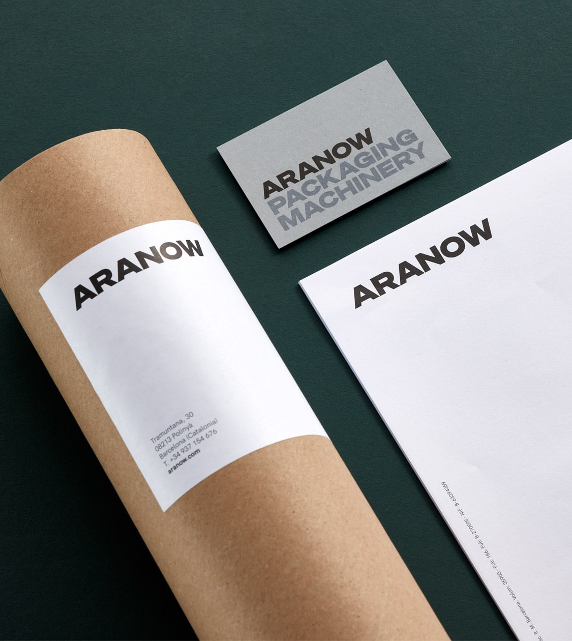
We have undertaken the task of rebranding Aranow, an international company specialising in single-dose packaging machinery for food, pharmaceutical, cosmetic and dairy products, coinciding with the firm’s 18th anniversary.
Aranow’s branding, as agreed with the client, should show and communicate a solid, modern and global company, which at the same time conceptually reflects the industrial sector. But the most important quality of the company’s identity to be expressed by its branding is the human factor.
2022
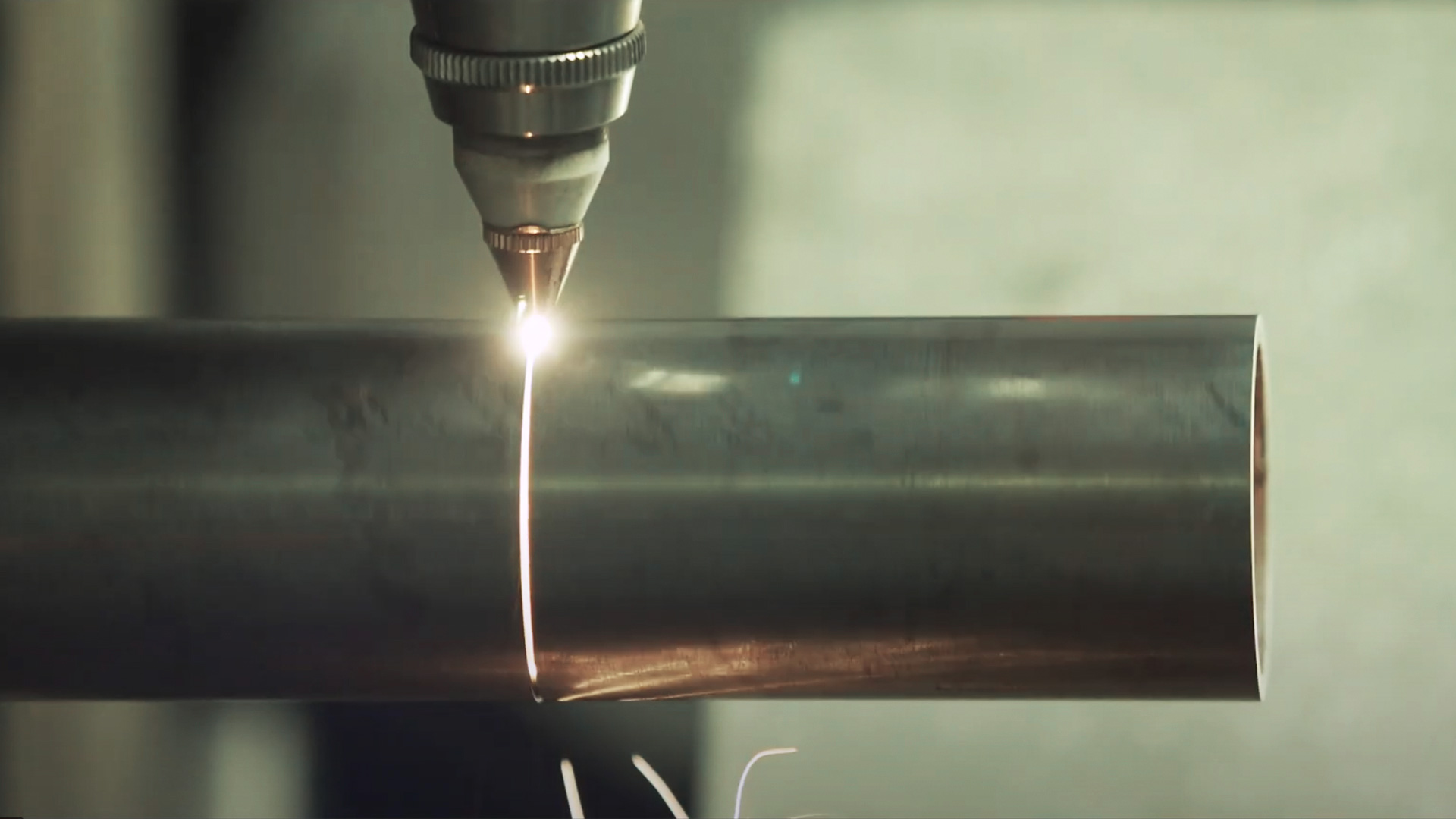
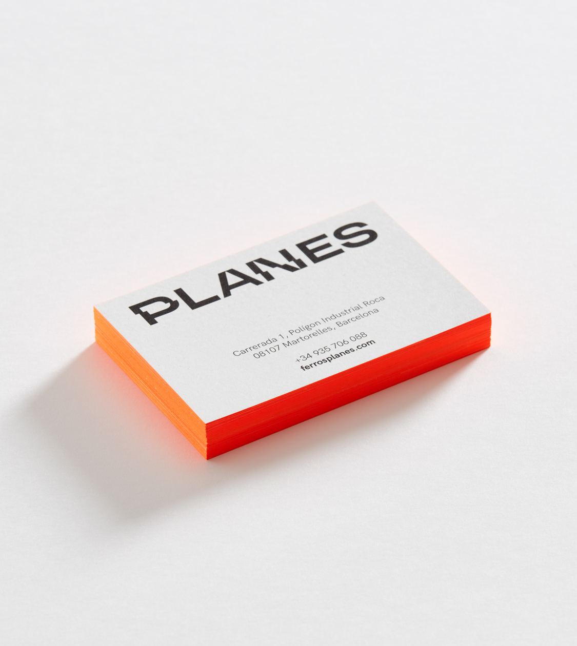
/en/work/ferros-planes-corporate-branding/
Ferros Planes
We redefined the positioning and branding of a family-owned pioneer in the metallurgical sector
Branding Strategy
Corporate Branding
Industry
We redefined the positioning and branding of a family-owned pioneer in the metallurgical sector
Branding Strategy
Corporate Branding
In the last quarter of 2020, we met our client Ferros Planes online and began our collaboration in a 100% digital environment due to the situation resulting from the pandemic. The great availability and readiness of all ensured that the project progressed easily and in a perfectly normal way.
The project consisted of reviewing and redefining its brand positioning, brand values and value proposition to redesign the firm’s corporate branding, adapting it to its market reality.
Ferros Planes is a family business in the metal and foundry sector, with 35 years of experience. The company is a pioneer in metal tubes cutting and machining, and more specifically in laser tube cutting.
2021
/en/work/famatel-communication-socket-plug-ip54/
Famatel
We crafted the communication campaign for their IP54 installer set
Communication
Digital Communication
Industry
We crafted the communication campaign for their IP54 installer set
Communication
Digital Communication
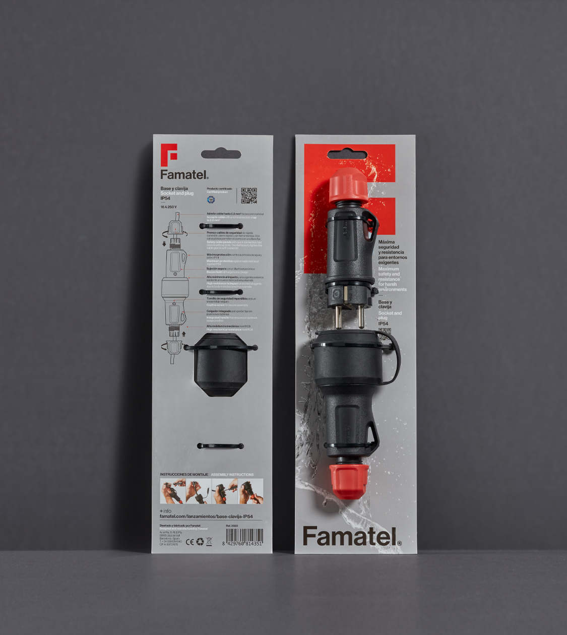
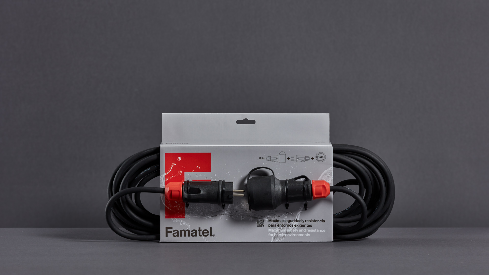
During our ongoing collaboration with Famatel, we have been working on a communication plan and product launch campaign for its new IP54 Set of plug and socket targeting semi-professional and professional technicians.
We therefore conceptualized and defined the graphic identity and the art direction of the campaign, giving continuity to the established global branding project of the firm, where the identity and the product blend into each other and form a unified image.
2021
/en/work/lekue-art-direction-collections/
Lékué
We defined a new art direction for their new collections and products
Communication
Industry
Objects for living
We defined a new art direction for their new collections and products
Communication


During all these years working alongside Lékué, we have produced a unique personality for the brand and its products. Our art direction visually represents their specific messages, building a connection with the consumers and making the products approachable.
On this occasion, we took on a significant and motivating project: to conceptualize our art direction for the brand’s new collections and products, starting with the Veggie Lovers range –which brings healthy food in easy vegetarian and vegan recipes into our kitchens– and Reuse & Reduce –an efficient, responsible alternative to single-use disposable plastic products, to store and preserve products in the fridge and freezer–.
2021
/en/work/ecoalf-powered-by-miquelrius-collection/
Miquelrius
Conceptualization and design of the “Ecoalf powered by Miquelrius” collection
Communication
Product Design
Stationery & Accessories
Industry
Conceptualization and design of the “Ecoalf powered by Miquelrius” collection
Communication
Product Design
Girls and boys are the future. Teaching them sustainability and generosity towards the environment is key to preserving our planet. Raising awareness is essential to turn sustainable practices into habits.
With this objective in mind we put forward the collaboration of Ecoalf + Miquelrius + NOMON DESIGN. Together we have developed the “Ecoalf powered by Miquelrius” collection, made with recycled and recyclable materials, a set of products adjusted to the demands of an increasingly eco-conscious world and consumers.
2021
/en/work/famatel-branding-strategy/
Famatel
New corporate strategy and branding for an international company
Branding Strategy
Corporate Branding
Packaging Design
Industry
New corporate strategy and branding for an international company
Branding Strategy
Corporate Branding
Packaging Design

Since 2015 we have collaborated with Famatel in conceptualizing and developing the firm’s communication, as well as that of the business group’s trademarks (i.e. Rosi, Keraco, BeFresh Home, Easy Life…)
Famatel is an international manufacturer within the electricity sector with 25 years of experience. Although their logistics centre is located in Barcelona, the firm operates in 60 different countries, developing value-added electrical solutions that simplify professionals’ lives.
2021
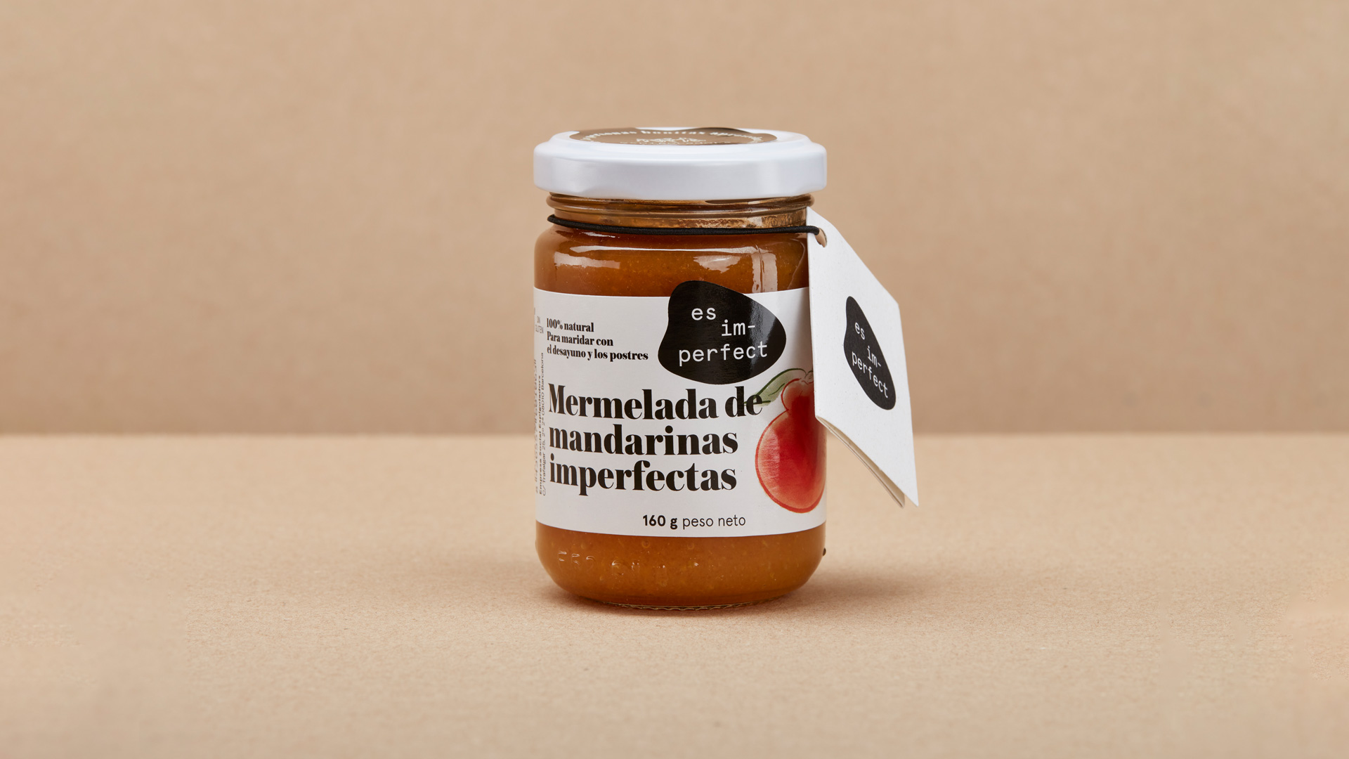
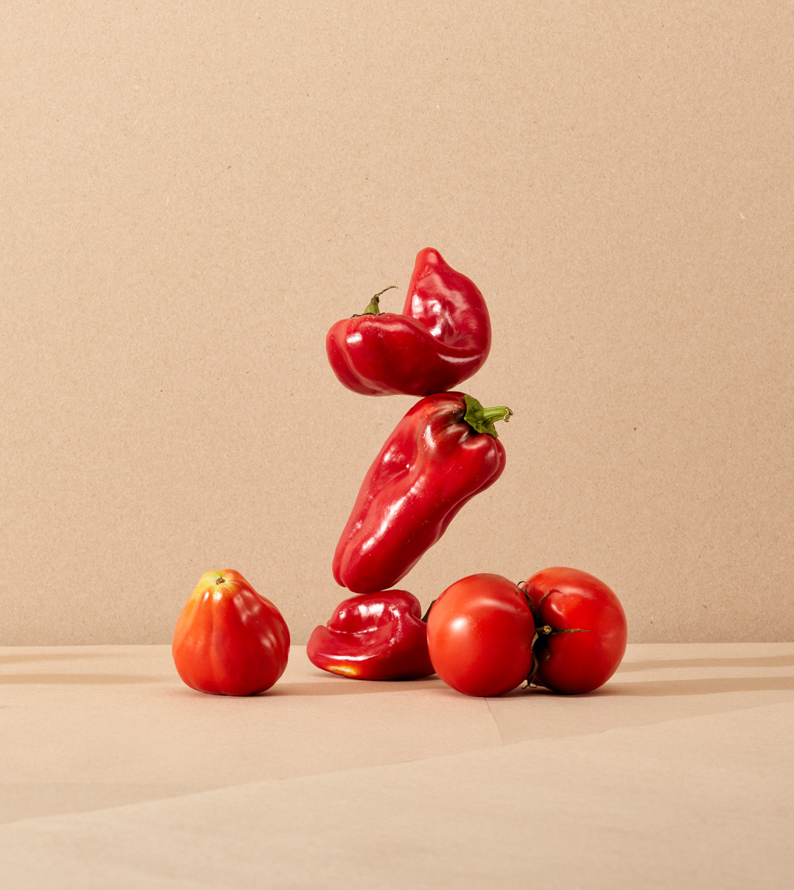
/en/work/esimperfect-digital-communication/
Espigoladors
Digital communication to raise awareness about food waste reduction
Digital Communication
Food & Drink
Sustainable companies
Digital communication to raise awareness about food waste reduction
Digital Communication
During these last few months we have been working alongside the es im-perfect® team on the conceptualization, design and storytelling of their new e-commerce.
es im-perfect® is the job placement branch of the Espigoladors Foundation, a company that has been fighting food wastage since 2014 while empowering people in situations of vulnerability. We have been collaborating with the organization since 2015.
2021
/en/work/esimperfect-artdirection-ecommerce/
Espigoladors
Art direction of sustainable brand es im-perfect®’s new e-commerce website
Communication
Food & Drink
Sustainable companies
Art direction of sustainable brand es im-perfect®’s new e-commerce website
Communication

During these last few months, we have been working alongside the es im-perfect® team in the conceptualization and design of its new e-commerce.
Oriented towards the final public, we worked together defining the objectives. The new es im-perfect® e-commerce is expected to properly communicate the brand, denounce food waste and create a community with social and environmental awareness.
2021
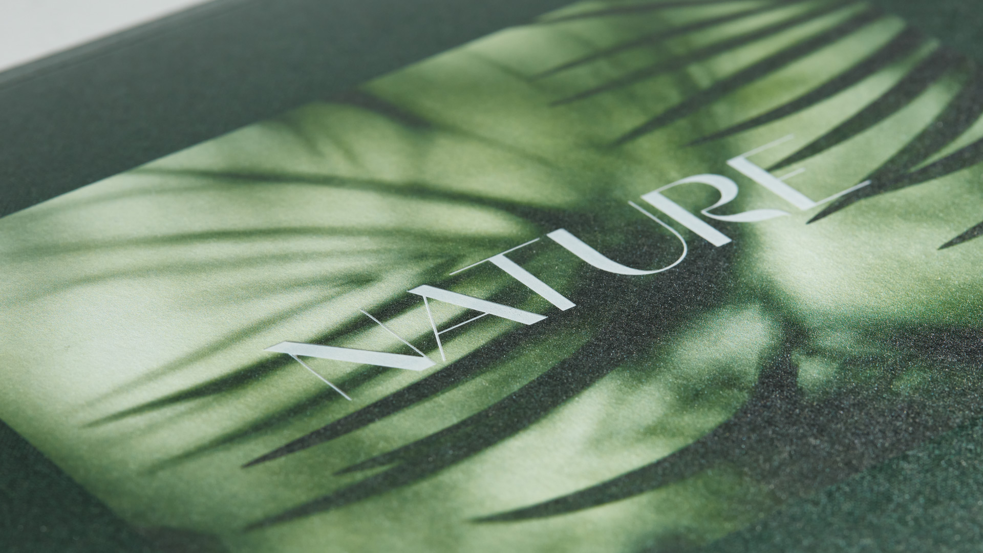
/en/work/klein-digital-communication-nature/
Klein
We crafted the digital communication strategy for KLEIN’s new product category, NATURE
Digital Communication
Industry
Furniture & Lighting
We crafted the digital communication strategy for KLEIN’s new product category, NATURE
Digital Communication
As part of the campaign launch for NATURE –KLEIN’s new sustainable oak profiling system– we conceptualized and designed a specific landing page for this new product category.
In this piece of digital communication we have applied the new identity and art direction of NATURE, which we conceptualized and developed at NOMON, entirely specifier-oriented, and which values the downright wholesome connection between natural wood and human health.
2021
/en/work/casmar-digital-communication-axpro/
Casmar
Introducing a communication campaign for the AX Pro professional solution
Communication
Digital Communication
Business
Introducing a communication campaign for the AX Pro professional solution
Communication
Digital Communication
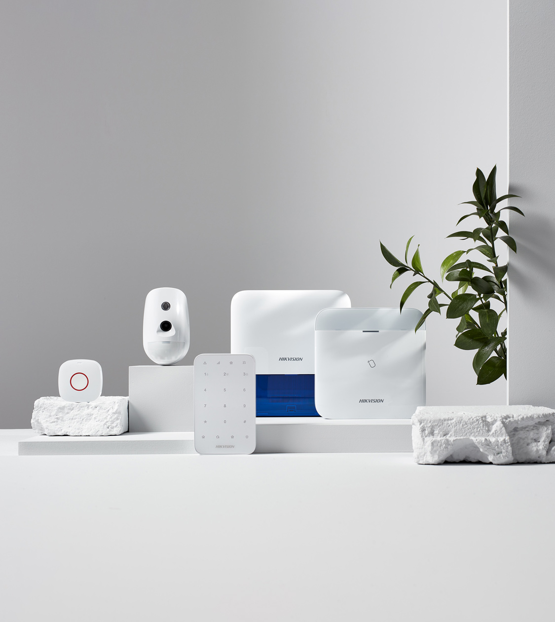
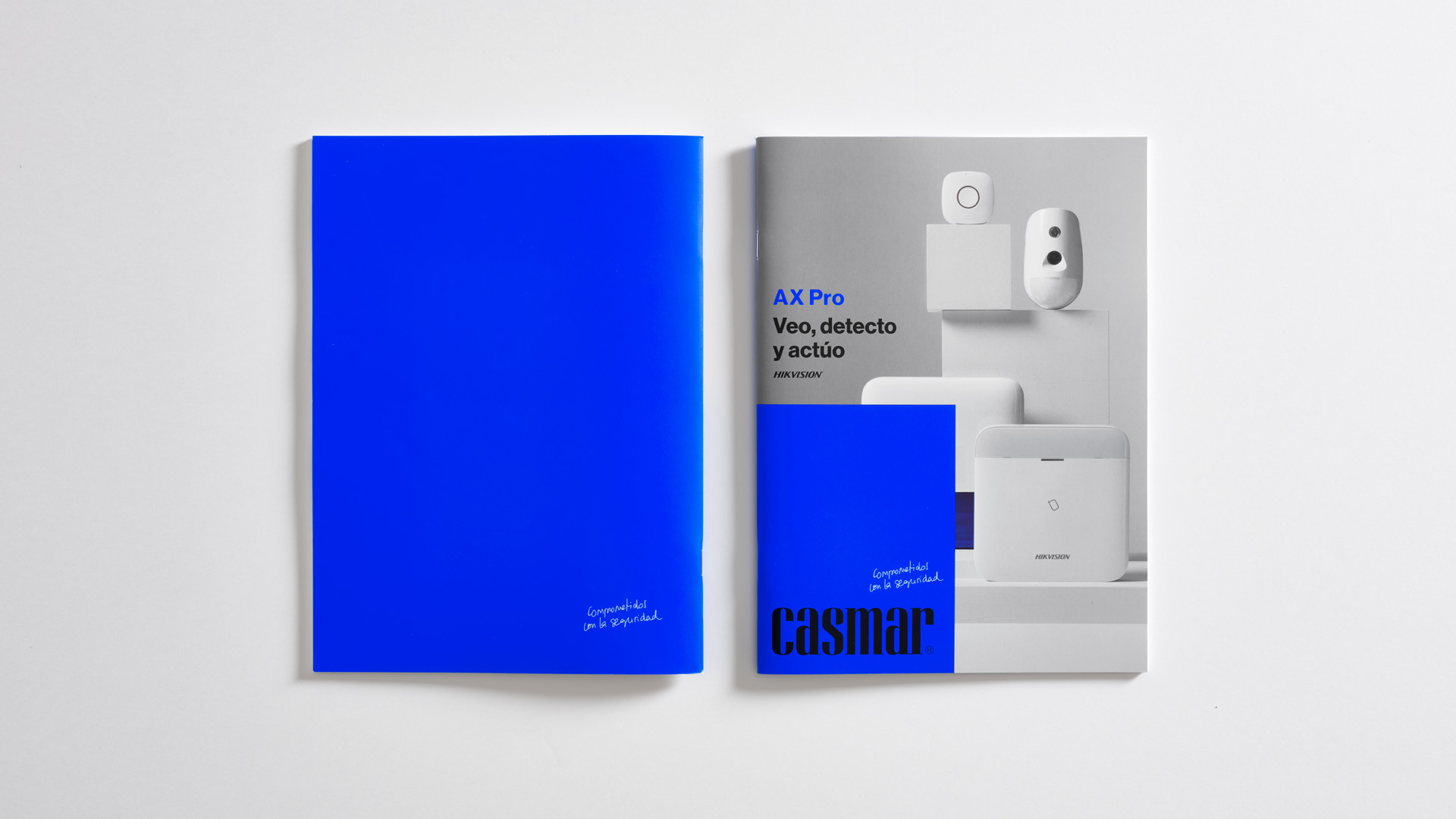
We have resumed our collaboration with Casmar –the most consolidated Spanish company in its field, with the longest history in providing security solutions– after finishing its corporate rebranding in 2019, coinciding with its 40th anniversary and a phase of generational change in its management team.
On this occasion, we have been working on the communication campaign for the firm’s new professional solution AX Pro (from Hikvision and distributed by Casmar) of a wireless alarm system that keeps homes, offices and / or businesses safe in real time.
2021
/en/work/lc-paper-digital-communication-infographics/
LC Paper
Showcasing LC Paper’s sustainability with an animated infographic
Digital Communication
Industry
Sustainable companies
Showcasing LC Paper’s sustainability with an animated infographic
Digital Communication
In 2019 we began to collaborate with LC Paper. For 20 years now, has the company been committed to continuing to lead the manufacture of the most sustainable paper products on the market.
The company’s strategic commitment to zero emissions during the manufacturing cycle, along with the development of their very own technology for the manufacture of tissue paper, Kraft paper and derivatives, has positioned them as the first international paper manufacturer considered carbon-neutral.
2021
/en/work/rolldrap-texia-branding/
ROLLDRAP
Repositioning Roll Drap through a rebranding initiative in the retail and professional sectors
Branding Strategy
Corporate Branding
Hospitality & Leisure
Industry
Textile
Repositioning Roll Drap through a rebranding initiative in the retail and professional sectors
Branding Strategy
Corporate Branding

We have been working alongside Texia since 2017. TEXIA is a family textile business that has been manufacturing and marketing textile products for over 100 years, with a unique, patented technology. One of its brands being MY DRAP, that offers products both in retail and the professional channels.
Last year, just as the COVID-19 pandemic started spreading, TEXIA decided to hire NOMON to develop another of the group’s brands, namely Roll Drap.
Roll Drap’s 30 years vouch for their experience in the professional channel. 100% cotton textile solutions with technical, innovative finishes, such as the seamless look, help keep hospitality spaces, communities and all types of homes clean and neat.
2021
/en/work/apli-kids-product-design-stickers-cardboard/
Apli Kids
Crafted the cardboard packaging for the new Apli Kids sticker game
Packaging Design
Product Design
Industry
Games
Crafted the cardboard packaging for the new Apli Kids sticker game
Packaging Design
Product Design
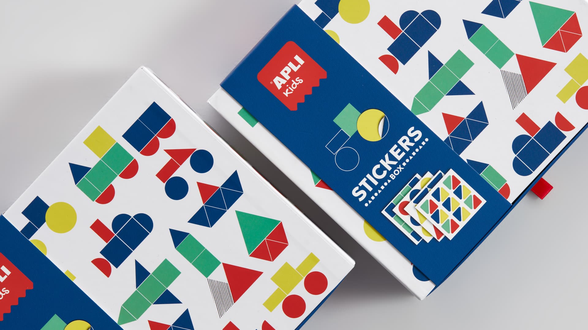
For 10 years, we have worked alongside Apli in the development of the brand’s Apli Kids product ranges allowing small children to learn while having fun playing in their homes.
With the same objective in mind, we have been designing a new set of stickers, in a nice pastel colour palette, presented in a cardboard box that opens up like little drawers, turning the packaging into part of the game itself.
2021
/en/work/klein-communication-nature/
Klein
Identity and communication of the new NATURE product category by KLEIN
Corporate Branding
Editorial Design
Communication
Industry
Furniture & Lighting
Identity and communication of the new NATURE product category by KLEIN
Corporate Branding
Editorial Design
Communication
KLEIN is a family-owned business of international projection with 90 years of experience in the design and manufacture of high-added value architectural systems for sliding and folding doors made of glass or wood.
NOMON has worked alongside the company to build the communication strategy for their new range of products, NATURE, a sustainable oak profile system devised to create environments in line with people’s current lifestyles.
2021
/en/work/irsap-editorial-design/
IRSAP
Editorial Design for the high-end cast iron decorative radiator catalog
Editorial Design
Industry
Furniture & Lighting
Editorial Design for the high-end cast iron decorative radiator catalog
Editorial Design
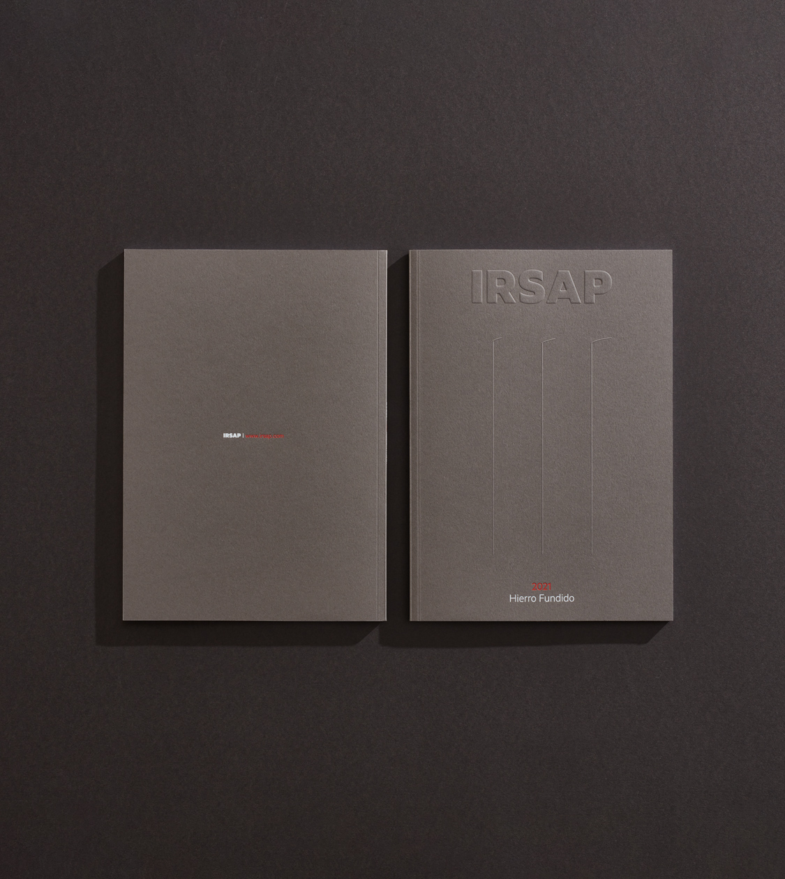
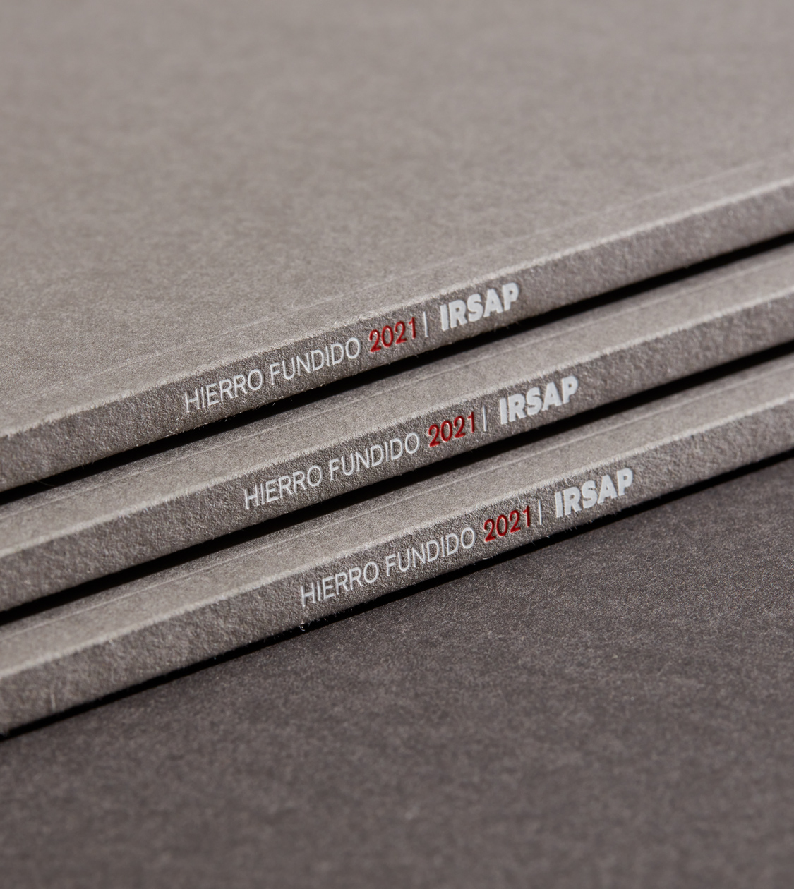
During the year 2020 we conceptualized and designed IRSAP’s newest Cast Iron Catalogue. IRSAP is a leading European manufacturer of decorative designer radiators. Since 1963, with its wide range of products, IRSAP has been aiming to improve people’s quality of life by creating more comfortable spaces.
NOMON’s challenge has been to redesign the product catalogue showcasing the brand’s new high-end cast-iron collection of decorative radiators that tap into Classic with British design influences. We also aimed to coherently convey its corporate brand values to its target audience: architects, interior designers, decorators and also the general public.
2021
/en/work/icex-foods-and-wines-comunicacion-tasting-spain/
ICEX
Creating visual communication for Foods & Wines from Spain events
Communication
Food & Drink
Arts & Culture
Creating visual communication for Foods & Wines from Spain events
Communication
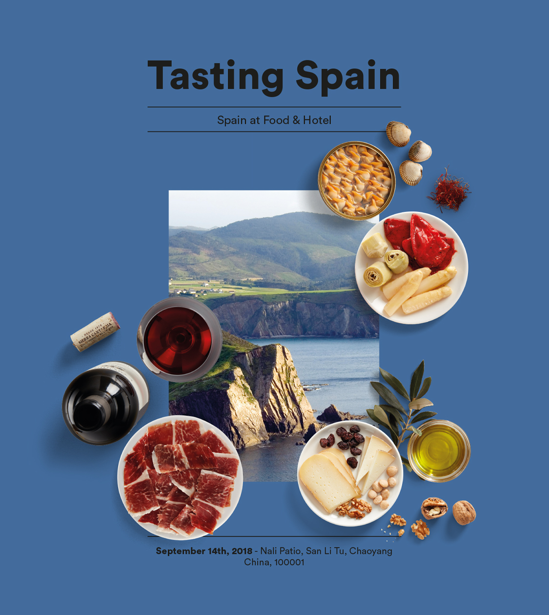
Since 2018, we have been working on the communication for ICEX brand Foods & Wines from Spain. We have created promotional materials, conveying the excellence and quality of our gastronomy, for events which take place all around the world.
Correspondingly, we were required to develop the creativity for the promotional materials and signage of the events for the year 2021.
2020
/en/work/ciat-editorial-design/
Ciat
Communicating a 100% sustainable philosophy through Editorial Design
Editorial Design
Sustainable companies
Industry
Communicating a 100% sustainable philosophy through Editorial Design
Editorial Design
Back in 2012 we designed CIAT’s corporate branding. CIAT is a company with 60 years of experience in the development, manufacturing and marketing of pulp-moulded packaging products. The company pioneered the introduction of this type of pulp packaging in the fruit-growing sector.
At the time, we created a corporate branding concept highlighting the versatility, the concern for precision in the process and the environmentally-friendly outlook of either the brand and its products. The products are made out of paper waste or leftovers from other projects, which are recycled and given a new life cycle at CIAT.
Last year we once again collaborated with the company to design and carry out a new corporate brochure and product catalogue, primarily focusing on the art direction and corporate discourse.
2020
/en/work/girofibra-digital-communication/
Girofibra
Digital Communication that emphasizes the company’s slogan: “The pleasure of eating well”
Digital Communication
Food & Drink
Digital Communication that emphasizes the company’s slogan: “The pleasure of eating well”
Digital Communication
Collaborating with Girofibra again to produce the company’s new website. We previously conceptualized and redesigned the packaging for their brand of healthy bars and biscuits, Natwins.
On this occasion, we designed and conceptualized the company’s corporate website, acting as a connection hub between the company and its consumers. In addition to being able to get to know and delve into Girofibra’s history, the consumer has also the opportunity to find detailed information on the range of Natwins products, as well as the points of sale.
2020
/en/work/aridi-art-direction-delta-collection/
Aridi
Editorial design of the new functional furniture collection Delta
Editorial Design
Furniture & Lighting
Industry
Editorial design of the new functional furniture collection Delta
Editorial Design

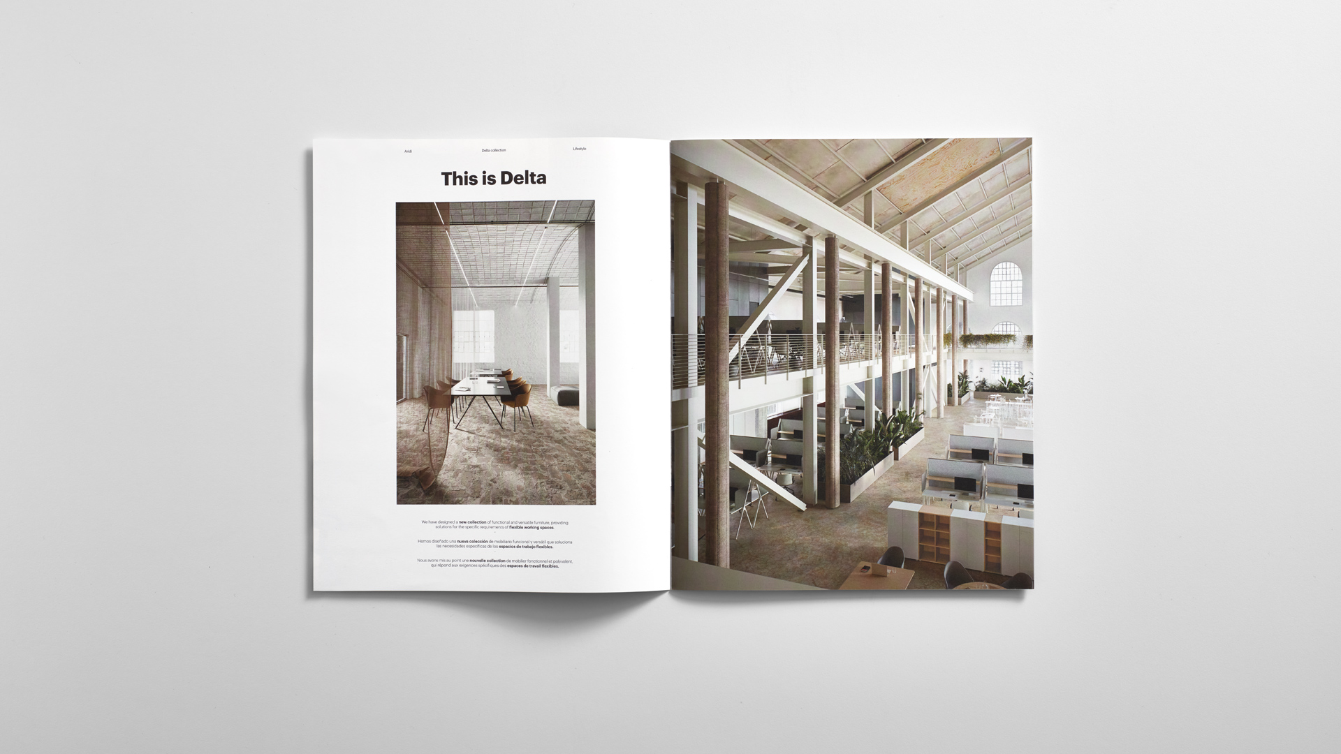
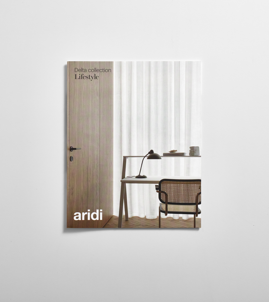
We have worked on concept building, art direction and design of the catalogues for the new Delta collection for our client Aridi, a leading company in furniture design since 1979.
The concept of this new collection stems from the company’s own philosophy: adapting office furniture to the work tasks and the employees, regardless of where they may be, and not the other way around.
2020
/en/work/belloch-forestal-digital-communication/
Belloch Forestal
We design Belloch Forestal’s digital communication promoting the tree culture
Digital Communication
Business
We design Belloch Forestal’s digital communication promoting the tree culture
Digital Communication
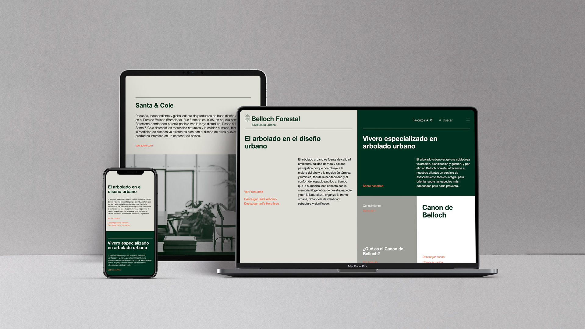
After finishing the redesign of Intramundana’s corporate identity, we went on to conceptualise and design the website for Belloch Forestal, one of the business group’s companies.
Belloch Forestal is located in Belloch, an estate of over 130 hectares in La Roca del Vallès, where the firm works in the selection and cultivation of plant elements for urban areas. The company promotes tree culture, appreciating the architecture of each specimen and interacting with it to obtain the most suitable shape for its different applications.
2020
/en/work/can-buch-branding/
Can Buch
Branding for an ecotourism project committed to nature
Corporate Branding
Packaging Design
Digital Communication
Sustainable companies
Hospitality & Leisure
Food & Drink
Branding for an ecotourism project committed to nature
Corporate Branding
Packaging Design
Digital Communication
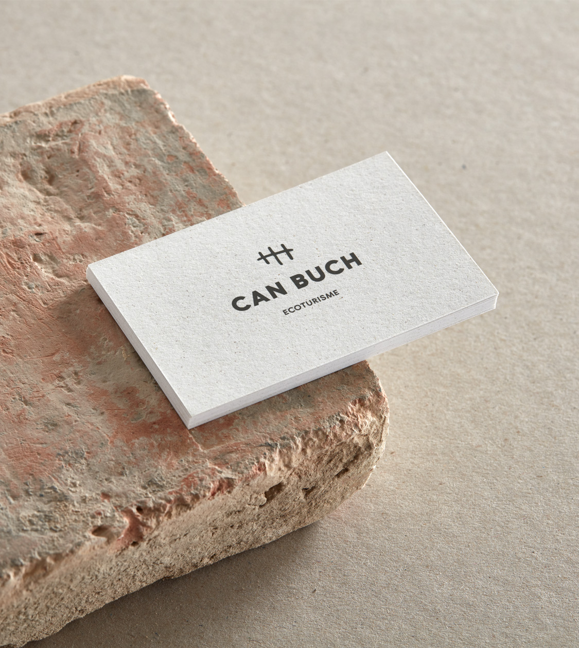
In 2020, we conceptualised and designed the corporate branding for Can Buch, a deeply personal project by Gerard Bofill, who decided to completely change his life and establish a 100% organic ecotourism hotel in the heart of Garrotxa, Girona. His goal was to share the peace and serenity of rural life.
Since then, we have continued to support Can Buch in growing its business by creating and designing various communication materials for the eco-hotel, including the branding and packaging for “Escampar la boira”, its brand of artisanal products: vegan beers, ratafia, olive oil, and jams.
2020
/en/work/mydrap-professional-texia-editorial-design-face-masks/
MY DRAP
We’ve crafted the Editorial Design and amenity presentation kit for MY DRAP in luxury hotels
Editorial Design
Health & Beauty
Industry
Textile
Hospitality & Leisure
We’ve crafted the Editorial Design and amenity presentation kit for MY DRAP in luxury hotels
Editorial Design

We have been working on the concept, art direction and design of MY DRAP’s catalogue of reusable and customisable face masks for the professional channel. These masks are being presented as amenities for luxury hotels. We have also developed a presentation kit that every guest will be finding in his or her hotel room.
We based our work on the brand’s previously established creative concept –the blank canvas– since each hotel can offer their own personalised face mask to their clients, branding it with their own identity.
2020
/en/work/editorial-design-casmar/
Casmar
An Editorial Design that showcases the company’s essence
Editorial Design
Communication
Business
An Editorial Design that showcases the company’s essence
Editorial Design
Communication
Recently, we have conceptualised and created Casmar’s newest corporate and security solutions catalogue. And, of course, we have also worked on the art direction of the photographs.
Our main challenge has been to create a piece of communication that would give continuity to the objective which we had previously established during the branding process: communicating a coherent brand with personality, which provides differential value within the security sector.
2020
/en/work/lc-paper-packaging-design-dalia/
LC Paper
Introducing a fresh packaging concept for Dalia® eco-friendly paper
Corporate Branding
Packaging Design
Industry
Sustainable companies
Introducing a fresh packaging concept for Dalia® eco-friendly paper
Corporate Branding
Packaging Design
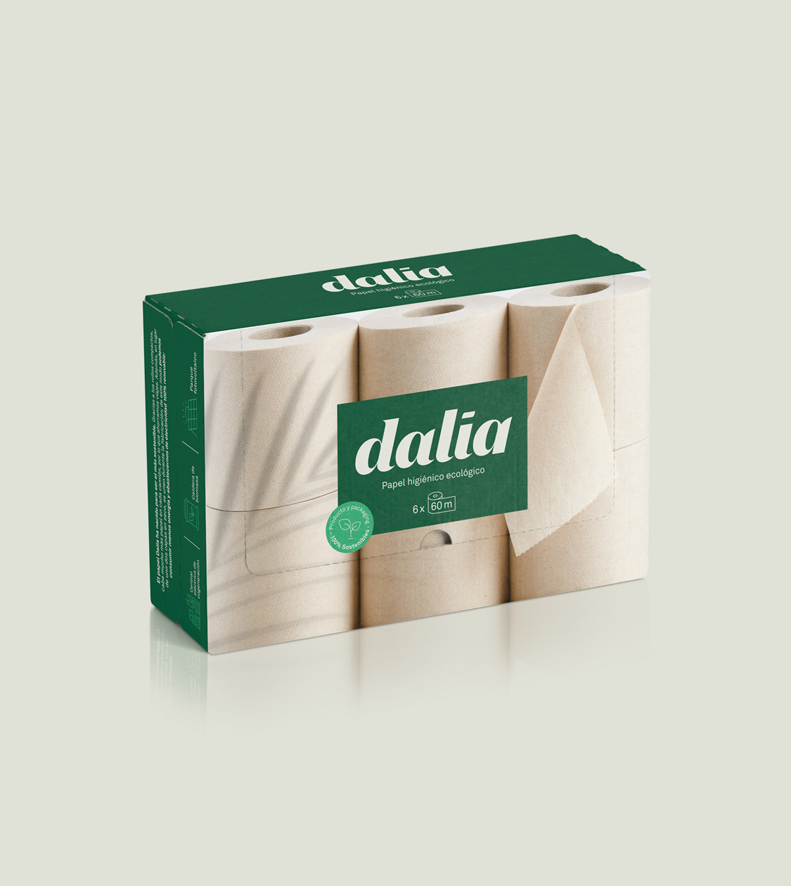
We have carried out the new packaging for a range of environmentally friendly toilet paper products conceived for mass consumption by LC Paper, a company with over 140 years of experience in the sector. Pioneering the manufacture of paper with zero CO2 emissions, its aim is to create the most sustainable paper in the world.
The main characteristic of this new Dalia® packaging is that it is the first packaging for toilet paper and kitchen paper in the world that replaces plastic wrapping with the concept of “transparent cardboard”.
2020
/en/work/grok-editorial-design-2020/
Grok
We created the Editorial Design for the 2020-21 Premium new releases catalogue
Editorial Design
Furniture & Lighting
We created the Editorial Design for the 2020-21 Premium new releases catalogue
Editorial Design
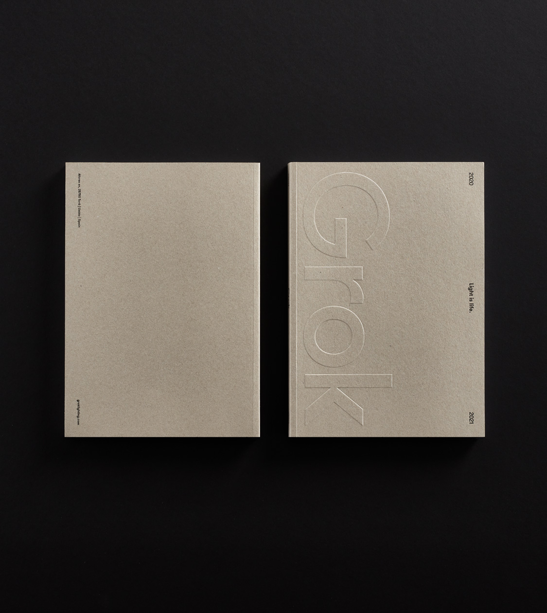
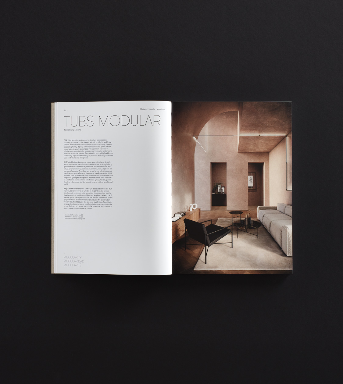
Hemos diseñado y maquetado el nuevo catálogo de Grok 2020-21, acorde al branding corporativo de la marca que desarrollamos en NOMON en 2017.
Nuestro principal reto ha sido conseguir que, pese a toda la información y elementos que contiene el catálogo, su conjunto respire y las luminarias y sus fotografías sean las protagonistas.
2020
/en/work/mydrap-professional-texia-editorial-design/
MY DRAP
Quality and elegance in MY DRAP Professional’s fresh Editorial Design
Editorial Design
Communication
Industry
Textile
Hospitality & Leisure
Quality and elegance in MY DRAP Professional’s fresh Editorial Design
Editorial Design
Communication
Once again, we took on the challenge of conceptualising and carrying out the art and design direction of MY DRAP’s product catalogue for the professional channel. As a novelty for this new season, the company has incorporated into its portfolio a new range of products aimed to be utilised in hotel bathrooms and luxury establishments.
Starting from the creative concept of the brand – a blank canvas – we have worked on an extremely thoughtful art direction that showcases the details of the fabric and the neat finishes, as well as the different uses of the products.
2020
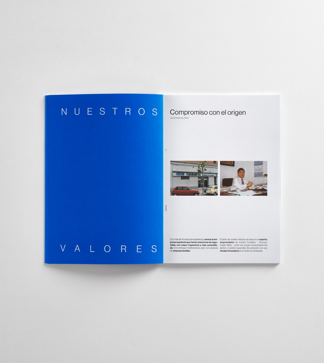
/en/work/casmar-corporate-branding/
Casmar
A branding that provides differential value within the security sector
Branding Strategy
Corporate Branding
Business
A branding that provides differential value within the security sector
Branding Strategy
Corporate Branding
Casmar has the longest history providing security solutions in the Spanish security sector. It is the most consolidated company in its field. Its success is partly due to the entrepreneurial spirit of the founder, Gonzalo Castro Mata, along with an outstanding knowledge of the sector and a team that is constantly evolving and has a genuinely innovative vision in a quickly changing environment.
During year 2019, coinciding with the company’s 40th anniversary, Casmar began a phase of generational change in its management team. This change required a brand repositioning that would reflect the new reality of the company and its commitment to the future.
2019
/en/work/grok-digital-communication/
Grok
We implement Grok’s corporate branding in their digital communication
Digital Communication
Furniture & Lighting
We implement Grok’s corporate branding in their digital communication
Digital Communication
2019
/en/work/leds-c4-digital-communication/
LEDS C4
We applied their new corporate branding to their digital communication
Digital Communication
Furniture & Lighting
We applied their new corporate branding to their digital communication
Digital Communication
LEDS C4 is one of the most important and influential companies in the Spanish lighting sector. In 2017, after a period of growth and professionalization, management reckoned that it was time to boost the internal and external communication.
2017 is also the year in which we started collaborating with the company to help strengthen and project their new brand positioning around the world, with a clear commitment to internationalization and an approach targeting partners.
2019
/en/work/natwins-packaging-design/
Girofibra
Natwins
We crafted the new Packaging Design for the Natwins brand, reflecting its values and commitment
Packaging Design
Communication
Food & Drink
We crafted the new Packaging Design for the Natwins brand, reflecting its values and commitment
Packaging Design
Communication
In 2019, we kicked off our partnership with Girofibra, a company that has been manufacturing cookies and healthy cereal bars using its own special recipe for over 4 decades.
Since then, we’ve conceptualised and designed the packaging for their range of 80g-pack cereal bars, 100g-double-pack cookies and their range of 200g high-fiber whole grain oats mini-cookie.
Our main challenge in developing all their packaging has been to convey the quality of the raw materials used in their manually crafted, special, and original recipes while expressing the company’s commitment: allowing consumers to “enjoy the products’ flavours at any time of the day while staying healthy” .
2019
/en/work/keraco-corporate-branding/
Keraco
A unique corporate branding in the industrial sector
Corporate Branding
Industry
A unique corporate branding in the industrial sector
Corporate Branding
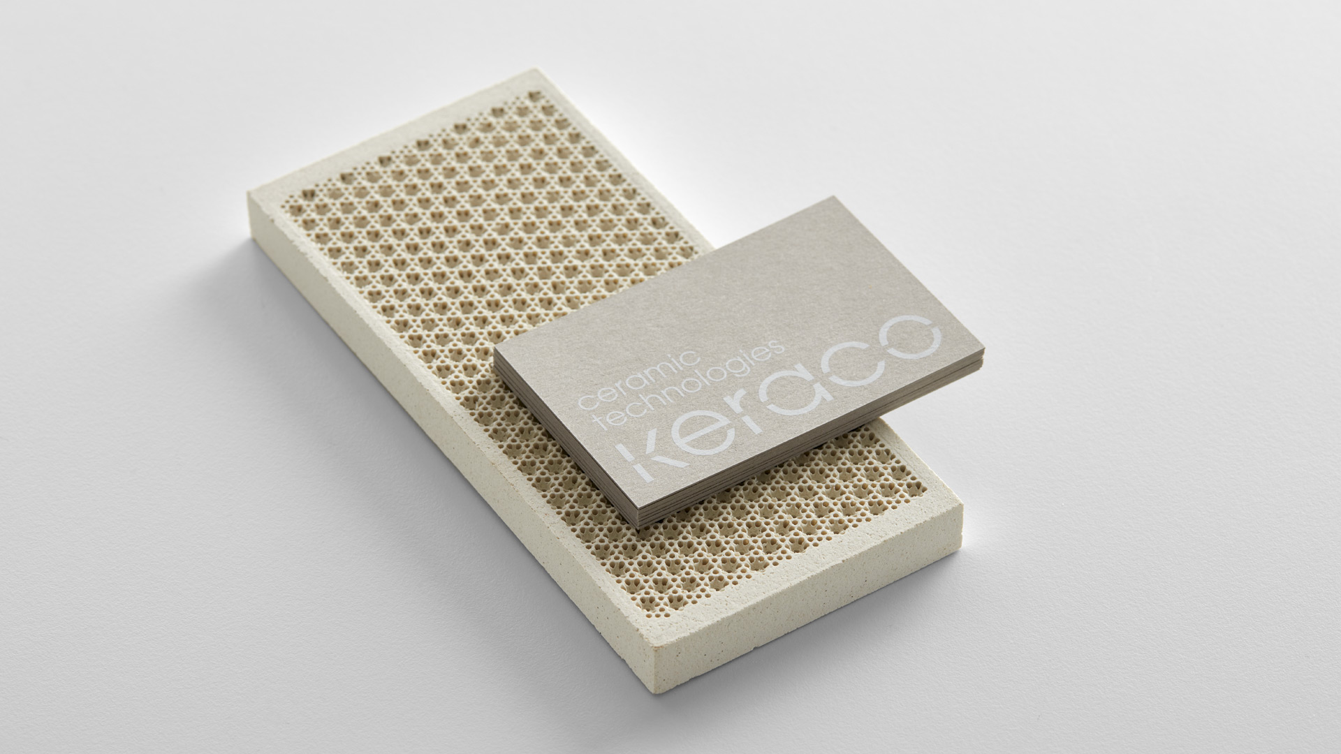
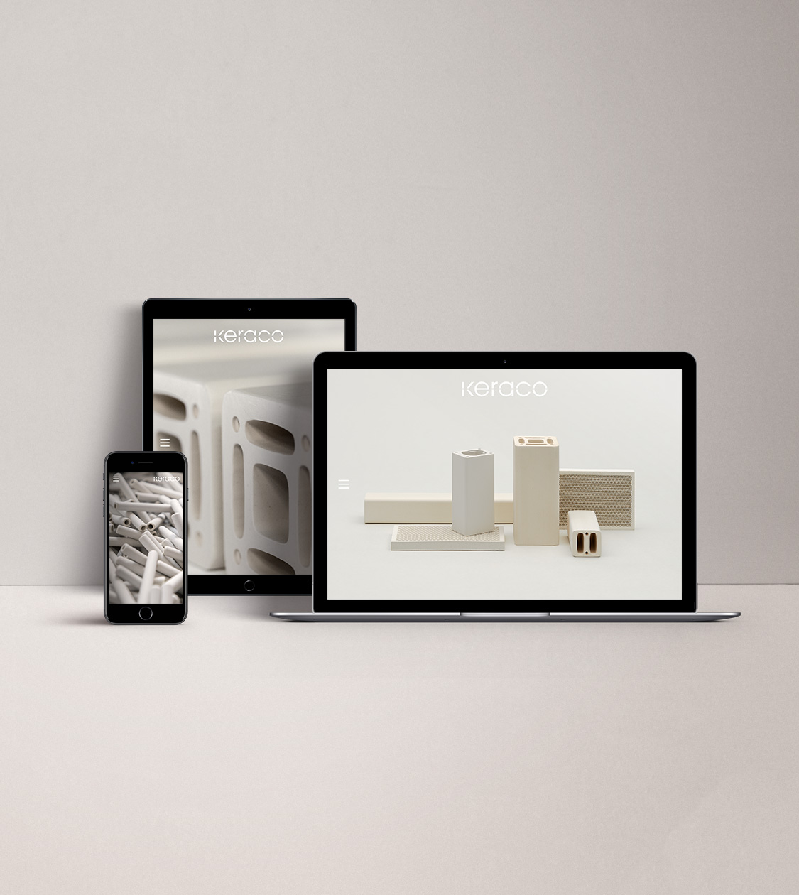
We have redesigned the corporate branding for Keraco Ceramic Technologies. Since 1990 the company has been manufacturing technical ceramic components for the industrial sector through extrusion and a pressing process of porous materials.
In order to kick off the branding development, as usual, we observed Keraco as a company and what mainly inspired us were the shapes, lines, textures and colours of the products and the quality of the used raw materials.
2019
/en/work/grafica-ideal-corporate-branding/
Gráfica Ideal
Rebranding for one of Portugal’s leading printing presses
Corporate Branding
Communication
Retail Branding
Business
Rebranding for one of Portugal’s leading printing presses
Corporate Branding
Communication
Retail Branding
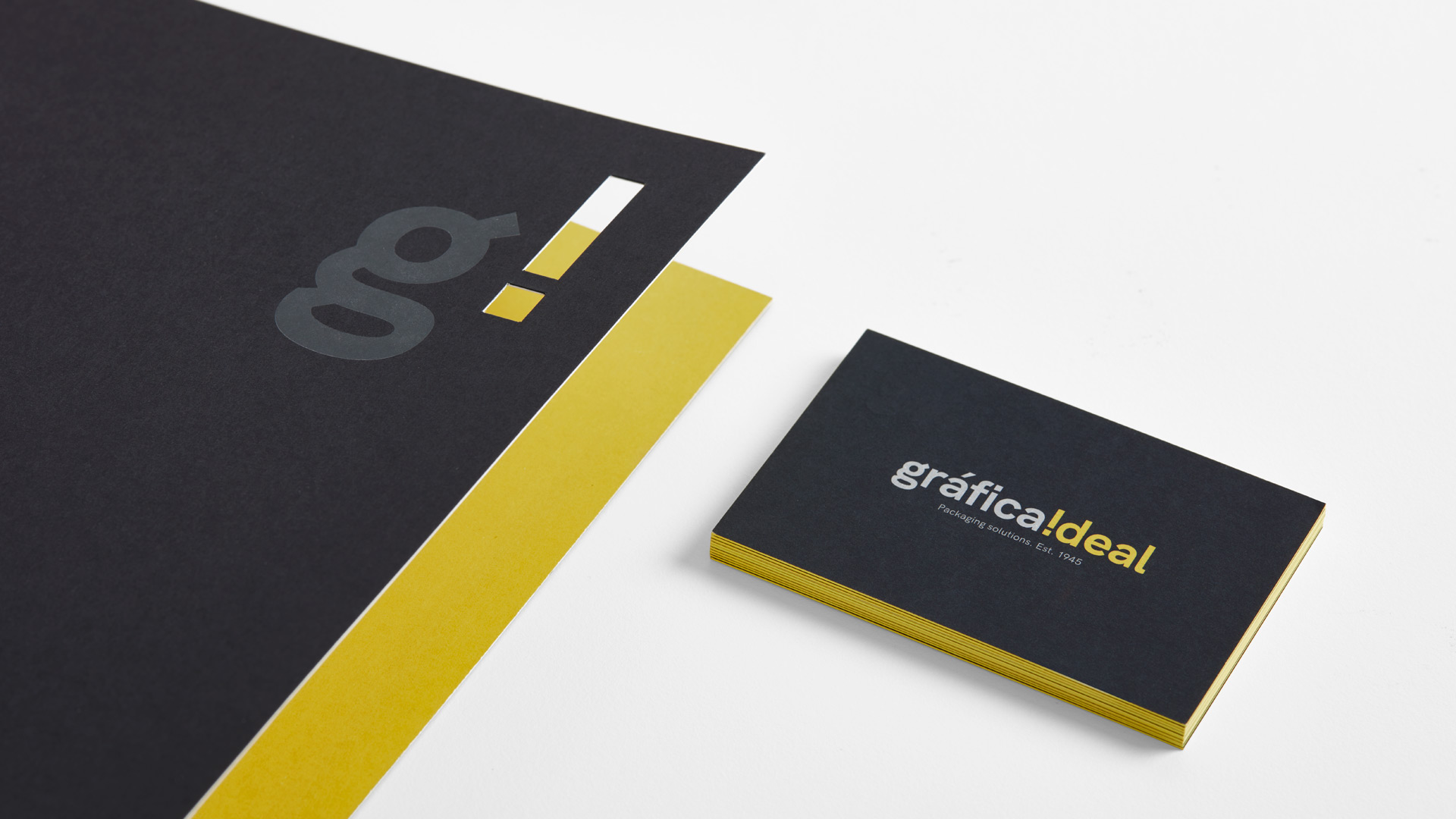
We are currently reworking the corporate brand identity for Gráfica Ideal, one of Portugal’s most important printing companies, specialising in the design, development and manufacture of packaging solutions since 1945.
Employing a team of over 100 people, the company offers services to both national and international clients as relevant as Procter & Gamble, Unilever or Nestlé.
With 75 years of experience, in 2017 an ambitious expansion phase was set in motion through the enlargement of facilities and the acquisition of new machinery, with the aim to generate significant growth within the organisation. This fact underlined the need for a full corporate rebranding in order to revamp the brand and adapt its image to the company’s new revitalised reality.
2019
/en/work/lc-paper-art-direction/
LC Paper
Setting the art direction for the market’s most sustainable paper manufacturer
Editorial Design
Communication
Sustainable companies
Industry
Setting the art direction for the market’s most sustainable paper manufacturer
Editorial Design
Communication
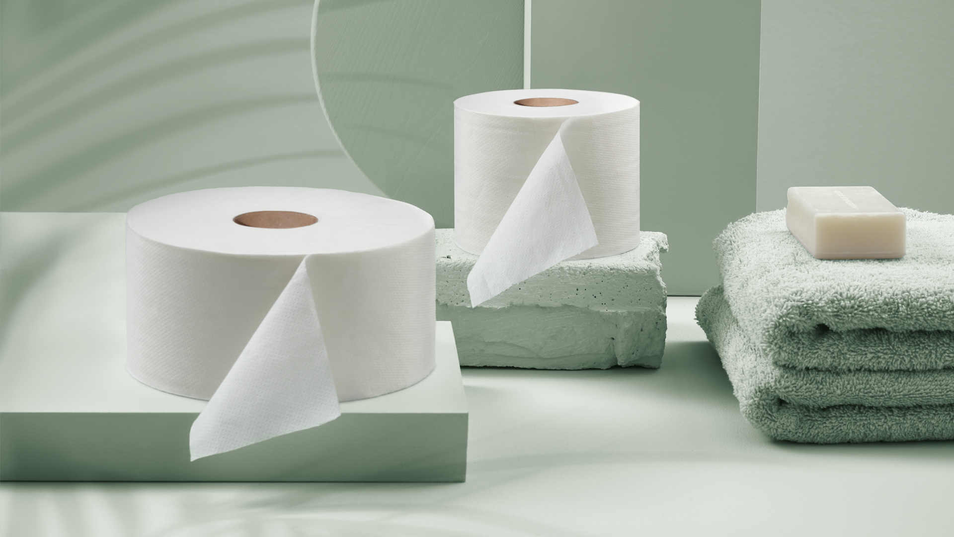
We conceptualised the art direction and design for the corporate brochure of our client LC Paper, a company with over 140 years of experience, who pioneered the manufacture of paper with zero CO2 emissions, and whose aim is to create the most sustainable paper in the world.
For the last two decades, LC Paper have been committed to continue as leaders in the manufacture of the most sustainable paper products on the market. Its strategic commitment to zero emissions during the manufacturing cycle and the development of its own technology for the manufacture of tissue paper, Kraft and derivatives, has positioned them as the first international paper manufacturer considered carbon-neutral.
2019
/en/work/exit-fabrics-digital-communication/
Exit Fabrics
Defining a new digital communication aligned with their updated corporate branding
Digital Communication
Textile
Industry
Defining a new digital communication aligned with their updated corporate branding
Digital Communication

We developed and designed the new website for Exit Fabrics, who have been manufactoring professional technical upholstery since 1985, applying its new corporate branding, which we had previously conceptualised, with the aim to adapt its image to the reality of their company.
2019
/en/work/apli-kids-product-design-magnets/
Apli Kids
We crafted Apli Kids’ collection of educational magnetic games
Packaging Design
Product Design
Industry
Games
We crafted Apli Kids’ collection of educational magnetic games
Packaging Design
Product Design
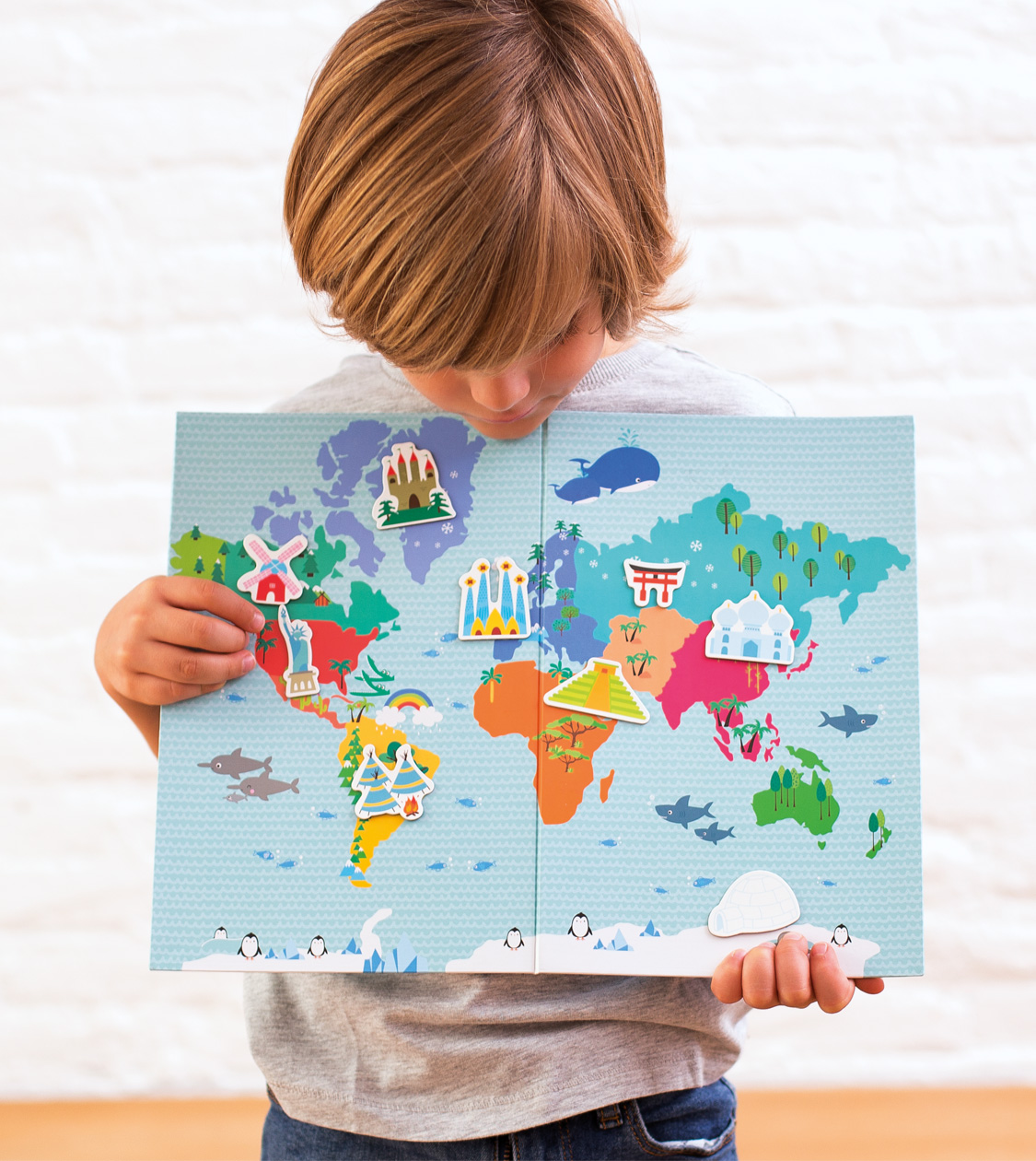
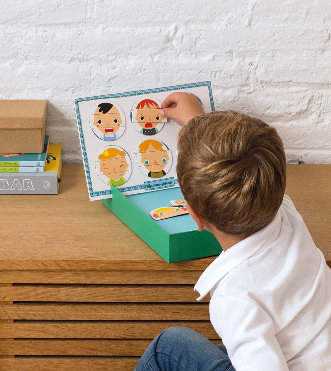
Since 2011 we have worked alongside Apli Kids in the creation of their educational games. Over the years we have been observing the kids, generation after generation, we have analysed the trends of the sector and examined the latest innovations, in order to conceptualise the new ranges of products which, apart from having a clearly educational nature, display a creative, original and attractive design for the little ones.
2019
/en/work/kedge-corporate-branding/
Kedge
Crafting the Strategy and Branding for a new strategic business consultancy
Branding Strategy
Corporate Branding
Business
Crafting the Strategy and Branding for a new strategic business consultancy
Branding Strategy
Corporate Branding


We have worked on the strategy and corporate branding for our client Kedge (i.e. naming, corporate tagline, brand identity), a newly launched Strategic Business Consultancy based in Barcelona. Kedge helps make tailored, informed decisions to generate growth in companies by contextualising each and every bit of data.
Our challenge has been to develop a branding strategy and corporate branding for a newly formed company, resulting from the union of three other firms: KODAMA ANALYTICS, ALLEGRO CONSULTING and CAMPOBASE, all of which coming from the Data Analytics and the Business Consulting sectors, led by a highly qualified team of professionals with extensive professional careers.
2019
/en/work/lekue-packaging-design-veggie-tools/
Lékué
Crafting the packaging for Lékué’s Veggie Tools collection
Packaging Design
Objects for living
Industry
Crafting the packaging for Lékué’s Veggie Tools collection
Packaging Design
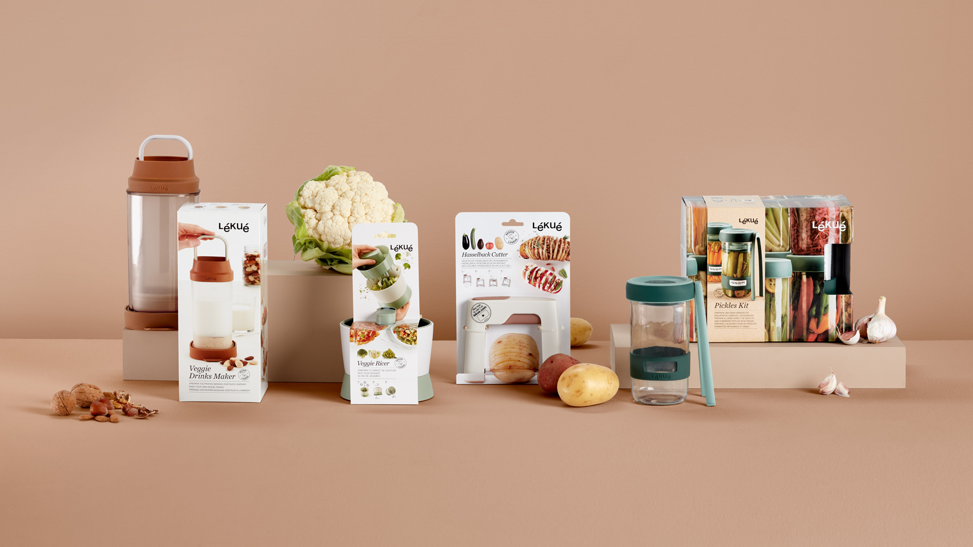
We carry out the packaging design for Lékué’s Veggie Tools Collection. Our aim is to communicate to the end consumer the concept of these innovative products as well as their functionality.
2019
/en/work/miquelrius-product-design-just-black/
Miquelrius
We designed the products for the new Just Black collection by Miquelrius
Product Design
Stationery & Accessories
Industry
We designed the products for the new Just Black collection by Miquelrius
Product Design
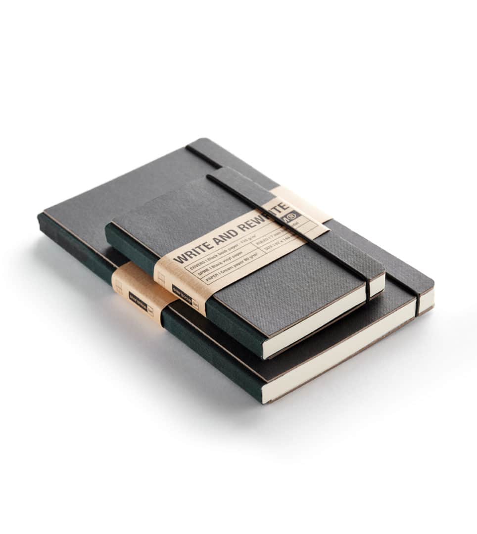
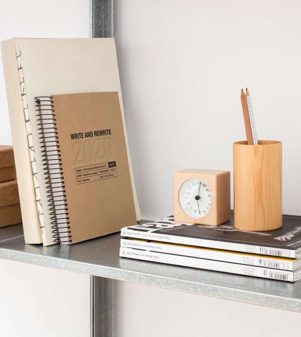
Conceptualising and designing a new collection of products for Miquelrius, an undisputable benchmark in the manufacture of stationery items, with over 180 years of experience.
The Just Black Collection consists of a diary, a range of notebooks, journals and holdalls with a functional design, championing the materials used, such as, for example, 100% recycled cardboard recovered from post-consumption, paper fibre, fabric linings or simile leather made of recycled scraps.
2019
/en/work/miquelrius-product-design-agenda-collection/
Miquelrius
We crafted the new Miquelrius 2019/20 agenda collection
Product Design
Industry
Stationery & Accessories
We crafted the new Miquelrius 2019/20 agenda collection
Product Design
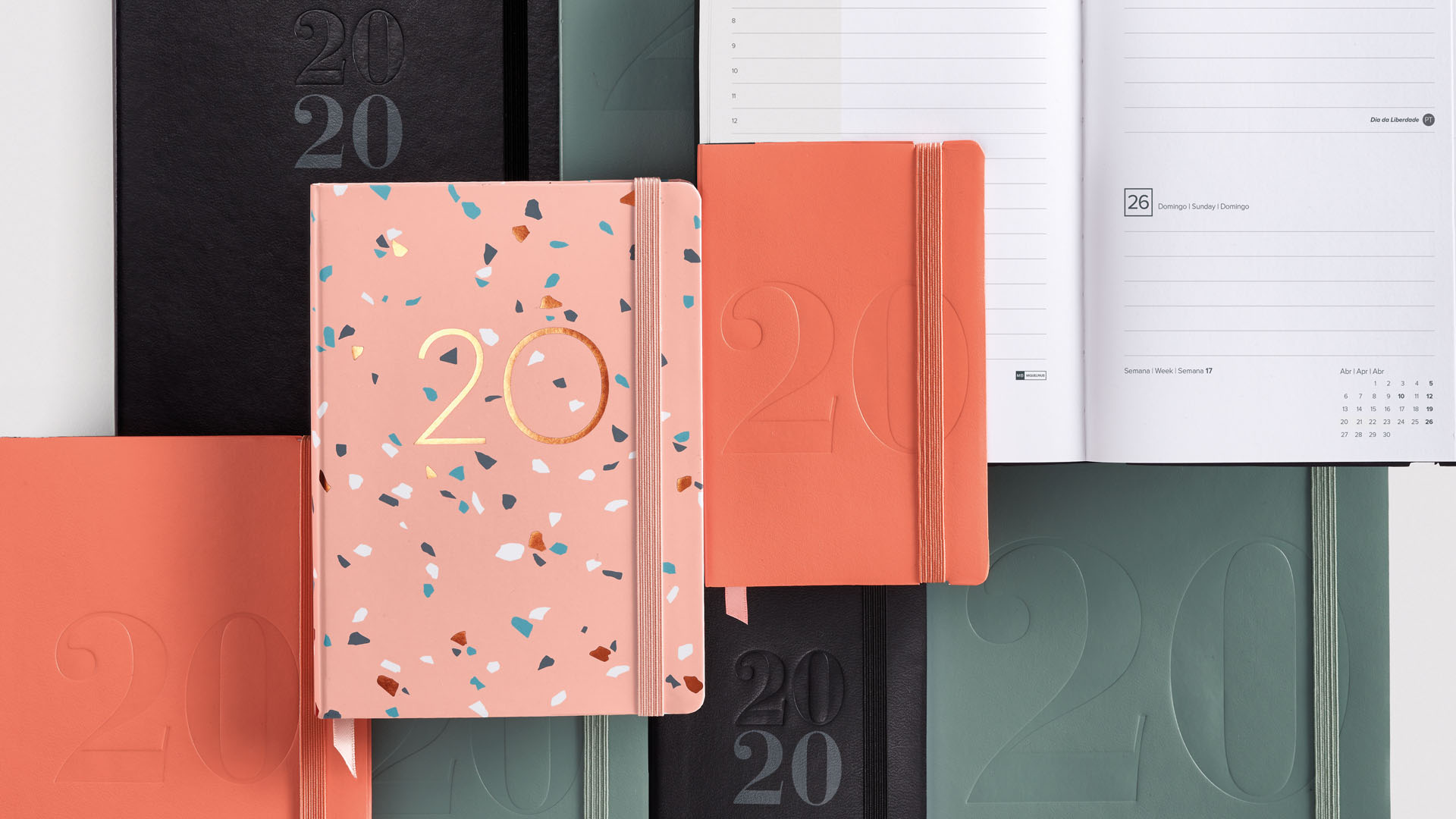
For yet another season, we get the ball rolling and work on concept and design of the newest collection of diaries and planners for our client Miquelrius, an undisputed reference in the manufacture of stationery items, with over 180 years of experience in the sector. Miquelrius’ products are characterised by reliable design and quality, offering a wide assortment and great diversity of styles, sizes and formats.
For year 2020, we have designed diary collections that take account of the needs and personalities of a variety of consumers and follow the trends of the market. As an example, the Basics collection is characterised by the timelessness of its colour range and the functionality of its designs.
2019
/en/work/mac-group-digital-communication/
MAC Group
We defined the digital communication for the stand and events company, MAC Group
Digital Communication
Business
We defined the digital communication for the stand and events company, MAC Group
Digital Communication
We have been conceptualising, developing and designing the new website for MAC Group –experts in trade-fair stands, business booths and event assemblies– to turn it into the company’s key piece of digital communication and product marketing.
We designed their digital communication by applying their previously redefined corporate branding, which is in turn a result of the new brand strategy that we reformulated to adapt it to the company’s current reality and to the size of the projects which they are currently carrying out around the world.
2019
/en/work/exit-fabrics-branding/
Exit Fabrics
A corporate strategy and branding that effectively communicates the company’s activities
Branding Strategy
Corporate Branding
Communication
Textile
Industry
A corporate strategy and branding that effectively communicates the company’s activities
Branding Strategy
Corporate Branding
Communication
Conceptualisation and redefinition of brand values and positioning in order to adapt them to the company’s current reality. We reformulated, renamed, reframed its storytelling with a new proposal of values and a new tagline which lastly translated into a complete rebranding.
2019
/en/work/mac-group-stands-corporate-branding/
MAC Group
We crafted the new corporate branding for MAC Group, inspired by the concept of ‘construction’
Branding Strategy
Corporate Branding
Business
We crafted the new corporate branding for MAC Group, inspired by the concept of ‘construction’
Branding Strategy
Corporate Branding
MAC Group, specialising in assembly of stands and events, needed a new corporate image, consistent with its reality and the size of the current projects in relevant events and trade fairs, at both a national and international level, such as Mobile World Congress, with clients such as Google, Vodafone, HP, Pepsi & Lays or Santa & Cole, among many others.
The development and result of this project for MAC Group is yet another example of our work methodology. We immerse ourselves in the area of expertise of our clients, getting to know their singularities, trends and competitors. We place ourselves in our client’s position and hence come to understand their business. As a result, we join up working together for the same goals.
2019
/en/work/grok-editorial-design-2019/
Grok
An art direction that conveys the brand values and showcases Grok’s latest luminaires
Editorial Design
Communication
Retail Branding
Furniture & Lighting
An art direction that conveys the brand values and showcases Grok’s latest luminaires
Editorial Design
Communication
Retail Branding
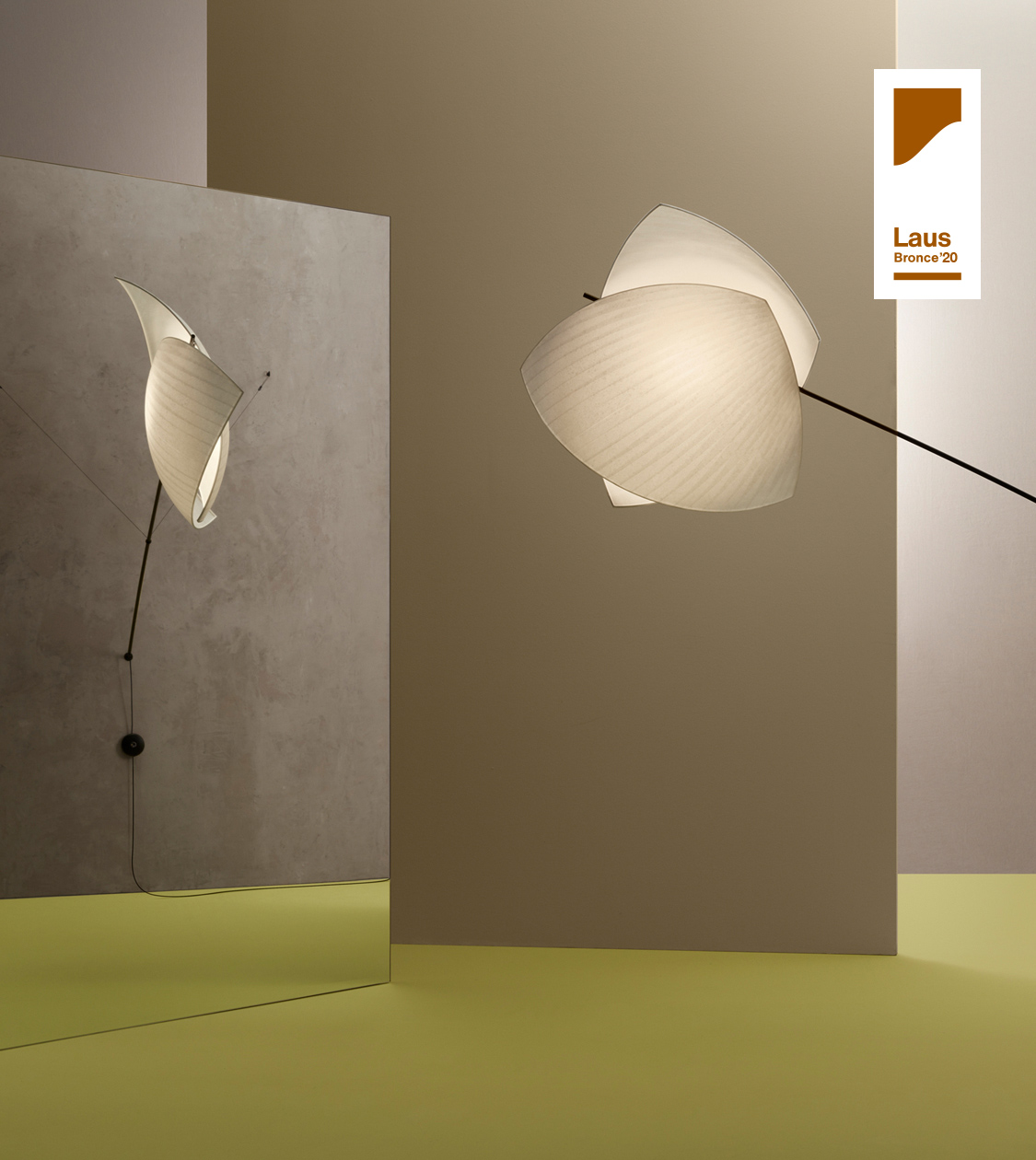
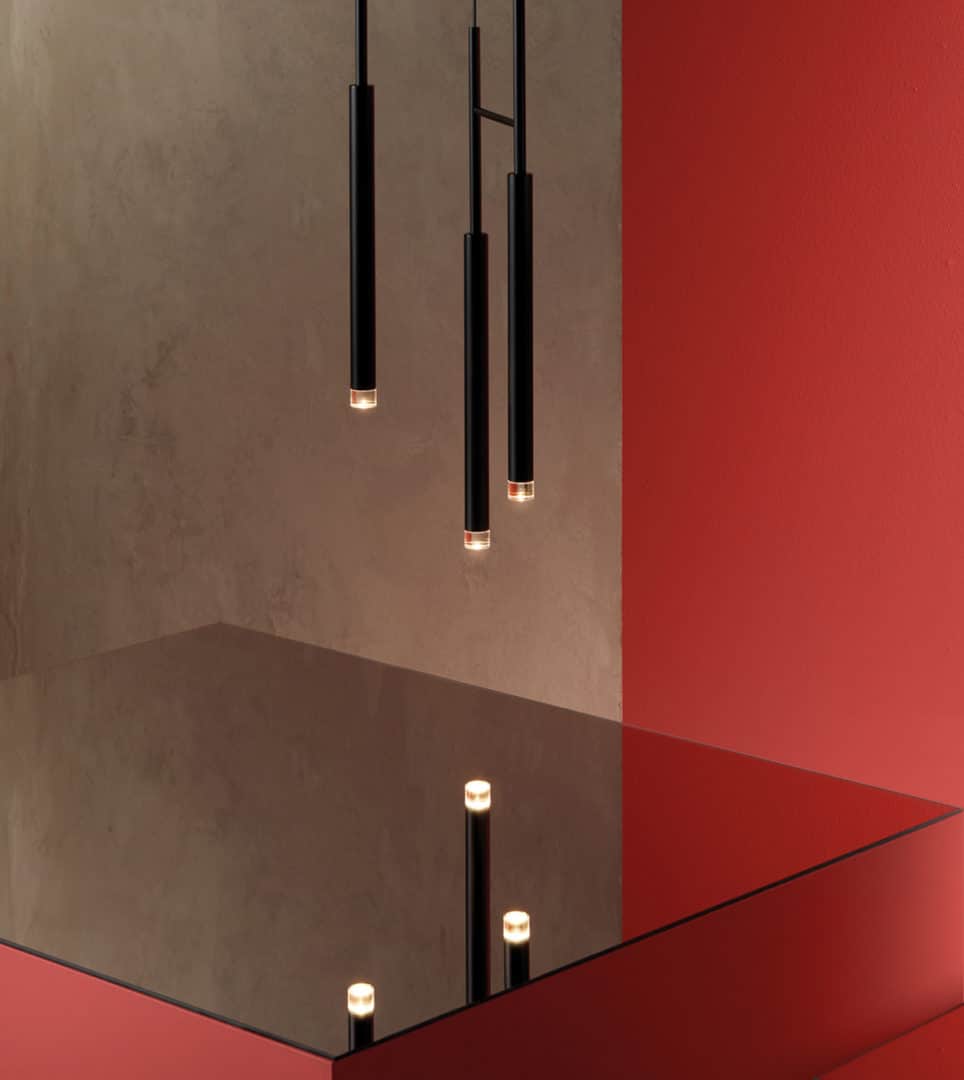
At NOMON we have carried out the design, the art direction and the photographic production of the new 2019/2020 product catalog, which Grok –the high-end brand of LEDS C4 lighting group– is presenting at Euroluce 2019.
To express the brand identity values of Grok and show the luminaries in a seductive way and in atmospheres that enhance its excellent design, the focus of Art Direction was to use a poetic and artistic concept: the reflection in a mirror, as reflection is the most objective and honest expression of oneself. The deepest vision. A way to understand the world. For all creation, all work, ends up being the reflection of oneself.
2019
/en/work/nomon-design-corporate-branding/
Nomon Design
Our new branding mirrors our appreciation for simplicity and our dedication to our craft
Corporate Branding
Business
Our new branding mirrors our appreciation for simplicity and our dedication to our craft
Corporate Branding

We needed to refresh NOMON’s image to bring it in line with how we really are, so that it better represents our values.
First and foremost, the new identity conveys the idea of design. It is based on the values shared by the entire team: creativity, design, pragmatism and honesty, which reflect our character and the concepts that best represent us.
We want our corporate image to better reflect our liking for simplicity and the passion we put into our daily work.
2018
/en/work/espigoladors-packaging-es-imperfect/
Espigoladors
Crafting socially impactful packaging for the im-perfect® brand
Packaging Design
Sustainable companies
Food & Drink
Crafting socially impactful packaging for the im-perfect® brand
Packaging Design
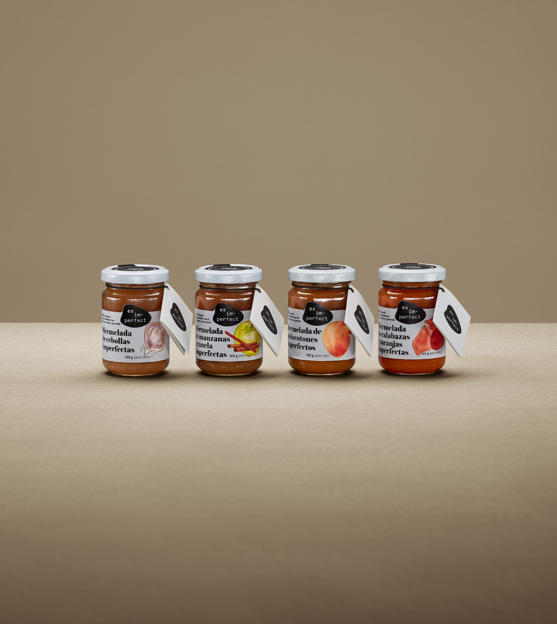
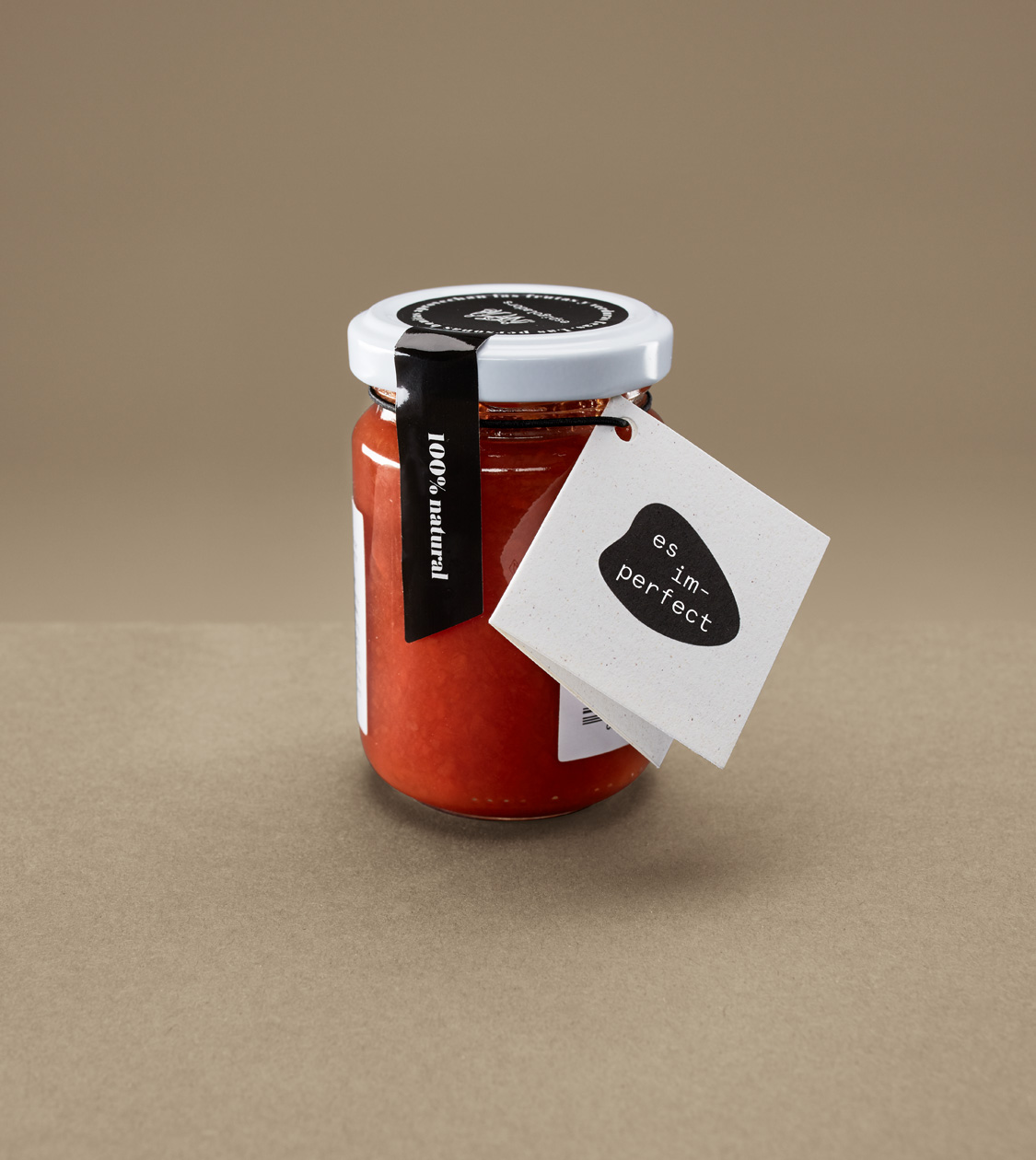
In 2015 we started working with Espigoladors, a non-profit foundation which has been fighting food waste since 2014, while it also empowers people who are at risk of social exclusion, in a transformative, participatory, inclusive and sustainable way.
We continued collaborating with Espigoladors and its trademark es im-perfect® for 4 years. We carried on designing packaging and developing communication using concepts with significant social values and impact, both in marketing campaigns and in campaigns alongside all kinds of private companies (Christmas gifts, personalised packs, preservation recipe books, etc.)
2018
/en/work/mydrap-texia-case-study/
MY DRAP
CS
Making a difference with a fresh branding strategy for MY DRAP
Branding Strategy
Digital Communication
Product Design
Industry
Hospitality & Leisure
Textile
Making a difference with a fresh branding strategy for MY DRAP
Branding Strategy
Digital Communication
Product Design
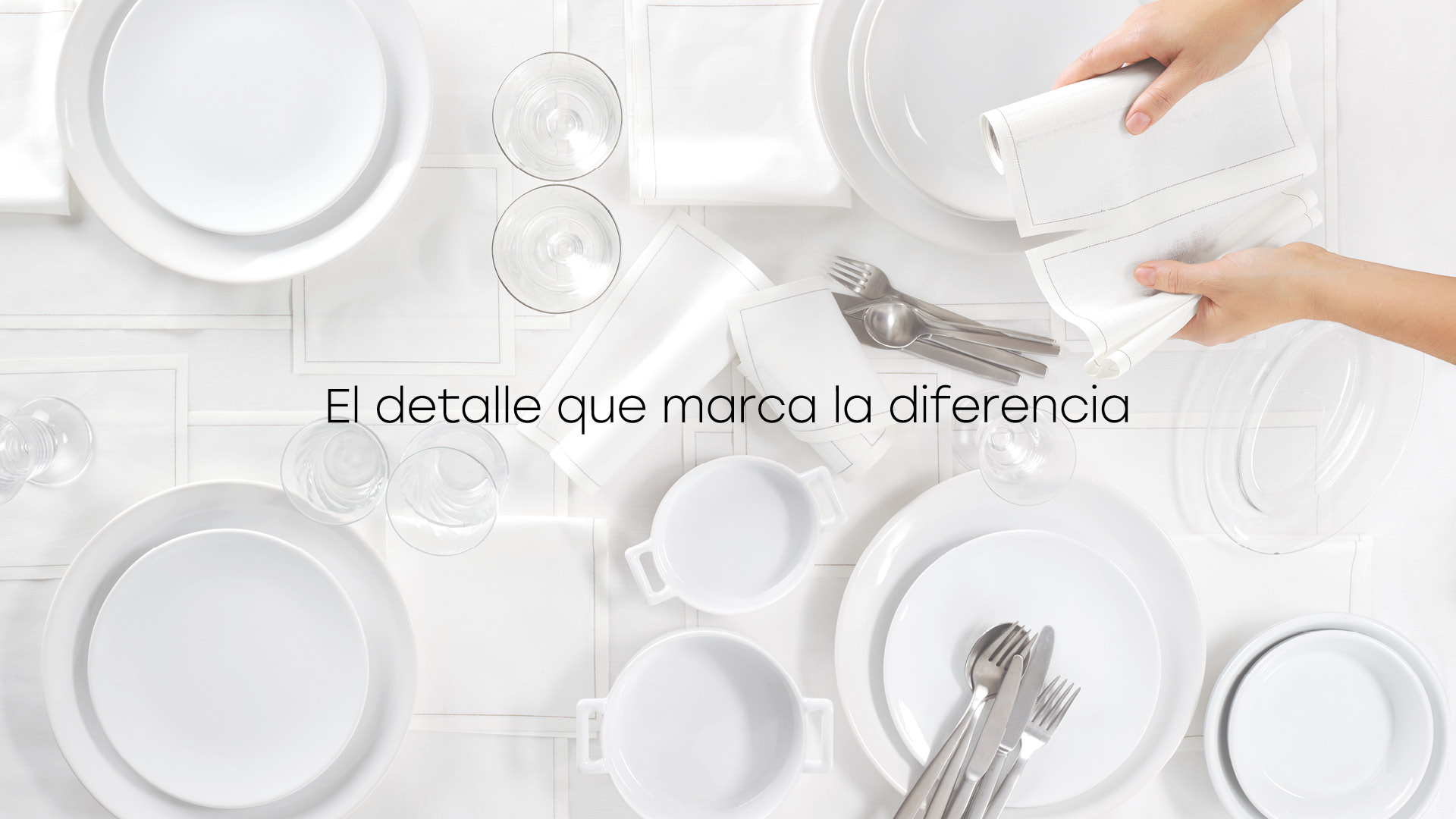
Since mid-2016, we have been working on branding development, alongside TEXIA Group, for some of the company’s trademarks such as MY DRAP, targeting both the retail and the professional channels. During this time, we managed to build a global communication strategy which genuinely makes a difference for a corporate group of over 100 years.
Thanks to our teamwork, we achieved significant changes in the design of the products and improved both the brand perception and the brand notoriety.
2018
/en/work/grok-packaging-design-cocktail/
Grok
Designing the packaging for Cocktail, Francesc Vilaró’s new luminaire
Packaging Design
Furniture & Lighting
Designing the packaging for Cocktail, Francesc Vilaró’s new luminaire
Packaging Design
We conceptualised and designed the packaging for the Cocktail luminaire, by Francesc Vilaró for Grok, a manufacturer of high-end lighting in the contract and home sectors.
In NOMON we have always reckoned that packaging plays an extremely important role as a key piece of communication which can perfectly transmit brand values, but also the values of the product itself.
2018
/en/work/mydrap-texia-packaging-design/
MY DRAP
We redesigned the packaging for MY DRAP’s innovative textile product
Packaging Design
Industry
Hospitality & Leisure
Textile
We redesigned the packaging for MY DRAP’s innovative textile product
Packaging Design


Faced with the need to better explain MY DRAP’s products in points of sale, we redesigned their packaging to make them more understandable for consumers.
The presentation of pre-cut linen tablecloths and napkins in rolls required a labelling system which would communicate their innovative nature and function at first sight. This had been something that had caused some confusion in consumers in the past.
2018
/en/work/la-remei-corporate-branding/
La Remei
We redesign the corporate branding of a new health space
Corporate Branding
Retail Branding
Health & Beauty
Business
We redesign the corporate branding of a new health space
Corporate Branding
Retail Branding
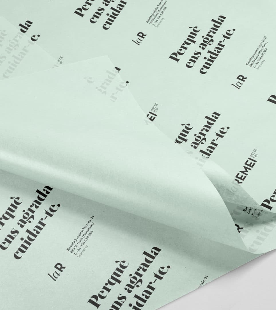
We completely redesigned the corporate branding (naming, tagline and identity) of the establishment formerly called Farmàcia de La Rambla, located in the centre of Gavà. A new health space known to be a meeting point for people of the region of El Baix Llobregat for its different services: pharmacy, greengrocer, restaurant, medical practice, activities and garden.
2018
/en/work/mydrap-texia-retail-branding-ambiente-2018/
MY DRAP
We designed the retail branding for MY DRAP and DAY DRAP at the Ambiente Fair
Retail Branding
Textile
Hospitality & Leisure
Industry
We designed the retail branding for MY DRAP and DAY DRAP at the Ambiente Fair
Retail Branding
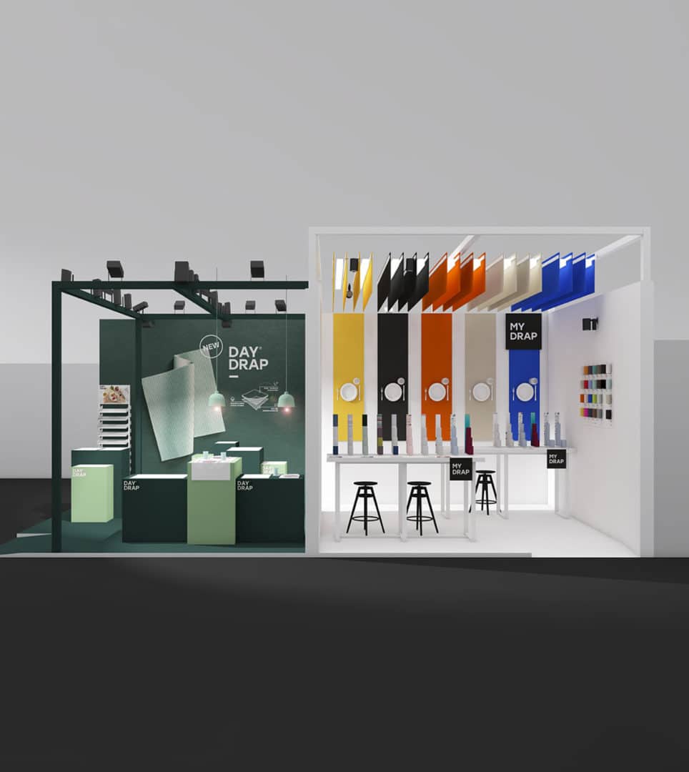
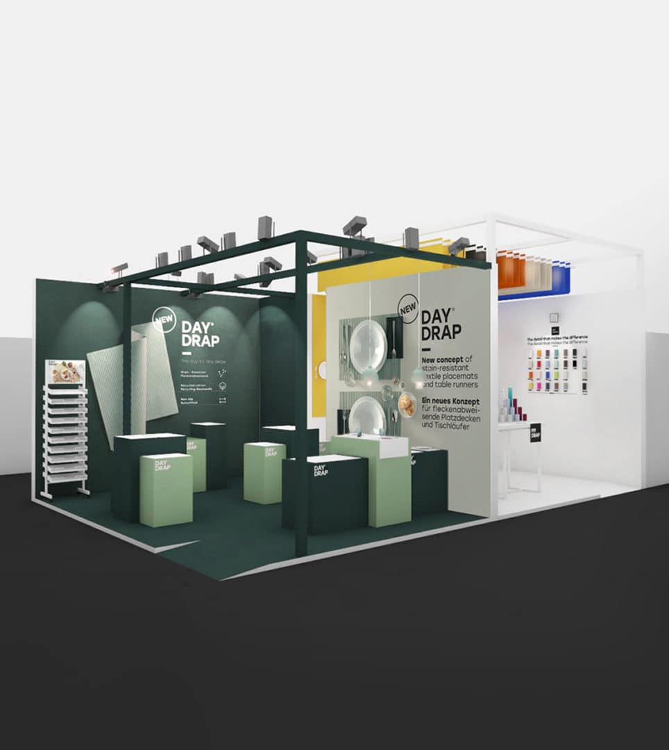
We have worked on conceptualising and designing the MY DRAP and DAY DRAP stands for AMBIENTE 2018 Trade Fair, using their recently rebranded values, creative concept and corporate branding. In redesigning the MY DRAP booth space, we primarily relied on the fundamental value of the brand: 100% cotton quality on the dining table.
Whereas in the case of DAY DRAP, we rather focused on the design and distribution of the booth space, to showcase the waterproof and non-slip layers of the products, and invite attendees to discover the final result on the table itself.
2018
/en/work/mydrap-professional-texia-retail-branding-igeho/
MY DRAP
Designing the retail branding for MY DRAP Professional for IGEHO and HOST
Retail Branding
Textile
Hospitality & Leisure
Industry
Designing the retail branding for MY DRAP Professional for IGEHO and HOST
Retail Branding

We worked on concept and design of the MY DRAP Professional stand, whose products were due to be showcased in the most relevant hotel and restaurant trade fairs in Europe: IGEHO in Switzerland and HOST in Milan. For the occasion, the recently restudied strategy was communicated in their space for the first time, while the rebranding and new product collections were presented as well.
We used the space to apply the new creative concept, i.e. product personalisation: the blank canvas on which the customer creates his or her own product. We produced an elegant space in which the black colour stands out as a representation of the professional gourmet sector.
2018
/en/work/le-creuset-communication-natures-kitchen/
Le Creuset
Crafting the Nature’s Kitchen communication campaign for Le Creuset
Editorial Design
Communication
Industry
Objects for living
Crafting the Nature’s Kitchen communication campaign for Le Creuset
Editorial Design
Communication
We conceptualised and designed the packaging and marketing materials for Le Creuset’s Nature’s Kitchen campaign. Bearing in mind the concept of the campaign and the current trends for everything in the kitchen to be natural and handmade, we designed a product called “aromatic plants from Le Creuset”: four packs of four aromatic plants (oregano, parsley, chives and basil) which contain everything necessary for people to enjoy the experience of planting, picking, cooking and eating without leaving home, and can be planted in limited edition coloured pots from Le Creuset.
We designed an accompanying pack and illustrated brochure, which explained all of the planting stages, and we handled the artwork and the contents of both these pieces and the campaign catalogue. We captured how nature is presented directly on our plates, through creative recipes and colourful products from the brand, bringing the Nature’s Kitchen concept directly into the home.
2018
/en/work/lekue-packaging-design-savarins/
Lékué
Crafting the packaging for Lékué’s new baking products: Savarin moulds
Packaging Design
Objects for living
Industry
Crafting the packaging for Lékué’s new baking products: Savarin moulds
Packaging Design
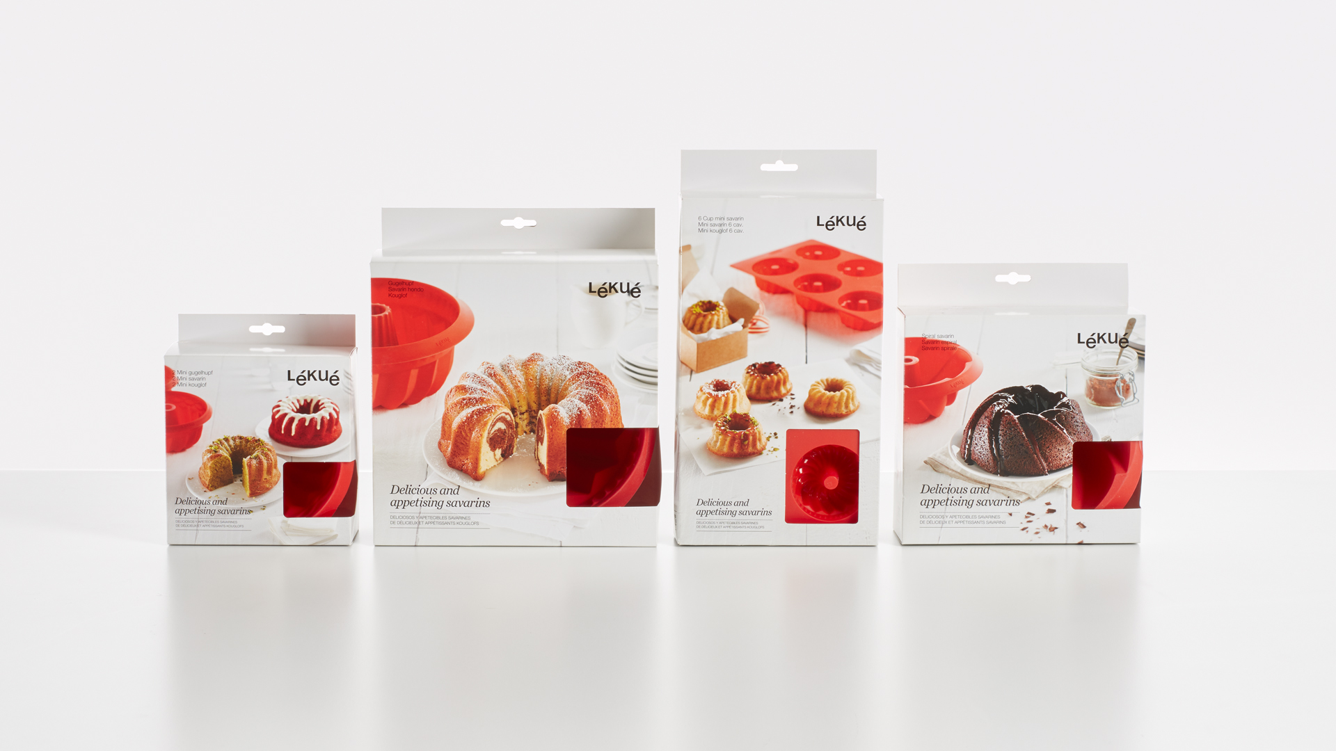
Lékué, the leading manufacturer of kitchen utensils, needed a special packaging design for its range of silicone baking moulds.
Following the design line of the Lékué baking product range, various packaging was designed featuring prominent images of the final results, with the aim of encouraging the consumer to use the silicone moulds by showing their potential for baking.
2018
/en/work/lekue-packaging-design-quick-cooker/
Lékué
Packaging design for Lékué’s new Quick Cooker range
Packaging Design
Objects for living
Industry
Packaging design for Lékué’s new Quick Cooker range
Packaging Design
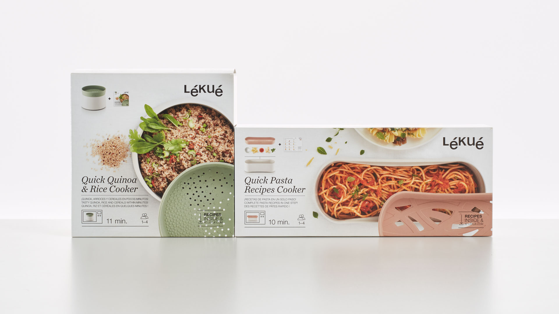
Slow food is not at odds with modern cooking
Lékué’s new containers for cooking pasta, quinoa, rice or cereal in the microwave needed packaging that would show off their strengths and the final image of the food once cooked.
Through the use of the packaging itself to convey the instructions for use, cooking times and recipes, useful information was offered to the consumer, who would be motivated to cook immediate, surprising and practical dishes in a quick, easy, flavourful and healthy way.
2018
/en/work/lekue-communication-veggie-tools/
Lékué
Developing communication and packaging for Lékué’s Veggie Tools collection
Communication
Industry
Objects for living
Developing communication and packaging for Lékué’s Veggie Tools collection
Communication
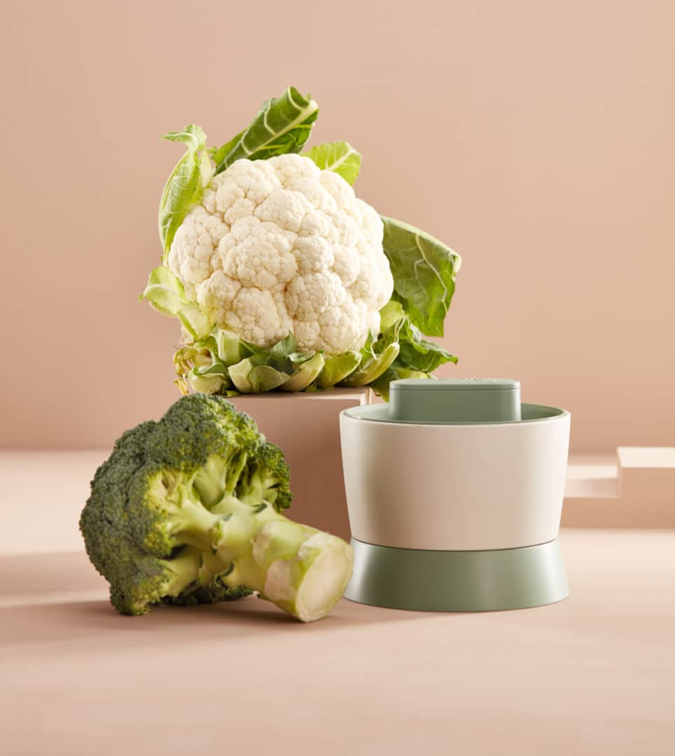
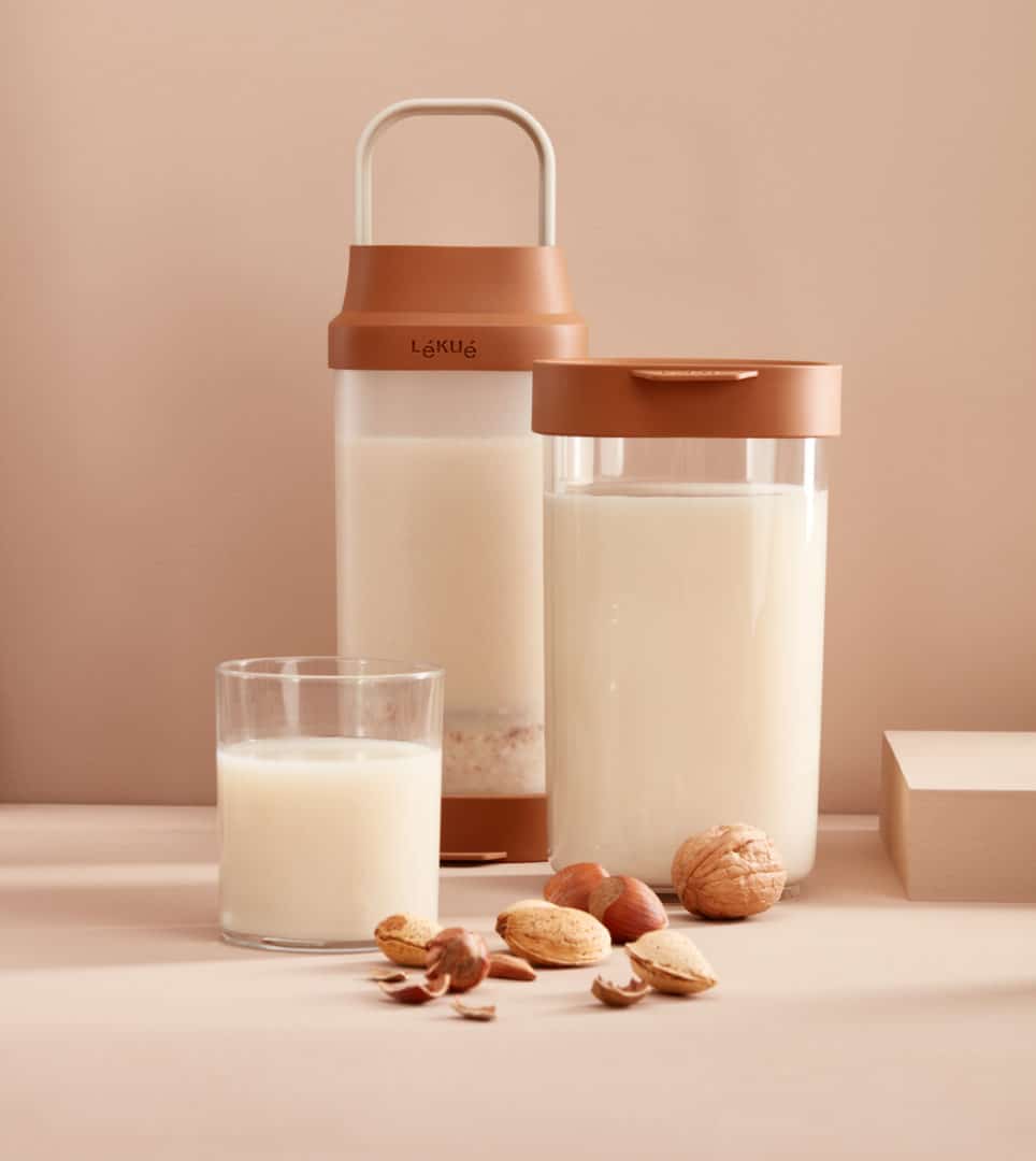
The Lékué brand, known internationally as a developer and manufacturer of kitchen utensils, unveiled the new Veggie Tools collection aimed at customers interested in slow food and healthy cooking. We conceptualised and created the collection’s image to present each of the products that make up the family: Pickles kit, Veggie drinks maker, Brocoli & Cauliflower rice and Hasselback vegetables.
2018
/en/work/le-creuset-editorial-bistro/
Le Creuset
Designing the editorial design for Le Creuset’s biannual Bristro Magazine
Editorial Design
Communication
Industry
Objects for living
Designing the editorial design for Le Creuset’s biannual Bristro Magazine
Editorial Design
Communication


For Le Creuset’s autumn-winter campaign The origin of flavour, we conceptualised, defined the structure, created the content and designed the biannual magazine Bistro. This publication fitted into the company’s marketing strategy with a concept that linked back to and gave continuity with the previous campaign Nature’s Kitchen.
2018
/en/work/mydrap-profesional-texia-e-commerce/
MY DRAP
Digital communication for MY DRAP Professional that makes a difference
Digital Communication
Textile
Industry
Hospitality & Leisure
Digital communication for MY DRAP Professional that makes a difference
Digital Communication
We designed the new MY DRAP Professional online shop, using the branding previously created for the brand.
Based on the creative concept, customisation, we presented the website as the blank canvas on which each client could be the creator of their own product. We gave it character with a smart and sophisticated look, where the colour black dominates to represent the gourmet sector, and the artwork tastefully shows the detail of the finishes and the fabric of each of the table linen products. Plus, to enable easier browsing and purchasing, we have developed an iconic system that explains and guides the user through the customisation of the products.
2018
/en/work/apli-kids-retail-branding-2018/
Apli Kids
Designing the Retail Branding for Only for Kids! by Apli Kids
Retail Branding
Games
Stationery & Accessories
Industry
Designing the Retail Branding for Only for Kids! by Apli Kids
Retail Branding
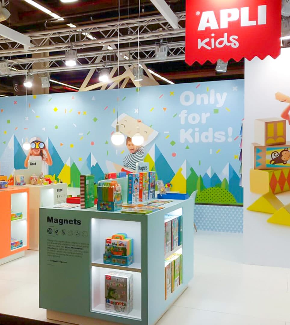
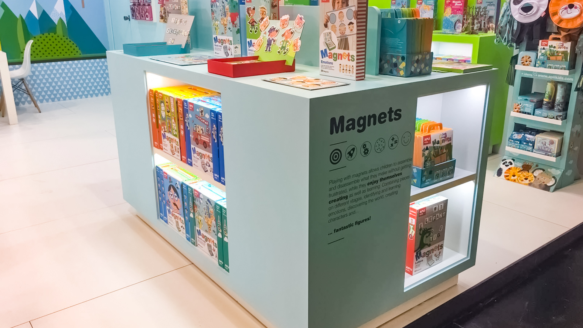

At the 2018 Spielwarenmesse toy fair in Nuremberg, at which Apli Kids was exhibiting, we designed the trade stand to fit the graphic line that we had conceptualised in the Only for kids! catalogue. The layout and furnishings enabled the products to be displayed in categories (games using stickers, magnets, puzzles, wood, painting and colouring, and DIY). We conveyed the pedagogical approach behind the products and used the project’s own colour scheme and iconography.
2018
/en/work/apli-kids-editorial-only-for-kids/
Apli Kids
New editorial design for the educational games brand Apli Kids
Editorial Design
Communication
Games
Stationery & Accessories
Industry
New editorial design for the educational games brand Apli Kids
Editorial Design
Communication
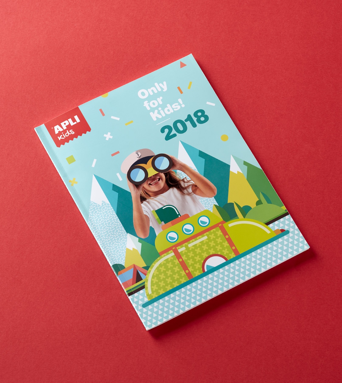
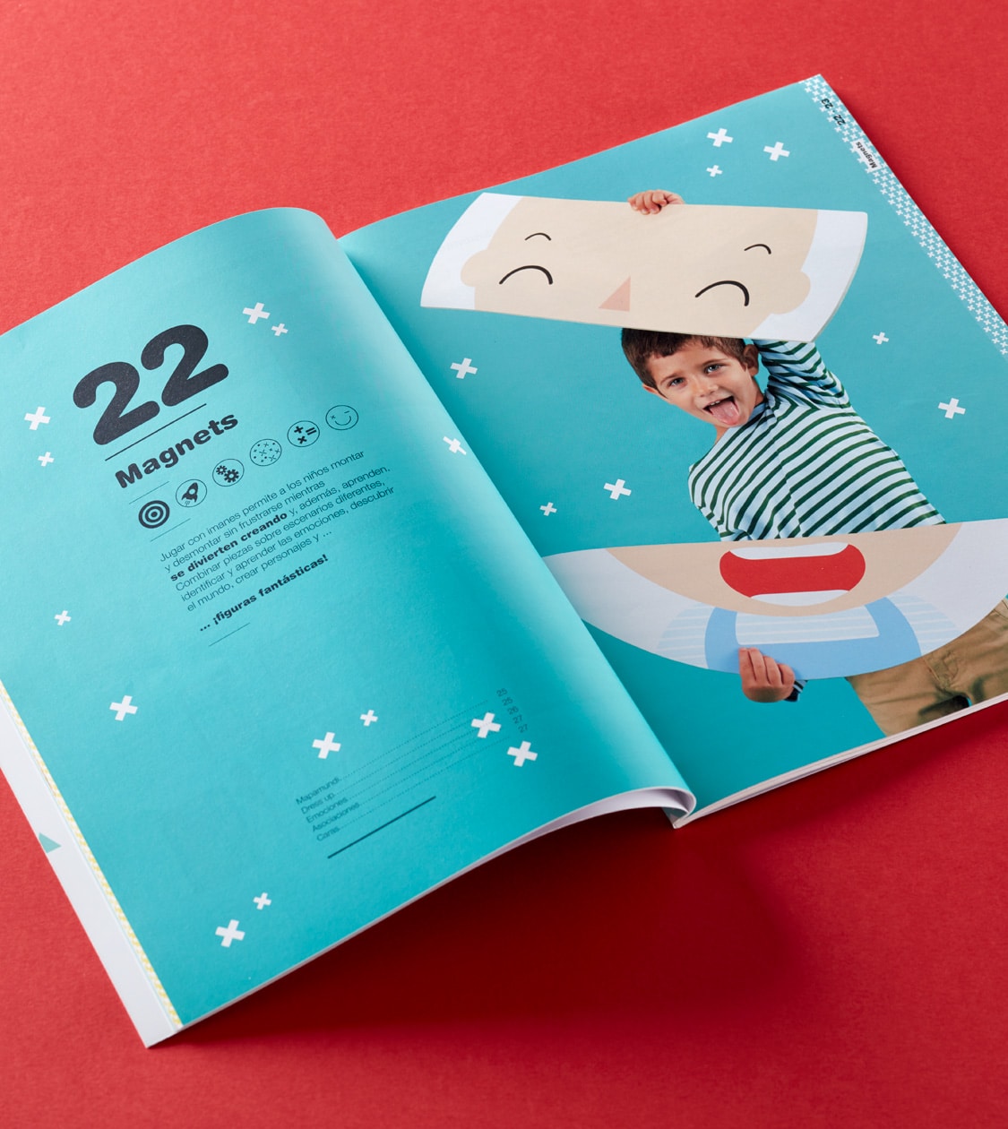
To highlight the value of the pedagogical approach behind Apli Kids products, we created a new categorisation for their product portfolio and segmented them into different categories: games using stickers, magnets, puzzles, wood, painting and colouring, and DIY. Plus, we created a series of resources unique to the project such as a new colour scheme and an iconographic system that was used in the design, lettering and contents of the new catalogue: Only for kids!
2018
/en/work/icex-foods-wines-from-spain-communication/
ICEX
We designed the visual identity for the Foods & Wines from Spain campaign
Communication
Arts & Culture
Food & Drink
We designed the visual identity for the Foods & Wines from Spain campaign
Communication
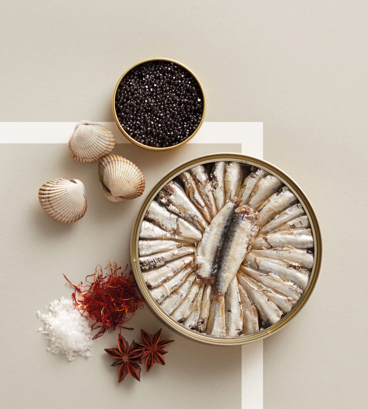

ICEX, an agency that promotes the export of Spanish companies abroad as well as foreign investment in Spain, sent out a national commissioning brief to prepare a new campaign that promoted the brands Foods & Wines from Spain, Foods from Spain and Wines from Spain.
2018
/en/work/grok-digital-communication-cocktail/
Grok
We crafted the digital communication for the launch of the Cocktail luminaire
Digital Communication
Furniture & Lighting
We crafted the digital communication for the launch of the Cocktail luminaire
Digital Communication
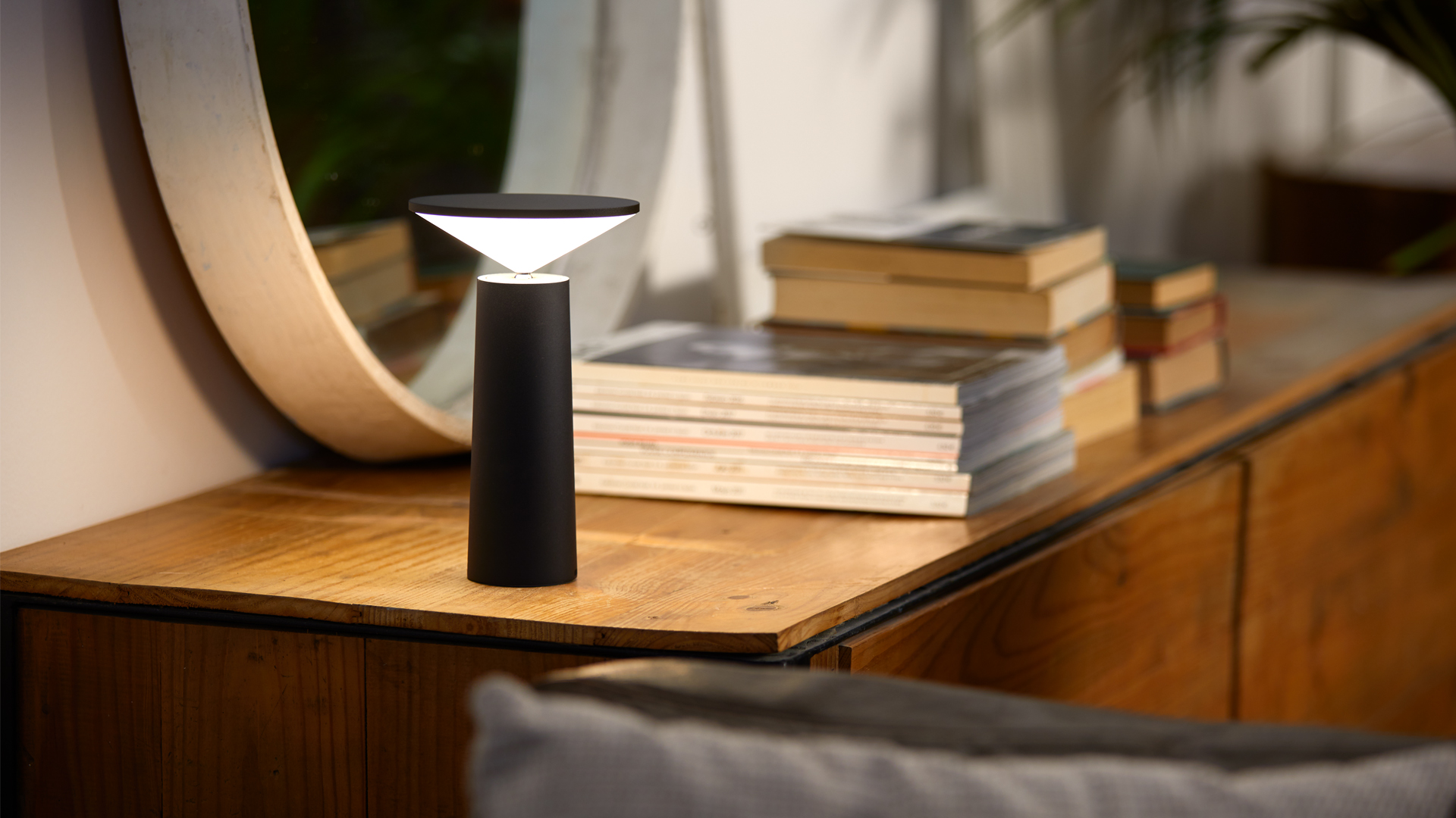
Grok, manufacturer of lighting for the contract and home sectors, launched the new Cocktail table lamp onto the market, designed by Francesc Vilaró.
2018
/en/work/leds-c4-case-study/
LEDS C4
CS
A new branding strategy projecting “lighting for all” worldwide
Branding Strategy
Corporate Branding
Furniture & Lighting
A new branding strategy projecting “lighting for all” worldwide
Branding Strategy
Corporate Branding
Since mid-2017 we’ve been working with LEDS C4 to create a corporate identity that will help them send, reinforce and project their new positioning and corporate message around the world.
The development and result of this project is a clear example of how we work at Nomon Design: we immerse ourselves in the sector, we empathise with our clients and their businesses, and we become part of the companies’ staff, working towards the same goal. This is because the more we know about our clients, the more the result of the project will better meet their real needs and expectations.
2018
/en/work/esimperfect-branding/
Espigoladors
We revamped the branding for a socially and environmentally responsible brand of vegetable preserves and jams
Branding Strategy
Corporate Branding
Food & Drink
Sustainable companies
We revamped the branding for a socially and environmentally responsible brand of vegetable preserves and jams
Branding Strategy
Corporate Branding
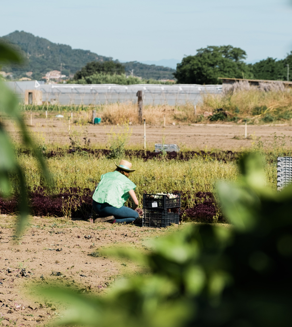
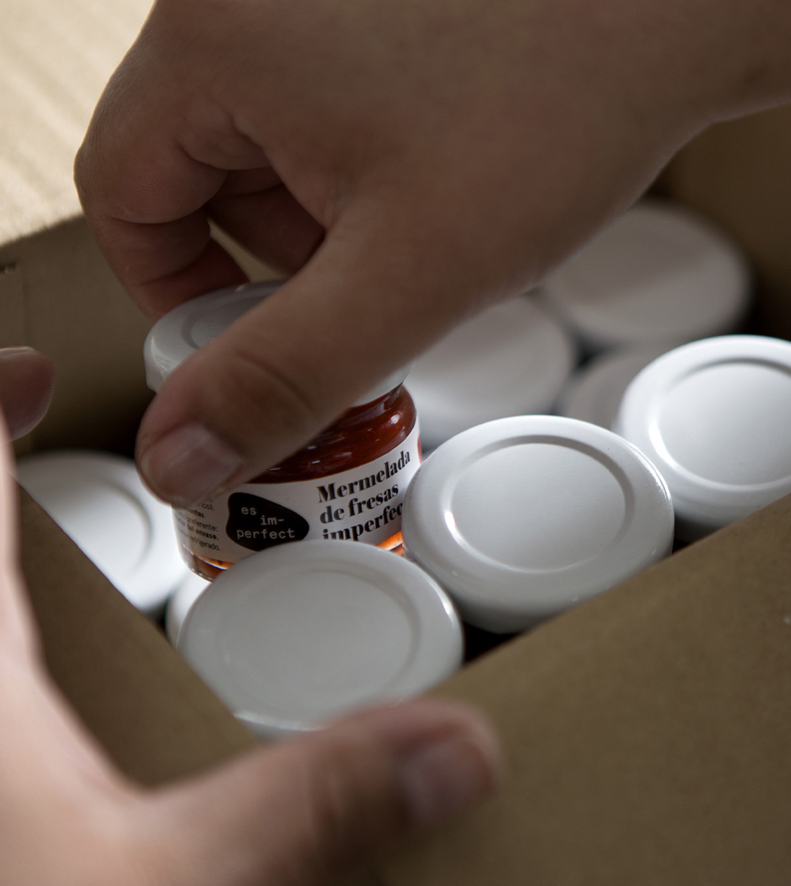
Since 2015 we have been collaborating with the non-profit foundation Espigoladors which, through its trademark es im-perfect®, has been fighting against food wastage, while empowering people at risk of social exclusion in a transformative, participatory, inclusive and sustainable way.
In 2018 we carried out the most relevant intervention, with the aim of perfecting the communication of the foundation and that of its products: we redesigned the logo, in accordance with the newly created corporate identity for the es im-perfect® brand.
2017
/en/work/le-creuset-urban-communication-campaign/
Le Creuset
Crafting their seasonal communication campaign, Taste of the City
Editorial Design
Communication
Product Design
Industry
Objects for living
Crafting their seasonal communication campaign, Taste of the City
Editorial Design
Communication
Product Design

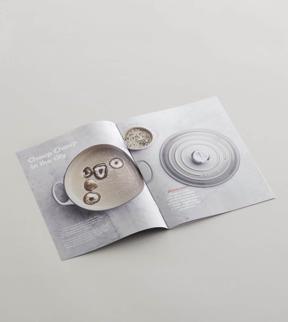
We conceptualised and designed the packaging and accompanying marketing materials for Le Creuset’s autumn-winter campaign Taste of the city.
Built around the concept of urban living, we transformed the campaign’s marketing plan into an inspiring and attractive visual piece which invites customers to buy. It also continues to connect and build loyalty with consumers and helps attract new ones.
For the section Christmas time in the city, we conceptualised and designed a special gift to accompany the purchase of Le Creuset products. Working with Cerabella, a world leader in the manufacture of candles, we reproduced the company’s logo, a mini-cocotte, in candle form.
2017
/en/work/lekue-packaging-limited-edition/
Lékué
Crafting the Limited Edition packaging for Lékué’s steam case
Packaging Design
Editorial Design
Industry
Objects for living
Crafting the Limited Edition packaging for Lékué’s steam case
Packaging Design
Editorial Design

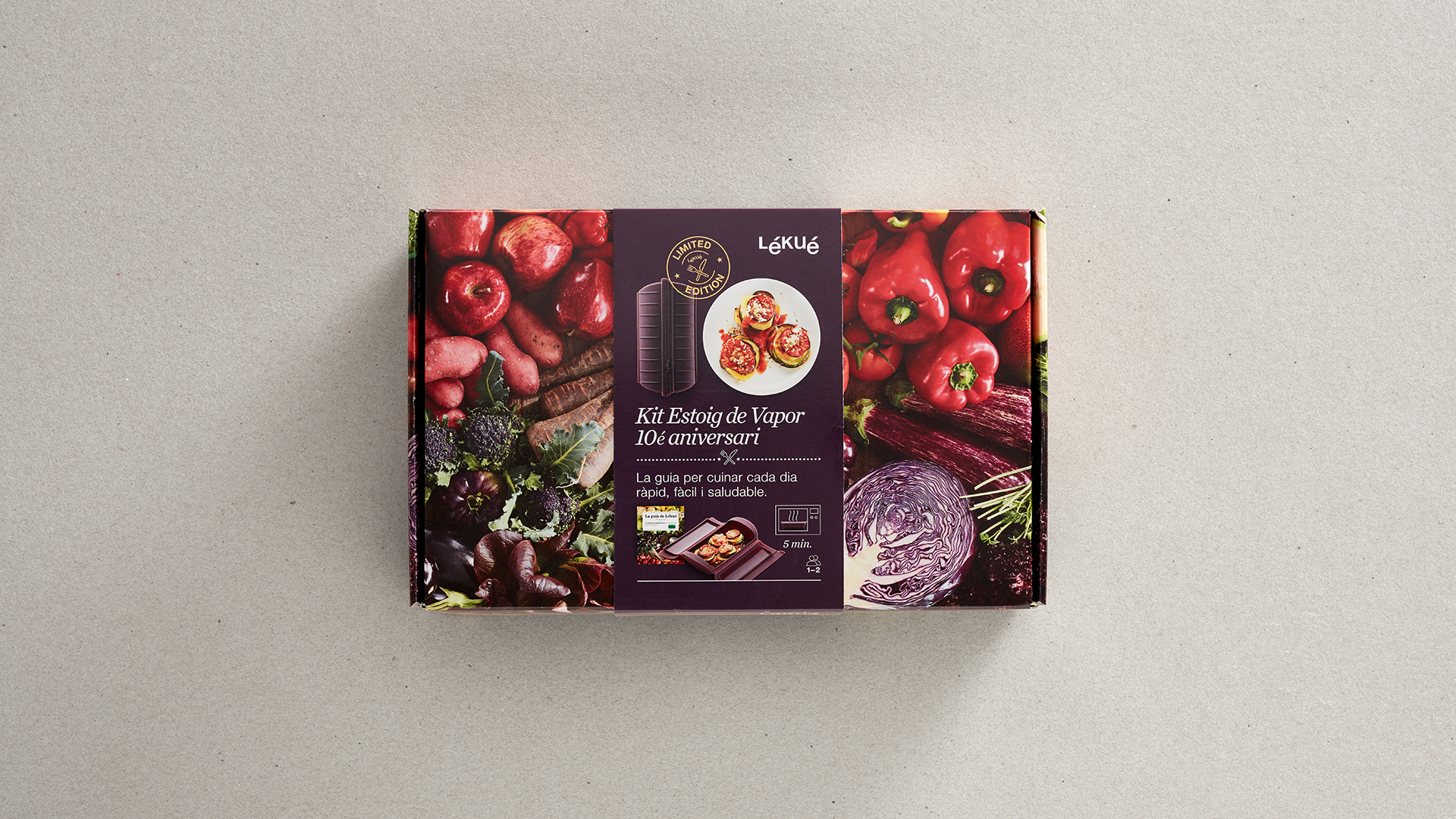
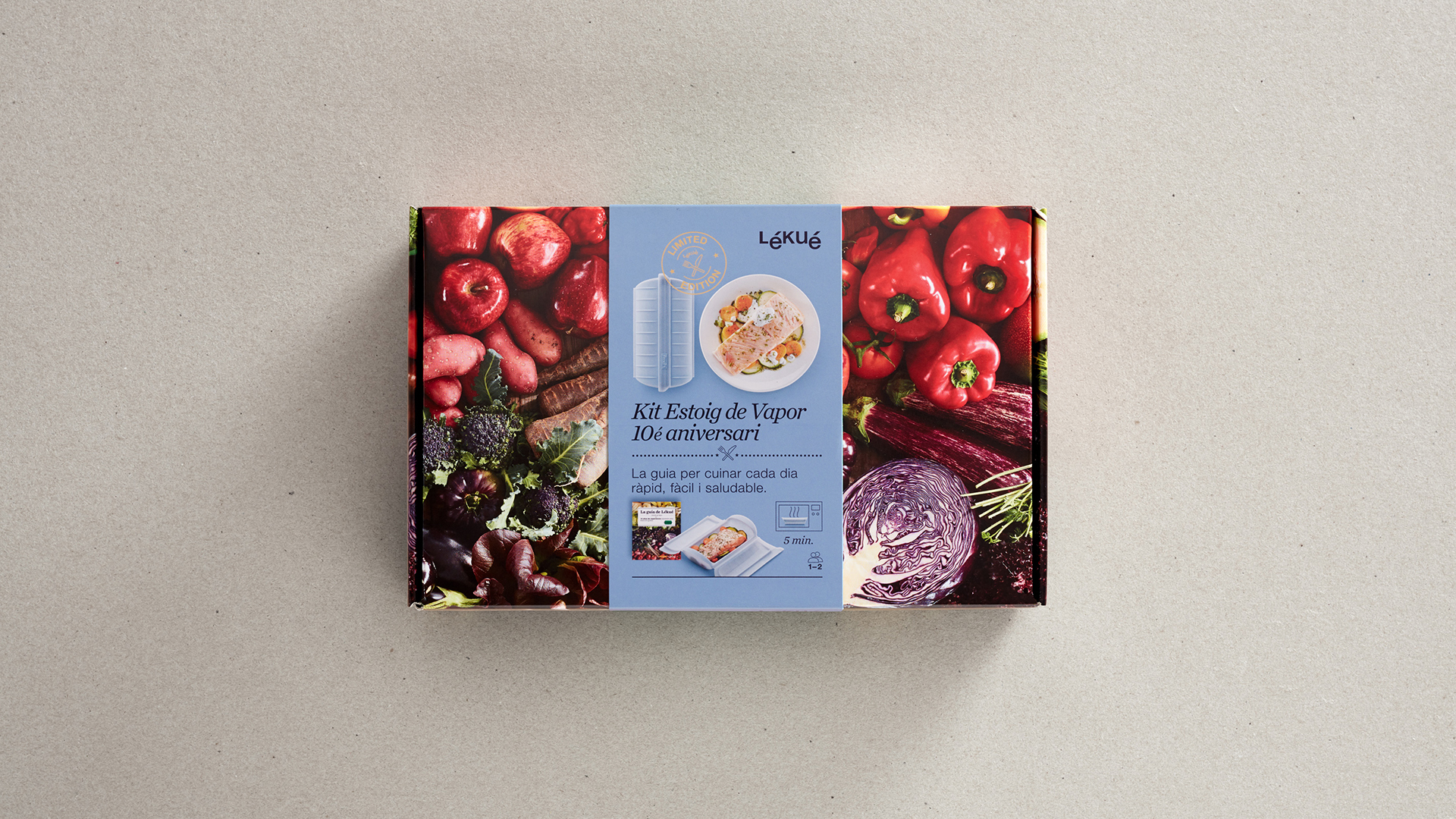
We designed the packaging and marketing materials for Lékué’s 10th anniversary limited-edition steam case.
To celebrate the 10th anniversary of the iconic Lékué steam case, we designed a limited-edition pack available in three new colours (green, grey and aubergine). It included a steam case for 1-2 people, the book “The Lékué Guide: 10 years’ experience cooking for all tastes”, and a recipe related to the colour chosen.
As well as being the container for the product itself, we wanted it to live on as a box for keeping recipes or books. We also handled the artwork and photographs that were used in all the anniversary marketing materials.
2017
/en/work/day-drap-branding-strategy/
DAY DRAP
The day-to-day detail
Branding Strategy
2017
/en/work/my-drap-digital-communication/
MY DRAP
Revitalising sales strategy and crafting digital communication design
Digital Communication
Textile
Industry
Hospitality & Leisure
Revitalising sales strategy and crafting digital communication design
Digital Communication
Online sale of rolls of pre-cut table linen
MY DRAP, a company in the Texia group that manufactures rolls of pre-cut napkins in 100% cotton and linen, needed to reformulate its online sales strategy and design a website adapted to the brand’s new branding image.
With our experience and knowledge of retail, the strategy was focused on how to dress a table with napkins and place mats from the same collection, offering creativity and uniqueness to the project. The new corporate branding was used in the design and content which highlighted the values of fabric, fun, naturalness, experience, quality and individuality.
This new approach meant that, in roughly its first year of operation, the average number of orders for each product increased by 75% and revenues increased by more than 500%.
2017
/en/work/my-drap-product-design/
MY DRAP
Design of collections featuring pre-cut 100% cotton and linen tablecloths
Product Design
Hospitality & Leisure
Industry
Textile
Design of collections featuring pre-cut 100% cotton and linen tablecloths
Product Design
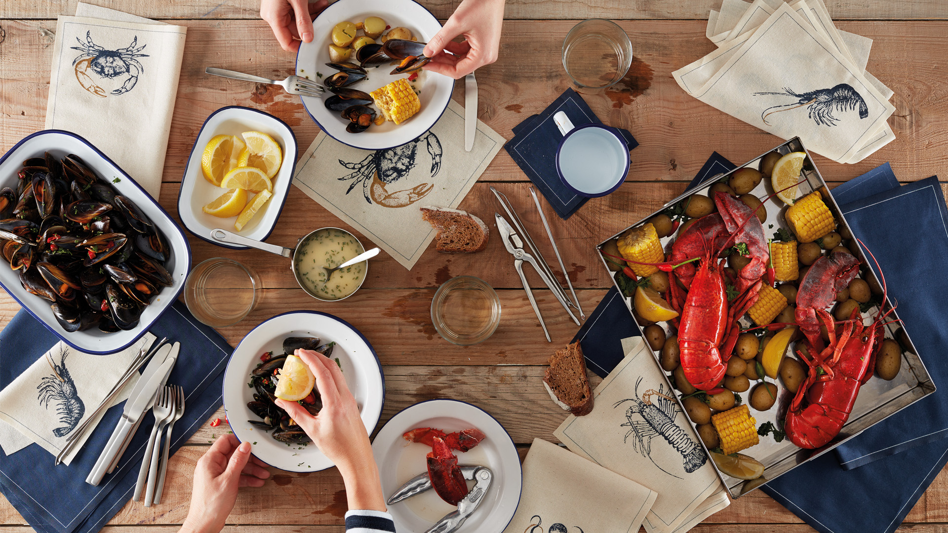
Crafting distinctive products for special moments
MY DRAP, a company in the Texia group, is a manufacturer of pre-cut napkins in 100% cotton and linen, which are washable and seamless, for use on special occasions.
Every year since 2017 we have worked on new product conceptualisation and have designed collections based on the MY DRAP branding strategy: the detail that makes the difference on special occasions.
2017
/en/work/mydrap-professional-texia-branding-strategy/
MY DRAP
We crafted the branding strategy for MY DRAP’s professional channel
Branding Strategy
Editorial Design
Hospitality & Leisure
Industry
Textile
We crafted the branding strategy for MY DRAP’s professional channel
Branding Strategy
Editorial Design

We reviewed the positioning of the MY DRAP brand in the professional channels, as well as its portfolio and product design.
Following a first phase of observation of the brand, its channels and products, we identified its important and essential values: 100% textile (100% cotton, recycled cotton or linen) and the single-use product, a significant differential for catering firms and restaurants because it avoids the need for laundry.
2017
/en/work/grok-branding/
Grok
A new branding to elevate the brand
Branding Strategy
Corporate Branding
Editorial Design
Furniture & Lighting
A new branding to elevate the brand
Branding Strategy
Corporate Branding
Editorial Design
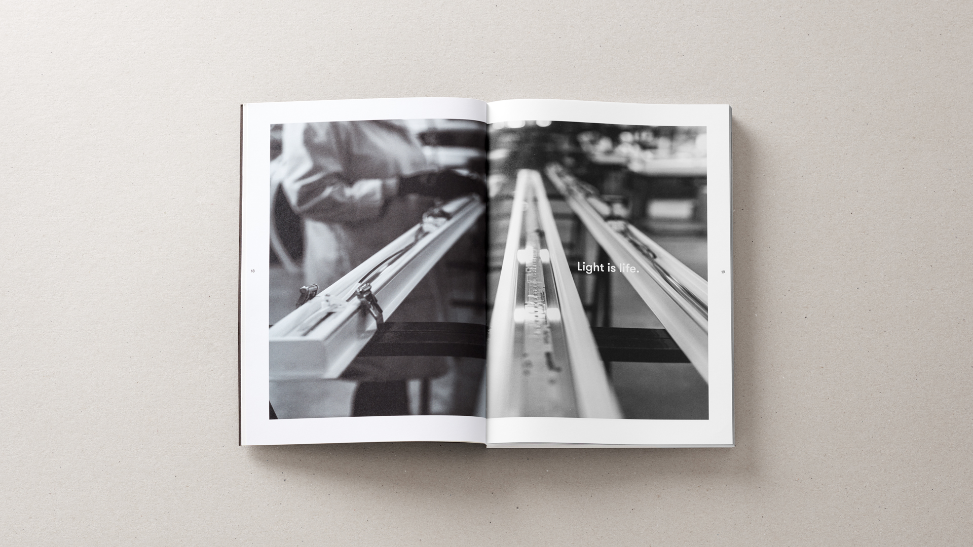
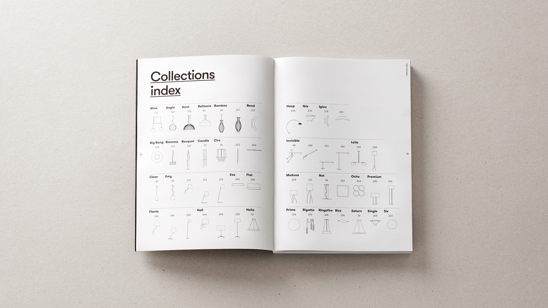
Grok is a manufacturer of lighting for the contract and home sectors which needed to reposition its brand to convey effectively the value of its new lighting products, which the firm developed together with renowned national and international industrial designers.
2017
/en/work/chelats-sarrate-editorial-design/
Chelats Sarrate
Editorial design for Chelats Sarrate’s product catalogue
Editorial Design
Hospitality & Leisure
Food & Drink
Editorial design for Chelats Sarrate’s product catalogue
Editorial Design
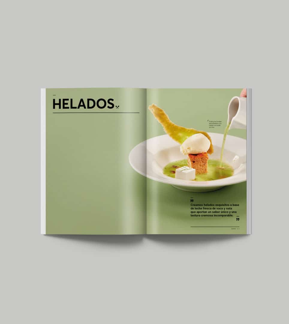
We designed the corporate product catalogue for Chelats Sarrate, a company that’s been making homemade ice cream and sorbets for the best professionals in the catering, hospitality and ice cream sectors since 1989.
We produced the catalogue’s design, artwork and photographs such that they reflect the care and creativity with which the company’s professionals create their products. Plus, we championed the endless range of ice cream flavours and the company’s passion for the truly authentic.
2017
/en/work/rocook-packaging-design/
Rocook
We crafted the packaging for Rocook, a project by El Celler de Can Roca
Packaging Design
Hospitality & Leisure
Food & Drink
We crafted the packaging for Rocook, a project by El Celler de Can Roca
Packaging Design
The renowned restaurant El Celler de Can Roca joined forces with three leading companies related to the culinary world: Cata Electrodomésticos (Home Appliances), Lékué and the Fundación Alicia to bring about the Rocook project, a set of tools exclusively designed for consumers to discover and learn about cooking at low temperatures in the home.
2017
/en/work/my-drap-branding/
MY DRAP
Revamping the corporate branding for a unique and innovative brand
Corporate Branding
Hospitality & Leisure
Textile
Industry
Revamping the corporate branding for a unique and innovative brand
Corporate Branding
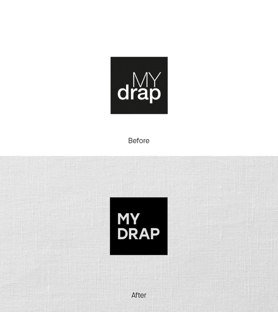
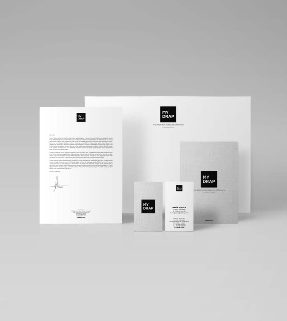
We redesigned the corporate image of MY DRAP, a unique and innovative brand that designs and manufactures individual place mats and napkins in 100% cotton and linen, which are washable, pre-cut and come on a roll.
As part of the brand repositioning process, we redesigned its identity, maintaining its character but increasing its presence. We came up with a more impactful and contemporary logo that also conveys and reflects the new values of the brand, such as 100% textile.
2017
/en/work/concep-communication/
Concep
We redesigned the communication for a company revolutionizing pharmaceutical retail
Communication
Business
Health & Beauty
We redesigned the communication for a company revolutionizing pharmaceutical retail
Communication
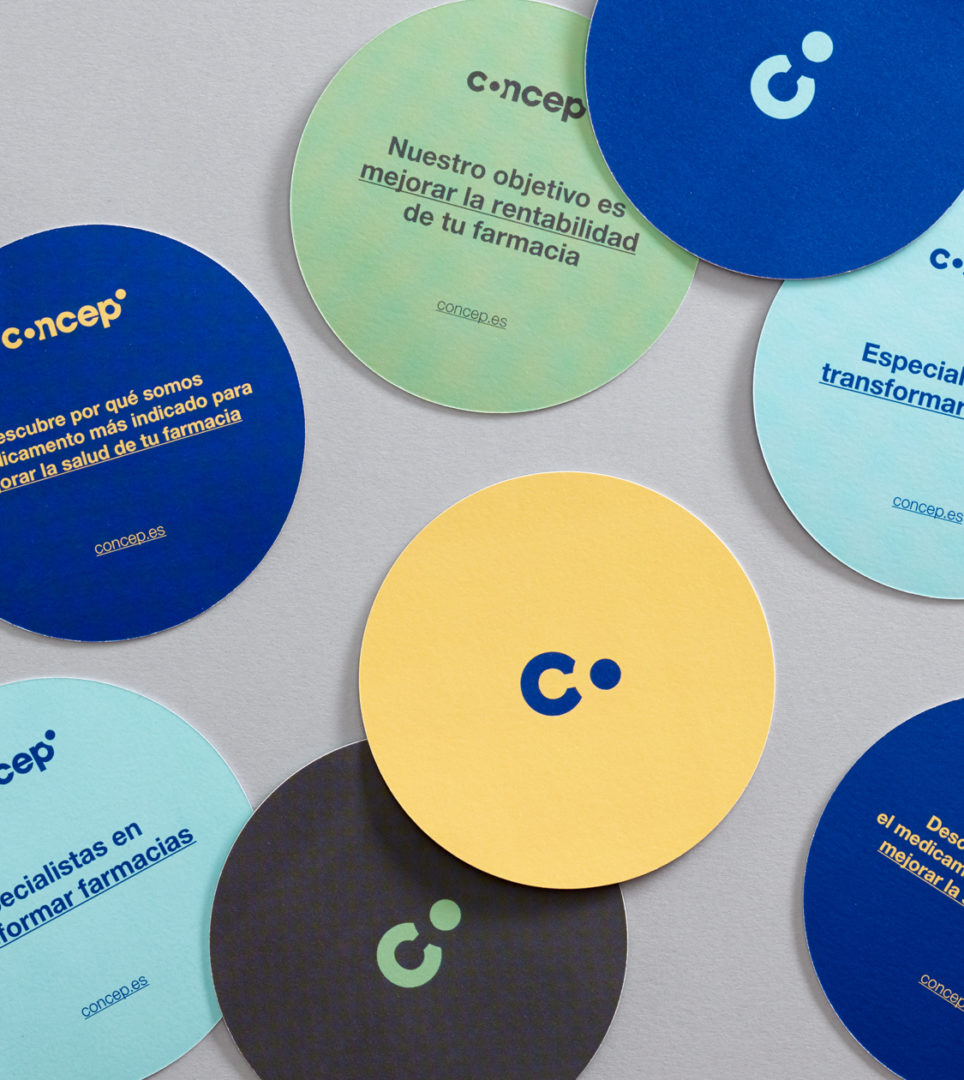
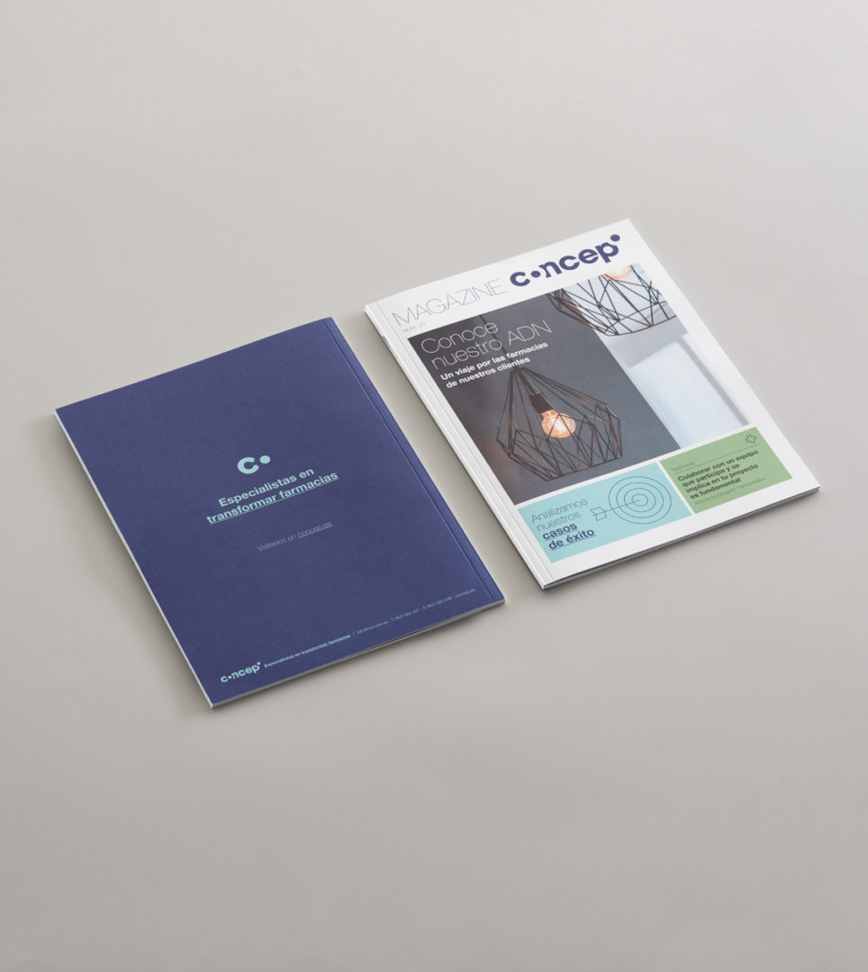
Pharmaceutical Retail, to improve the profitability of pharmacies, came about through the business concept of Concep, a company that seeks to make the most of the space available in a pharmacy to achieve greater financial performance.
2017
/en/work/lab-accion-social-blanquerna/
Blanquerna (FCRI)
Our commitment to the Lab d’Acció Social Blanquerna
Branding Strategy
Corporate Branding
Editorial Design
Communication
Digital Communication
Sustainable companies
Our commitment to the Lab d’Acció Social Blanquerna
Branding Strategy
Corporate Branding
Editorial Design
Communication
Digital Communication
As a B Corp-certified responsible branding agency, we are dedicated to supporting projects that create a positive social impact. This commitment has driven us to collaborate with the Lab d’Acció Social Blanquerna (FCRI) for its seven editions, contributing our expertise in design and communication to the participating social organisations.
The purpose of the Lab (a Diploma in Social Action Communication and Marketing) is to help social organisations professionalise their communication and marketing efforts to achieve greater economic sustainability. Through the programme, participants—employees from social organisations—gain both theoretical and practical knowledge in marketing and communication.
2016
/en/work/parachilna-editorial-design-2016/
Parachilna
Editorial design for a genuine and distinctive lighting brand
Editorial Design
Furniture & Lighting
Editorial design for a genuine and distinctive lighting brand
Editorial Design
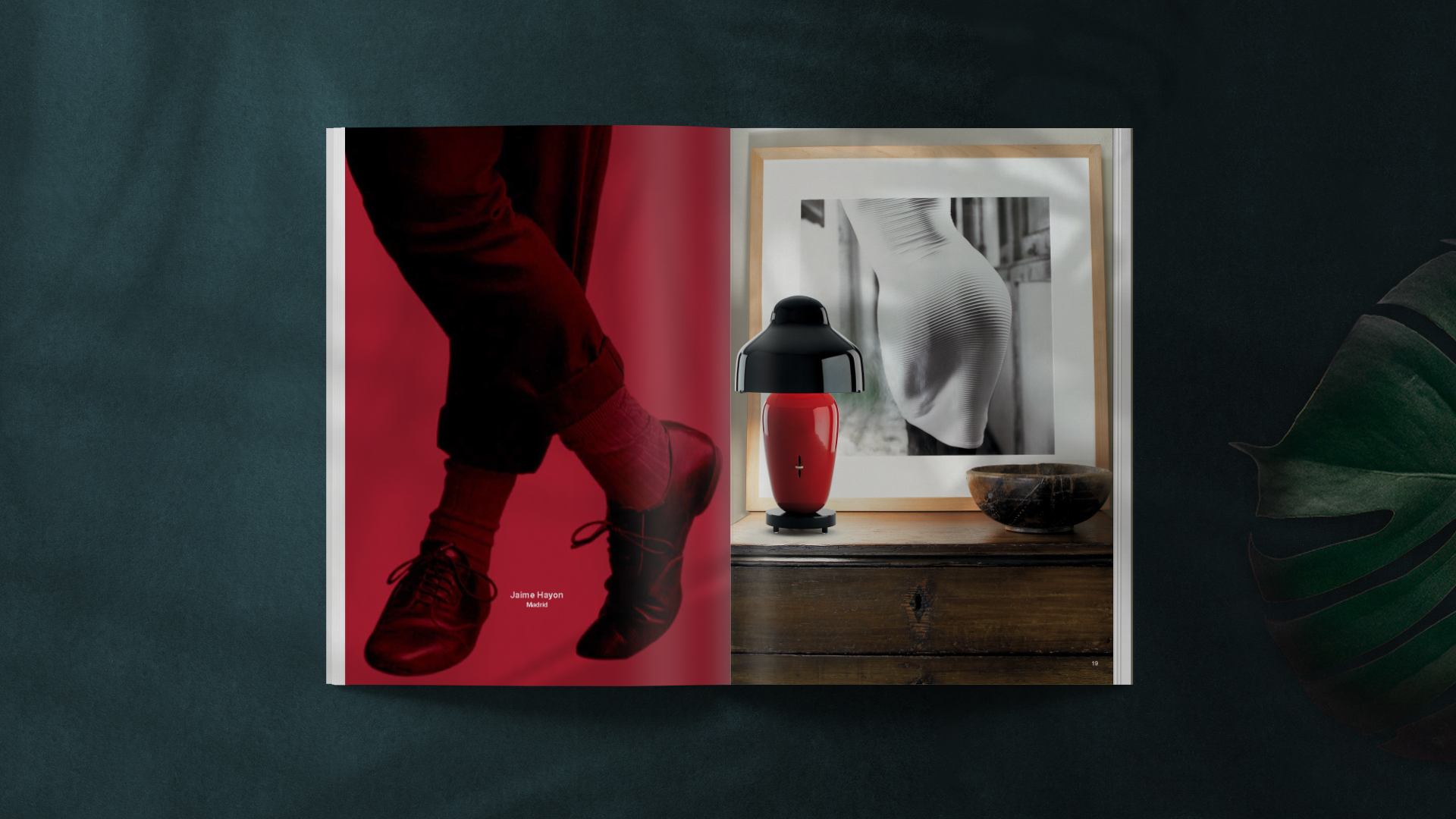
We have been working on the concept and design of the product brochure for the lighting company Parachilna, characterised by the uniqueness of its designs, the honesty of its proposals, the excellence of noble materials, the commitment to artisanal manufacturing and their collaboration with relevant designers.
Our art direction, following the spirit of the corporate branding which NOMON had previously developed, achieved to recreate a global brand experience for the consumer.
2016
/en/work/lekue-product-design-ice-creams/
Lékué
Design of packaging for ice cream moulds with iconic 90s shapes
Packaging Design
Retail Branding
Objects for living
Industry
Design of packaging for ice cream moulds with iconic 90s shapes
Packaging Design
Retail Branding
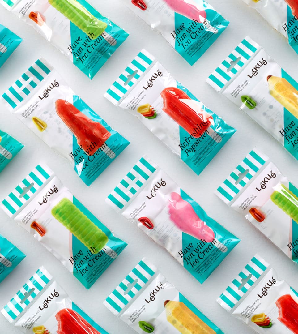
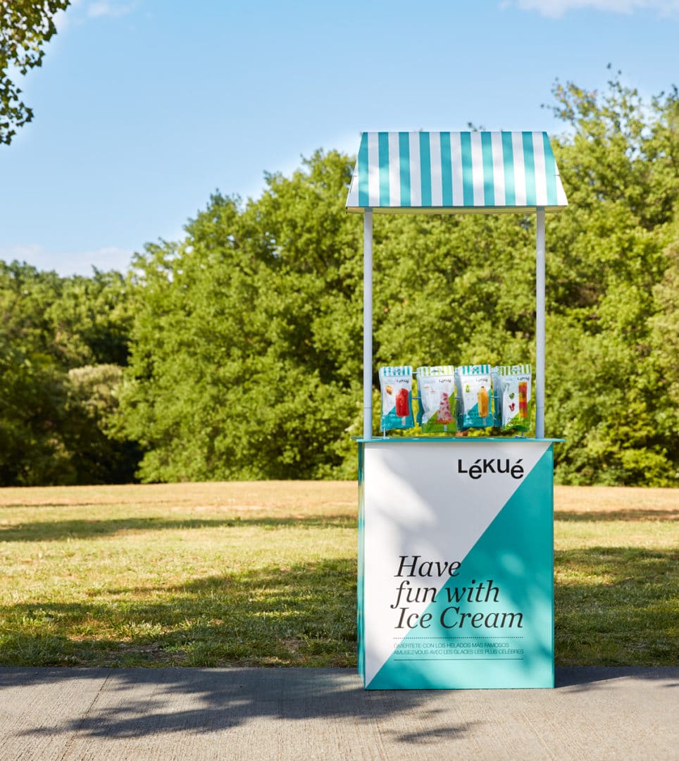
Now that Summer time is near, Lékué presents a new mould collection that will help us prepare healthy ice cream at home. These moulds recreate the iconic ice cream shapes from the 90s.
2016
/en/work/apli-kids-educational-games/
Apli Kids
We design educational games for Apli Kids, catering to the youngest members of the household
Product Design
Industry
Games
We design educational games for Apli Kids, catering to the youngest members of the household
Product Design

Given Apli’s long-term experience working with schools, and with the company’s background in developing products and materials that support teaching tasks in class, we have been working on creating a new range of Apli Kids’ products for children to learn while they enjoy playing in their homes as well.
We thus designed a range of games, with a significant educational angle, specifically targeted for each child to bring out their internal artist, mathematician, astronaut or writer.
2016
/en/work/icex-editorial-design-who-is-who/
ICEX
Editorial design for the Who is Who animation guide for Animation from Spain
Editorial Design
Arts & Culture
Editorial design for the Who is Who animation guide for Animation from Spain
Editorial Design

We designed the new animation guide Who is Who for Animation from Spain (ICEX) in partnership with DIBOOS (the Spanish Federation of Animation Producers) to be distributed at animation trade fairs in 2016, 2017 and 2018.
We came up with a guide whose design enables readers to find anybody involved in the industry in Spain easily, including professionals, studios, producers, distributors, publishing and technology companies and those offering animation software. The guide shows off the achievements, strengths and talents of the Spanish animation industry.
2016
/en/work/grapes-barrels-branding/
Grapes and Barrels
Crafting a new corporate branding for a Spanish winery
Corporate Branding
Packaging Design
Food & Drink
Crafting a new corporate branding for a Spanish winery
Corporate Branding
Packaging Design
Loving quality and exclusive wines
A passion for the wine sector prompted a Spanish entrepreneur to found the Grapes & Barrels winery, which distributes both young wines and exclusive crianza varieties from Menorca and Castile.
We created the branding to capture the values and attributes of the brand. The identity conveyed personality and, in turn, complemented the characteristic image of each of the wines.
The second phase was to develop the storytelling, the naming (Consejo de lobo, Hora Bruxa and (a)islado) and the identity of each of the wines based on the geographical origin of its raw material. Subsequently, we shaped the graphic design on the packaging.
2016
/en/work/zicla-case-study/
Zicla
CS
Turning waste into opportunities: a strategic branding approach
Branding Strategy
Corporate Branding
Communication
Digital Communication
Business
Sustainable companies
Turning waste into opportunities: a strategic branding approach
Branding Strategy
Corporate Branding
Communication
Digital Communication
The management of waste and recycling is one of the major challenges faced by governments and businesses. Zicla has been working on the conversion of waste into new materials for industry and new products for the market since 2005.
Nomon Design started working with Zicla in 2015 on its process of repositioning and international development. Through analysis and by working together, we developed a new communication strategy based around people, design and an innovation culture that connects with the broad range and complex nature of the company’s target audiences.
2016
/en/work/kriskadecor-case-study/
Kriskadecor
CS
A new corporate identity upholding Kriskadecor’s tradition
Corporate Branding
Furniture & Lighting
Industry
A new corporate identity upholding Kriskadecor’s tradition
Corporate Branding
An identity that connects for Kriskadecor
Nomon Design began working with Kriskadecor in 2015, to reposition and redesign their corporate identity in order to update it in line with their business situation and position themselves in the sector as an aspirational design brand.
2016
/en/work/le-creuset-branding/
Le Creuset
We repositioned the brand with a branding strategy centred around the concept ‘Cooking with Personality’
Branding Strategy
Editorial Design
Communication
Industry
Objects for living
We repositioned the brand with a branding strategy centred around the concept ‘Cooking with Personality’
Branding Strategy
Editorial Design
Communication
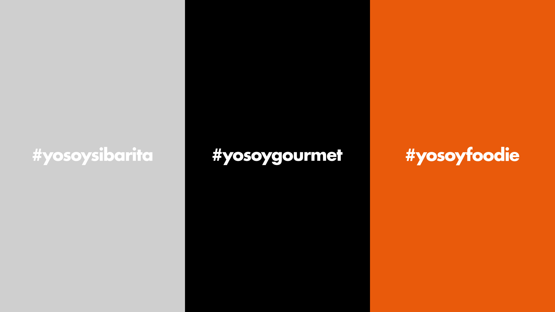

We repositioned the Le Creuset brand as an aspirational brand with a new marketing campaign aimed at a younger customer with an interest and passion for cooking. To do this, we created a new branding strategy expressed in the message “Cooking with personality”.
2016
/en/work/le-creuset-communication-colours-of-spice/
Le Creuset
Crafting the promotional communication campaign ‘Colours of Spice’
Editorial Design
Communication
Industry
Objects for living
Crafting the promotional communication campaign ‘Colours of Spice’
Editorial Design
Communication

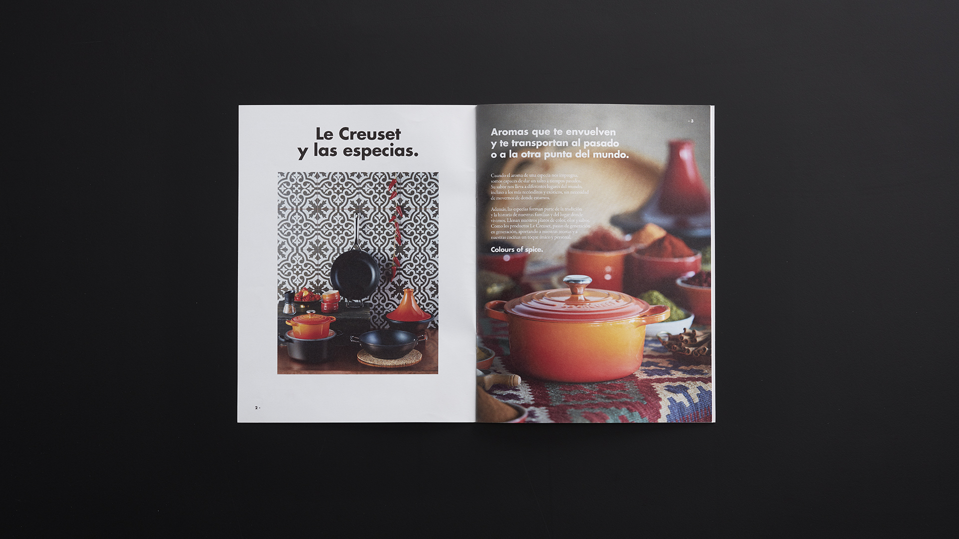
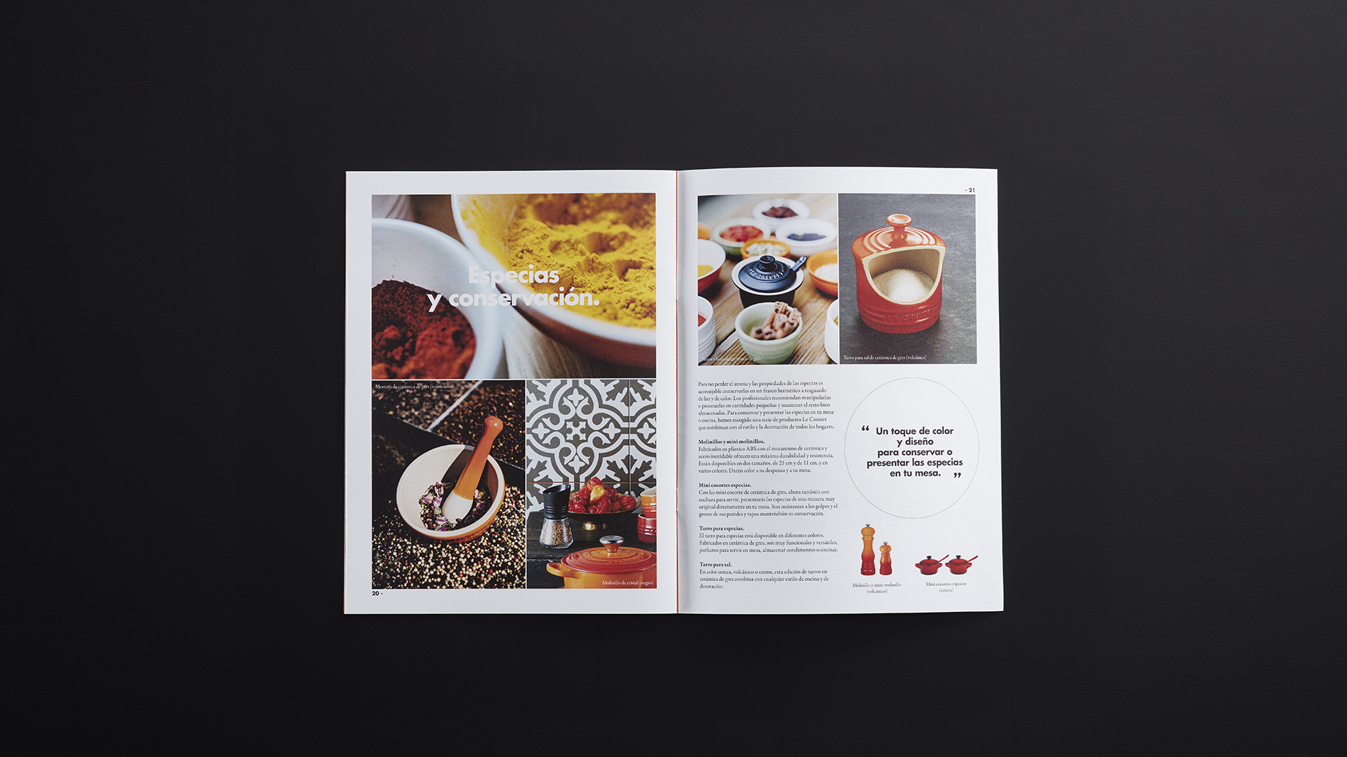
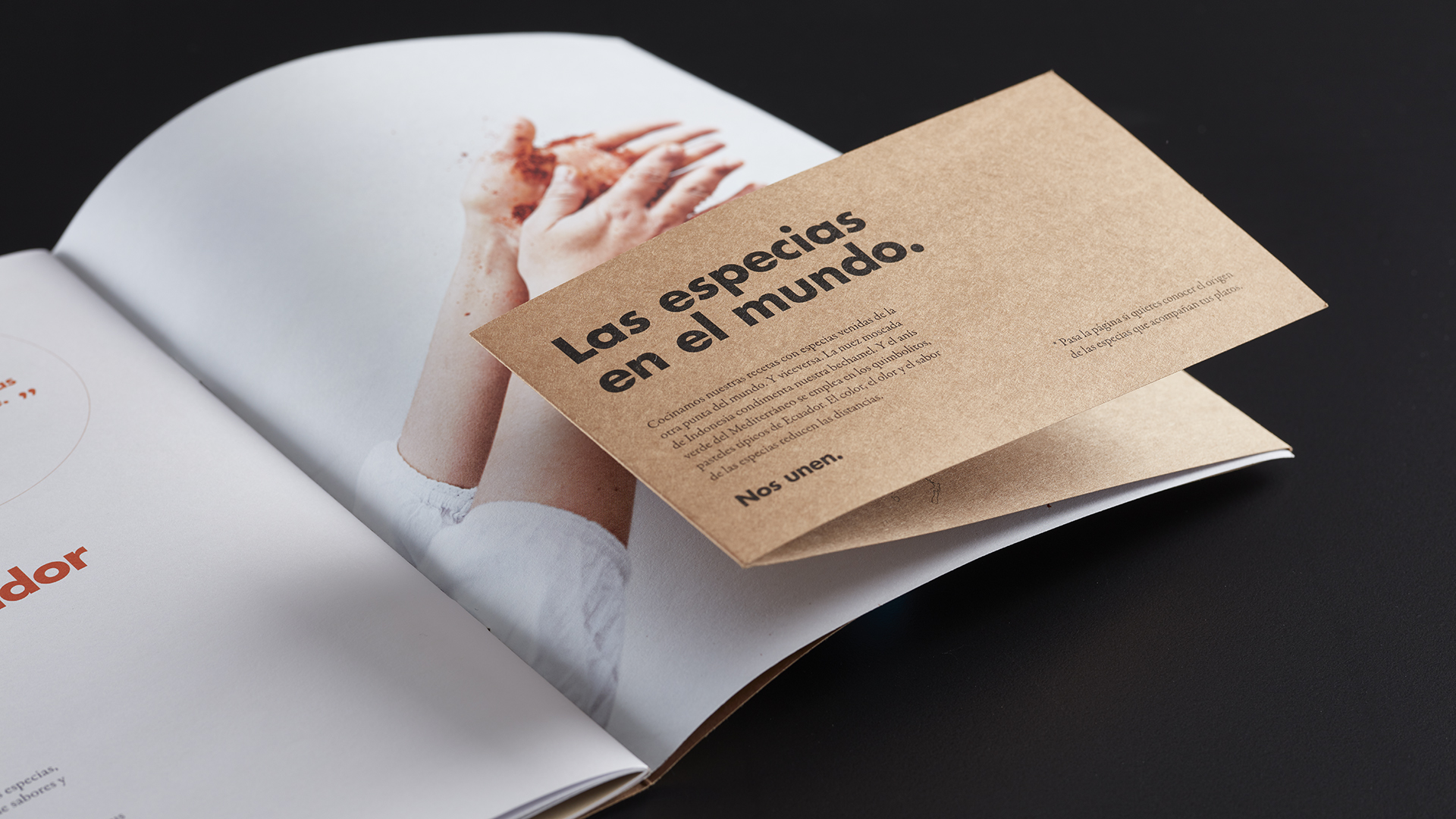
We conceptualised and designed the packaging and marketing materials for Le Creuset’s Colours of spice campaign, a gift kit to accompany the purchase of Le Creuset products.
Based on the parallels between the essence of spices and the essence of Le Creuset itself, we developed the creative concept for the campaign: the smells and colours of spices surround us and transport us to the past or to the other side of the world. They fill our tables with special flavour and colour and are part of our family tradition and the place where we live.
We developed the gift kit with special packaging, sachets of spices and a little book that explained their history and other curios, as well as recipes, tips on how to keep them and ideas for combining them.
To convey the cosy, comfortable atmosphere created by spices in our kitchens, we went for evocative images, carefully chosen for their detail, in a range of warm colours, and we created content with a real romantic feel.
2016
/en/work/sembra-corporate-branding/
Sembra
Redesign a educational agriculture brand
Corporate Branding
2016
/en/work/aridi-editorial-design-wo/
Aridi
We crafted the editorial layout to unveil Gabriel Teixidó’s latest collection, Wo
Editorial Design
Furniture & Lighting
Industry
We crafted the editorial layout to unveil Gabriel Teixidó’s latest collection, Wo
Editorial Design
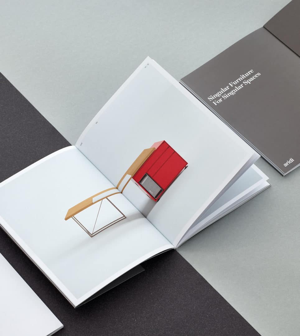
To exhibit at the international trade fair Orgatec 2016, specialising in office and workspace furniture, we designed the new catalogue unveiling the new WO furniture collection by Gabriel Teixidó, which also looked back at those collections that best represent Aridi, having set trends in the sector.
2015
/en/work/miquelrius-case-study/
Miquelrius
Reinventing paper with Miquelrius
Branding Strategy
Communication
Product Design
Retail Branding
Stationery & Accessories
Industry
Reinventing paper with Miquelrius
Branding Strategy
Communication
Product Design
Retail Branding
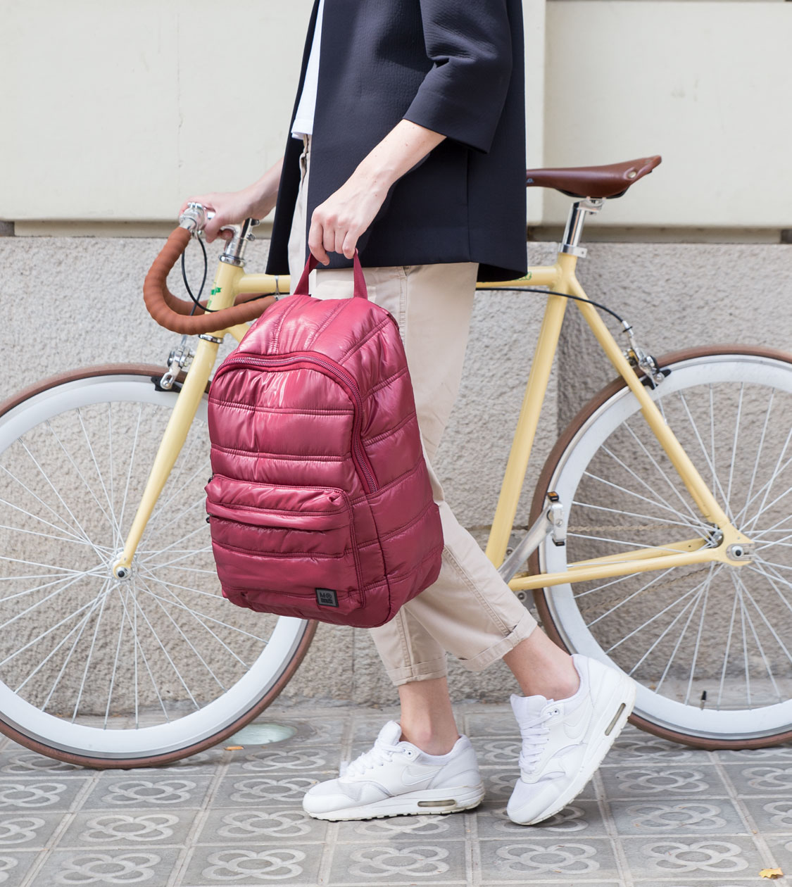
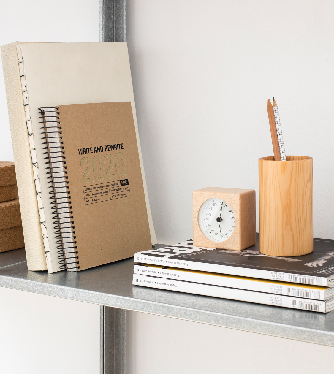
Analysis, co-creation and a close professional relationship spanning more than 25 years have enabled Nomon Design and Miquelrius to evolve from a range of traditional notebooks to diverse product lines that follow and create trends.
For a company to still be in business after so many years is not a matter of luck. Knowing how to work in close collaboration with your partners, knowing and keeping abreast of the latest sector trends and, above all, knowing how to reinvent yourself, if necessary, are the keys to staying afloat in an environment in continual evolution.
2015
/en/work/assegur-case-study/
Assegur
CS
Innovation and customer focus define Assegur’s new branding strategy
Branding Strategy
Corporate Branding
Communication
Business
Innovation and customer focus define Assegur’s new branding strategy
Branding Strategy
Corporate Branding
Communication
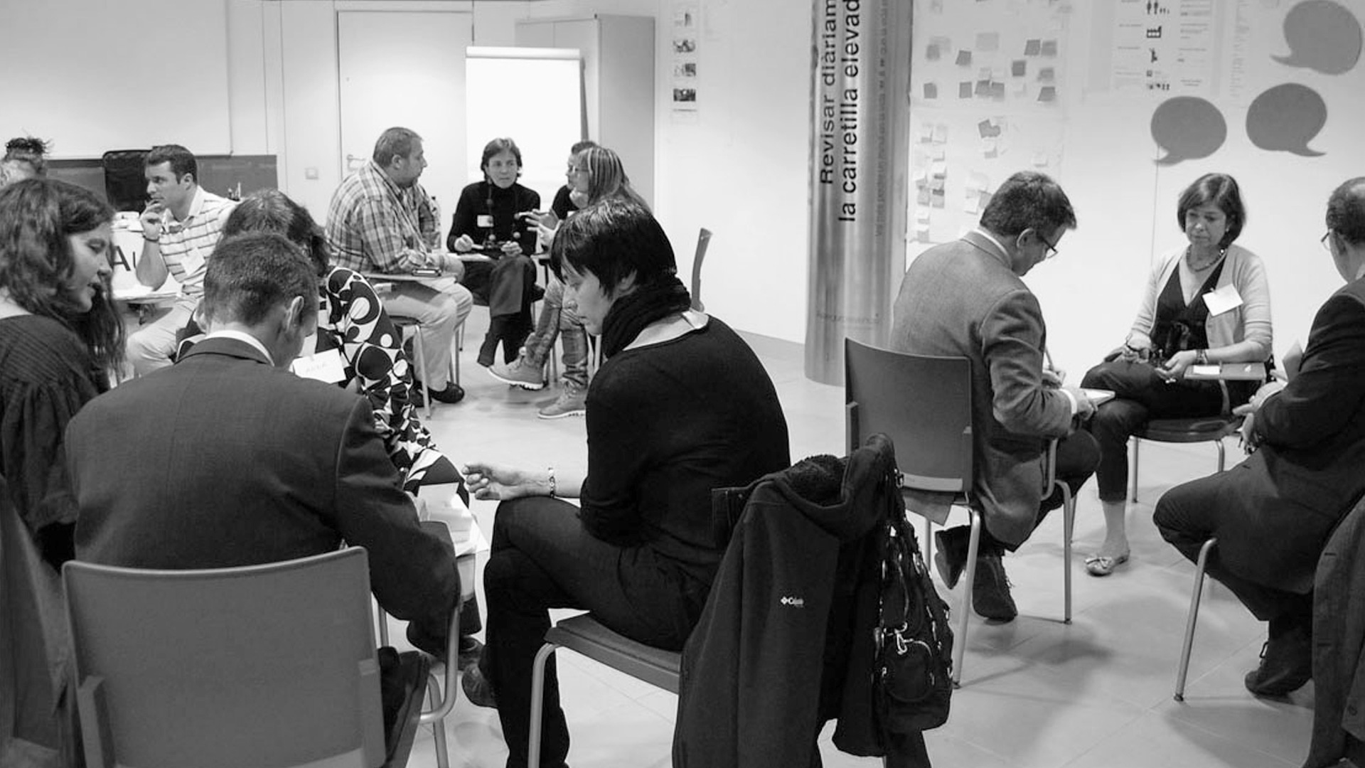
In little more than 20 years, Andorran insurance company Assegur has established itself as a leading company with a 16% market share. With the collaboration of NOMON DESIGN it has redefined its corporate culture on the basis of innovation and a customer focus.
The collaboration and co-creation between NOMON DESIGN and the whole of the Assegur team has been essential in implementing the company’s internal restructuring. The goal was to reposition the brand in customers’ minds.
2015
/en/work/parachilna-corporate-branding/
Parachilna
Corporate branding for a world-leading lighting company
Corporate Branding
Packaging Design
Editorial Design
Furniture & Lighting
Corporate branding for a world-leading lighting company
Corporate Branding
Packaging Design
Editorial Design
We created the corporate branding for Parachilna, a lighting company that stands out for the uniqueness of its designs, the honesty of its ideas, the value of the top-quality materials it uses, its artisan manufacturing techniques and, above all, its collaboration with key designers worldwide.
We developed its corporate identity, the design of its catalogues and the packaging for its lighting products, creating an all-round brand experience for the consumer, from their first contact with the brand to receiving the product. Parachilna received the Best New Brand 2015 award from the prestigious Wallpaper* magazine.
2015
/en/work/aridi-editorial-one/
Aridi
Creating an impactful and surprising communication piece for Aridi
Editorial Design
Industry
Furniture & Lighting
Creating an impactful and surprising communication piece for Aridi
Editorial Design

We designed the catalogue and the artwork for the new One furniture collection by Gabriel Teixidó. This series of managerial office furniture is noted for its character, its top-quality materials, its artisanship and the comfort and convenience of each piece. This top-quality handmade furniture stands the test of time, combining wood, glass, leather and lacquered wood, and turning the offices which have it into more than just workspaces.
2015
/en/work/lekue-packaging-design-reusable/
Lékué
Crafting packaging that’s 100% reusable and integral to the product
Packaging Design
Objects for living
Industry
Crafting packaging that’s 100% reusable and integral to the product
Packaging Design
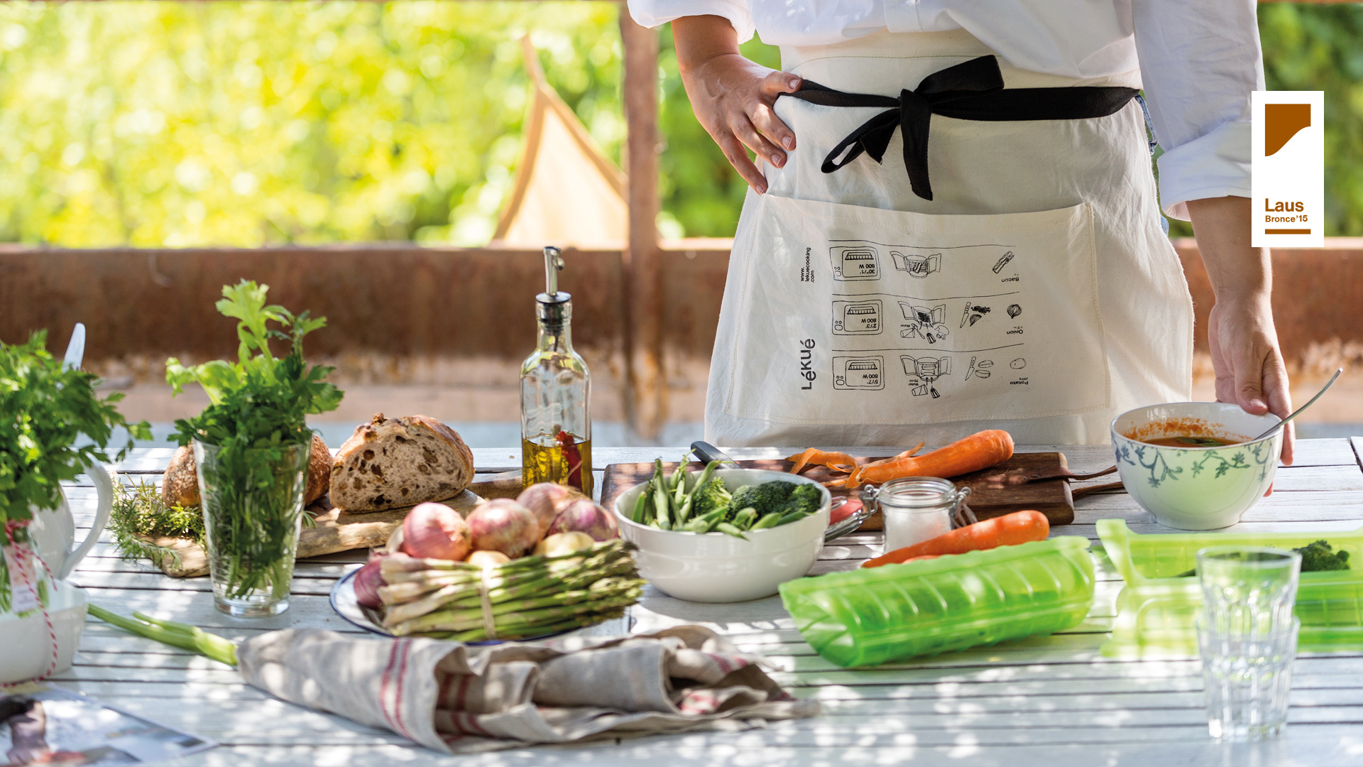
During teamwork at co-creation sessions between Lékué and NOMON, we identified the need to create reusable packaging, linking the packaging to the product.
2015
/en/work/idonea-branding/
Idonea
Creating the branding for a new dermocosmetics brand in pharmacy channels
Corporate Branding
Packaging Design
Health & Beauty
Creating the branding for a new dermocosmetics brand in pharmacy channels
Corporate Branding
Packaging Design
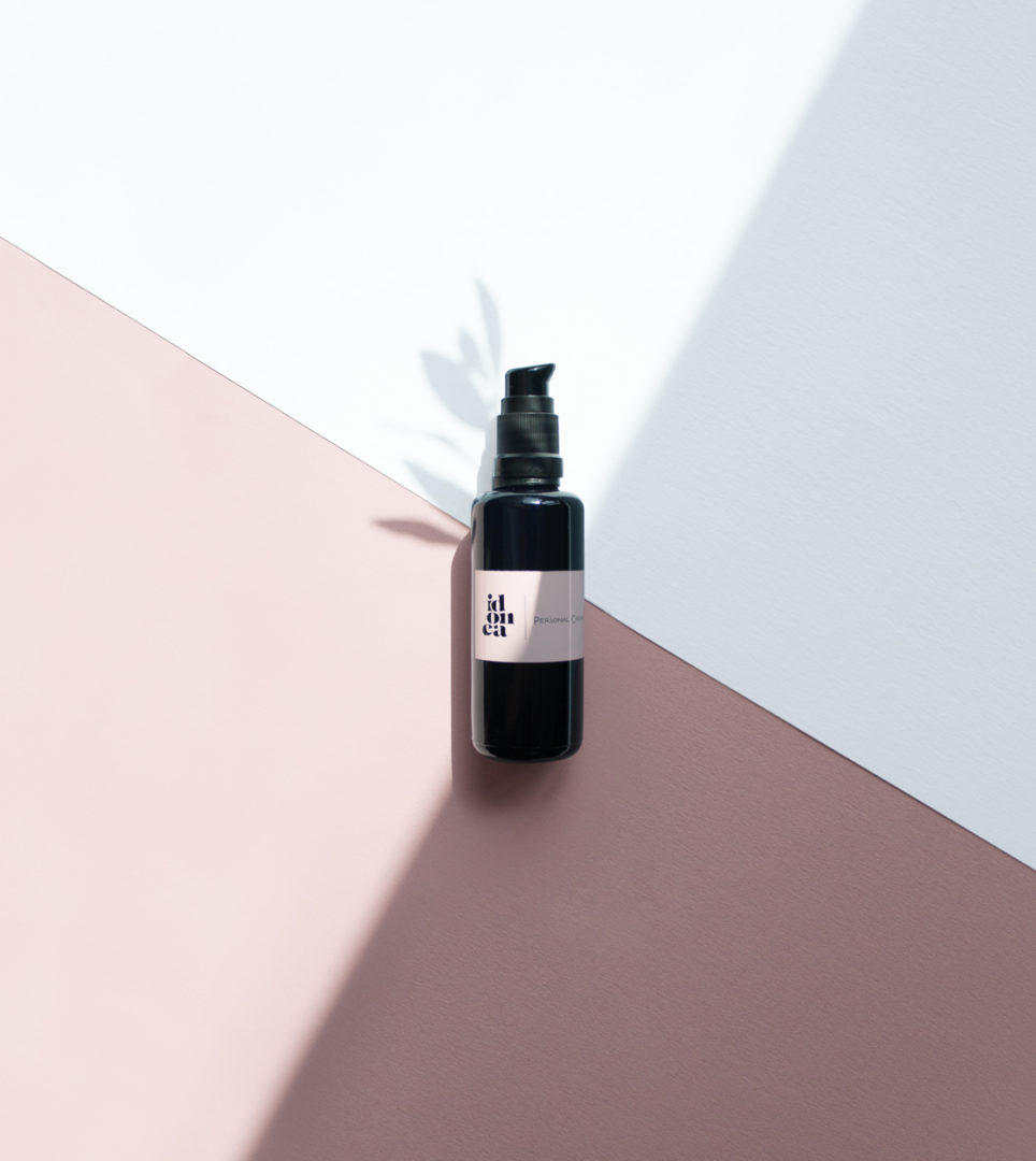
We created the branding for Idonea, a brand of dermocosmetics for pharmacies, which reflected its most human, tangible and emotional side, thus making it visible in the vastness of the pharmacy.
2014
/en/work/raima-communication-competition/
Raima
We crafted a sweet commemorative poster for the 10th edition of the Raima Competition
Communication
Stationery & Accessories
We crafted a sweet commemorative poster for the 10th edition of the Raima Competition
Communication
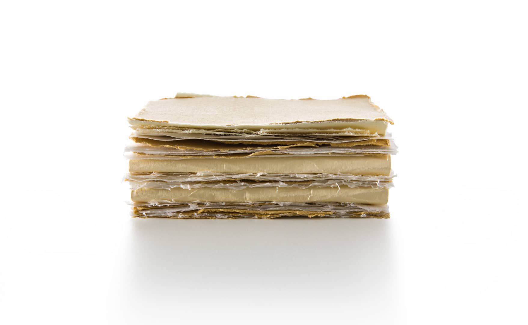
The well-known shop Raima, which specialises in stationery, writing materials and handicrafts, organised the 10th Raima Illustration and Design Competition, which in 2014 focused on ideas for kitchen paper.
NOMON focused its entry on the world of confectionery, a gastronomic discipline known for its meticulousness and for the importance of detail. We entered a delicate idea depicting a cream Napoleon with assorted sheets of paper of different thicknesses and colours, representing the layers of pastry and cream respectively. Most importantly, it showed off the value of Raima’s main product – paper.
Thanks to its careful construction, our idea took 2nd prize in the competition.
2012
/en/work/lekue-packaging-design-citrus/
Lékué
Packaging design for the Citrus Spray, an innovative new product from Lékué
Packaging Design
Objects for living
Industry
Packaging design for the Citrus Spray, an innovative new product from Lékué
Packaging Design
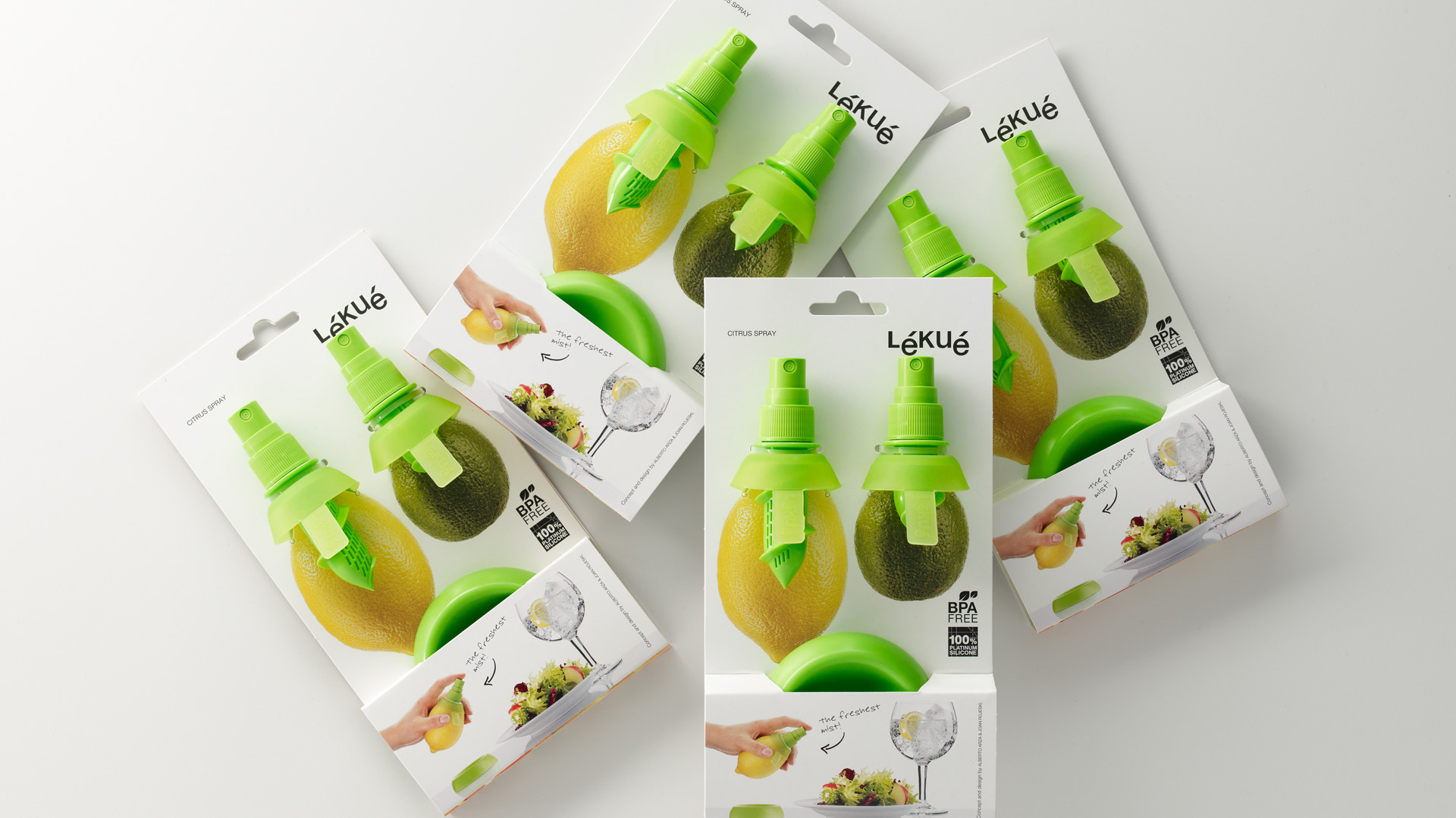
Conceptualisation, art direction and packaging design for Lékué’s Citrus Spray, a citrus sprayer that does not require a container, used to flavour dishes, drinks and cocktails, designed by Papila Studio with the collaboration of Joanrojeski.
The main challenge was to create a pack for such an innovative product. NOMON designed a fully descriptive packaging, which fundamentally clarifies the correct functioning and use of the product in the point of sale.
2012
/en/work/lekue-retail-branding-market/
Lékué
Conceptualising the retail branding for Lékué’s exhibition spaces and stands
Retail Branding
Objects for living
Industry
Conceptualising the retail branding for Lékué’s exhibition spaces and stands
Retail Branding
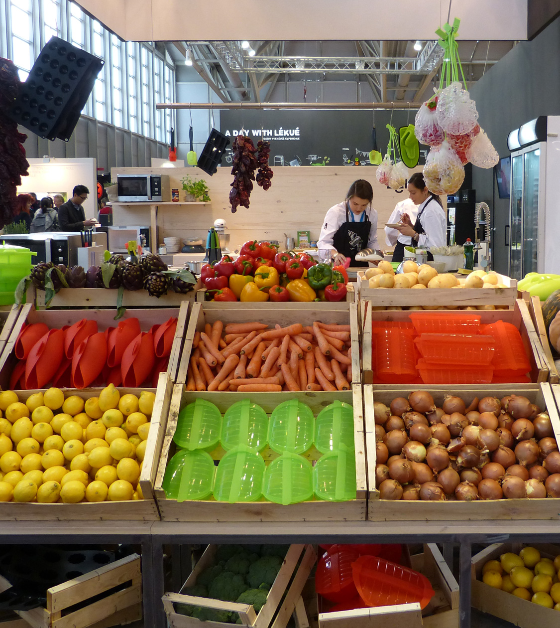
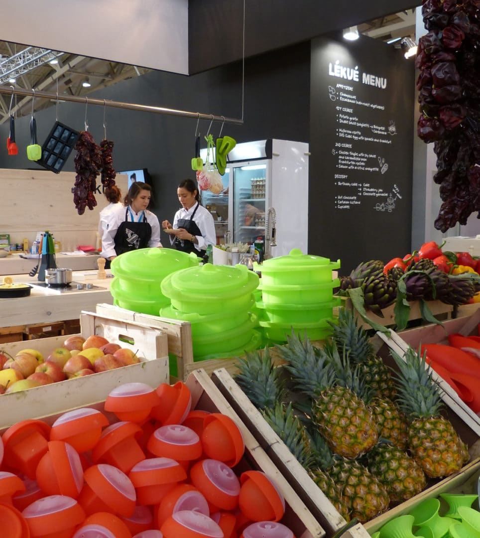
We work on concept and design of Lékué’s retail spaces emphasising the company’s corporate branding, represented by design and innovation, and with a prominent orientation towards the consumer. For Lékué, “What you cook” is just as important as “How you cook”. And that is the reason we devised spaces for demonstrations and tastings which you could typically find in a market.
2012
/en/work/miquelrius-case-study-licenses/
Miquelrius
CS
A branding strategy driving Miquelrius’ positioning and sales
Branding Strategy
Product Design
Industry
Stationery & Accessories
A branding strategy driving Miquelrius’ positioning and sales
Branding Strategy
Product Design
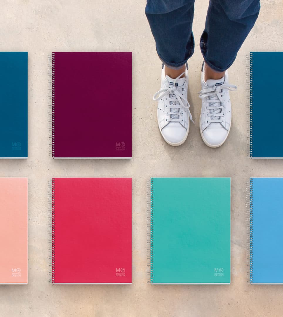
The ability to detect consumer needs before others do and the creation of new business areas based on innovation and design have directly impacted growth at Miquelrius.
The close relationship between Nomon Design and Miquelrius that spans more than 25 years has led to the development of product ranges under licence and the company’s own brand. A positive coexistence of these items on the market has seen the firm make a name for itself as a strong brand with extensive renown.
2012
/en/work/toda-nel-lo-comnunication/
Toda & Nel·lo
Revamping all communication materials for the Barcelona-based law firm Toda&Nel-lo
Editorial Design
Communication
Digital Communication
Business
Revamping all communication materials for the Barcelona-based law firm Toda&Nel-lo
Editorial Design
Communication
Digital Communication
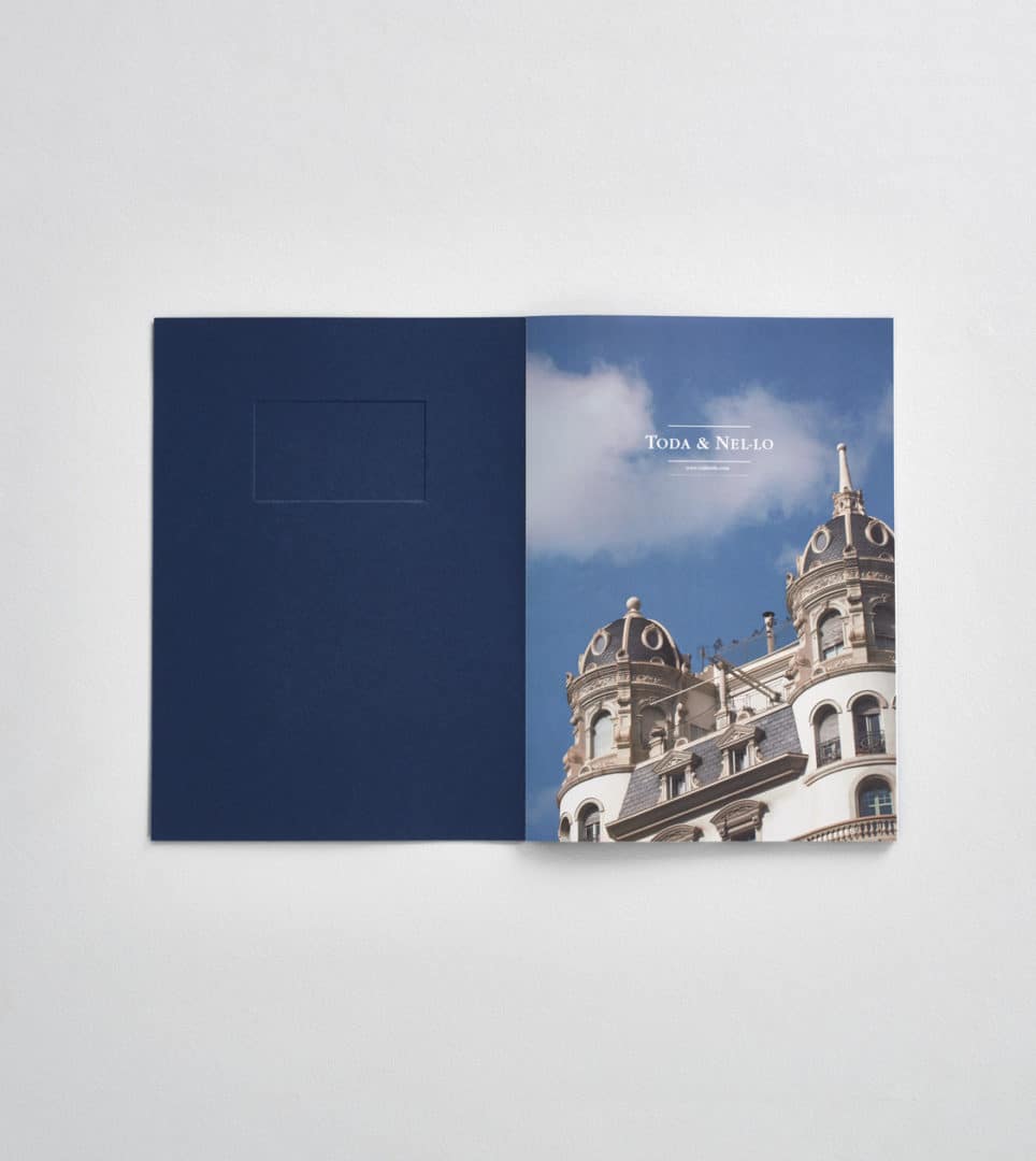
Legal services specialising in the combination of public and private law
The renowned Barcelona law firm Toda & Nel-lo needed us to oversee its corporate branding, following a stage of significant growth and the opening of a branch in Madrid.
After analysing the business, we redesigned its catalogue of services and the new website, as well as several marketing materials used daily at the firm.
2012
/en/work/laie-product-design/
Laie
Designing products for the Laie store at the Fundación Telefónica space
Product Design
Business
Stationery & Accessories
Designing products for the Laie store at the Fundación Telefónica space
Product Design
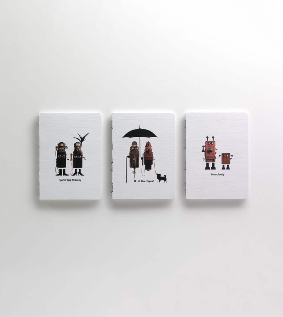
With a view to spreading 21st century culture based on creativity, innovation and technology, we conceptualised and designed the products for the Laie stand at the Fundación Telefónica exhibition hub.
Using the company’s photograph archives, we brought back to life images of vintage telephones, turning them into strange characters or splashing them with multicoloured patterns, and adapted the designs for diaries, badges, T-shirts, notebooks and postcards.
2012
/en/work/ciat-corporate-branding/
Ciat
Defining the corporate branding for a 100% sustainable brand
Corporate Branding
Sustainable companies
Industry
Defining the corporate branding for a 100% sustainable brand
Corporate Branding
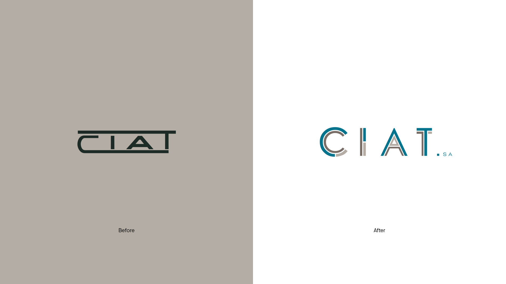
We redesigned their branding to align with their new positioning
Since the early 50s Ciat has designed, manufactured and sold moulded cellulose products for the production of containers for the wine, fruit and poultry sectors.
In order to position itself in the market, the company had to redesign its corporate identity.
2012
/en/work/aridi-editorial-design-k2-k3/
Aridi
Editorial design for Gabriel Teixidó’s new K2/K3 furniture series
Editorial Design
Industry
Furniture & Lighting
Editorial design for Gabriel Teixidó’s new K2/K3 furniture series
Editorial Design
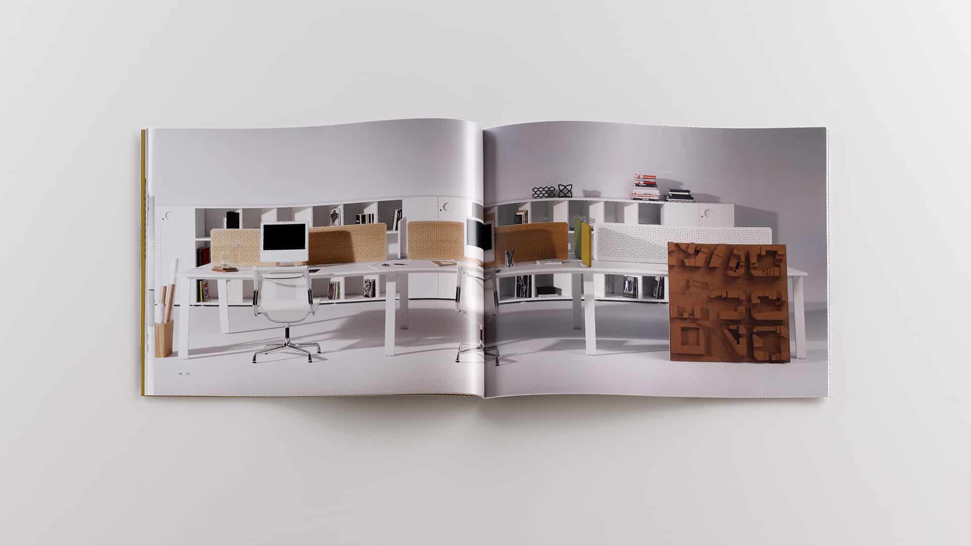
A furniture line of impressive design which simplifies and preserves the essential
Aridi, a company that manufactures office furniture, launched two new lines of office furniture onto the market, with a striking design whose main feature was the return to a schematic look. The office furniture in the K2 and K3 Series, both designed by Gabriel Teixidó, makes for a free workspace with endless combinations.
Using specific artwork, reflecting the different combinations or scenarios that could be achieved with K2 and K3, the new catalogue was designed to show off the essence of the furniture line and highlight its flexibility and functionality.
2012
/en/work/ametlla-de-mallorca-branding/
Ametlla+
Crafting the branding for an entrepreneurial project emphasizing local products
Corporate Branding
Packaging Design
Food & Drink
Crafting the branding for an entrepreneurial project emphasizing local products
Corporate Branding
Packaging Design

A business venture that champions home-grown produce
Ametlla de Mallorca is a project driven by five enterprising women who wanted to make the most of one of the local products with the greatest potential in the food sector, the Mallorca almond, to position it as one of the traditional ingredients of the island’s culinary culture while also promoting the planting of almond trees and the tourism sector.
One of Ametlla de Mallorca’s stand-out products is Ametlla+, an almond-based preparation that enables various traditional, quality recipes to be made in very little time. This was the inspiration for the strategy and corporate identity, starting with new branding which combines Mallorca’s tradition and culture, and conveys the key attributes of the product: home-grown, quality and innovation.
The new graphic design and packaging for Ametlla+ were developed with these concepts in mind, using one of the traditions most symbolic of Balearic culture, the traditional lengües, (cloth of tongues) fabric pattern.
2011
/en/work/lekue-case-study/
Lékué
CS
Cooking up a branding strategy with Lékué: design, innovation, and emotion
Branding Strategy
Industry
Objects for living
Cooking up a branding strategy with Lékué: design, innovation, and emotion
Branding Strategy
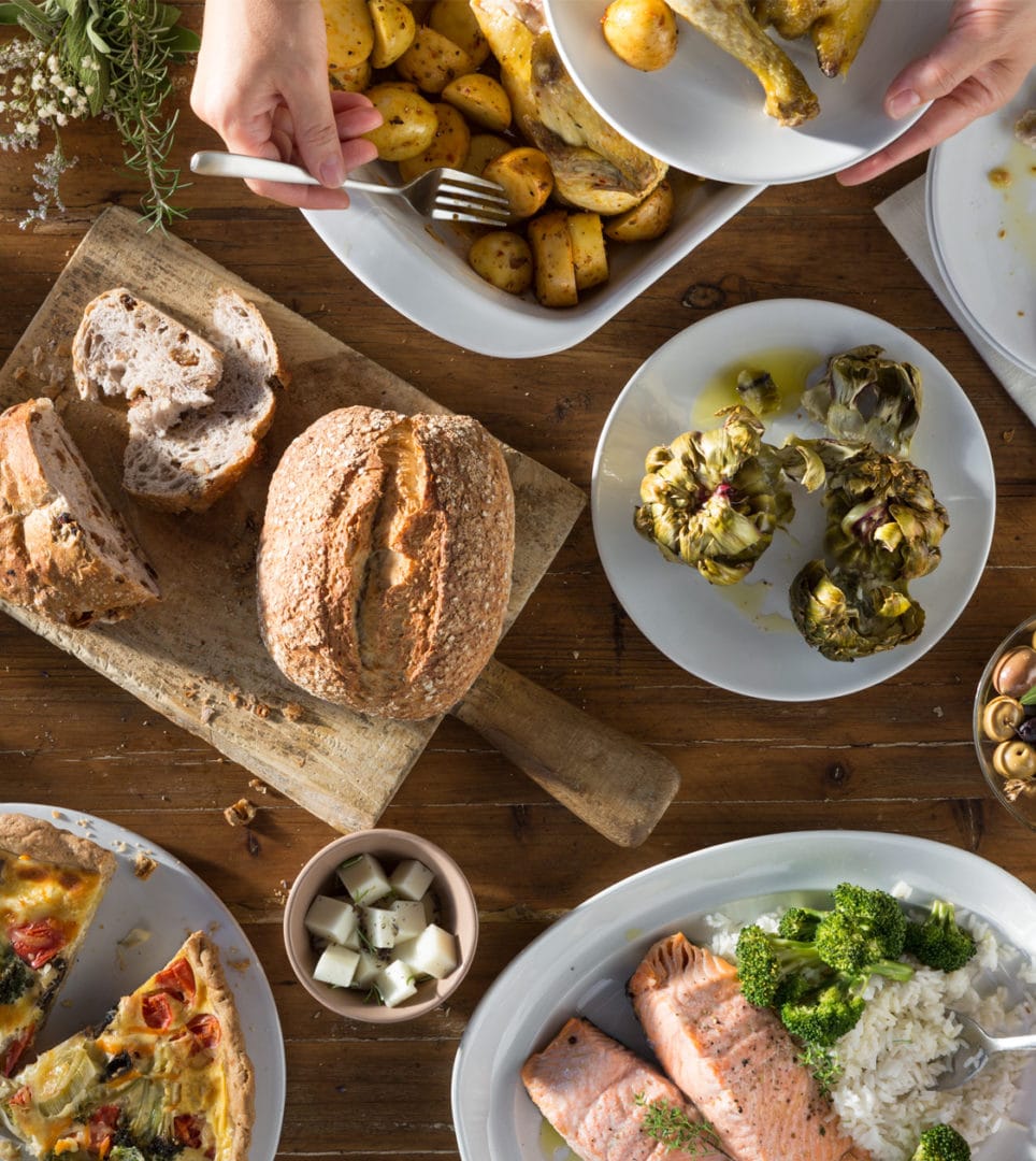
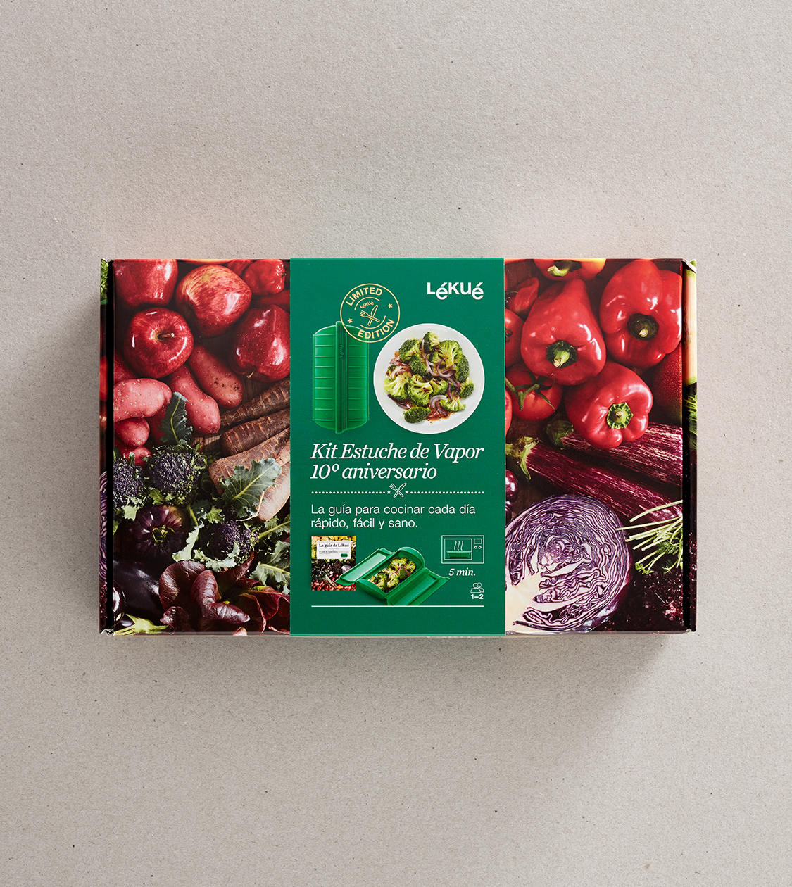
After nearly a decade collaborating with Lékué, Nomon Design has contributed to the creation of a brand linked to design and innovation, with a clear customer focus. The original designs, known for their practical nature and the casual style of the packs, add value to the brand and enable customers to enjoy a global experience from the time they discover the products at the point of sale.
Nomon Design and Lékué share the excitement they put into all of their projects. The result of their teamwork was to convey this feeling to the millions of consumers who enjoy cooking and experimenting with Lékué products in the privacy of their homes every day.
2011
/en/work/fundacion-mutua-madrilena-editorial/
Fundación Mutua Madrileña
Editorial design for the Mutua Madrileña Foundation’s annual corporate report
Editorial Design
Business
Editorial design for the Mutua Madrileña Foundation’s annual corporate report
Editorial Design

We designed the 2011 annual report for the Fundación Mutua Madrileña (Mutual Society of Madrid). To do this, we managed the layout, organisation and complete design of the report, in which we collated the various not-for-profit initiatives carried out by the society in relation to culture, social action, health and road safety.
2011
/en/work/apli-kids-case-study/
Apli
CS
A strategy for growing with Apli Kids
Branding Strategy
Packaging Design
Games
Industry
A strategy for growing with Apli Kids
Branding Strategy
Packaging Design


Nomon Design has been standing by Apli in its growth and repositioning project since 2011. A strategy based on co-creation and design has enabled APLI to expand its portfolio of products intended for new targets, such as children, with the launch of its new brand, Apli Kids.
Apli and Nomon Design have drawn on analysis, reflection and cooperation to revolutionise the stationery sector with the creation of the new brand, APLI Kids. Rolling out this new business area has enabled the company to reach new target publics and possibilities.
2010
/en/work/lekue-editorial-design-guides/
Lékué
Defining the editorial design and art direction for Lékué’s recipe books and guides
Editorial Design
Objects for living
Industry
Defining the editorial design and art direction for Lékué’s recipe books and guides
Editorial Design
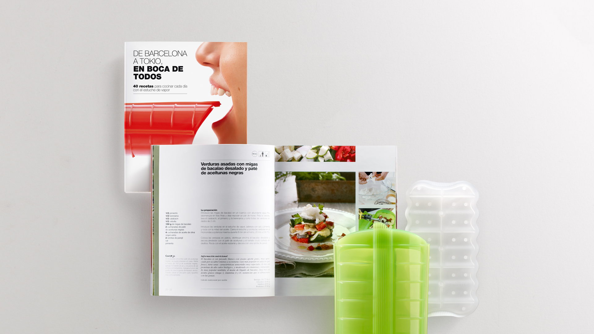
As part of the brand strategy that we developed for Lékué, we produced the concept, art direction and design for a series of recipe books with the aim to communicate and publicize the qualities of the brand’s products as kitchen tools for easy and healthy cooking.
The first book was “De Barcelona a Tokio, en boca de todos” (From Barcelona to Tokyo, a world of taste). In it we showcased a wide range of recipes from around the world to promote the daily use of Lékué’s steam case. Tokyo was a special mention due to the fact that this steam case was a best-seller in Japan in 2010, selling even more than iPhone 4, specifically 1.2 million units.
Another example was Lékué’s 10th Anniversary Guide, especially made for those who either were no cooking experts or had little time to cook at home, but did value healthy food. In each of the recipes, we show the final dish and explain the dish-making process in easy step steps, using illustrated infographics.
2010
/en/work/aridi-editorial-kiwi/
Aridi
Designing the editorial catalogue for Kiwi, Aridi’s versatile furniture programme
Editorial Design
Industry
Furniture & Lighting
Designing the editorial catalogue for Kiwi, Aridi’s versatile furniture programme
Editorial Design
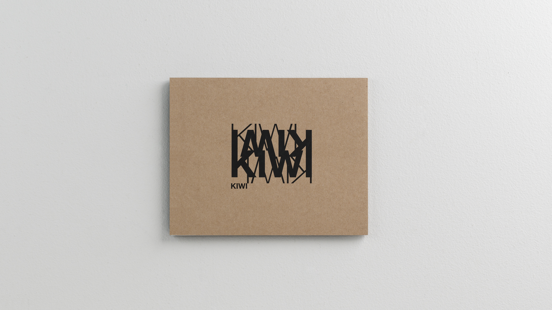
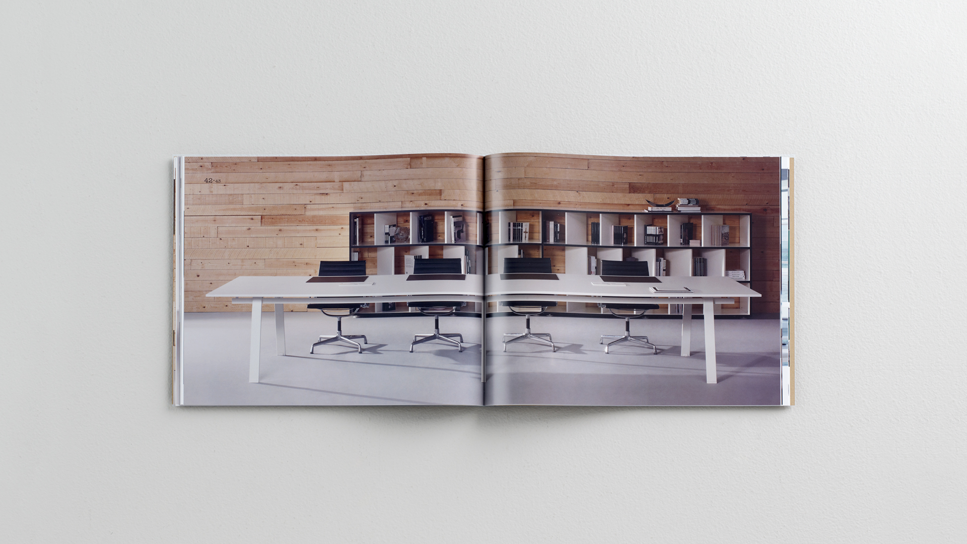
A multi-purpose furniture line
Aridi, a company that manufactures office furniture, launched a new line onto the market – Kiwi, a lightweight, multi-purpose design which allows endless combinations, responding to the new demands of the modern office.
A type of furniture designed for operational and managerial use, based on the concepts “handcrafted” and “handmade”, we designed the new Kiwi brand image in order to show off the uniqueness of each piece in the range, which are made with an aluminum structure and layered, lacquered or oak finishes.
2010
/en/work/valira-take-away/
Valira
Repositioning Valira through the design of their new product, Take Away
Product Design
Industry
Objects for living
Repositioning Valira through the design of their new product, Take Away
Product Design
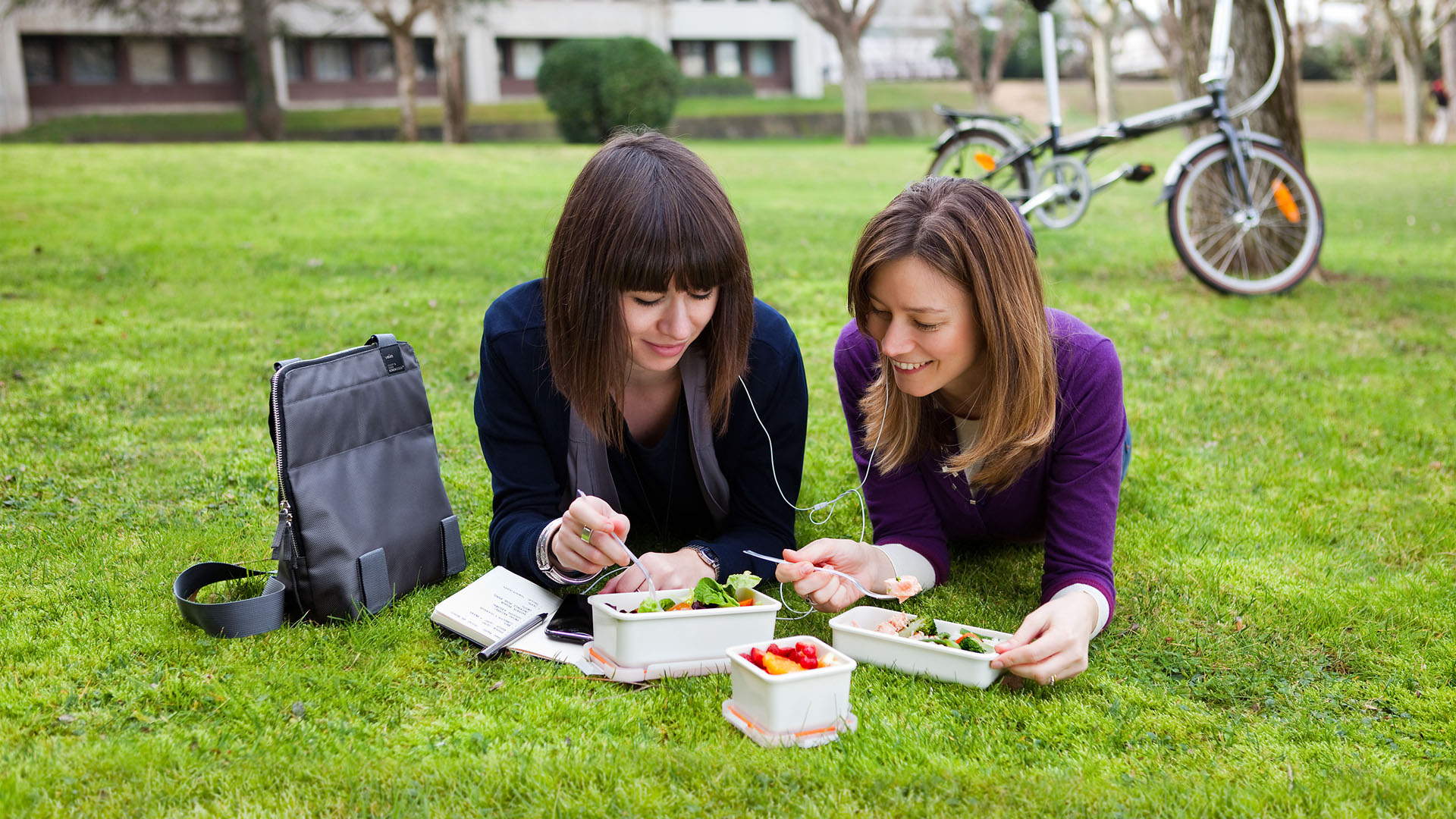
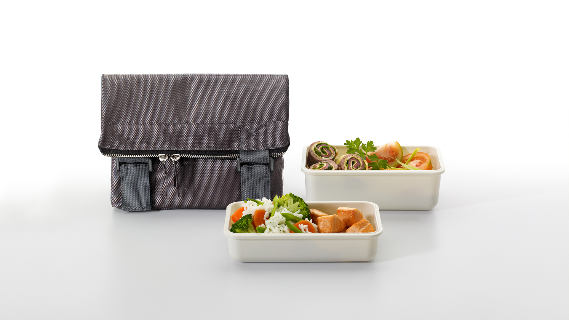

Valira needed support to reposition itself in the market and generate business growth through the launch of new products.
Working together with the client, we established a new branding strategy, defining the company’s character, corporate values and a new value proposition that would open new areas to Valira in the market.
We conceptualised and designed the Take Away product, as well as the artwork for the images in their marketing and the design of their packaging. Take Away is a bag designed to keep and carry food conveniently, as well as being easy to clean and store.
2009
/en/work/point-editorial-design-outdoor-urban/
Point
Editorial design for Outdoor Collection and Urban by Gabriel Teixidó
Editorial Design
Furniture & Lighting
Industry
Editorial design for Outdoor Collection and Urban by Gabriel Teixidó
Editorial Design

In 2009 we were given the opportunity to work on concept, design and art direction for the product catalogues of the Outdoor and Urban collections by designer Gabriel Teixidó, commissioned by our client Point.
For the Outdoor Collection catalogue our art direction was centered on highlighting the quality of the materials used in the finished products while, at the same time, it also aimed to feature the collection’s textures and its Mediterranean roots. For that purpose, we looked for locations to suitably place the pieces of furniture, typically Mediterranean locations in Barcelona and on the Costa Brava.
For the Urban Collection catalogue by Gabriel Teixidó, our art direction goal was to reinforce the concept of the furniture range: the In & Out quality. We therefore showcased the pieces of furniture placed and contextualized both in interior and exterior spaces. We also used the products’ own colour palette, mocha and cream, to create warm, welcoming and aspirational settings.
These editorial pieces are just two examples of the several year-long teamwork with Point to conceptualise and design the company’s general catalogues and new product brochures. Point is a benchmark company in the manufacture of outdoor furniture in braided fibres from Valencia, which was awarded with the National Design Award 2019.
2009
/en/work/icex-audiovisual-from-spain-branding/
ICEX
Renovating the corporate branding for Audiovisual from Spain by ICEX
Corporate Branding
Arts & Culture
Renovating the corporate branding for Audiovisual from Spain by ICEX
Corporate Branding
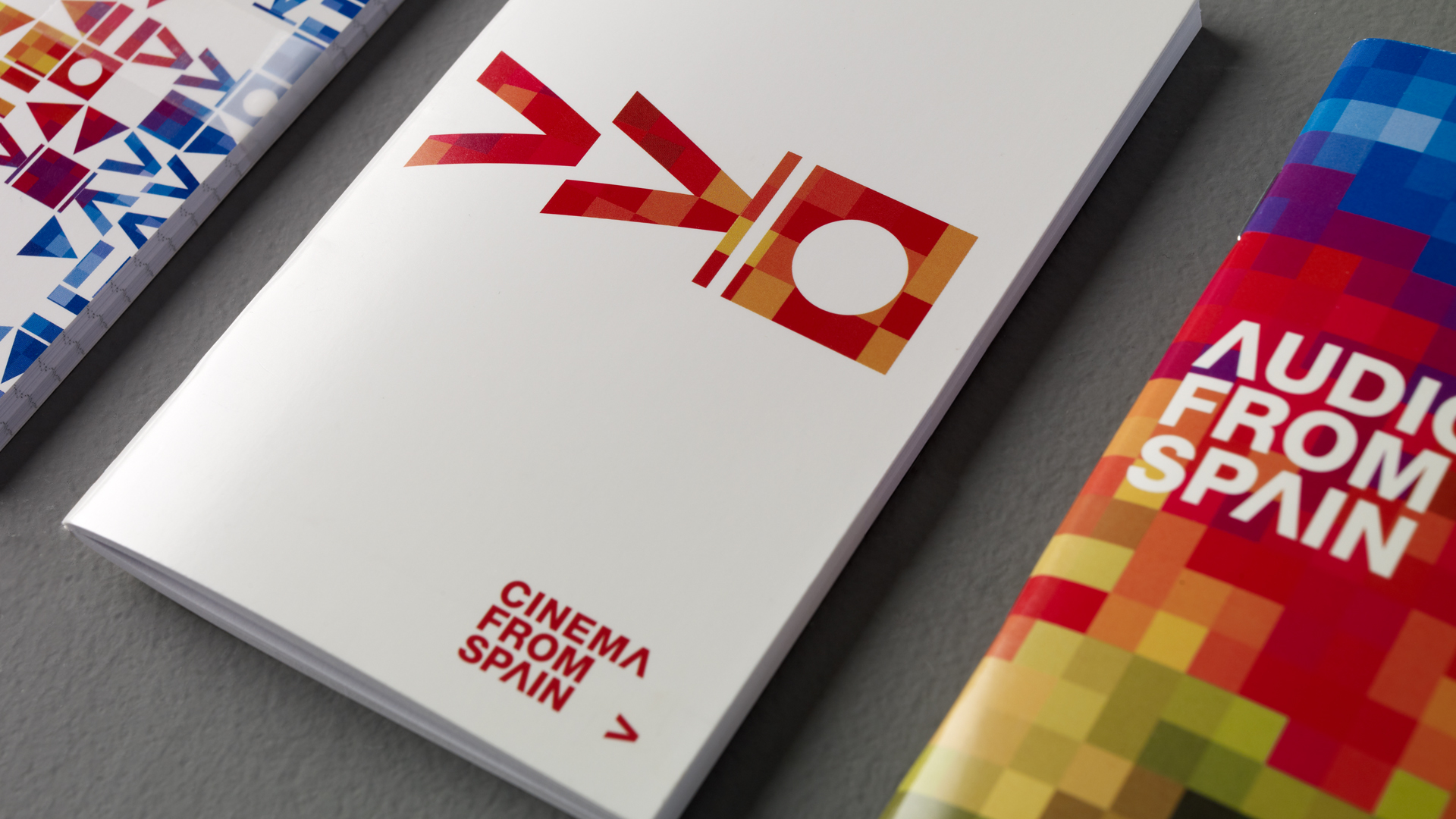
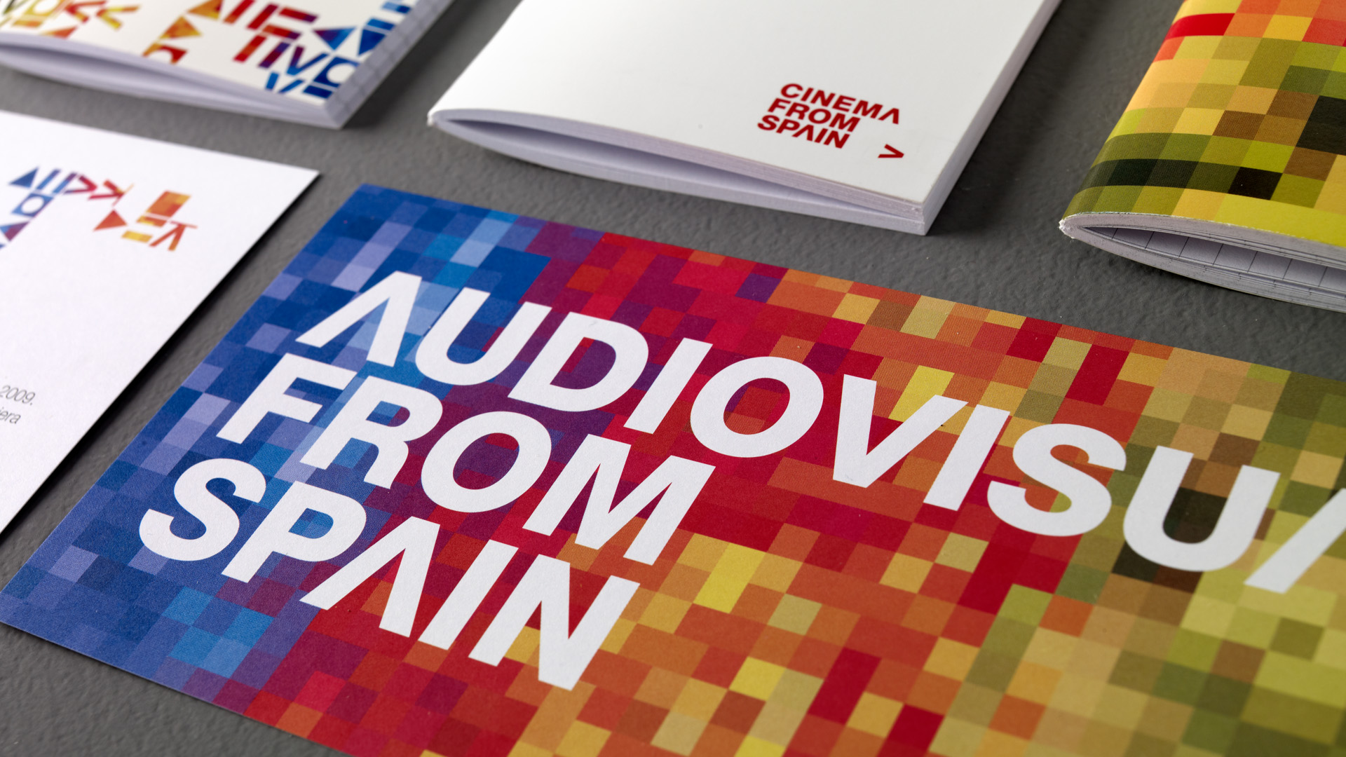
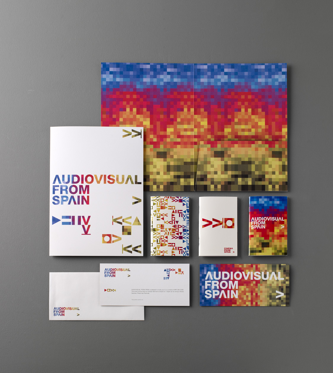
We created corporate branding for the renewed brand image of Audiovisual from Spain by ICEX, an initiative that supports and makes known internationally the products and players from the world of cinema and TV that participate in numerous fairs and festivals.
Our idea, which won the commission, fitted the needs of the brand: represent the diversity of the sector, project an image of innovation and strengthen the values of the country’s creativity, freshness and vitality. We took the colour and iconography of the audiovisual world and created a living mosaic, based on the pixel, which reflects the boundless plurality and modernity of the sector. We collaborated with the brand from 2009 to 2014, developing all its corporate material.
2009
/en/work/valira-packaging-aroma/
Valira
Designing the packaging and communication for Antoni Arola’s Aroma Collection
Packaging Design
Industry
Objects for living
Designing the packaging and communication for Antoni Arola’s Aroma Collection
Packaging Design

For the renowned company Valira, we designed the packaging and marketing materials for the high-end Aroma collection, developed for the brand by Antoni Arola. The collection consists of a range of stainless-steel cookware and cast aluminium pans.
2009
/en/work/levira-corporate-branding/
Levira
Redesigning the branding for the Portuguese office furniture manufacturer, Levira
Corporate Branding
Industry
Furniture & Lighting
Redesigning the branding for the Portuguese office furniture manufacturer, Levira
Corporate Branding


We have redesigned the corporate branding for the Portuguese office furniture manufacturer Levira. Since 1971, this company has been developing management and operative furniture pieces for the national and international market with the aim to create unique and comfortable offices and workspaces in a contemporary style. Subsequently, we also applied the branding guidelines to their communication materials as well as product and corporate brochures.
2007
/en/work/icex-editorial-interiors-2007/
ICEX
Editorial design for Interiors from Spain at the 100% Design Fair 2007
Editorial Design
Arts & Culture
Furniture & Lighting
Editorial design for Interiors from Spain at the 100% Design Fair 2007
Editorial Design
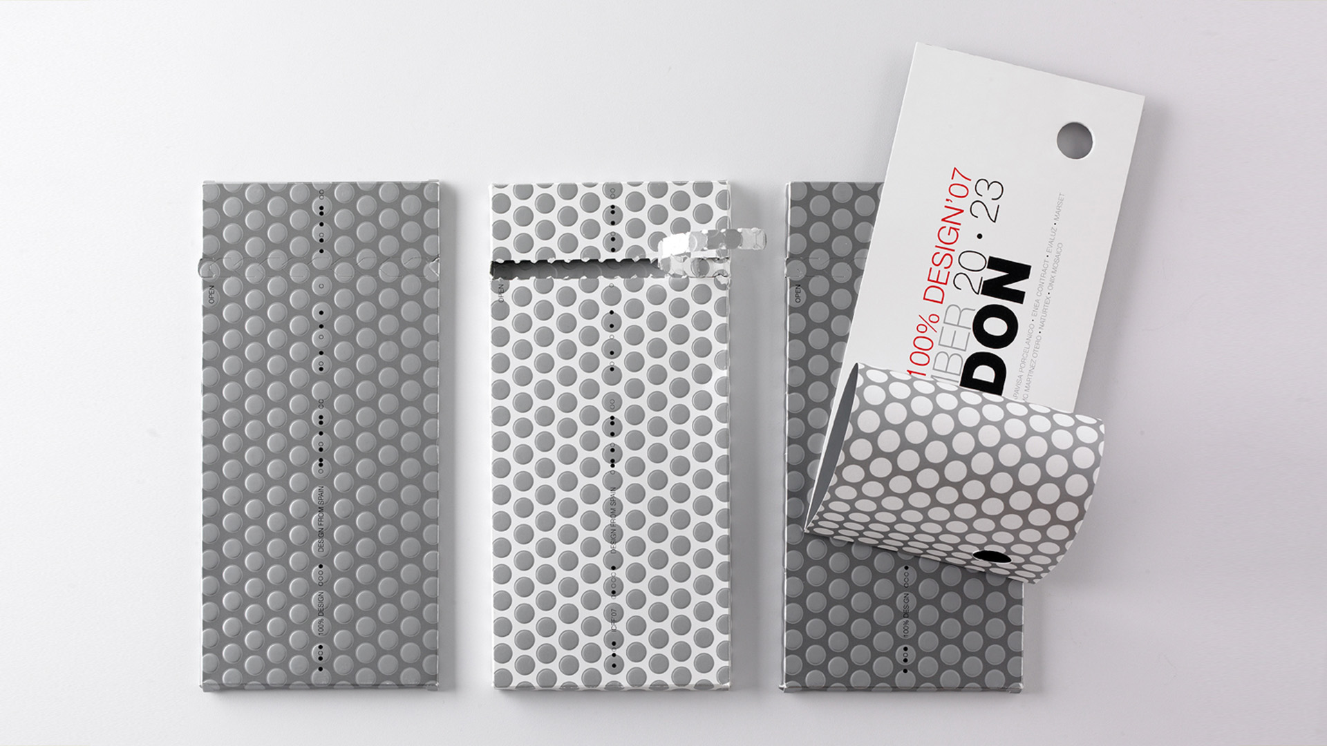
We designed and conceptualised the ICEX Interiors corporate catalogue for the 100% Design 2007 trade fair in London, which featured all the Spanish companies exhibiting at the fair.
2007
/en/work/permasa-communication/
Permasa
Defining the communication for Grupo Permasa’s Oikos Collection
Communication
Industry
Furniture & Lighting
Defining the communication for Grupo Permasa’s Oikos Collection
Communication
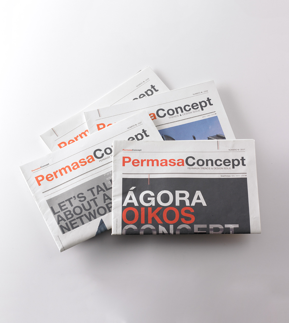
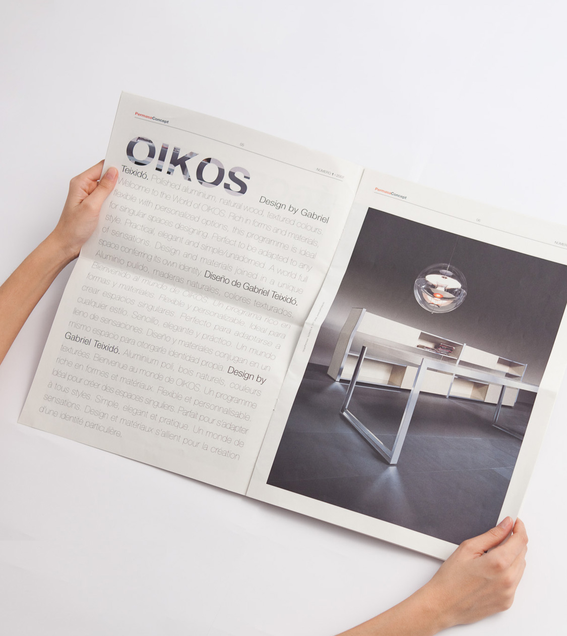
Following our first collaboration with the Permasa Group in 2005, with the design of the Oikos Series brochure, our next step has been to conceptualise and design the company’s corporate communication materials.
Among the communication items that we developed for the group, this piece particularly stood out: its quarterly daily newsletter Permasa Concept, Permasa Trends & Design issue.
The first edition of this piece of communication was launched in spring 2007. Its objective was to share Permasa’s design culture and its vision on trends in visual communication, architecture, advertising and culture in general. In addition, the newsletter also shared the Group’s latest corporate news, interviews, projects and product news.
To create the content of the newsletter, we once again relied on the collaboration of the journalist specialising in architecture, Anatxu Zababeascoa.
2007
/en/work/biok-editorial-design/
Biok
Editorial design to promote the brand at major trade fairs
Editorial Design
Industry
Furniture & Lighting
Editorial design to promote the brand at major trade fairs
Editorial Design

Quality and design for office and contract furniture
Biok, a company that manufactures office and contract furniture, needed to express the style and distinction of its furniture in various marketing materials to promote the brand at the most important national and international trade fairs.
By means of a multi-purpose corporate identity, used in the brand’s various marketing materials, Biok was able to be identified clearly in all its catalogues, price lists, and so on, and this image continues to have a very contemporary feel today.
2006
/en/work/inoxcrom-packaging-david-delfin/
Inoxcrom
Packaging and communication design for the David Delfín collection
Packaging Design
Stationery & Accessories
Industry
Packaging and communication design for the David Delfín collection
Packaging Design
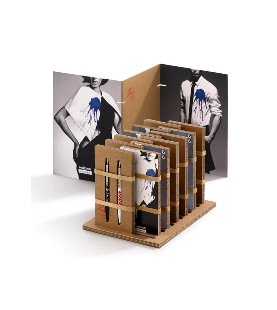
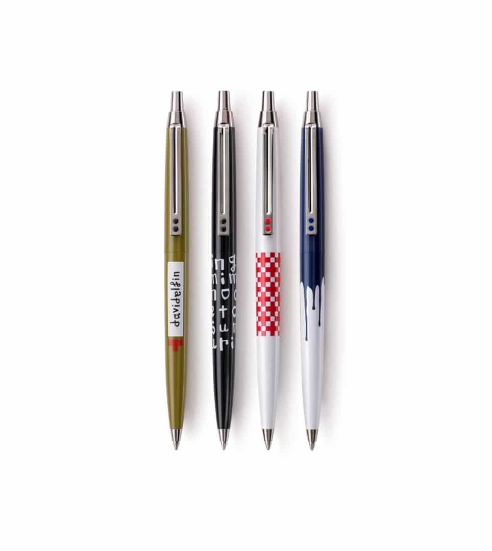
We created the point-of-sale materials for the David Delfín writing collection in 2006.
The collection’s values and attributes were conveyed by the product’s graphics, artwork, packaging design and the design of the point of sale, hence bringing together all the marketing elements as indivisible parts of the product.
2006
/en/work/lekue-packaging-luki-huber/
Lékué
Defining the packaging for the innovative utensils designed by Luki Huber
Packaging Design
Industry
Objects for living
Defining the packaging for the innovative utensils designed by Luki Huber
Packaging Design
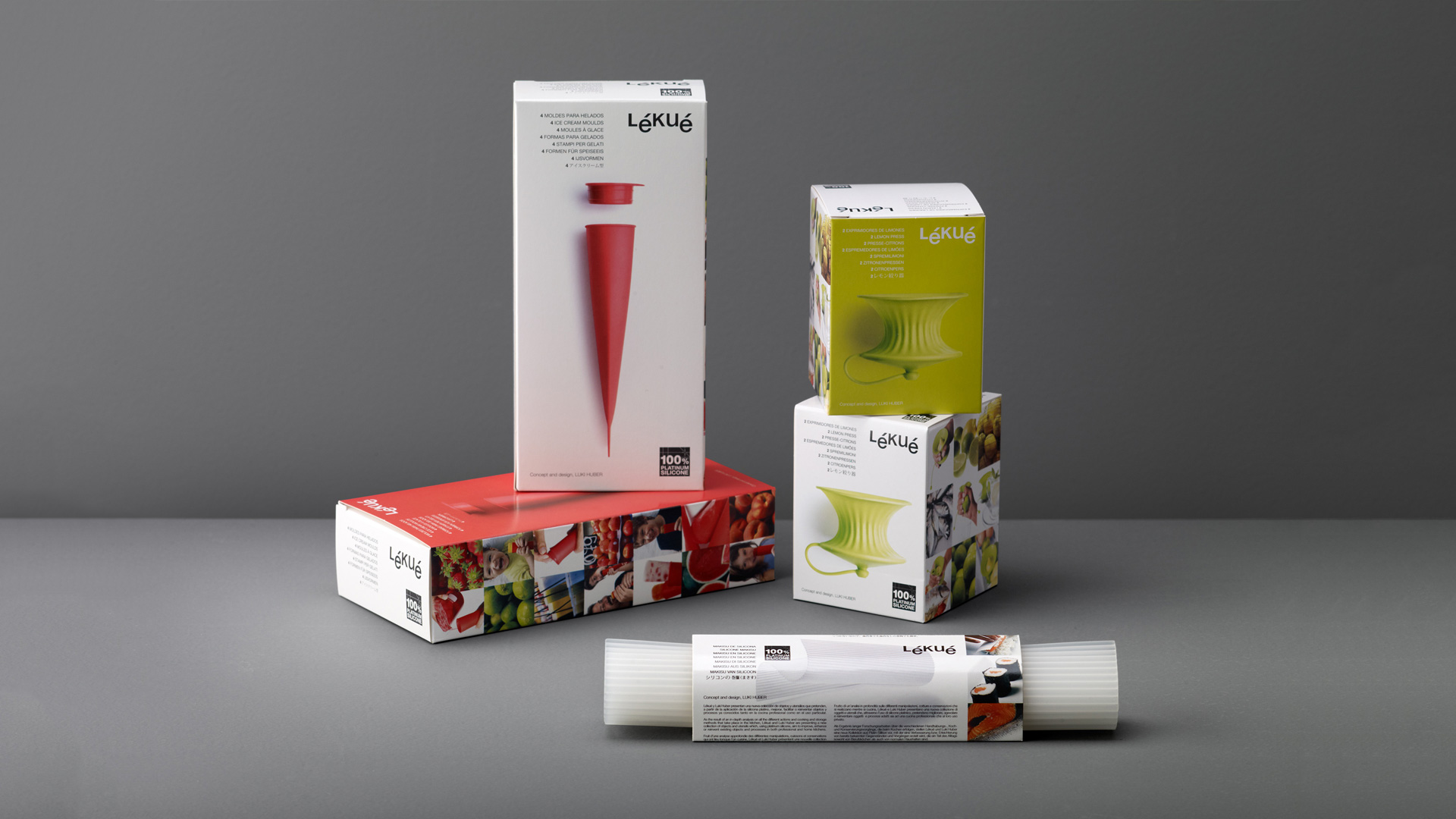
Taking into account Lékué’s business strategy is based on design thinking, in 2006 we started working alongside Luki Huber –a regular collaborator of world renowned restaurant El Bulli– developing a new kitchen utensils collection that came to revolutionize the food industry market. We conceptualized and designed the packaging for these pieces of kitchenware, in which innovation and product design were the protagonists, along with the benefits of the raw material and its user experience.
The combination of art direction, design and descriptions helped consumers understand the product, as well as their use and the brand attributes: i.e. simple, healthy, natural, and tasty cooking.
2005
/en/work/inoxcrom-packaging-antonio-miro/
Inoxcrom
Packaging and communication design for the Antonio Miró collection
Packaging Design
Stationery & Accessories
Industry
Packaging and communication design for the Antonio Miró collection
Packaging Design
2005
/en/work/lekue-branding/
Lékué
Redesigning Lékué’s branding to communicate a new way of cooking
Corporate Branding
Industry
Objects for living
Redesigning Lékué’s branding to communicate a new way of cooking
Corporate Branding
A new way of cooking
Lékué, the leading manufacturer of kitchen utensils, seeks to contribute to the happiness of the user by offering designs that create easy, healthy and tasty food.
The brand was redesigned with this concept in mind. The corporate branding was in line with a new business strategy geared towards growth based on innovation and design, and with a clear focus on the consumer. With the change, the brand was linked to design, innovation, the excitement of cooking and a commitment to healthy and nutritious food.
The new identity was used in the various marketing materials: product catalogues, guides, recipes, manuals and the packaging for all of its ranges; and the corporate branding remains in place 14 years on.
2005
/en/work/permasa-oikos-editorial-design/
Permasa
We carry out the editorial design for the Oikos Series by Gabriel Teixidó
Editorial Design
Furniture & Lighting
Industry
We carry out the editorial design for the Oikos Series by Gabriel Teixidó
Editorial Design
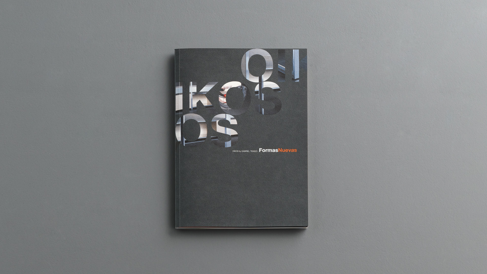
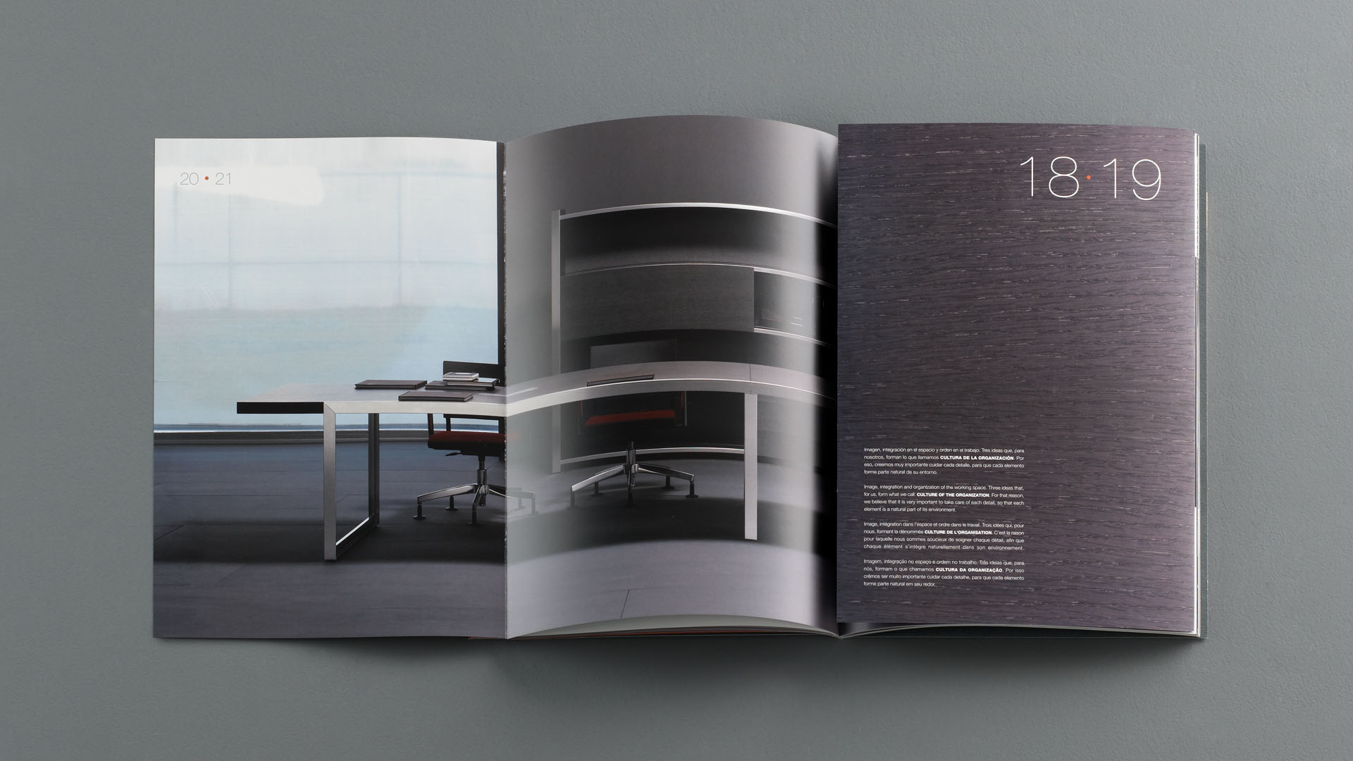
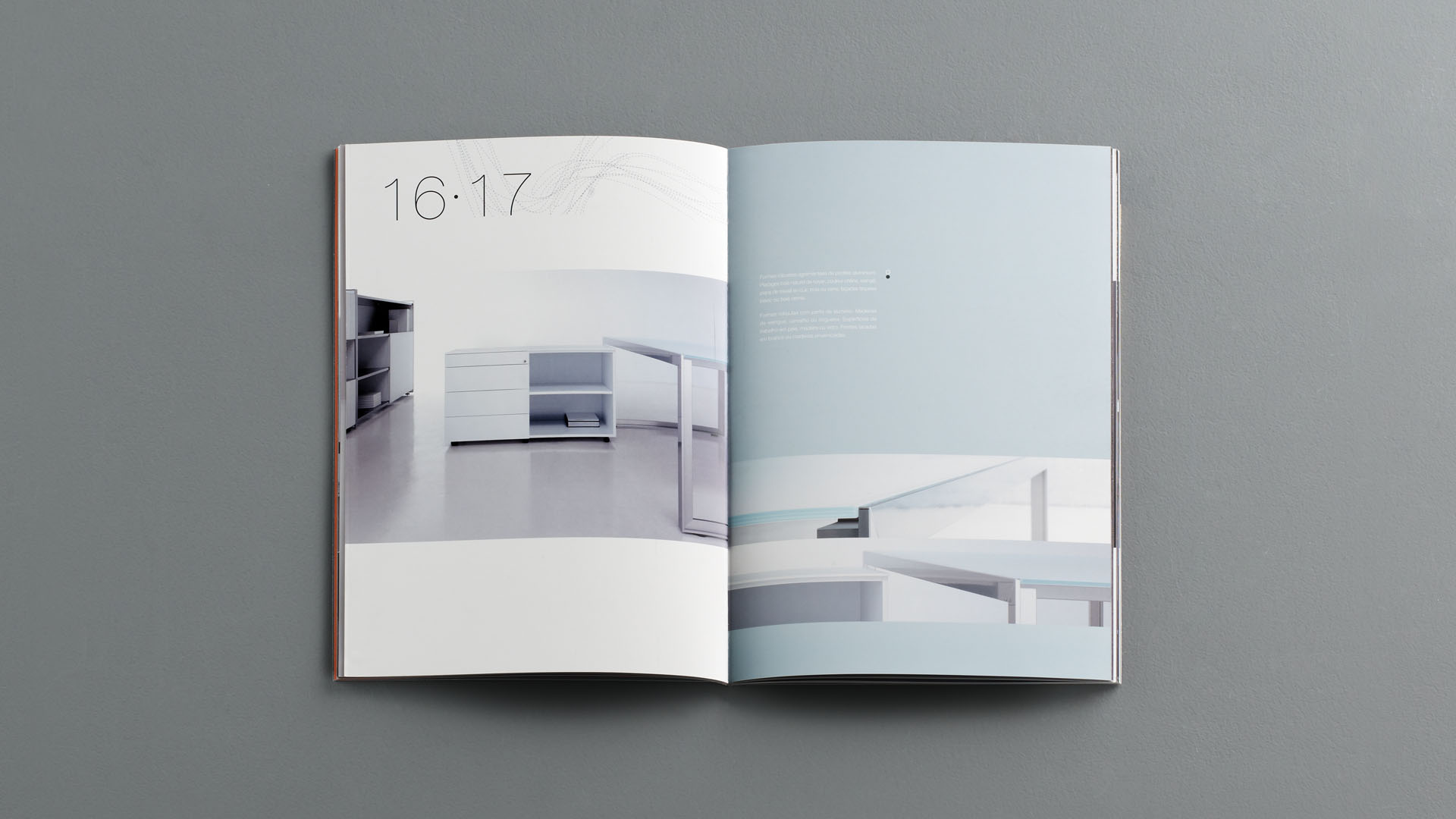
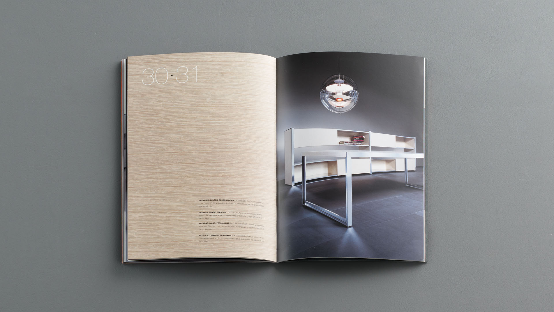
In 2005 we kicked off our first collaboration with Permasa, a company with over 40 years’ experience in the design and manufacture of office furniture solutions and systems. Coinciding with the launch of the Oikos Series, designed by Gabriel Teixidó, we hopped on board to conceptualise, take on the art direction and design the product brochure.
Oikos is a program that relies on high quality architectural shapes and finishes. These furniture pieces are furthermore characterised by their versatility and by their excellent customisation possibilities. They therefore perfectly blend into all types of environments, creating unique people-centred spaces thanks to the warmth of the utilised materials.
To conceptualise the art direction, we reflected on visual aspects of architecture. We devised images that emphasise the angles and architectural lines of the furniture systems, while showcasing the use of noble materials. The photographs were taken by Martin & Zentol studio.
2003
/en/work/oken-corporate-branding-binaria/
Oken
Designing the branding and communication for an icon of 21st century Spanish design
Corporate Branding
Editorial Design
Furniture & Lighting
Industry
Designing the branding and communication for an icon of 21st century Spanish design
Corporate Branding
Editorial Design

We have carried out the brand conceptualisation, design and communication of the ergonomic seating Binaria, a piece created in 2003 as part of the Oken brand furniture catalogue.
Designed by the dentist Jordi Badía and the industrial designer Otto Canalda, this piece was awarded a Silver Delta during the 2005 edition of the ADI-FAD Awards and subsequently established itself as an icon of Spanish furniture design of the early 21st century.
At NOMON we developed the creative concept for this new product, which was devised by a medical prescription. We concentrated on its main attributes: ergonomics, the health benefits and its adaptability to all kinds of people.
We thus established that not only was Binaria a moving, castered stool developed to make certain jobs easier, but it was primarily a new way of sitting, ensuring the most correct position of our back.