Editorial design of the new Aridi catalogue for the Orgatec 2016 trade fair
The leading international Working Environments trade fair Orgatec 2016 took place in Cologne from October 25 to 29. Office furniture company Aridi, presented its new WO Collection, designed by Gabriel Teixidó.
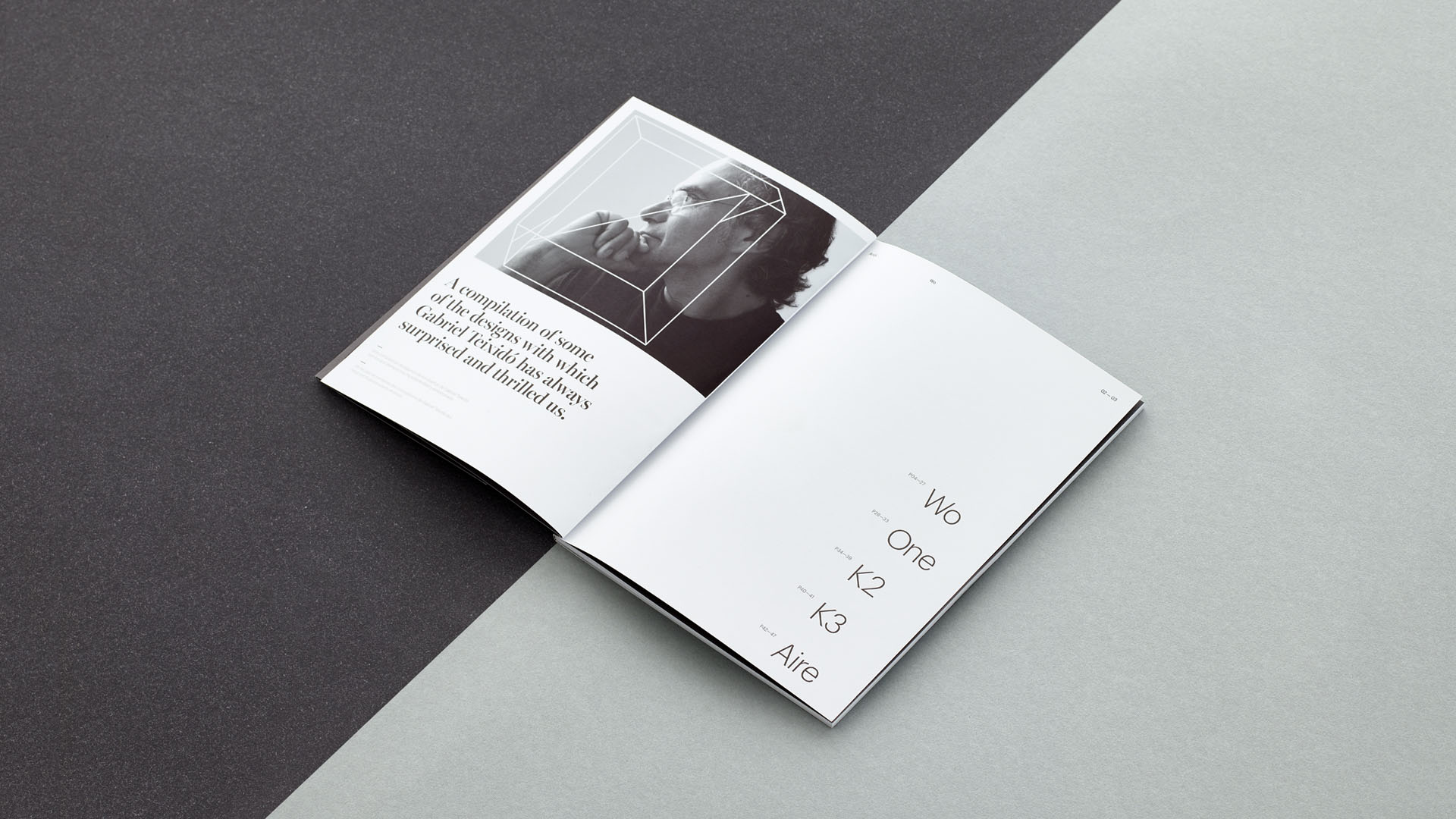
For the event, we designed a catalogue that presented WO and also took a look back at the designer’s other recent creations. Collections that excited and surprised us at the time, and that set the trend in the industry. It also offers a look back at Aridi’s unique way of interpreting contract spaces and office spaces since 1979.

A versatile editorial design
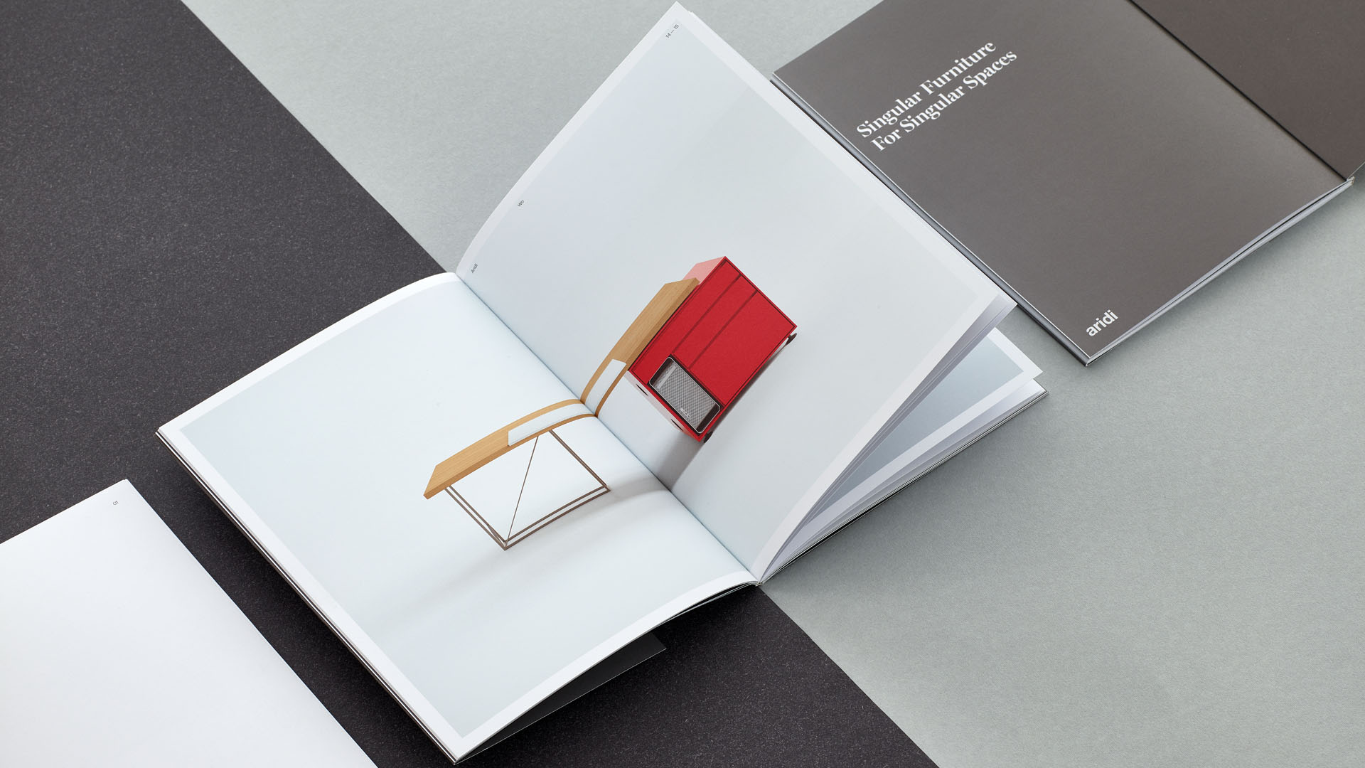
The design of this catalogue reflects the personality both of the company and of Gabriel Teixidó. It also maintains continuity with the company’s predecessor catalogue One. Its elegant and original composition is striking for the dark cover of the catalogue contrasting with the pastel colour headlines. A combination that allows all the designs from previous collections to be grouped together.
We worked with two different fonts: Graphik and Miller Banner. The first is a clean, functional sans serif which we used for body text. For headings and highlighted text, we selected Miller Banner – a serif font with personality and elegance.
On the catalogue cover, we wanted to highlight the company’s track record. When the cover page is turned, the reader discovers the relationship between the collections and the years they were launched. A total of sixteen years creating office furniture.
More than fifteen years of working with Aridi
The pieces in the WO collection are characterised by being simple, multi-purpose, flexible structures that allow multiple compositions. WO transcends the world of offices to fit into contract projects and unique spaces.
Designing this catalogue was also an opportunity for Nomon Design to recall our more than fifteen years of working with Aridi.


Tags: Editorial design, Fairs, Aridi
2016