Branding for Belone, office furniture from Portugal
Belone, located in Aveiro, dubbed “the Venice of Portugal”, is a company that designs and manufactures modular office furniture systems.
The marine waters off this small city on the shores of the Atlantic Ocean are home to the needlefish, member of the family Belonidae and the genus Belone belone, and it is after this fish that the brand is named.

Corporate Branding inspired by the peculiar anatomy of the Belone fish and its habitat
The company’s corporate image, whose concept and design was created by Nomon Design, captures the essence and elegant, simple lines of its modular systems and the colour spectrum of the habitat in which the needlefish lives, and alludes to a peculiar feature of its anatomy.
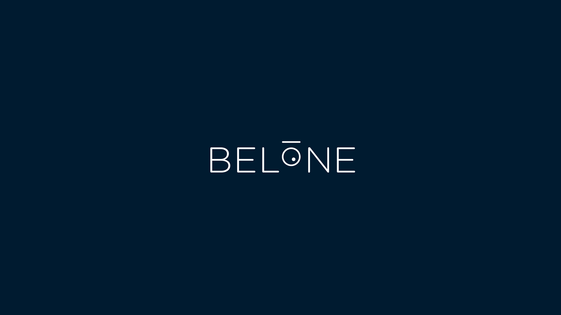
For the typeface of the logo, we chose a sans serif font (Gotham Rounded Light) and, for the text on all other materials, we selected a serif font (Baskerville Regular). The design of the “o” of Belone alludes to the peculiar characteristics of the eye of this marine species and works perfectly as an independent element. For the choice of colour, we opted for navy blue combined with white.
The final touch was applying the corporate image to the stationery and provisional company website, and we are currently working on future product catalogues.
Belone, the most important office furniture company in Portugal
This family business has been dedicated to office furniture since the 70s. It is the most important company in its field in Portugal. Since its inception, the owners’ passion for the ocean and their small town is represented in their brand identity and in each of the collections which they have developed since.


Tags: Corporate branding, Editorial design, Belone
2015