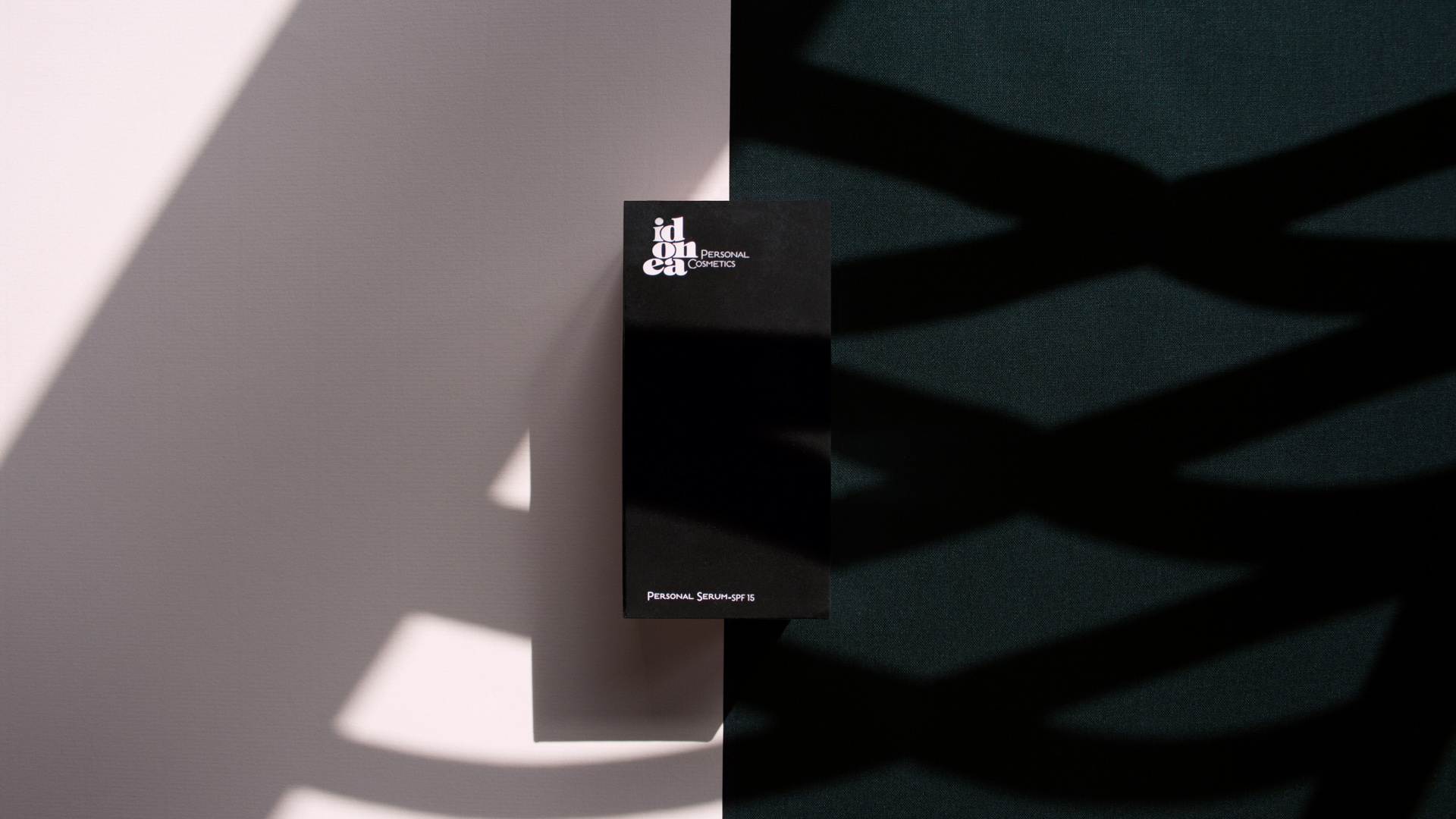
Corporate branding for Idonea, targeting the farmacy retail channel
So, what do we consider when we develop a corporate branding strategy? The first and main thing is, we must thouroughly get acquainted with the company.
Idonea Personal Cosmetics is a brand that offers an innovative dermoesthetic prescription service. It is only available in pharmacies, and ready in just 5 minutes. Through a complete and free diagnosis, which quantifies 9 skin parameters (hydration, fat, wrinkles, tonality, etc.), the consumer receives a complete personalised report and is also presented with a “Personalized Cosmetic Treatment” with a series of complementary recommendations.

Corporate branding: Attesting the suitability of the product for each consumer
At NOMON we have carried out the conceptualisation and design of the corporate image, naming, packaging, stationery and media. The objective of corporate branding is precisely to unify all the resources to communicate the same brand attributes: reliance, personalisation, balance and elegance.
In the face of a product and technical service per se, the main objective was to conceptualise an image that reflects a more human, tangible and emotional aspect, achieving a not-so-technical image that would enhance the visibility of Idonea products in the vastness of pharmacy outlets.
Another fundamental aspect of corporate branding is naming. Developed in collaboration with the client, in this case it reflects the concept of personalisation: each product is ideally adapted to each consumer.
An unusual corporate image for a dermocosmetic brand in the pharmacy channel
But corporate branding is much more than just a name. On a graphic level, we conceptualised the brand as a watercolour in which each substance puts its colour note on a base, the skin. The corporate element is a stain that represents the drop of the essence of active ingredients.
For the corporate colour we chose a skin make-up tone that perfectly combines with the black colour of the Miron Violet Glass of the containers, which in turn also constitutes a very elegant and unusual hue in the pharmacy retail channel.
The use of Miron Violet Glass makes Idonea the only cosmetic brand to utilise this material. The purpose of it is to block all visible light radiation to keep the properties of the product intact, using only ecological preservatives, endorsed by Ecocert.
Furthermore, another important aspect of corporate branding and brand image is, of course, the logo. For Idonea we chose a typography with personality and character (ITC Tiffany LTD) that easily stands out within the stain and that is combined with the Pro Light and Quicksand Style font for the claim and the rest of the copies.

The naming strategy
Picking a name for a company or product is not easy. It is, without a doubt, an important decision, since it is the main element by which they are widely identified. It must attract the consumer and, at the same time, contribute to the positioning of the brand (and be consistent with the activity and the values of the company).
Of course, there is also a legal aspect, which is no less important: the brand must be correctly registered to avoid possible plagiarism in domain names or social networks.
Like we mentioned before, the choice of the company name must be the result of extensive research and deliberation, and in line with the global corporate branding strategy.
You can contact us for more information on this matter. However, below are some aspects that must be taken into account when choosing brand names:
Easy reading and pronunciation, to make sure your brand can be easily verbalised. Is it easy to spell?
Brevity, which also enables effortless memorisation (with the correct name!)
Association with the product or service. In Idonea’s case, we linked it with one of its main characteristics and values (product customisation: a product that adjusts itself to the needs of each person).
The euphony, how it sounds. Some words have a better sound than others. This is also important in order to generate good impressions. Some letters such as L, D or T provide a positive and smooth auditory effect, while X and J or Castilian G usually sound slightly more annoying.
Another element to keep in mind is that a name starting with a letter from the beginning of the alphabet is more helpful when positioning the brand on certain media supports.
And let’s not forget the international market. If presently, or in the future, your brand must be marketed in other countries, make sure that in their respective languages / cultures the name does not have a negative connotation.
And remember: naming a product is not really about sounding attractive but should convey something else to help build your brand image. You have to avoid generic names which do not allow you to differentiate yourself.

Tags: Corporate branding, Packaging design, Retail branding, Idonea
2015