Aridi
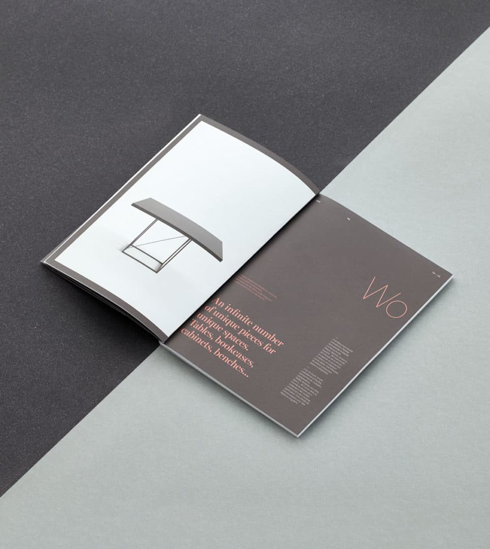
We crafted the editorial layout to unveil Gabriel Teixidó’s latest collection, Wo
A tailor-made editorial design, exclusively created for the international Orgatec 2016 fair
Editorial design
Challenge
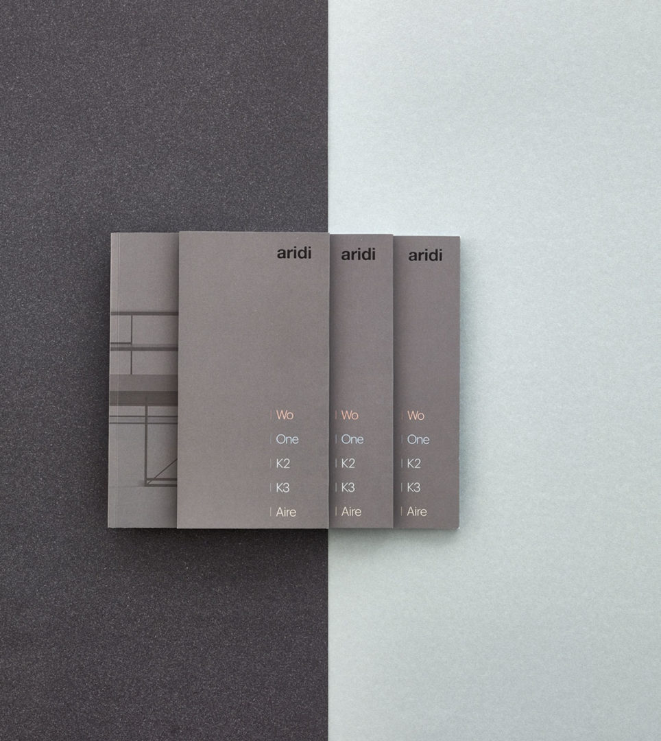
A comprehensive catalogue introducing the new collection while offering a retrospective of the brand’s most iconic pieces
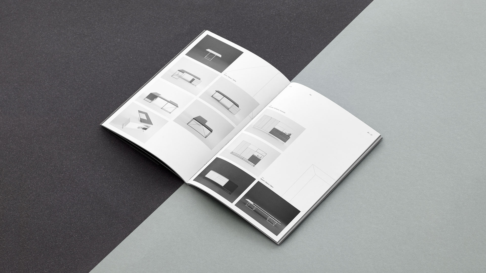
To exhibit at the international trade fair Orgatec 2016, specialising in office and workspace furniture, we designed the new catalogue unveiling the new WO furniture collection by Gabriel Teixidó, which also looked back at those collections that best represent Aridi, having set trends in the sector.
Process and result
An editorial piece capturing the essence of both the designer and Aridi
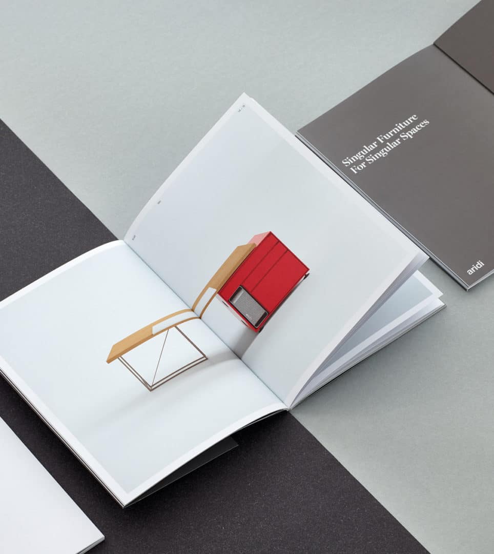
The design of the catalogue reflects the company’s character as well as that of Gabriel Teixidó, and keeps continuity with the firm’s previous catalogue, One.
We worked with two different fonts: Graphik and Miller Banner. The first is a clean and functional sans serif that was used for body text, while for headers and highlighted text, we selected Miller Banner, a serif font that stands out for its individuality and style.
Tags: Editorial design
2016
More Projects

