Textil Blanca 1941
We developed a new branding strategy for the Textil Blanca 1941 Group – honest textile solutions for rest and wellbeing
Rediseñamos el branding de Textil Blanca 1941 y creamos un nuevo branding para tex-blanca, manteniendo la esencia y valores de la marca
Branding Strategy
Corporate Branding
Packaging Design
Communication
Digital Communication
Challenge
Redefining the branding strategy for the new business phase of Textil Blanca 1941
In 2023, we began our collaboration with Textil Blanca 1941, a company based in Olot (Girona) with more than 80 years of experience manufacturing textile products for rest, sold in over 50 countries.
With facilities spanning more than 5,000 m² — including a manufacturing plant, logistics centre, and R&D hub — the company offers a product range based on innovation, quality, and a strong commitment to the environment and society. Its team of 150 professionals combines expertise and technology to develop high-level textile protection and comfort solutions.
At the time, the company was undergoing an internal reorganisation of its brand structure with the goal of maximising its production and commercial potential.
The rest textile sector is a complex and saturated market, where the lack of differentiation and inconsistency in brand messaging often leads to consumer confusion. Information overload and similar offerings make choosing the right product a challenge.
Our task was to conduct a thorough process of analysis and reflection to address these challenges, which led to a redefinition of the brand architecture, the development of an integrated branding strategy that ensured coherence and differentiation, and the creation of a new commercial brand.
Process
We reviewed and structured their brand architecture, branding strategy, and created a new commercial brand
The project was structured in several key phases:
– Observation and analysis: To understand the internal dynamics of the organisation and its future vision, we held meetings, interviews, and conducted the NOMON Test with key figures involved in the project.
– This process allowed us to identify the internal motivations behind the company’s evolution, leading us to redefine its brand architecture to ensure that each brand had a clear purpose and differentiated positioning.
– We detected that the retail segment was using the group’s brand, creating confusion and lack of distinction. To bring clarity and value, we decided to create a new commercial brand specifically for this segment.
– Based on this restructuring, we reviewed their mission, vision, and values, with a proposal that reflected the internal transformation they were undergoing — focused on their future vision and purpose, as well as their strategic pillars:
– Becoming a benchmark in rest textiles
– Constant innovation in materials and processes
– Responsible manufacturing, with respect for the environment
– We defined a new verbal identity with a storytelling approach that highlighted the legacy of Textil Blanca 1941, its commitment to innovation, certified quality, and customer care.
– We reformulated the corporate descriptor to clearly define the organisation’s activity: “Textil Blanca 1941: We manufacture honest textile solutions for your rest and wellbeing.”
– For the naming of the new commercial brand, we explored several creative routes through a brainstorming and analysis process.
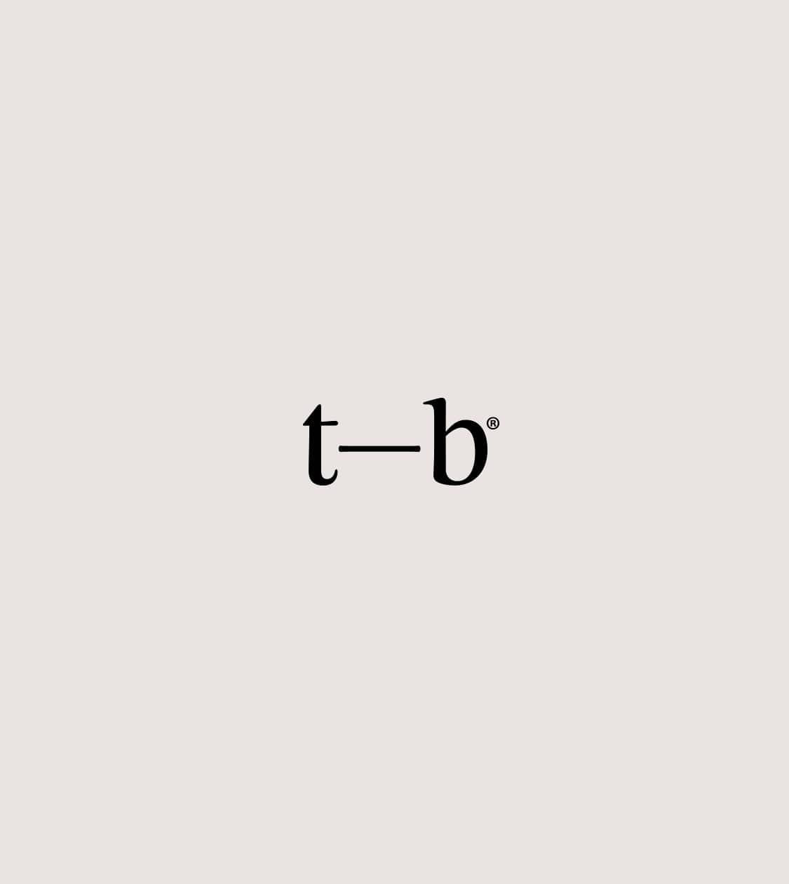
After evaluating various options, we selected “tex-blanca” — a more compact and direct name that preserves the brand’s values while adapting to the new target audience. Thus, Textil Blanca 1941 remained as the group’s name, while tex-blanca became the new commercial brand for the retail division.
– We also created the tagline for tex-blanca: “Bed care & comfort”, reinforcing its essence and commitment to restful wellbeing.
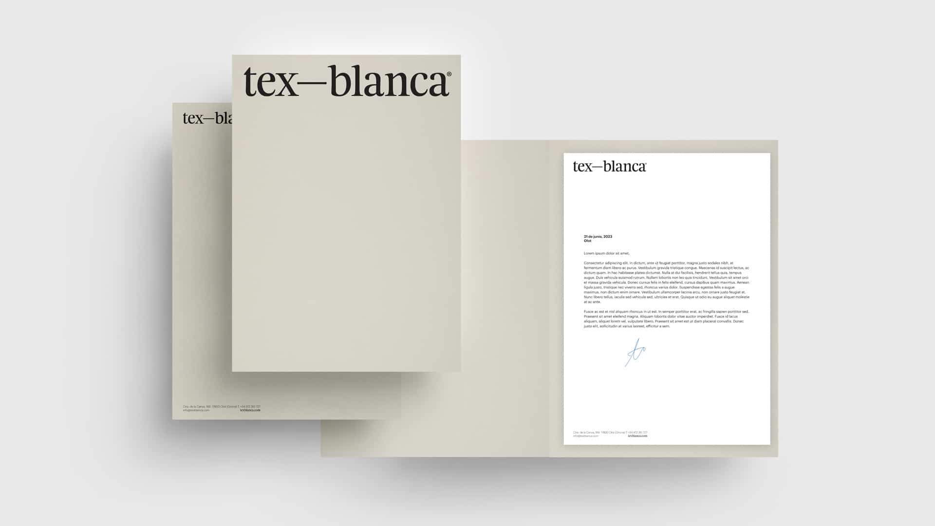
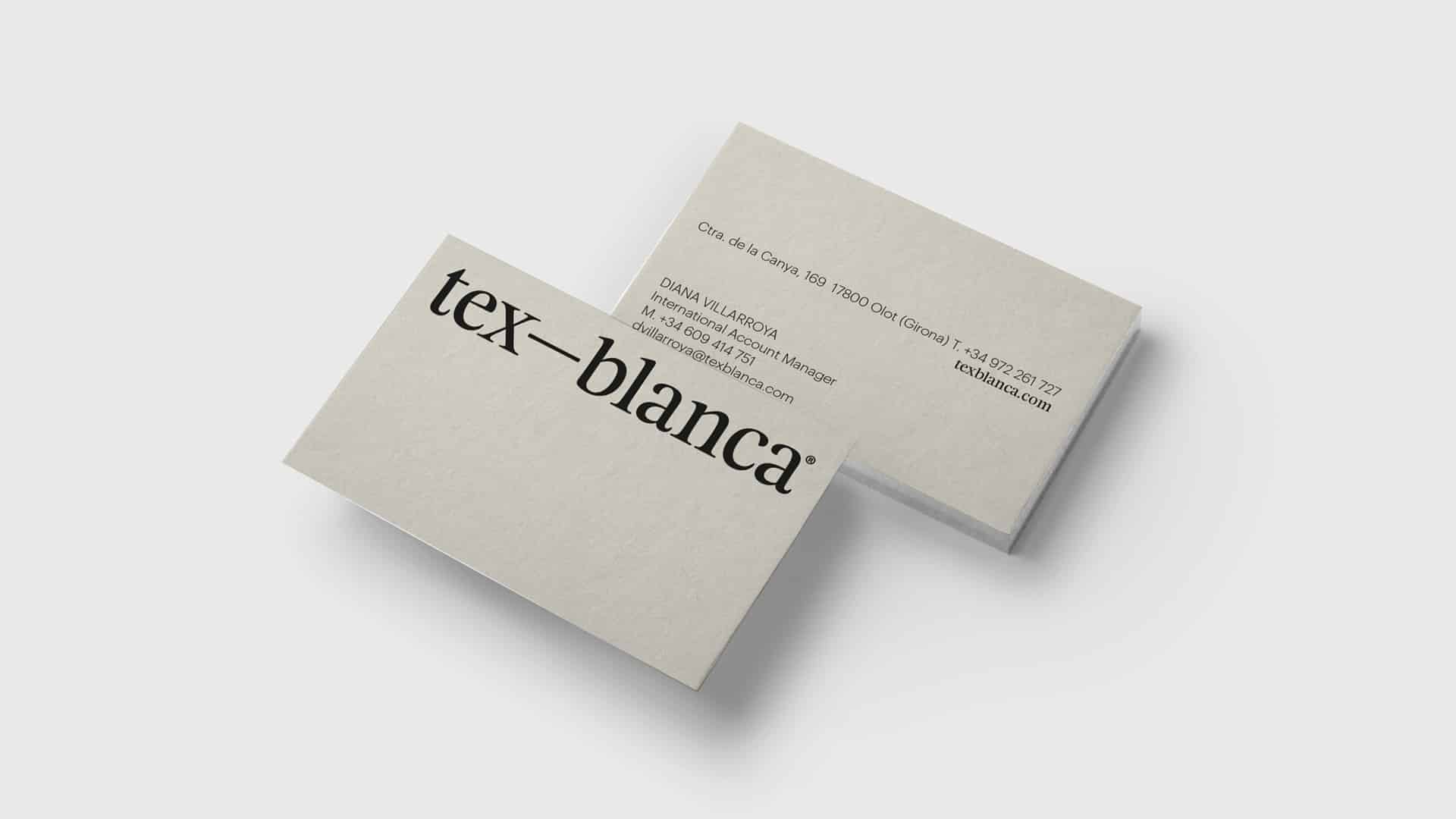
– Once the brand strategy and verbal identity were defined, we began the branding design phase for both the group and the new commercial brand, ensuring coherent and distinctive visual communication.
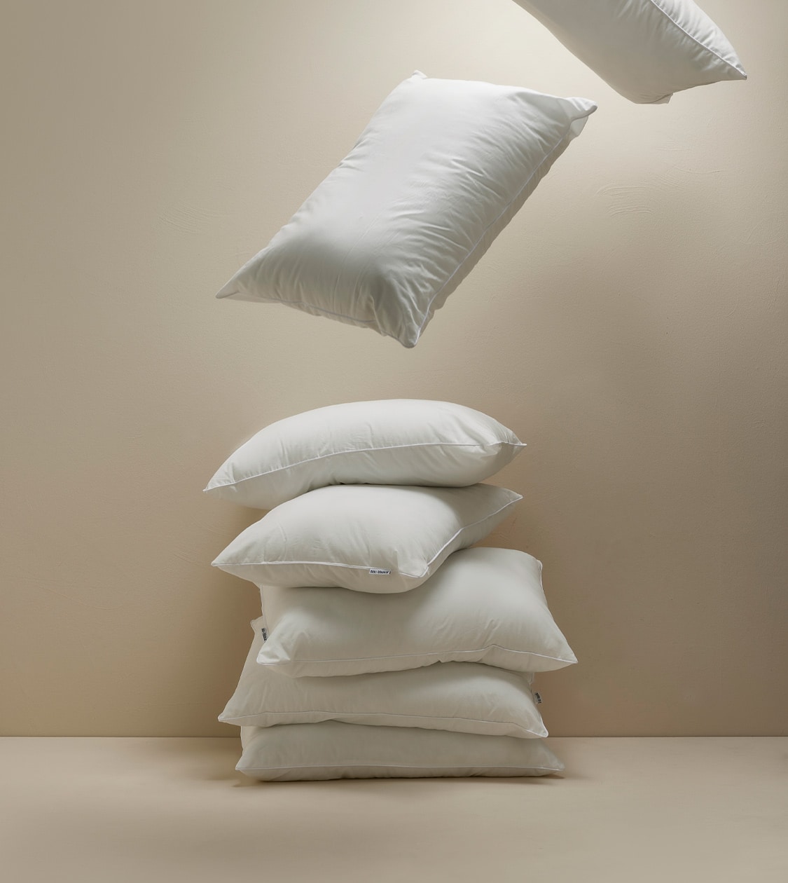
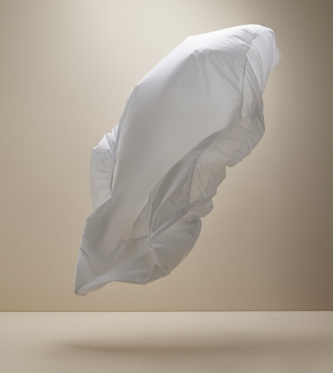
We designed a graphic identity that reflects the brand’s essential values — honesty, simplicity, and innovation — conveying trust and transparency, avoiding unnecessary embellishments and prioritising clarity of message.
For the logo, we chose the Feijoa Display typeface — elegant and organic — evoking comfort and wellbeing. Its soft, rounded forms express naturalness and align with the group’s commitment to sustainable materials and responsible processes.
As a secondary typeface for print materials, we selected Graphik, a clean and geometric font that enhances readability and reinforces the brand’s clarity and simplicity.
For colour, we chose a neutral and warm palette — black, white, and Pantone Warm Gray 1U — conveying purity, calm, and sophistication.
The combination of typography and colour not only defines the brand’s aesthetic but also communicates its essence: a clear, approachable, and trustworthy brand offering high-quality textile solutions without frills.
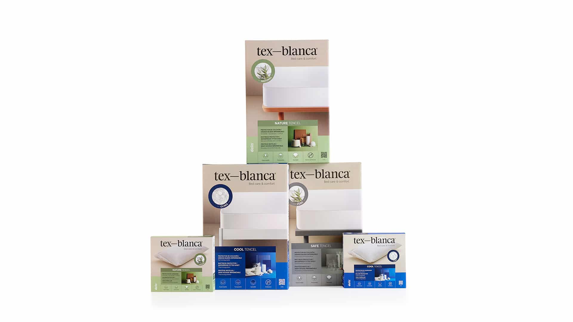
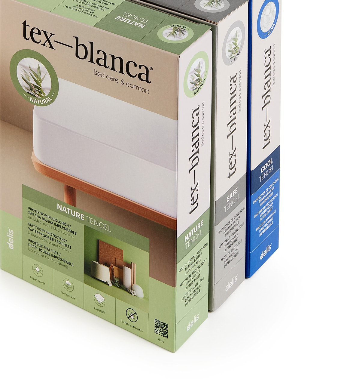
We also defined the art direction. After analysing the market, we saw the need to create a clear and high-quality visual language to stand out. We developed a distinctive visual style with powerful images that express personality and consistency across all formats, while clearly showcasing product qualities.
With the verbal and visual identities in place, we implemented the new branding across all communication channels — from packaging systems and digital platforms to editorial content and retail applications.
After conducting a competitive packaging analysis, we created a unique and distinctive packaging system for tex-blanca, using colour coding by product range to ensure coherence and differentiation at the point of sale.
Result
A new branding strategy to build a strong and distinctive brand in the rest sector
We supported Textil Blanca 1941 in defining a new business chapter, with a forward-looking approach while preserving the essence that has defined them for over 80 years: delivering the best rest textiles with outstanding service.
Thanks to a well-defined brand architecture, a coherent branding strategy, and a strong visual identity, we built a brand that communicates trust and commitment.
With a clear and distinctive positioning, tex-blanca establishes itself as an innovative and honest brand, designed for those who seek rest and wellbeing without frills, with an offering based on certified quality, innovation, and sustainability.
More Projects