Espigoladors
We revamped the branding for a socially and environmentally responsible brand of vegetable preserves and jams
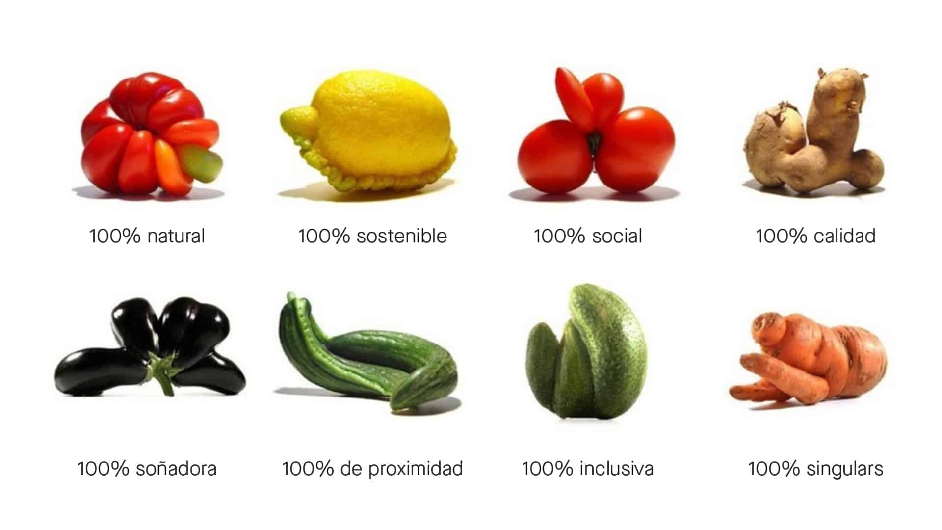
We shaped the entire brand communication around the concept of imperfection
Branding strategy
Corporate branding
Challenge
In collaboration with the foundation and its commercial brand, our most significant intervention involved redesigning their logo
Since 2015 we have been collaborating with the non-profit foundation Espigoladors which, through its trademark es im-perfect®, has been fighting against food wastage, while empowering people at risk of social exclusion in a transformative, participatory, inclusive and sustainable way.
Process
We chose a new typography and color palette to embody the essence of the gourmet sector
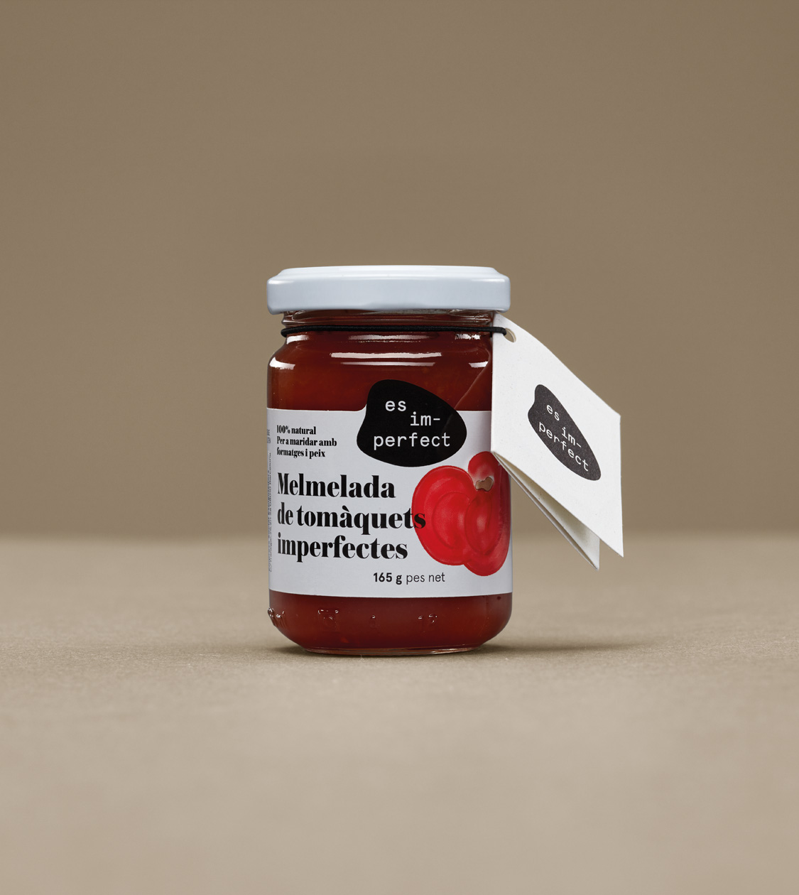
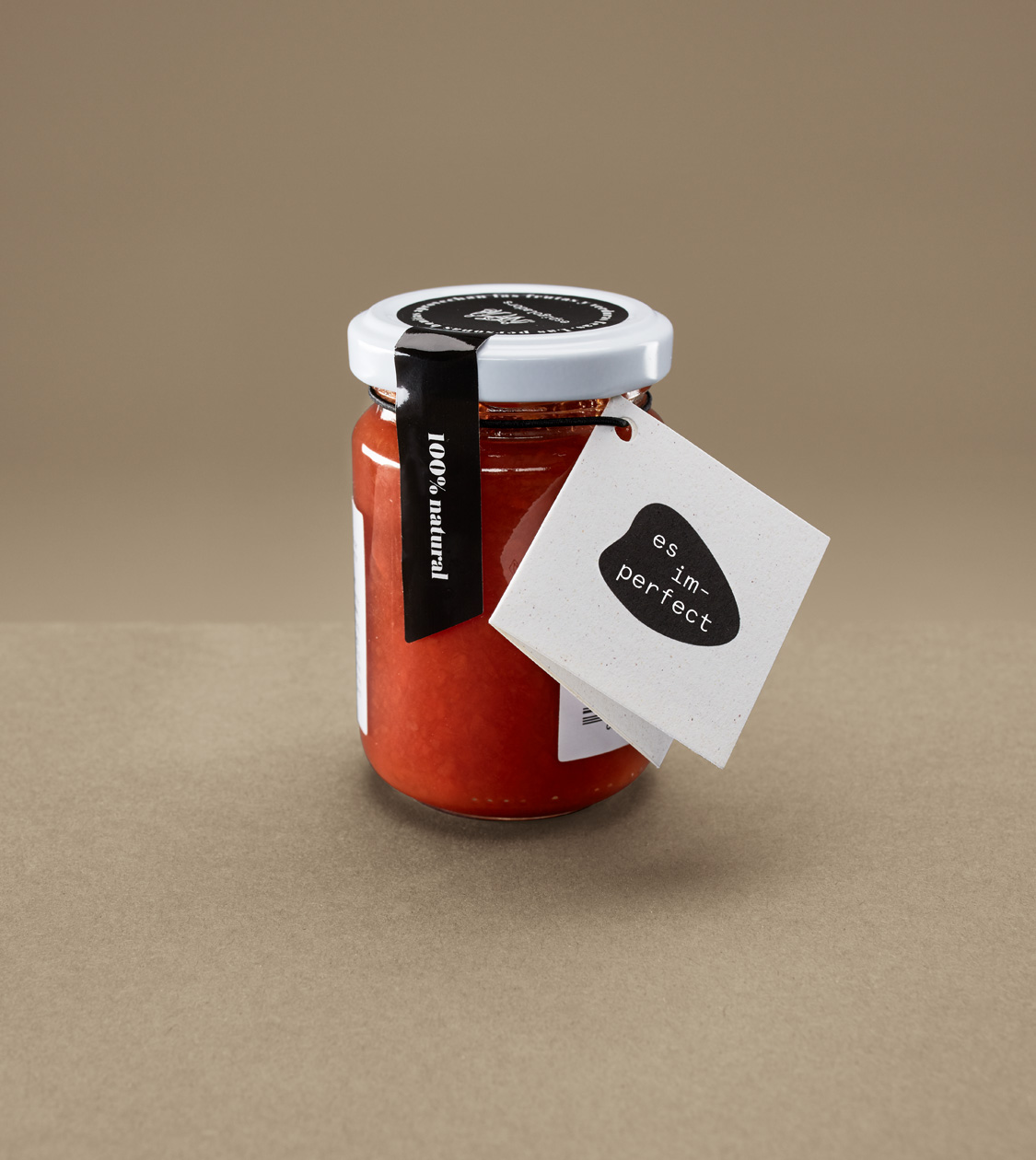
In 2018 we carried out the most relevant intervention, with the aim of perfecting the communication of the foundation and that of its products: we redesigned the logo, in accordance with the newly created corporate identity for the es im-perfect® brand. In both cases we chose a new typeface, with simpler lines. Colour-wise, we opted for the use of black as a representation of the gourmet sector.
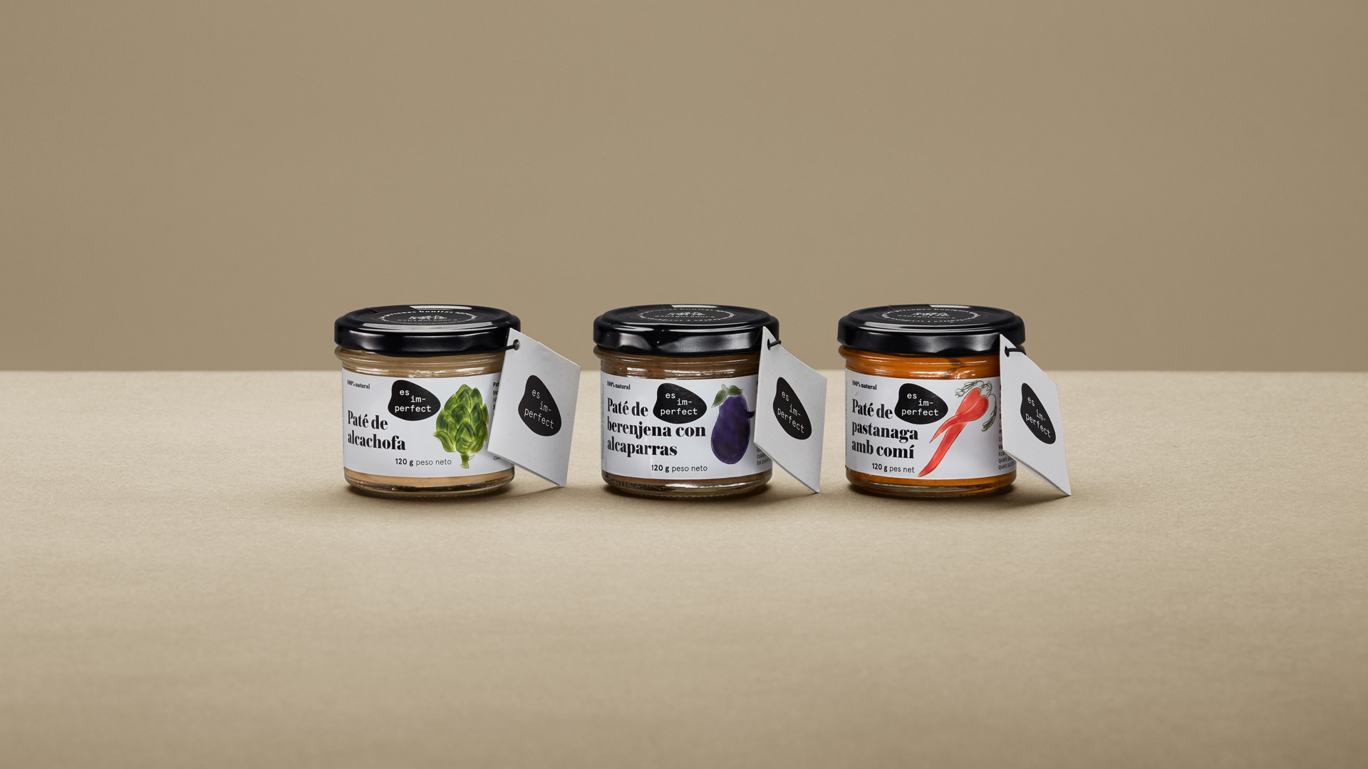
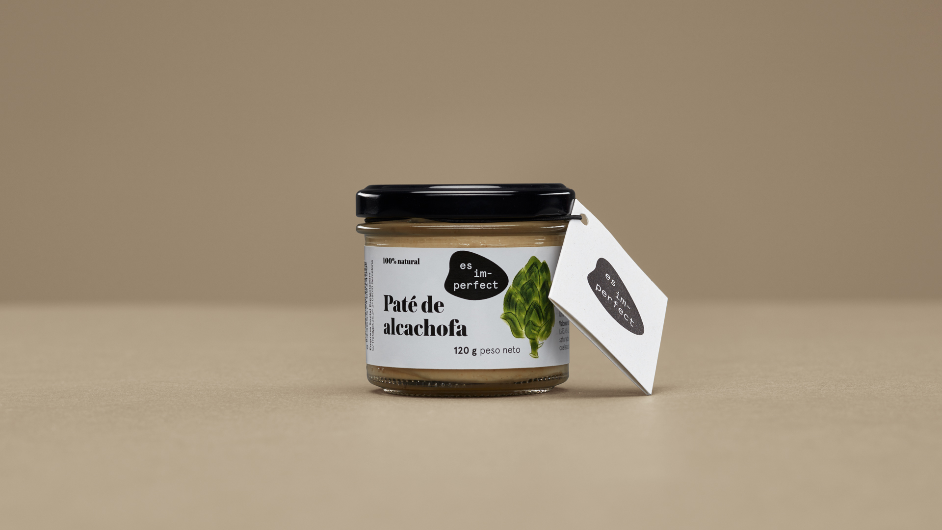
In the case of the trademark es im-perfect®, we sustained its identity with the creation of a new graphic element: an irregular object that changes its shape depending on where it is applied, and that emphasizes the concept of imperfection, around which we have structured the communication. Likewise, this new element also refers to the various shapes of defective fruit and vegetables that constitute the raw material of es im-perfect® products.

Result
Imperfection became the focal point of all their communication materials
We applied the new identity to the packaging and to all the communication elements of es im-perfect® products, as well as to the e-commerce and signage of the organization’s workshop.
Tags: Branding strategy, Corporate branding
2018
More Projects

