Fluxua
Branding to convey the values of a new online psychological clinic
Crafting the strategy and corporate branding for FLUXUA
Corporate branding
Challenge
Branding that embodies the quality and professionalism of an online psychological clinic
We’ve outlined the branding strategy, conceptualised, and designed the corporate branding for FLUXUA, a novel online psychological clinic. Through personalised psychological therapies facilitated by top professionals, FLUXUA guides its patients towards improving their emotional well-being.
Our challenge was to develop a strategy and design branding that effectively communicates how an online psychological clinic can provide its patients with the same level of quality and professionalism as in-person psychotherapy, all while offering the convenience and accessibility that technology brings.
Process
We crafted a branding that, above all, champions the emotional well-being of individuals
Our journey kicked off with an in-depth benchmark analysis covering Spanish-speaking, Anglo-Saxon, and multilingual competitors. We delved into directories of in-person and online psychology services, as well as sought inspiration from key references and intriguing projects.
In this initial phase, we sat down for an interview and administered the NOMON Test to the founders and partners, Alfonso Navarro and Jorge Zapatel—seasoned professionals in the field.
Drawing insights from the first phase of our strategy, we refined and solidified the project’s values.
At FLUXUA, we underscored the utmost importance of ethics, professionalism, personalization, and support. These values became the foundation for our descriptive storytelling and tagline: “Your emotional well-being above all.”
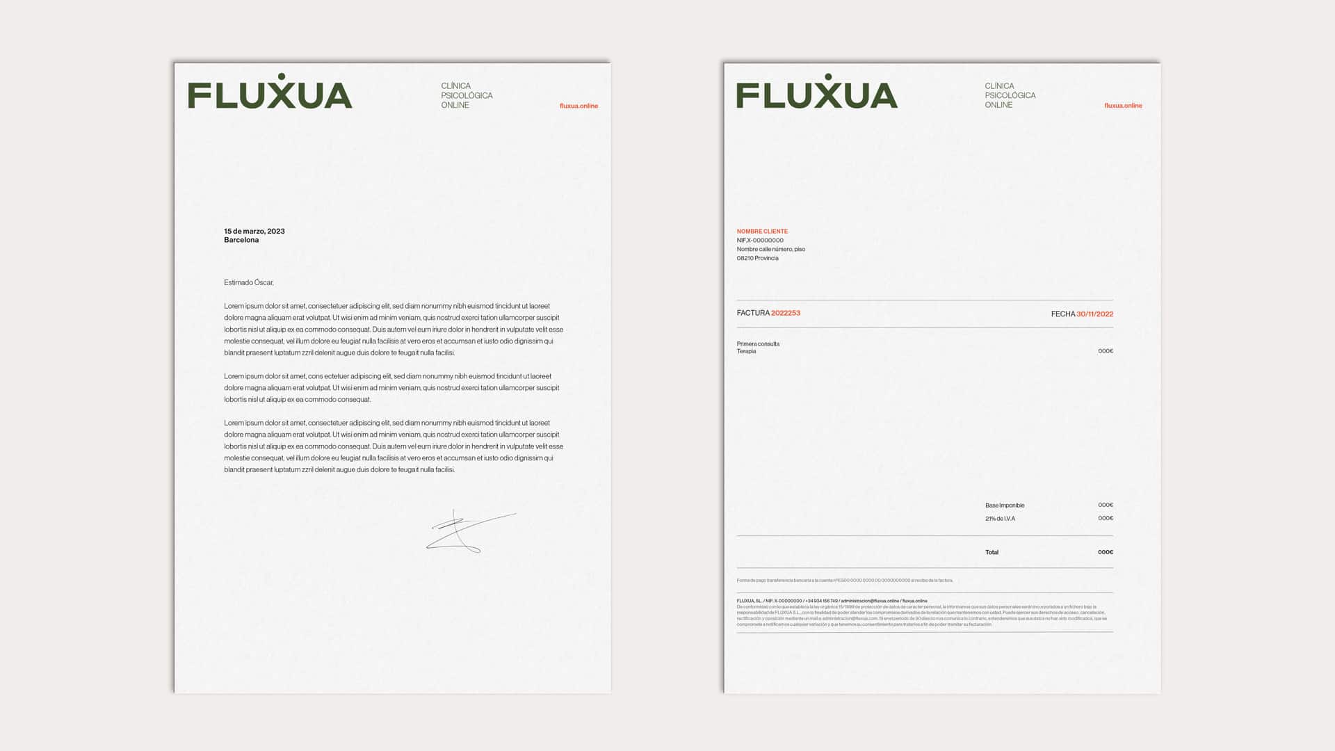
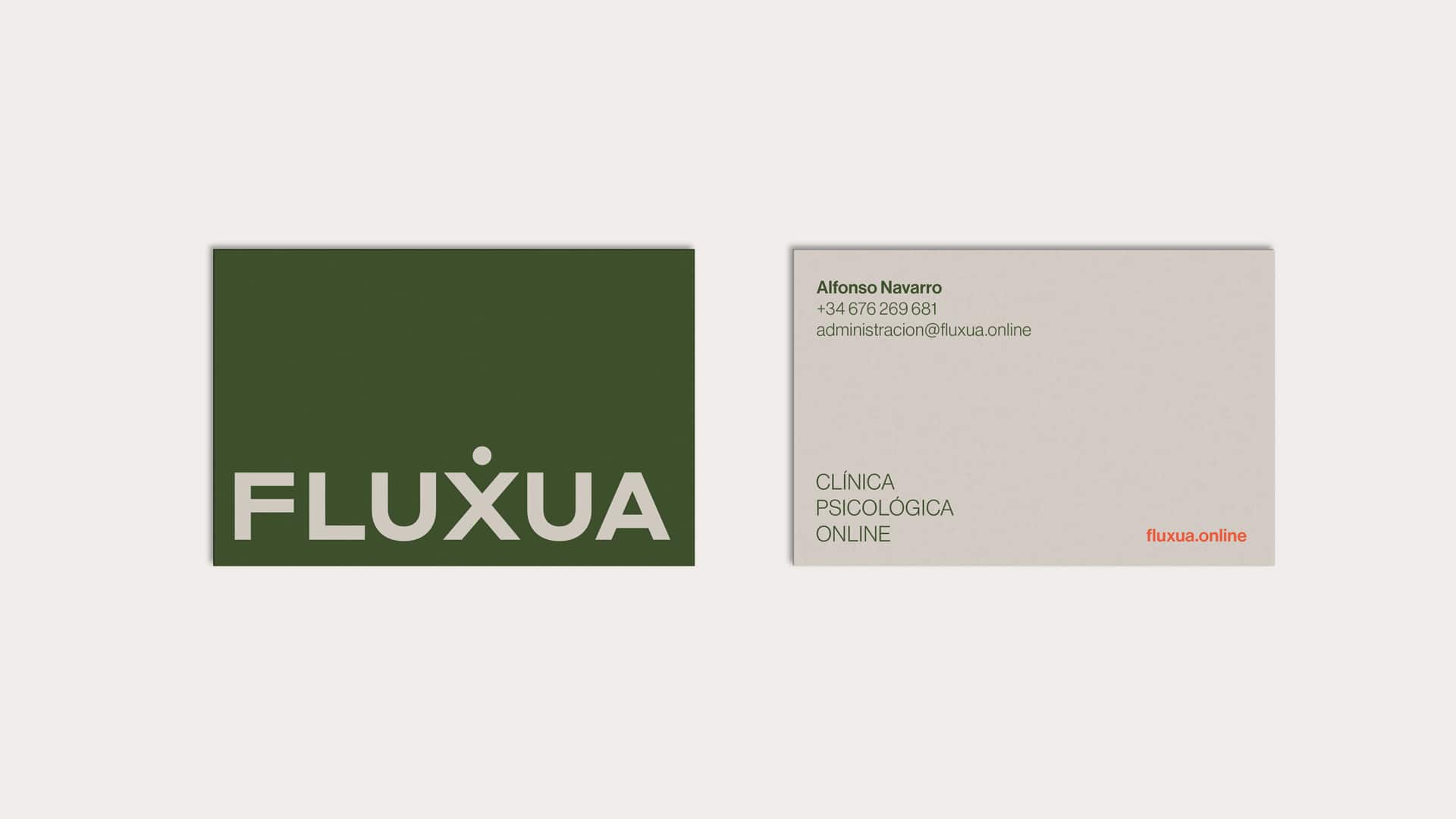
Armed with our defined branding strategy, we brought their corporate identity to life, accentuating the connecting theme of “above all.” Graphically, we introduced a subtle point “above” the X in their name, symbolizing the head as the focal point for the clinic’s therapies.
For the logo, we opted for Styrene A, a bold, solid sans-serif typeface that exudes confidence and aligns seamlessly with the less-is-more philosophy.
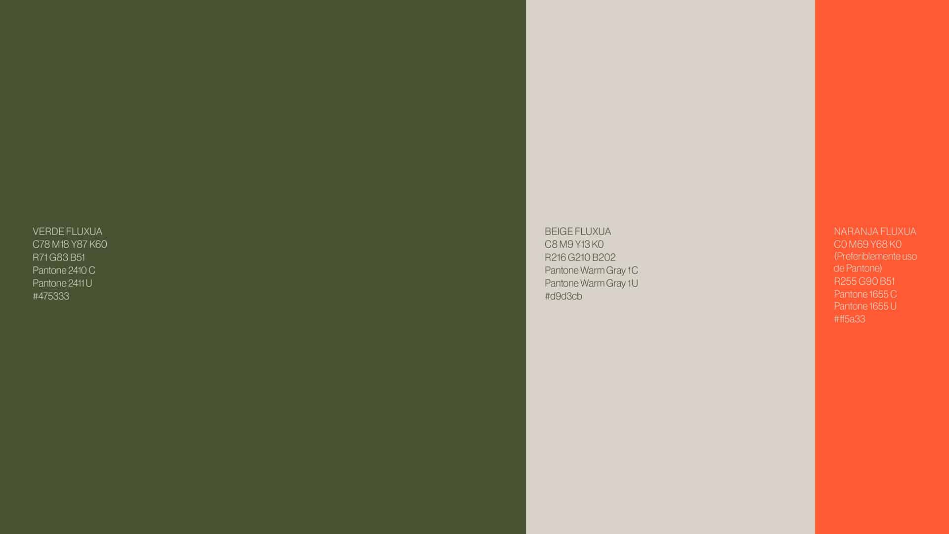
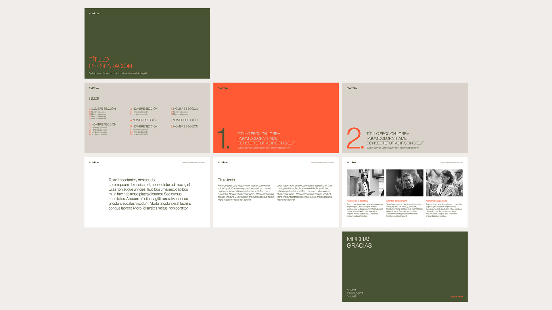
We curated an elegant colour palette that radiates naturalness and trust, aligning seamlessly with their corporate values. Alongside the primary hues of green and beige, we infused touches of orange – a nod to vitality – in specific details to inject vibrancy.
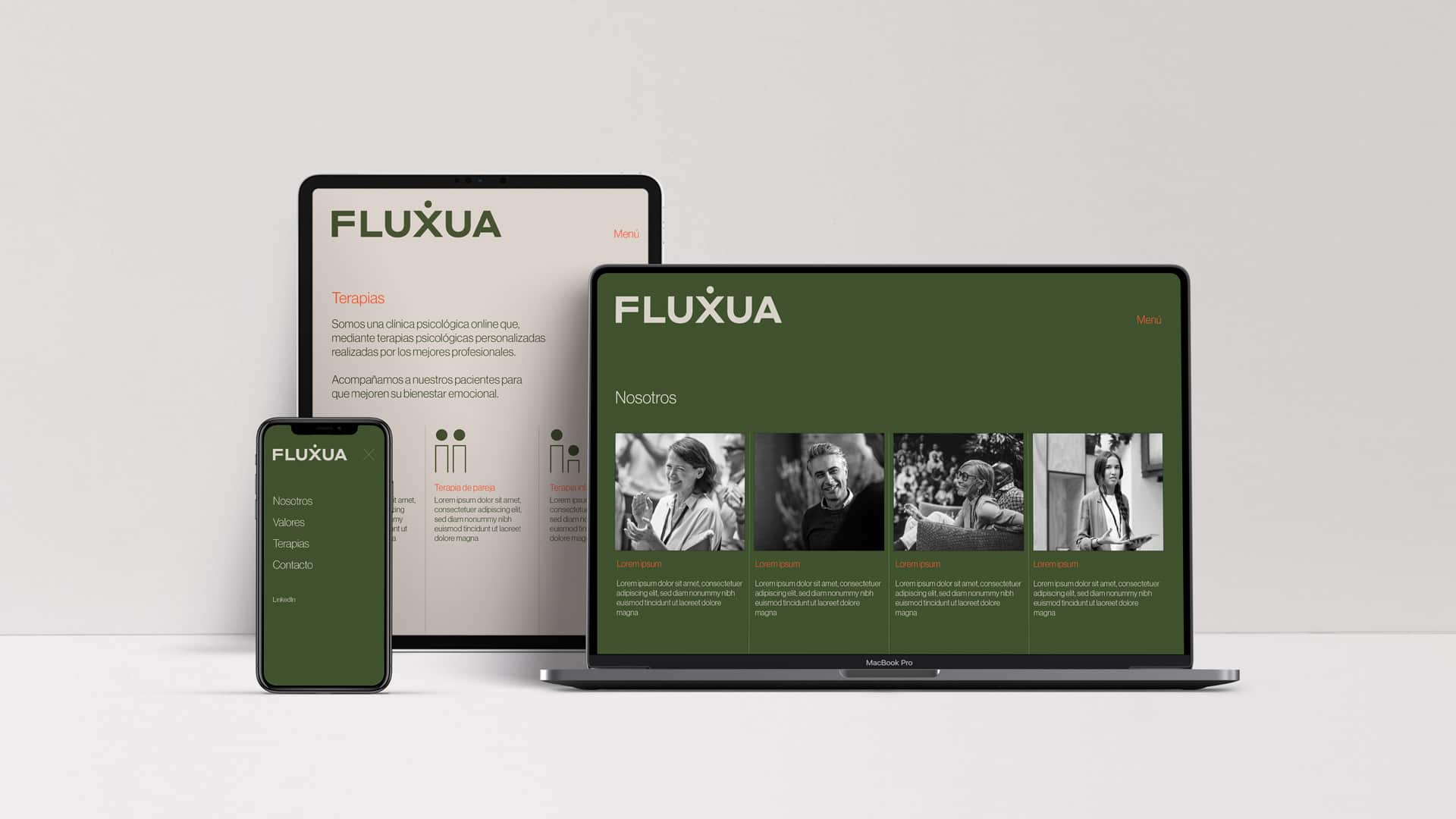
In terms of art direction, we envisioned lifestyle images capturing individuals in natural, spontaneous poses, all presented in a timeless black-and-white finish. The aim was to create a cohesive style for photographs contributed by different collaborators at the clinic.
Our iconographic style took a cue from simplicity and minimalism, ensuring clear communication of the target audiences for each therapy—once again, adhering to the philosophy of less is more.
To ensure consistency, the branding strategy and corporate identity were documented in a brand manual, guiding its application across all communication materials, including stationery, corporate presentations, and digital channels.
Result
Branding that captures the quality and professionalism of this innovative online psychological clinic
The result of our endeavour is a strategy and corporate branding that seamlessly conveys the values and mission of this online psychological clinic. Simultaneously, it introduces its services to various audiences through straightforward and clear iconography. All of this is presented with a commitment to quality and professionalism, ensuring that patients perceive online therapy as an experience of the same calibre as in-person sessions.
Tags: Corporate branding
2023
More Projects

