


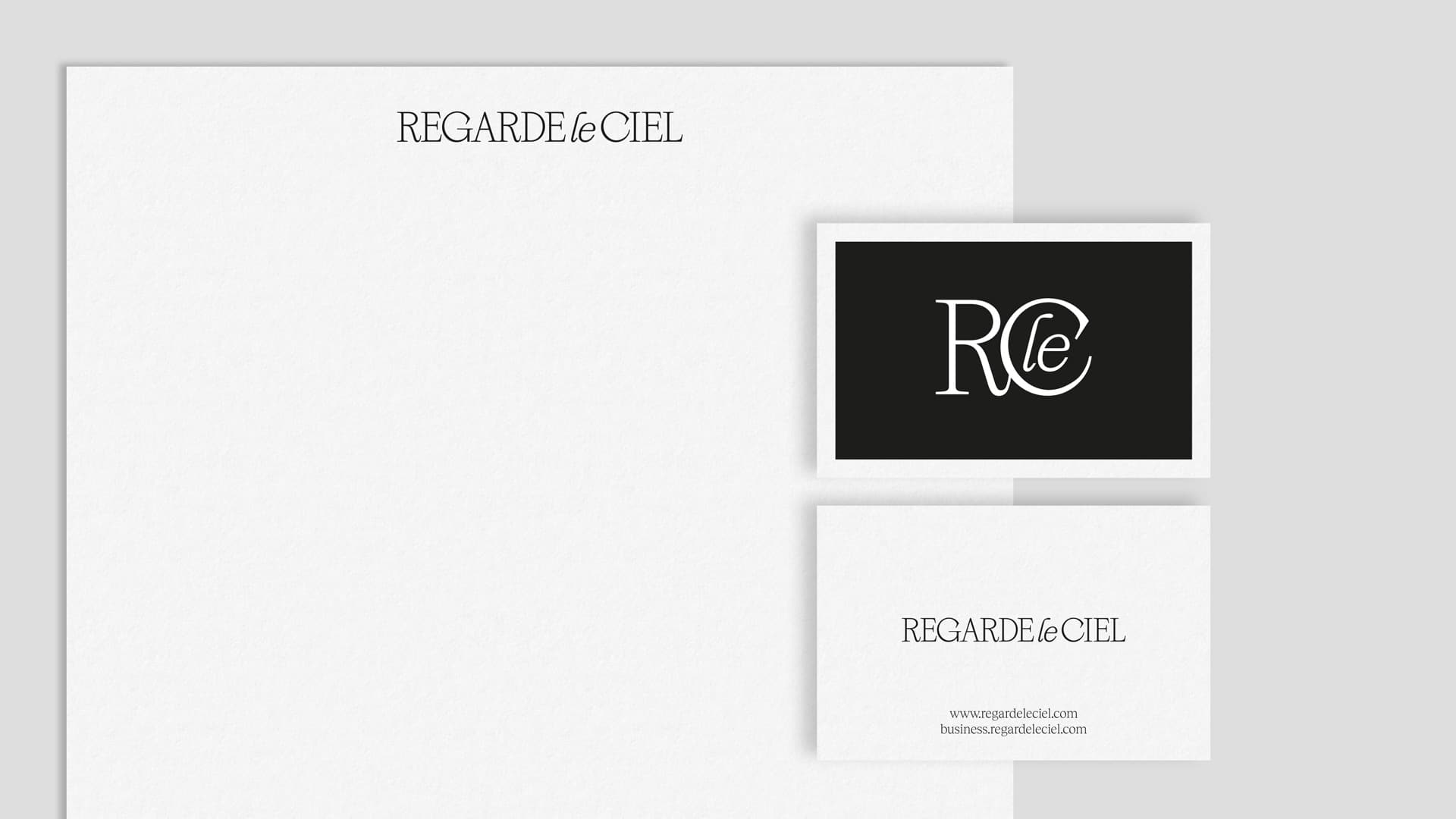
Regarde Le Ciel
An elegant and contemporary corporate branding to help them step even further
We craft a corporate identity that accentuates its quality and the value placed on craftsmanship
Branding Strategy
Corporate Branding
Packaging Design
Challenge
A fresh corporate branding for a new chapter in the company
Our challenge was to revamp the corporate branding of Regarde Le Ciel for a new phase, where they continue their commitment to accompanying their consumers’ steps for as long as possible.
Regarde Le Ciel is an international company, spanning approximately 30 countries, renowned for its responsible design and manufacturing of timeless, functional, and high-quality leather footwear using the finest raw materials.
Regarde Le Ciel products are distinguished by their craftsmanship, utilizing premium materials like soft leather. Their designs are celebrated for their classic elegance with a touch of contemporary aesthetics.
Process
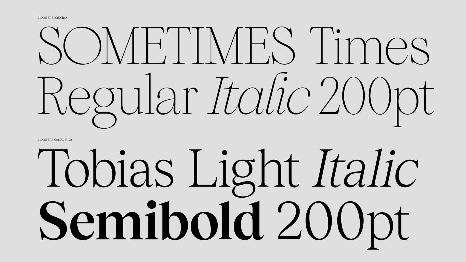
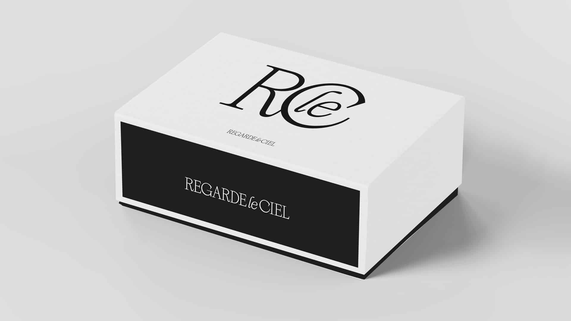
Building on their core values of timelessness, functionality, and social and environmental responsibility, we defined a contemporary and elegant corporate branding with classic undertones. We personalised the Sometimes Times typeface, a timeless serif inspired by the individualistic strokes of old-style fonts and mid-90s culture.
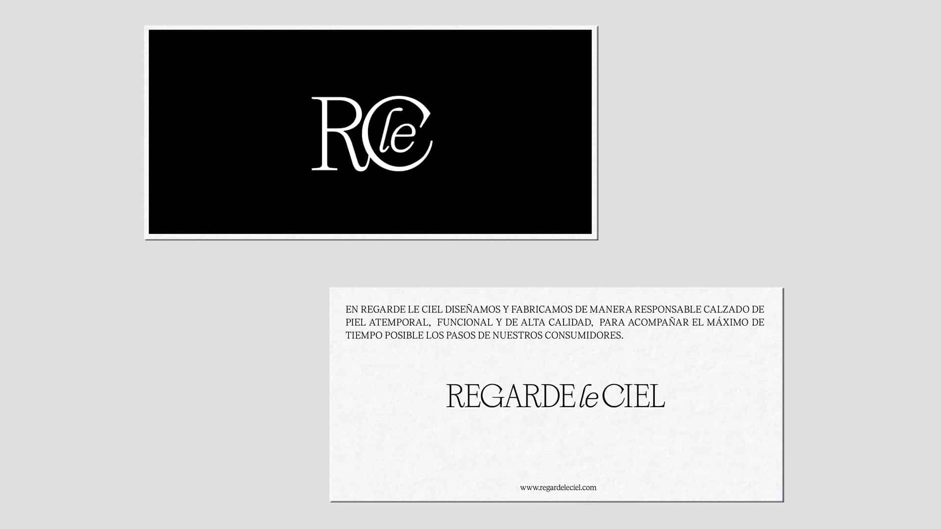
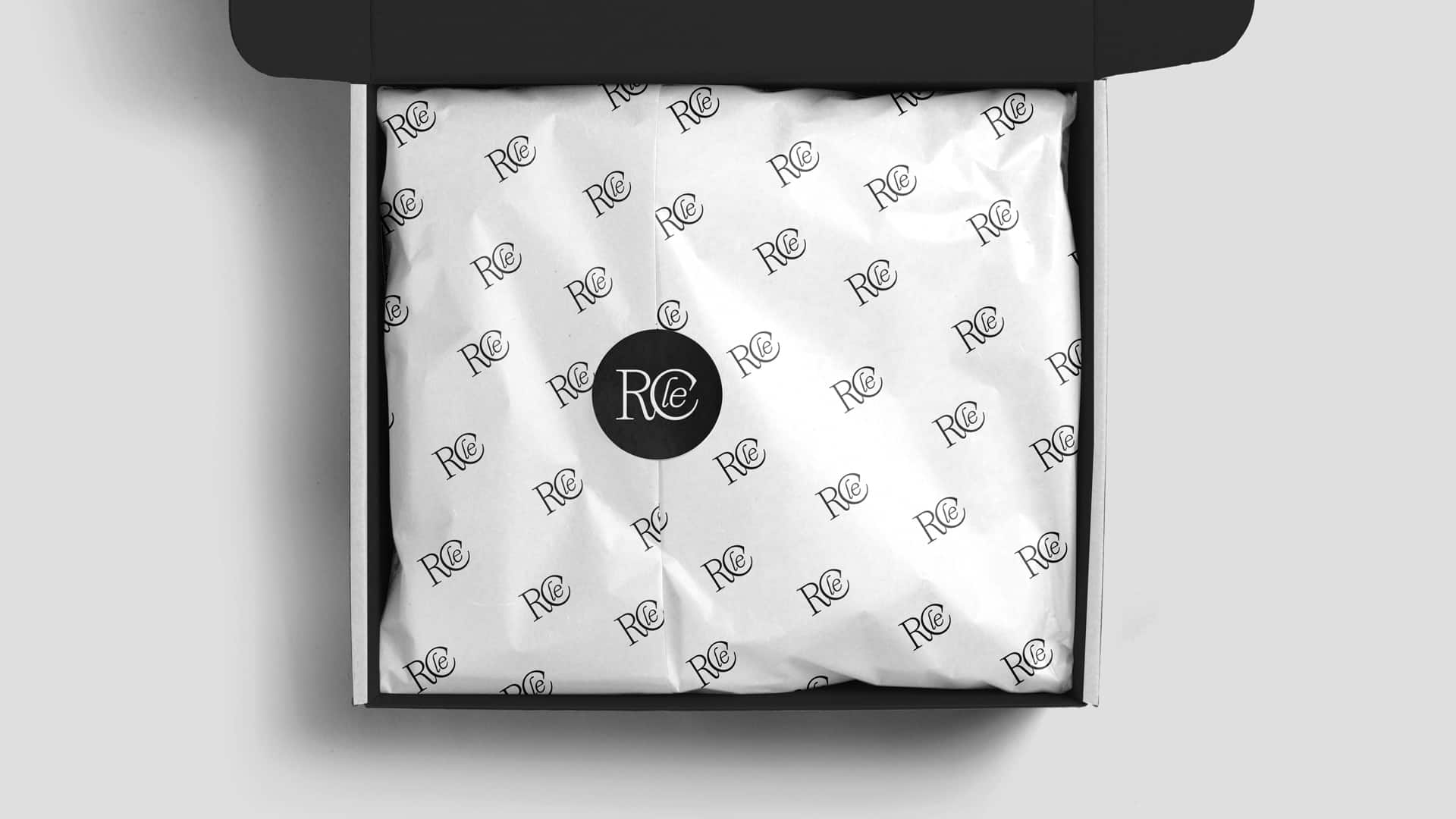
In terms of colour, we embraced a black-and-white palette in a monochromatic application using a single ink. To enhance flexibility and readability in specific applications, we complemented the corporate branding with a symbol that emphasises the initials and acts as a stamp.
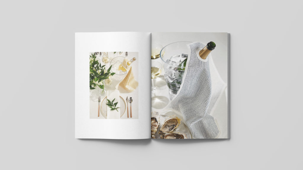
Finally, we compiled a Branding Manual, consolidating their new strategy, corporate branding guidelines, and application specifics across all communication elements, including their revamped packaging, where we took into consideration various product types and dimensions.
Result
A fresh strategy and corporate branding that bring out the values and essence of the company
With the new corporate branding we’ve designed at NOMON, Regarde Le Ciel’s next steps in this new phase will go even further.
The brand’s updated identity, known for its elegance and contemporary feel, perfectly aligns with its mission of consistently offering consumers sophisticated and comfortable designs, all crafted with meticulous attention to detail.
Tags: Branding Strategy, Corporate Branding, Packaging Design
2023
More Projects