


LocalizationLab
A new branding to project the true value of LocalizationLab
We redefined its verbal and visual identity to clearly communicate that they are the perfect partner for your linguistic projects
Branding Strategy
Corporate Branding
Communication
Digital Communication
Challenge
Defining a new branding aligned with LocalizationLab’s value proposition
With more than 25 years of experience in the language services sector, LocalizationLab had built a solid reputation based on excellence. However, in a highly competitive environment with strong international players, they needed a corporate branding that would help them stand out, build trust and position themselves as a leading linguistic partner.
The challenge was multifaceted: to update their verbal and visual identity, reorganise their service offering, and build a coherent narrative that would connect with their audiences — primarily SMEs undergoing internationalisation processes and technical departments within large corporations.
Process
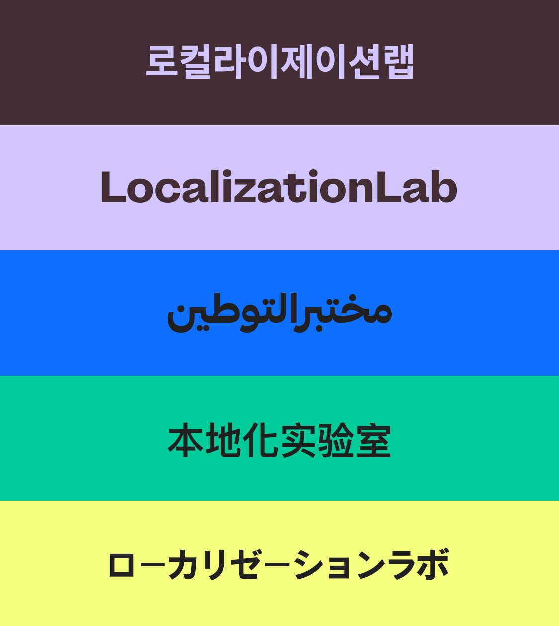
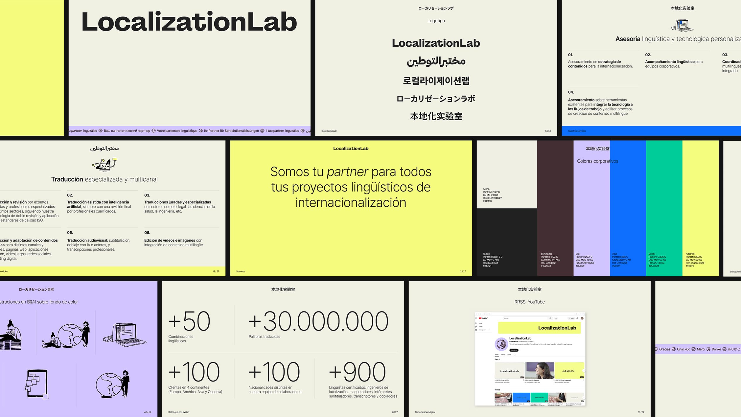
This multiplicity of versions reinforces the company’s sense of closeness and adaptability, enabling authentic communication across different multicultural contexts.
We defined a colour palette that expresses the balance between the technical and the emotional. Sand conveys warmth and approachability; aubergine expresses professionalism; violet suggests empathy; deep blue projects trust and precision; green symbolises growth and adaptability; and yellow adds energy and dynamism.
Based on these attributes, we assigned a specific colour to each service: yellow identifies specialised and multichannel translation; green represents content creation and copywriting; lilac is used for on-site and remote interpreting services; and blue denotes linguistic consultancy and customised technology.
In addition, we designed a bespoke iconographic system with illustrations representing the different services which, when combined with images of the team, reflect the brand’s human approach and professional rigour.
We applied LocalizationLab’s new visual language across all communication touchpoints, conveying the brand narrative and ensuring a coherent, clear and distinctive experience.
Result
A new branding that reflects the true value of LocalizationLab as a strategic business asset
The branding redesign developed by NOMON DESIGN has transformed the way LocalizationLab presents itself to the world.
It now clearly communicates what the company truly is: an expert, technology-driven and empathetic agency, capable of supporting its clients in any linguistic project with guarantees of quality, rigour and efficiency.
Thanks to a consistent verbal and visual identity, LocalizationLab’s offering is now easier to understand, perceived as more specialised, and generates greater trust in international markets.
All customer touchpoints now reflect a solid, professional and coherent brand, capable of communicating in any language and across any channel.
More Projects