Mr. Barbecuer
Branding to elevate the barbecue experience for enthusiasts
A new brand creating experience and building community beyond the product
Corporate branding
Packaging design
Communication
Challenge
Developing the corporate branding for a European ceramic brand specializing in barbecues
Mr.Barbecuer is a new brand under the Keraco Ceramic Technologies group, dedicated to crafting ceramic plates for grilling. With a 30-year presence in 80 countries, Keraco is a leading European ceramic manufacturer based in Spain and Italy, renowned for its culinary passion and high-quality gastronomy.
Our collaboration with Keraco spans over 5 years, during which we’ve also launched another of their successful brands: BEfresh Technology.
Our latest endeavour was to create a new brand tailored for the American and European markets, targeting barbecue enthusiasts seeking to enhance their grilling experience with the authentic taste of ceramic-cooked food.
Process
Crafting a name, visual identity, art direction, packaging, and digital communication infused with barbecue essence
Immersing ourselves in the barbecue culture, we aimed to create a brand that resonated with enthusiasts as not just a product, but a lifestyle.
After thorough analysis of the sector, competition, target audience, and communication codes—both visual and verbal—we conceptualized and defined the corporate branding, beginning with its name.
We envisioned a brand that went beyond selling ceramic plates, offering an immersive experience and support for barbecue enthusiasts.
Thus, we chose to personalize the brand, opting for the term “barbecuer”—someone who cooks using a barbecue—akin to “pitmaster” or “smoker,” popularized recently in the U.S. (the BBQ epicentre), complemented by the prefix “Mr.”
This brand persona serves as a guide, enriching the consumer’s grilling journey while sharing resources, tips, and recipes.
Our tagline “BBQ Grill Tiles – Premium Quality” underscores the product’s excellence in European manufacturing.
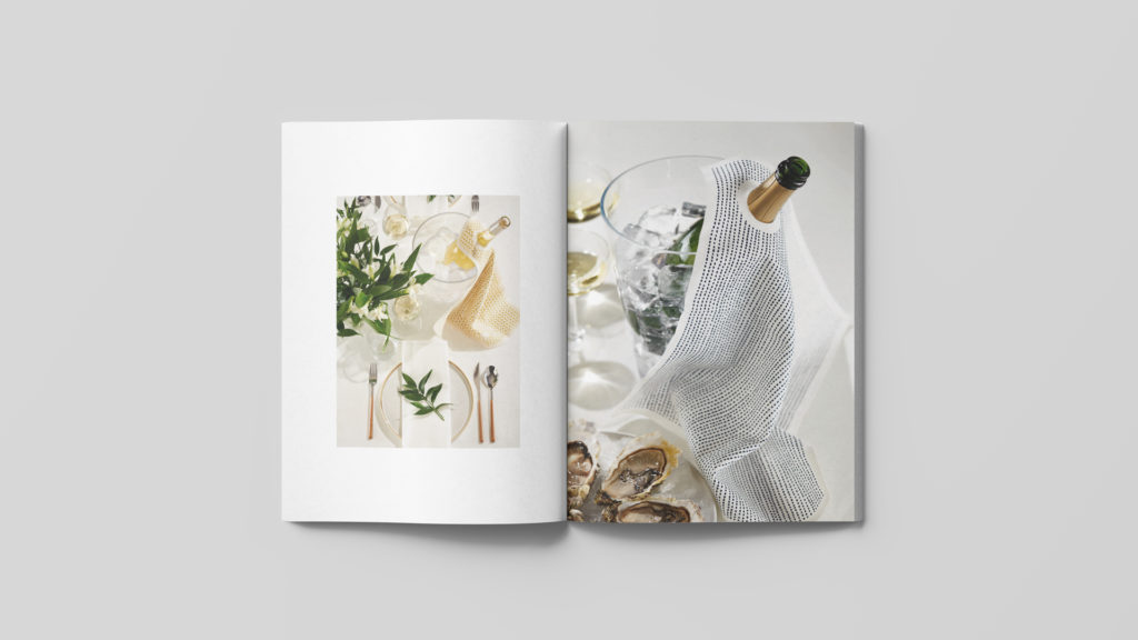
The corporate identity was enriched with highly sensory art direction, featuring primarily American recipes with a Mediterranean touch, where colours, textures, and aromas generated while grilling transcended all communication pieces.
The concept of “personalization” extended to the corporate identity design. Using the abbreviation “Mr.,” we crafted a dynamic smiley with various expressions, enhancing the brand’s personification, which, dissociated from the logo, also acts as an icon.
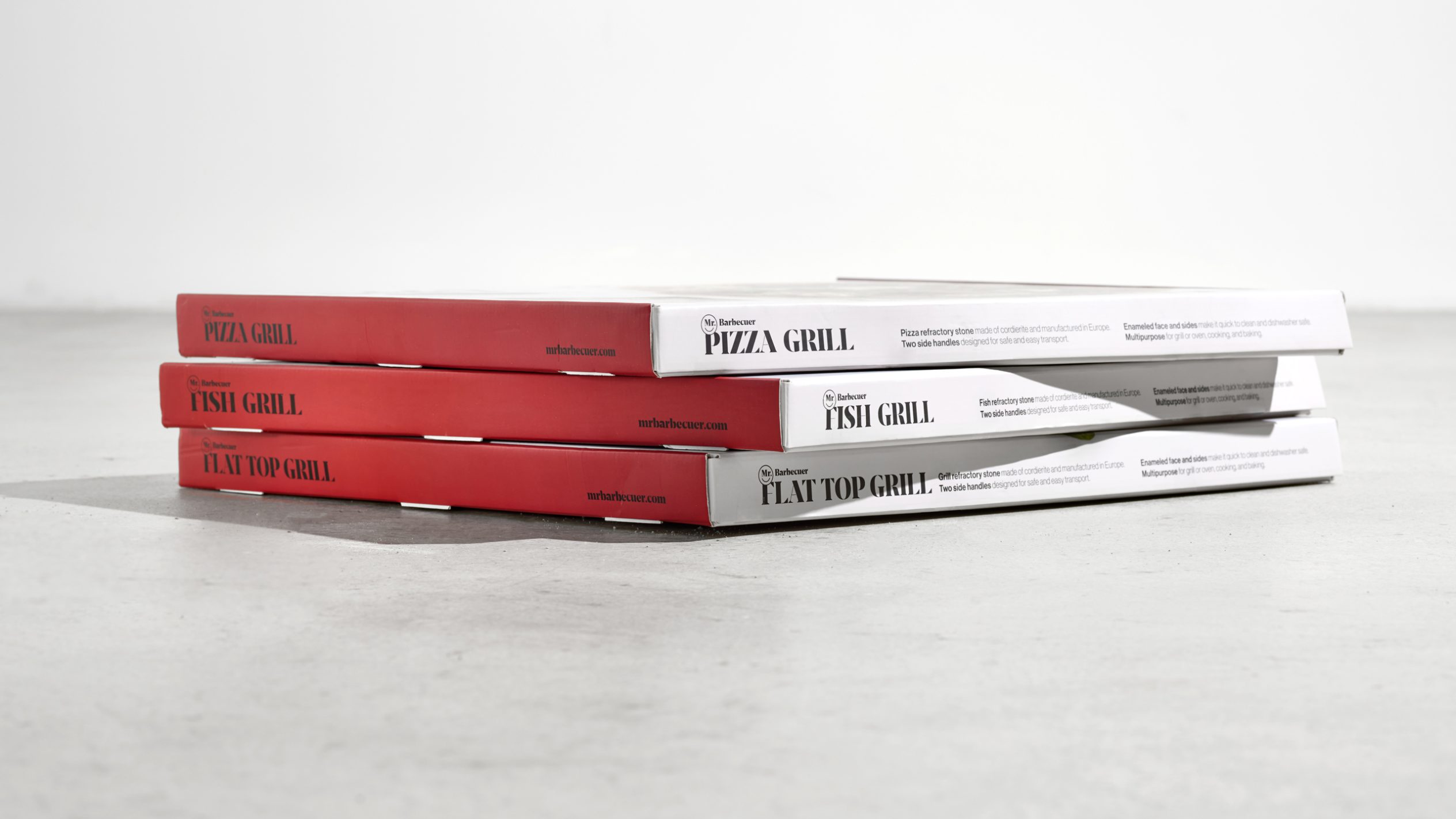
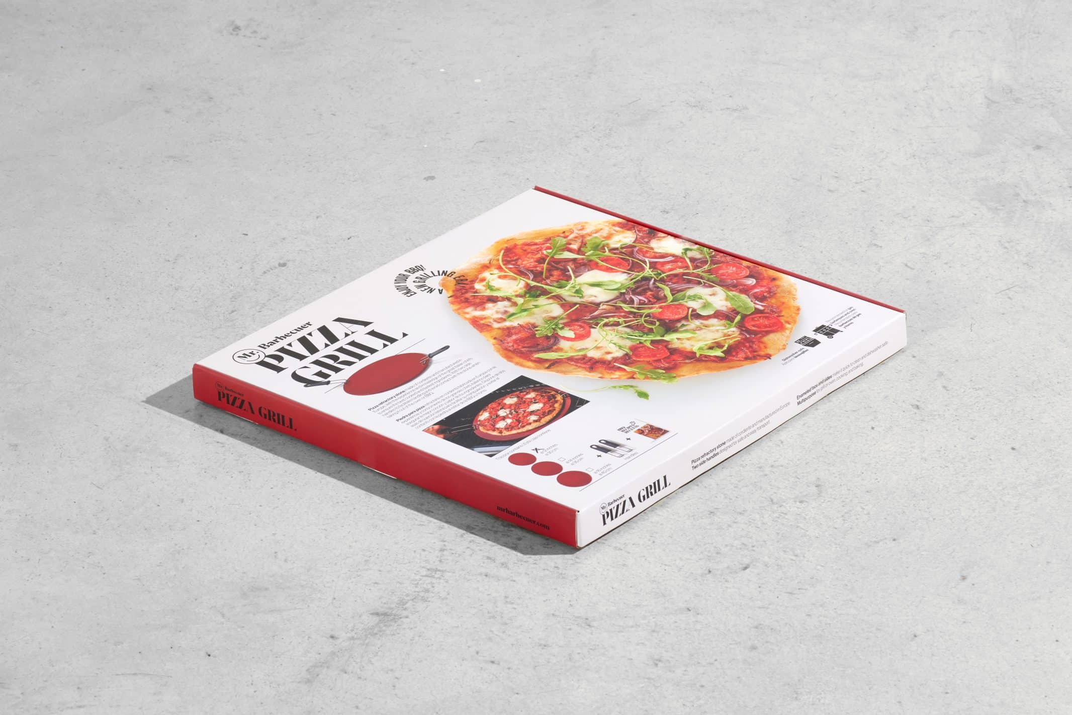
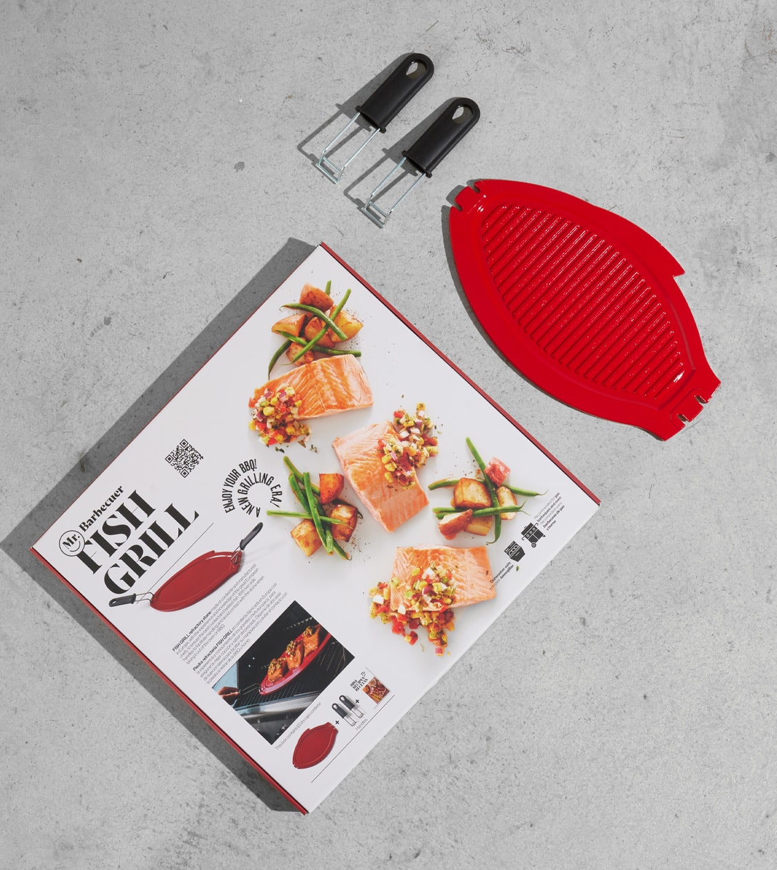
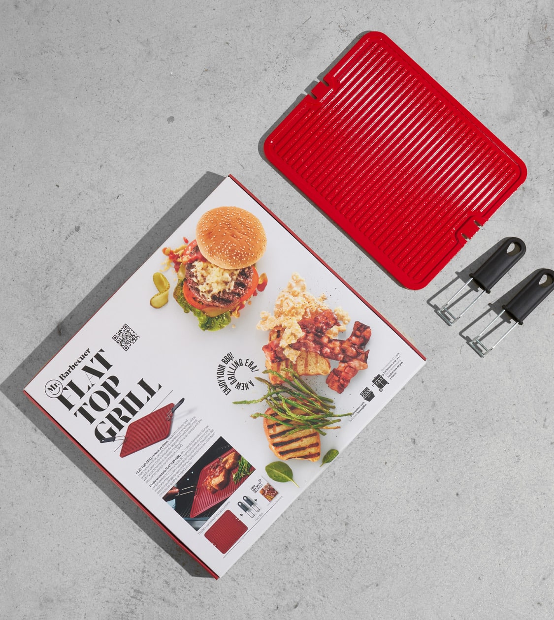
For the branding and packaging colour scheme, we relied on the corporate burgundy, defined in collaboration with the client.
This was complemented by white and black to achieve a harmonious combination that accentuated the foods featured in the recipes across communication materials.
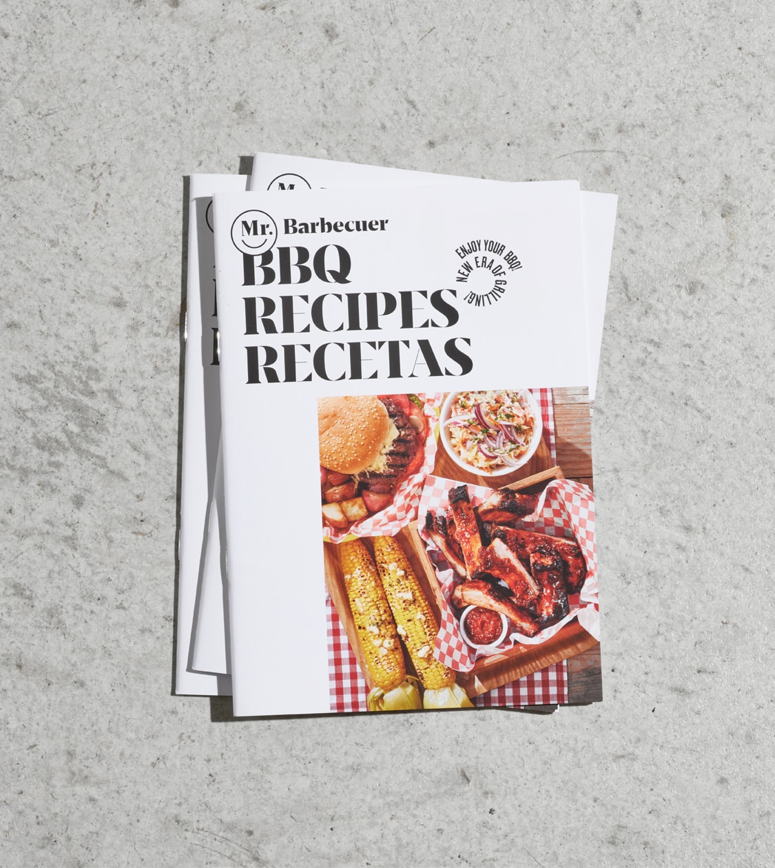
Through close-up shots enhancing the visual appeal, we showcased the product during preparation, cooking, and the result.
We extended the art direction to all physical and digital communication materials of Mr. Barbecuer, bolstering its mission to foster a community that encourages living and enjoying the barbecue experience to the fullest.
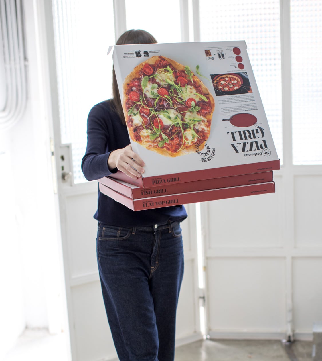
After creating the branding and defining its art direction, we conceptualized and designed the packaging for its product range—Grill Tiles, Grill Pizza, Flat Top Grill, and Grill Fish—alongside a comprehensive recipe book.
Lastly, we crafted a series of explanatory videos highlighting the uses and benefits of each product, immersing viewers in the cooking experience with a blend of American and European styles.
The Mr. Barbecuer website, designed as a key communication piece, elucidates the product and introduces the new brand, providing valuable content to users.
Result
A fresh, engaging brand to unite barbecue enthusiasts
The result is a fresh, fun, and representative branding that encourages consumers to fully immerse themselves in the barbecue experience while also facilitating the brand’s introduction and differentiation in a market primarily focused on products rather than experiences.
Credits
Concept, Art Direction, and Design: NOMON DESIGN
Photography: Santi de Pablo
Video and Editing: Alfred Larumbe
Chef, Home Economist & Kitchen Stylist: AMANDA LAPORTE
Web Development: LLOS&
View digital communication project
Tags: Corporate branding, Packaging design, Communication
2023
View digital communication project

