Aranow
Introducing a fresh branding that captures the essence of a well-established international company
The new branding for Aranow shines with solidity and personality, showcasing their commitment to quality and professionalism
Corporate branding
Communication
Challenge
Aranow’s revamped branding puts the spotlight on the human touch, their utmost value
We have undertaken the task of rebranding Aranow, an international company specialising in single-dose packaging machinery for food, pharmaceutical, cosmetic and dairy products, coinciding with the firm’s 18th anniversary.
Aranow’s branding, as agreed with the client, should show and communicate a solid, modern and global company, which at the same time conceptually reflects the industrial sector. But the most important quality of the company’s identity to be expressed by its branding is the human factor.
Process
Unveiling a branding strategy that embodies equality, dedication, and efficient production
For this reason, we involved the entire team in the creation of their new brand and, as a result, an isotype was developed that represents equality, mass production and commitment (“Aranow accompanies you”).
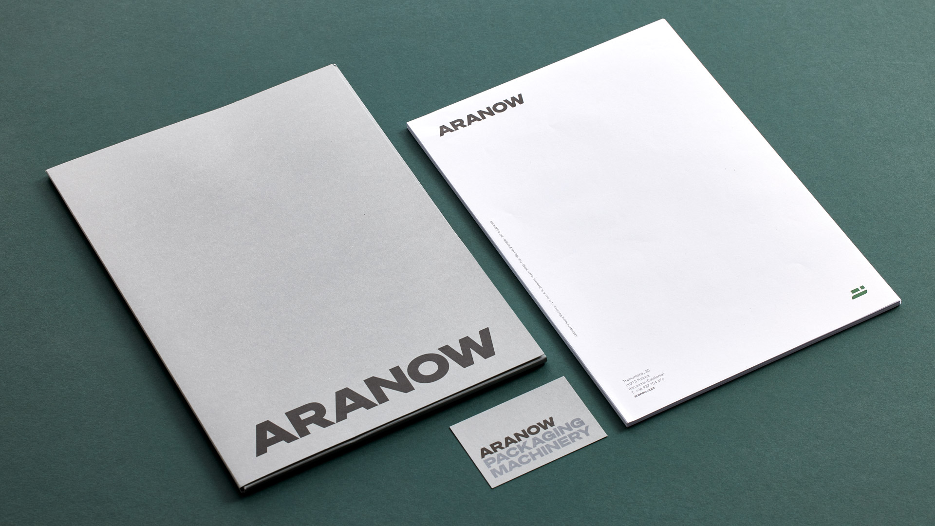
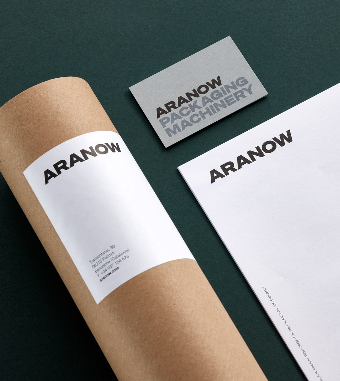
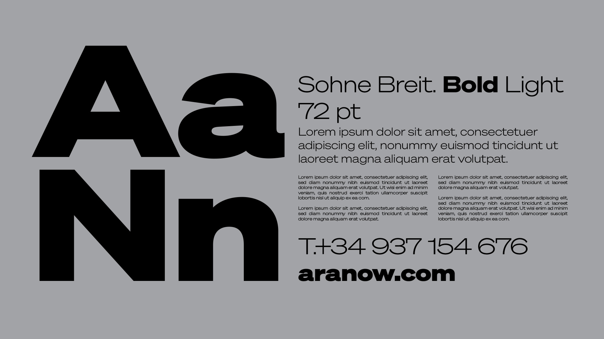
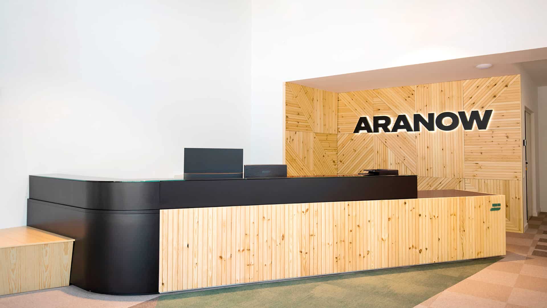
Using the Söhne Breit typeface – a solid, sober and technical font – we designed a consistent identity. This font was established as the firm’s corporate typeface, complementing it with HK Grotesk for print and Libre Franklin for web.
We determined a colour palette whose main colours are black and dark grey, using a lighter shade of grey as a complementary colour representing the industrial sector, and green, as a representation for sustainability, which is another of the company’s important values.
Result
Empowering Aranow with a compelling branding approach that exudes strength, personality, and professionalism across all communication platforms
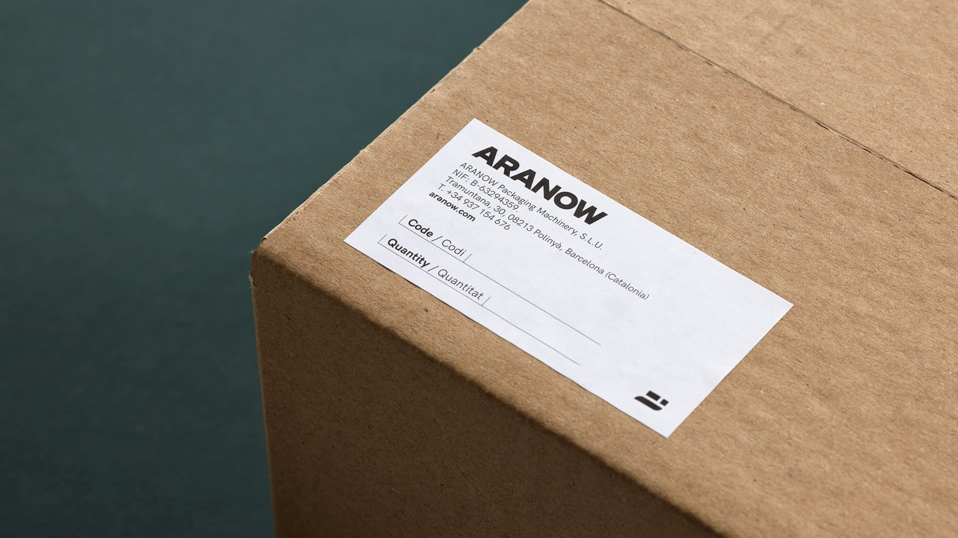
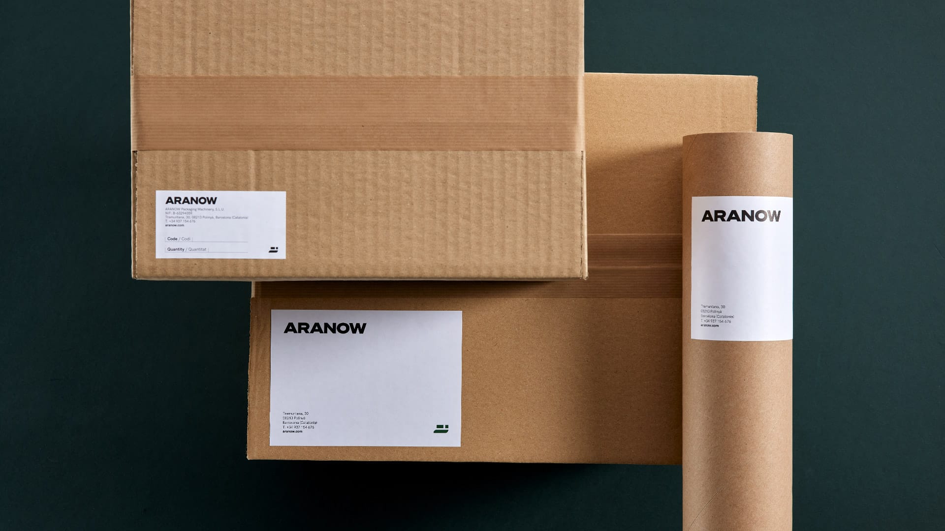
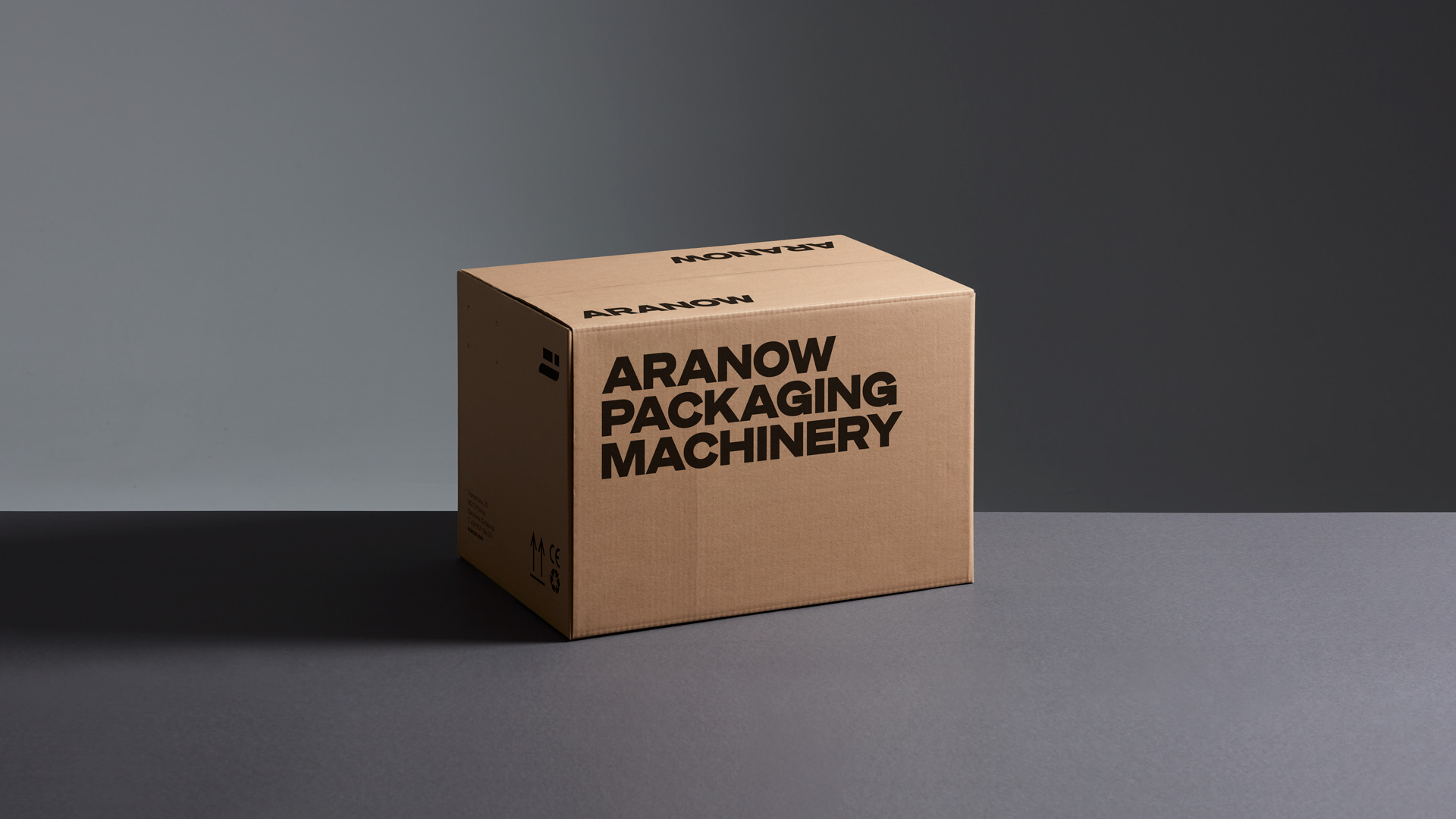
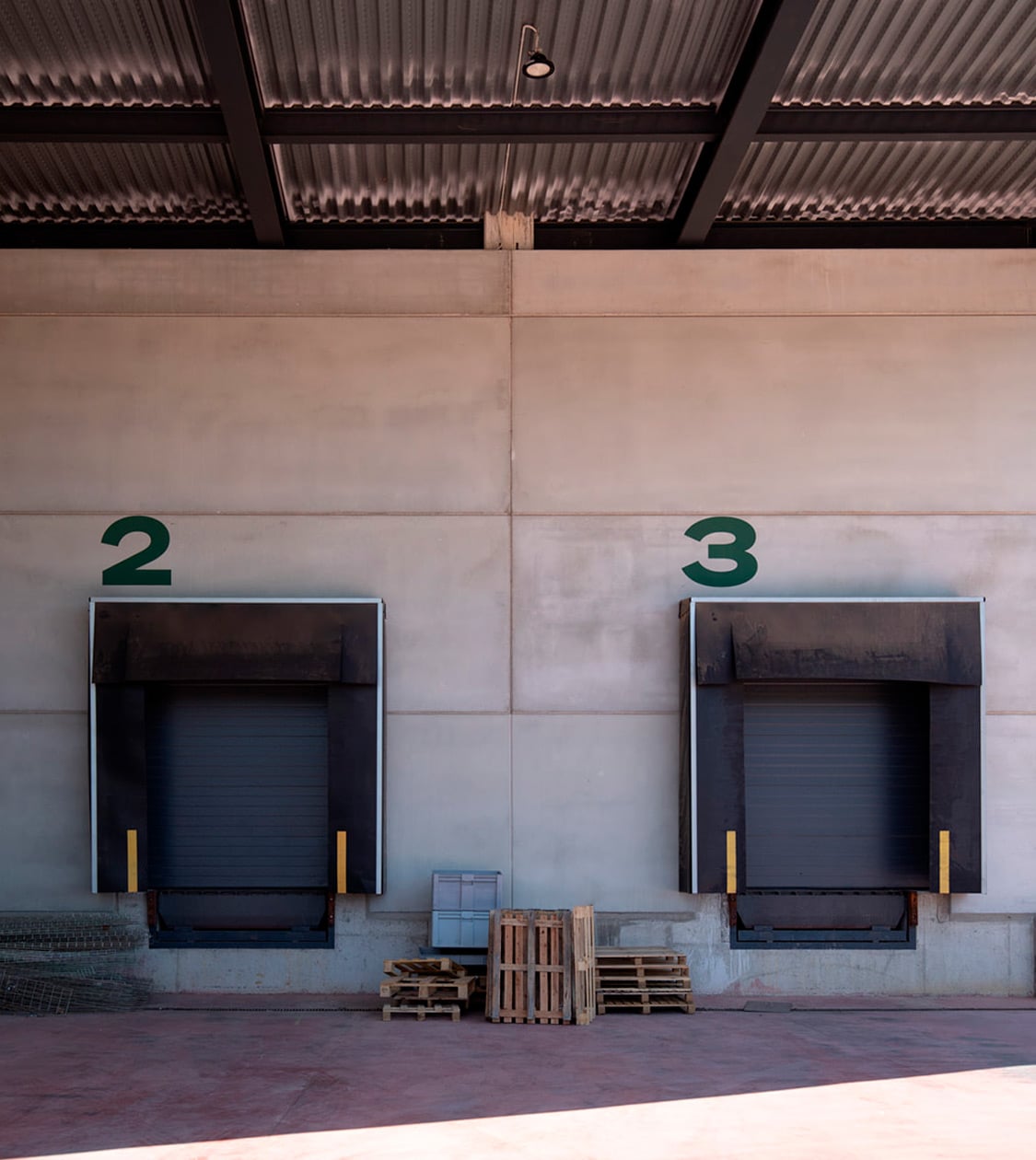
The result is a powerful branding, with strength and personality, that denotes both quality and professionalism. The branding was furthermore applied to its sub-brands (i.e. machine models) and to all its physical and digital communication materials.
Tags: Corporate branding, Communication
2022
More Projects

