Can Buch
Branding for an ecotourism project committed to nature
We created the corporate branding and packaging for a project where tradition meets modernity
Corporate branding
Digital communication
Packaging design
Challenge
Designing branding that embodies the harmony and sustainability of ecotourism
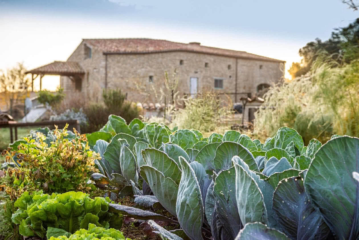
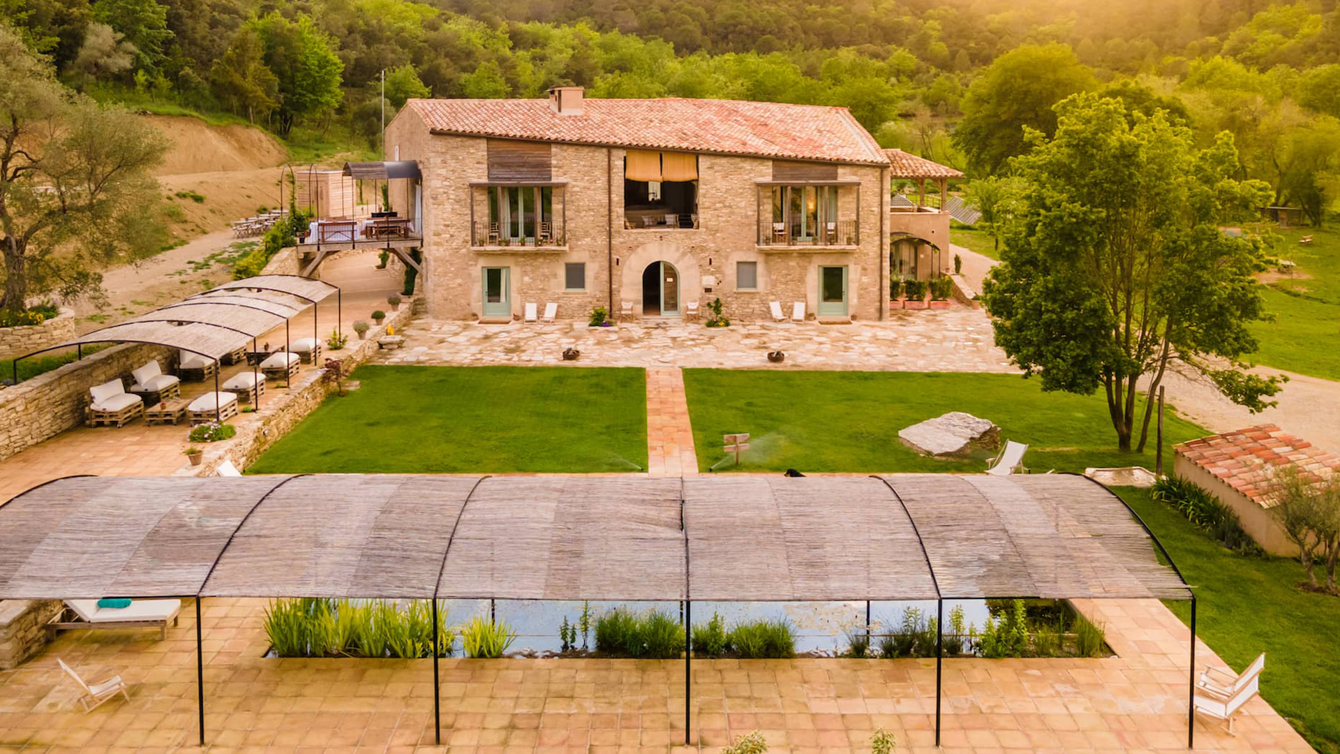
In 2020, we conceptualised and designed the corporate branding for Can Buch, a deeply personal project by Gerard Bofill, who decided to completely change his life and establish a 100% organic ecotourism hotel in the heart of Garrotxa, Girona. His goal was to share the peace and serenity of rural life.
Since then, we have continued to support Can Buch in growing its business by creating and designing various communication materials for the eco-hotel, including the branding and packaging for “Escampar la boira”, its brand of artisanal products: vegan beers, ratafia, olive oil, and jams.
Process
Creating branding that highlights respect, coexistence, and care for the environment
From the outset, we decided that Can Buch’s branding should reflect the blend of tradition and modernity. This approach was taken because the restoration of the farmhouse involved working with artisans who respected original, eco-friendly, natural materials and employed traditional techniques. Simultaneously, innovative methods were used to ensure the hotel runs entirely on renewable energy generated on-site.
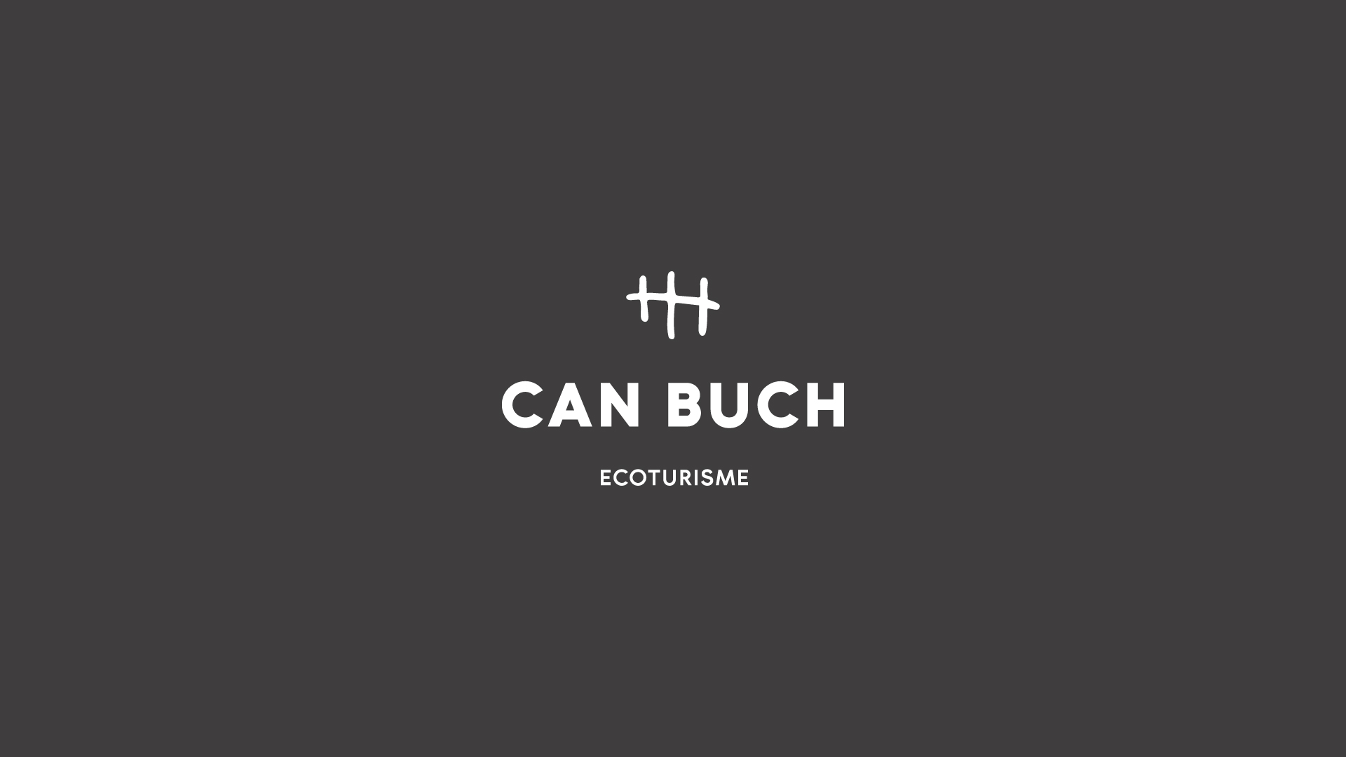
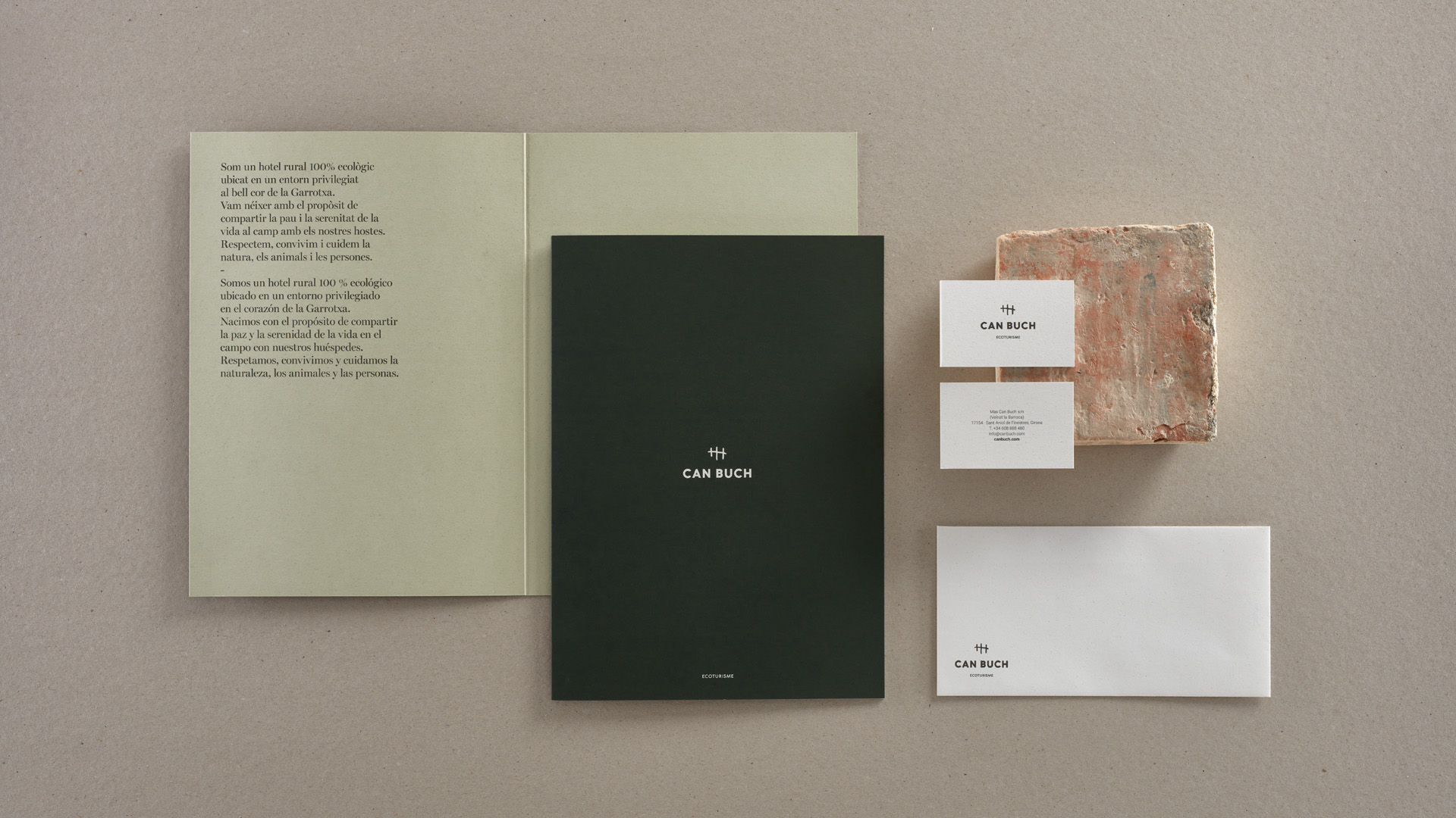
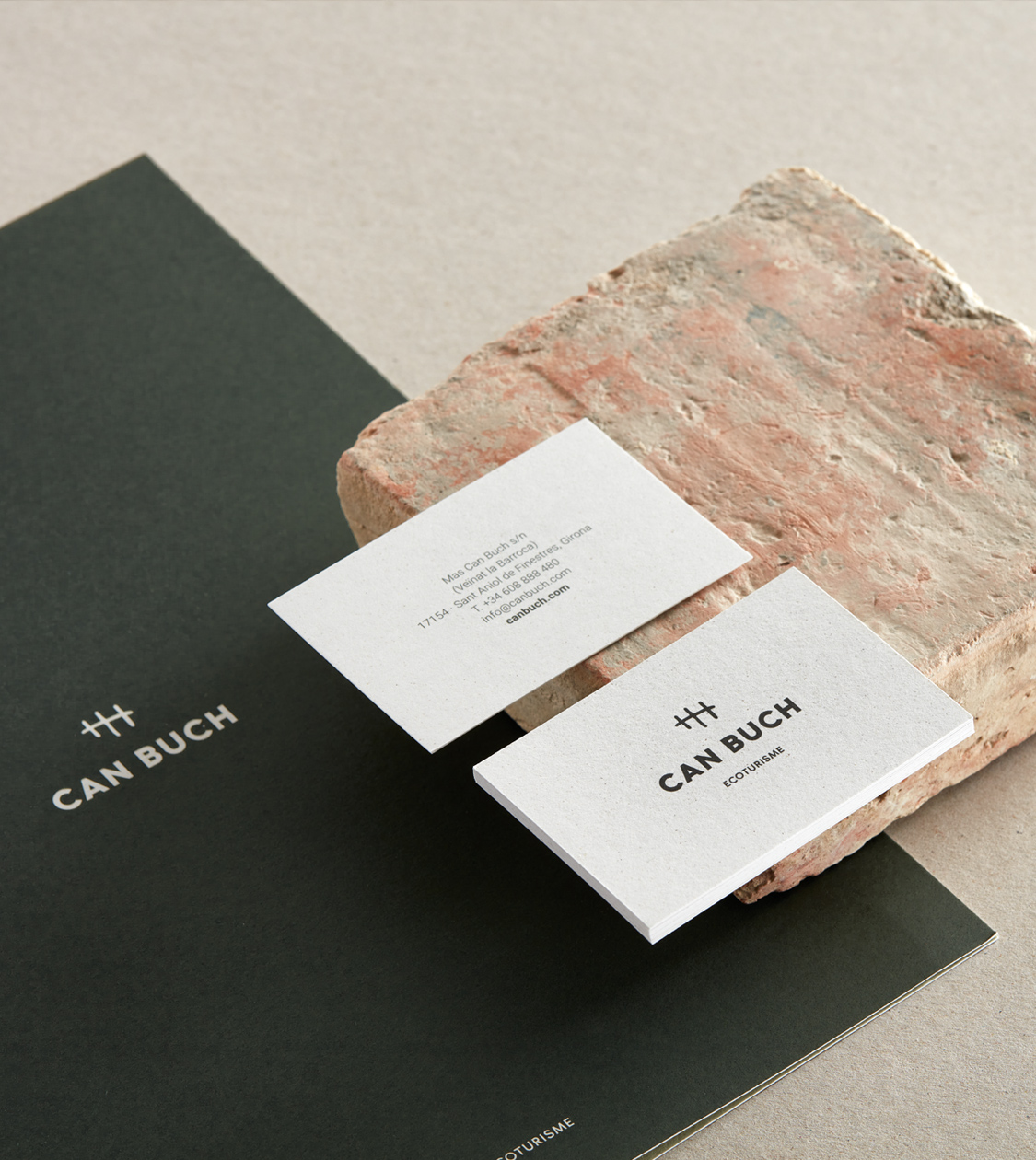
To represent this balance and dichotomy, we developed an identity that combines a modern sans-serif typeface, Roboto Bold, which is both accessible and approachable, with an emblem that maintains a connection to the farmhouse’s origins.
We created this emblem from an engraving found on one of the farmhouse’s window stones. At NOMON DESIGN, we digitized and simplified it, creating a distinctive and unique icon.
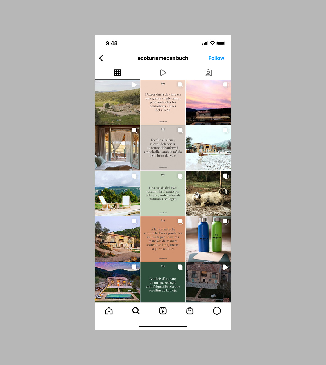
Additionally, we defined a warm colour palette that evokes the natural hues of its surroundings and connects with the territory, as well as with the colours of the original materials used in the renovation.
A year later, building on the eco-hotel’s branding, we conceptualised and created the visual and verbal identity of their new limited-edition craft beer brand, which has since expanded to include other products such as ratafia, olive oil, and jams.
We named this brand “Escampar la boira” because it describes both Can Buch’s purpose and the experience they want their guests to have during their stay: to disconnect and enjoy the peace and serenity of the countryside.
For the graphic design, we created an illustration of a person walking “headless” to emphasise the sense of disconnection you achieve at Can Buch, “clearing the fog.”
When applying the branding to the beers, we considered each variety’s characteristics to determine its colour scheme: the IPA has a lighter colour, and PALE ALE by Fede Igarzabal is darker.
For the ratafia, we adapted the “Escampar la boira” branding by defining a colour scheme that combines the ratafia’s natural colour with gold, referencing the gourmet sector.


Result
The branding of Can Buch and its artisanal product line enhances its values and purpose
The branding for Can Buch reflects its values—proximity, self-sufficiency, and sustainability—and its commitment to respecting, coexisting with, and caring for nature, animals, and people. Furthermore, it connects Can Buch with its territory and origins, maintaining continuity with the location’s history while simultaneously highlighting its sustainability standards.
With the “Escampar la boira” brand, we provided its range of artisanal products with a distinctive and personality-rich image that continues to enhance Can Buch’s purpose.
And we can confidently say, having experienced it ourselves, that when you enjoy a beer or a shot of ratafia in such a unique and special place as Can Buch, you truly “clear the fog” while savouring the taste.
Tags: Corporate branding, Digital communication, Packaging design
2020
More Projects

