Cosmic
A new brand repositioning for Cosmic to fully connect with its target audience
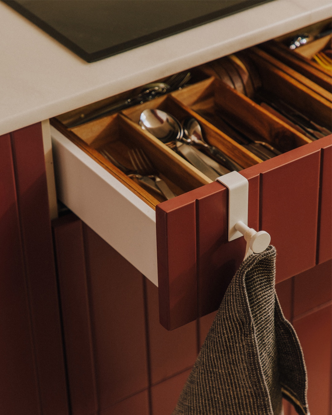
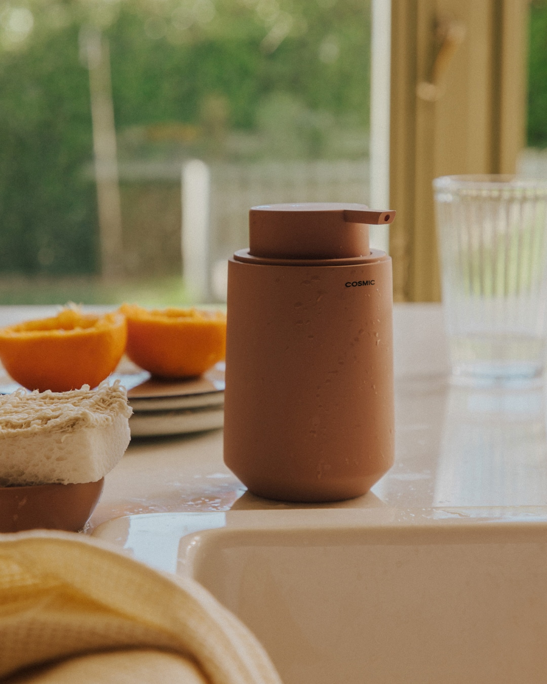
We redefined Cosmic's essence, transforming it into a brand that creates design objects turning houses into homes where people can be 100% themselves
Branding Strategy
Corporate Branding
Packaging Design
Digital Communication
Challenge
We accompanied Cosmic through a strategic brand repositioning project
At the end of 2023, NOMON DESIGN took on the challenge of supporting Cosmic, a leading brand in the design and manufacturing of home design objects under Grupo Roca, in its brand repositioning process.
Cosmic needed to evolve in order to connect more deeply with its target audience and reflect its new strategic approach.
Our challenge went far beyond redesigning their corporate identity or communication materials. It was an integral transformation that involved redefining their verbal and visual identity. We kept intact the elements that make Cosmic a unique brand, but adapted them to appeal to a millennial audience that values sustainability, functional design, and a balanced lifestyle.


Process
A new strategy that repositions Cosmic beyond its products with a consumer-centred approach
To achieve this repositioning, we conducted an exhaustive market analysis, identifying both trends and behaviours of Cosmic’s target audience.
This research allowed us to define a clearly differentiated course of action, optimally adapting it to their main audience: millennials aged 30 to 45, digital natives who value flexibility, sustainability, and prioritise experiences over material possessions.
From these insights, we revisited Cosmic’s mission, vision, and values, adopting a clearer and more authentic communication tone that resonates with the millennial generation, giving Cosmic a unique narrative in the market.
We developed a verbal identity that expresses Cosmic’s purpose: “A home where you can be 100% yourself”, inspired by the brand’s core values:
– A home where everything is easier: We design each of our objects with you in mind, blending creativity with practicality to improve and simplify your life at home.
– A home where you can be unique: We care about our design, based on minimalism, inspired by both nature and cosmopolitan lifestyles. We consider trends and sustainability, so our objects naturally integrate into any type of home, allowing each to maintain its identity and be unique.
–A home where you can live better: Every day, we strive to ensure that our designs are respectful of the environment and all who live within it. We take into account the diversity of needs and criteria, so that we fit seamlessly into a home where you can live better.


These values are reflected in Cosmic’s storytelling and emphasised in the tagline:“A home where you can be 100% yourself.”
For the brand’s visual identity, we developed the concept Milleclectic, which synthesises the main characteristics that Cosmic aimed to convey: millennial, eclectic, and minimalist.
–Millennial represents the primary audience the brand seeks to reach.
–Eclectic defines a style that combines elements from different eras and movements, achieving a successful and appealing aesthetic balance.
–Minimalism reflects the tendency to eliminate the unnecessary and focus on the essential, maintaining the useful and the beautiful without excess. This characteristic has been a distinctive hallmark of the Cosmic brand and its products.
Although we kept the brand’s original logo, at the client’s request, we successfully created a completely refreshed identity capable of standing out and differentiating Cosmic within its sector. This new visual and strategic approach not only honours its legacy but also elevates the brand, aligning its image with the new positioning and strengthening its connection with the target audience.
The new branding connects with the attributes of sustainability and well-being and reflects a balance between innovation and the core values that have been the brand’s foundation.
One of the most notable changes is Cosmic’s new corporate colour palette, vibrant and versatile.
Navy blue, yellow, mist blue, olive green, turquoise, red, grey, and purple were strategically selected to convey the Milleclectic concept, combining elegance and personality. We carefully defined their combinations to maximise impact and reflect the brand’s aesthetic richness.
We defined two corporate typefaces that, when combined, establish a clear visual hierarchy and generate a balanced contrast, enriching the brand’s communication.
For headlines, we chose INFERI, a contemporary serif font that provides character and visual strength, ensuring that each key message captures the audience’s attention. For the main text, we selected Haas Grotesk Display a sans serif with clean lines and balanced proportions, ensuring readability and fluency. This typographic combination reinforces Cosmic’s visual identity and the Milleclectic concept.

With the verbal and visual identity clearly defined, we are advancing the comprehensive implementation of the branding, which includes developing the packaging system, the digital guide, new editorial pieces, and even retail applications.
We undertook a conceptualisation and design process for Cosmic’s new product packaging system, considering structural, material, and graphic aspects. The new packaging was meticulously designed to meet the client’s needs, prioritising functionality, sustainability, differentiation, and visibility at the point of sale.
In addition to the physical development of the packaging, we placed special importance on product communication. Each pack must clearly convey the attributes and complexities of each item, as well as its place within the collection, ensuring that the consumer understands the value and essence of each design, transforming their house into a home.
Result
A repositioning that fully conveys Cosmic’s essence
Throughout this process, close collaboration with the Cosmic team was essential to ensure that every strategic decision consistently reflected the company’s values and the new brand approach.
The result of our work is a new corporate branding and communication strategy that positions Cosmic as a leader in the sector. This change not only strengthens their brand identity but also creates a significant emotional connection with the audience, enhancing their experience when interacting with the products.
“At Cosmic, we want to improve your daily life so that you feel you live in a home where you can simply be yourself.”
More Projects
