Diseño editorial del catálogo de Cosmic por Nomon Design, agencia de branding

Cosmic

We brought Cosmic’s new brand narrative to life in its main editorial piece

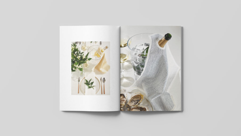
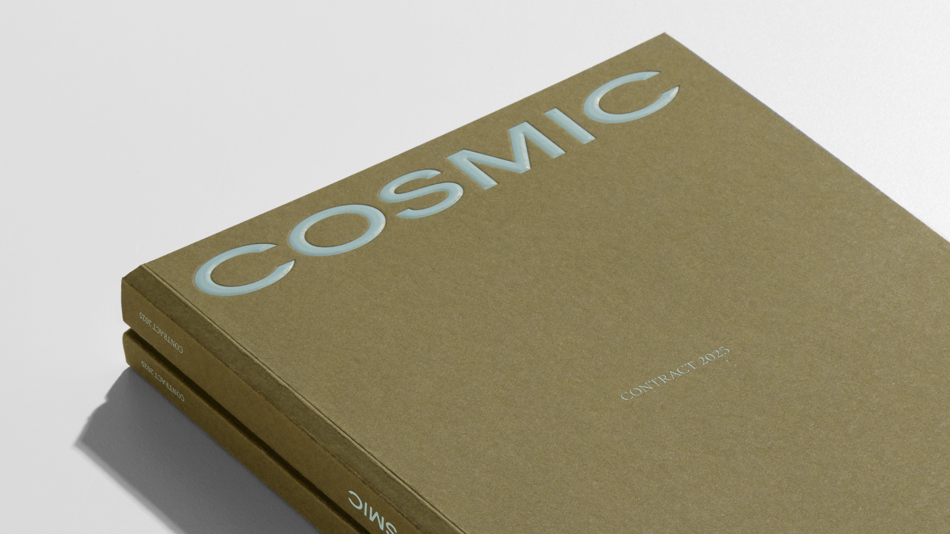
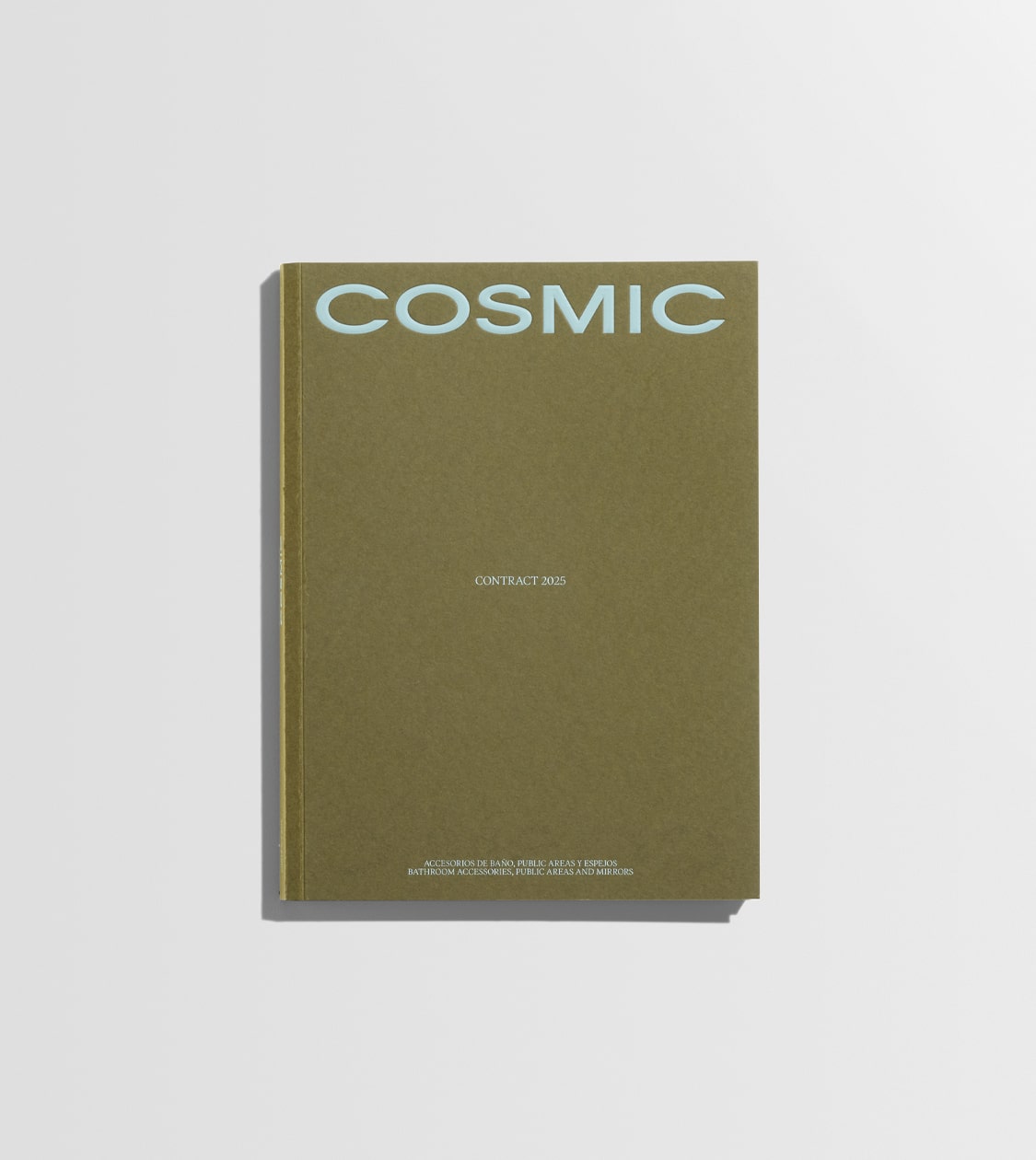
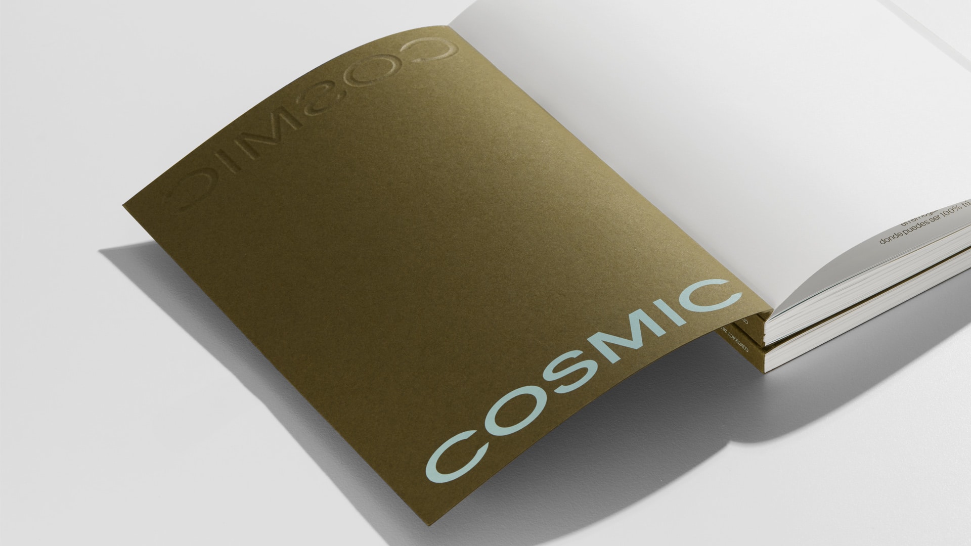
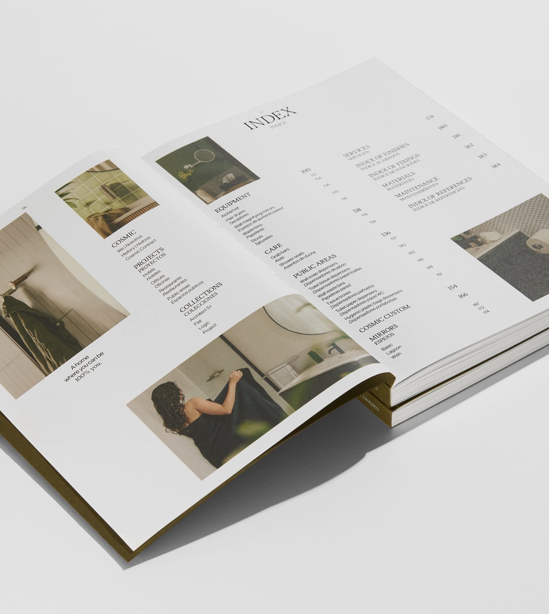
Cosmic’s new branding takes shape on every page of its corporate and product catalogue

Editorial Design

Challenge

Creating an editorial piece that conveys the new brand positioning and aligns with its values


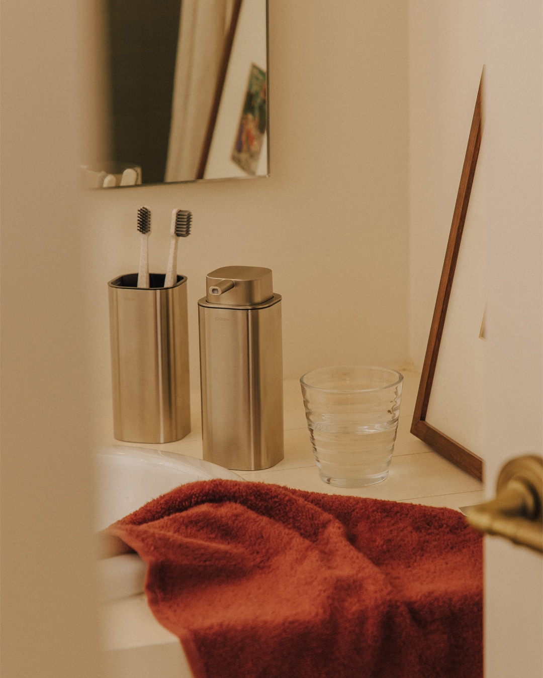
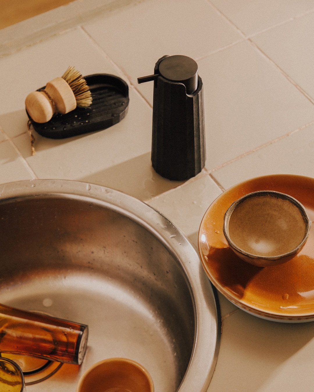
After carrying out the full rebranding of Cosmic — a leading brand in the design and manufacture of home design objects within the Roca Group — the next step was to translate its new positioning and identity into all communication materials, including its editorial content.


Cosmic’s new corporate branding had to be expressed clearly and consistently in its main editorial piece: the corporate and product catalogue. This catalogue needed not only to present and provide information about the product range, but also to connect with its target audience and convey the new brand purpose: “A home where you can be 100% you”. All of this through a more authentic, inspiring and approachable visual and editorial language.

Process

Reinforcing Cosmic’s new positioning through its new editorial design


We conceptualised the new corporate and product catalogue as a visual and narrative extension of the Cosmic universe, defined by the concept of Milleclectic, which blends millennial, eclectic and minimalist elements into a unique and distinctive proposition within the sector.


Both the structure and content, along with the visual execution, were designed to reinforce this new brand identity. Through a series of carefully designed graphic and compositional elements, we built a narrative that communicates the company’s story and evolution.


We integrated the new brand storytelling — including its vision, values and international scope — into a design combining a flexible grid with clear typographic hierarchy, making the content easy to read and understand.

The vibrant and versatile colour palette — composed of navy blue, mist blue, olive green, turquoise, red, yellow, grey and purple — was thoughtfully combined to convey elegance and personality. Product images are given visual prominence within clean compositions, while white space adds clarity, order and sophistication. The editorial tone strikes a balance between technical and inspirational, adopting a warm and honest style that resonates with a young and demanding audience.


In addition to the concept and design, we carefully selected materials and finishes for the catalogue, using H-UV printing technology to ensure high production quality while reducing environmental impact — in line with the brand’s sustainability values and those of its audience. The cover was printed on 350 g Gmund Colors Matt 88 paper, with blind embossing and a single Pantone screen print. The interior pages used 120 g Arena White Smooth paper, printed in four colours.

Portada del diseño editorial del catálogo de Cosmic por Nomon Design, agencia de branding de Barcelona

Result

An editorial design that reinforces Cosmic’s new brand positioning


The result is an editorial piece that not only informs, but also builds brand connection and value. A publication that clearly conveys Cosmic’s new positioning, aligned with its core values of sustainability, wellbeing and innovation.


Designed as a clear and functional tool, each section — collections, finishes, designers, services, projects and materials — enhances the user experience. Every page strengthens the brand’s presence as a premium name in the home design sector, standing out with its own distinctive style and a verbal and visual narrative that communicates authenticity, design and functionality.

Tags: Editorial Design

2024

We use our own and third-party cookies to improve our services and to obtain statistical data. If you accept or continue browsing, we consider that you accept its use. You can get more information here.

Accept