Espigoladors
Art direction of sustainable brand es im-perfect®’s new e-commerce website
Together with es im-perfect®, we defined an art direction committed to sustainability and food waste reduction for their new e-commerce
Communication
Challenge
We conceptualized an art direction that denounces food waste and promotes the brand
es im-perfect® is the job placement branch of the Espigoladors Foundation, a company that has been fighting food waste since 2014, and which we have been collaborating with since 2015.
es im-perfect® is a canned veggies brand committed to environmental sustainability and social justice. Their workshop, which is located in El Prat de Llobregat, counts with the participation of socially vulnerable people to produce vegetable pâtés, marmalade, jams and sauces using locally sourced fruits and vegetables, which are typically discarded from commercial circuits for being imperfect or for constituting production surpluses.
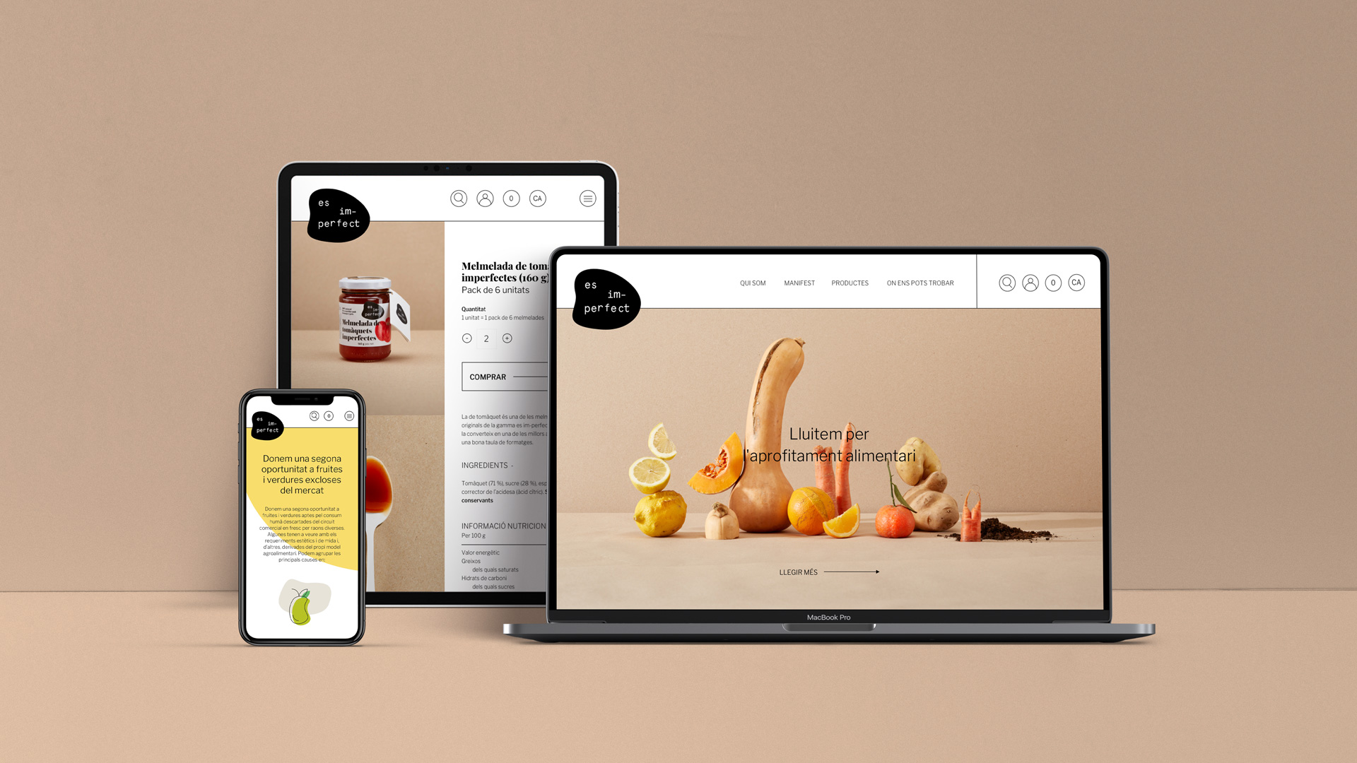
During these last few months, we have been working alongside the es im-perfect® team in the conceptualization and design of its new e-commerce.
Oriented towards the final public, we worked together defining the objectives. The new es im-perfect® e-commerce is expected to properly communicate the brand, denounce food waste and create a community with social and environmental awareness.
Process
We defined an art direction inspired by the discarded fruits and vegetables and Marcel Duchamp’s conceptual art
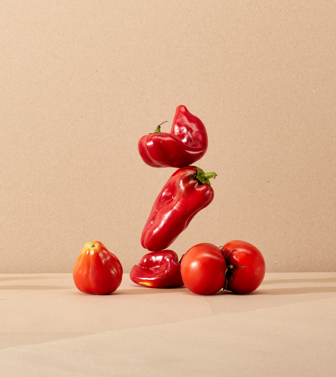
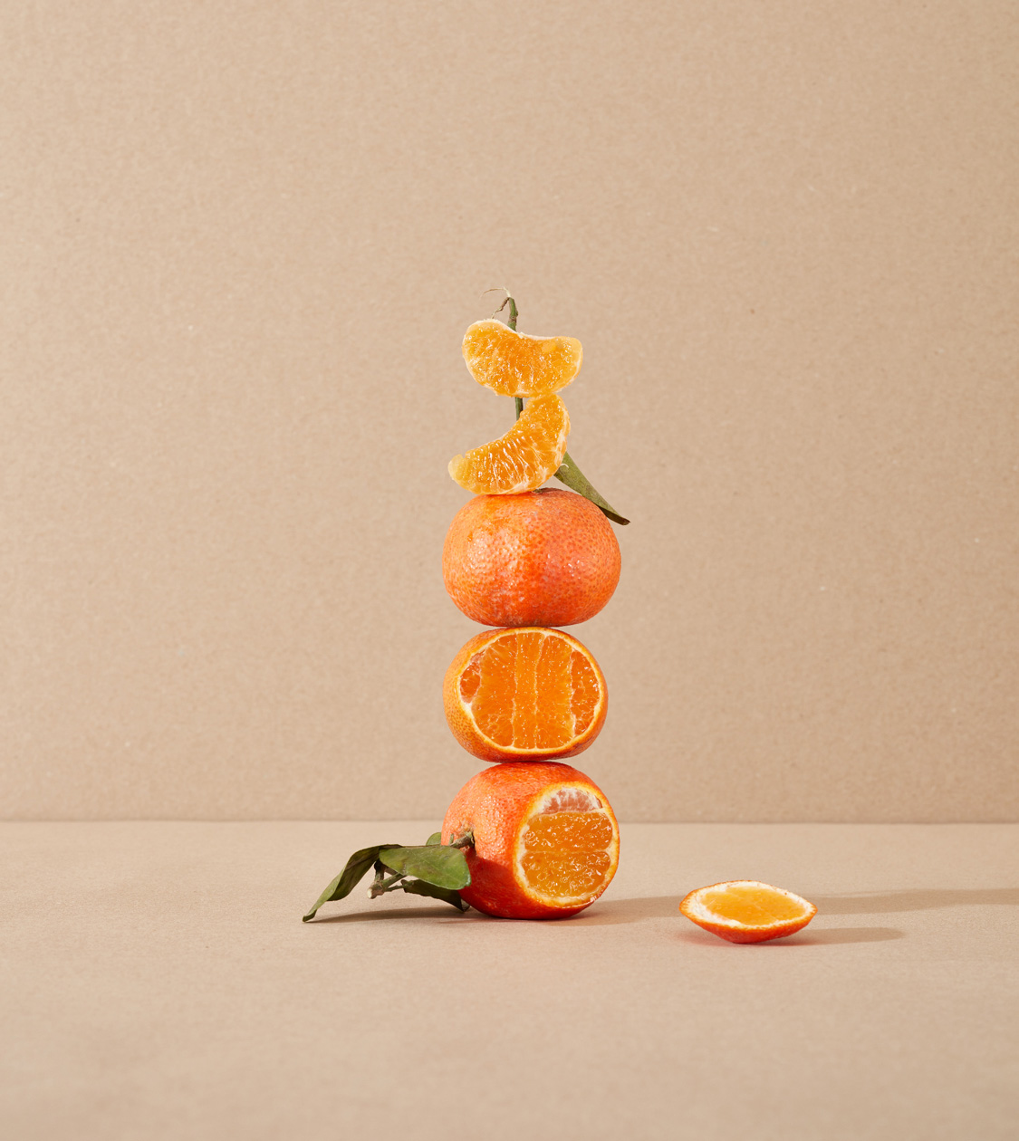
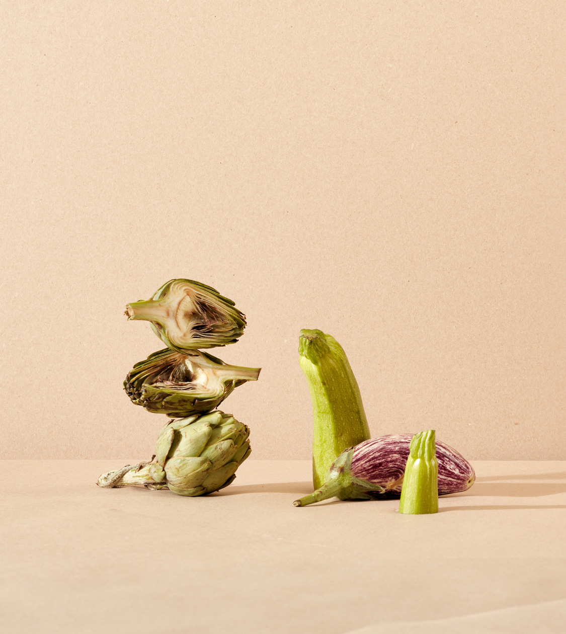
Based on these objectives, we defined the art direction based mainly on the criticism of food waste and the aesthetic criteria which is so often imposed upon food.
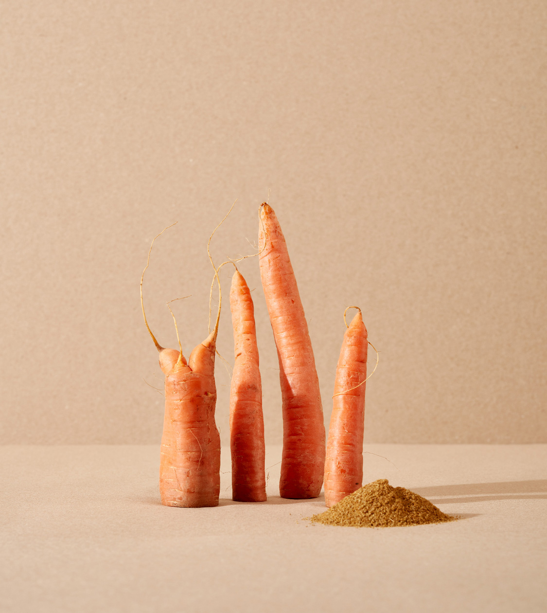
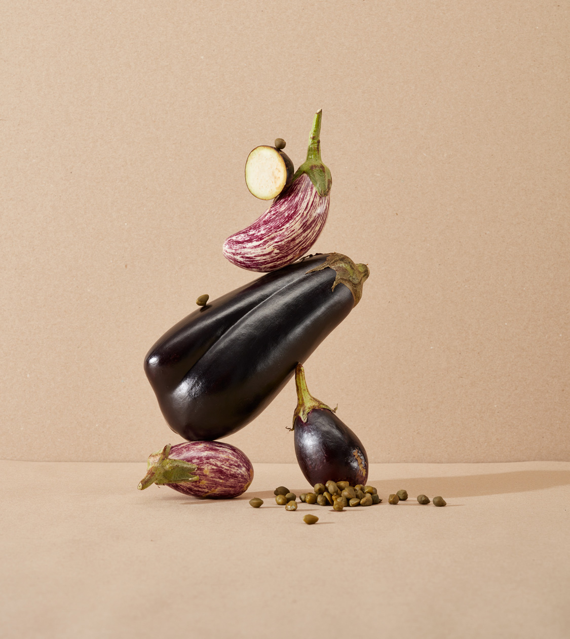
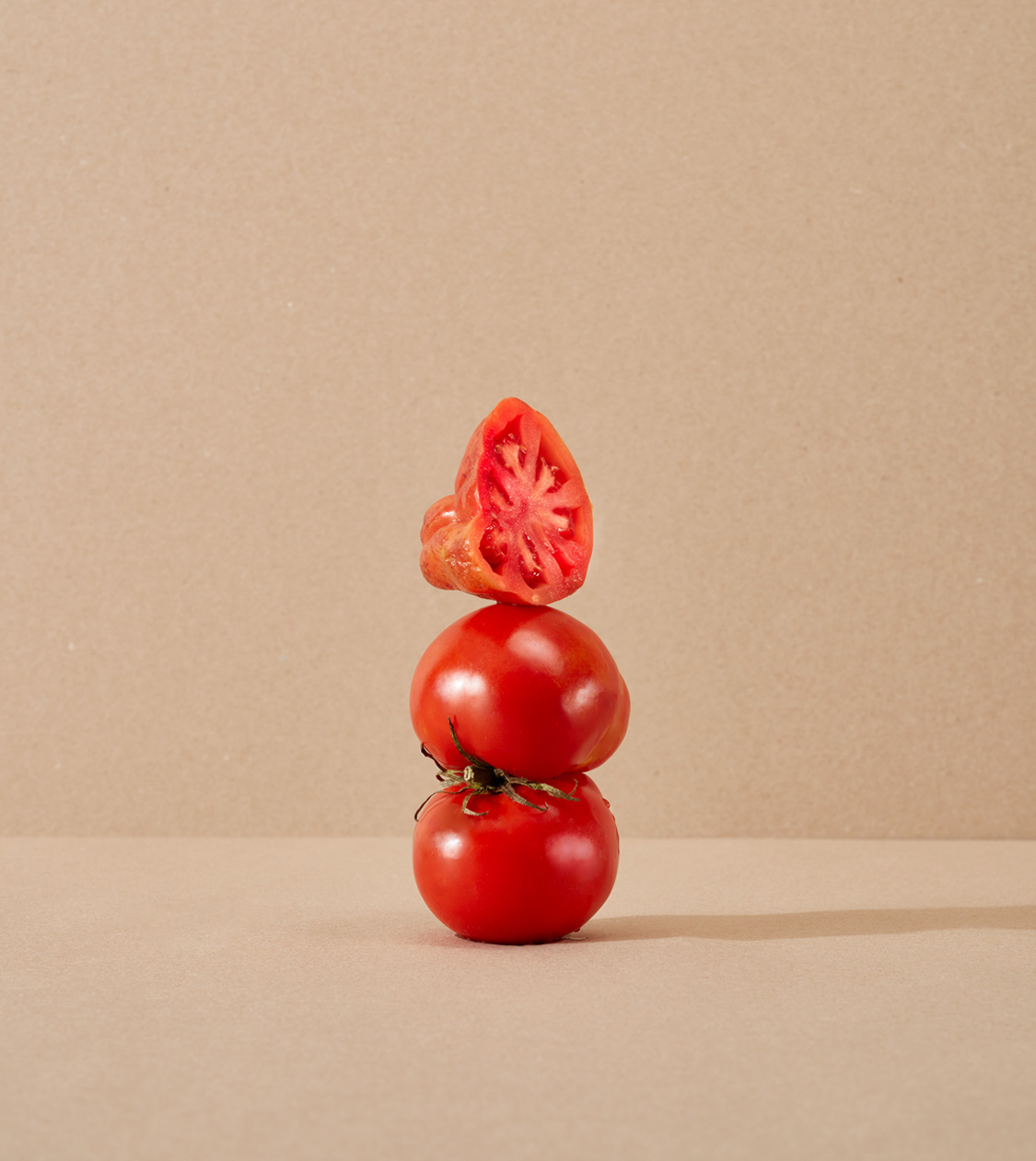
Inspired by our own discarded fruit and vegetables, in the conceptual art of Marcel Duchamp, who elevated the everyday object to the category of art, radically changing the idea of beauty; and in the “flickering”, the part that divides the belly from the head of bluefin tuna and that, for years, was considered a marginal piece, classified as a waste and that, now, has become a gourmet delicacy.
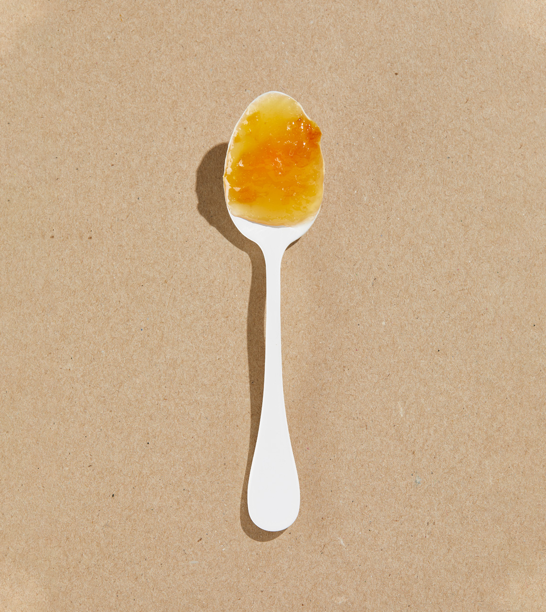
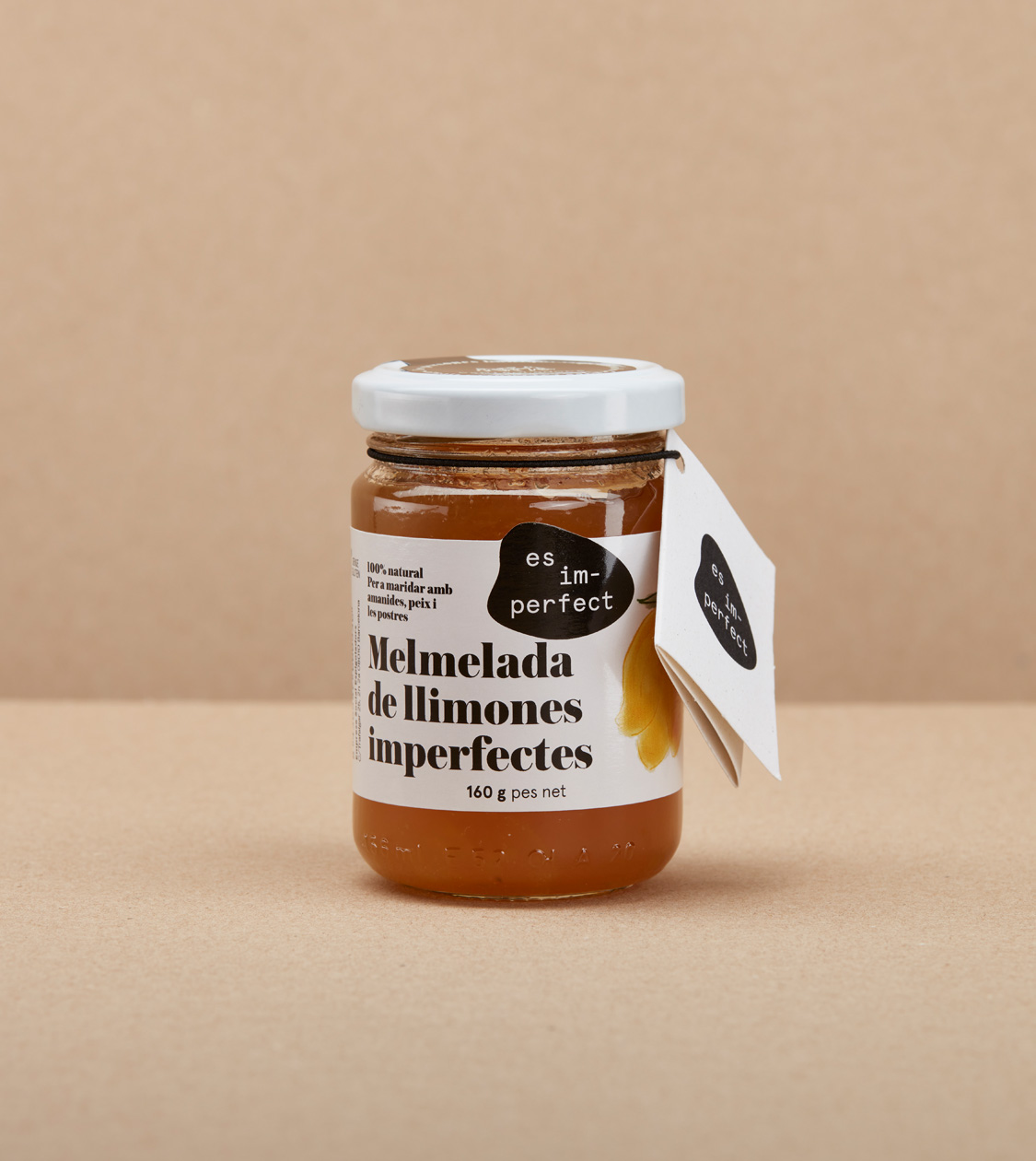
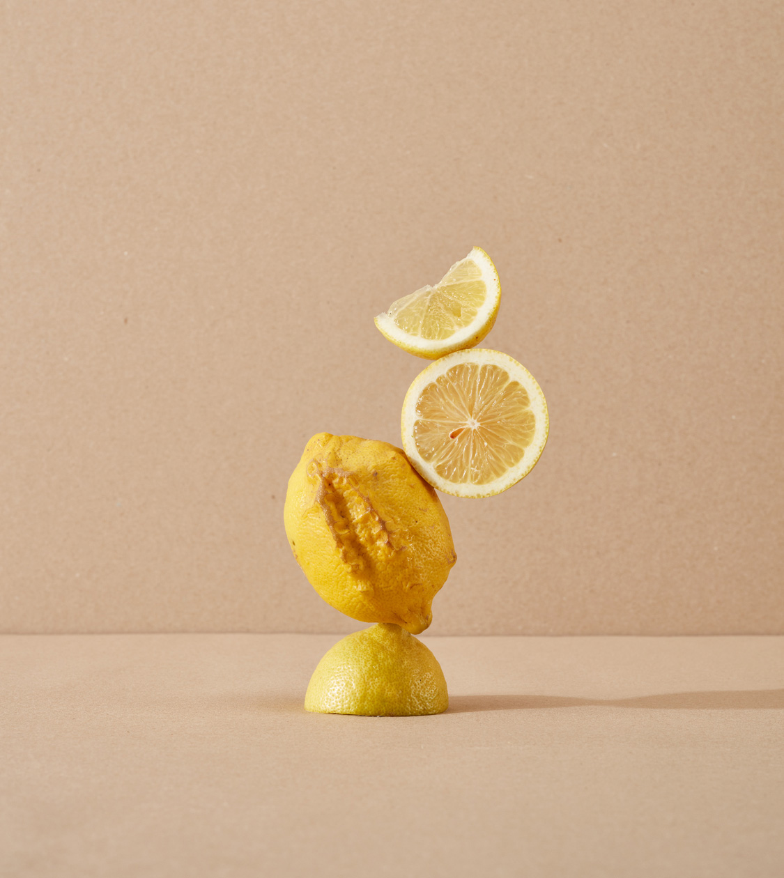
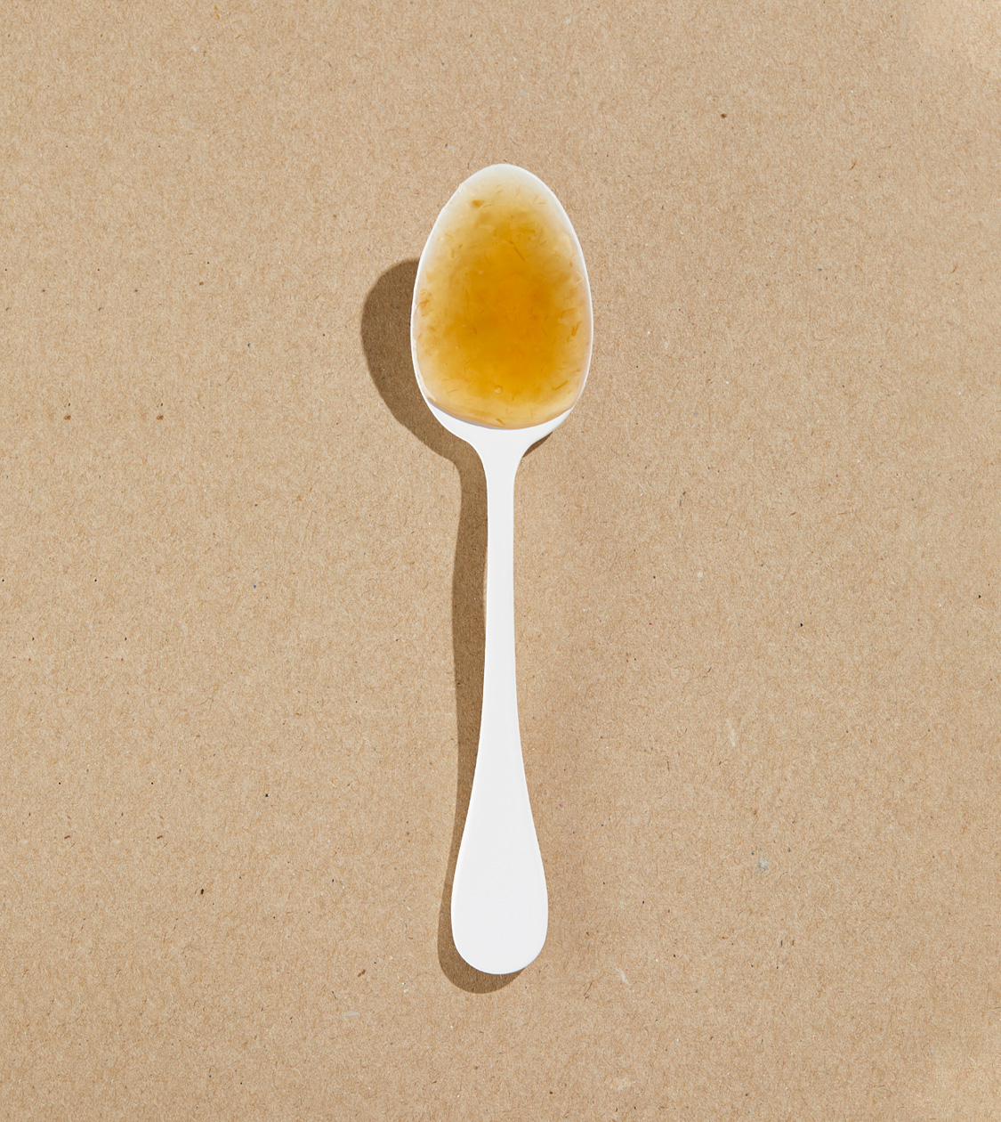
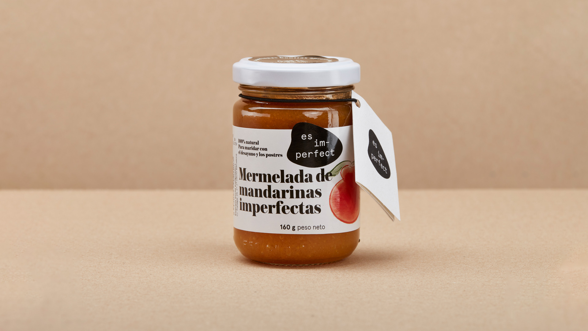
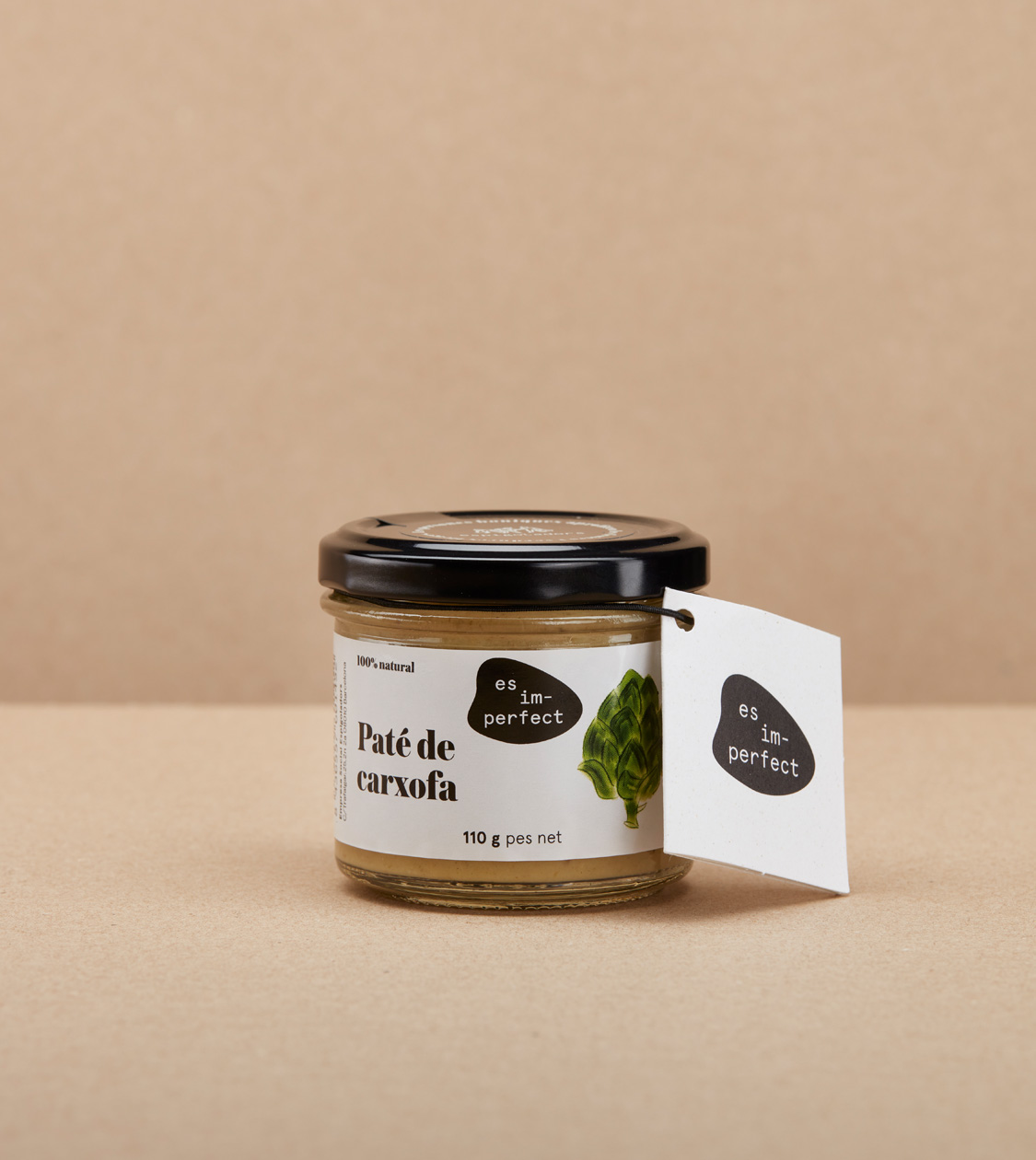
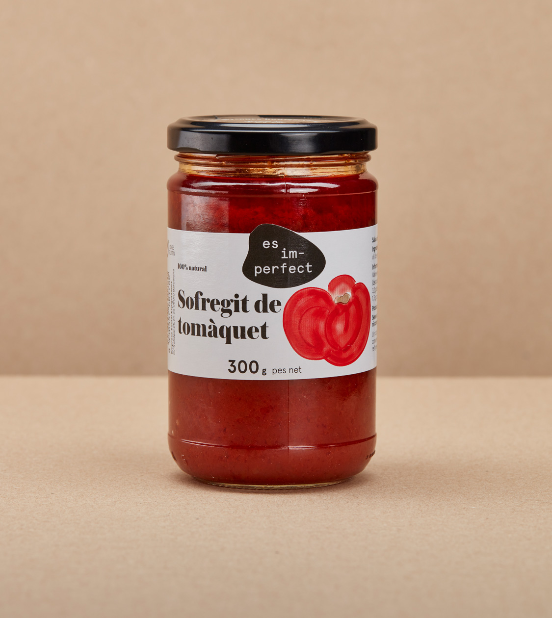
With all this, we determined a series of photographs according to the function and location in the e-commerce: the still-lifes with the produce used in the preserves –real fruits and / or vegetables– which, based on the composition and lighting, add value and give the deserved prominence to these pieces, and the final product, whose textures were highlighted and, finally, the pots and packaging.
In addition, we reviewed and simplified the colour palette, chose the fonts and defined and created the iconography that would be used in the web design.
Result
We revalorized the “ugly” fruits and vegetables that, despite being perfectly edible, are eliminated from commercial circuits
The final result of the art direction perfectly meets the objectives which were set, and the essence of the commitment of es im-perfect®: striving to dignify and revalue the ugly fruits and vegetables which the market and so many consumers do not want, with the creation of natural, healthy, qualitative, proximity products.
Tags: Communication
2021
More Projects

