Girofibra
Digital Communication that emphasizes the company’s slogan: “The pleasure of eating well”
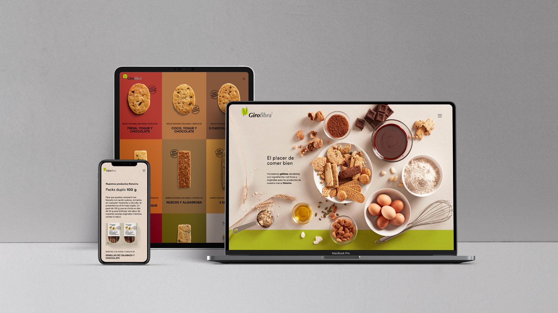
We crafted Girofibra's website as the central piece of their Digital Communication
Digital communication
Reto
We define their website as a bridge between Girofibra and its consumers
Collaborating with Girofibra again to produce the company’s new website. We previously conceptualized and redesigned the packaging for their brand of healthy bars and biscuits, Natwins.
On this occasion, we designed and conceptualized the company’s corporate website, acting as a connection hub between the company and its consumers. In addition to being able to get to know and delve into Girofibra’s history, the consumer has also the opportunity to find detailed information on the range of Natwins products, as well as the points of sale.
Desarrollo
We develop Digital Communication focused on highlighting the value and excellence of their raw ingredients
We developed this piece of digital communication with the same objective that we set for ourselves when we did the Natwins packaging. Our aim was, and still is, to convey the brand values and the main commitment of the company: products whose flavours the consumer can enjoy at any time of day while maintaining a healthy diet.
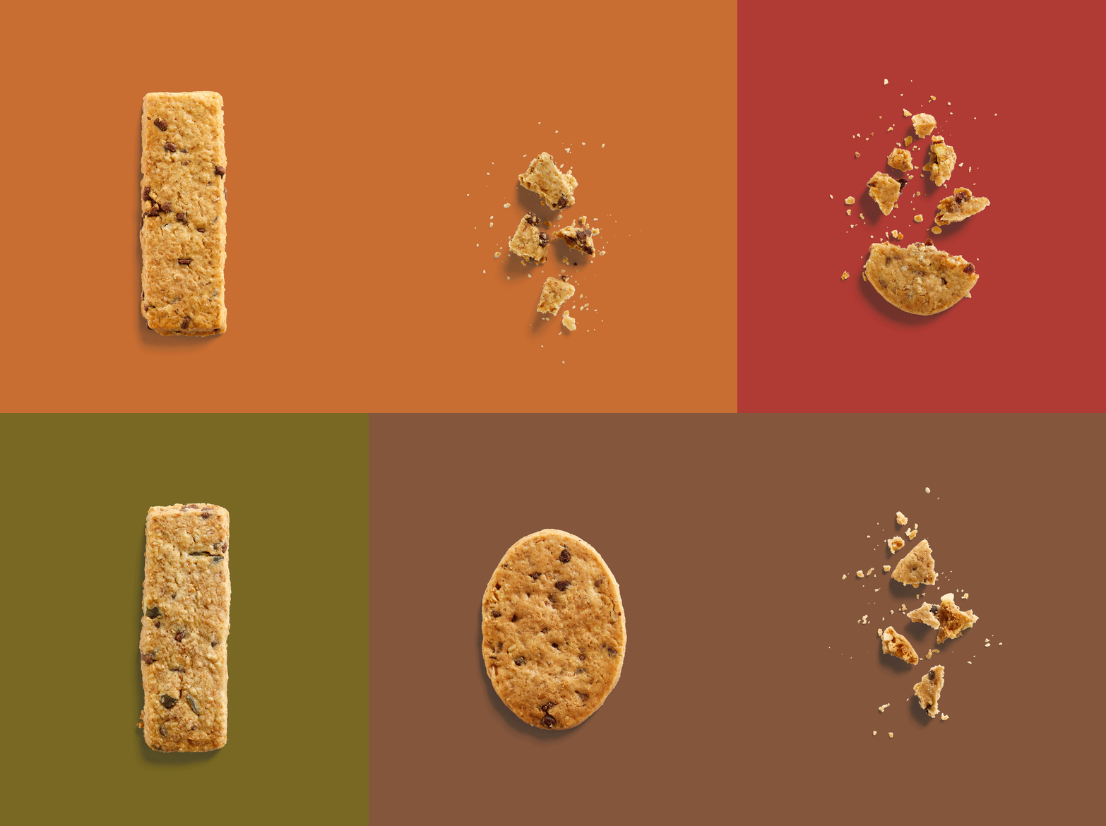
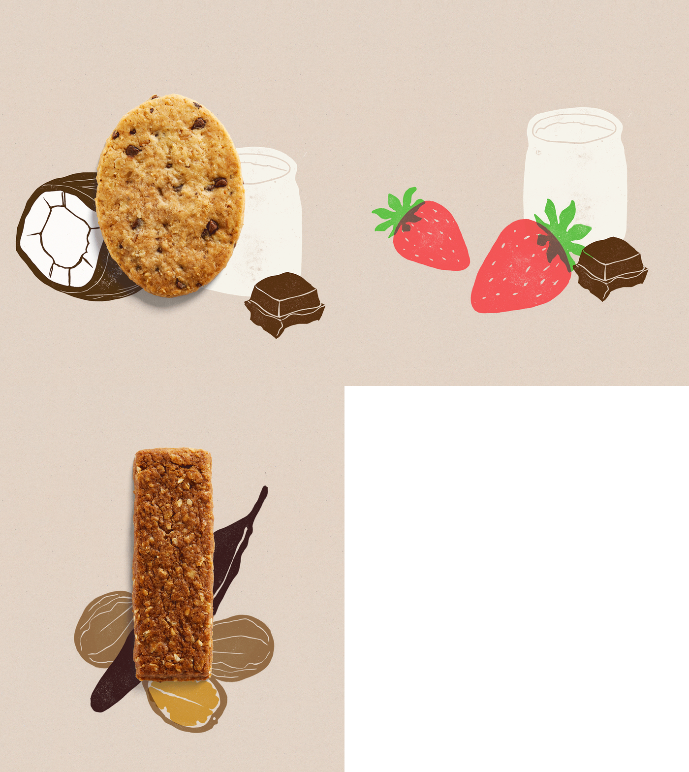
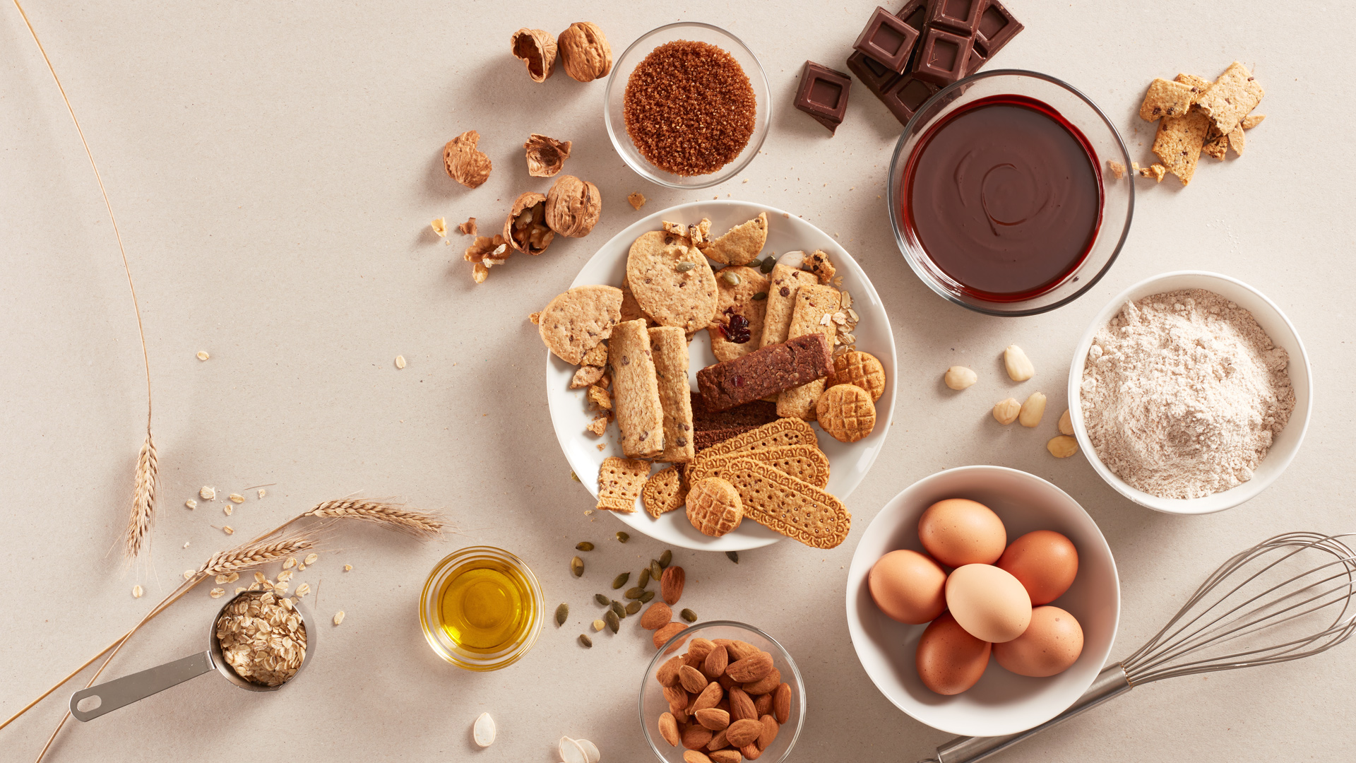
With this goal in mind, our art direction primarily focuses on and highlights the raw produce and the natural, distinctive and inspired combination of ingredients used in the crafty elaboration of the products. We also express the action of eating a bar or biscuit representing the crunch-moment, the moment in which the biscuit cracks and the crumbs are scattered all around.
Playing with the idea of this appetizing moment, we emphasize Natwins’ claim “The pleasure of eating well” and we endow the website with dynamism, while also producing a surprise effect on the user.
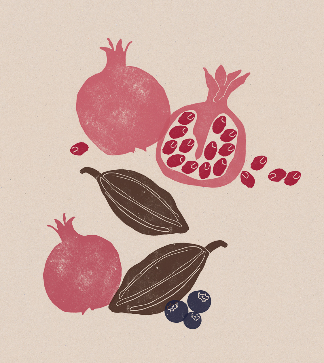
We also chose to maintain and use the colour palette of Natwins packaging and other graphic elements –such as illustrations and stamps– to adapt them to the digital medium.
Resultado
A Digital Communication that conveys over 60 years of tradition and precision in crafting their own recipes
The result is a web page that transmits and reinforces the brand positioning of the company, highlights the raw produce used and showcases the recipes that have been carefully and meticulously prepared for over 60 years.
Tags: Digital communication
2020
More Projects

