Gráfica Ideal
Rebranding for one of Portugal’s leading printing presses
We've created a branding that highlights the company's friendly and positive character
Corporate branding
Communication
Retail branding
Challenge
We’ve refreshed and updated the company’s branding to coincide with an ambitious expansion phase
We are currently reworking the corporate brand identity for Gráfica Ideal, one of Portugal’s most important printing companies, specialising in the design, development and manufacture of packaging solutions since 1945.
Employing a team of over 100 people, the company offers services to both national and international clients as relevant as Procter & Gamble, Unilever or Nestlé.
With 75 years of experience, in 2017 an ambitious expansion phase was set in motion through the enlargement of facilities and the acquisition of new machinery, with the aim to generate significant growth within the organisation. This fact underlined the need for a full corporate rebranding in order to revamp the brand and adapt its image to the company’s new revitalised reality.
Process and Result
A branding that reflects their experience and history, along with the positive attitude and ambitious nature that characterize them
Given the dimension of this project and its relevance for the company itself, NOMON established right from the start that the new brand needed to reflect their remarkable experience and trajectory acquired during the years, as well as emphasise the positive disposition and ambitious nature that so genuinely characterises the company.
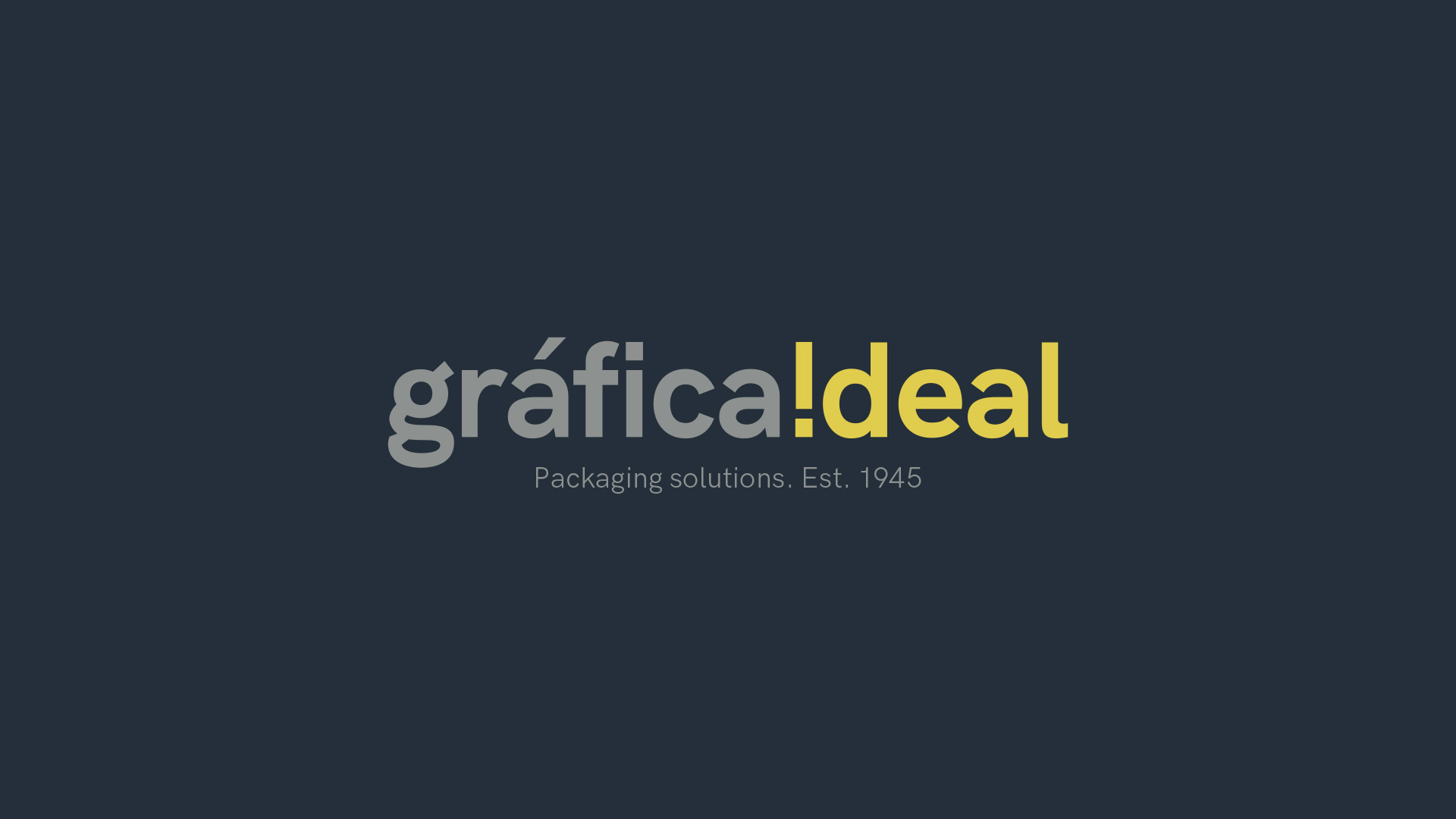
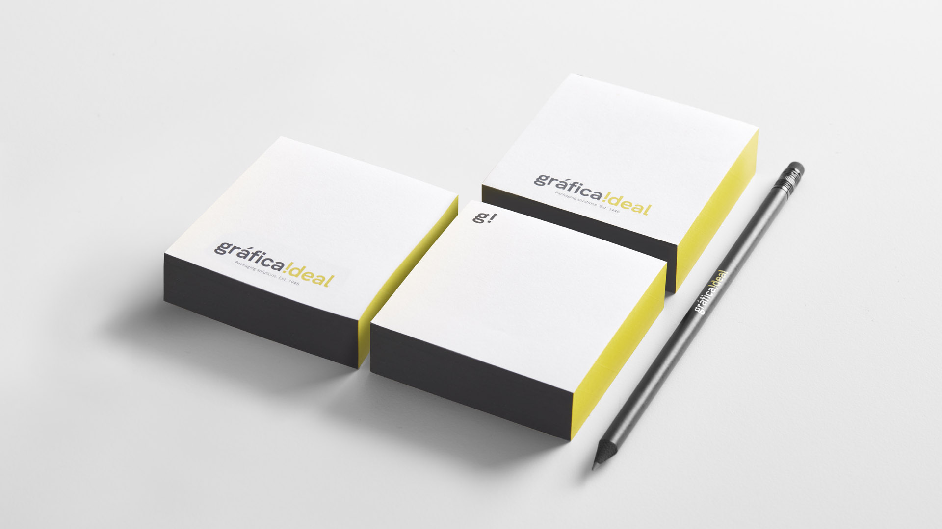
With this goal in mind, we conceived their corporate brand image by highlighting the company’s open and positive character, which the actual naming already conveys. We therefore thought of a logo represented in small caps in which we rotated the “i” of the word “ideal” to act as an exclamation mark, thus communicating a corporate identity symbolising strength and determination.
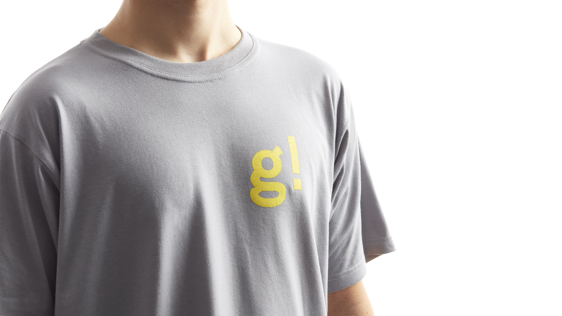
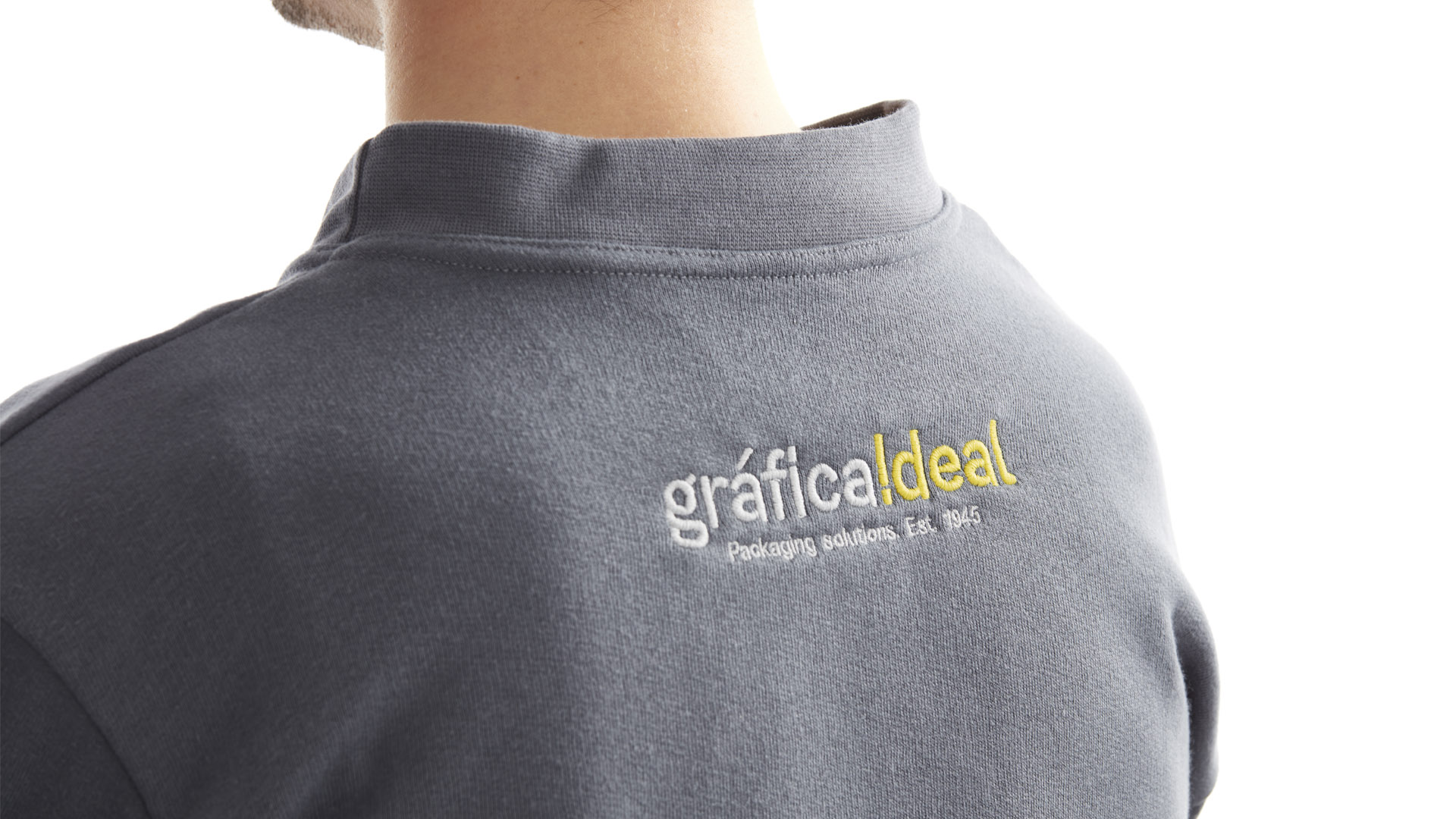
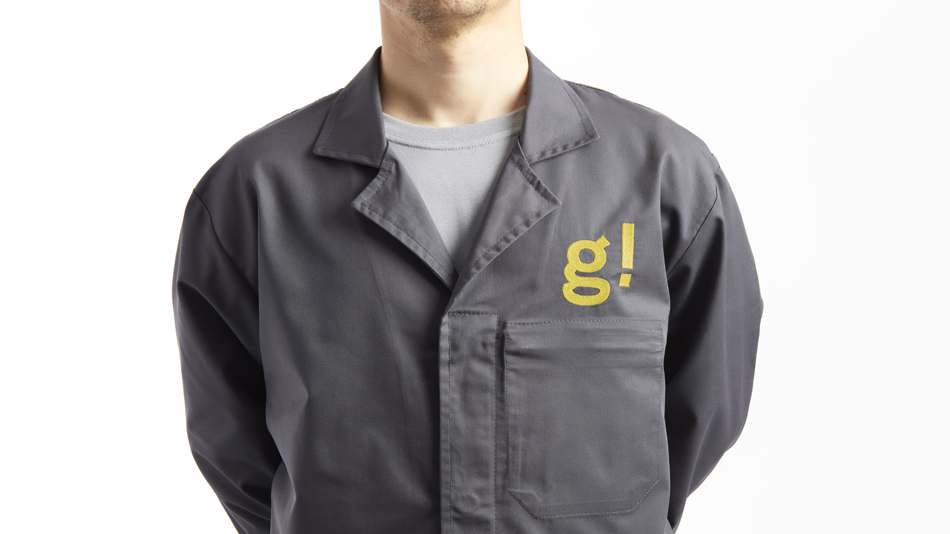
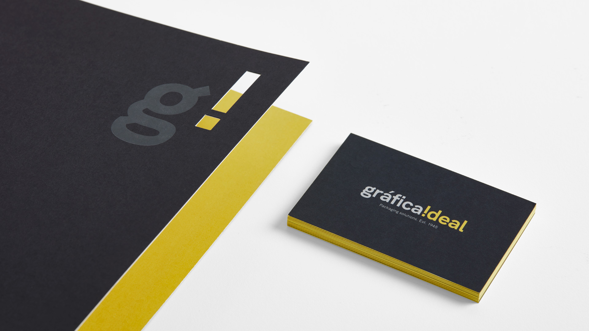
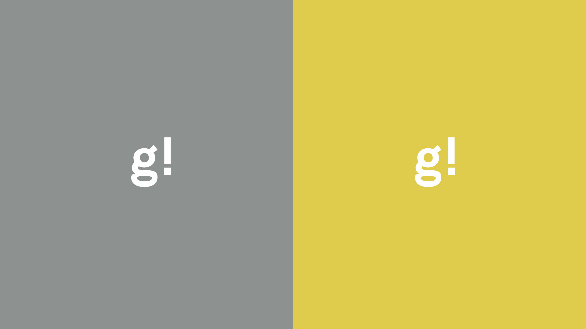
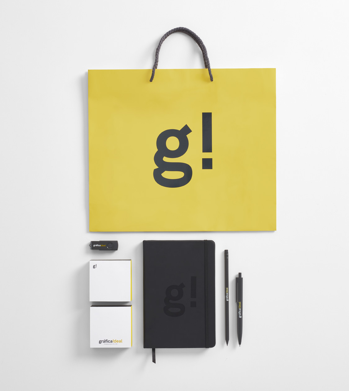
To further emphasise the essence of the company, we created an isotype based on its initials, joining the “i” as an exclamation mark along with the “g” of the word “gráfica”. This element allows us to communicate the nature of the Gráfica Ideal brand in environments where it is required, such as the digital realm, merchandising or retail branding.
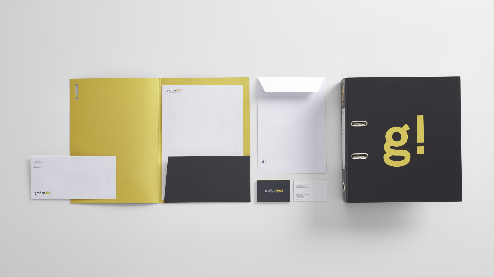
We defined the sans serif HK Grotesk family as the corporate typography that best defines the character of the company, alongside a colour swatch championing the colours Pantone Black 6 and Pantone 429 grey, which together help communicate the professionalism of the company, while we used a yellow Pantone 605 as secondary colour, representing the more positive, ambitious and innovative side of the brand.
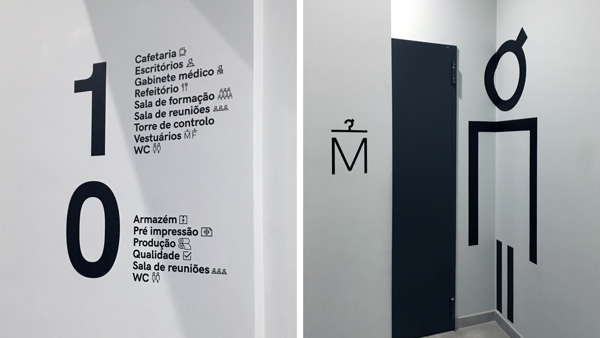
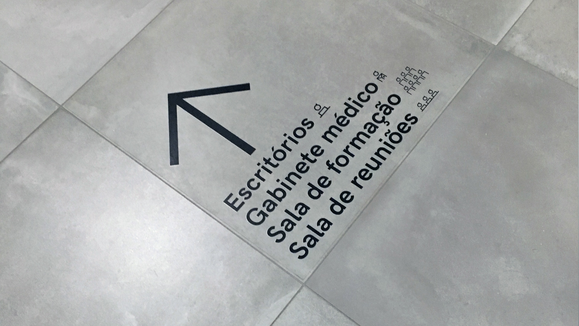
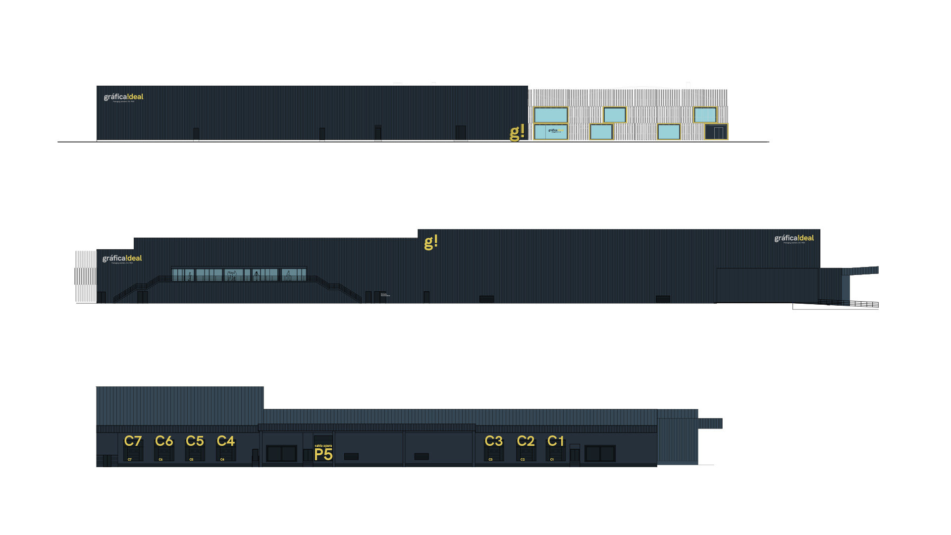
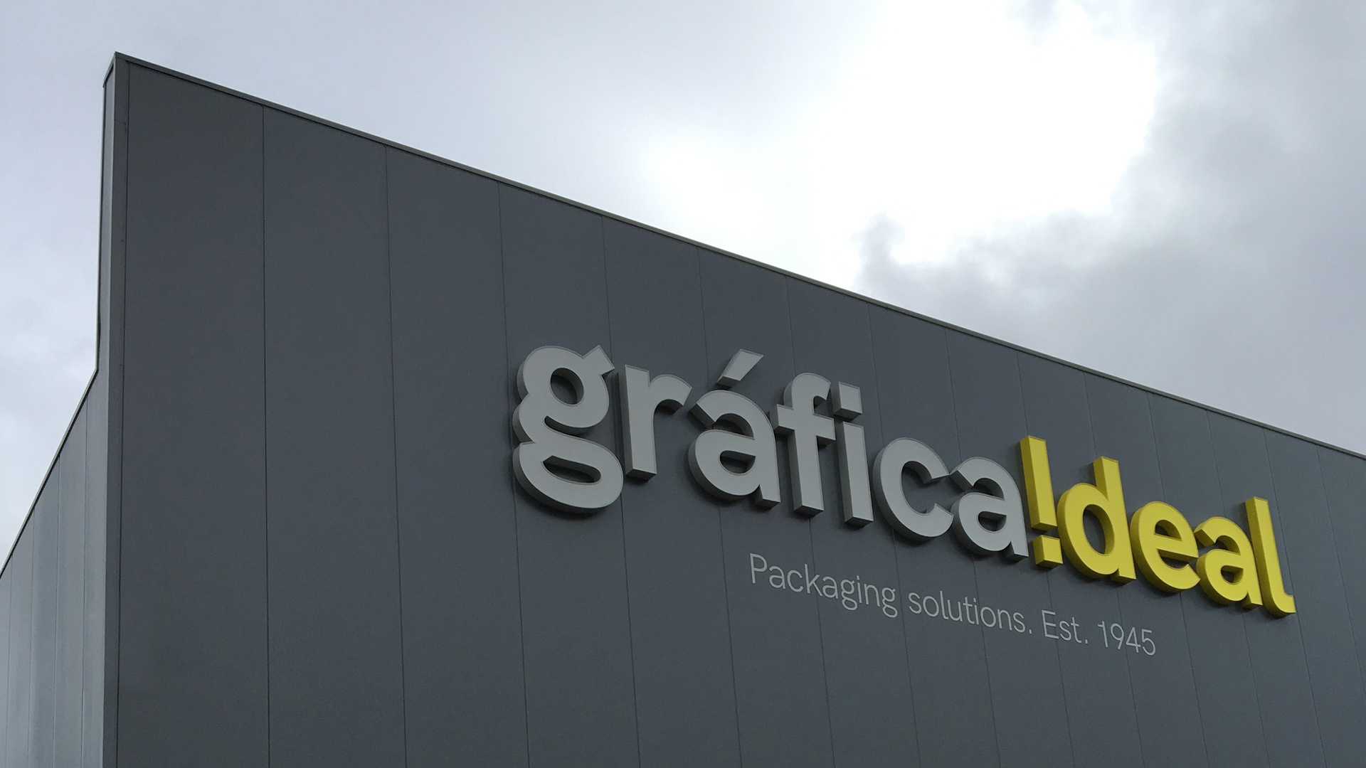
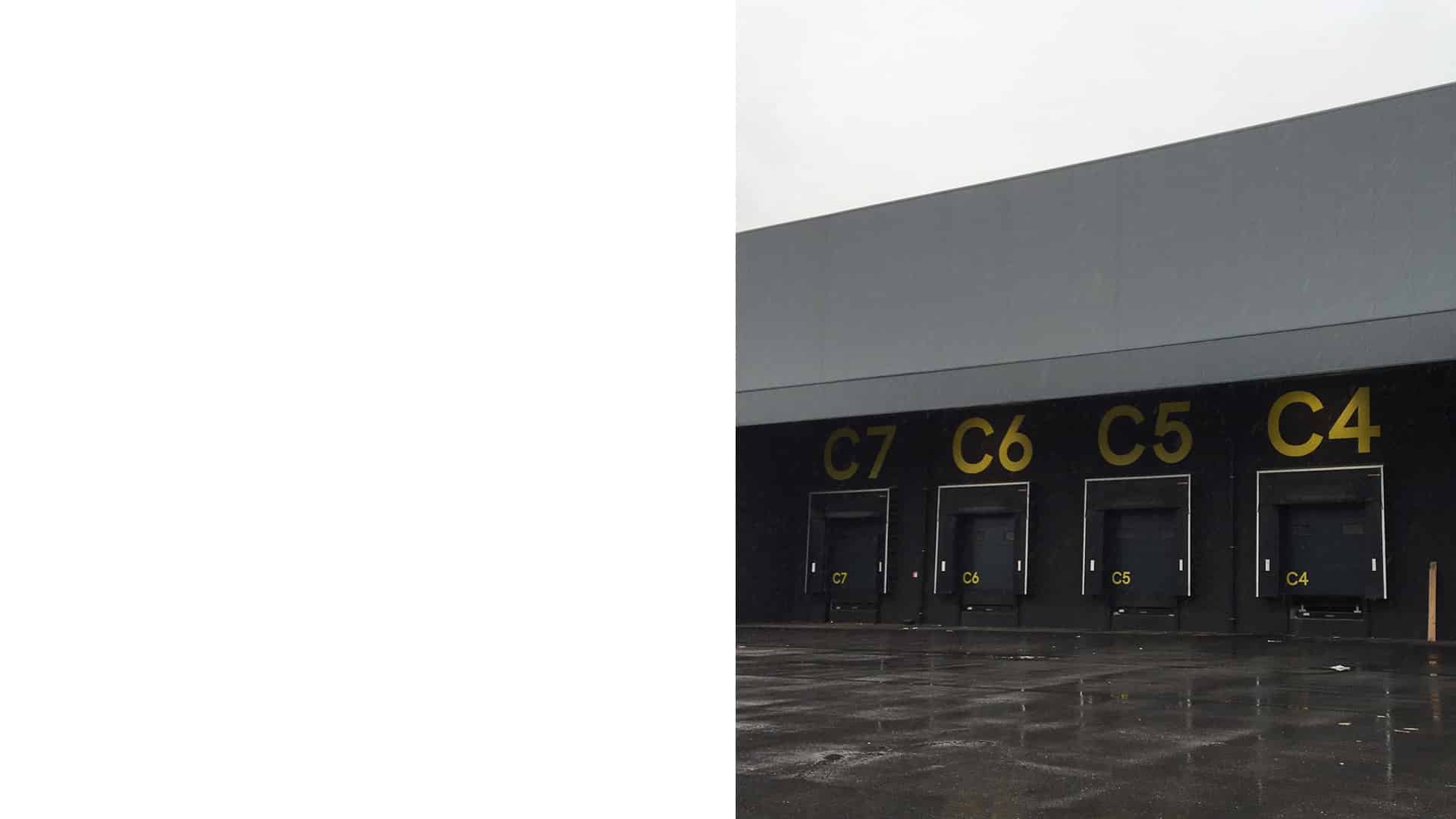

Subsequently, we worked on an extensive corporate manual and applied the branding of Gráfica Ideal in the company’s entire communication pieces, such as corporate stationery, uniforms and company vehicles. The most significant application of the corporate image was nonetheless carried out in the approx. 6000 square-metre corporate property, where we created the signage for the new facilities and applied the brand identity in its different spaces, facade, entrance for employees, locker rooms, production, staff canteen, showroom, etc.
This large project has not yet been completed. We will evidently continue working, alongside Gráfica Ideal, on this new endeavour of growth for the company.
Tags: Corporate branding, Communication, Retail branding
2019
More Projects

