


Keraco
A unique corporate branding in the industrial sector
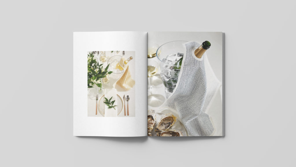
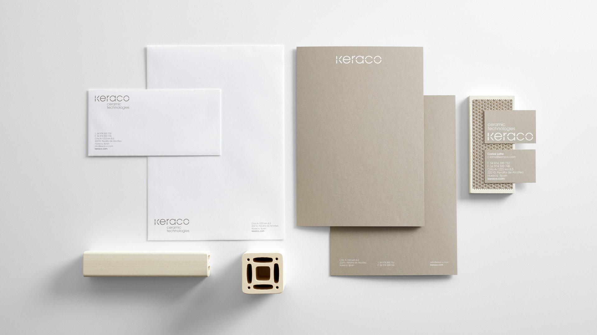
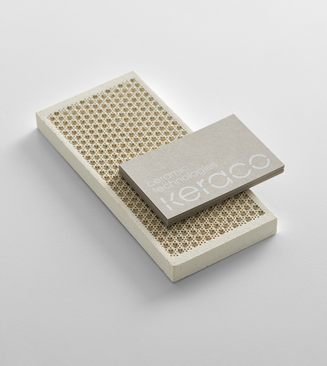
We've developed branding inspired by the shapes, textures, and colours of Keraco's products and raw materials
Corporate Branding
Challenge
We revamped the branding for an industrial manufacturer of ceramic components
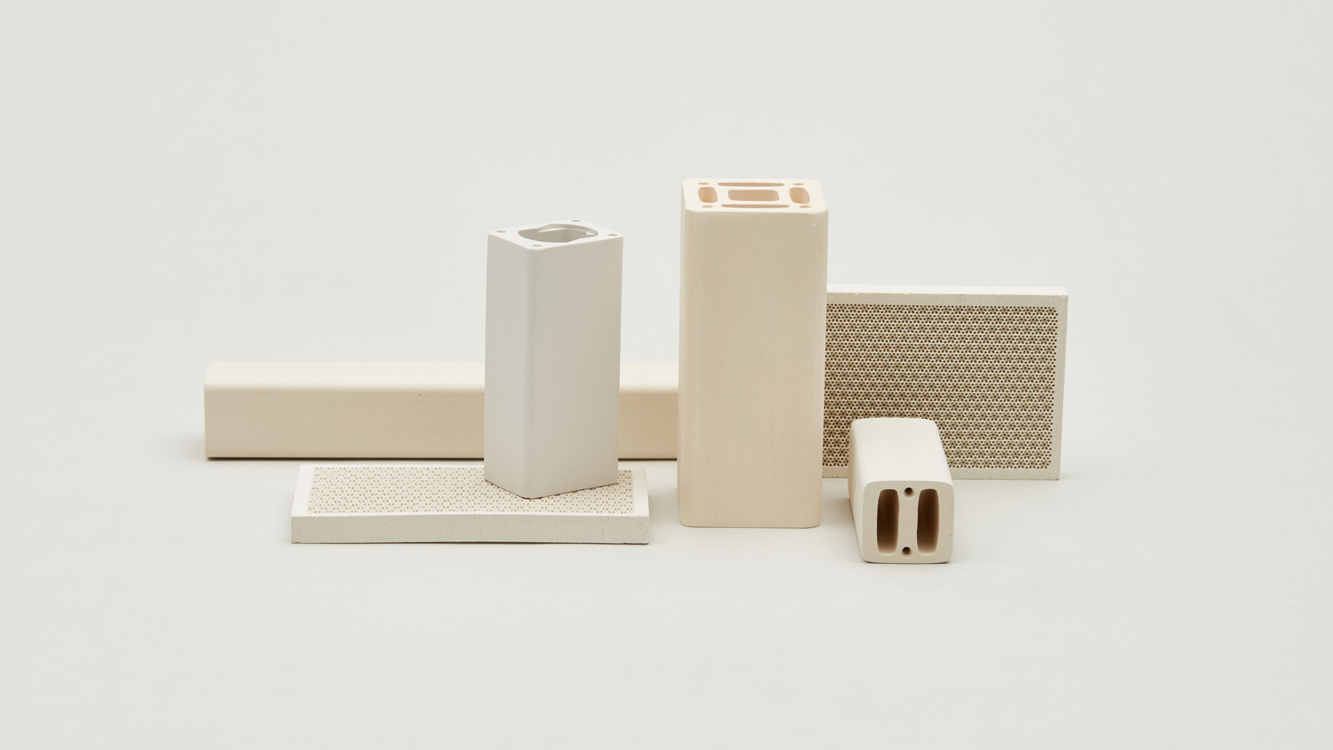
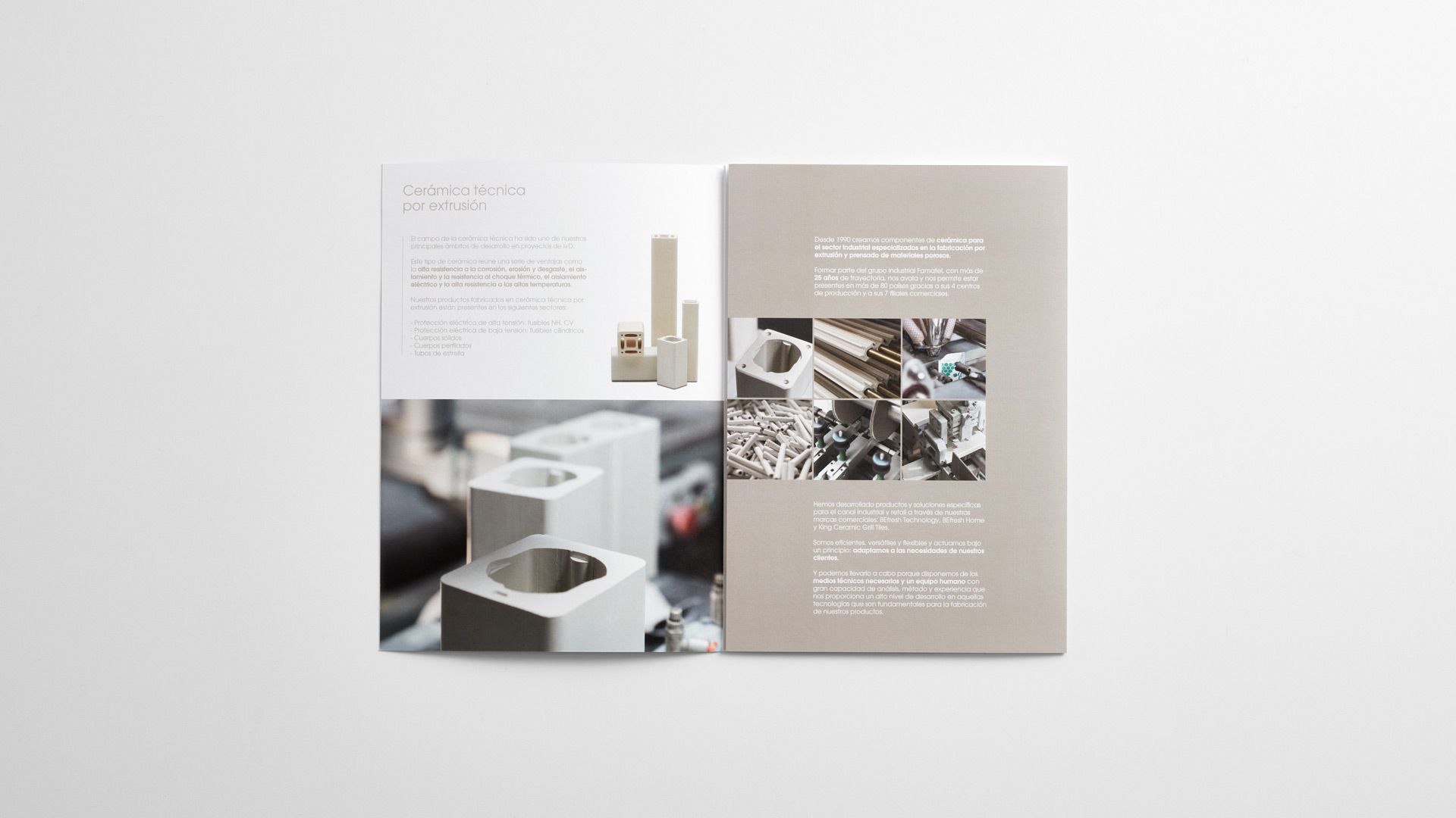
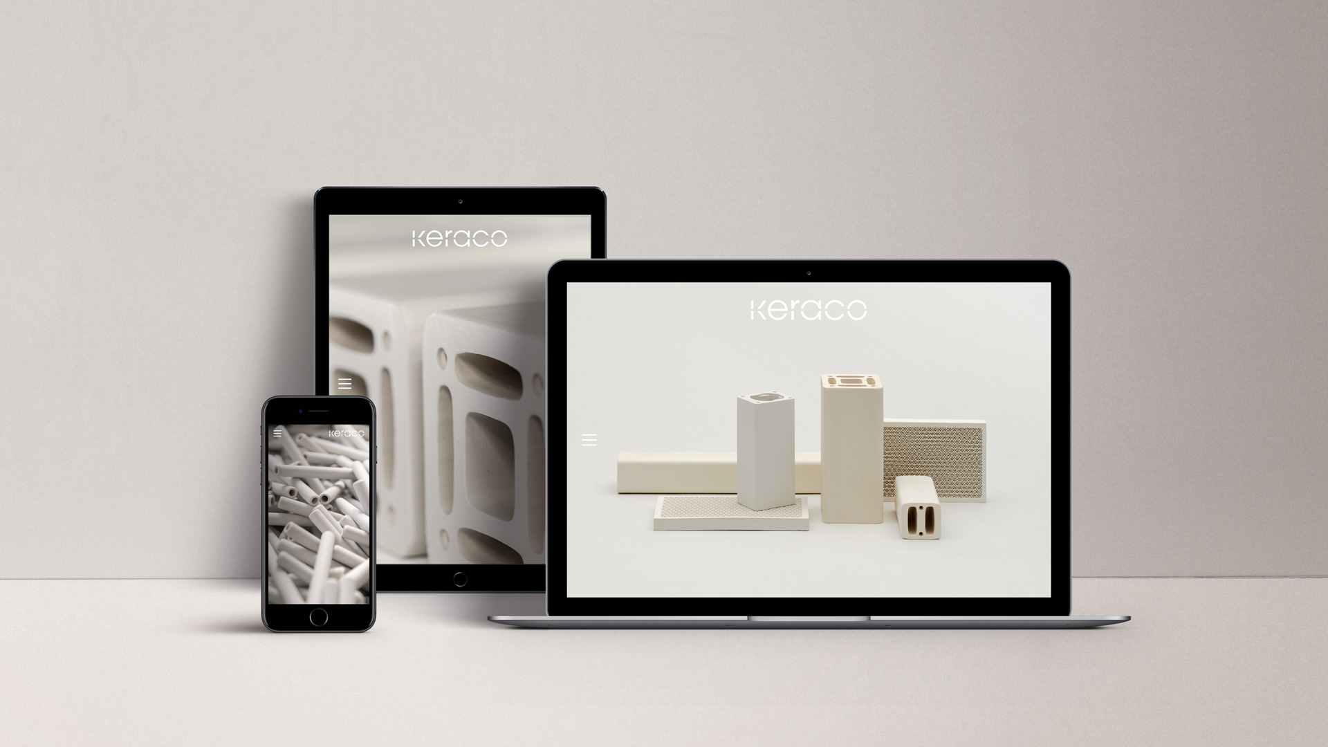
We have redesigned the corporate branding for Keraco Ceramic Technologies. Since 1990 the company has been manufacturing technical ceramic components for the industrial sector through extrusion and a pressing process of porous materials.
Process
A versatile branding that encapsulates the company’s corporate values
In order to kick off the branding development, as usual, we observed Keraco as a company and what mainly inspired us were the shapes, lines, textures and colours of the products and the quality of the used raw materials.
We chose to express the company’s identity through its corporate values – i.e. efficiency, versatility and flexibility – by using the rather geometric and elegant ITC Avant Garde typeface, which takes its inspiration from the German Bauhaus movement, formally solid, strong and clearly distinctive of modern design.
In addition, we have defined the firm’s very own colour palette, namely white and grey Pantone Black 6U, and developed graphic resources based on the company naming, specifically its K symbol, extracted from its logo, which allowed us to create a visual system.
Result
We’ve provided Keraco with a truly distinctive branding in its sector
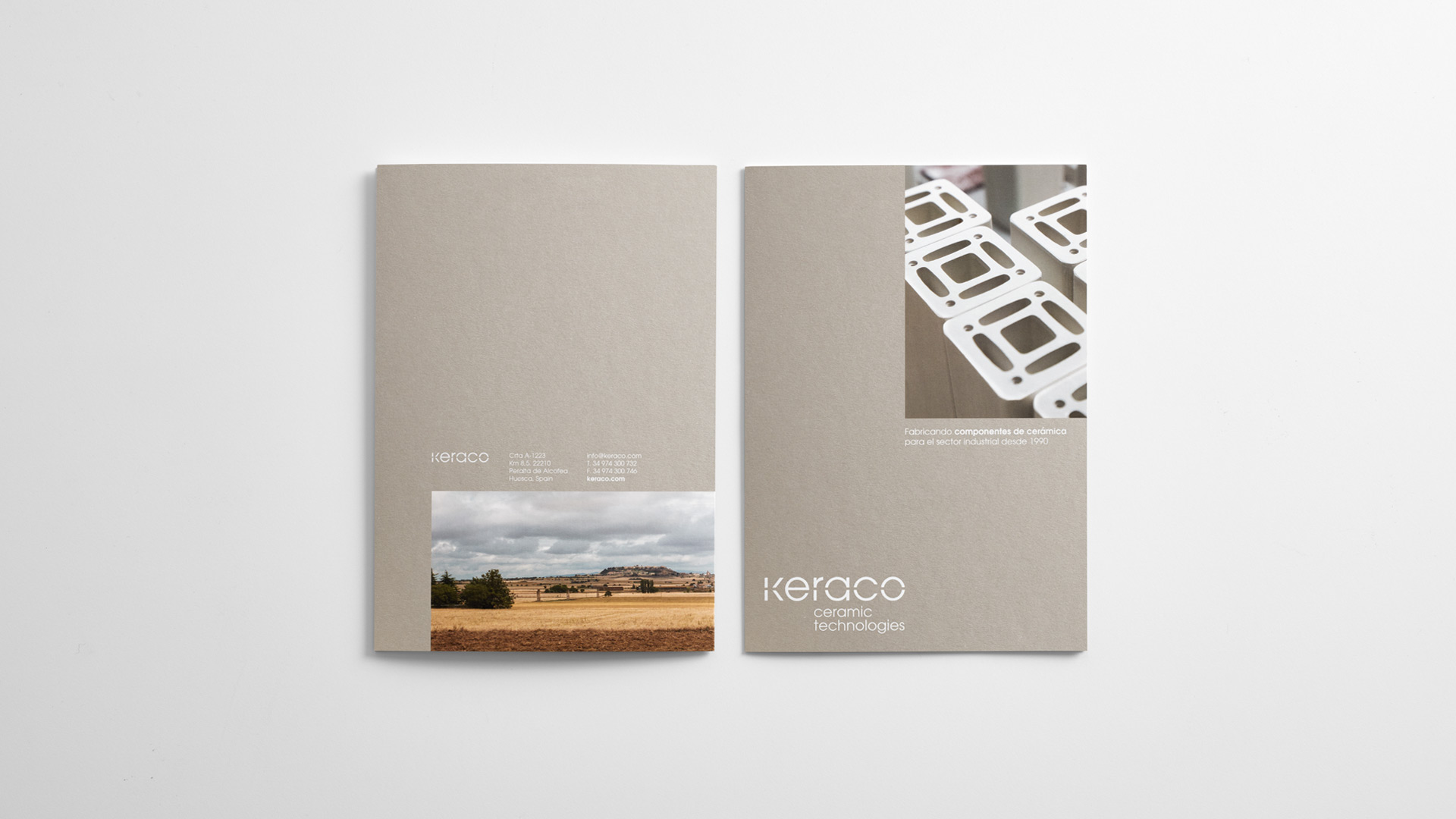
The versatility of Keraco’s identity has allowed us to apply it in all the corporate and communication materials, such as signage and website, among others. We thus provided the company with a distinctive, differentiating brand image within the overly rigorous industrial sector.
Tags: Corporate Branding
2019
More Projects