


Natwins
New packaging for Natwins that makes an impact at point of sale and reflects its evolving brand
Disruptive, differentiated packaging that communicates Natwins’ purpose and values to engage the more conscious consumer
Corporate Branding
Packaging Design

Challenge
Positioning Natwins on the shelves of major retailers alongside leading brands like Fontaneda and Lu
Since the beginning of our collaboration with Natwins by Girofibra in 2019 — a company based in La Garrotxa specialising in healthy biscuits and bars made from original recipes — we’ve supported the brand throughout its transformation process to gain greater visibility across all its channels.
During this time, we’ve redesigned its corporate branding to reflect its new purpose: to be bolder, more adventurous, and braver. We’ve also developed its digital communication and redesigned the packaging across its full product range.
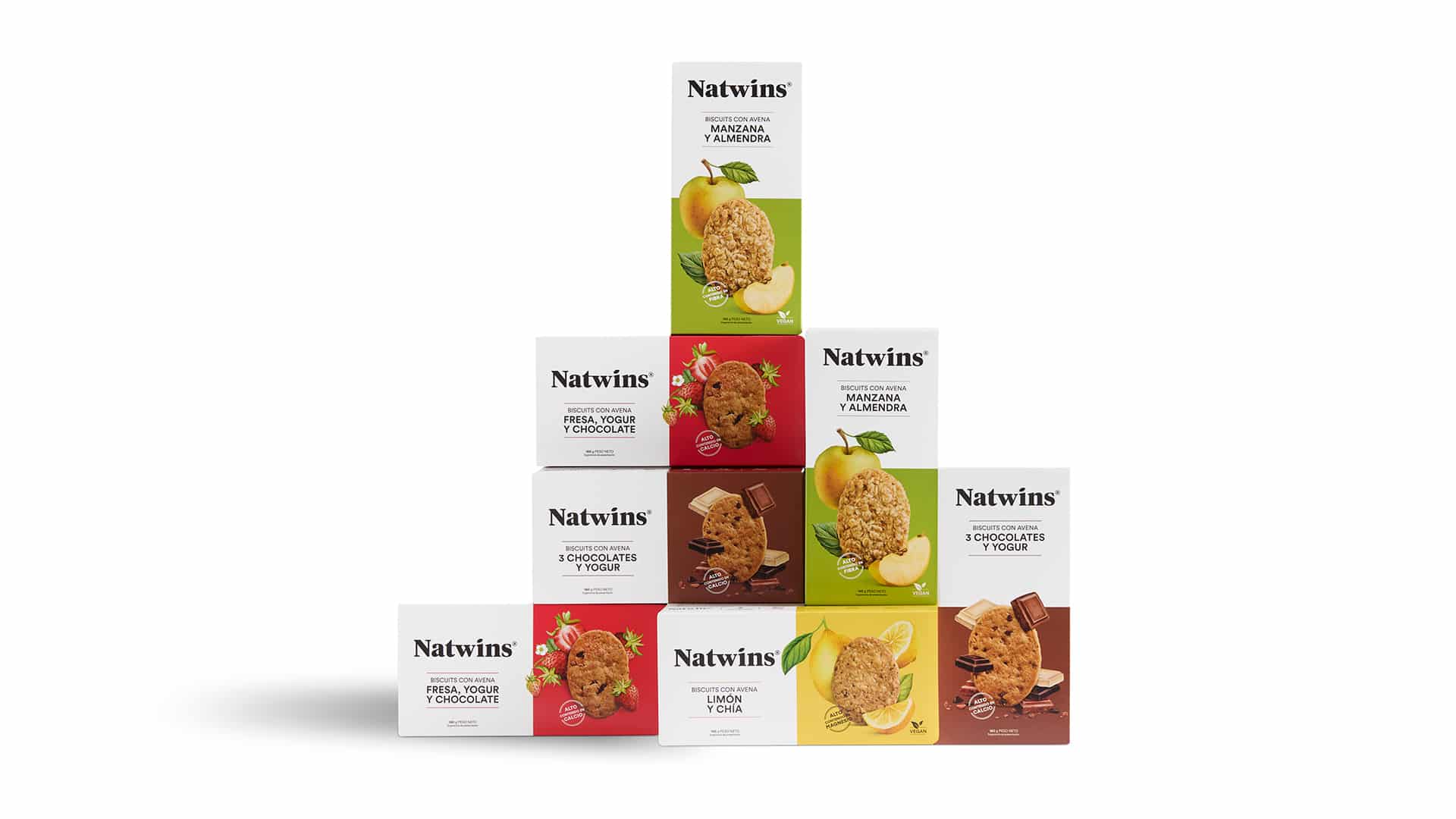
This year, we carried out a new project: applying its renewed visual identity and narrative to the 160g format.
A larger format that not only expands the product universe but also rises to the challenge of becoming a key piece in strengthening the brand’s positioning in-store — particularly on the shelves of major supermarkets — as a reference in tasty, healthy and balanced biscuits.
Result
A reversible pack that strengthens the positioning and brand identity of Natwins
The new 160g pack is much more than just packaging. It’s a tangible expression of Natwins’ strategic transformation. A brand that today presents itself as bolder, more adventurous, braver — and, above all, more visible.
We reinforced its market positioning and broadened its presence in major supermarkets alongside leading brands like Fontaneda and LU.
This new design complements the strategic work we began in 2019 with Girofibra — a company with over four decades of experience in producing healthy biscuits and bars with original recipes — to build a brand that is honest, approachable and forward-looking.
Today, Natwins products are exactly where they deserve to be: competing head-to-head with leading brands on the shelves.
Tags: Corporate Branding, Packaging Design
2025
More Projects