Grok
We created the Editorial Design for the 2020-21 Premium new releases catalogue
An Editorial Design that highlights Grok's lighting fixtures
Editorial design
Challenge
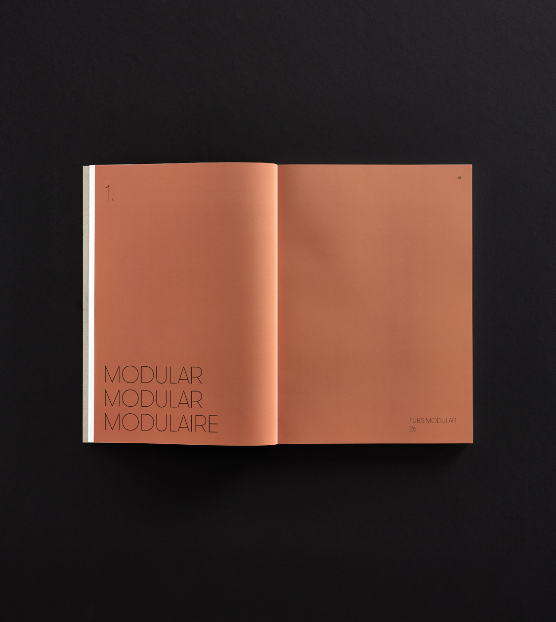
A new catalogue aligned with Grok’s branding, showcasing its extensive range of products
We have been designing and working on the layout for the newest Grok 2020-21 catalogue, following the corporate branding guidelines, which we developed at NOMON in 2017.
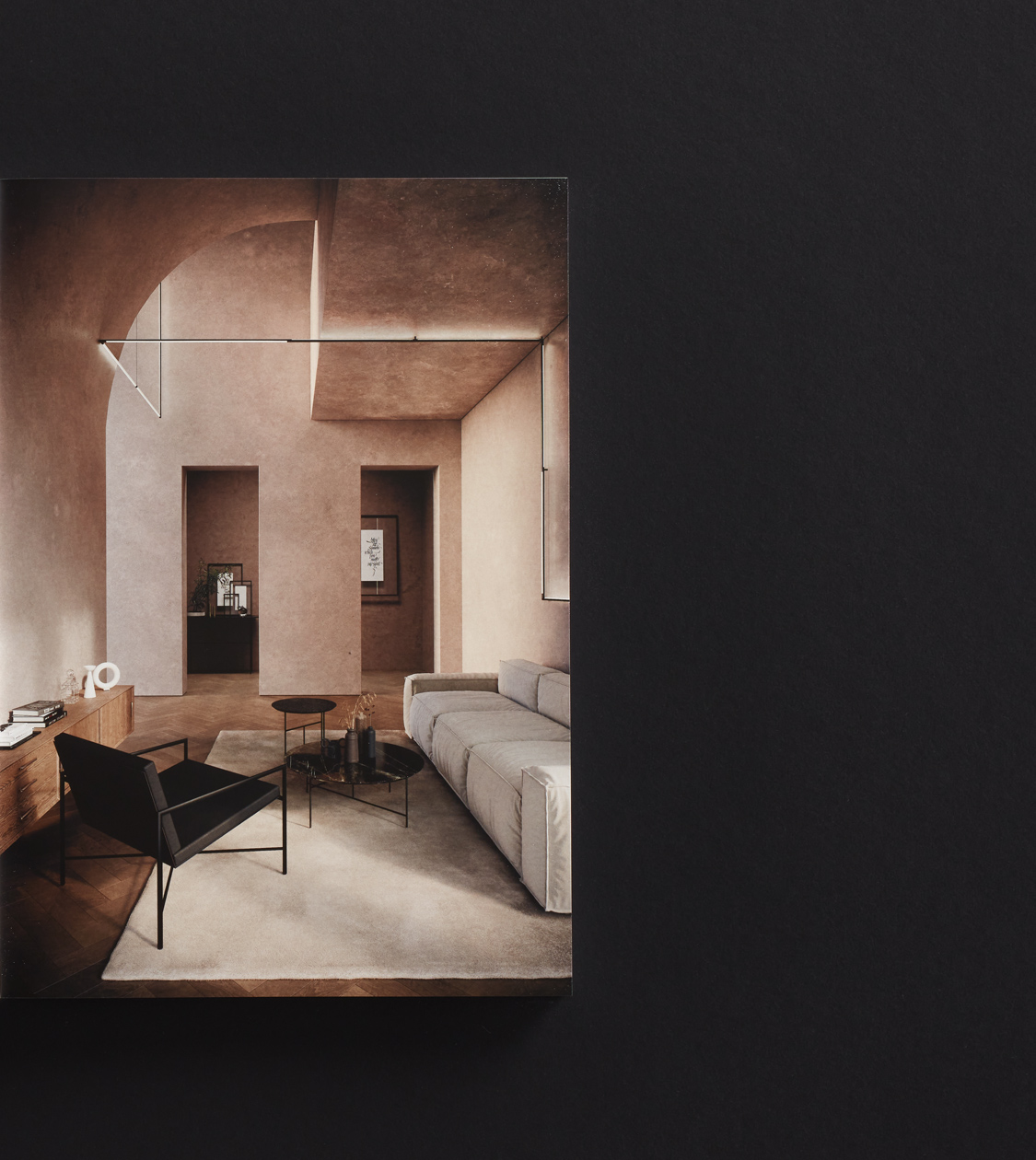
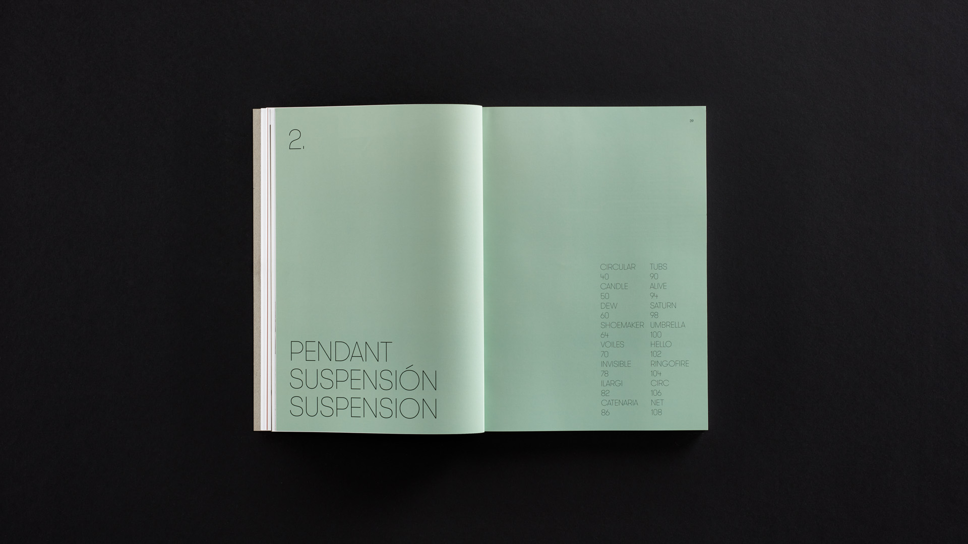
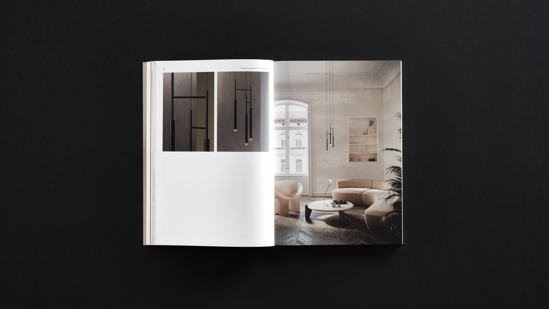
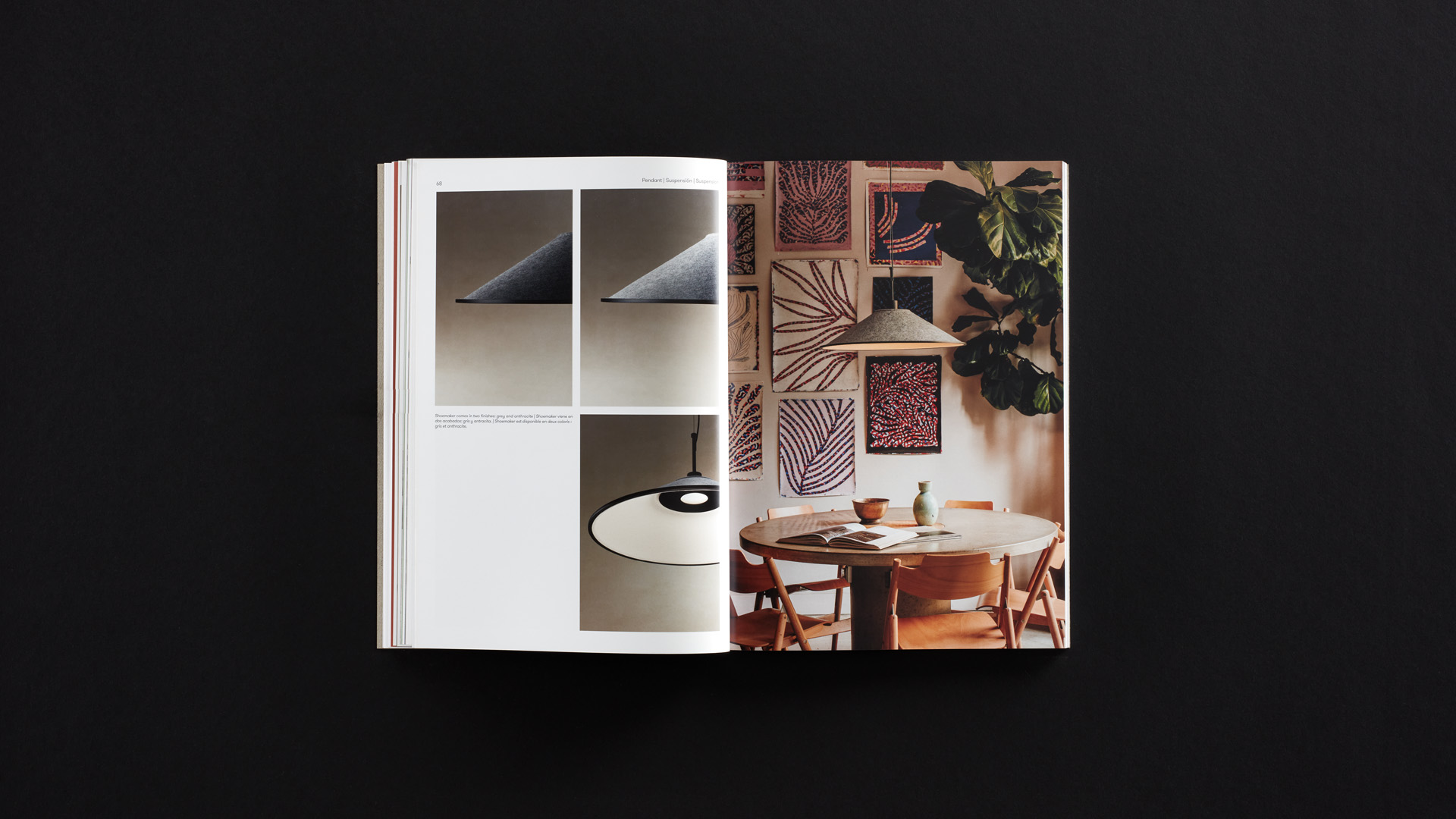
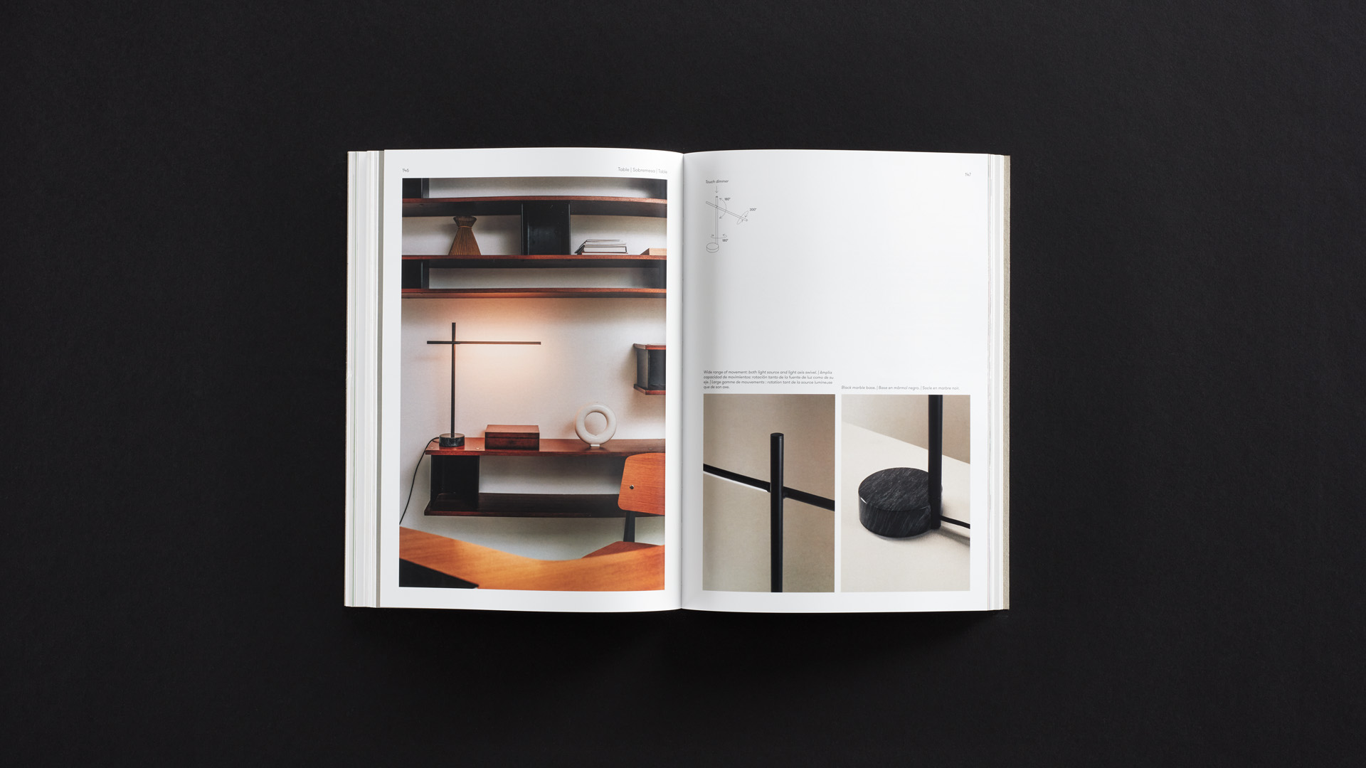
Our main challenge has been to ensure that, despite all the information and the different elements contained in the catalogue, the contents would still have plenty of breathing space, putting the luminaires and their photography in the forefront.
Process
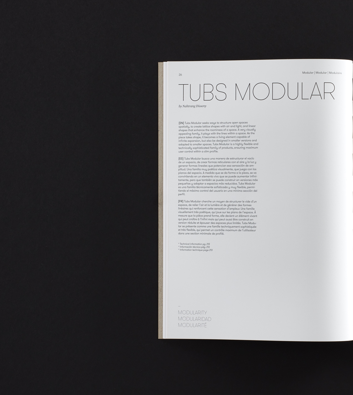
We defined and developed Grok’s Editorial Design from start to finish
Likewise, we have worked on an optimal categorisation of the collections and sub-products. We managed to have our art direction perfectly blend with the technical information, the descriptions and the corporate contents.
Aside from the design process, we also offered counsel for the actual production of the catalogue, advising and selecting the best finishes and materials which altogether have provided a highly relevant and qualitative result.
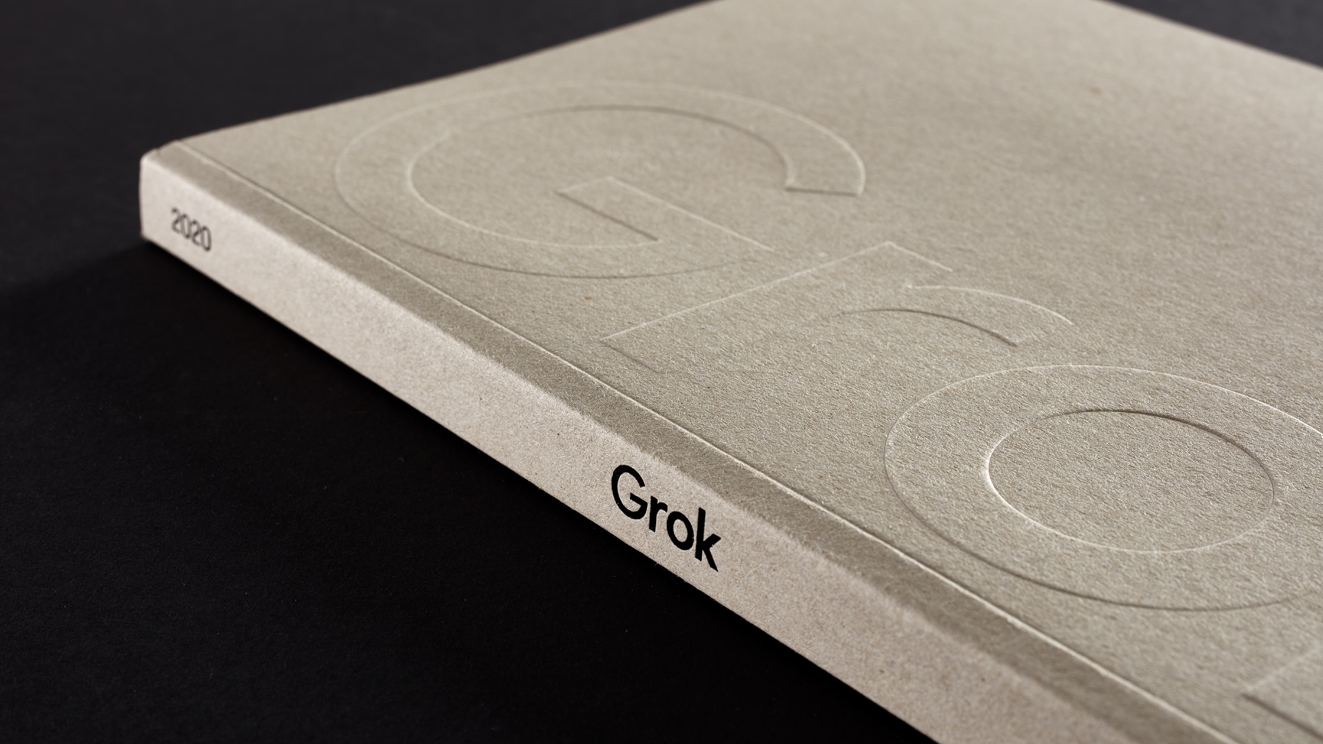
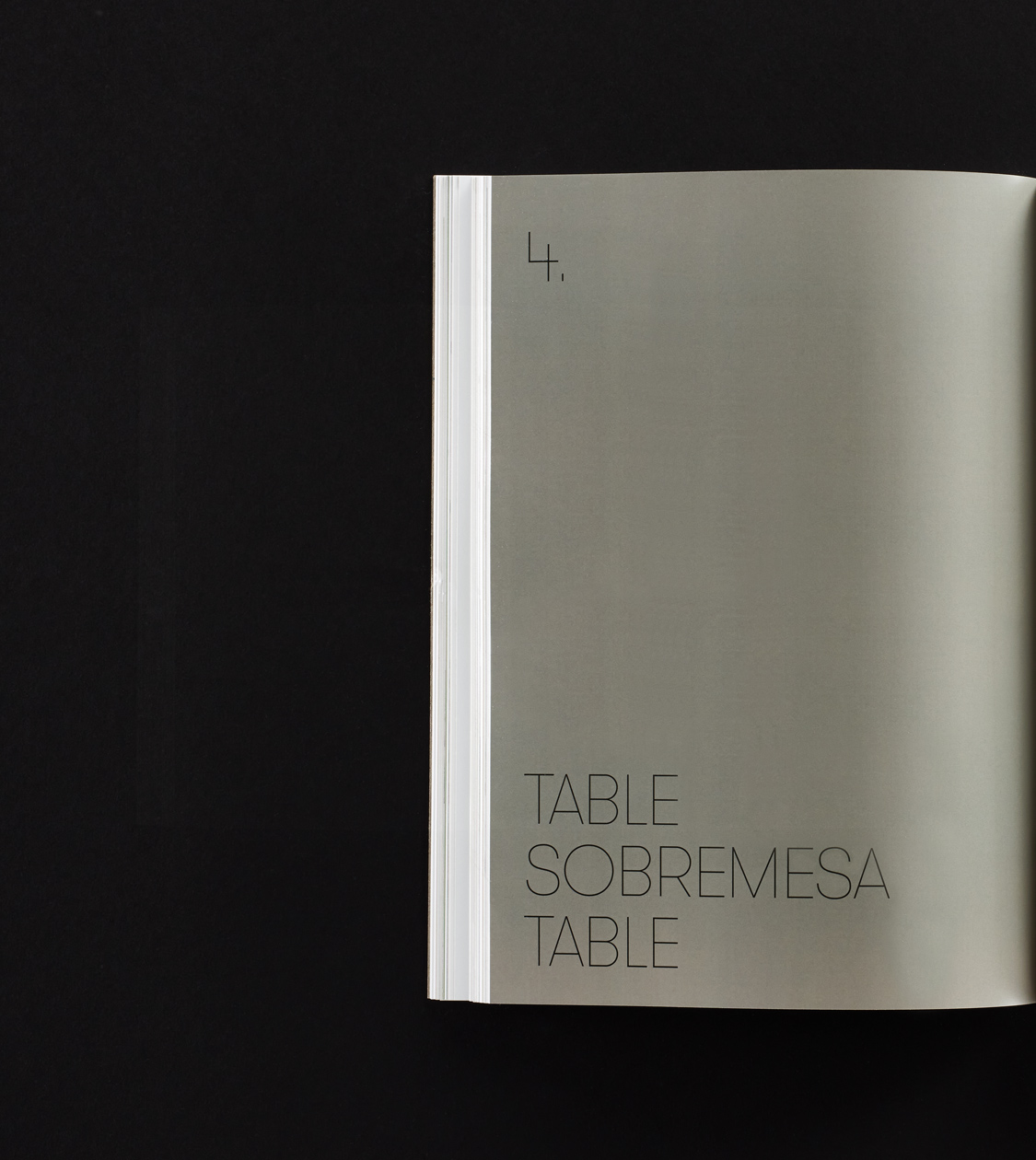
Along with Grok, we chose for the cover of the catalogue 100% recycled fibre paper which provides personality, proximity and warmth due to its textured finish.
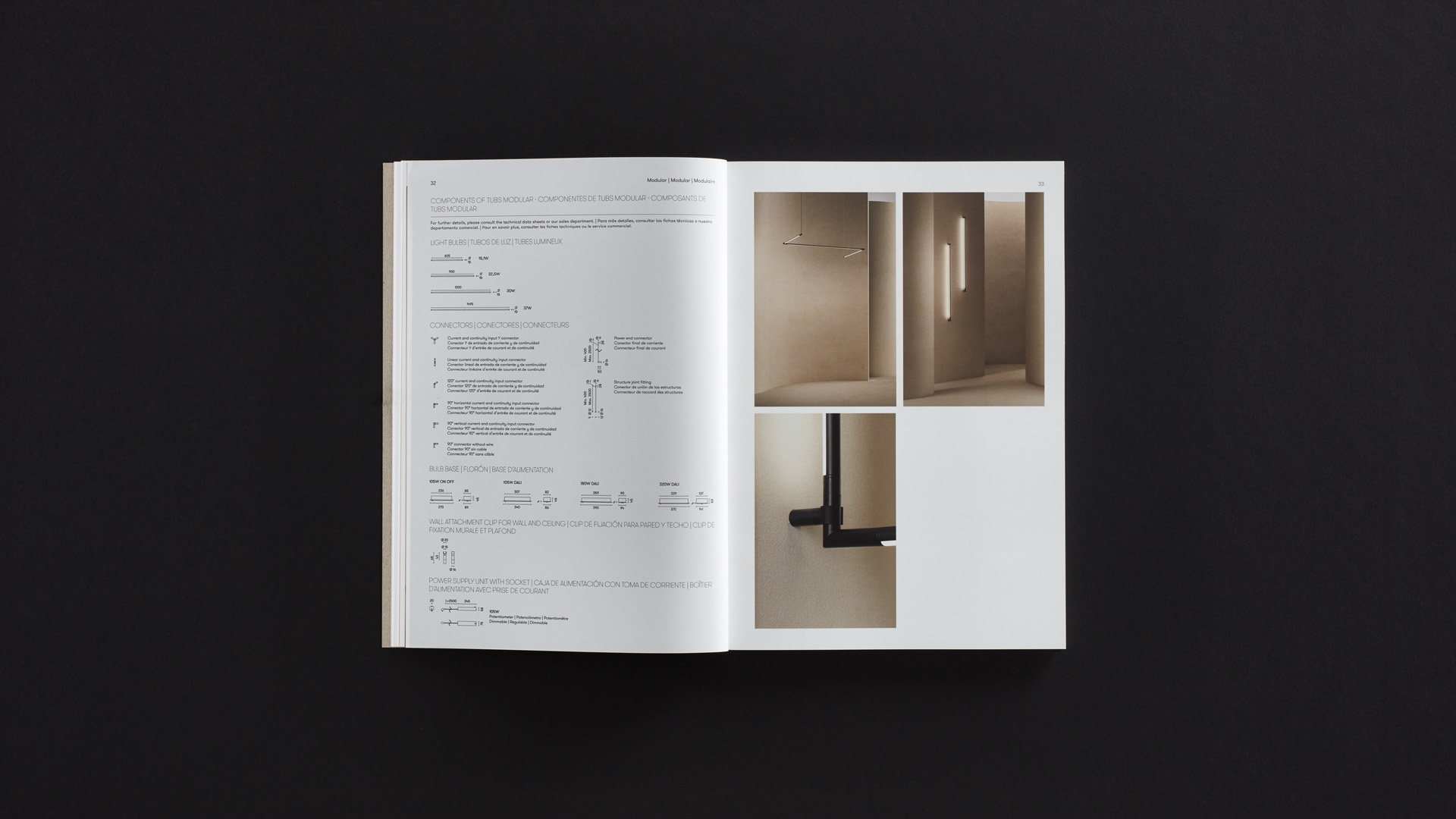
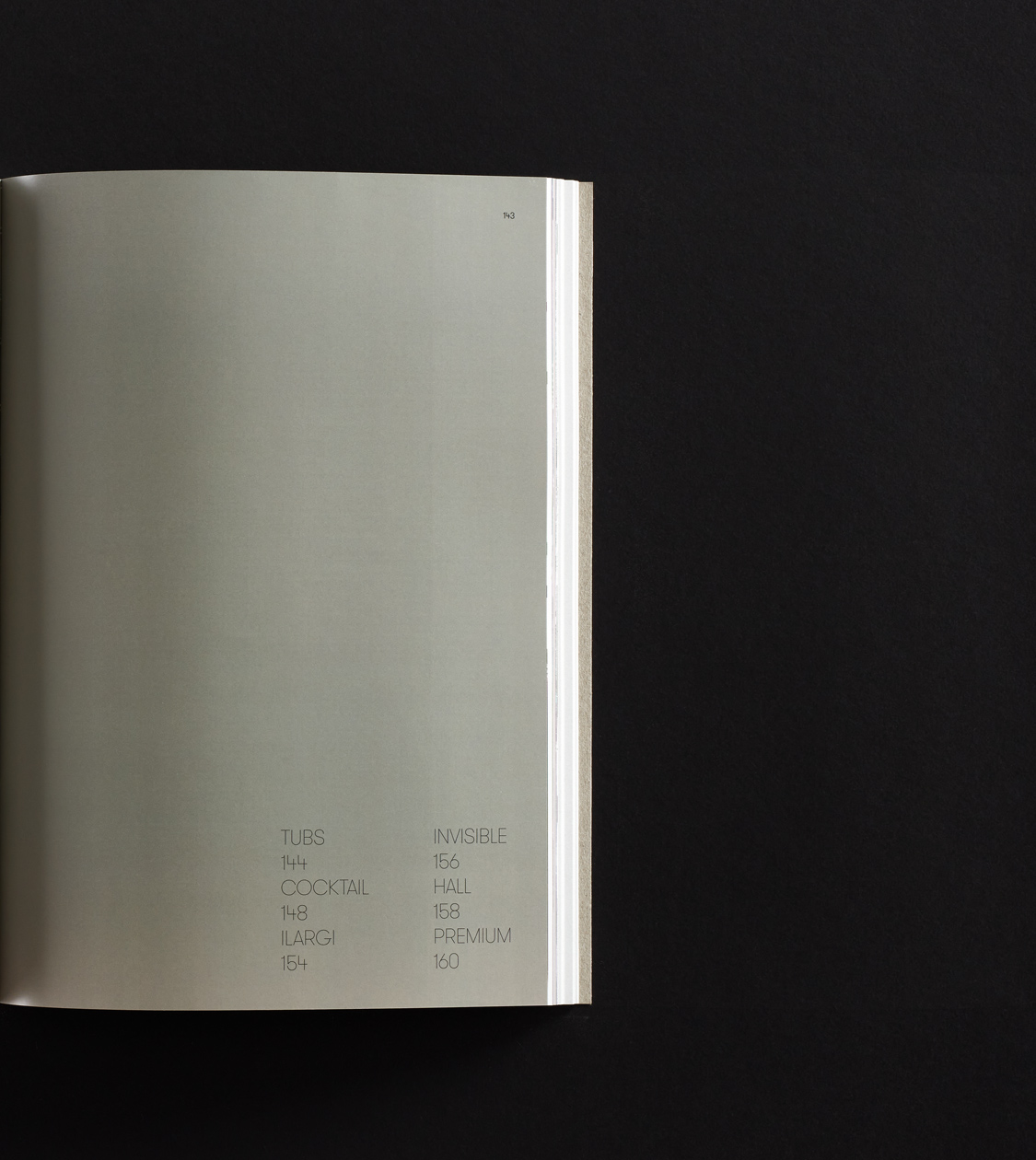
As for the interior pages, we thought that the best option would be a very white, matt, opaque, coated paper that would offer outstanding chromatic precision to show the photographs at its best.
Furthermore, for the pages printed with the technical information of the products, we opted for a high-quality recycled paper – which we had already used in Grok’s previous catalogue – allowing us to clearly differentiate the collections from the technical sheets.
As a result of our commitment to sustainability and our concern with the environment, which we share with our suppliers and customers, the production of Grok’s catalogue has been certified with the Eco-printed and PEFC labels.
Result
A Premium Editorial Design that captures Grok’s essence
The end result is a Premium catalogue that highlights the quality and design of luminaires, perfectly adjusted with the target audience, which also neatly represents the essence of Grok: striving to transform spaces and improve people’s well-being through light.
Design:
Nomon Design
Photography:
Jordi Anguera
Jordi Balcells
Albert Font
Salva López
Jordi Miralles
Santi de Pablo
Marçal Vaquer
3D Renders:
Alga Studio
Visualizers
Printing:
CEGE
Tags: Editorial design
2020
More Projects

