The collaboration between Kriskadecor and Nomon Design, on the process of analysing and redefining the brand and sharing values such as creativity and innovation, have been key to obtaining a new versatile identity with personality.
Kriskadecor
A new corporate identity upholding Kriskadecor’s tradition
We redesigned their corporate identity to strengthen their presence in the Interior Design and Architecture Sector
Corporate Branding
An identity that connects for Kriskadecor
Nomon Design began working with Kriskadecor in 2015, to reposition and redesign their corporate identity in order to update it in line with their business situation and position themselves in the sector as an aspirational design brand.

Challenge
Una identidad versátil y con personalidad para posicionar a la compañía como una marca de diseño aspiracional
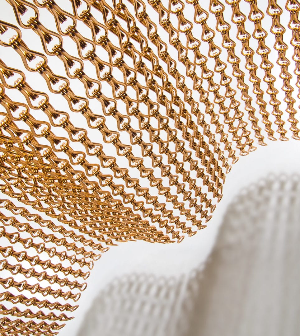
Kriskadecor is a family business, established in 1926, which crafts and manufactures metal structures using small anodised aluminium links, a truly lightweight and versatile metallic material that offers multiple design options to interior design and architecture professionals.
Currently run by the third generation of the Sans family, in recent years they have opened up to the international market, positioning themselves as a benchmark of European design and working with the most renowned designers and architects, and on top-level projects.
The company has also diversified production with new solutions for walls, ceilings, façades and other completely customised structures, as well as decoration and lighting elements, such as lamps and folding screens.
All the changes the company has undergone required a new corporate identity to help consolidate this new positioning and reflect the new possibilities for their small links in design projects for architects and interior designers, but without losing sight of the essence of the company.
Process
Through collaborative efforts, we redefined their values and mission, and presented a new corporate image
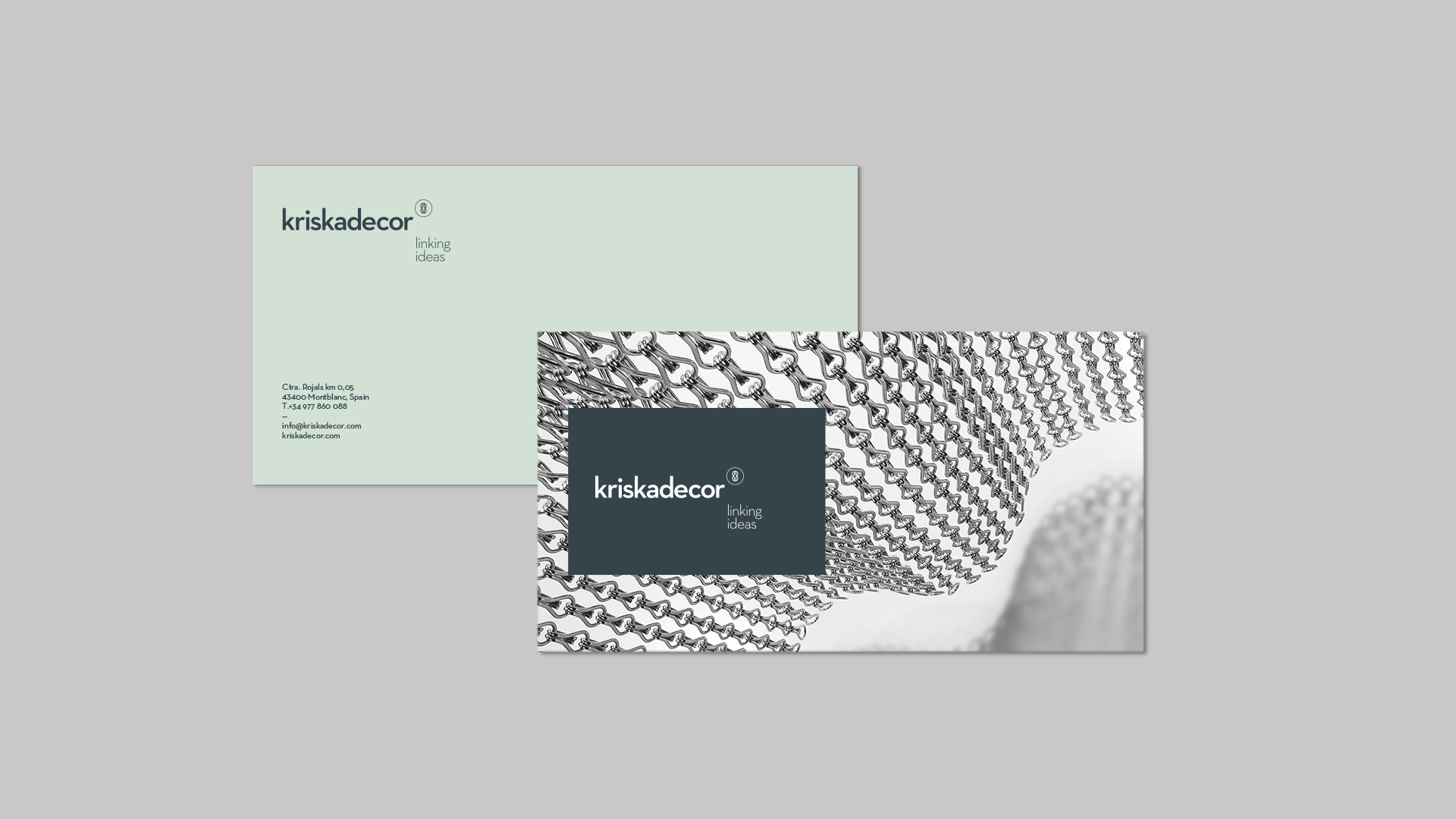
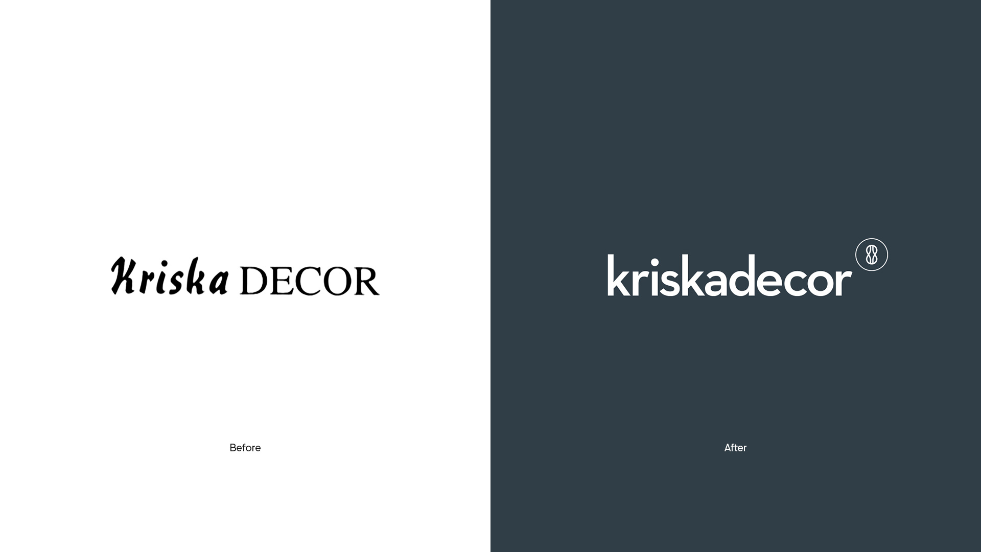
Working with Nomon Design, Kriskadecor’s brand values and company mission were defined, and the corporate logo was relaunched. The new design placed the name of the brand on one level to avoid confusion, using geometric typography with balanced, simple and timeless shapes to convey precision and rhythm.
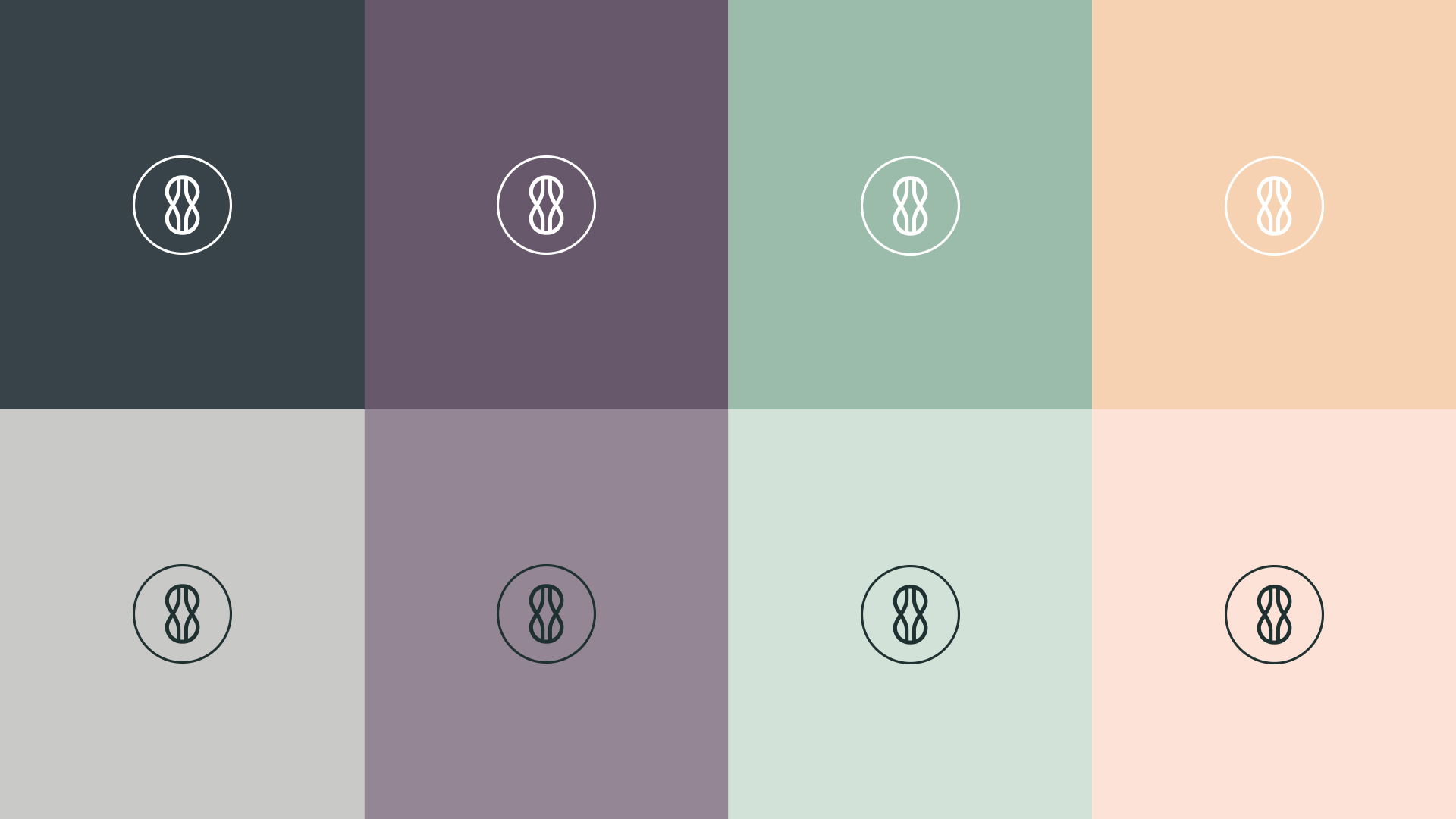
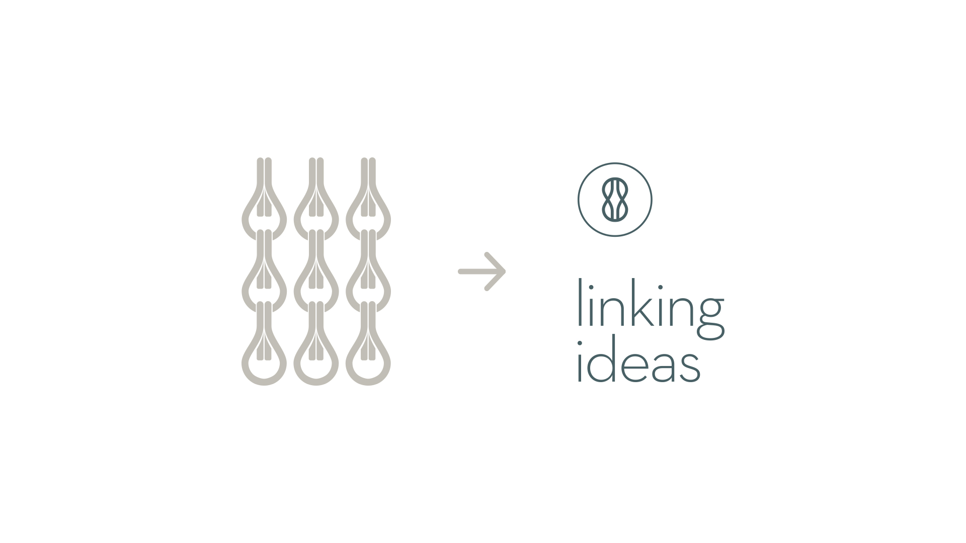
A new symbol was also added, inspired by the essence and the raison d’etre of the company, created by intertwining two small links to symbolise an infinite connection.
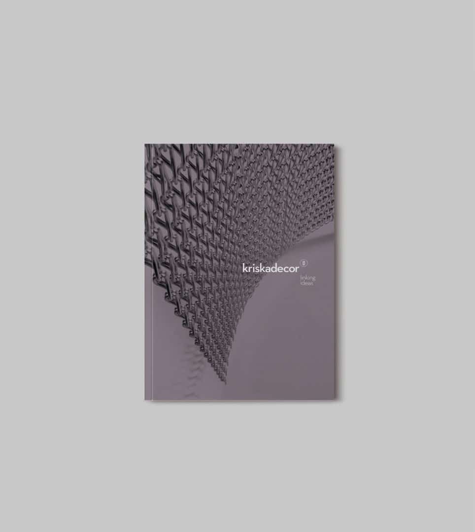
The unusual placing of the new symbol and the new tagline, “Linking ideas”, bring the whole image together with originality. The new, more personal and aspirational tagline is a play on words between the literal meaning of physically joining the links and a more poetic sense of linking ideas with reality by bringing customers’ wishes to fruition.
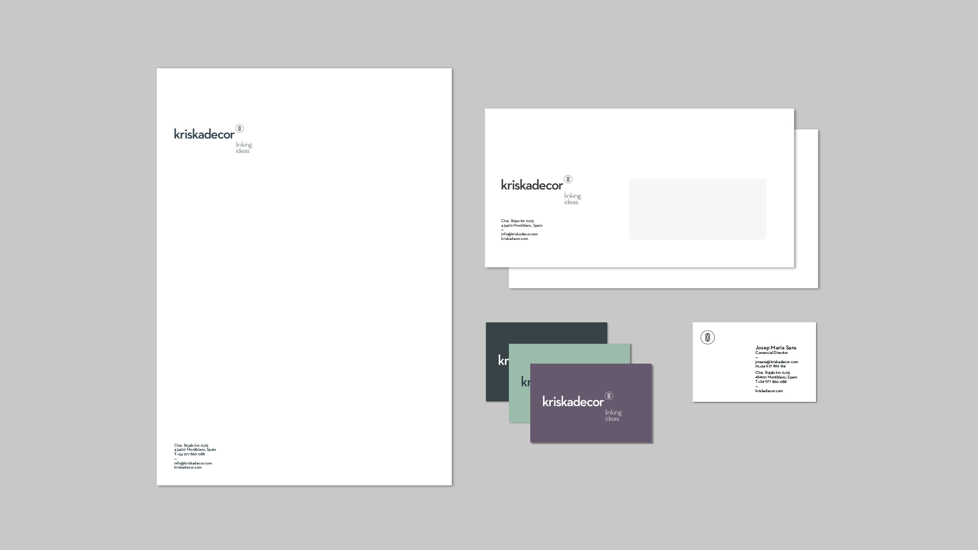
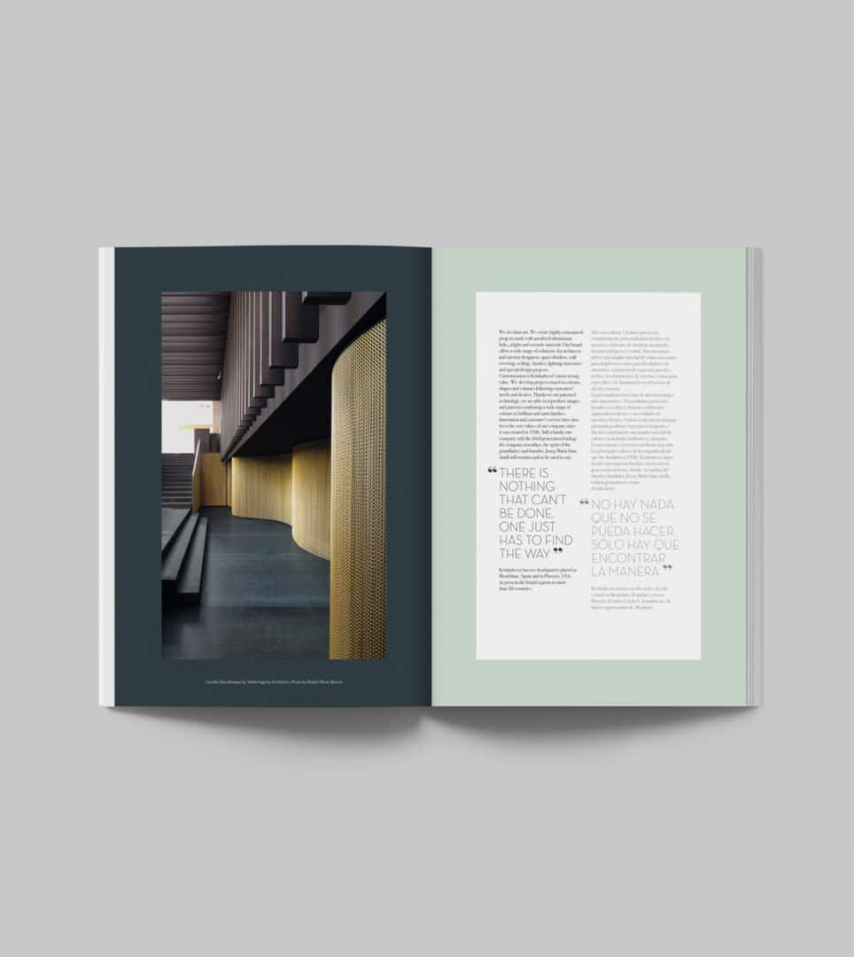
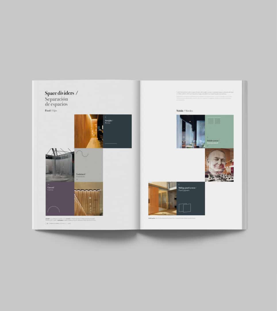
In addition, a new functional and Premium colour range was chosen for the design of their corporate stationery, samples and communications materials.
Result
The new identity firmly establishes the company in its fresh positioning, while preserving its essence and purpose
The new and refreshing corporate identity has helped consolidate Kriskadecor as a design brand, with a more powerful image and personality, but with the same essence of the company’s more than 90 years’ experience.
Tags: Corporate Branding
2016
More Projects
