Mescladís
We repositioned the Mescladís brand: more opportunities, more inclusion, more impact
The new branding improves the recognition and perception of Mescladís, strengthening its community
Branding Strategy
Corporate Branding
Editorial Design
Communication
Digital Communication
Challenge
Redefining Mescladís’ identity to amplify its social impact
We first encountered Mescladís in 2023 at Blanquerna’s Social Action Lab (FCRI), a space that, since 2017, has allowed us to collaborate with social organisations and contribute our expertise to transformative projects.
From the outset, the connection was immediate. What initially began as a brief collaboration soon evolved into an opportunity to lead a brand transformation for the organisation.
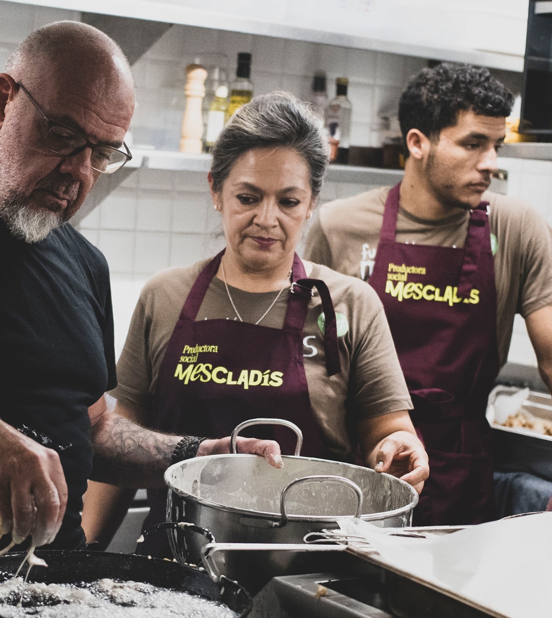
Mescladís is a social organisation that, since 2005, has become a model and reference point for dignified migration rights and the social and solidarity economy. Over the years, thanks to the commitment and dynamism of its founder, Martín Habiague, the organisation has expanded rapidly, driving multiple initiatives: restaurants, catering, training programmes, and employment schemes.
However, their brand failed to reflect or communicate their growth and social impact effectively, limiting their ability to convey their mission, values, and the people behind this meaningful project.
The organisation presented us with the challenge of rethinking their identity and strengthening their presence as a benchmark in inclusion, training, and sustainability through gastronomy. The objective was to review the branding strategy to align with the organisation’s new reality and its 2030 business plan.
Process
Streamlining strategy, branding, and communication to enhance brand perception
We began with a thorough observation and analysis phase, identifying the needs and opportunities within the Mescladís ecosystem. We conducted a benchmark study of their various areas of operation—restaurants, catering, training, employment, and awareness-raising—while also identifying similar initiatives by other social entities, as well as cultural projects, hotels, consultancies, and other relevant organisations.
This phase revealed a key differentiator: Mescladís unites all its initiatives under one brand.
To deepen our understanding, we interviewed key audiences: the internal team, beneficiaries (students of their courses), collaborators (suppliers, entities, etc.), society at large, and neighbours. We also utilised the NOMON TEST to visually evaluate internal brand perception.
The insights confirmed what we had sensed: Mescladís has a clear purpose—creating opportunities for individuals at risk of social exclusion through sustainable gastronomy—with a direct message that emotionally connects with people.
Considering their 2030 business plan, we reviewed and redefined their branding strategy around three key pillars: brand architecture, mission, vision, and values, and verbal identity.
– We designed a circular brand architecture to organise their business areas (restaurants, catering, training, employment, cultural events) in alignment with their business plan. This approach not only ensures cohesive, structured management but also opens the door to sustainable growth.
This new brand architecture became the cornerstone of the project, defining and guiding all subsequent efforts.
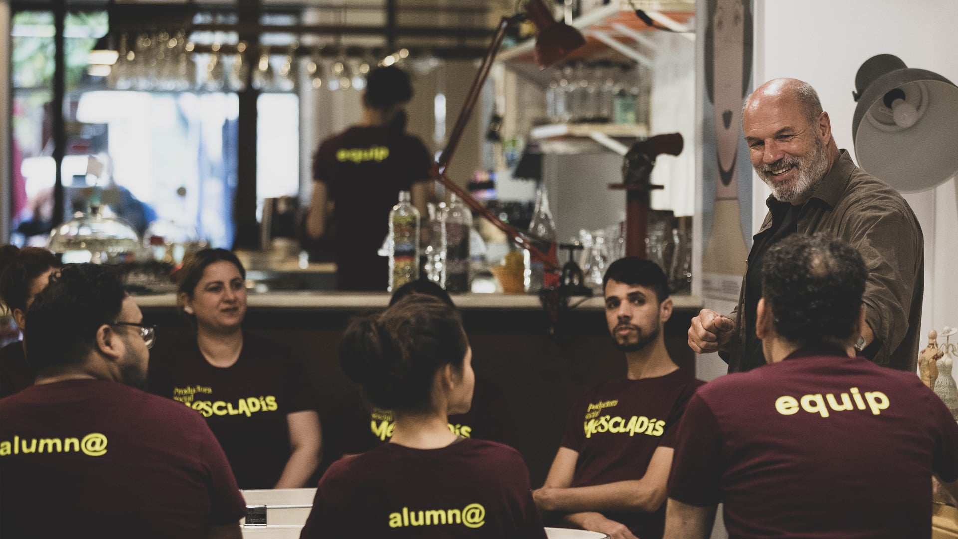
Recognising that Mescladís is much more than a social organisation—acting as a driver of change across various domains—we proposed renaming it a “social producer.” This new designation more accurately reflects their role in generating opportunities for those at risk of social exclusion.
We also renamed their areas of operation to highlight their purpose: producer of knowledge (training), producer of experiences (restaurants, catering), producer of employment (job programmes), producer of culture (awareness), and producer of products.
This new architecture gave Mescladís a unique identity and a solid corporate narrative, reinforcing their essence and transformative mission.
– Building on the new architecture and designation, we revisited their mission, vision, and values. The proposal emphasised the values of coexistence, talent, sustainable gastronomy, and the autonomy they provide to individuals, while highlighting the role of gastronomy as a tool for inclusion and social change.
– We defined a new verbal identity with storytelling centred on 20 years of creating opportunities and the transformative impact of dignified migration.
Additionally, we reformulated their descriptor to ensure their message resonates clearly and concisely with diverse audiences.
Their corporate tagline encapsulates their essence: A Mescladís of opportunities.
Following the verbal identity phase, we redesigned their branding and visual communication.
We developed a visual concept based on “collage,” representing everything Mescladís stands for: inclusion, opportunities, identity, empathy, personal growth, synergies, gastronomy, diversity, local resources, and the future.
From this concept, we created a new identity featuring a blend of typefaces—Exposit, ITC Garamond Std, and Fellix—and established a typographic system with clear visual hierarchy.
For the names of the producers (areas) and sub-brands, we chose ITC Garamond Std for its versatility and contemporary style. This same typeface is used for headlines and key elements in offline communication, while Instrument Serif was selected for digital formats due to its adaptability across weights and formats.
For secondary fonts, we used Untitled Sans for offline communication and Manrope for digital, both chosen for their functionality, clarity, and adaptability.
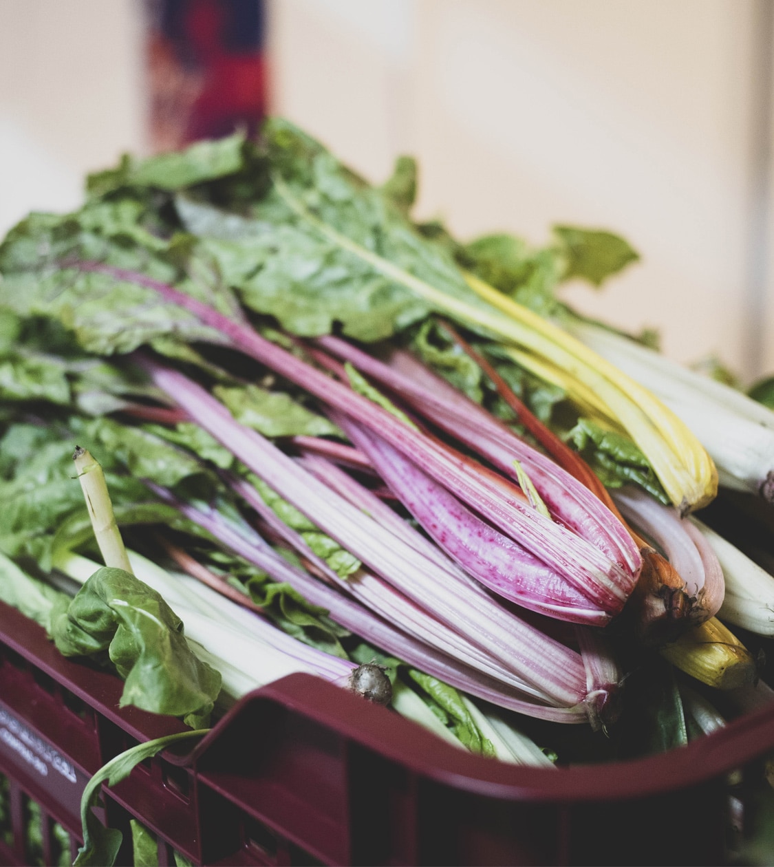
We also developed a colour palette inspired by the hues of various foods: chocolate, lime, kale, kiwi, tuna, blueberry, mandarin, cabbage, water, and strawberry. These colours evoke diversity and freshness, with specific colours assigned to each sub-brand for differentiation and a unique identity.
The art direction was guided by the authenticity of the people behind Mescladís, using natural, unfiltered images with natural light, slight blurring, and a candid style—avoiding staged or exaggerated elements.
Once the rebranding was completed, we implemented the new corporate image on their website, which brings together all of Mescladís’ producers and their associated activities.
Beyond applying the branding graphically, we aimed to define a clear UX structure compatible with the sub-brands and extensive content, with a narrative aligned to their new positioning, reinforcing the concept of “cooking opportunities.”
Finally, we implemented the new branding across all corporate communication materials, both print and digital.
Result
A new positioning and branding that strengthens Mescladís’ social mission and growth
For us, working with Mescladís has been more than a project. It has been a testament to how strategy and design can amplify the power of a mission and transform a brand into a true driver of change.
With this new branding, Mescladís is positioned as a unique and recognised “social producer,” not only for their commitment to dignified migration but also for their ability to build bridges and foster community through gastronomy.
Thanks to their new positioning and identity, we improved their brand perception, visibility, and recognition locally and nationally, fostering a stronger connection with beneficiaries and collaborators.
With a unique and authentic message, Mescladís can continue cooking opportunities for those who need it most, impacting more lives and territories.
More Projects