


Natwins
New packaging for Natwins that makes an impact at point of sale and reflects its evolving brand
Disruptive, differentiated packaging that communicates Natwins’ purpose and values to engage the more conscious consumer
Corporate Branding
Packaging Design

Challenge
Positioning Natwins on the shelves of major retailers alongside leading brands like Fontaneda and Lu
Since the beginning of our collaboration with Natwins by Girofibra in 2019 — a company based in La Garrotxa specialising in healthy biscuits and bars made from original recipes — we’ve supported the brand throughout its transformation process to gain greater visibility across all its channels.
During this time, we’ve redesigned its corporate branding to reflect its new purpose: to be bolder, more adventurous, and braver. We’ve also developed its digital communication and redesigned the packaging across its full product range.
This year, we carried out a new project: applying its renewed visual identity and narrative to the 160g format.
A larger format that not only expands the product universe but also rises to the challenge of becoming a key piece in strengthening the brand’s positioning in-store — particularly on the shelves of major supermarkets — as a reference in tasty, healthy and balanced biscuits.
Process
A packaging design for Natwins with more presence, more versatility and more storytelling
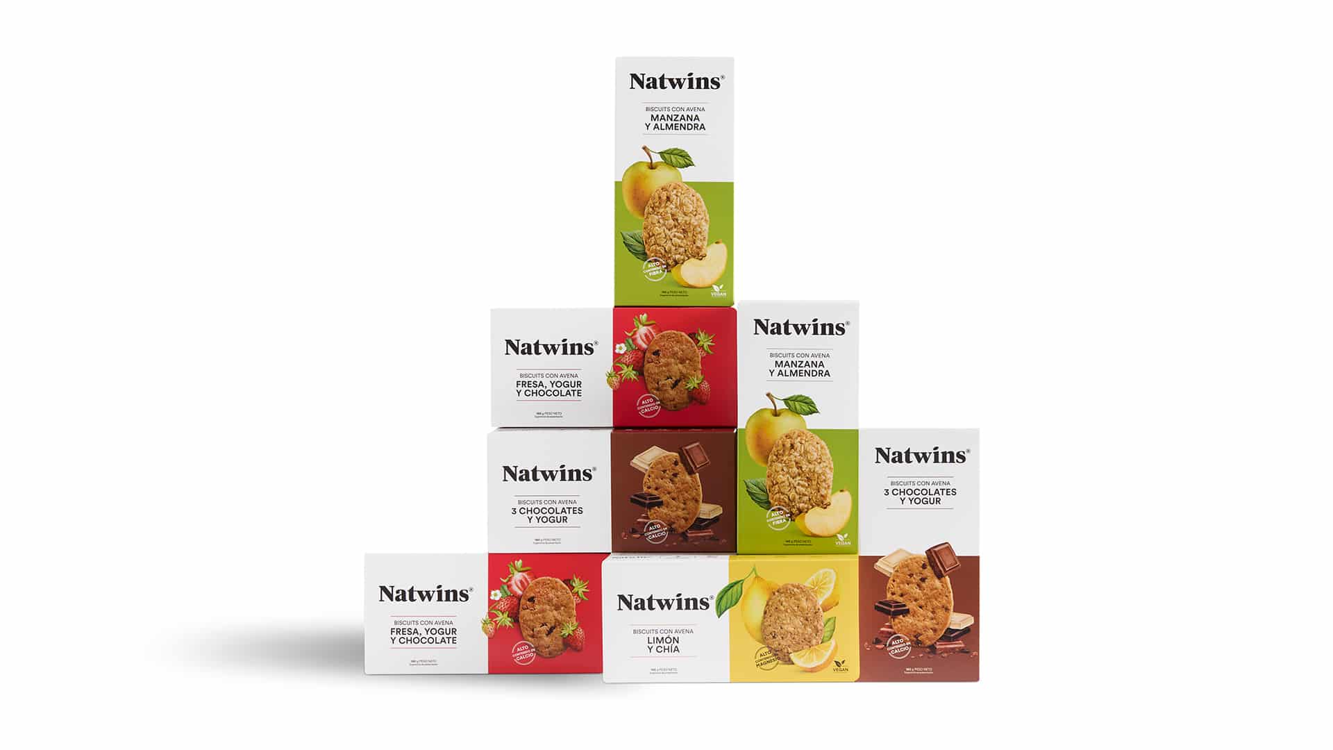
To stand out at the point of sale, we went for a modular, versatile design in which each original recipe has its own colour universe.
Realistic watercolour illustrations — created especially for this project — convey the craftsmanship of the production process. Together with food photography and an energetic colour palette, they form an authentic and clearly distinctive visual system.
Each pack communicates the company’s commitment: that consumers can “enjoy the flavours of our products at any time of day while taking care of their health.”
This new format gave us the opportunity to break the mould. The 160g packaging was designed with a reversible format, with two main faces — one horizontal and one vertical — increasing its visibility options on shelf.
We moved away from the traditional front-facing window in favour of a more visual and appetising approach. The biscuit photography takes centre stage and sits alongside the ingredient illustrations, creating a visual narrative that is both appetising and authentic.
We maintained coherence with the rest of the brand’s packaging range, while elevating its visual impact and shelf differentiation. This pack became a key element in reinforcing Natwins’ visual universe and positioning as a leading brand in healthy biscuits with original recipes.
Result
A reversible pack that strengthens the positioning and brand identity of Natwins
The new 160g pack is much more than just packaging. It’s a tangible expression of Natwins’ strategic transformation. A brand that today presents itself as bolder, more adventurous, braver — and, above all, more visible.
We reinforced its market positioning and broadened its presence in major supermarkets alongside leading brands like Fontaneda and LU.
This new design complements the strategic work we began in 2019 with Girofibra — a company with over four decades of experience in producing healthy biscuits and bars with original recipes — to build a brand that is honest, approachable and forward-looking.
Today, Natwins products are exactly where they deserve to be: competing head-to-head with leading brands on the shelves.
Tags: Corporate Branding, Packaging Design
2025
More Projects