Espigoladors
Crafting socially impactful packaging for the im-perfect® brand
Branding and packaging that celebrates the beauty of imperfection
Packaging Design
Challenge
Four years conceptualizing and designing packaging and communication infused with Espigoladors’ values
In 2015 we started working with Espigoladors, a non-profit foundation which has been fighting food waste since 2014, while it also empowers people who are at risk of social exclusion, in a transformative, participatory, inclusive and sustainable way.
We continued collaborating with Espigoladors and its trademark es im-perfect® for 4 years. We carried on designing packaging and developing communication using concepts with significant social values and impact, both in marketing campaigns and in campaigns alongside all kinds of private companies (Christmas gifts, personalised packs, preservation recipe books, etc.)
Process
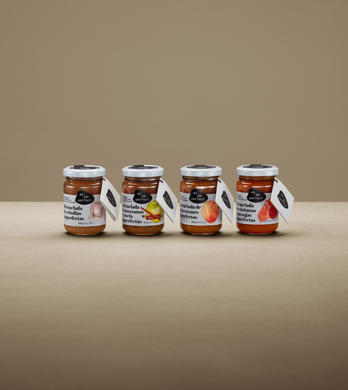
Integrating the new corporate branding into the design of their product packaging
But it is during the past year that we carried out the most important intervention to help the foundation communicate its products: we redesigned the logo, in line with the corporate identity that we had initially created for their trademark es im-perfect®.
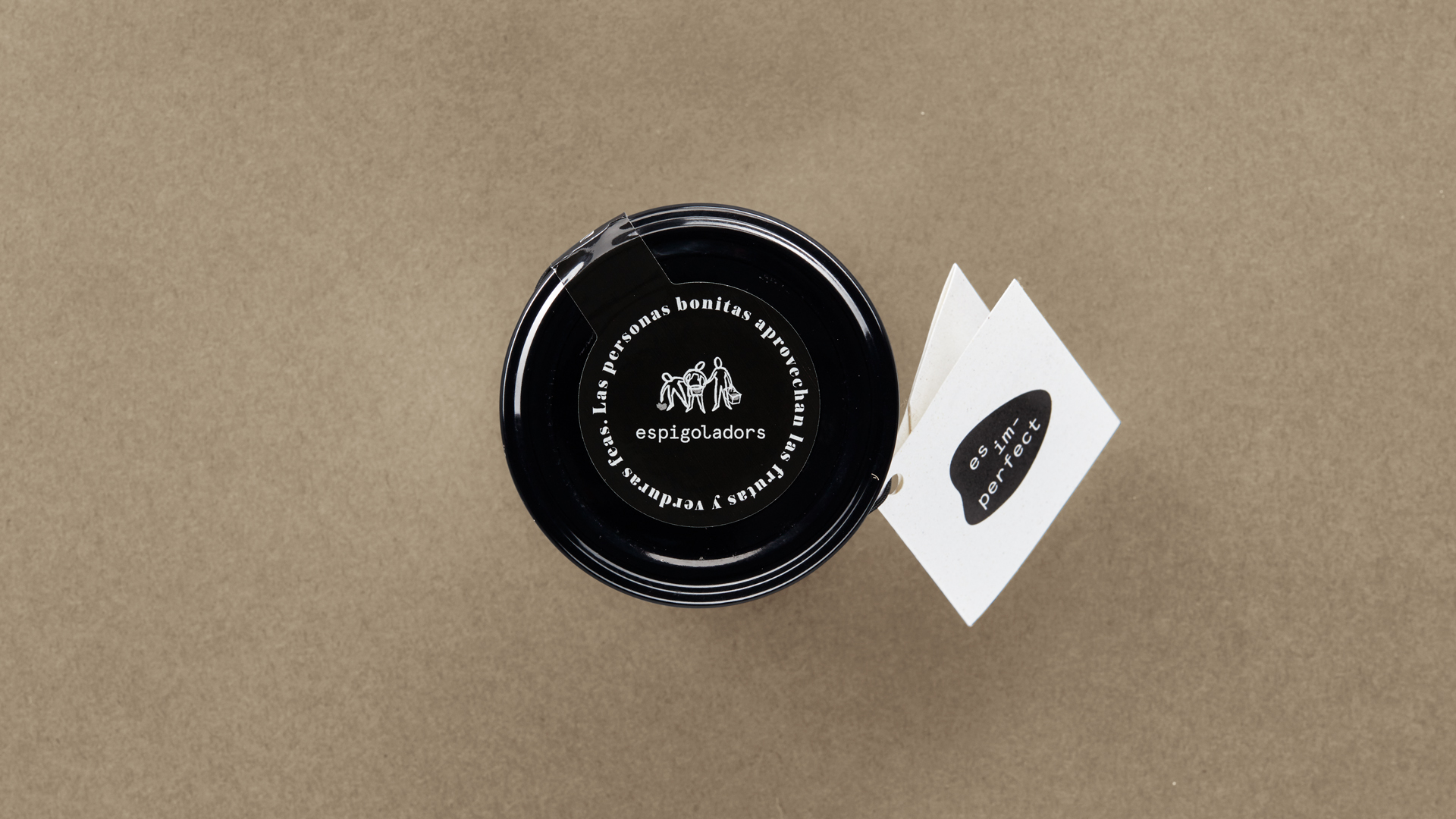
In both cases, we chose a typeface with simple lines while, chromatically, we suggested the colour black as a representation of the gourmet sector. For the brand identity of Espigoladors, we opted to continue with a slightly updated illustration of the harvesters, which had accompanied the brand and represented it since the beginning.
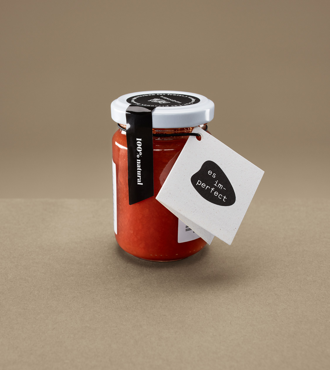
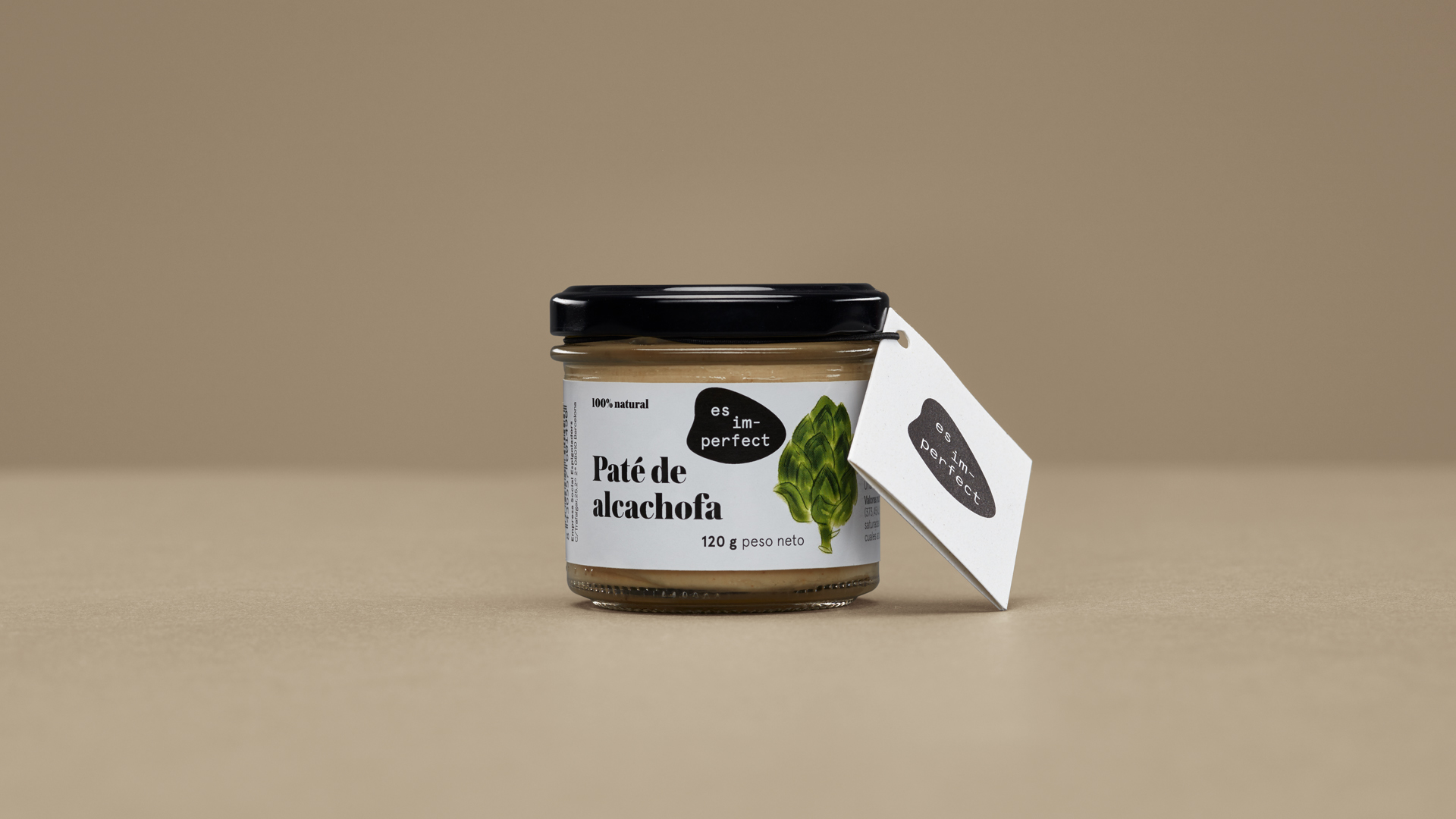
In the case of es im-perfect®, we strengthened the identity by designing a new graphic element: an irregular element that modifies its shape according to the support where it is applied to, emphasising the concept of imperfection, around which we have structured all the brand’s communication.
Furthermore, this new element also refers to the diverse shapes of defective fruits and vegetables, which in turn constitute the raw materials for es im-perfect® products.
Result
Beyond packaging design, we also implemented signage for their new facility in El Prat
The new identity was subsequently applied to packaging and communication elements of es im-perfect® paté and jams. In addition, we developed brand new signage for their new El Prat workshop, created their corporate presentation –which constitutes a key piece in its communication– for which we defined the structure, drafted the contents and carried out art direction and design.
Tags: Packaging Design
2018
More Projects

