Exit Fabrics
A corporate strategy and branding that effectively communicates the company’s activities
We defined an art direction that showcases the textures and colours of its products
Branding Strategy
Corporate Branding
Communication

Challenge
We crafted a new branding to better align Exit Fabrics with its reality
Conceptualisation and redefinition of brand values and positioning in order to adapt them to the company’s current reality. We reformulated, renamed, reframed its storytelling with a new proposal of values and a new tagline which lastly translated into a complete rebranding.
Process
We developed a comprehensive branding strategy, encompassing values, naming, storytelling, value proposition, and tagline
Following the first phase of observation within the brand’s business sector, we concluded that experience, timelessness, service and personalisation were the values on which the brand is currently built on, and which best define the company internally and externally.
We particularly focused on the naming process as the main pillar of the new brand strategy since it had to better describe the company’s activity and also strengthen the digital marketing strategy. As a consequence, Exit Solutions was renamed Exit Fabrics.
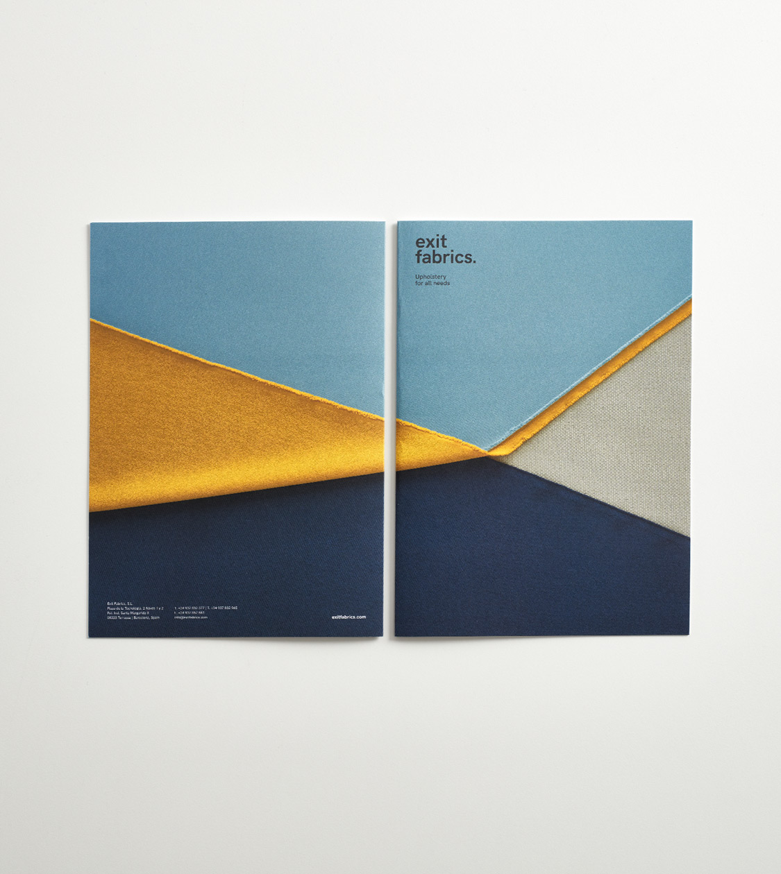
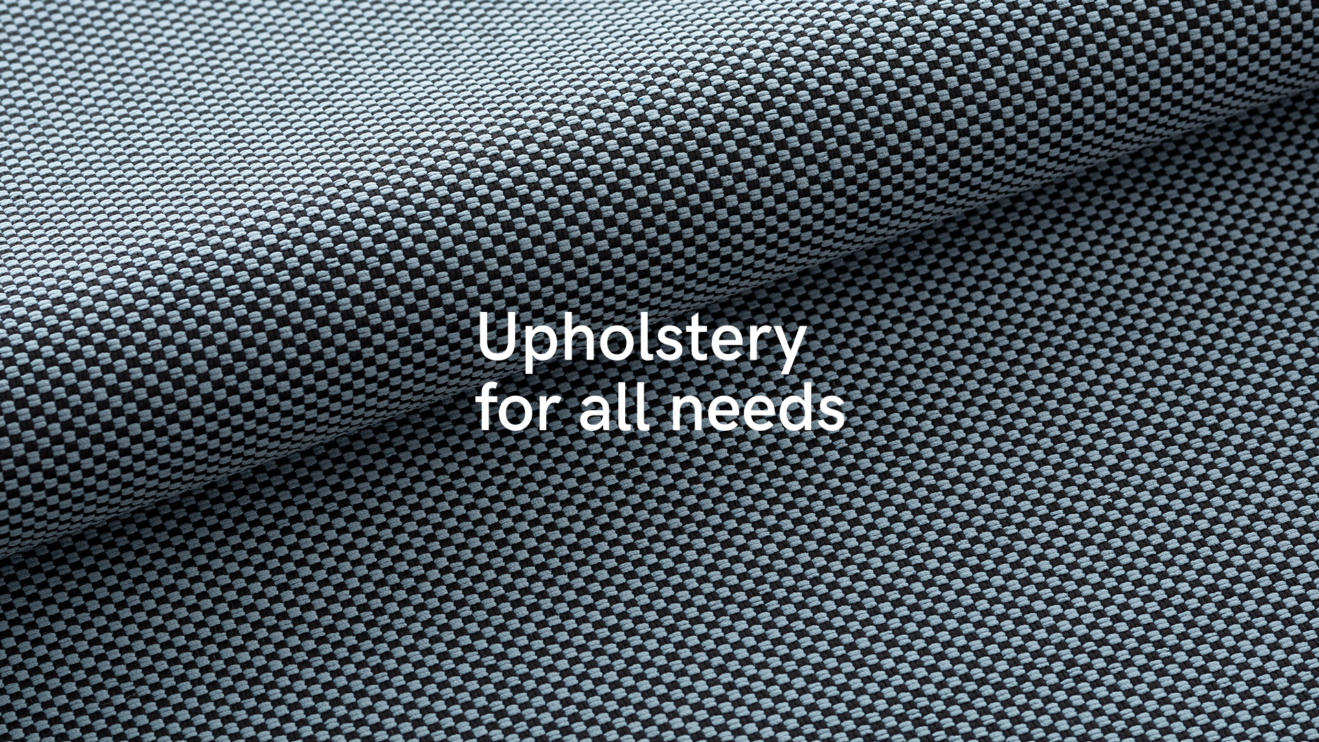
To complete the branding strategy, we developed a storytelling focused on communicating the company’s experience, its vocation of service, its values and the attributes that differentiate its product range from other competitors. Finally, we expressed this statement onto a new brand value proposition and tagline “Upholstery for all needs“.
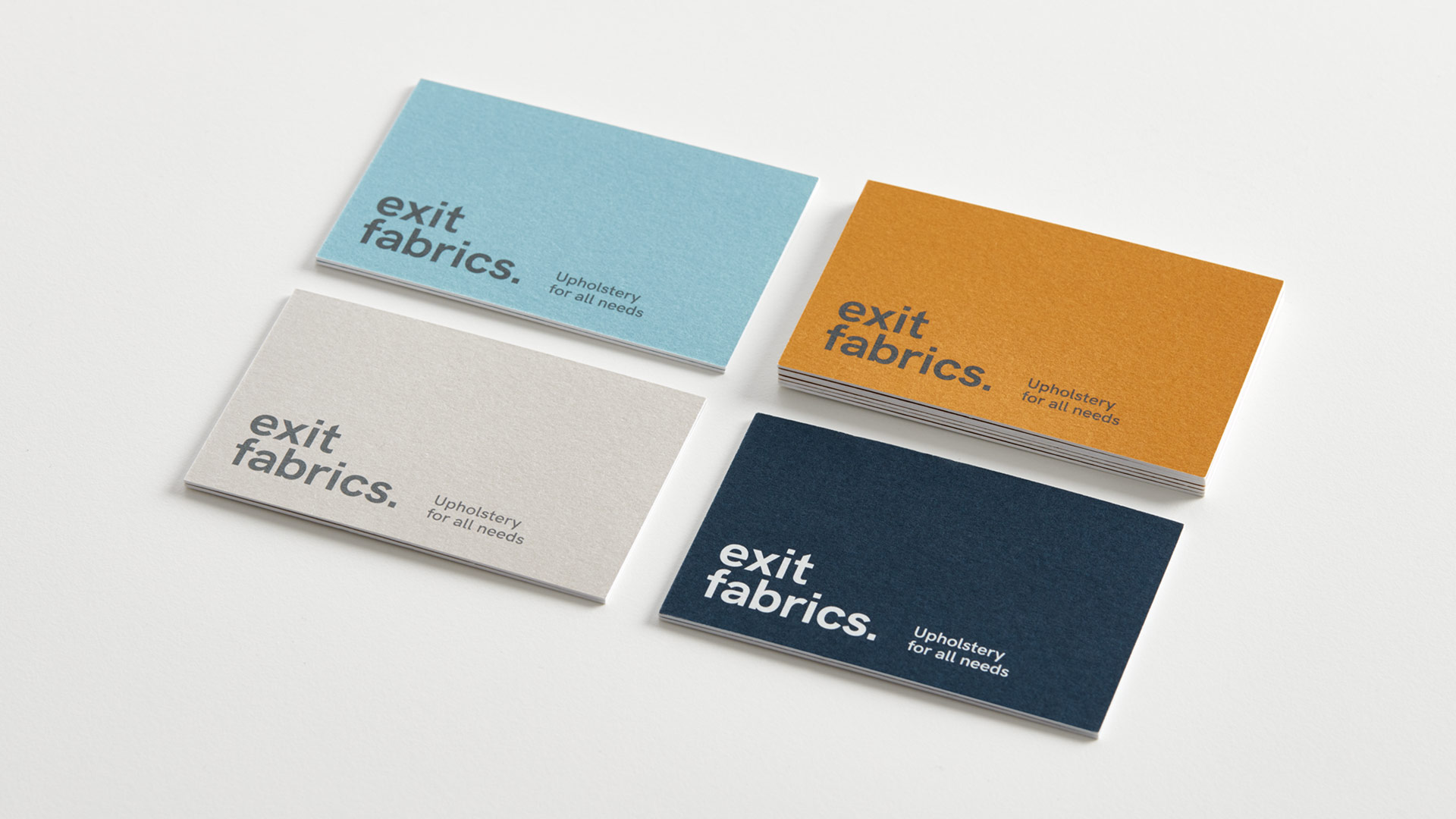
The rebranding of Exit Fabrics is mainly based on its renaming. Unlike the previous logo, we have singled out the two terms. In doing so, they acquired more relevance. By adding the final point, we further emphasised the name of the company. In order to symbolise the proximity of the service and the personalisation of the products we have presented the logo in a low case typeface.
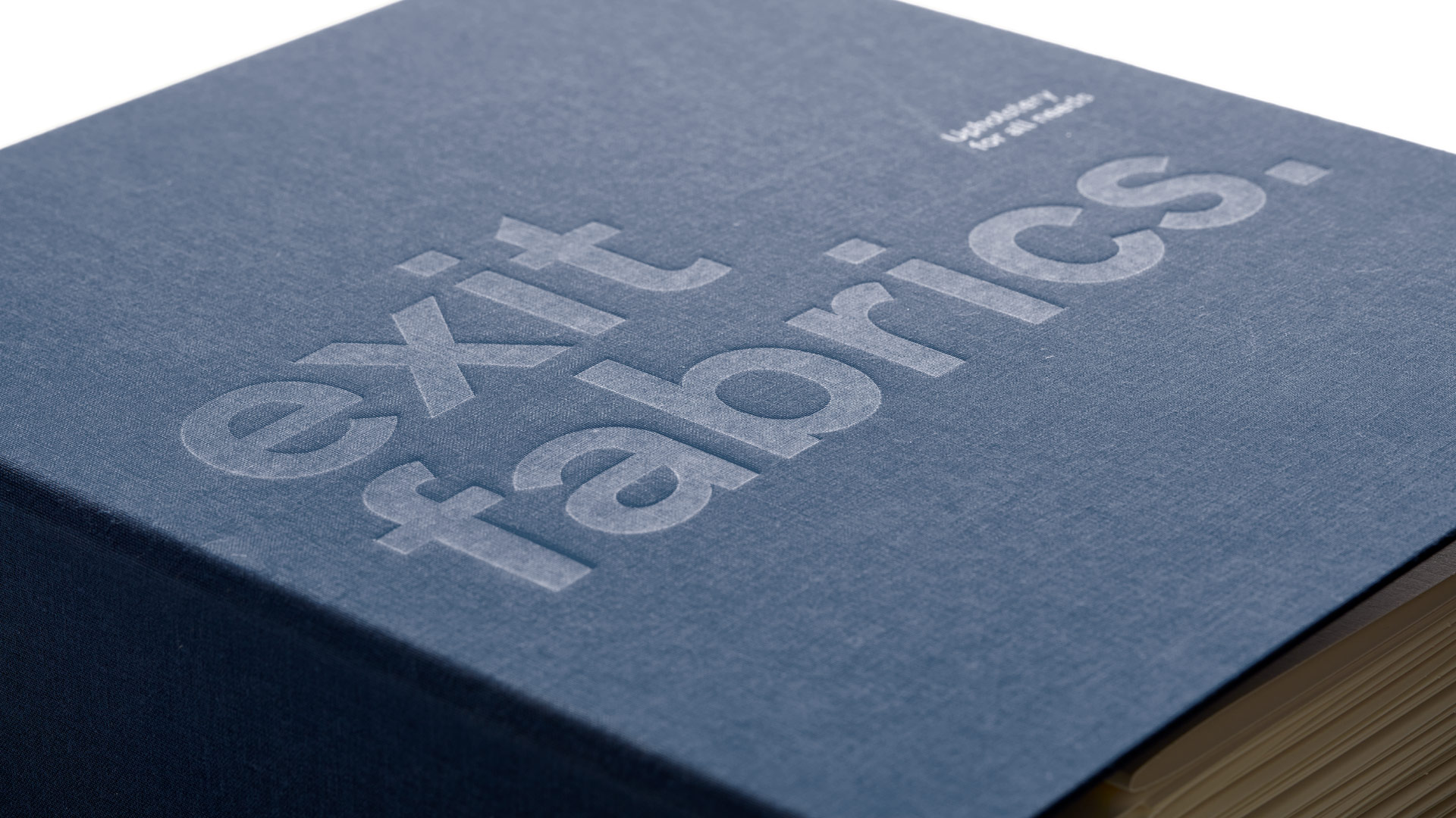
The corporate typography that we chose is the sans serif HK Grotesk Light. The colour palette is composed of blue tones, which reflect the timelessness of the product, and a range of grey and ochre tones that communicate the warmth and closeness of the service provided by the company.

Result
We implemented the new corporate branding across all communication pieces
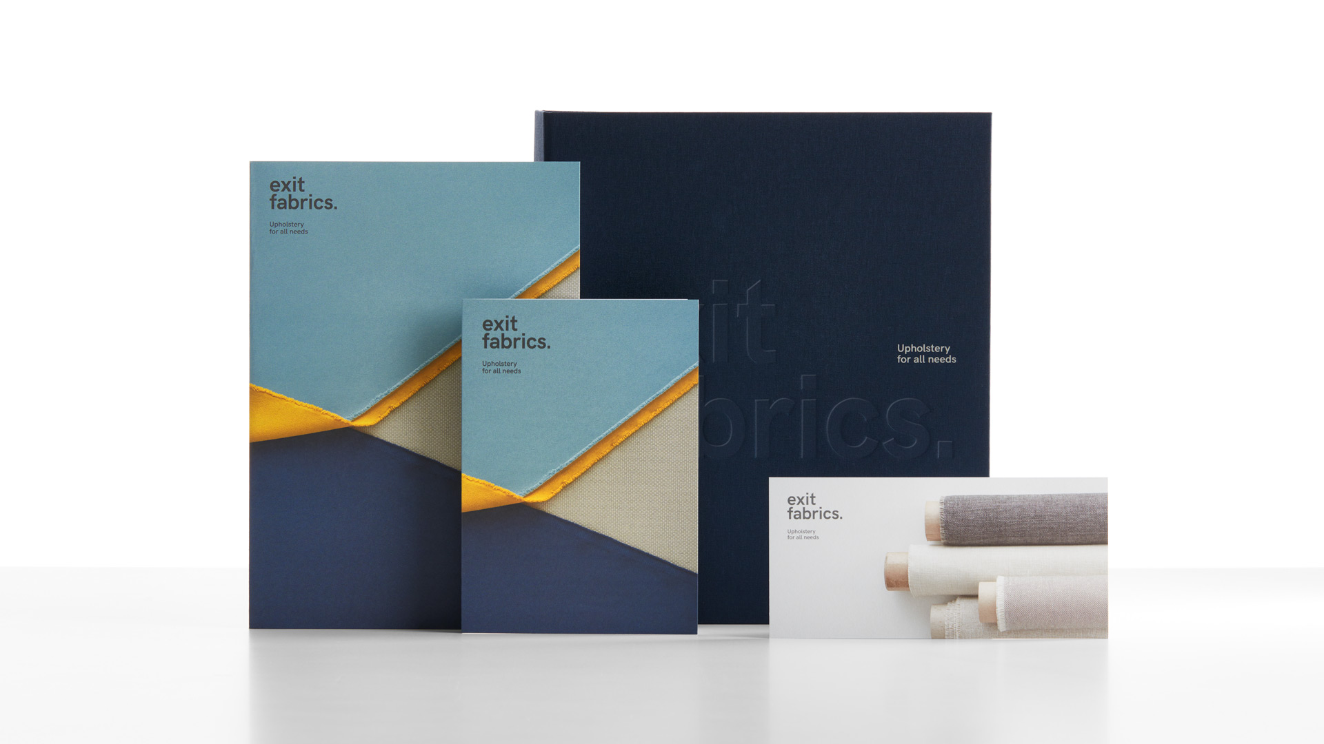
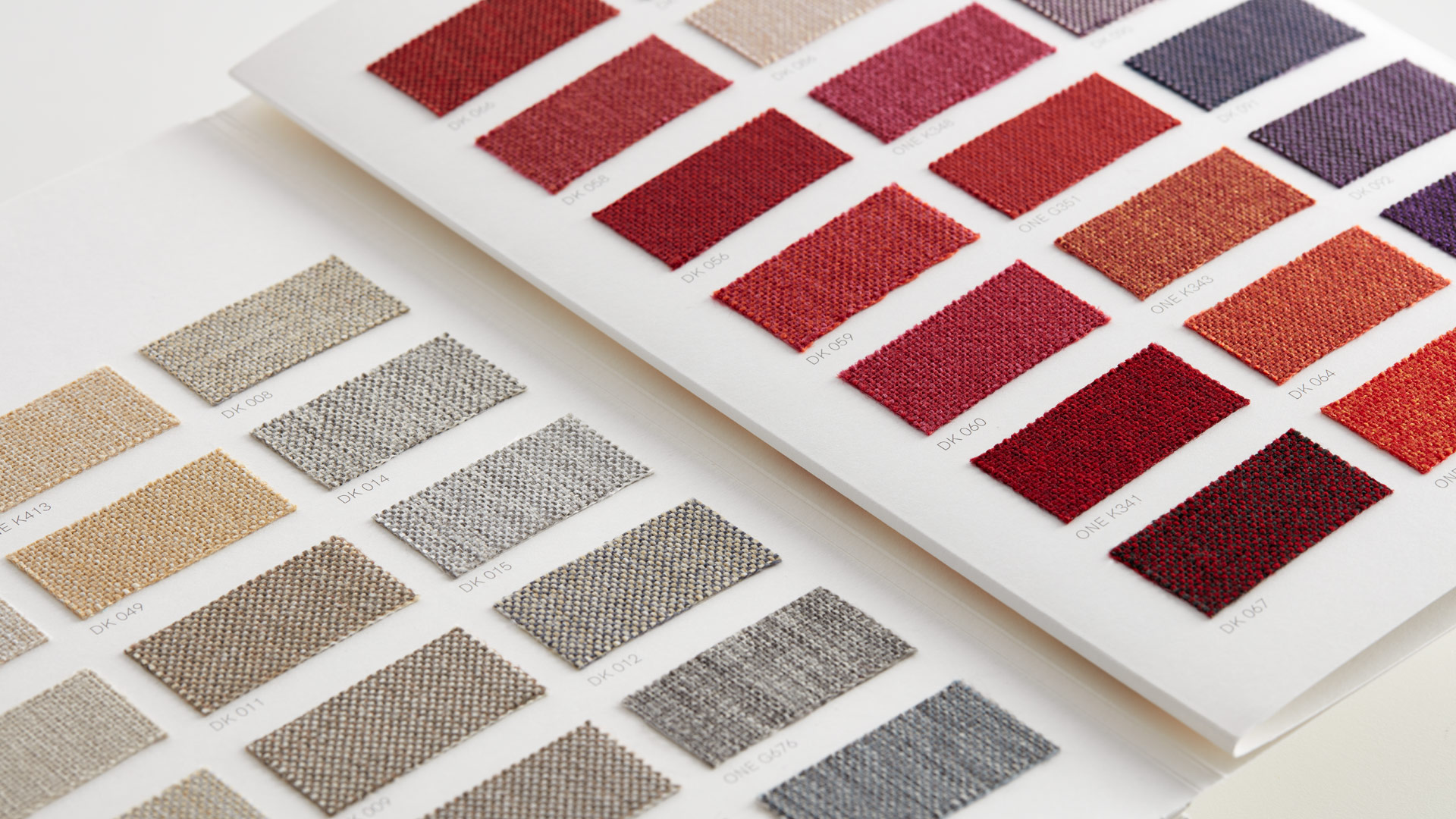
This new identity is consolidated with a series of images that highlight the value of their products, textures and fabric colours. This branding is also reflected in editorial design of the company brochure and its sample charts, in its communication pieces such as corporate stationery and merchandising items, in retail branding –signage– and in the firm’s digital communication, i.e. website.
Tags: Branding Strategy, Corporate Branding, Communication
2019
More Projects

