


We transformed Xarxafarma into Iconika – a community of forward-thinking pharmacies committed to people’s wellbeing
A new brand identity that reinforces excellence, innovation, and leadership in the pharmaceutical sector
Branding Strategy
Corporate Branding
Packaging Design
Communication
Challenge
Transforming Xarxafarma into a benchmark project with the power to lead and generate impact in the pharmaceutical sector
Throughout 2024, we supported the Fedefarma team in the strategic redefinition and redesign of Xarxafarma — a network of pharmacies offering their members the tools needed to enhance competitiveness and profitability.
Our challenge was to define its new positioning and to conceptualise and develop a strong brand identity aligned with its values — one that ensures consistent communication and effective connection with both professional audiences (B2B) and end consumers (B2C).
To achieve this, we worked on revising the branding strategy, defined a distinctive and memorable new name, and created a visual identity that would establish Iconika as an innovative, trustworthy brand with the ability to lead and create impact within the pharmaceutical sector.
Process
We created branding that communicates the brand’s values and builds community by connecting with different audiences
To define the new branding, we carried out a comprehensive strategic analysis, including sector benchmarking to identify key opportunities and differentiate the brand in a highly competitive environment. This was complemented by interviews and the NOMON Test with key project stakeholders to gather their perspectives on the brand’s present and future.
Based on the findings, we redefined Xarxafarma’s positioning, evolving it from a “group of pharmacies” to a “community of pharmacies” that promotes collaboration, innovation and collective growth, while focusing on people.
To reflect this shift, we developed a consistent verbal identity, revisited its mission, vision and values, and built strong storytelling to communicate its purpose effectively, enhancing its reach and engagement with diverse audiences.
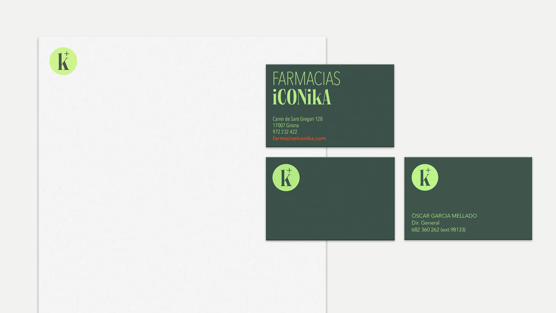
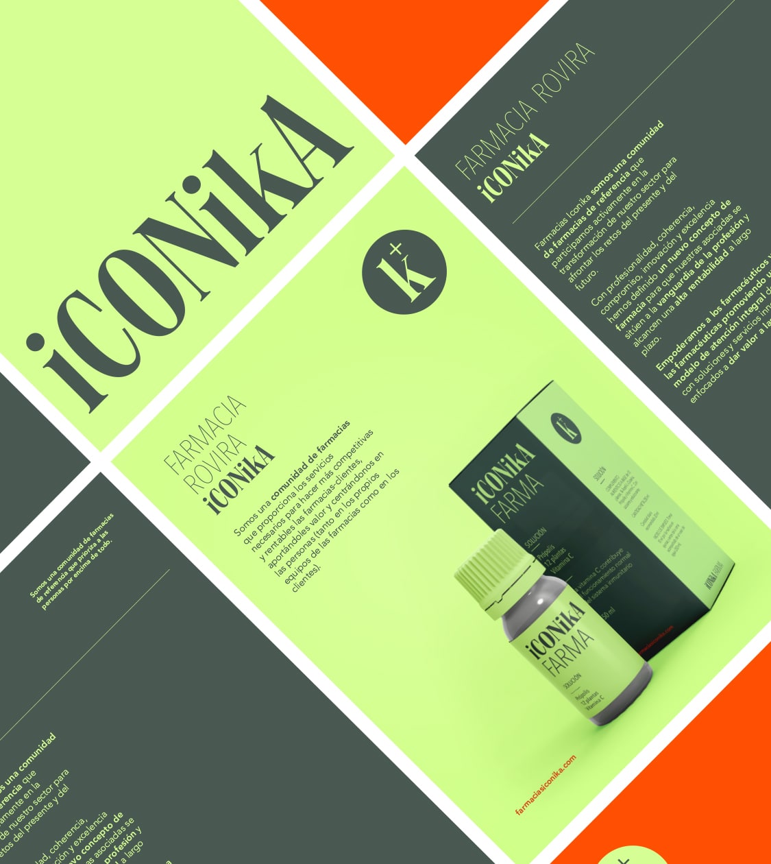
To convey the new positioning, we created a distinctive and memorable name that captures the brand’s essence and expresses prestige, community and leadership. Thus, Iconika was born — inspired by the word “iconic”, from the Greek eikonikos, meaning “worthy of being represented as an icon”.
Iconika represents recognition, influence and a new model of pharmacy built on excellence and personalised care, while also connecting with its target audiences: member pharmacies and end consumers. Choosing the letter “K” instead of a “C” gives it a distinctive, original character that sets it apart in the sector.
To reinforce Iconika’s positioning, we developed a clear and consistent visual identity that strengthens its purpose and communicates its values.
We created its logotype using the serif typeface PP Neue World, chosen for its contemporary style that conveys solidity, trust and approachability — without losing the innovative spirit of the brand. The combination of uppercase and lowercase letters adds dynamism, avoiding a rigid image and enabling a friendlier and more versatile visual language.
We also created a graphic symbol based on the “K” in the name and the dual meaning of the “+” symbol: both as a traditional sign of the pharmacy sector and as a symbol of addition. This “+” acts as a sort of “K squared”, enhancing visual recognition and communicating the added value of Iconika pharmacies.
For its typographic system, we selected a combination that balances modernity, legibility and personality. Avenir Pro and Next Pro ensure a contemporary and accessible look; SE Orsulin adds character and distinction, reinforcing brand identity; while Roboto ensures a smooth and efficient reading experience across digital environments.
This typographic mix enhances visual consistency while improving usability and communicative impact, reinforcing Iconika’s image as a trustworthy and innovative brand in the pharmaceutical industry.
We defined a colour palette that strengthens its identity and balances professionalism with innovation, carefully selecting tones that reflect Iconika’s core values.
Forest green (Pantone C2466C) and lime green (Pantone C2282C) evoke wellbeing, stability and vitality; white brings clarity and transparency; and burnt orange (Pantone C3556C) symbolises creativity, enthusiasm and confidence.
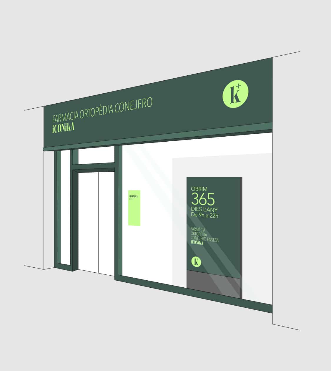
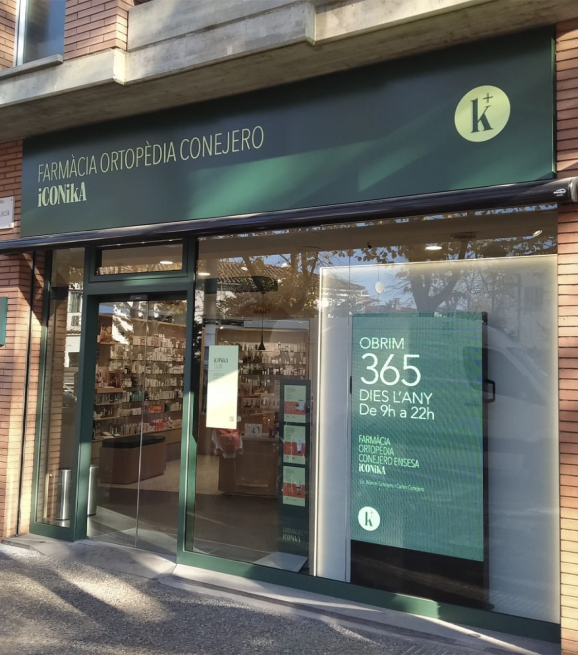
To ensure coherence across all brand touchpoints, we developed a brand guidelines manual outlining usage across formats. We also rolled out the new branding across all communication materials: from the façades and signage of associated pharmacies, to the products, packaging and promotional items.
In addition, we defined the new corporate website — optimising user experience and aligning it with the visual identity — and created a brand video that not only introduces the new name and identity, but also reinforces its impact in the pharmaceutical sector and its commitment to excellence.
Result
Iconika, a benchmark community of pharmacies actively shaping the future of the sector
At NOMON DESIGN, we worked on every stage of the project to transform Xarxafarma into Iconika — a new pharmacy concept with its own identity, ready to lead both the present and future of the pharmaceutical sector, and to inspire trust in both member pharmacies and end customers.
The new branding has unified B2B and B2C communication, set associated pharmacies apart, and reinforced their reputation in the sector, while also establishing a strong and memorable visual identity aligned with the brand’s core values.
Iconika has become a community of entrepreneurial pharmacies committed to people’s wellbeing.
Tags: Branding Strategy, Corporate Branding, Packaging Design, Communication
2024
More Projects