Klein
Identity and communication of the new NATURE product category by KLEIN
Collaborating with KLEIN on the launch of their sustainable profile system for creating environments
Corporate branding
Editorial design
Communication

Challenge
Communicating a new concept for creating environments by KLEIN
KLEIN is a family-owned business of international projection with 90 years of experience in the design and manufacture of high-added value architectural systems for sliding and folding doors made of glass or wood.
NOMON has worked alongside the company to build the communication strategy for their new range of products, NATURE, a sustainable oak profile system devised to create environments in line with people’s current lifestyles.
Process
Defining the communication of NATURE by showcasing the system’s benefits in various communication materials
We so worked on the concept and definition of the new NATURE brand identity and also produced the art direction –exclusively oriented to specifiers– inspired in the extraordinary value of the downright wholesome connection between natural wood and human health.
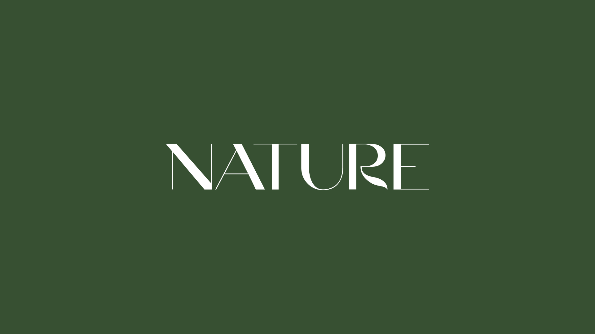
We designed the NATURE brand identity based on this concept and endowed it with its own unique personality.
We used the Grand Slang typeface –by designer Nikolas Wrobel– inspired by the grotesque shapes and serifs of mid-20th century American calligraphy. This typeface combines fairly straight lines with softer elements, which we recognised as an analogy to the oak, which is a tree made up of a robust trunk and a crown bearing more sinuous foliage.
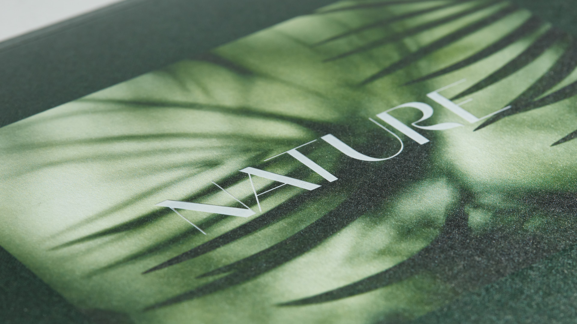
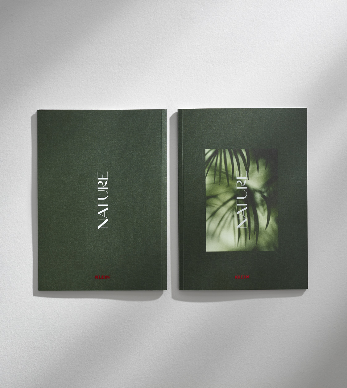
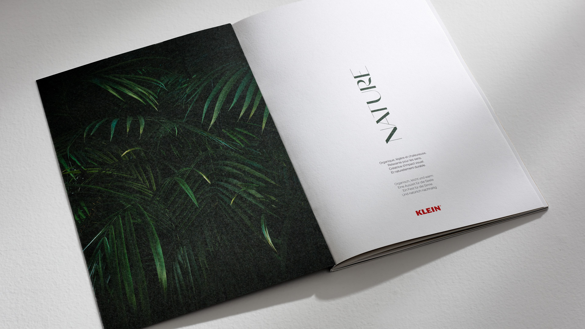
We reworked the typeface, removing some serifs, tweaking some of the thicknesses, and perfecting the curve of the R. The result is a logo that embodies the nature and honesty of this series of products in an elegant and exclusive way.
Chromatically speaking, we worked on a palette in which dark green is predominant, combined with KLEIN’s corporate red and the natural tone of the oak itself.
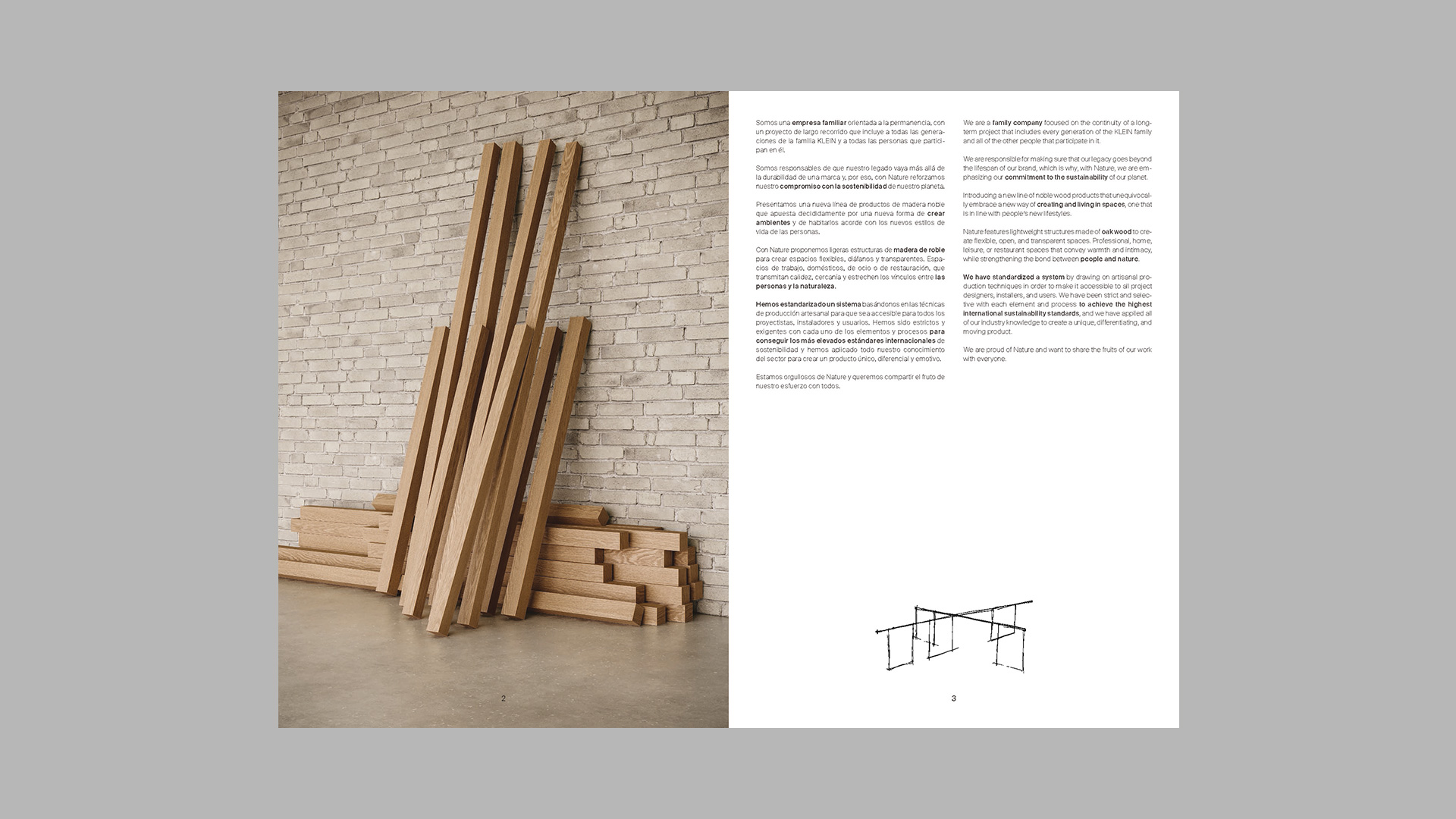
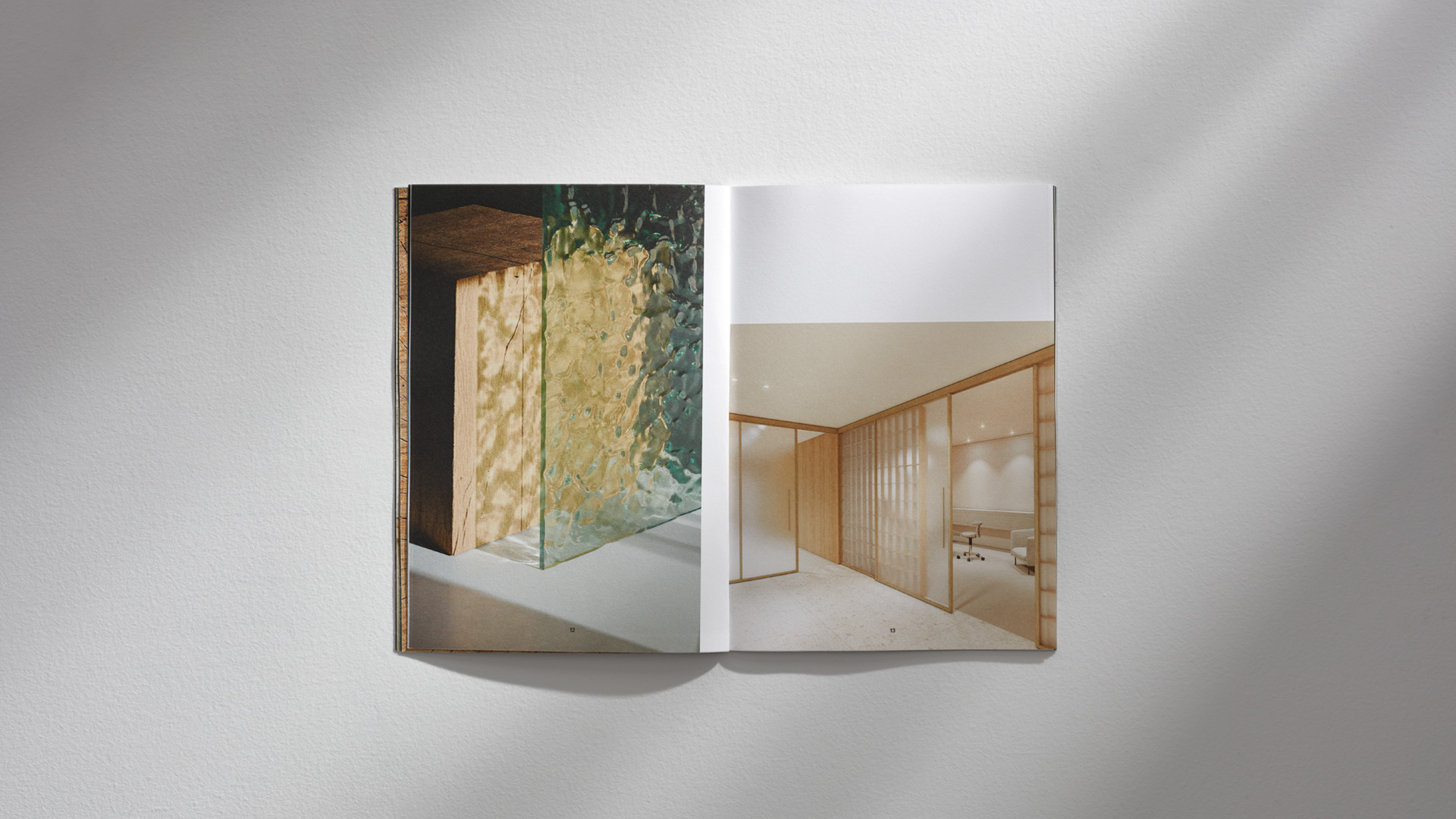
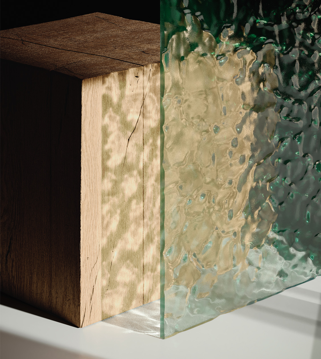
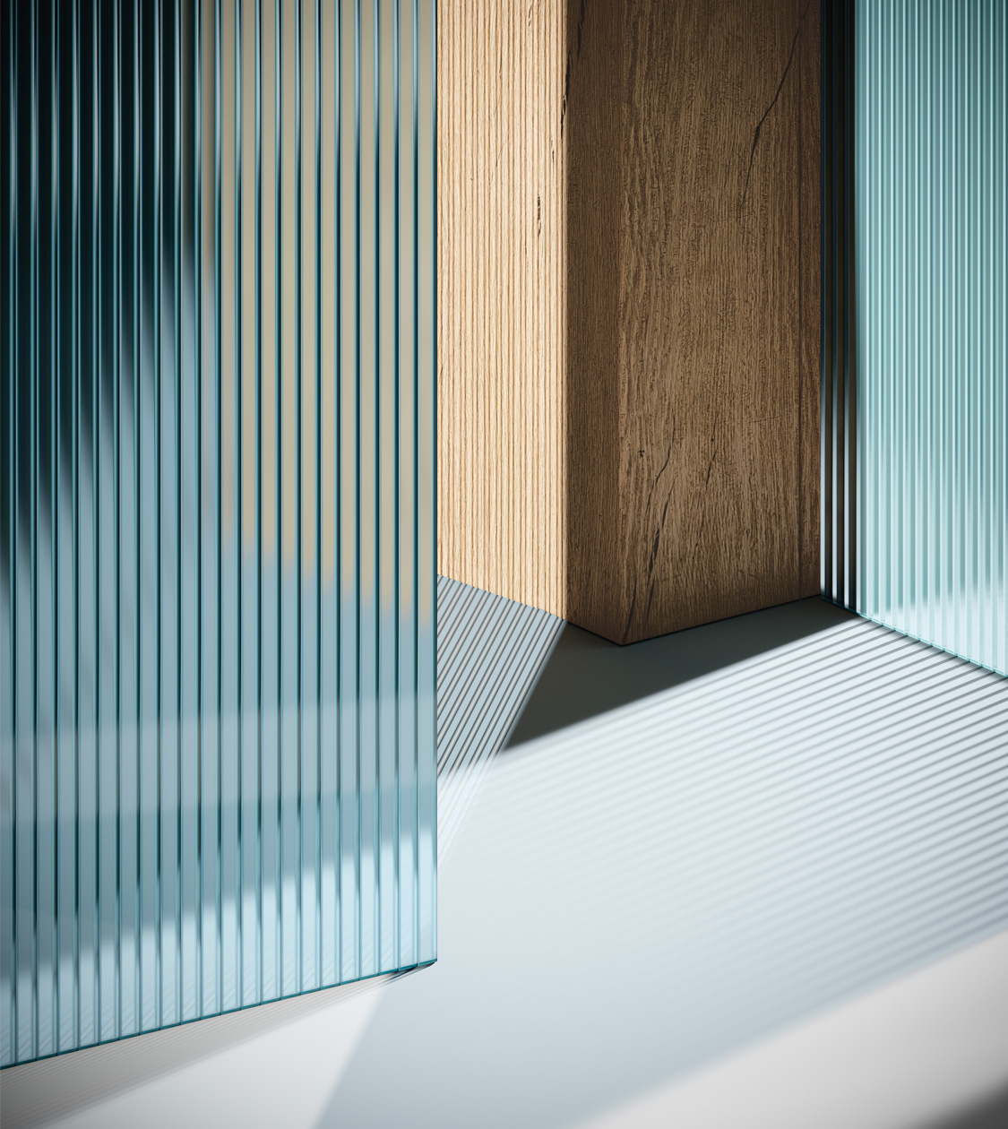
As for the art direction of this project, we mainly relied on the shapes, texture and warmth of the materials, i.e. oak wood and glass. Likewise, we showcased the possible applications of these items in different spaces: at home, in business environments, at the office or in retail outlets.
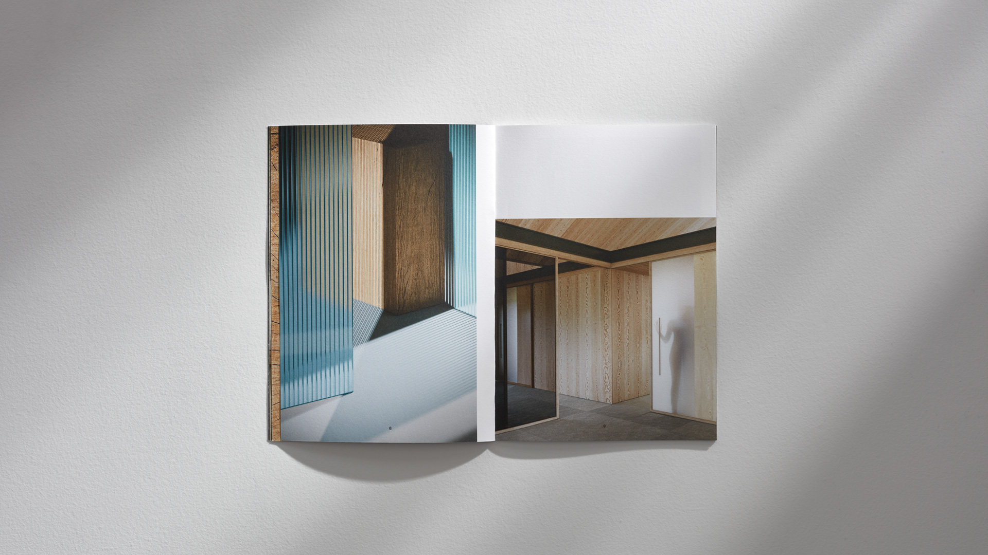
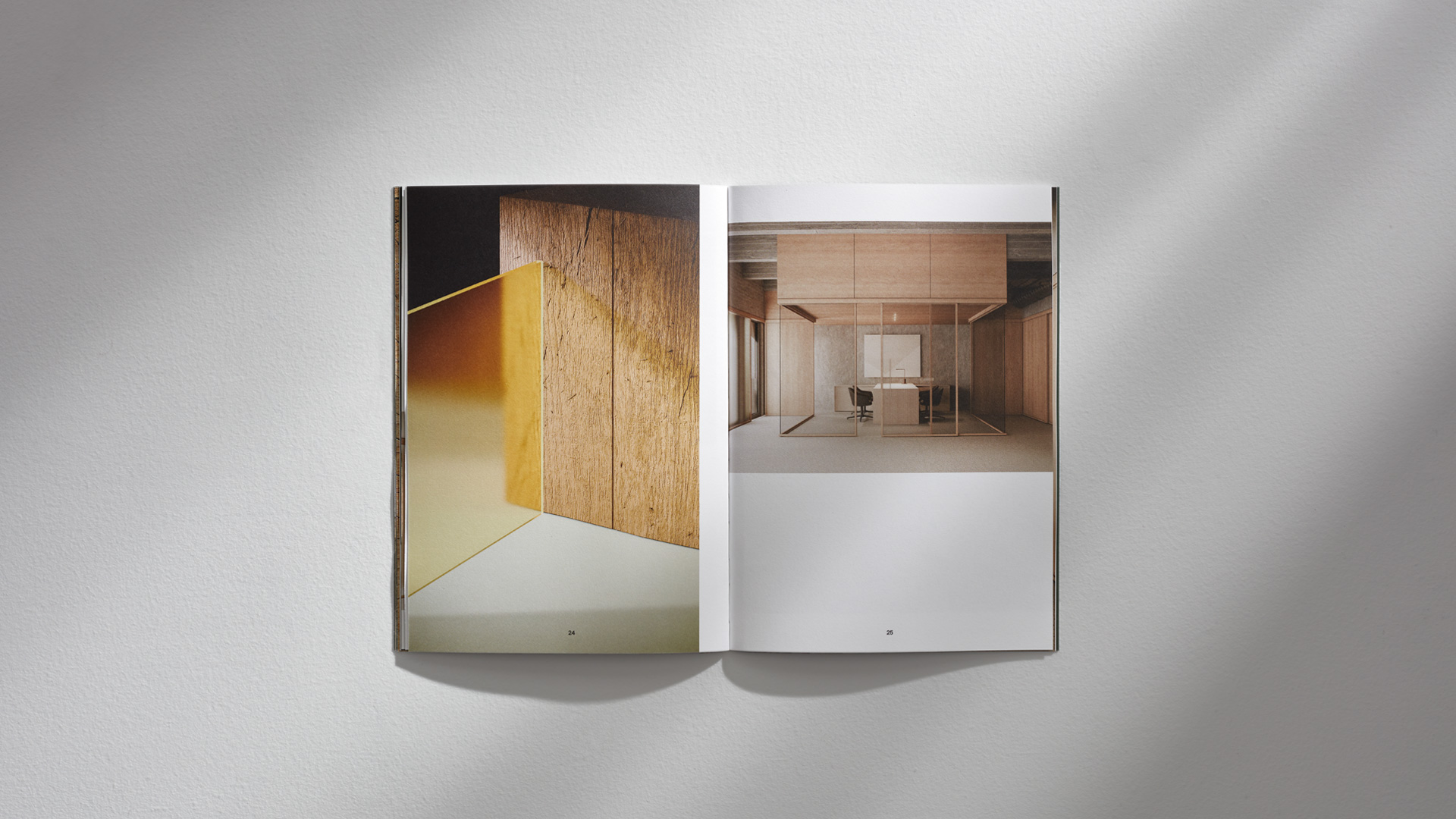
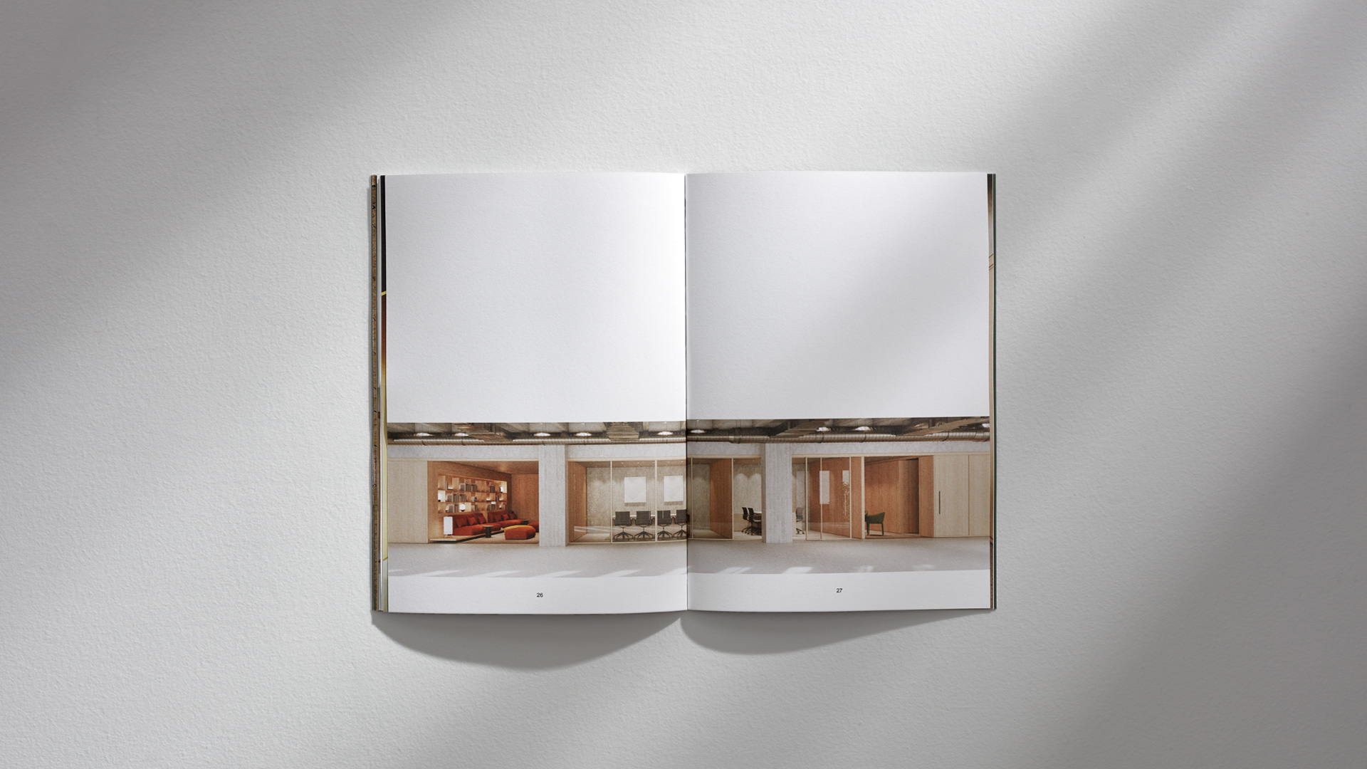
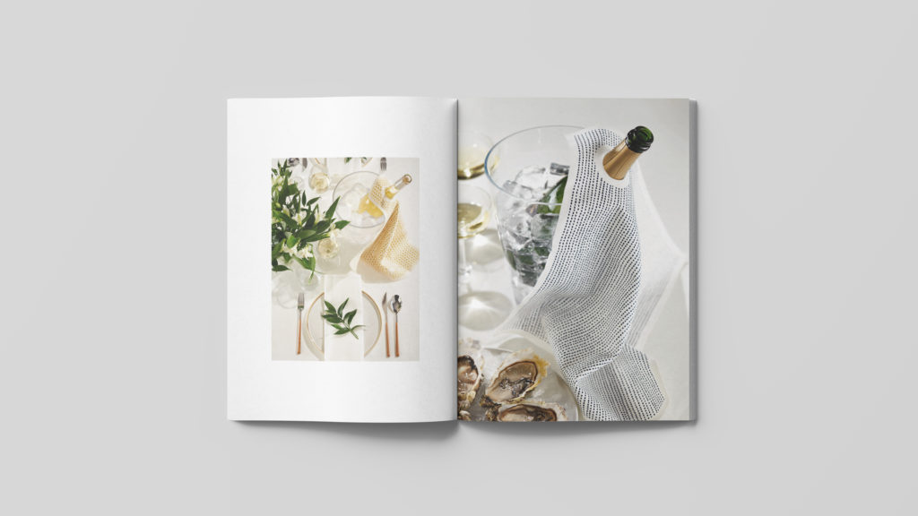
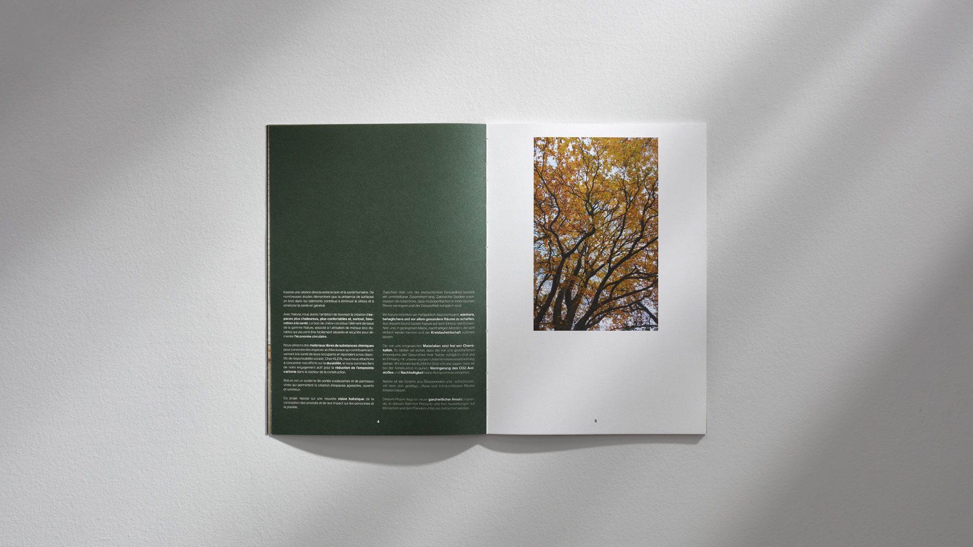
In order to design and develop the catalogue –to fully direct it to the specifiers– we found the inspiration in the aesthetics, composition and finishes of specialised architecture publications.
We also made recommendations for the actual production of the catalogue, picking the different materials and finishes that essentially endows the piece with the required quality, in harmony with the product itself.
Additionally, we chose the most sustainable printing system possible (offset with eco-printed Led-UV) on Munken Lynx Roug paper, with FSC, PEFC, ECOLABEL and C2C (Cradle to Cradle™) certification, based on circular economy standards.
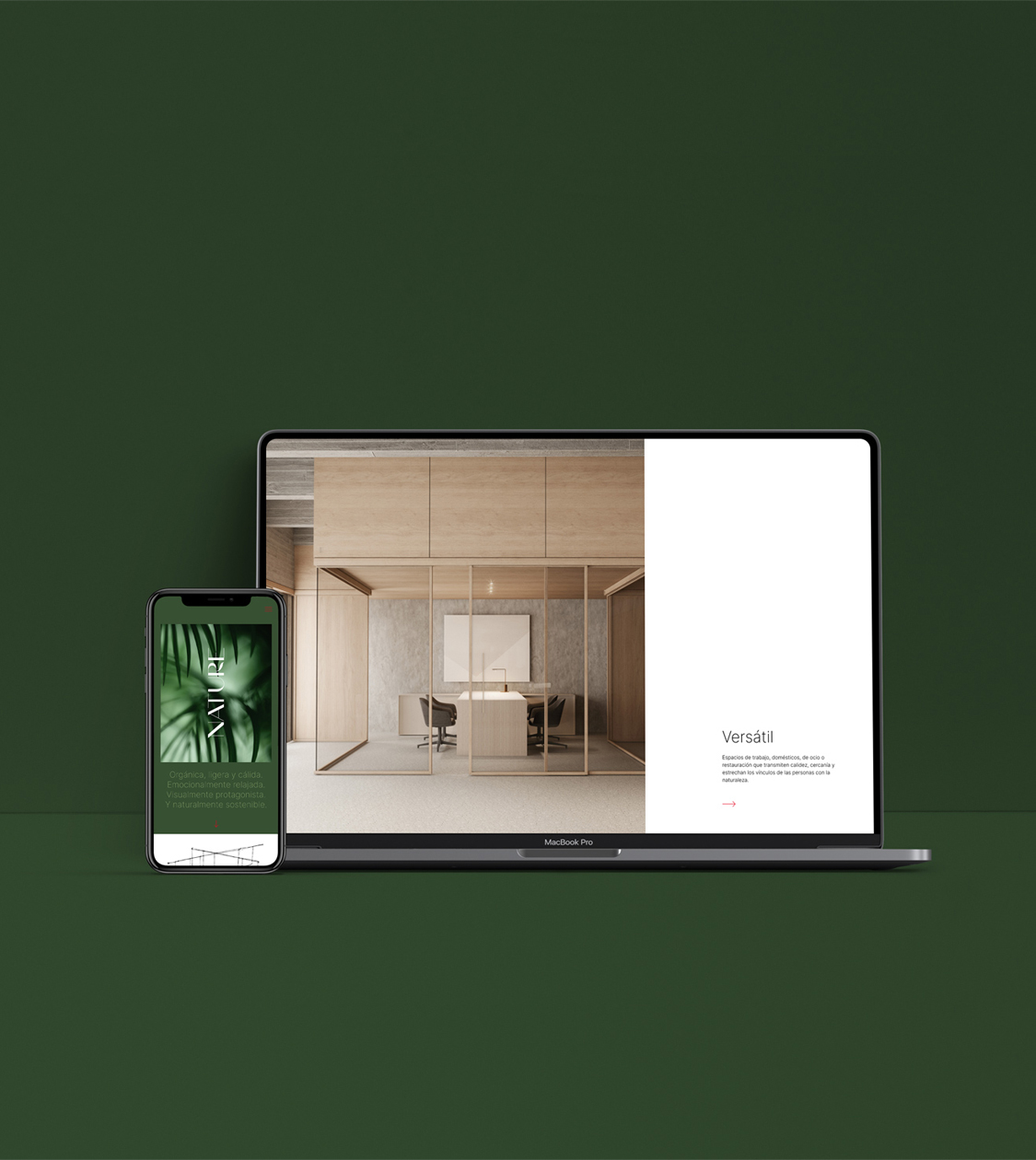
Finally, we conceptualised and designed the corresponding digital communication to round up the NATURE campaign launch. In particular, we designed a landing page specifically developed for this new product category.
Result
The result is a cohesive and responsible communication project that aligns with Klein’s objectives
The project as a whole coherently conveys the essence and attributes of NATURE products and meets the corporate objectives which KLEIN had set for us in the beginning: to appeal to specifiers and communicate the brand’s major commitment towards the environment and society.
Tags: Corporate branding, Editorial design, Communication
2021

