MY DRAP
We redesigned the packaging for MY DRAP’s innovative textile product
Crafting packaging that instantly conveys the nature and function of the product
Packaging design


Challenge
A packaging design meeting the need for improved understanding of MY DRAP products
Faced with the need to better explain MY DRAP’s products in points of sale, we redesigned their packaging to make them more understandable for consumers.
The presentation of pre-cut linen tablecloths and napkins in rolls required a labelling system which would communicate their innovative nature and function at first sight. This had been something that had caused some confusion in consumers in the past.


Process and result
Through art direction, showcasing the functionality, colors, and corporate values of the product
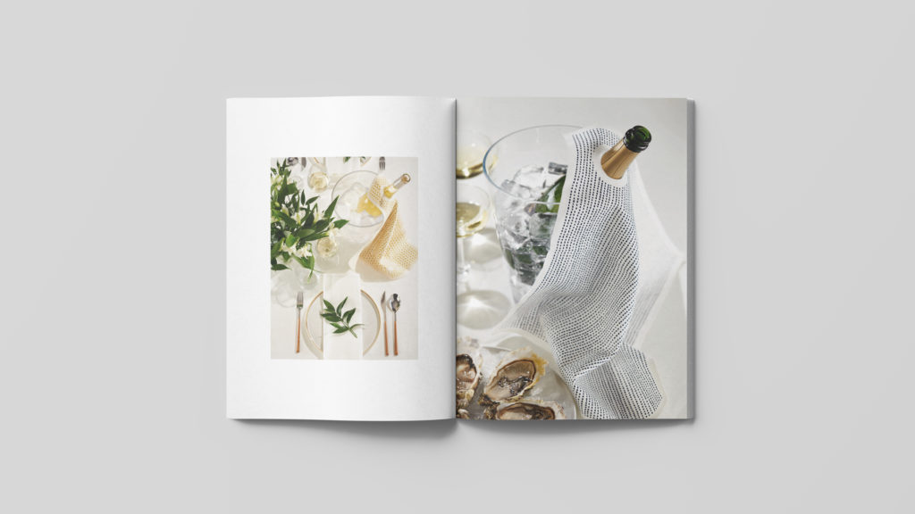
We therefore developed a design that would identity the items without reading the description, directly by showing the image of a dressed table in which the product’s function and colour were clearly depicted. At the same time, we took great care to strengthen the brand values with our art direction, specifically highlighting the 100% fabric quality of products while emphasising the more emotional aspects, like the experience of sharing moments around a table with those we love most.

In addition, in order to differentiate special collections –linen and Christmas– from the rest of MY DRAP product ranges, we chose to identify linen collections with a silver stamping finish and Christmas collections with a gold finish. These finishes brought a touch of quality and distincti.
Tags: Packaging design
2018
More Projects


