Natwins
We redesigned Natwins’ corporate branding
Introducing a new corporate branding that embodies a daring, adventurous, and fearless Natwins
Corporate branding
Challenge
We have redesigned Natwins’ corporate branding to enhance its brand visibility
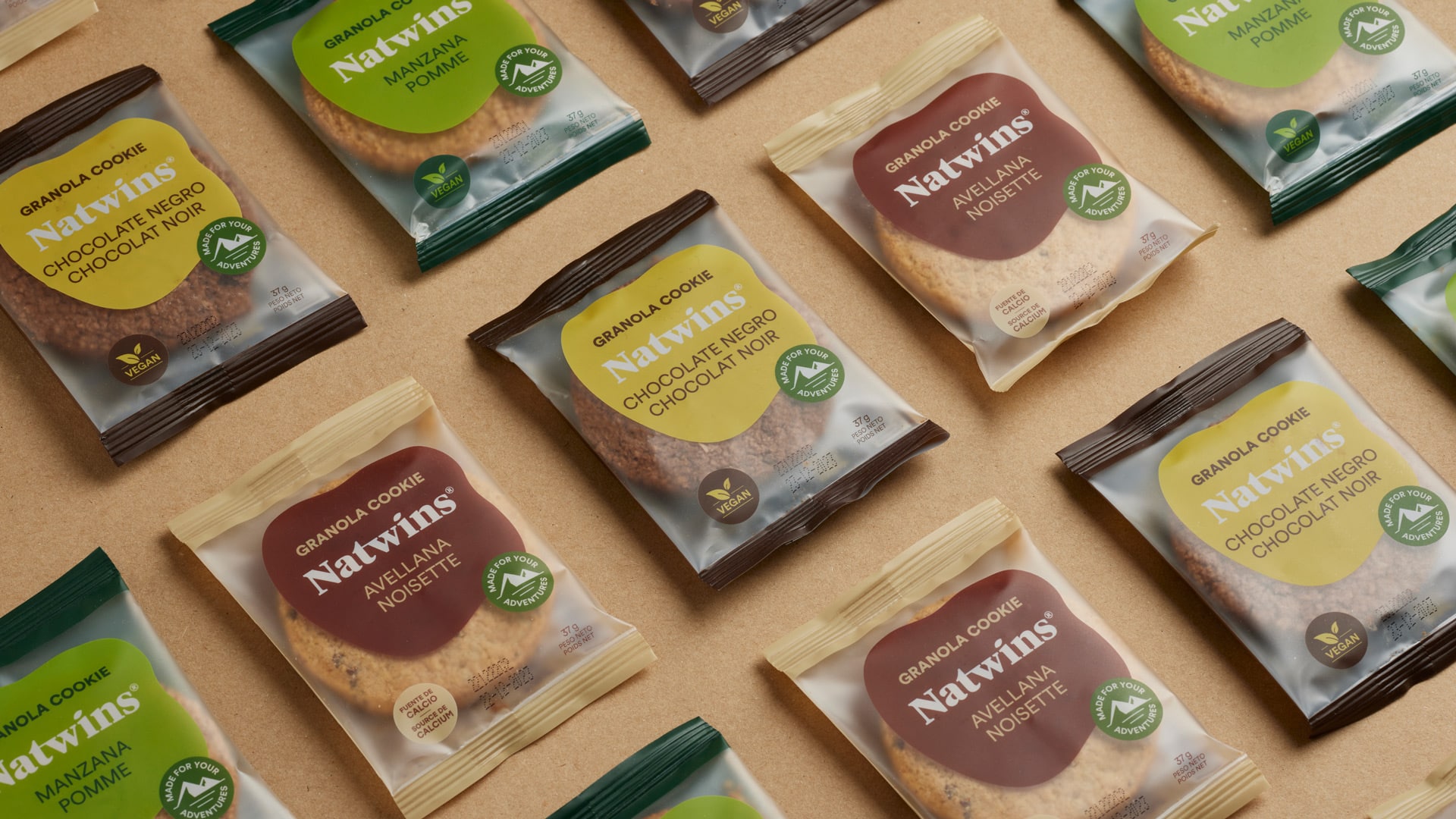
Once again, we collaborated with Girofibra, a company located in La Garrotxa and specialized in the production of healthy cookies and bars with their own recipe, to redesign their corporate branding.
Since 2019, we have undertaken various projects involving packaging design, communication, and digital communication with the company. It was during this collaboration that we recognized the need to redesign their corporate branding.
This project primarily aims to achieve two objectives: to reflect the company’s goals for 2023 – to be more daring, adventurous, and courageous – through the new corporate branding, while simultaneously increasing brand visibility across all channels.
Process
We have created a new corporate branding that authentically represents Natwins
While preserving Natwins’ essence, we redesigned their corporate branding to simplify it, infuse personality, and enhance brand visibility while effectively conveying its distinctive qualities.
To begin, we selected the TIEMPO serif typeface, which possesses significant character and improved legibility, and tailored it to our objectives.
First and foremost, we standardized the heights of lowercase letters. Additionally, we introduced straight serifs in place of curved ones to add a touch of personality. Finally, we ingeniously transformed the dot above the “i” into a seed, subtly mimicking the movement of grains swaying in the field when caressed by the wind. This gesture pays homage to the previous logo’s wheat symbol while reinforcing the concept of natural ingredients.
Regarding the color scheme, we carefully crafted a fresher and more captivating palette that vividly represents the hues of the ingredients used in their delightful cookie and bar recipes.


Result
Natwins sets sail on a new journey with its revamped corporate branding
The result of this project is a revitalized identity that grants Natwins a stronger visual impact across all communication channels, all while staying true to its core. It communicates attributes of quality, nature, and freshness.
Moreover, the new corporate branding harmoniously aligns with the company’s mission to embrace new challenges and foster continuous growth.
Tags: Corporate branding
2023
More Projects


