Girofibra
Natwins
We crafted the new Packaging Design for the Natwins brand, reflecting its values and commitment
Packaging that conveys the ingredients and the crafting process of their products
Packaging Design
Communication
Challenge
Natwins’ packaging highlights the quality and unique qualities of its original recipes
In 2019, we kicked off our partnership with Girofibra, a company that has been manufacturing cookies and healthy cereal bars using its own special recipe for over 4 decades.
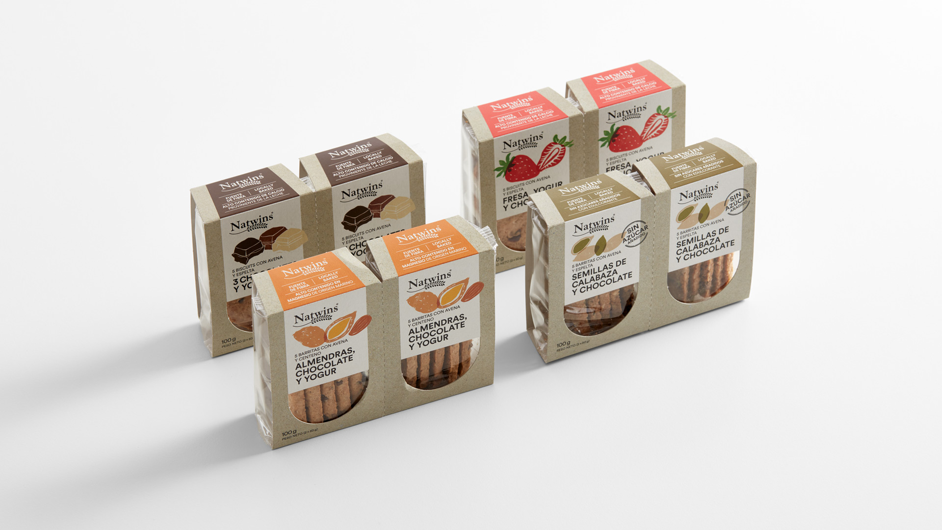
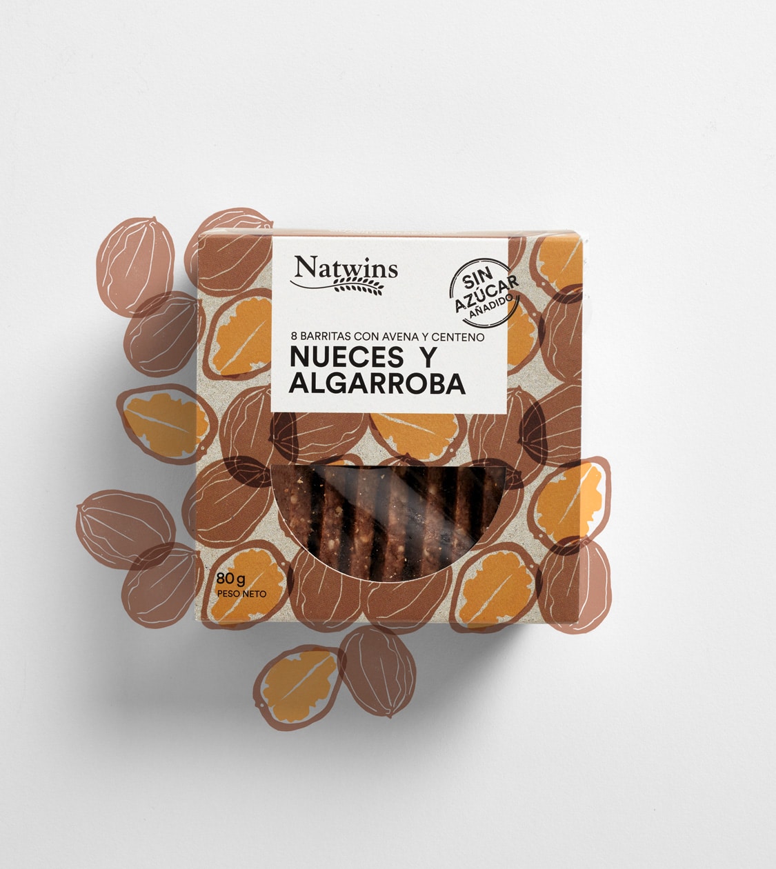
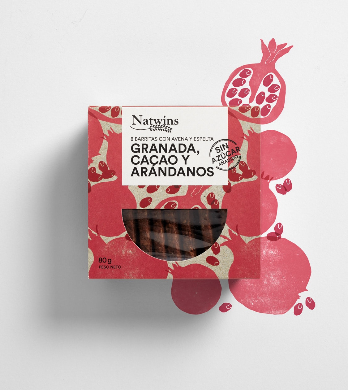
Since then, we’ve conceptualised and designed the packaging for their range of 80g-pack cereal bars, 100g-double-pack cookies and their range of 200g high-fiber whole grain oats mini-cookie.
Our main challenge in developing all their packaging has been to convey the quality of the raw materials used in their manually crafted, special, and original recipes while expressing the company’s commitment: allowing consumers to “enjoy the products’ flavours at any time of the day while staying healthy” .
Process
We conceptualise and design packaging that minimises the use of plastic and makes recycling easier
We started the project, as we always do, by observing and analysing the competition, as well as some references having a similar set of brand values, i.e. responsibility during the manufacturing process and with consumers, quality of produce and the healthy nature of final products as well as its tastiness.
We identified and defined the consumer target of Natwins as people who enjoy spending time with family and friends, with a Mediterranean character, active and mainly living in urban areas. The target consumer also appreciates healthy and tasty snacks at any time of the day.
Following the conclusions of this first observation phase, we established what the packaging should primarily communicate, namely the quality of the produce used to elaborate the product and the fact that the recipes were prepared with great detail and care. Therefore, in order to transfer these concepts to the actual packaging, we relied on hand-drawn illustration, creating unique stamps with sketches of the main produce.
In addition, we also reckoned that the packs should disregard the use of plastic materials. However, due to the technical limitations of food preservation, we could not completely eliminate it. We thus devised packaging minimising it to a maximum and definitely facilitating recycling by easily separating plastic from cardboard materials.
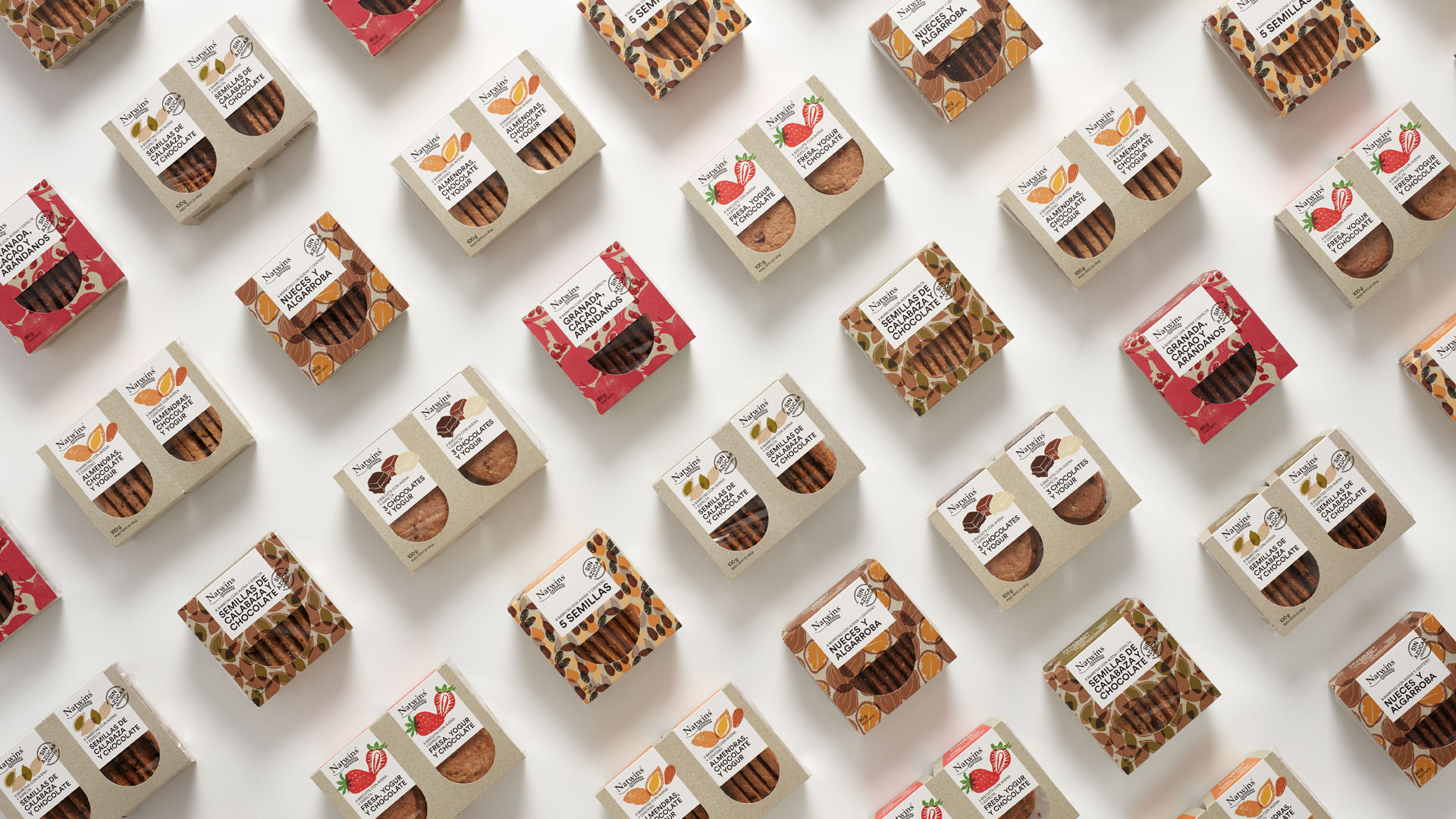
For the 80g-packs of cereal bars with no added sugar, we created a textured pattern using the main ingredient of each of the products.
For the 100g cookie packs (a 2-unit pack of 50g), which we conceived as two separate packs but that function together, we duplicated the graphics in order to keep the same visual front once they are separated.
For their mini-cookie range, we tailored a band with a unique shape, adding more personality to the packaging and making it stand out at the point of sale.
Result
Encouraging consumers to enjoy Natwins products at any time of the day
The resulting packaging design achieves prominence at the point of sale and transmits Natwins’ values and main commitment: to provide a tasty product for consumers to enjoy at any time of the day while staying healthy, thanks to the meticulous selection of top-quality ingredients and their elaboration according to original recipes.
Tags: Packaging Design, Communication
2019
More Projects

