


Famatel
New corporate strategy and branding for an international company
A global branding project of great relevance for Famatel
Branding Strategy
Corporate Branding
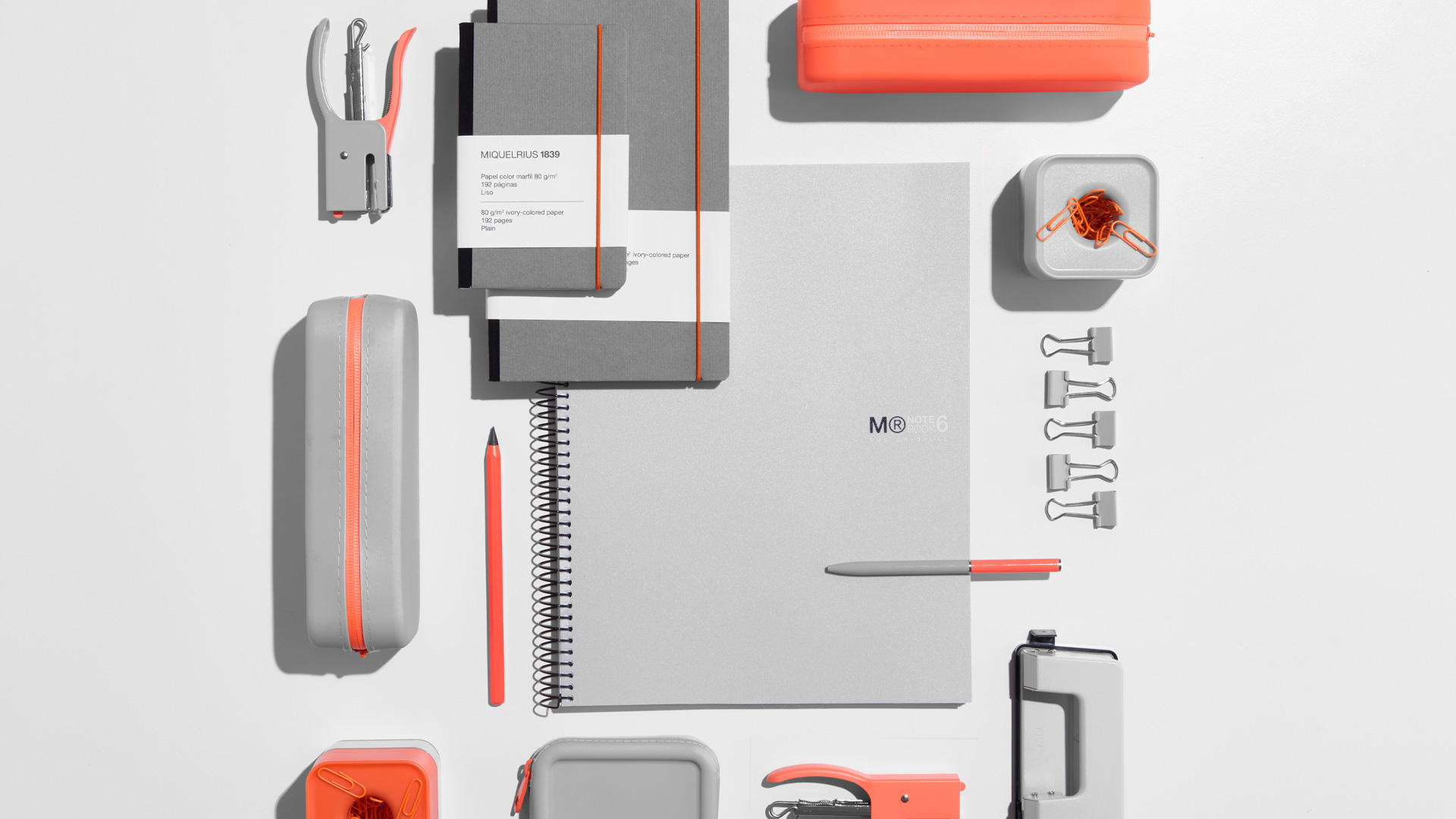
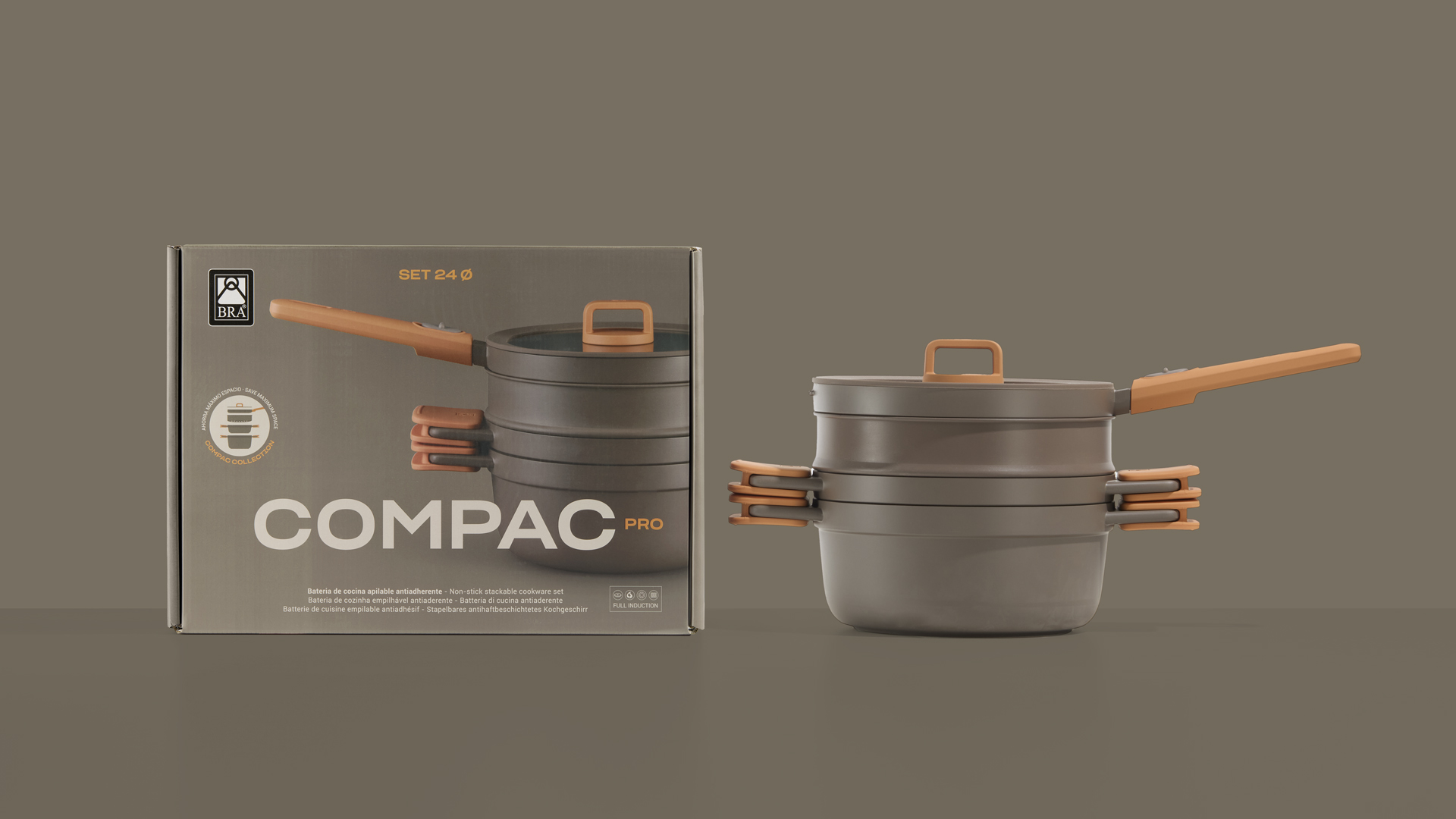
Packaging Design
Challenge
We defined a corporate strategy and branding that communicates their reality and future vision
Since 2015 we have collaborated with Famatel in conceptualizing and developing the firm’s communication, as well as that of the business group’s trademarks (i.e. Rosi, Keraco, BeFresh Home, Easy Life…)
Famatel is an international manufacturer within the electricity sector with 25 years of experience. Although their logistics centre is located in Barcelona, the firm operates in 60 different countries, developing value-added electrical solutions that simplify professionals’ lives.
At the beginning of 2020, we began the most important intervention carried out to date: the creation of a new strategic branding plan and an entirely new identity, one representing the reality and future commitment of this international company.

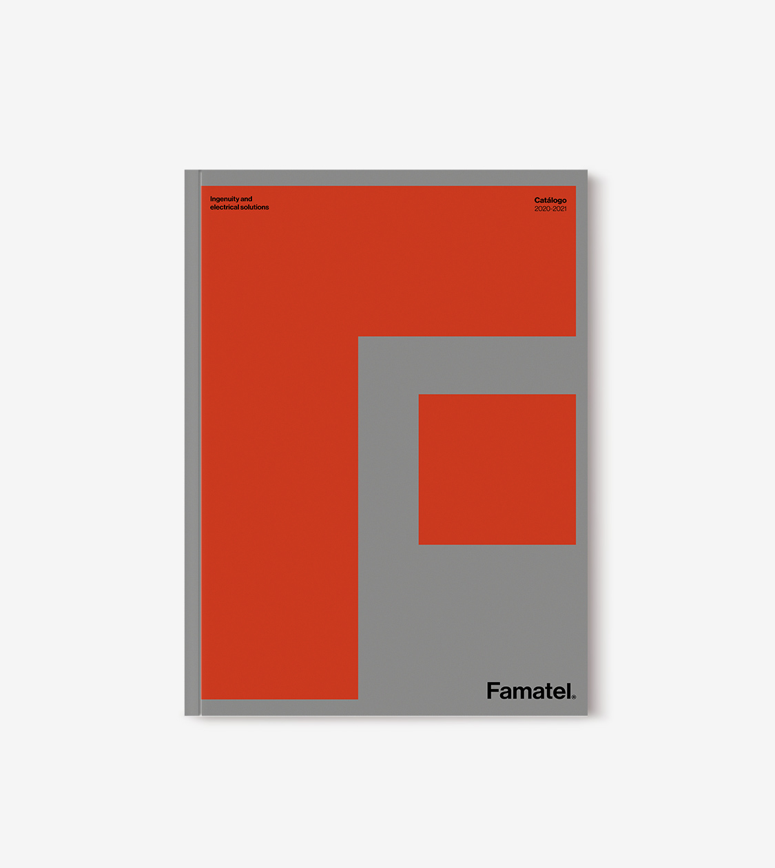


Using the Neue Haas Grotesk typeface, a hallmark of contemporary Swiss graphic design, we designed a consistent and architectural logo that represents the power of the sector and of Famatel itself. We also established its corporate typography, still banking on the Neue Haas Grotesk due to its wide family of alphabets in most languages.
We determined a chromatic palette where grey, white and black predominate to technify the brand; combined with an orange red that provides proximity.
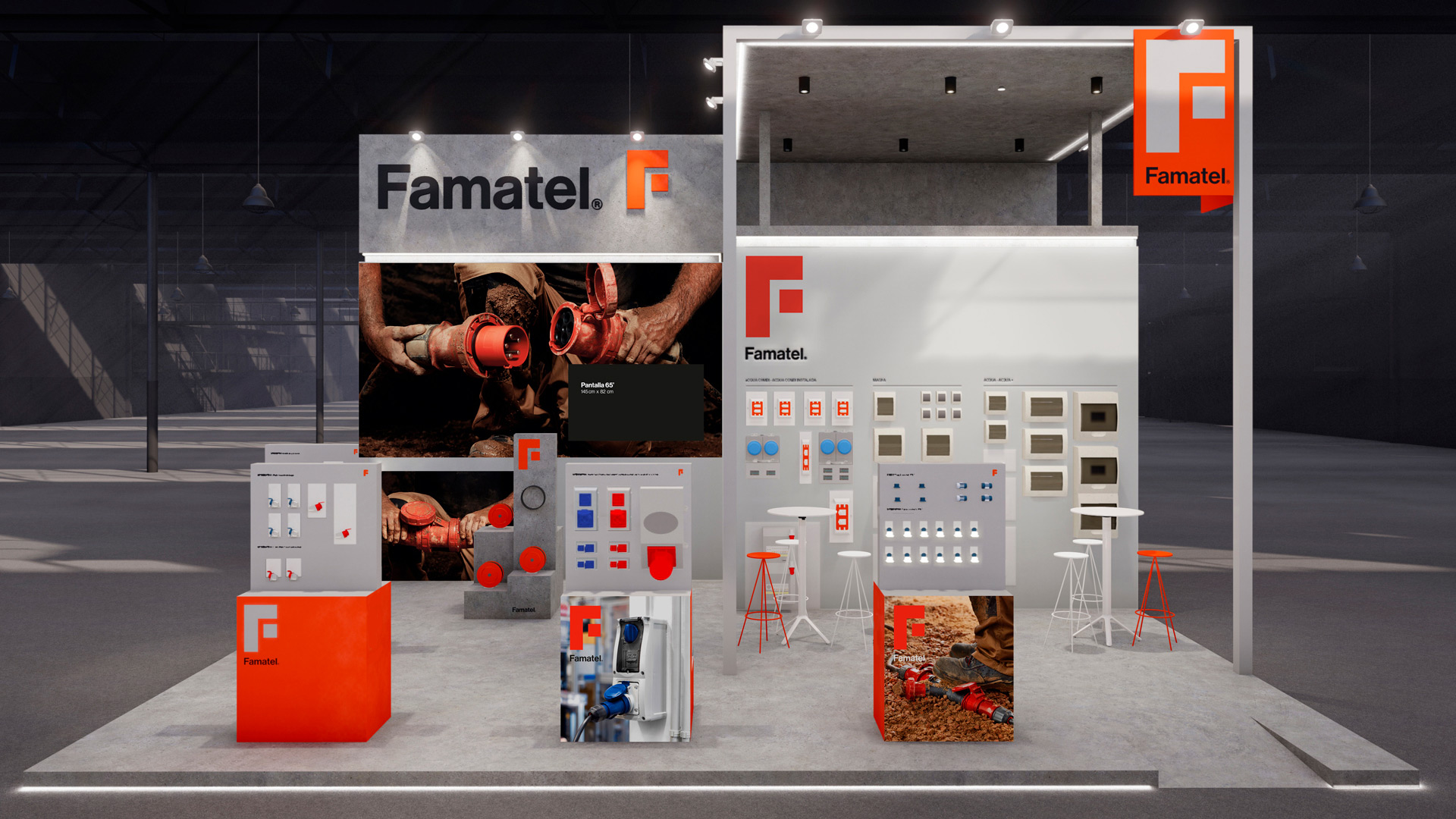
We accompany the logo with the isotype F (of Famatel) with very straight shapes, in order to enhance the strong character of the company, but with a composition that is very flexible in all its applications.


Our objective with this isotype has been to create a very identifying symbol for the brand, which would work on its own, both on the shelves and in digital channels, and which would stand out for its presence and differentiate itself in the sector.
As for the art direction, we built it on Famatel’s own reality: being a part of and accompanying professionals on a day-to-day basis. For this reason, its identity (mainly the isotype) and its products are camouflaged and blend into the image itself.
Result
We created a highly distinctive corporate branding that reflects the character and vitality of the company
The result is a very distinctive corporate branding, with character and vitality, which represents the strength of the sector and of the company itself. Recognizable on the shelf, in its digital communication channels and standing out from competitors. Easily readable and adaptable to all communication formats and materials.
A new branding to enable Famatel, with its ingenuity, to continue its international growth, adding value and simplifying the lives of professionals and users.
This Strategy and Corporate Branding project por Famatel has been recognized in DesignRush’s Best Design Awards.
Tags: Branding Strategy, Corporate Branding, Packaging Design
2021
More Projects