


M30
Introducing M30’s fresh corporate branding to showcase their new positioning
A strategic rebranding to realign M30's presence in the design and construction of stands sector
Branding Strategy
Corporate Branding
Digital Communication
Challenge
Overcoming sector challenges during COVID: M30’s revamped branding takes the lead
In 2020 we started collaborating with M30 –a company from Barcelona with 35 of experience in designing, building and assembling trade fair stands. We have worked with them on different projects for many of our clients for years.
Coinciding with the new challenges arising in the sector due to the COVID pandemic, and also with a change in management, M30 needed to analyse and find new business opportunities that would reposition the company within its business sector.
Process
It was also important for the new identity to be timeless, reflecting both its past (35 years of experience) and its new vision for the future (new management team).
To express this dichotomy and build the new identity we relied on two different typefaces: Bauer Bodoni and Neutra Text. In terms of corporate colours, we chose to maintain the red and white of the previous branding, but also incorporated grey and black, used in different tone percentages, providing continuity to the brand.
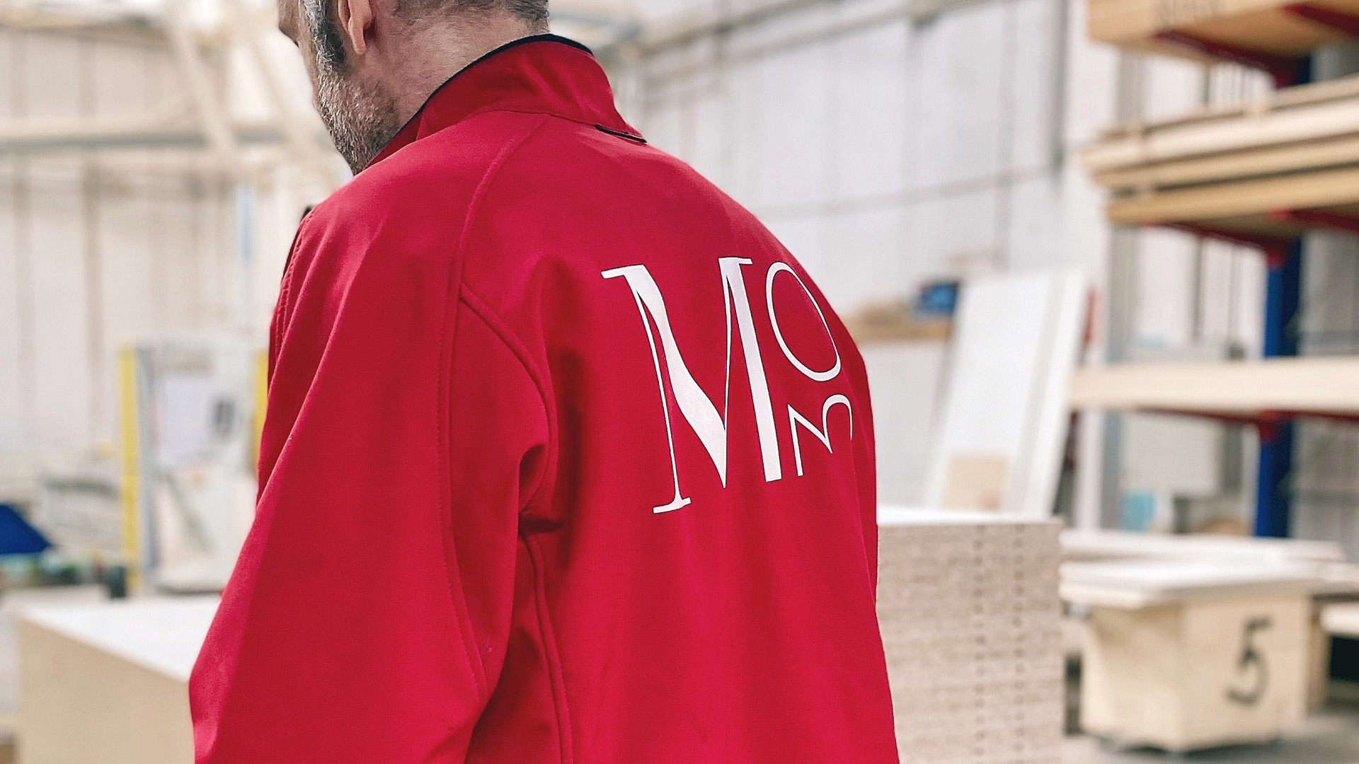
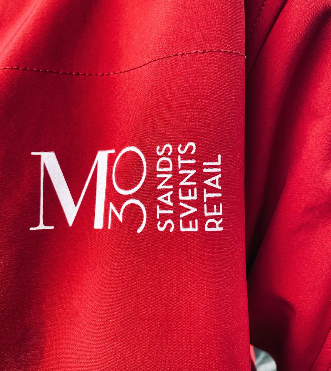
We developed the firm’s corporate identity manual and did branding applications in several communication materials, such as corporate stationery, staff clothing, merchandising, vehicles, etc.
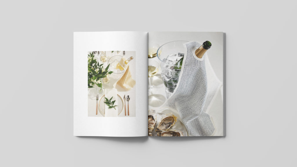
Finally, we thought that it would be key for the brand strategy to update M30s digital communication as well. That’s why we also apply M30s new branding to its corporate website and social networks.
Result
In addition, the renewed corporate identity and communication materials have made it easier for the sales team to access potential clients, and is currently developing new projects with them.
Tags: Branding Strategy, Corporate Branding, Digital Communication
2022
More Projects