


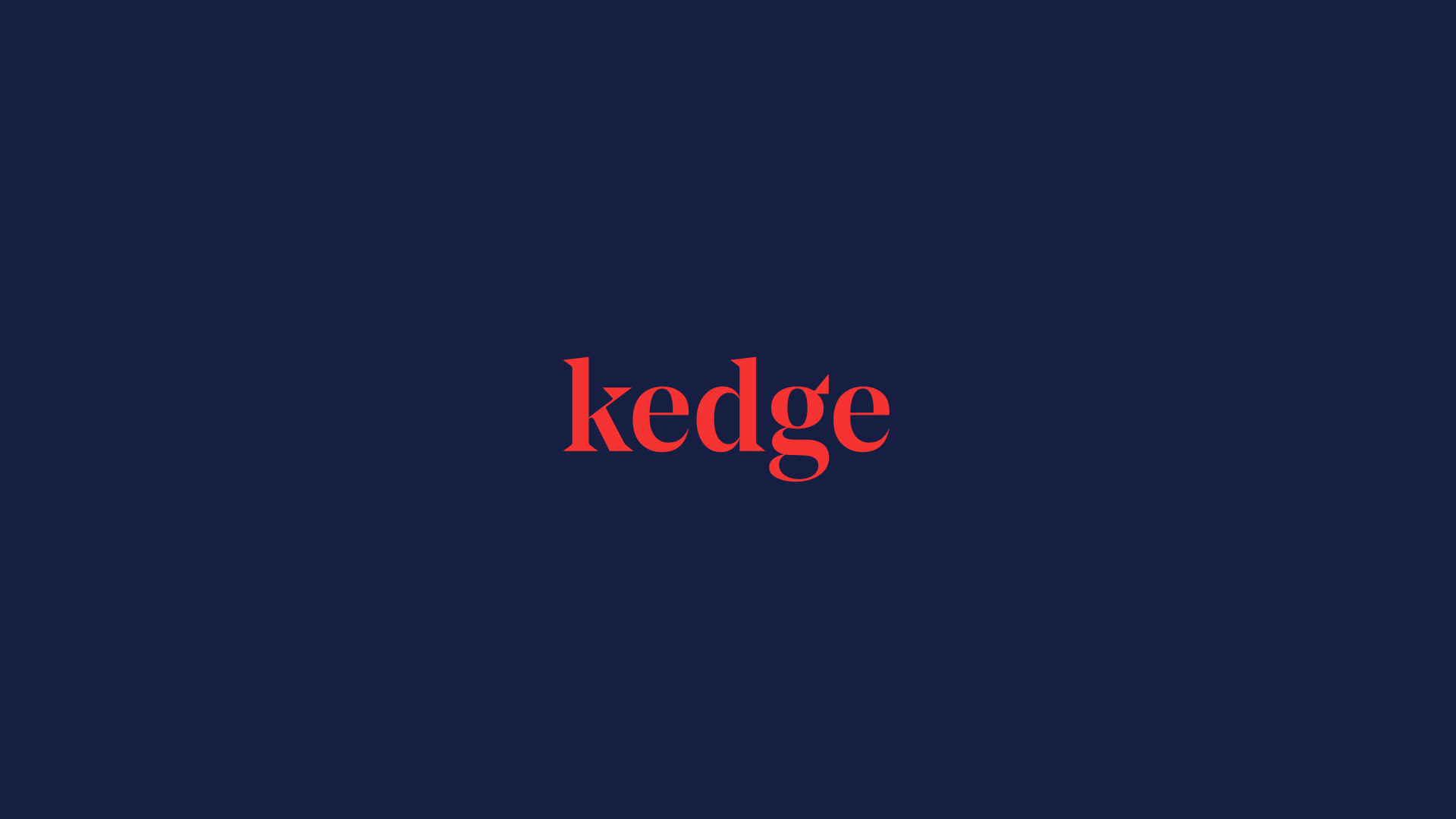
Kedge
Crafting the Strategy and Branding for a new strategic business consultancy
Tailored Branding for a company facilitating decision-making through data
Branding Strategy
Corporate Branding


Challenge
Defining Branding that unites three companies in the Data Analytics and Business Consulting sector
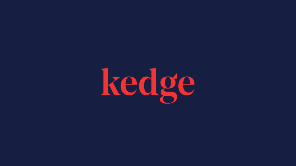
We have worked on the strategy and corporate branding for our client Kedge (i.e. naming, corporate tagline, brand identity), a newly launched Strategic Business Consultancy based in Barcelona. Kedge helps make tailored, informed decisions to generate growth in companies by contextualising each and every bit of data.

Our challenge has been to develop a branding strategy and corporate branding for a newly formed company, resulting from the union of three other firms: KODAMA ANALYTICS, ALLEGRO CONSULTING and CAMPOBASE, all of which coming from the Data Analytics and the Business Consulting sectors, led by a highly qualified team of professionals with extensive professional careers.
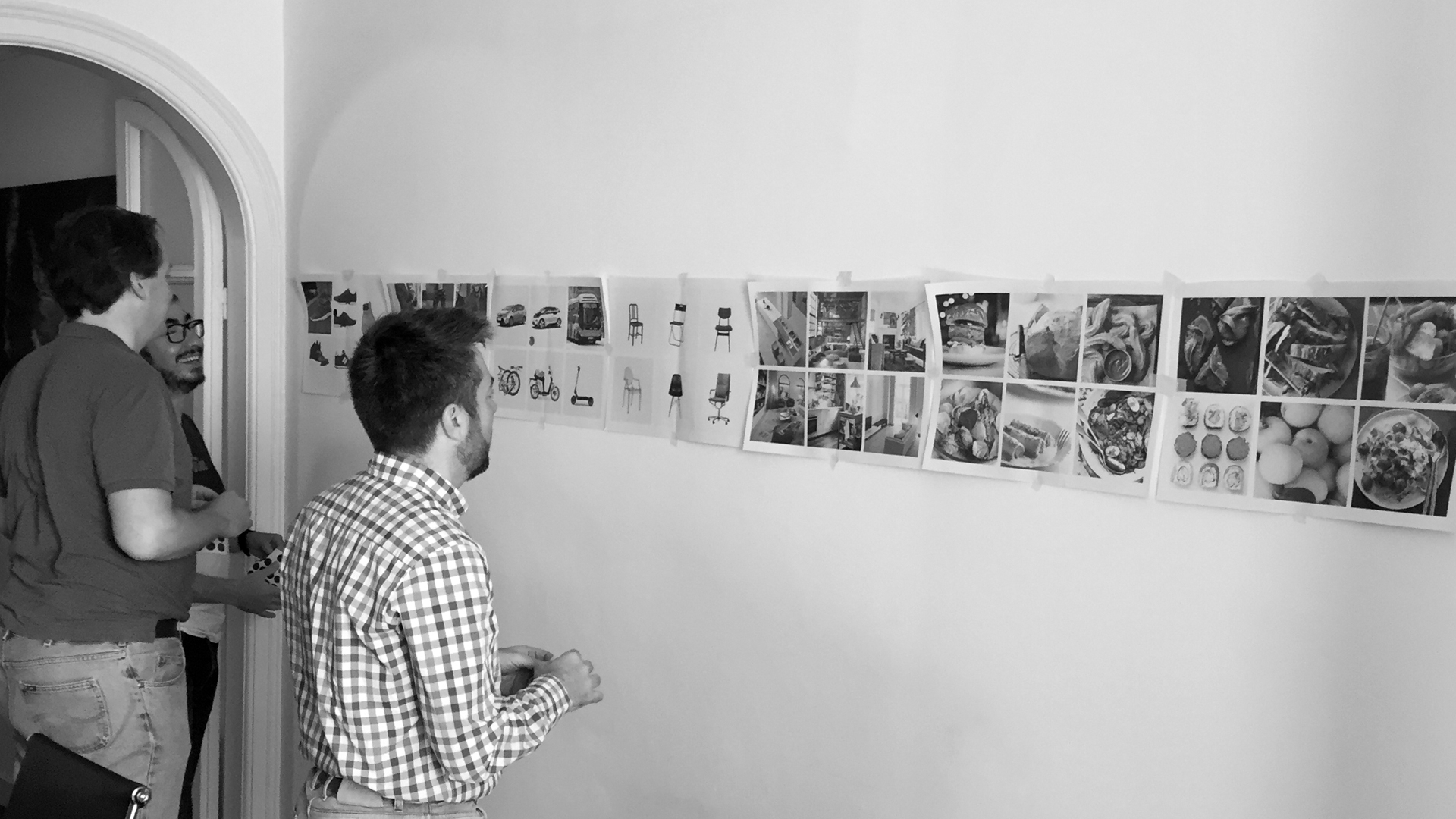
Process
In order to conceptualise and design the corporate branding of Kedge, in which naming has all the prominence, we have particularly taken into account the personality of the company’s own partners, as well as the character of each of the business areas: i.e. a more conventional aspect for Consulting and a more innovative feel for Analytics.


We furthermore defined that the identity, understood as the tip of the iceberg of branding, should project the company’s ability to adapt to all environments and last over time.
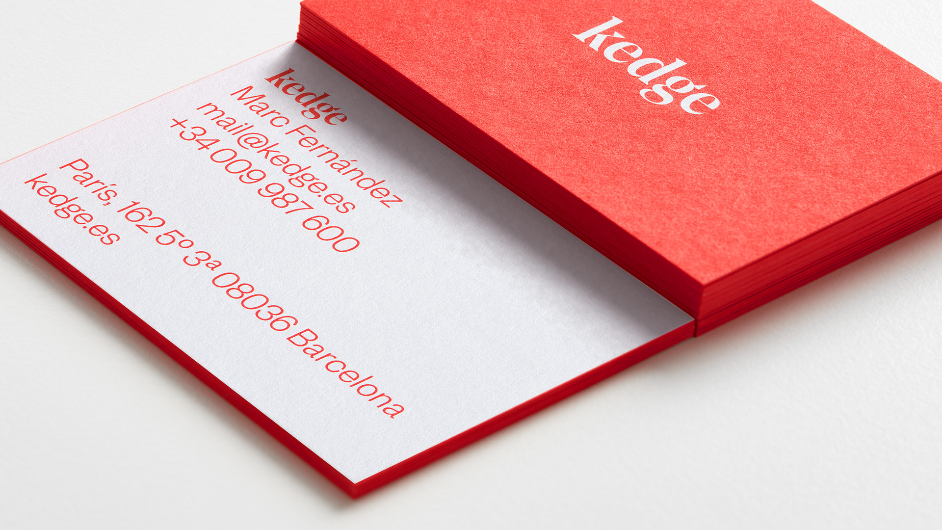
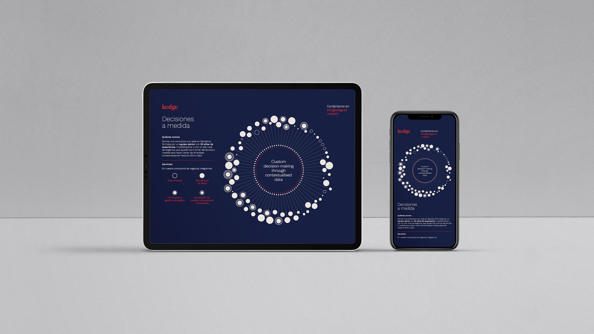
We found in the Noe Display typography, developed by the independent firm Shick Toikka, the perfect ally. This consistent, clean and elegant typeface projects personality while speaking clearly and confidently thanks to the dialogue between its round and leisurely curves and its energetic and pointed final strokes, which favour the readability and visibility of its details in small sizes without losing sharpness.
The typography comes with a chromatic palette which refers to the two areas of the company, using more formal colours, such as Warm Gray and the earthy Pantone 7592 U, along with energetic Reflex Blue U and Warm Red, which appear in a versatile way throughout the company’s communication materials.
Result
Branding that reflects the experience and personality of the partners forming the new company
Thanks to experience and teamwork we have managed to create a brand with character, mature but, more importantly, differential within its sector.
Tags: Branding Strategy, Corporate Branding
2019
More Projects