


DryMelt (UIC)
Strategy and Corporate Branding for DryMelt — The Bioactive Innovation from the Bioengineering Institute of Technology at UIC
Branding to position DryMelt as a disruptive technology within the competitive cosmetics industry
Branding Strategy
Corporate Branding
Packaging Design
Communication
Challenge
Branding to position DryMelt as a disruptive technology within the competitive cosmetics industry
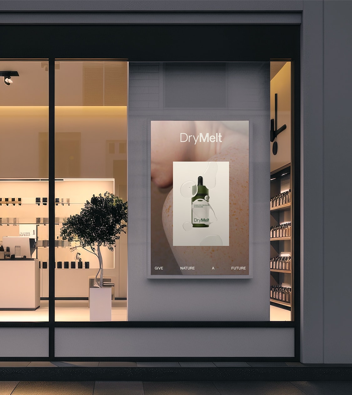
In 2024, we collaborated with the Bioengineering Institute of Technology at UIC, an innovation centre dedicated to developing cutting-edge biotechnological solutions for the cosmetics and biomedical industries. Our challenge was to create the branding and communication strategy for DryMelt — a patented bioactive technology representing a scientific breakthrough in skincare.
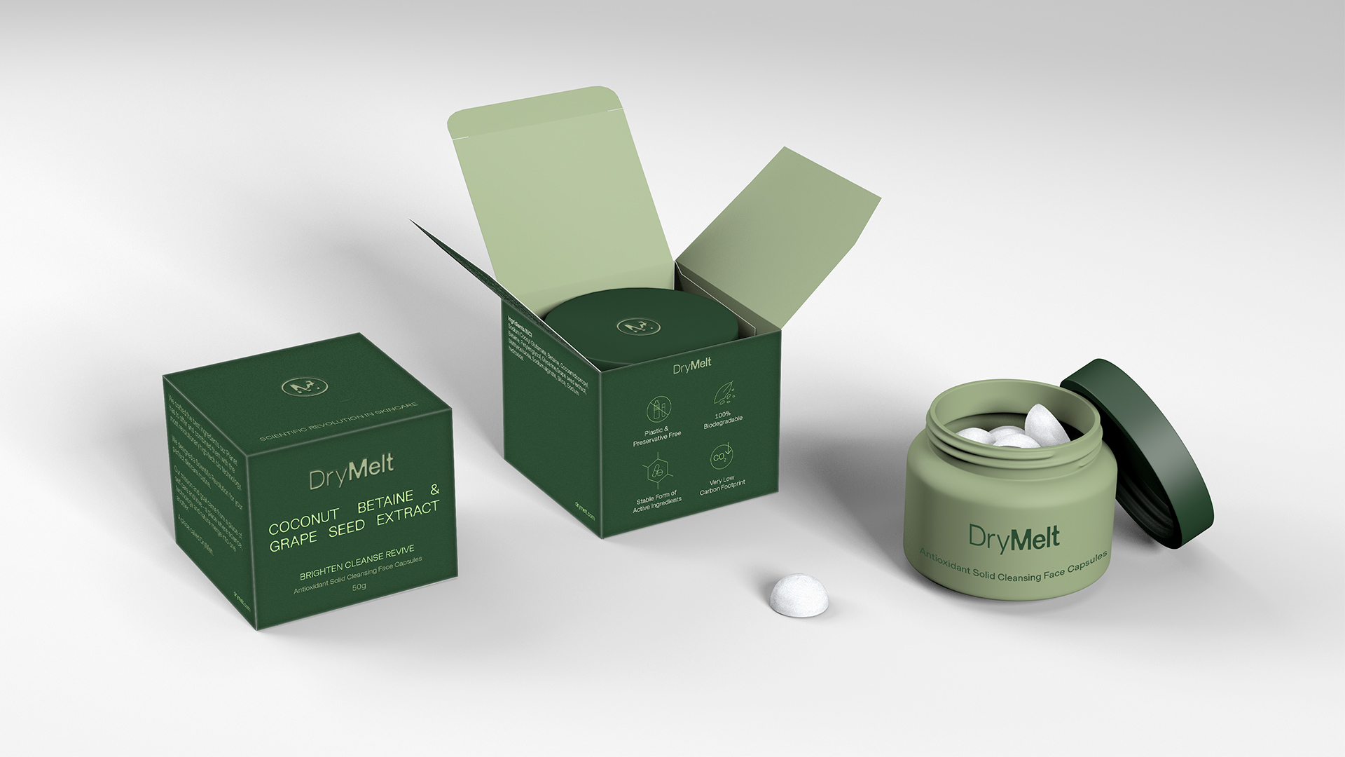
This unique solution — solid, single-dose, water-soluble, and free from preservatives and microplastics — makes it possible to formulate natural, highly customisable products compatible with a wide range of active ingredients
The main challenge was to position this disruptive technology within a constantly evolving market, where consumer demands revolve around preservative-free, microplastic-free, natural and sustainable products that deliver meaningful health results.
The key lay in communicating its distinctive value and competitive advantages to empower cosmetic brands to innovate and stand out with a solution that combines sustainability, high performance and a unique sensory experience.
Process
Once the values of the new technology were defined, we created its corporate storytelling, aligned with the essence of UIC’s Bioengineering team: to innovate, transform and advance — together with the product’s features and advantages for both the sector and end users.
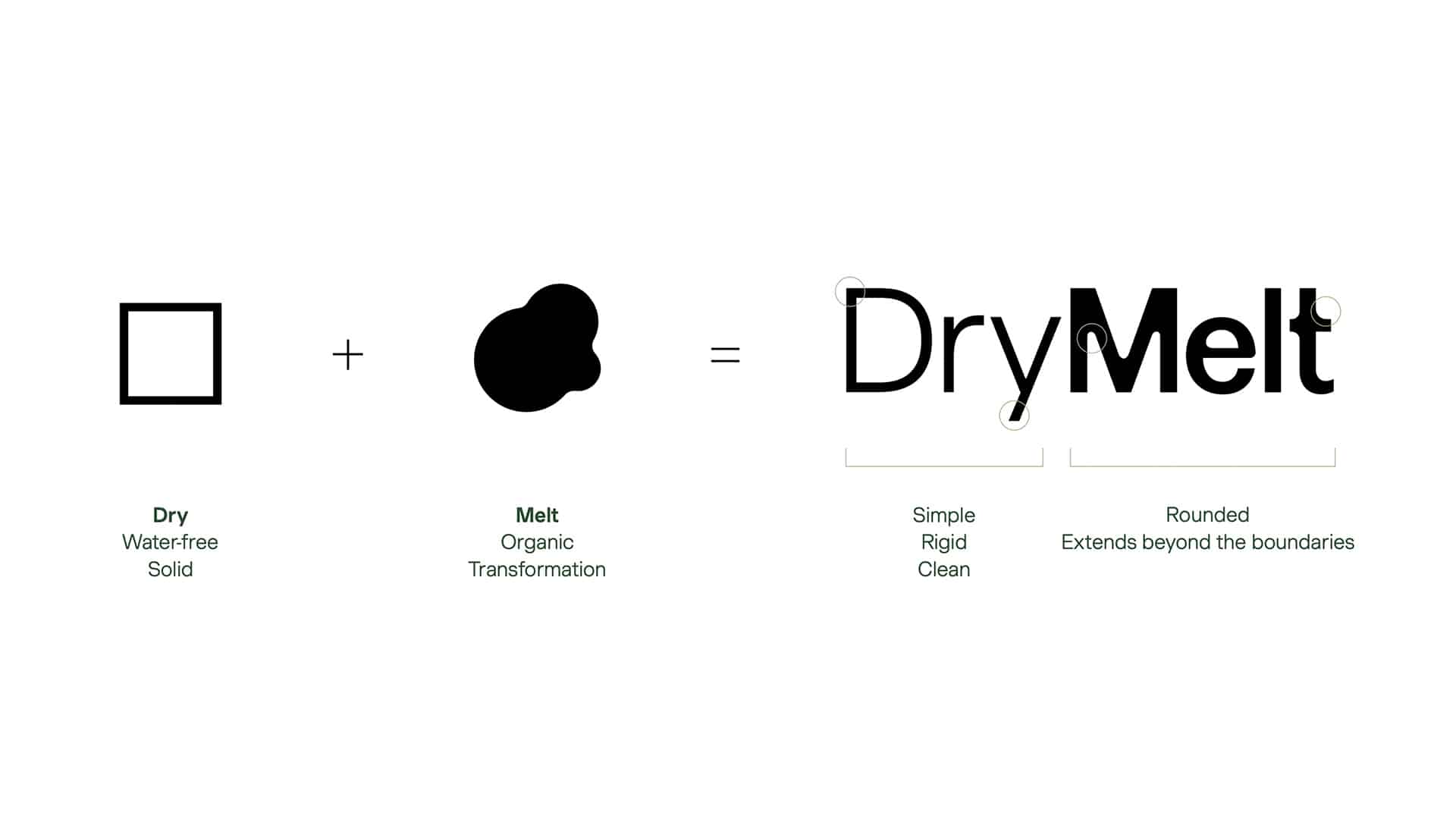
In the same vein, we defined its value proposition and corporate tagline: “Patented bioactive technology enabling unique and sustainable cosmetics.”
Next, we developed the naming. We explored various options, drawing from a concept cloud generated during the analysis, strategic and verbal definition phases, which included ideas such as innovation, sustainability, efficacy, biotechnology, waterless, zero waste, and wellbeing, among others.
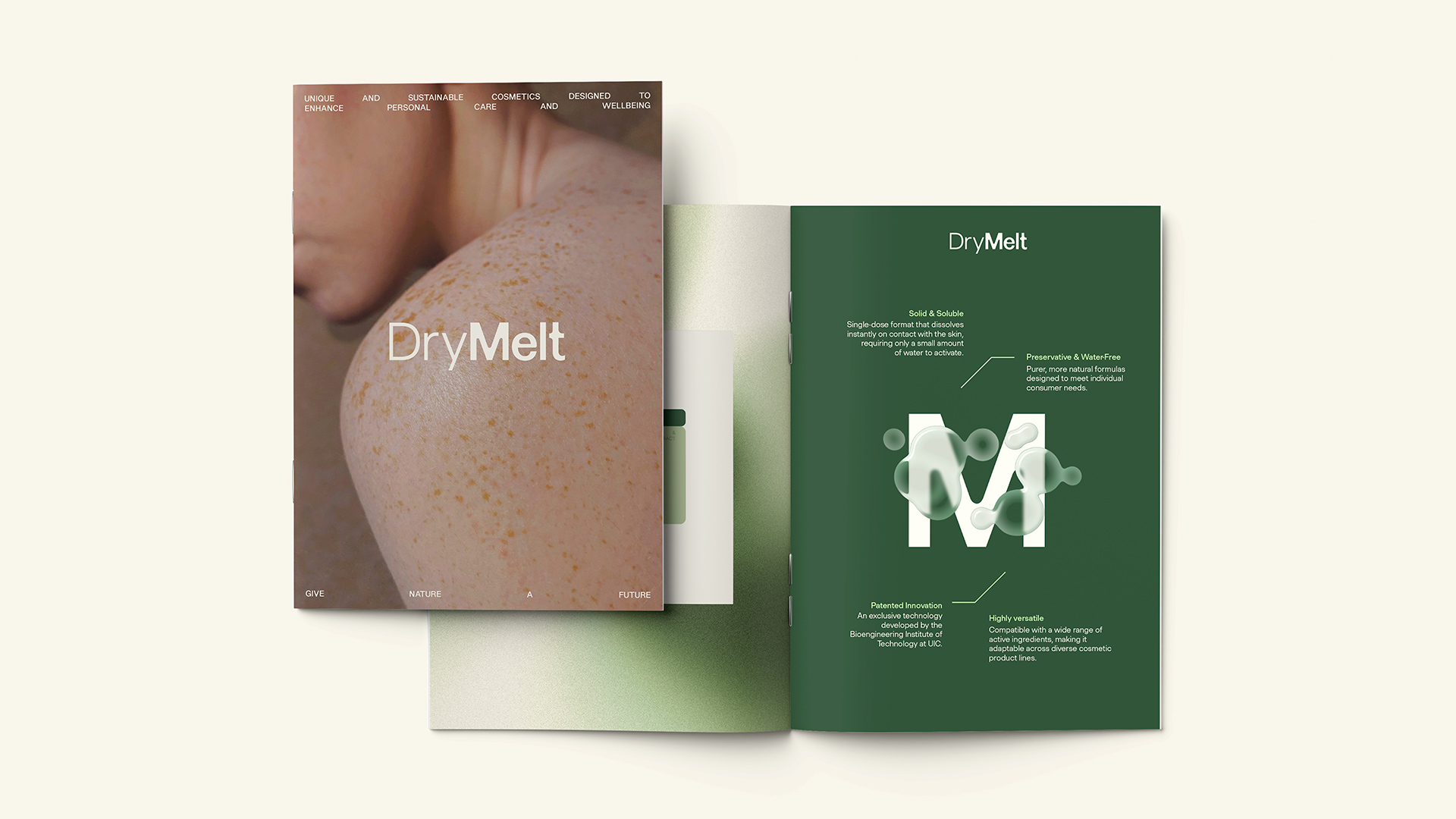
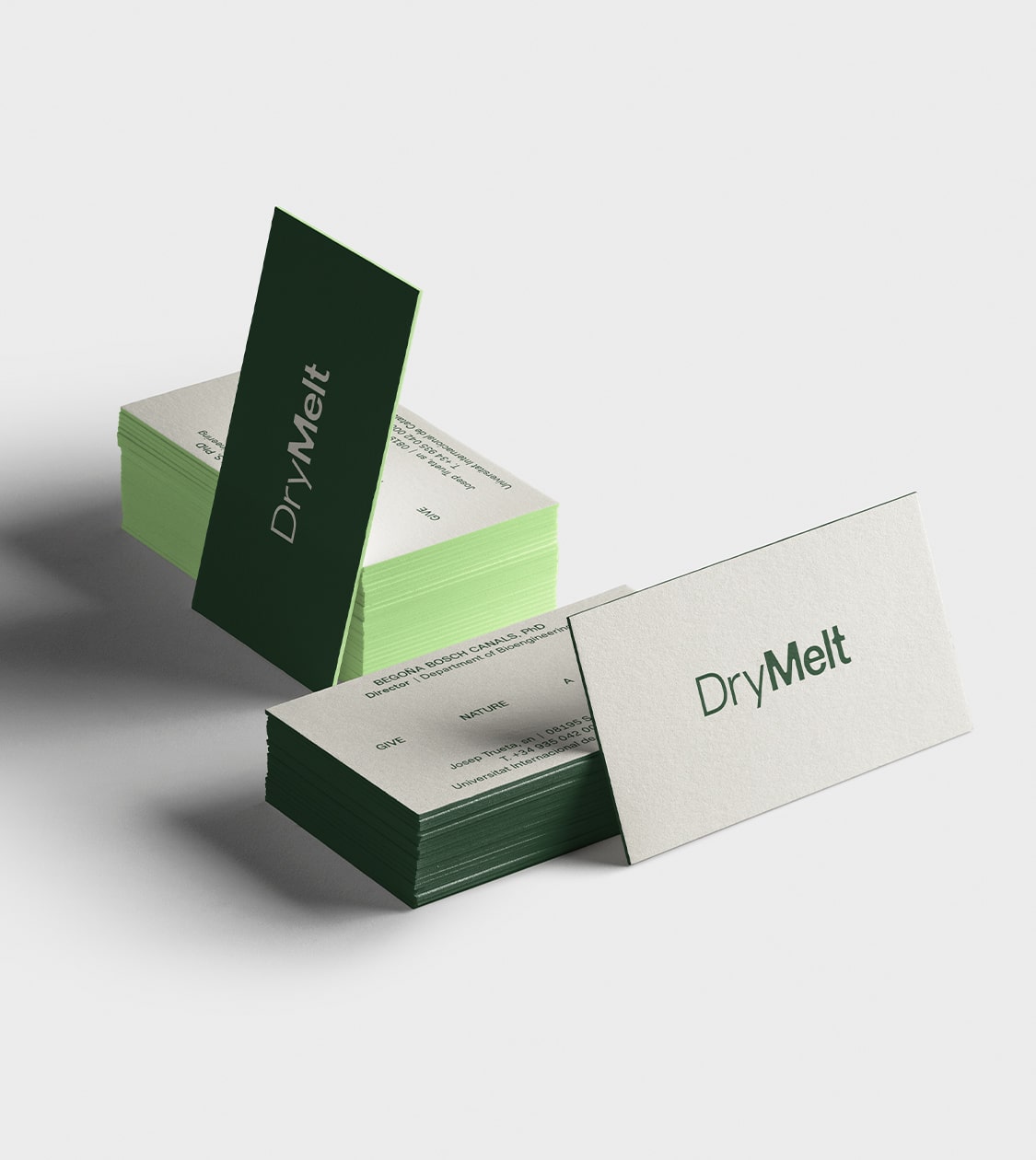
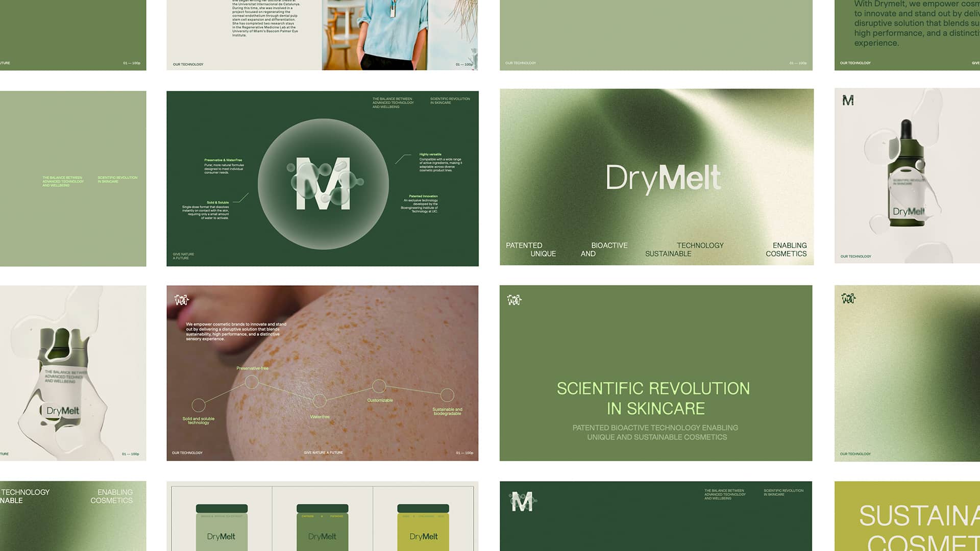
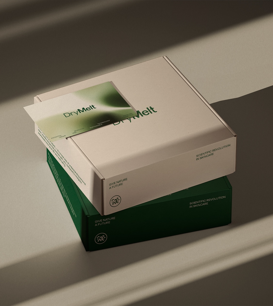
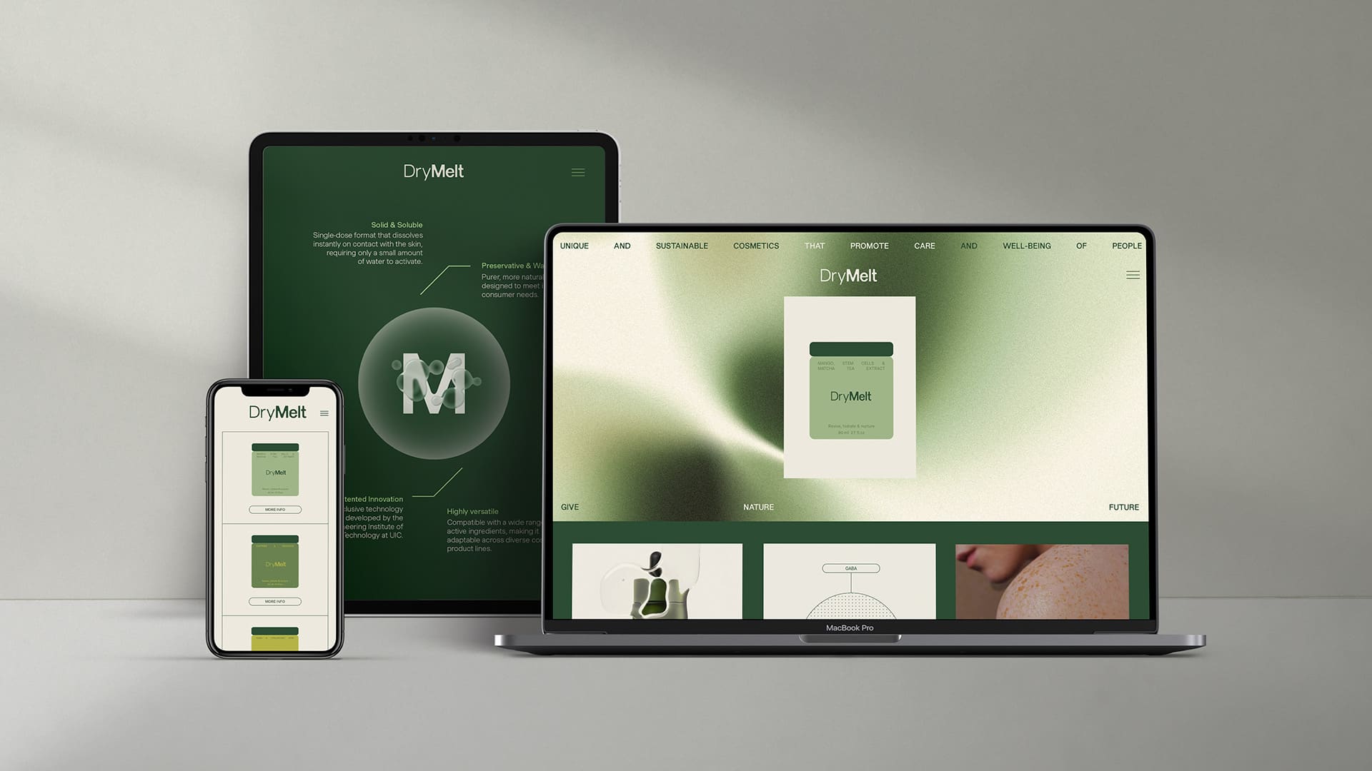
We applied the new DryMelt identity across its communication materials — including the corporate presentation, stationery and social media — as well as in the design of its packaging.
We defined packaging for DryMelt that was both functional and sustainable, while also serving as a communication tool that reflects the brand’s mission: to offer a new generation of cosmetics in responsible, innovative formats aligned with the wellbeing of both the consumer and the planet.
Result
Positioning DryMelt as a strategic partner for cosmetic brands seeking to stand out through responsible innovation
Thanks to the strategic and creative work of NOMON DESIGN, we have consolidated DryMelt as a brand with its own coherent and distinctive identity. Moreover, we have translated a complex scientific innovation into an accessible, attractive and competitive verbal and visual language for the cosmetics market.
The new branding gives DryMelt a strong and aspirational personality, aligned with the values of sustainability, responsibility and wellbeing.
Its name, visual and verbal identity, and all its communication materials reflect a revolutionary technology that meets the demands of contemporary consumers: transparency, performance and a genuine commitment to the planet.
Its branding projects a premium image that positions DryMelt as a strategic partner for cosmetic brands seeking to differentiate themselves through responsible innovation. It also establishes the foundations to enhance its growth, scalability and connection with its future audiences.
Tags: Branding Strategy, Corporate Branding, Packaging Design, Communication
2024
More Projects